- HOME
- BI & Analytics
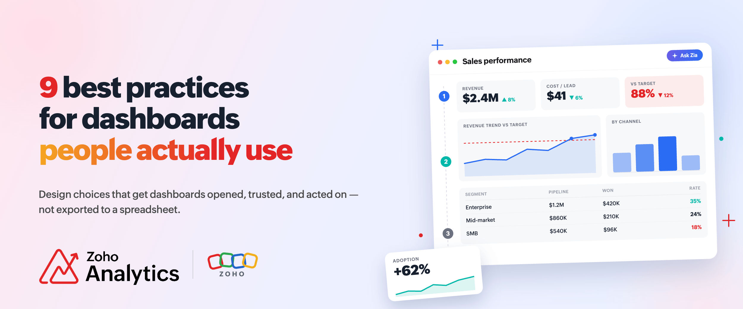
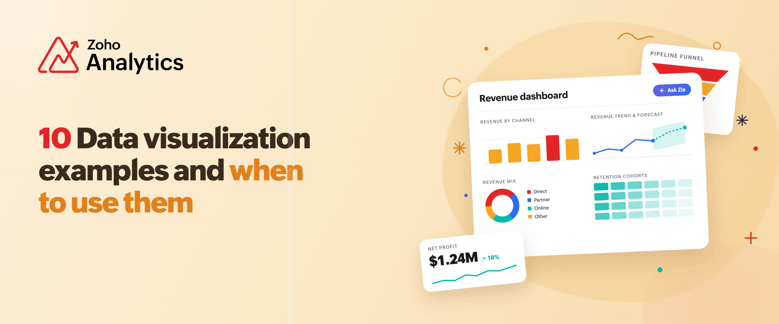
- 10 Data visualization examples and when to use them
10 Data visualization examples and when to use them
- Last Updated : June 15, 2026
- 48 Views
- 7 Min Read
What will your sales pipeline look like next quarter? Which marketing channels are actually bringing in customers? Where are shipments getting stuck in your supply chain? Which products are running out of stock before you've noticed?
These are questions teams ask every week. Most of the time, someone opens a spreadsheet to find the answer. The data is there. Getting it into a form that actually answers the question is where things slow down.
This blog shows common data visualization examples that answer those questions. The first section covers examples by business use case. Examples in the second section focus on specific features and what they let you do that a standard chart builder does not.
7 Data visualization examples by business function
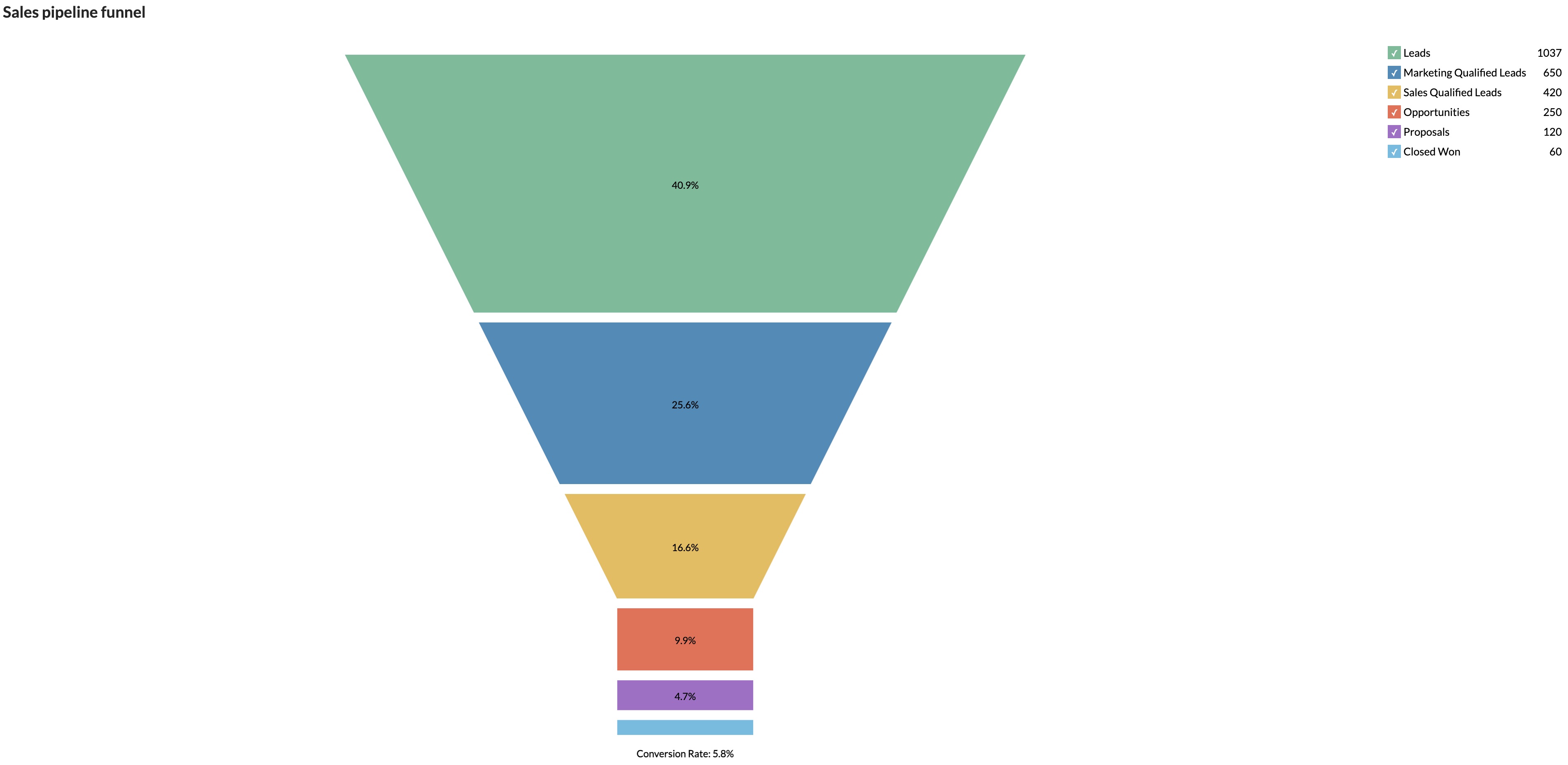
1. Sales pipeline funnel chart
This report answers where deals are dropping off?
A funnel chart shows your pipeline from lead to close. You see the conversion rate at every stage. Win rate is low? It shows you exactly which stage is losing deals. Proposal? Demo? Negotiation? Each has a different cause.
Connect Zoho CRM, Microsoft Dynamics CRM, or HubSpot CRM to Zoho Analytics. Click any stage in the funnel and drill down to rep-level or product-level detail. You get the answer without building a second report.
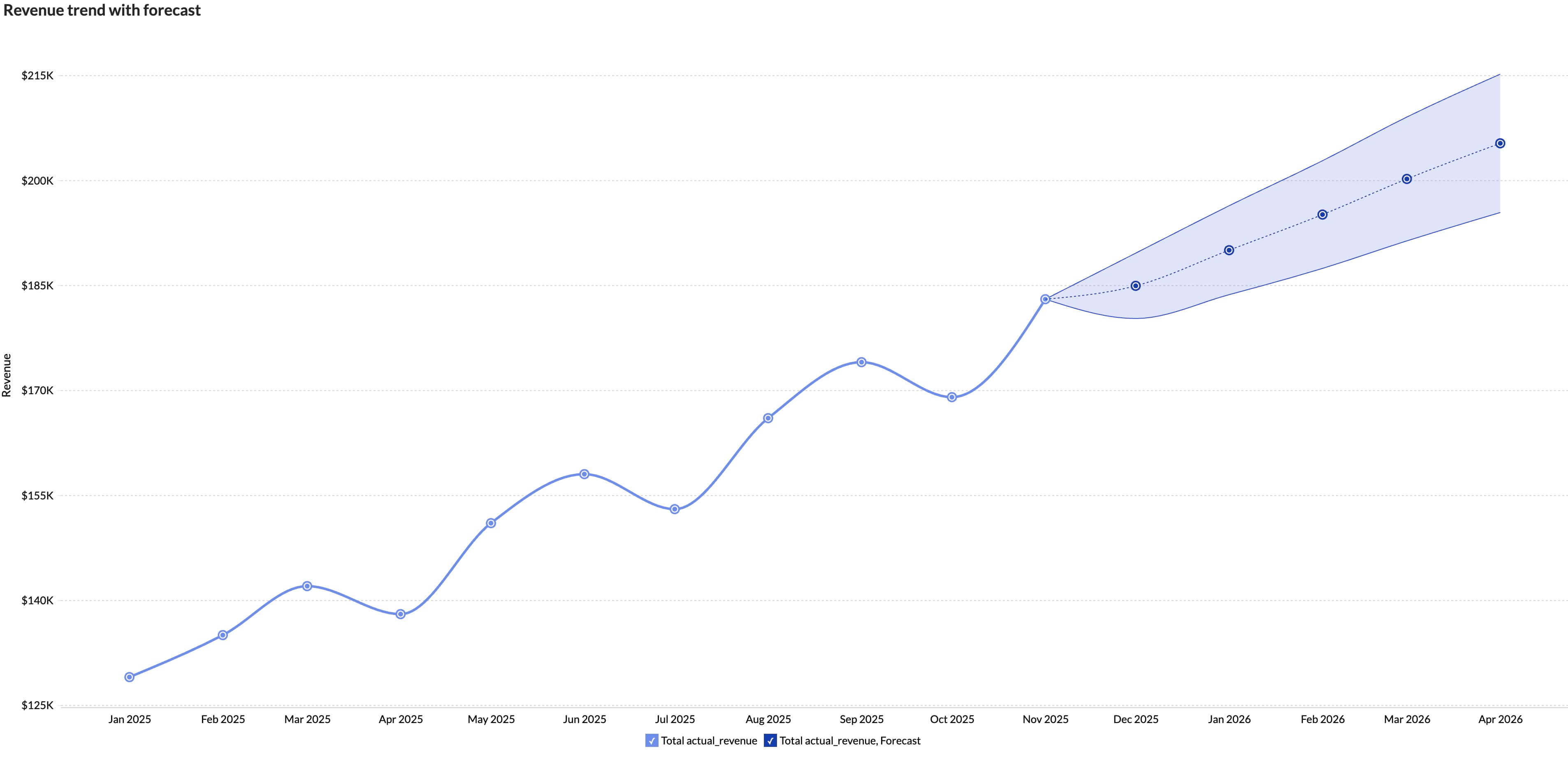
2. Revenue trend line chart with forecast
This visualization answers whether we are going to hit our number this quarter?
A line chart of past revenue tells you where you've been. Add a forecast on top and it tells you where you're headed.
Zoho Analytics connects to Zoho Books, QuickBooks, and other finance tools. Forecast the future revenue trend by using multiple forecasting models. The output is a trend line with a shaded band showing the range of likely outcomes. Your finance team can see the projection and how confident to be in it.
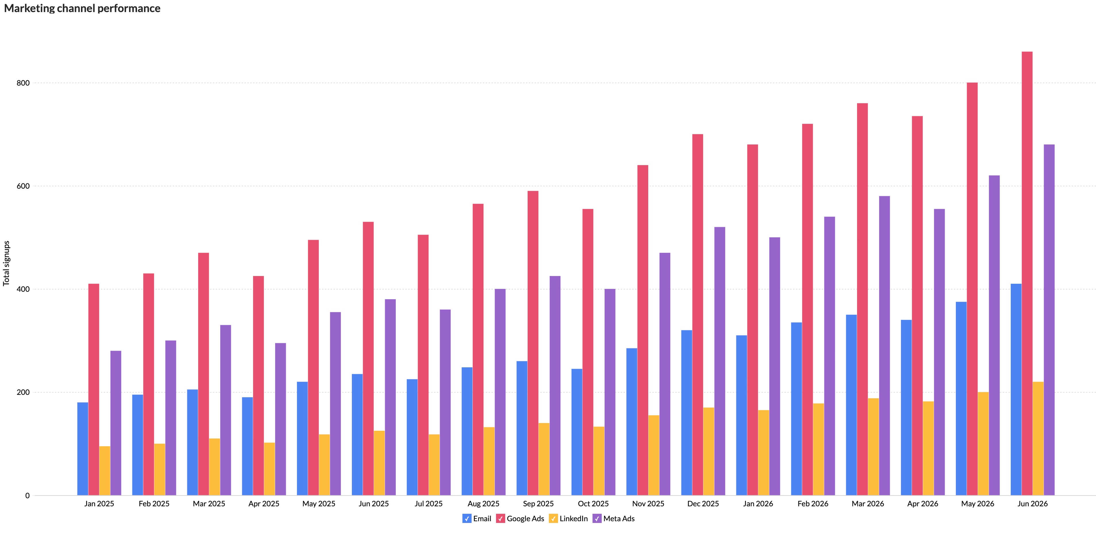
3. Marketing channel performance bar chart
This chart answers which channels are bringing in customers, and which are just burning budget?
A grouped bar puts clicks, signups, and cost per conversion side by side for each channel. You see Google Ads, Meta, LinkedIn, and email in one view.
Zoho Analytics connects directly to ad platforms and your CRM. So when a lead from LinkedIn converts in HubSpot weeks later, it shows up in the same report.
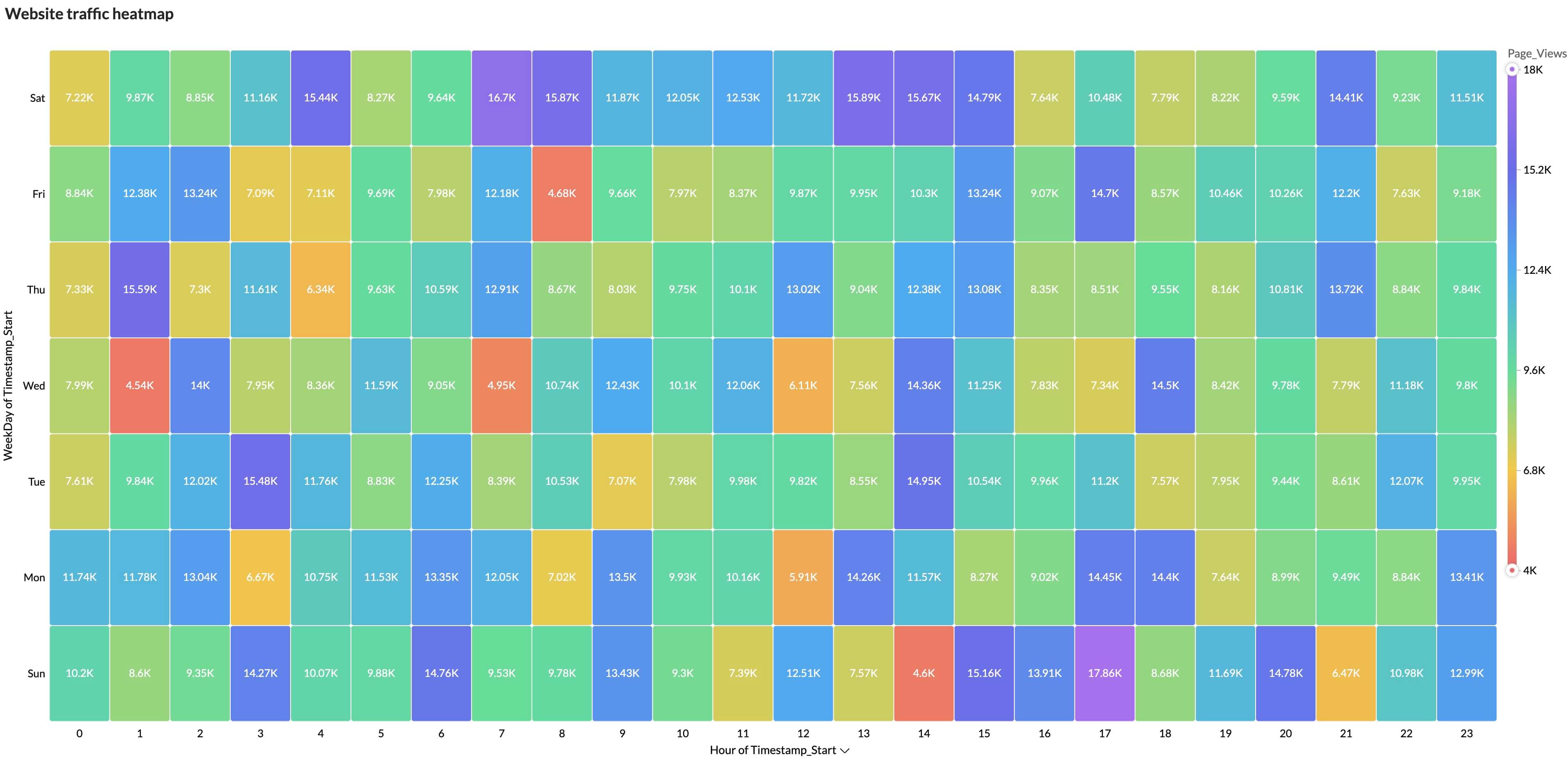
4. Website Traffic Heatmap
This visualization answers when your website is busiest and when engagement drops off.
A heatmap displays the hour of day on one axis and the day of the week on the other. Each cell represents the total number of page views during that time period. Darker colors indicate higher traffic, while lighter colors indicate lower activity.
Patterns become obvious at a glance. Are weekday mornings your busiest period? Does traffic dip during weekends? Are there peak hours when most visitors engage with your site?
By connecting to your web analytics platform, the heatmap aggregates page views across thousands of sessions and highlights recurring behavior patterns. Hovering over any cell reveals the exact traffic volume, making it easy to identify peak engagement windows and optimize content publishing, marketing campaigns, and staffing decisions.
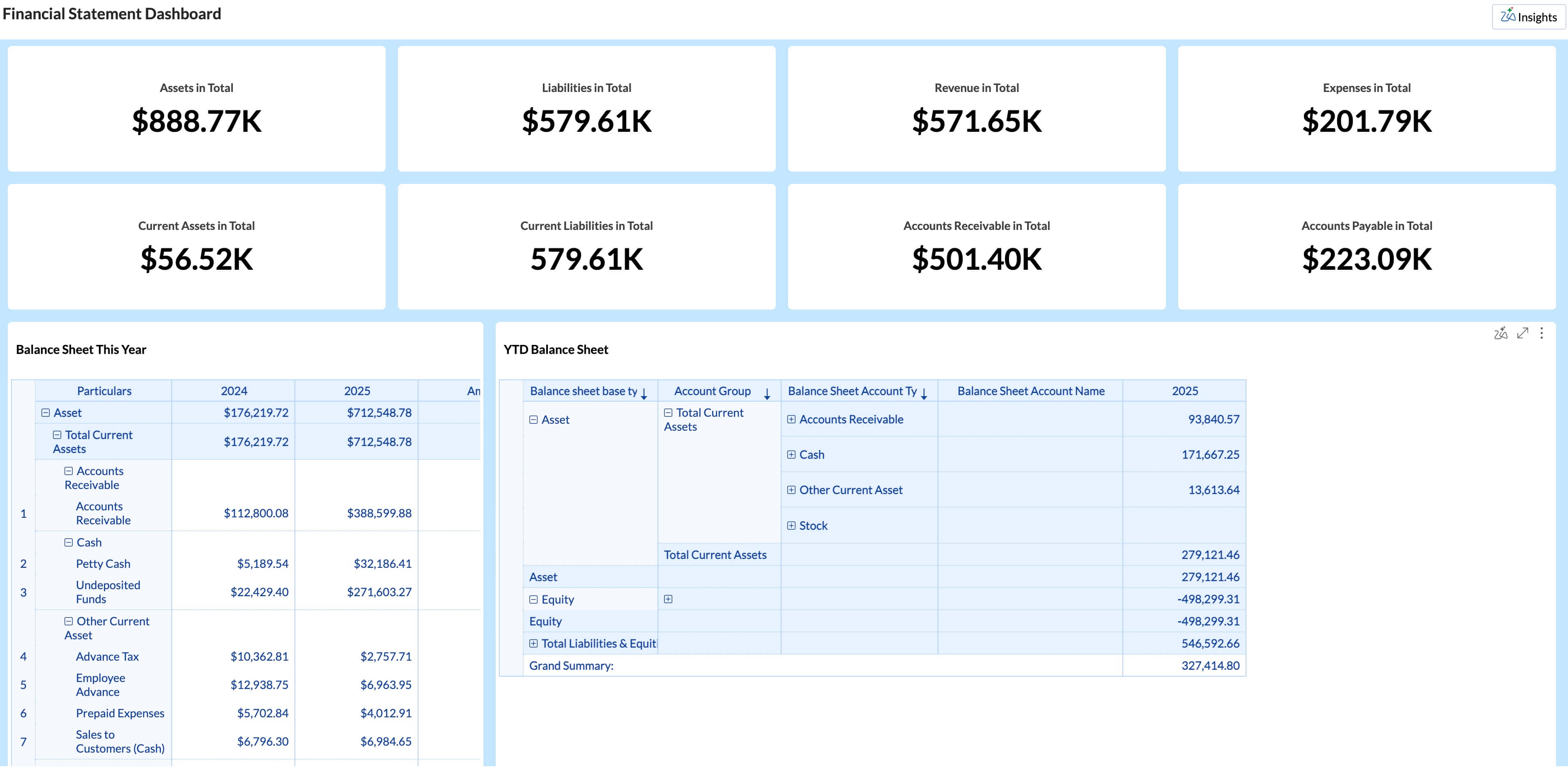
5. Financial P&L dashboard with KPI widgets
This report answers how the business is doing against the budget right now?
A P&L dashboard shows revenue, gross margin, operating expenses, and net profit in one place. Each KPI sits next to its budget target with a trend line below it.
Zoho Analytics has 75+ pre-built financial visualizations. Connect Zoho Books, QuickBooks, or Xero and the dashboard is ready to go.
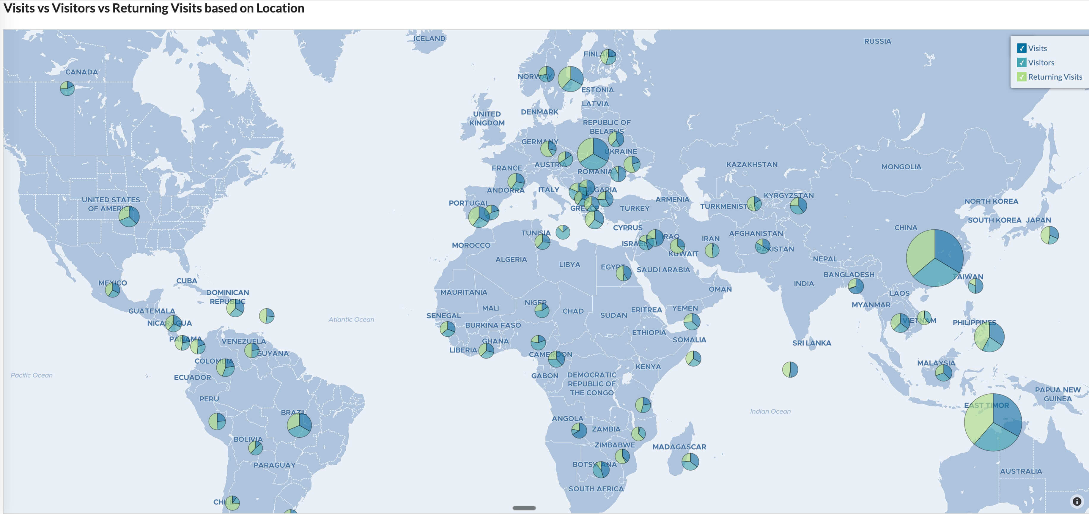
6. Website traffic geo map with layering
This chart answers where is traffic coming from, where is it converting, and where should we focus next?
A regular geo map shows sessions by state or country. Zoho Analytics adds geo-map layering. You can put three data dimensions on one map: sessions as color intensity, conversion rate as circle size, and store count as a separate marker. One map instead of three separate views.
Say sessions in a state are low but your store count there is also low. You can decide whether to push more traffic there or open more locations. That call comes from data, not a gut feeling.
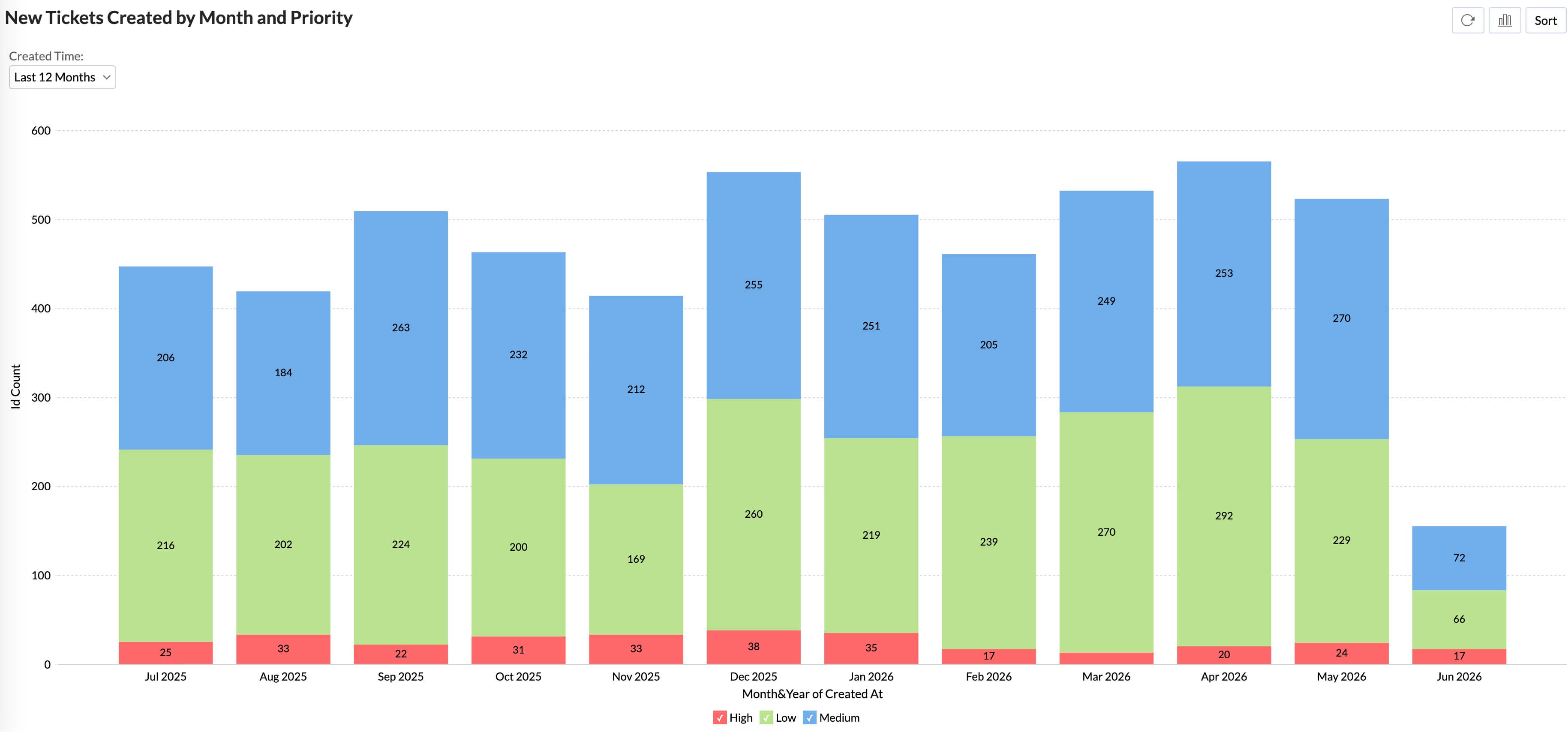
7. Support ticket volume stacked area chart
This report answers whether support volume is going up, and what's causing it?
A stacked area chart shows total ticket volume over time, broken down by category. You see the total trend and what's inside it at the same time.
If billing tickets tripled in one quarter while total volume stayed flat, something changed in your pricing or invoicing process. You know where to look.
Zoho Analytics can combine Zoho Desk or Zendesk data with CRM data. A spike in tickets from high-value accounts tells a different story than a spike from trial users.
3 Data visualization examples by features
These examples focus on specific features of data visualization software and what they let you do that a standard chart builder does not.
8. Drill-down interactivity: Going deeper without leaving the report/dashboard
Static dashboards show the top-line number. Going deeper means opening something else, losing your place, and mentally reconciling two different views.
Drill-down interactivity changes that. Click a stage in a funnel and a breakdown loads in the same view, by sales rep, product, or deal size. You're not navigating to a different report. A manager reviewing pipeline can go from total deals to "which three reps account for 60% of stalled proposals" in two clicks, without leaving the dashboard. This is what interactive data visualization means in practice.
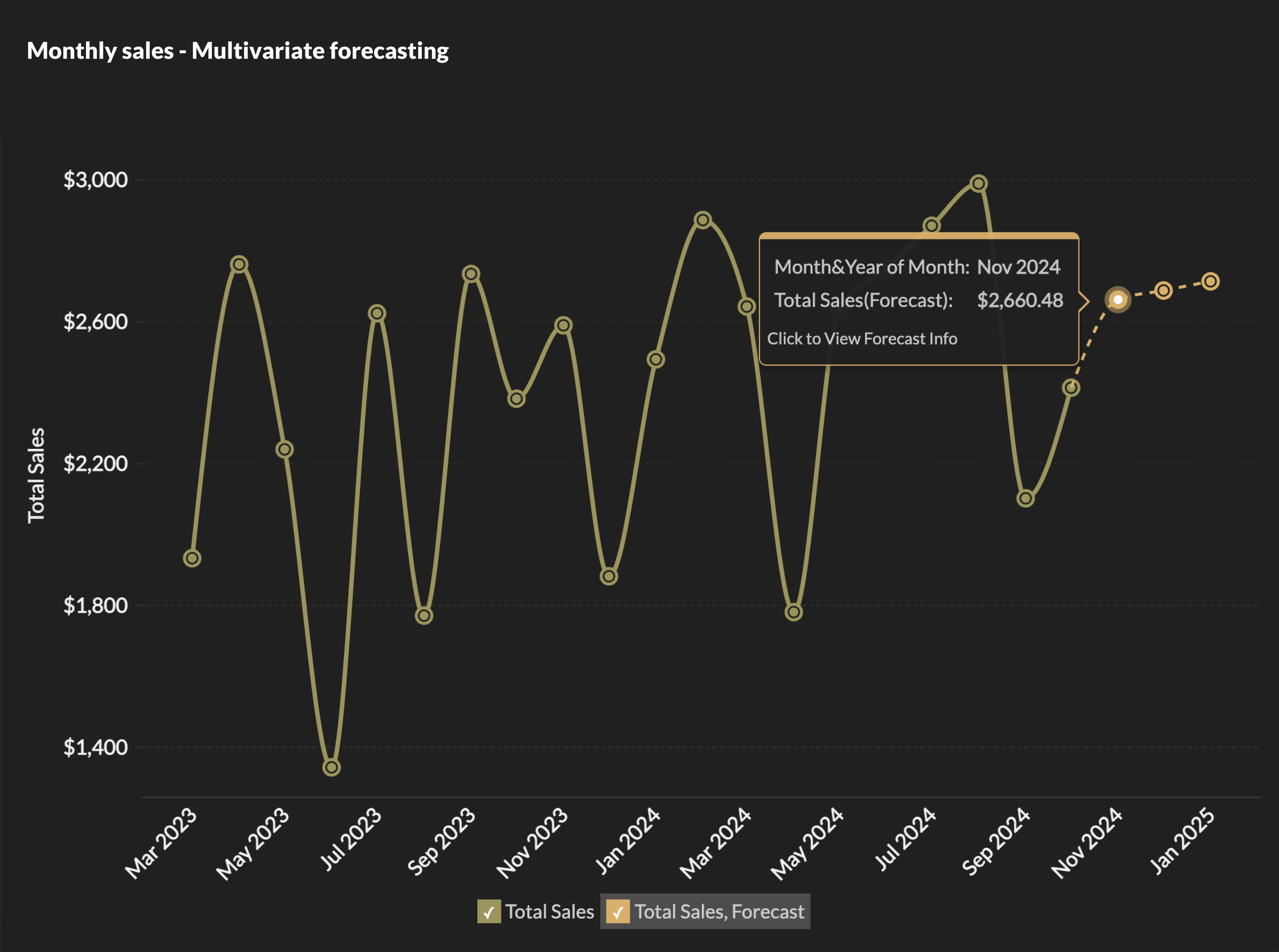
9. AI forecast overlay: Separating analysis from prediction
A forecast overlay adds a predicted trend to an existing line chart, with a clear visual break showing where historical data ends and prediction begins.
Your finance team can see the projection and judge how much weight to give it based on how wide the band is. A narrow band on a stable revenue trend reads differently than a wide band on a volatile one.
The more important detail: the forecast should update whenever the underlying data does. A static projection built in a spreadsheet doesn't. If revenue is tracking 15% below the model by the third week of the quarter, a live forecast shows it. You don't wait for the monthly review to find out.
10. Color as a signal: Conditional formatting
Instead of reading every number, you can use color intensity to immediately spot high-performing and underperforming areas.
In this view, darker shades highlight higher values, while lighter shades indicate lower values. You can quickly identify top-performing regions, product categories that drive the most revenue, or segments that may need attention.
Without color encoding, this is simply a table of numbers. Finding trends requires scanning row by row and comparing values manually. With conditional formatting, the most important information stands out immediately. The eye is naturally drawn to the darkest and lightest cells, making outliers, opportunities, and problem areas easy to spot.

Why Zoho Analytics for data visualization
All 10 examples above were built in Zoho Analytics. A few things make it stand out from other data visualization software.
Zia, the AI assistant, is part of the core product. It generates forecasts, catches anomalies, recommends the right view for your data, and answers questions in plain language. You don't buy it separately or set it up as an add-on.
The platform connects to 500+ data sources, making the blended reports possible. The marketing channel example in example 3 above pulls from ad platforms and a CRM at the same time. Zoho Analytics handles the connection and the join.
With Zoho Analytics' drag-and-drop builder, a sales ops manager or a marketing coordinator can build their own reports without involving IT.
When you compare Zoho Analytics to other best data visualization tools like Tableau or Power BI, the price difference is significant. For a team of 10 to 50 users, it adds up.
Mitrefinch, a global workforce management company, had the same problem. Their support data was spread across Zoho Desk, Salesforce, and internal databases. Analyzing it in Excel was a dead end, and Power BI didn't work either. They built support KPI dashboards in Zoho Analytics that pulled from all three sources. Customer satisfaction scores went from 80% to 100%, and first call resolution time dropped from 20 hours to 7 hours. The data was always there. They just couldn't see it in one place until the dashboards were in place.
How to start building visualizations in Zoho Analytics
There are three ways to get started. Watch the video below to see each one in action.
If you know what you want to build: Connect your data source, open the chart builder, and drag the columns you want onto the axes. Zoho Analytics suggests a chart type based on what you select. You can keep it or change it. For help picking the right chart type, the Zoho Analytics chart picker guide covers all 50+ chart types with use case guidance.
If you want to build faster: Type your question into Ask Zia. "Show me revenue by region for this year." Zia builds the chart. You can keep asking and it keeps adding to the dashboard. This is what makes Zoho Analytics one of the more practical AI data visualization tools for teams that don't want to spend time in a chart builder.
If you don't know what to build: You can choose auto-analysis and Zia will analyze your data and create reports and dashboards over your data. You can preview the dashboards and choose to save them for future use.
You can try all of this on a 15-day free trial. No credit card required. Every feature is available, including Zia. If you want a walkthrough of a specific use case first, you can book a free demo.
 Pradeep V
Pradeep is a product marketer at Zoho Analytics with a deep passion for data and analytics. With over eight years of experience, he has authored insightful content across diverse domains, including BI, data analytics, and more. His hands-on expertise in building dashboards for marketing, sales, and major sporting events like IPL and FIFA adds a data-driven perspective to his writing. He has also contributed guest blogs on LinkedIn, sharing his knowledge with a broader audience. Outside of work, he enjoys reading and exploring new ideas in the marketing world.