- HOME
- BI & Analytics
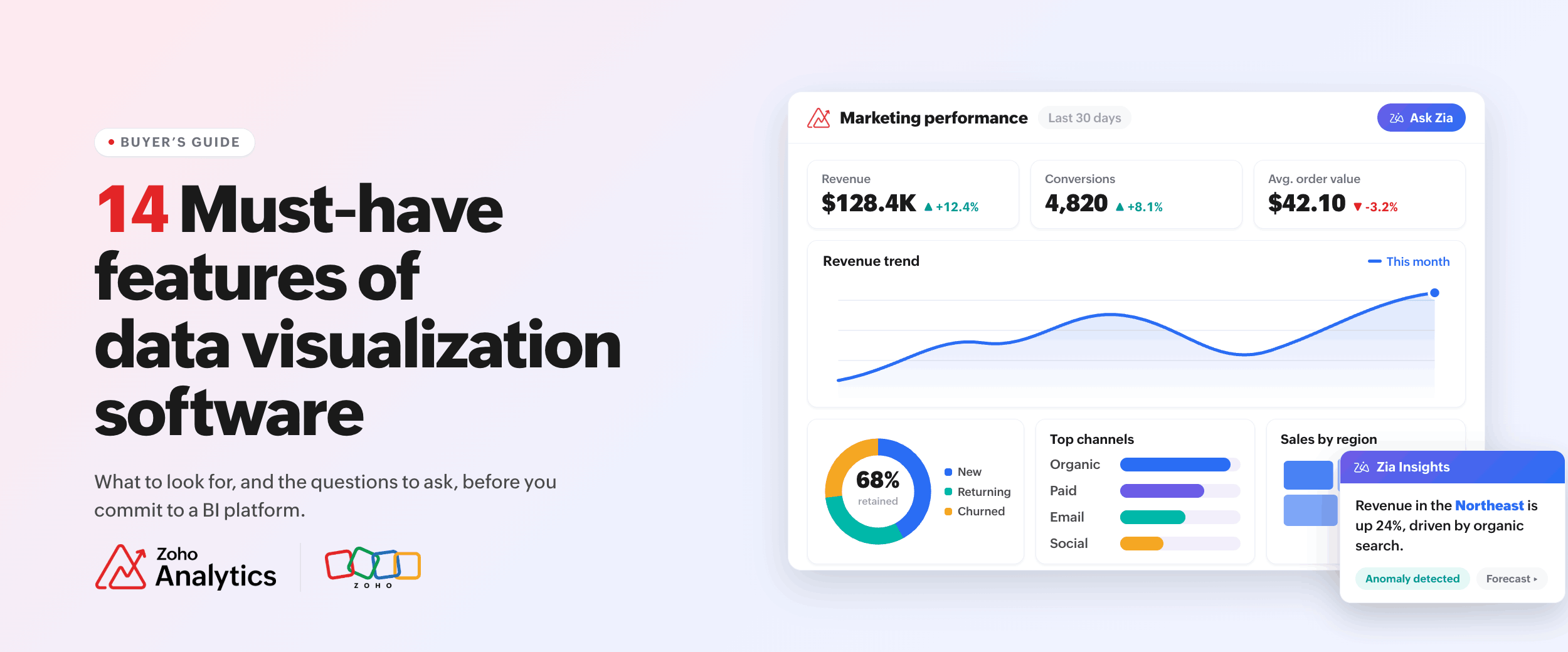
- 14 Must-have features of data visualization software (and how to evaluate them)
14 Must-have features of data visualization software (and how to evaluate them)
- Last Updated : June 3, 2026
- 119 Views
- 11 Min Read
Your data lives in your CRM, your database, a few spreadsheets, maybe a tool or two that doesn't connect to anything else. Getting a clear picture out of all that is harder than it should be.
That's the problem data visualization software is built to solve. It takes raw numbers and turns them into charts, dashboards, and reports that people can actually read and use.
The challenge is that tools vary a lot under the surface. In the 2024 BARC BI Survey, data quality and data integration ranked as the top two pain points among BI users (ahead of performance, cost, or usability). That's a signal: the features that matter aren't always the ones that get the most attention in demos.
This blog covers 14 features of data visualization software worth checking for when you're evaluating. Each one is here because skipping it causes problems down the line. By the end, you'll know what to look for and what questions to ask before you commit.
What data visualization software does
At its core, data visualization software turns data into visuals. Charts, graphs, maps, tables, dashboards. That's it.
The gap between older tools and newer ones is big though. Older tools needed you to export data first, then build something. Newer tools connect directly to your live data, refresh on their own, and let anyone on your team ask questions and get a chart as the answer.
There's also some overlap now between visualization tools and what people call BI (business intelligence) platforms. Pure visualization tools just help you create charts. BI platforms go further and include things like data prep, access controls, and analytics workflows. Many tools today do both.
When you're evaluating options, look at the features rather than going by brand name.
The 14 core features of data visualization software
1. A wide chart library
Having a lot of chart types sounds basic. It matters more than people expect.
Every tool has bar charts, line charts, and pie charts. The problem shows up when your ops team needs a Gantt chart, or your sales data needs to go on a map, or finance wants a pivot view. If the tool doesn't have it, someone ends up building a workaround in a separate tool.
Look for a wide chart type support, covering Gantt, heatmaps, pivot tables, KPI widgets, funnel charts, and geographic maps.
2. A drag-and-drop report builder
A drag-and-drop builder lets people build reports by dragging columns onto a canvas and picking a chart type.
The real test is whether someone on your team who doesn't have a technical background can actually use it on their own. A sales manager or a marketing lead should be able to build a basic report without help from a data analyst or IT.
When we look at how teams use Zoho Analytics in the first week, the ones that get value fastest are the ones where non-technical users can build their own reports without filing a request. The drag-and-drop builder is what makes that possible.
During your trial, ask someone like that to try it. Give them a task and see what happens. That tells you more than watching a demo.
3. Interactive dashboards
A dashboard that just shows a fixed snapshot isn't very useful. An interactive dashboard lets users filter data, click into charts to see more detail, and change the view based on what they're looking at.
When you create dashboards that pull together multiple reports into one place, those reports should respond to the same filters. If you change the date range in one chart, every other chart on the page should update too.
During your trial, test exactly that. Pick a filter and see if it updates everything. If it doesn't, people will have to make the same change in several places every time they want to check something.
4. Data connectivity
Your charts are only as good as the data going into them. If connecting your data sources is painful, everything else slows down.
Good data visualization software connects directly to your databases, your business apps (like your CRM or ERP), and accepts file uploads when needed. It should sync automatically so you're not manually pulling fresh data every time.
The key question is whether it connects natively to the tools your team already uses. A native connector to Salesforce, for example, syncs on its own. Exporting a CSV from Salesforce manually and uploading it every week is a different thing entirely.
Look for more connectors, native support for your key business tools, and live-connect options for databases where you need up-to-date data.
5. Data preparation
Data is rarely clean when it comes out of a source. There are duplicates, formatting issues, fields that need to be combined or split, and calculations that need to run before the numbers make sense.
If your visualization tool can't handle any of that, you need a separate data preparation tool or a data engineer to clean things before you can build anything. That adds time and extra steps.
A good data prep feature inside the tool lets you join tables, clean records, and make the data analysis-ready. You can see what the data looks like at each step as you set it up.
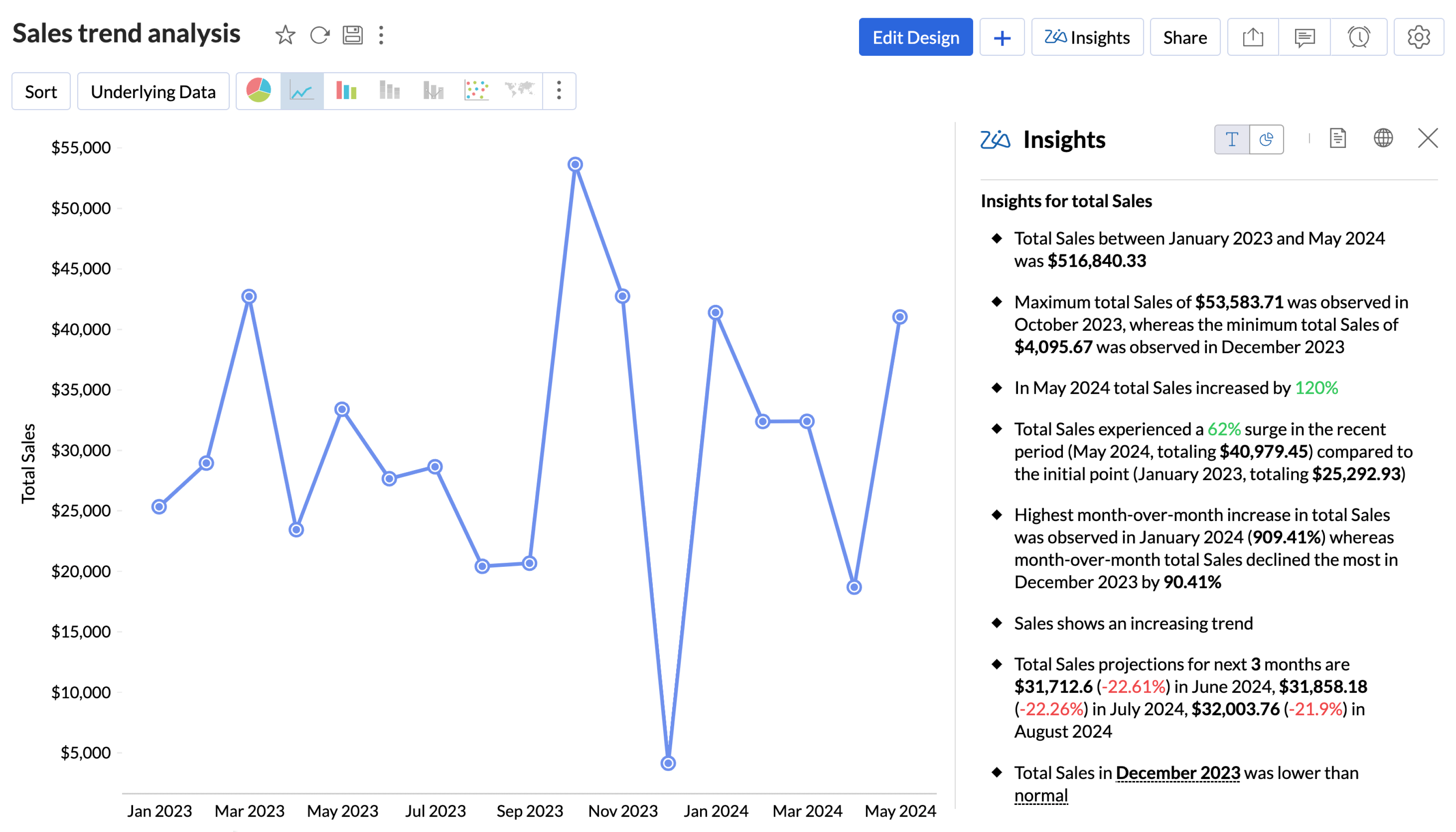
6. AI-powered insights
Your analysts check the same reports every week. What they can't do is catch everything that changed without them looking for it.
An AI layer in your visualization tool scans the data and flags things on its own. A drop in revenue in one region. A spike in refunds for a certain product. These things show up in your data whether or not someone happens to pull the right report at the right time.
Look for AI data visualization tools that offer automatic insight generation, anomaly detection, and an explanation of why something was flagged. A tool that just says "this is unusual" with no context isn't much help.
7. Natural language query
Your business users shouldn't need SQL to get answers from data. Natural language query lets them type a question in plain English and get a chart back.
Something like: "What were our top five products by revenue last quarter in the Northeast?" The tool reads that, runs the query, and shows a chart.
How well this works varies a lot between tools. Test it with real questions your team would ask. See if it handles follow-up questions without you having to repeat everything.
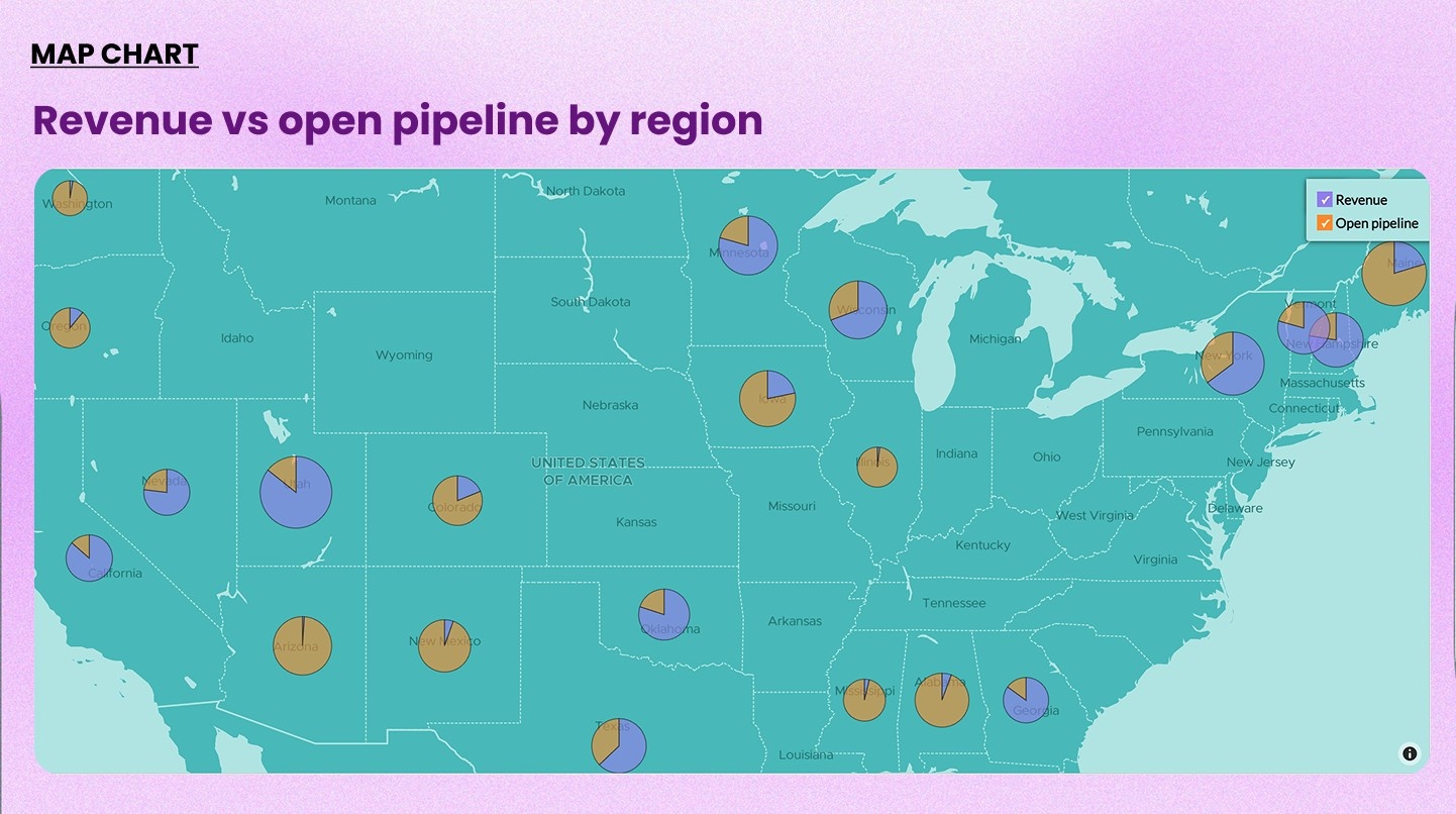
8. Maps and geo-visualization
If your data has anything to do with geography, such as store locations, sales regions, delivery areas, customer distribution, maps are worth having.
Looking at a table of numbers by region takes time. A map shows the same thing in a few seconds. A sales lead can spot which regions are behind with one look.
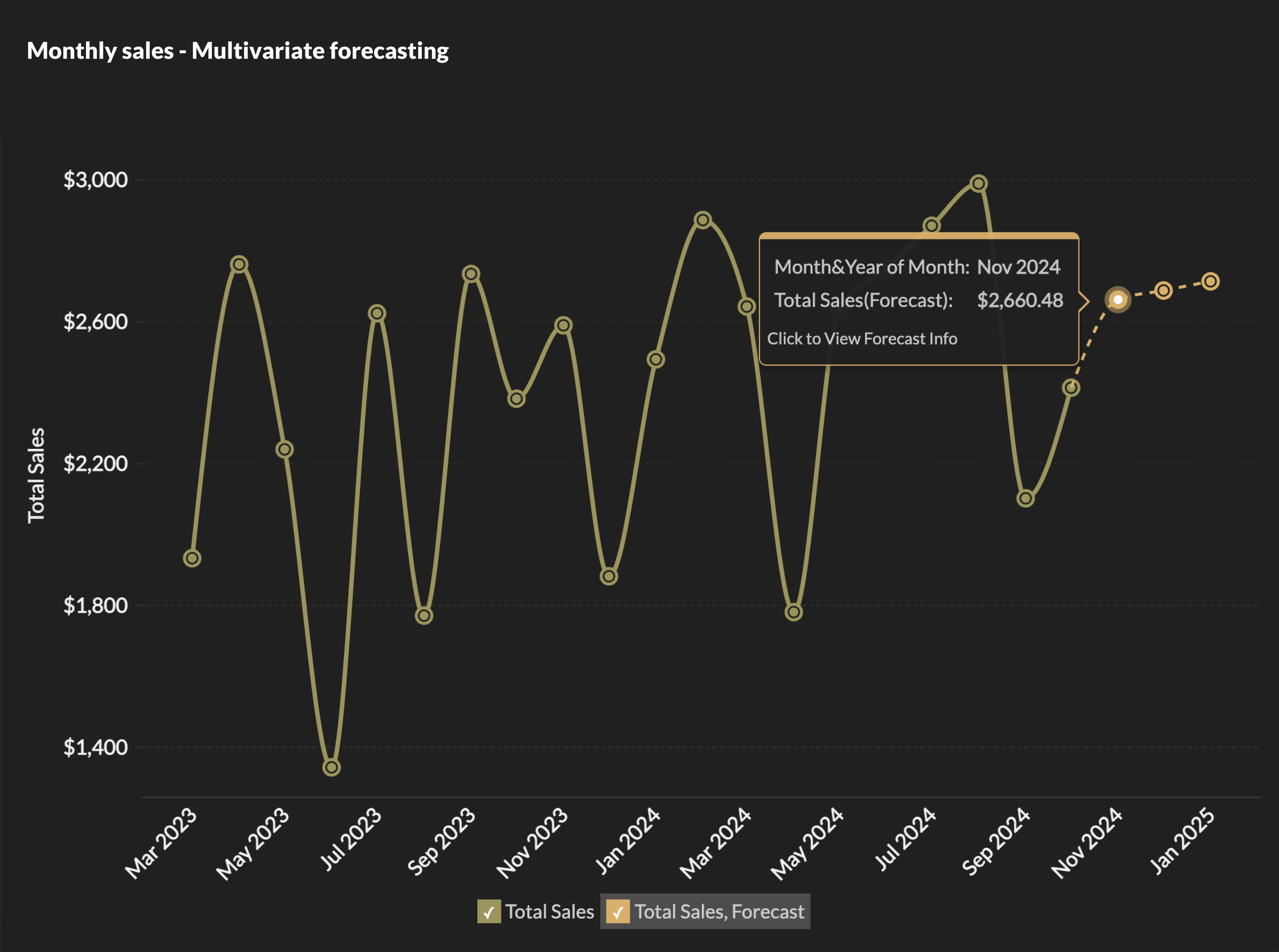
9. Forecasting and predictive analytics
Historical data tells you what happened. Forecasting tells you what's likely to come next.
Good forecasting features build predictions from your own data using machine learning. You don't need a data science background or a separate tool. You set it up, and the tool generates projected numbers you can view alongside your actual historical trend.
Look for built-in forecasting with confidence intervals and what-if simulation that business users can configure on their own.
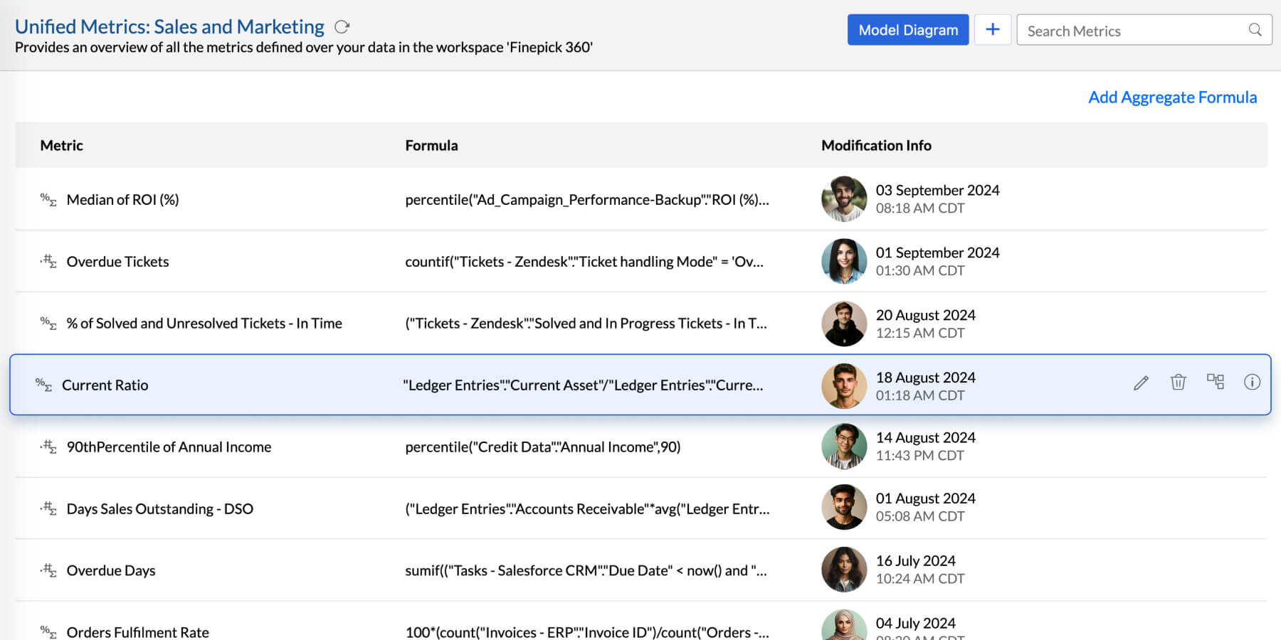
10. A metrics layer
This one solves a problem that sneaks up on teams as they grow.
Two people define "revenue" differently. Two dashboards show two different numbers. A new hire rebuilds a metric that already exists in four other reports. The metrics layer stops this from happening.
It's a central place where you define your KPIs and calculations once. Every report that uses "revenue" or "churn rate" or "customer acquisition cost" pulls from the same definition. Change it in one place and it updates everywhere.
This is one of the things we hear about most from teams that move to Zoho Analytics from spreadsheets or lighter tools. The metrics layer is what lets a 10-person team and a 200-person team use the same analytics setup without the numbers drifting apart.
Look for reusable metric definitions, access control so only the right people can edit them, and consistent application across all report types.
11. Sharing and collaboration
A visualization nobody else can see doesn't do much.
Sharing should go beyond sending a file. Team members should be able to view dashboards with the right level of access (view only, or edit). Reports should be deliverable on a schedule via email so people get them without logging in. And teams should be able to comment directly on a dashboard so the conversation stays connected to the data.
Among the best data visualization tools, how well they handle collaboration is often the difference between a tool that gets used and one that doesn't. It's worth checking carefully.
12. Data storytelling
A dashboard shows you numbers. A data story gives those numbers context.
With data storytelling features, you can arrange your charts and dashboards into a guided presentation with commentary and narrative flow. Instead of dropping a link to a dashboard and hoping people draw the right conclusions, you walk them through the key points.
This is especially useful for presenting to leadership, running quarterly reviews, or sharing findings with teams who aren't in the data day to day.
13. Embedded analytics
Some teams need analytics to appear inside another product rather than as a standalone tool. That's what embedded analytics covers.
If you build software for clients, or you run an internal portal where users need to see their numbers without switching to a separate BI tool, embedded analytics lets you put the dashboards right inside your product. Users see data filtered to their account. They never see the BI tool underneath.
Look for white-labeling, iframe and API embedding, row-level security so each user only sees their own data, and an SDK for custom work.
14. Security and access controls
Every other feature on this list creates a risk if access controls aren't handled properly.
The basics: role-based access so people can only see and edit what they're supposed to. Row-level security so a regional manager sees their region's data and nobody else's. SSO for enterprise login. Audit logs that track changes. Compliance certifications like SOC 2 and GDPR for teams in regulated industries.
These features can look similar across tools on paper. During evaluation, ask specifically how row-level security is configured, where your data is stored, and what encryption is in place.
Three data visualization features buyers tend to overlook
These don't show up on most demo checklists. They tend to come up in support tickets six months after a team goes live.
1. Drill through and drill actions
Drill down is standard. You click a bar in a chart and see the next level of detail. Fine.
Drill through is different. You click a data point and jump to a separate report that's already filtered to exactly what you clicked. Someone builds that connection once, and it works for everyone automatically after that.
Drill actions go further still. You click a data point and something happens in an external system; for example, a CRM record opens, a new deal gets created, a field in another tool gets updated, or an API gets called.
For a sales rep, that means clicking a deal in a pipeline report and having the full CRM record open right there.
2. Custom visualization builder
The default chart library covers a lot. But it doesn't cover everything.
Custom visualization support lets your team build chart types that aren't in the default library using JavaScript and libraries like Plotly or D3. You package them as a plugin and they work inside the regular dashboard builder alongside all the standard charts.
Teams in manufacturing, healthcare, logistics, and finance often have specific visualization needs that standard libraries don't cover. A custom budget variance chart. A network graph for dependency mapping. A layout built for a specific type of clinical data. Without this feature, the answer is usually another domain-specific tool.
Look for plugin-based architecture, support for external JS libraries, configurable field mappings, and admin-controlled plugin management.
3. Report and dashboard templates
When your team builds a solid dashboard, that work shouldn't have to be repeated from scratch for every new department, client, or region that needs the same thing.
Template export saves the layout and configuration of any view, like charts, pivot tables, summary views, dashboards, as a file. That file can be imported into a different workspace and connected to a different data source.
For a consulting firm, this means building one client reporting dashboard and rolling it out across dozens of accounts. For a company with regional teams, it means one regional KPI dashboard deployed everywhere without rebuilding each time.
Look for template support across all view types, import with remapping, and the ability to copy views across accounts.
How to evaluate a tool before you buy
Features matter. So does checking whether those features actually work for your team. Here are five things worth testing during a trial.
- Can a non-technical person use it on their own? Ask someone on your team without a data background to build a basic report. See how far they get without help.
- Does it connect to everything you need? Go through each of your data sources. Check for native connectors, how often they sync, and what happens when a sync fails.
- Can it handle your data volume at scale? Ask the vendor for performance numbers at a volume larger than what you have now. Demo data is always clean and small.
- Does governance hold up as the team grows? Test the metrics layer and row-level security specifically. These are the things that break down as more people use the tool.
- What does the full cost look like? Add up the license, the setup work, the time to connect your data sources, and ongoing maintenance. A cheaper license that takes longer to set up and maintain may cost more overall.
How Zoho Analytics holds up against this list
Here's a quick look at how Zoho Analytics maps to all 14 features before we go into more detail.
| Feature | Zoho Analytics |
| Wide chart library | 50+ types: Gantt, geo maps, pivot, KPI widgets, racing bar, heatmaps |
| Drag-and-drop builder | Full no-code builder |
| Interactive dashboards | Cross-filter, drill-down, tabbed layouts, tooltip customization |
| Data connectivity | 500+ sources, 100+ native business app connectors |
| Data preparation | Visual ETL pipeline builder, 250+ transform functions |
| AI-powered insights | Zia: automated insights, anomaly detection, NLQ in multiple languages |
| Natural language query | Ask Zia: ask questions in plain English, get charts back |
| Maps and geo-visualization | Choropleth, heat maps, custom territories |
| Forecasting | Multiple forecasting models, confidence intervals, and more |
| Metrics layer | Centralized KPI definitions, access control per metric |
| Sharing and collaboration | Role-based access, scheduled email reports, commenting |
| Data storytelling | Native data stories feature |
| Embedded analytics | White-labeled dashboards, row-level security, SDK |
| Security and compliance | SOC 2, GDPR, SSO, data masking, audit logs |
| Drill through and drill actions | Supported on charts, pivot views, summary views |
| Custom visualization builder | Plugin-based, JS library support, admin-controlled |
| Report and dashboard templates | Export/import across workspaces and accounts |
If you're evaluating platforms, here's where Zoho Analytics stands on each of these features.
It comes with 50+ chart types, including Gantt, geo maps, pivot views, KPI widgets, racing bar charts, and more. The drag-and-drop builder requires no SQL. It connects to 500+ data sources including relational databases and 100+ pre-built business app connectors for tools like Salesforce, HubSpot, QuickBooks, and Shopify.
The AI assistant, Zia, takes natural language questions in multiple languages, generates automatic insights, and catches anomalies in your data. Through agentic AI, Zia can also build data pipelines and run analysis workflows through a conversation.
Zoho Analytics has been in the Gartner Magic Quadrant for Analytics and Business Intelligence Platforms five years in a row. In the BARC BI Survey, 91% of users said they would recommend Zoho Analytics. It serves 22,000+ customers and over 3 million users.
One thing worth remembering
Every tool looks good in a demo. The real question is whether it holds up when your team is using it with actual data and actual questions.
Run the trial with your own data. Connect your real sources. Ask the kinds of questions your team asks every week. See where the tool makes things easier and where it gets in the way.
Zoho Analytics offers a free trial with no credit card required. Go through the five evaluation questions above while you're in there.
 Pradeep V
Pradeep is a product marketer at Zoho Analytics with a deep passion for data and analytics. With over eight years of experience, he has authored insightful content across diverse domains, including BI, data analytics, and more. His hands-on expertise in building dashboards for marketing, sales, and major sporting events like IPL and FIFA adds a data-driven perspective to his writing. He has also contributed guest blogs on LinkedIn, sharing his knowledge with a broader audience. Outside of work, he enjoys reading and exploring new ideas in the marketing world.