- HOME
- BI & Analytics
- Types of Charts and Graphs: 20+ Data Visualization Types Explained
Types of Charts and Graphs: 20+ Data Visualization Types Explained
- Last Updated : June 3, 2026
- 1.0K Views
- 16 Min Read
You have the data and the numbers, but the moment you open your BI tool and stare at a blank canvas, the question hits: which chart do I use?
Pick the wrong type of chart, and your data becomes misleading, unclear, and confusing.
Research published in Psychological Science in the Public Interest found that even when the underlying data is accurate, how that data is visually presented determines whether viewers draw correct conclusions or wrong ones. This is one of the most common (and costly) mistakes in data analytics: poor presentation.
In this guide, we'll cover 20 types of charts and graphs, grouped by what they communicate. You'll also find a quick-pick decision framework and common mistakes to avoid.
All the chart types covered here are available natively in Zoho Analytics. Let's get into it.
The 5 goals of data visualization
Before you pick a chart, ask one question: what am I trying to show?
Every effective data visualization serves one of five goals:
- Comparison: How do different categories or entities stack up against each other?
- Trend or change over time: How has a metric evolved?
- Composition: What makes up the whole? How are parts distributed?
- Distribution: How is data spread or concentrated across a range?
- Relationship and flow: How do variables connect, correlate, or flow into each other?
The rest of this guide is organized around these five goals. Find your goal, and you'll find your chart.
Most modern data visualization tools support all five of these goals.
20 Types of charts for data visualization (with examples)
- Comparison charts
- Trend or change over time charts
- Composition charts
- Distribution charts
- Relationship and flow charts
- Geographic and specialized charts
Comparison charts
Use these when you want to show how values differ across categories, groups, or entities.
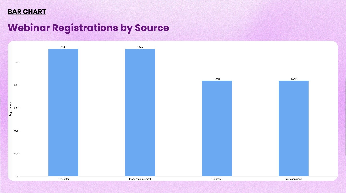
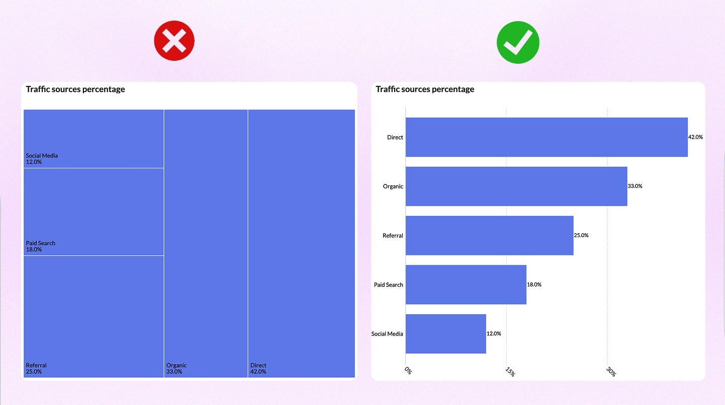
1. Bar chart
A bar chart displays values as horizontal bars that each represent a category. The length of the bar corresponds to the value.
When to use it: Comparing values across categories where the order doesn't matter. Ideal for rankings, survey results, or performance breakdowns.
When not to use it: When you have more than 15 to 20 categories, the chart gets cluttered. Switch to a table or filter the data.
Check out our bar chart maker→
Example: Comparing leads by source
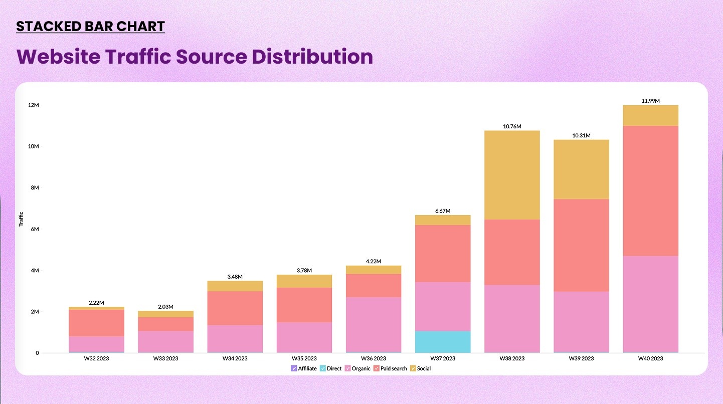
2. Stacked bar chart
A stacked bar chart divides each bar into segments. Each segment represents a sub-category. It shows both the total and the composition within it.
When to use it: When you want to compare totals and also show how each total breaks down. Works well for budget allocation, product mix, or headcount by department.
When not to use it: Avoid it when individual segment comparisons are important. Segments in the middle are hard to compare across bars.
Example: Monthly revenue broken down by product category: SaaS, services, and licenses
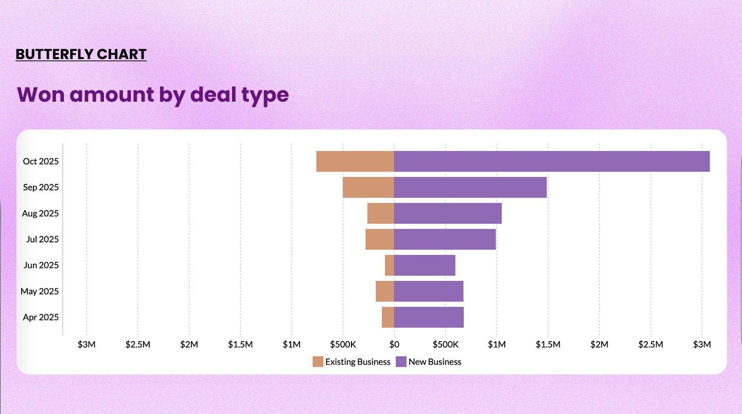
3. Butterfly chart
A butterfly chart (also called a tornado chart) places two bar charts back-to-back on a shared axis. It mirrors two datasets side by side for direct comparison.
When to use it: Comparing two distinct groups across the same categories. Common in demographic analysis, A/B test results, and before-and-after comparisons.
When not to use it: When the two groups don't share the same categories or scale.
Example: Comparing male vs. female response rates across age groups in a survey
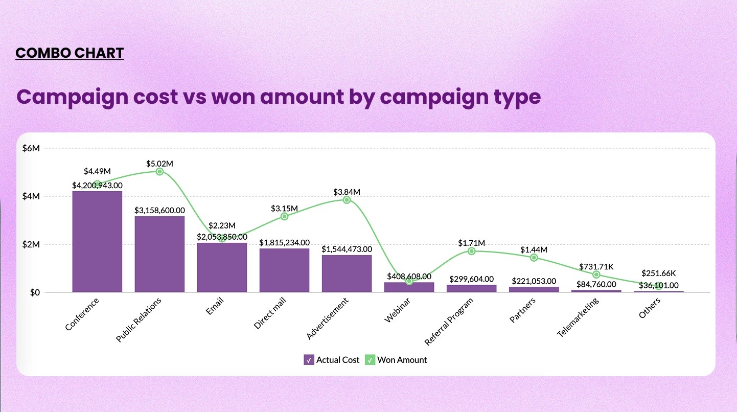
4. Combo chart
A combo chart overlays a bar chart and a line chart on the same visualization. Each series uses a different chart type to distinguish the two measures.
When to use it: When you need to compare a volume metric alongside a rate or percentage. This is one of the most used charts in business dashboards.
When not to use it: When both metrics are the same type of measure, using two bars side by side is cleaner.
Example: Monthly sales volume (bars) vs. profit margin percentage (line) over 12 months
Trend or change over time charts
Use these when time is on the X-axis and you want to show how something has changed.
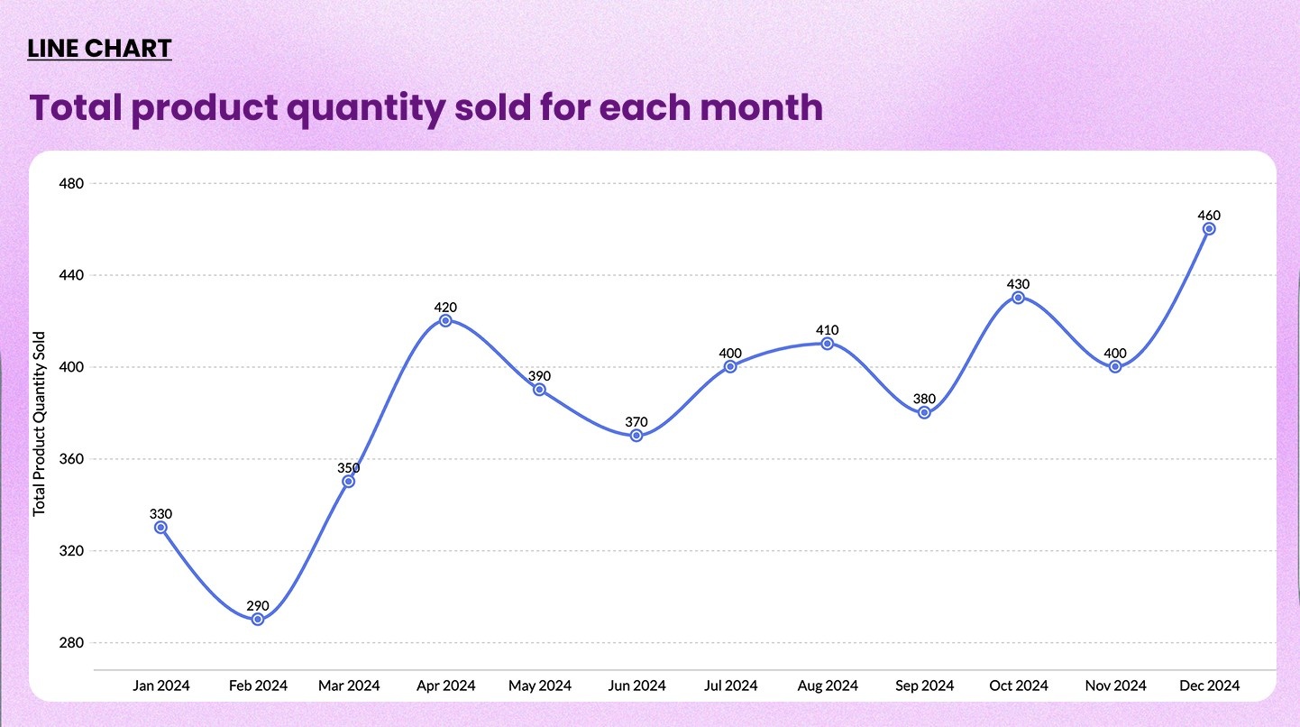
5. Line chart
A line chart connects data points with a continuous line. It's the default choice for showing trends over time.
When to use it: Tracking a single metric or comparing a few metrics over a continuous time period. Works well for revenue trends, website traffic, and operational KPIs.
When not to use it: Avoid it for categorical comparisons with no time dimension. Also avoid it when you have more than five or six lines (the chart becomes unreadable).
Check out our line chart maker→
Example: Monthly trend of first reply time vs. requester wait time
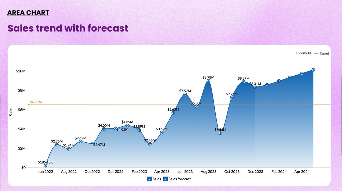
6. Area chart
An area chart is a line chart with the area below the line filled in. The fill emphasizes volume and cumulative magnitude over time.
When to use it: When the size of the value matters as much as the trend. Good for showing cumulative signups, total downloads, or growing inventory.
When not to use it: Multiple overlapping areas make the chart hard to read. Use stacked area charts carefully as they can distort the individual series.
Example: Total new user signups accumulated by month over the year
7. Racing bar chart
A racing bar chart is an animated bar chart. The bars change length and reorder dynamically as time progresses. It's a powerful storytelling tool.
When to use it: Showing how rankings have shifted over time. Ideal for presentations, reports, or public-facing dashboards where engagement matters.
When not to use it: Static reports or scenarios where precision matters more than storytelling. Animation can distract when the audience needs to read exact values.
Check out our bar chart race maker→
Example: Sales performance by region
Composition charts
Use these when you want to show how a whole is divided into its parts.
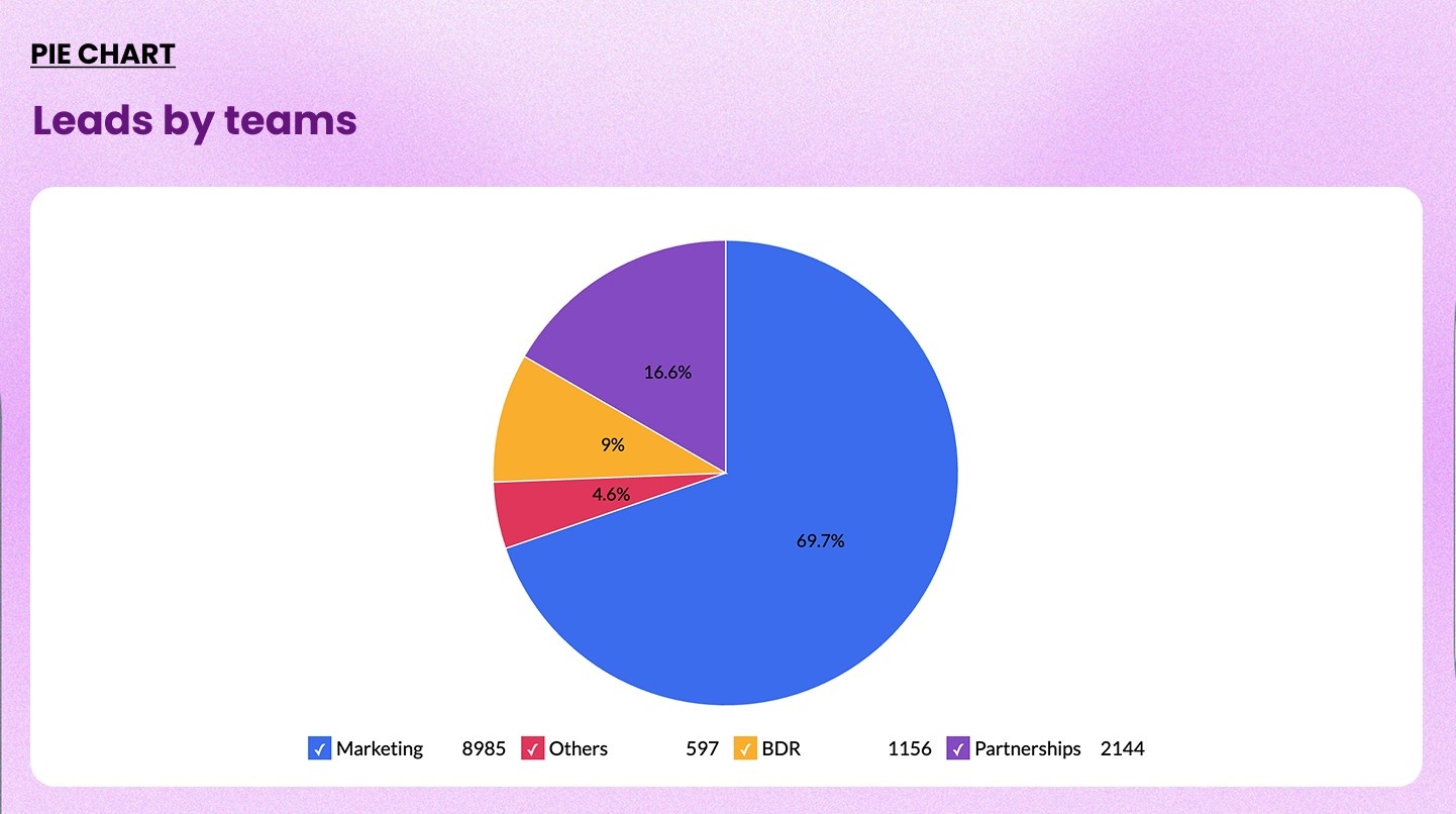
8. Pie chart
A pie chart divides a circle into slices. Each slice represents a category's proportion of the total.
When to use it: When you have five or fewer categories and want to show simple part-to-whole relationships
When not to use it: More than five slices makes it impossible to compare segments accurately. Also avoid it when values are close to each other.
Check out our pie chart maker→
Example: Market share distribution across four major competitors
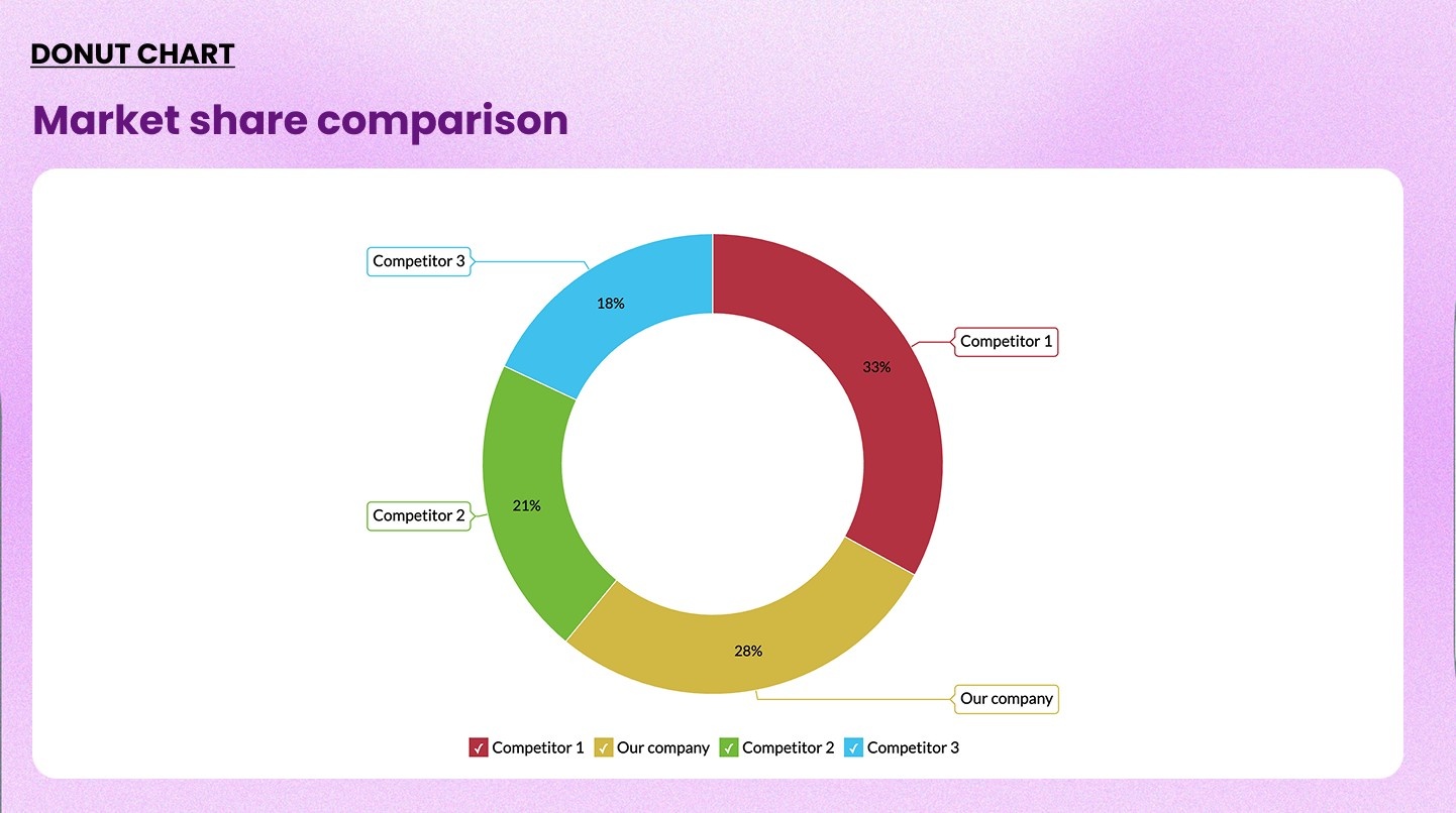
9. Ring chart (Donut chart)
A ring chart is a pie chart with the center removed. The hollow center can display a key metric: total value, percentage, or a label.
When to use it: When you want the same part-to-whole view as a pie chart but also want to highlight a central KPI. Works well on executive dashboards.
When not to use it: When there are five or more segments.
Example: Customer segment breakdown, with total customer count shown in the center
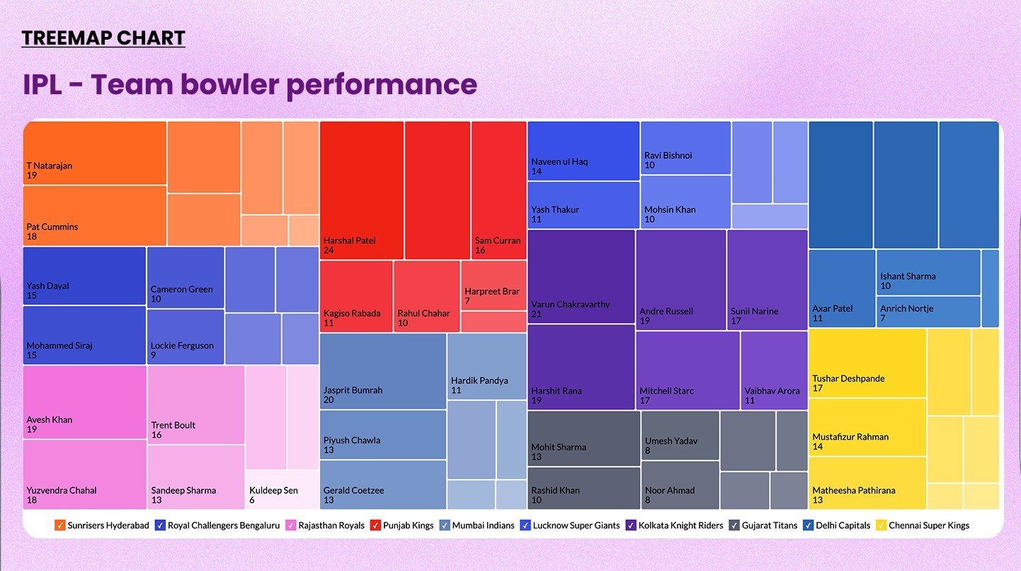
10. Treemap
A treemap uses nested rectangles to represent hierarchical data. The size of each rectangle maps to its value. Color can be used for a second dimension.
When to use it: When showing composition across many categories, especially when there's a hierarchy.
When not to use it: When precise comparison is needed. Rectangles of similar sizes are harder to compare than bar lengths.
Example: Retail inventory analysis
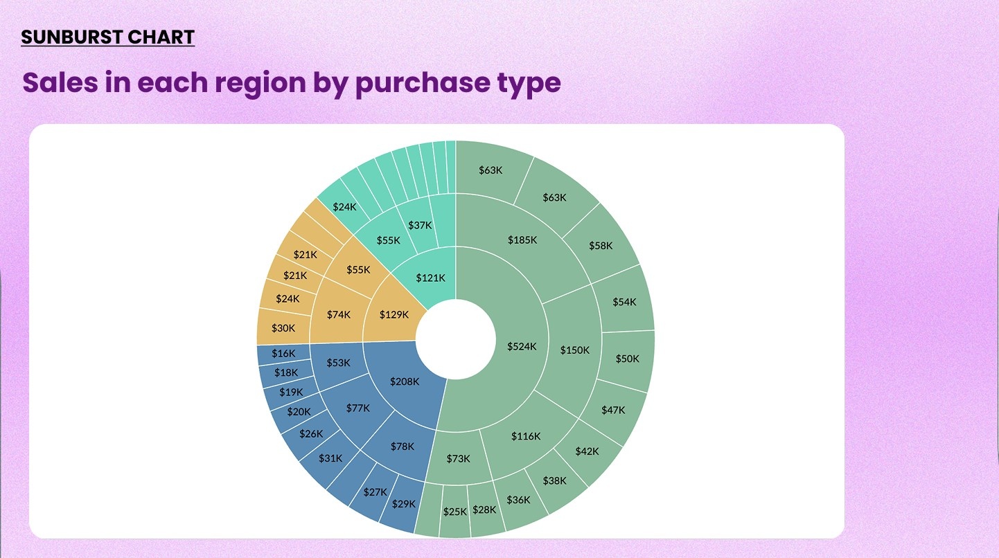
11. Sunburst chart
A sunburst chart is a radial treemap. Each ring of the chart represents a level of hierarchy, radiating outward from the center.
When to use it: When you have multi-level hierarchical data and want to show how each level contributes to the whole. It's better than a treemap when relationships between levels are important.
When not to use it: When the data has no meaningful hierarchy. Flat data belongs in a bar or pie chart.
Example: Sales broken down by region, then by country within each region, then by product line within each country
Distribution charts
Use these when you want to understand how data is spread across a range or concentrated at certain values.
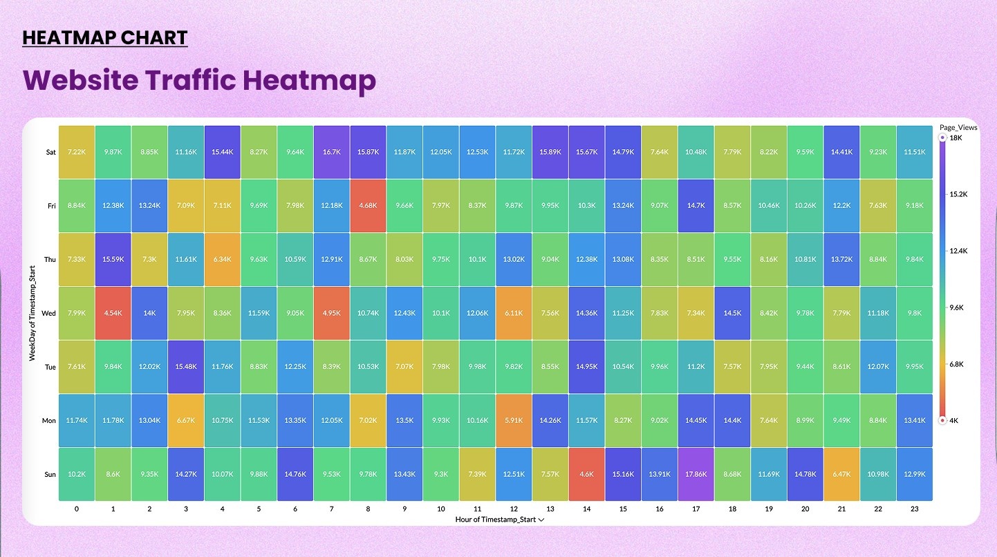
12. Heatmap
A heatmap uses a color gradient on a grid to show the intensity or frequency of values. The two axes define dimensions, and color shows the metric.
When to use it: Spotting patterns, hotspots, or anomalies across two categorical dimensions. Extremely useful in operational and behavioral analytics.
When not to use it: When you need exact values. Color gradients convey relative intensity, not precise numbers.
Check out our heatmap generator→
Example: Instagram media impressions by day and time
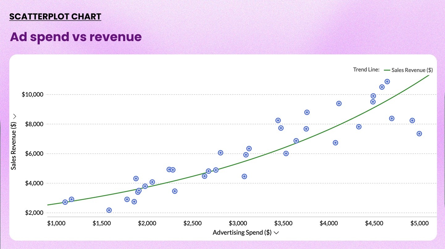
13. Scatter chart
A scatter chart plots individual data points on X and Y axes. Each dot represents one record. The position shows the relationship between two numerical variables.
When to use it: Identifying correlations, clusters, or outliers between two variables. Standard in sales, marketing, and scientific analysis.
When not to use it: When you have only a few data points, the pattern won't be meaningful. Also avoid it for categorical data.
Check out our scatter plot maker→
Example: Plotting advertising spend (X) vs. revenue generated (Y) to identify high ROI patterns
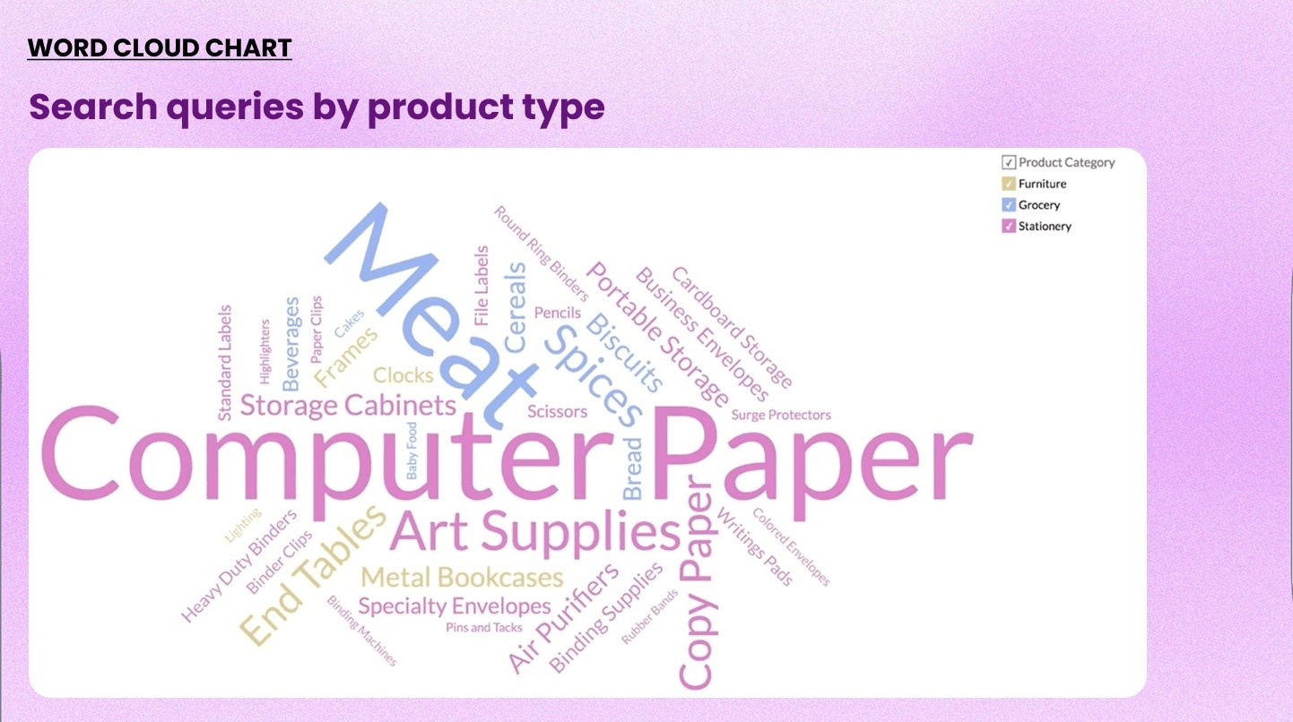
14. Word cloud
A word cloud chart visualizes text data. Words appear larger when they occur more frequently or carry higher weight. It gives a fast overview of what dominates a dataset.
When to use it: Exploring patterns in text-heavy data: customer feedback, survey responses, social media mentions, or support tickets.
When not to use it: When precision matters. Word clouds show relative frequency, not exact counts. Don't use them as the sole source of insight for text analysis.
Example: Visualizing the most frequently mentioned issues in 10,000 customer support tickets
Relationship and flow charts
Use these to show how variables relate to each other or how data moves through stages.
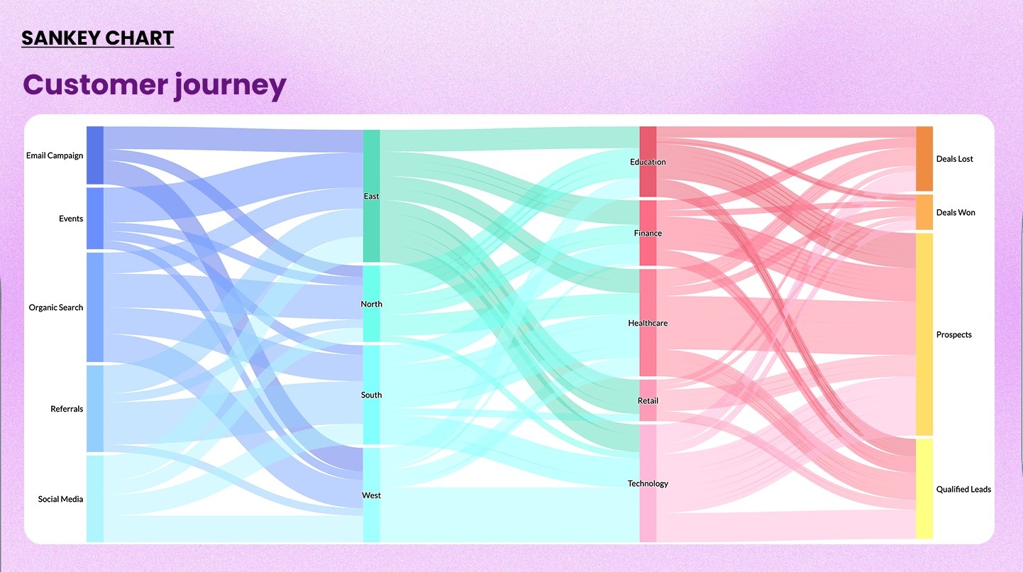
15. Sankey diagram
A Sankey diagram uses flowing bands to show how quantities move or transition between stages. The width of each band represents the volume of flow.
When to use it: Visualizing multi-step flows where volume matters at each stage. Excellent for customer journey mapping, budget flows, and energy or resource allocation.
When not to use it: When your flow has no meaningful volume associated with each transition. It also gets complex fast, so limit it to fewer than 10 nodes when possible.
Check our our Sankey chart maker→
Example: Showing how marketing leads flow from source to lead to opportunity to closed deal, with drop-off volumes visible at each stage
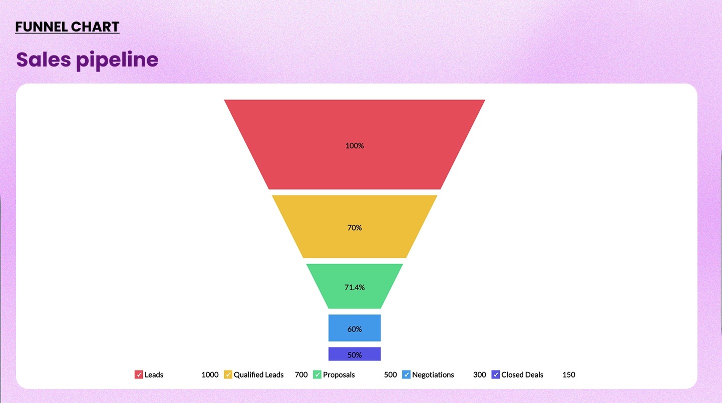
16. Funnel chart
A funnel chart shows sequential stages of a process. Each stage is narrower than the previous one to represent how the volume decreases as it progresses.
When to use it: Tracking conversion rates across a multi-step process like sales pipelines, marketing funnels, and ecommerce checkout flows.
When not to use it: When stages aren't sequential or when volume does not necessarily decrease at each step.
Check out our funnel chart maker→
Example: Visualizing a five-stage sales pipeline: leads, qualified leads, proposals, negotiations, and closed deals
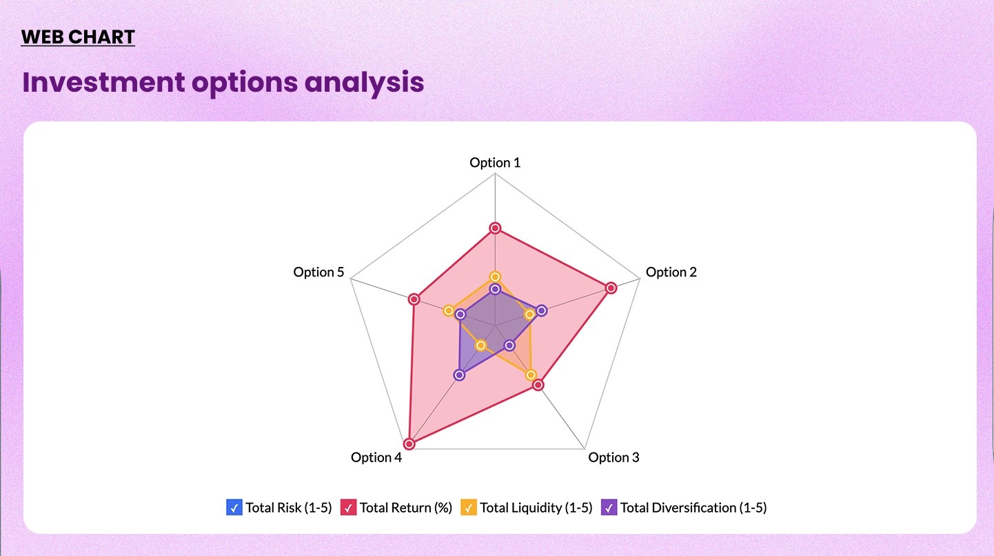
17. Web chart (Radar chart)
A web chart plots multiple variables on radial axes originating from a central point. Each part is drawn as a polygon. Overlapping polygons allow direct comparison.
When to use it: Comparing two or more parts across five to ten dimensions simultaneously. They're common in product comparisons, employee performance reviews, and competitive analysis.
When not to use it: More than three to four overlapping entities make the chart unreadable. Also avoid it when the axes are not on a comparable scale.
Check out our web chart maker→
Example: Comparing website performance across five attributes
Geographic and specialized charts
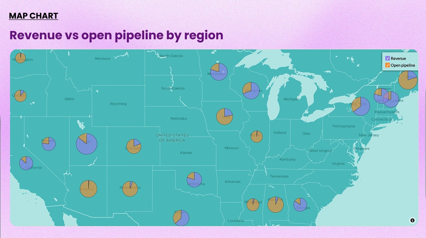
18. Map chart
A map chart displays data geographically. Color intensity (choropleth) or marker size shows the metric value for each location.
When to use it: When the geographic dimension is meaningful. Ideal for sales territory analysis, regional performance, store density, and logistics.
When not to use it: When geography is not relevant to the question. A map draws attention to location. Use it only when a location is the story.
Check out our map chart maker→
Example: Revenue and open pipelines by country plotted on a world map
Related read: How Zoho Analytics' geo maps can be leveraged to solve real retail business problems
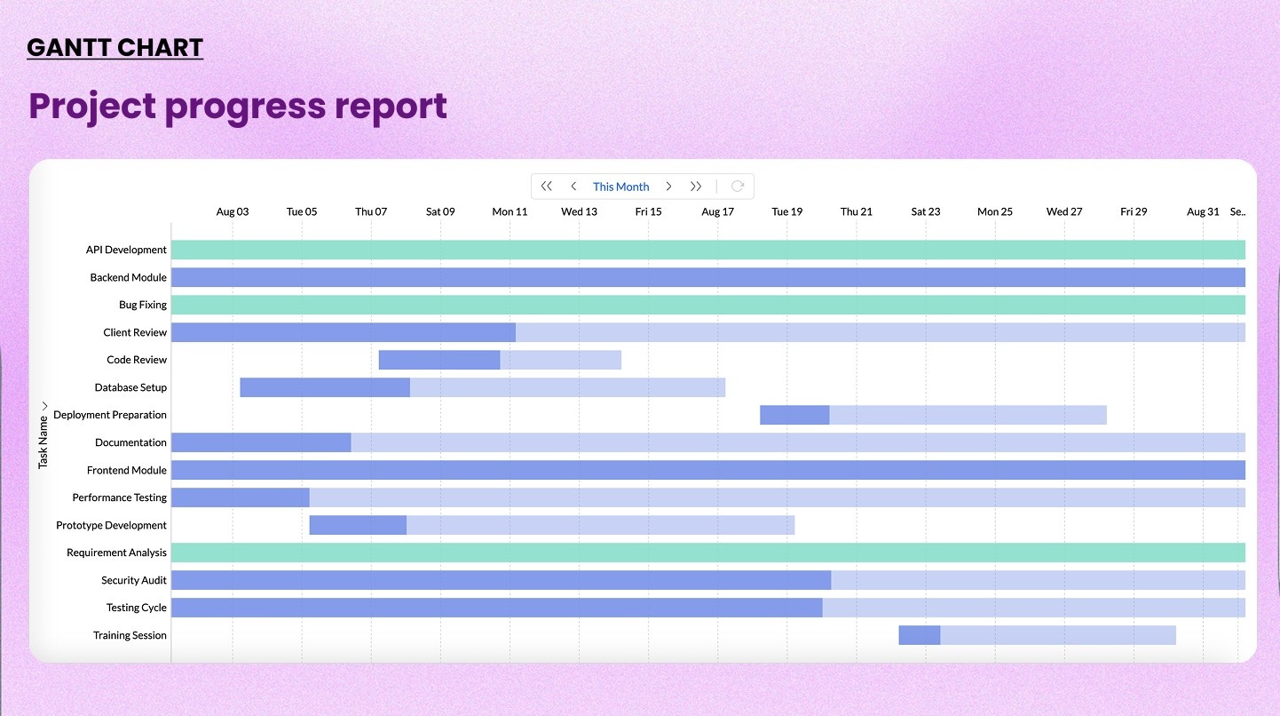
19. Gantt chart
A Gantt chart displays tasks or milestones on a horizontal timeline. Each bar represents a task's start date, duration, and end date. Dependencies can be shown with connecting lines.
When to use it: Planning projects, tracking campaign timelines, creating product roadmaps, or any scenario where schedule and sequence matter. It bridges data visualization and project management.
When not to use it: Ad hoc data exploration or operational dashboards where project timeline context is irrelevant.
Example: Visualizing a product launch plan with milestones: development, QA, beta release, marketing, and live
20. KPI scorecard or indicator
A KPI scorecard displays a single key metric as a large number, often with a target, trend indicator, or percentage change. It's designed to be read at a glance.
When to use it: Executive dashboards, real-time monitoring, and any situation where a single number needs to stand out. Often used alongside other charts to anchor data visualization dashboards.
When not to use it: When context matters more than the single value. A scorecard without a target or comparison can be misleading.
Example: Current month MRR displayed as $420,000 with a +12% indicator vs. the previous month
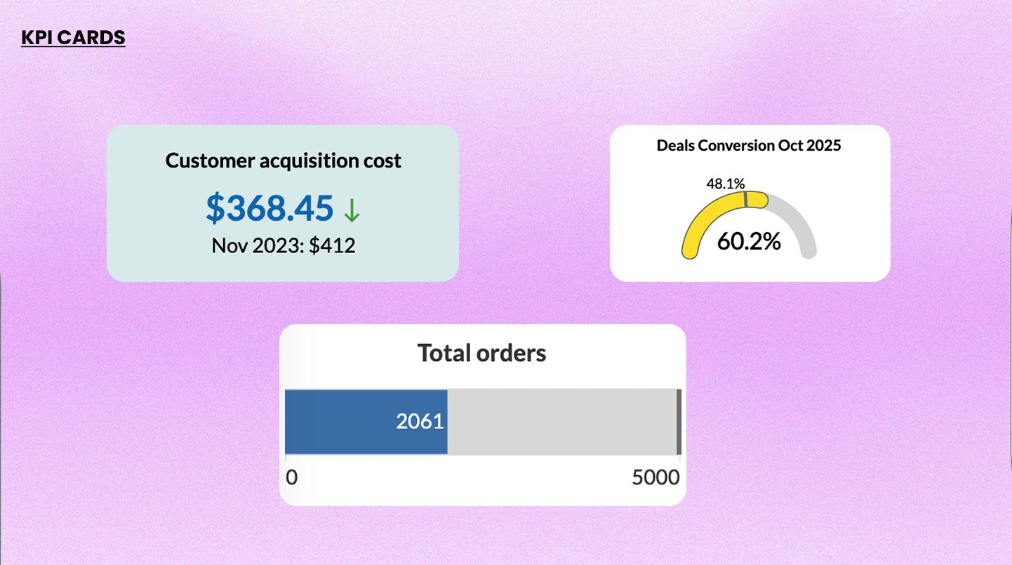
Chart selection framework: how to pick the right graph
This table covers the most common types of graphs for data visualization, matched to the data question you are trying to answer.
| What you want to show | Best chart type |
| Compare values across categories | Bar chart |
| Compare composition across groups | Stacked bar chart |
| Compare two mirrored datasets | Butterfly chart |
| Compare a volume metric with a rate | Combo chart |
| Show change over time | Line chart / area chart |
| Show animated ranking changes over time | Racing bar chart |
| Show part-to-whole (5 or fewer categories) | Pie chart / ring chart |
| Show part-to-whole with hierarchy | Treemap / sunburst chart |
| Show data intensity across two dimensions | Heatmap |
| Show correlation between two variables | Scatter chart |
| Visualize frequency in text data | Word cloud |
| Show flow and volume between stages | Sankey diagram |
| Show conversion drop-off across stages | Funnel chart |
| Compare multiple attributes across entities | Web / radar chart |
| Show geographic distribution | Map chart |
| Show project timeline and tasks | Gantt chart |
| Monitor a live KPI at a glance | KPI Scorecard / Indicator |
5 Common data visualization mistakes to avoid
Choosing the right chart is only half the job. How you configure it matters just as much.
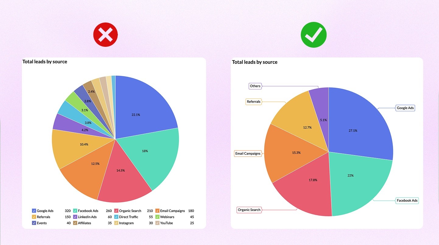
1. Using pie charts with too many slices
More than five segments makes it impossible to compare values accurately. The problem is that we read pie charts by comparing angles and arc lengths, and that becomes difficult when slices are close in size. Here is what this looks like in practice. Imagine a pie chart showing revenue by product line across eight categories. Three of them cluster between 10% and 14%. A viewer cannot reliably tell which is largest without reading the labels. Now take those same eight categories and put them in a horizontal bar chart, sorted descending. The ranking is immediately obvious.
The fix: If you have more than five categories, use a bar chart. If you want to keep the pie format, group the smaller categories into an "Other" slice and let viewers drill down.
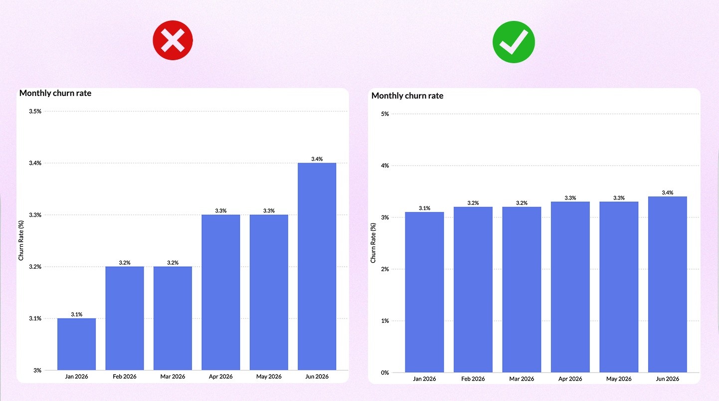
2. Truncating the Y-axis
Starting the Y-axis at a value other than zero exaggerates differences and can mislead viewers.
A line chart tracking monthly churn rate from 3.1% to 3.4% over six months is a flat, unremarkable trend. Start the Y-axis at 3.0% instead of 0%, and those same data points look like a steep climb. The numbers have not changed. The story has.
This matters most in bar charts, where the length of a bar is the core visual signal. A bar chart with a truncated axis can make a 5% difference look like a 300% difference, depending on where you cut it.
The fix: Always start bar chart axes at zero. For line charts tracking small fluctuations where the absolute value matters less than the relative change, annotate the axis clearly so readers know the scale is compressed.
3. Using 3D charts
3D effects add visual complexity and subtract accuracy. A 3D pie chart tilts the slices toward the viewer, which makes the front slices appear larger than they are. A 3D bar chart makes bars in the foreground look taller than bars in the background, even when they're the same height.
The problem is not that 3D charts look bad. It is that they actively misrepresent the data, and most viewers do not adjust for the distortion.
One documented example: in a 3D pie chart showing four equal segments of 25% each, the two front-facing segments routinely get estimated at 30 to 35% by viewers, and the back segments at 15 to 20%. The data says equal. The chart says otherwise.
The fix: Use 2D charts. The only exception is when you are explicitly visualizing three-dimensional spatial data (like geographic elevation) where the third axis carries real information.
4. Choosing a chart for aesthetics
Sunburst charts look impressive. So do force-directed network graphs and three-ring donut charts with animated transitions. None of that matters if the viewer can't extract the information they need in the time they have.
A common version of this mistake: using a treemap to show three categories because it looks more "dashboard-y" than a bar chart. A treemap is built for hierarchical data with many nodes. Three rectangles in a treemap communicates less, not more, than three bars in a bar chart.
The fix: Before choosing any chart, figure out if someone could read this correctly in five seconds without asking for help. If the answer is no, simplify.
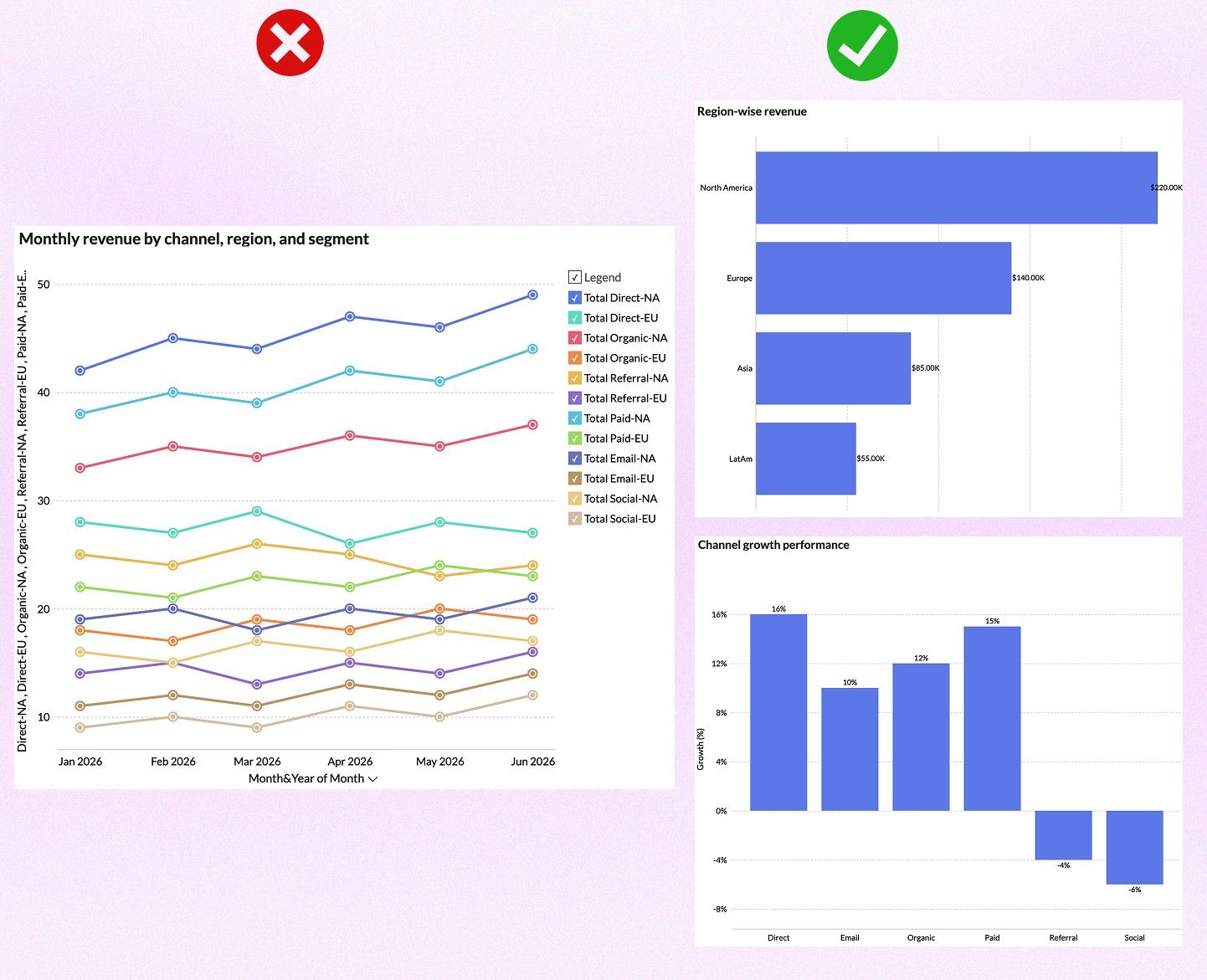
5. Overloading a single chart
Too many variables or series in one chart dilutes the information. A line chart with 12 series becomes a bowl of spaghetti. A stacked bar chart with nine sub-categories becomes a color matching puzzle.
The instinct behind this mistake is understandable. You have the data, and you want to show all of it. But a chart is an answer to a specific question.
Here is a practical test. If you cannot write a single sentence describing what a viewer should take away from the chart, the chart is doing too much. Split it. A dashboard with four focused charts communicates more than one chart trying to say everything at once.
The fix: Identify the one question each chart is answering. If your chart is answering two questions, you need two charts.
Related read: Choosing the right data visualization type
Data visualization best practices
- Start with the question, not the chart: Know what decision this visualization supports before you build it. A review in SAGE Open cataloged the most common ways visualizations mislead viewers, and the leading cause was design decisions: truncated axes, inappropriate chart types, and poor use of color that pushed readers toward conclusions the data didn't support.
- Label axes clearly: Always include axis labels and units. Never make the reader guess what they're looking at.
- Use color with intention: Color should encode information, not just make the chart look polished or colorful. Use accessible, colorblind-friendly palettes.
- Add interactivity where it adds value: Interactive data visualization features like drilldowns, filters, and hover tooltips help analysts explore data without cluttering the main view.
- Keep it simple: The best BI dashboards communicate one key insight per chart. If a viewer needs more than five seconds to understand it, simplify.
Create compelling data visualizations with Zoho Analytics
Most reporting software make you choose either ease of use or analytical depth. Zoho Analytics gives you both.
It supports all 20 chart types covered in this guide, plus several more.
Building reports is also fast. Use the drag-and-drop builder to create visuals manually, or just type what you want to see in plain English using Ask Zia, the AI data visualization tool.
Not sure which chart fits your data best? Zia Suggestions analyzes what you have and recommends the most suitable visualization. You get the right chart from the start, not after three revisions.
Here is what that looks like in practice.
- Sparex, the UK's leading distributor of agricultural spare parts, had 18 subsidiaries running on different ERP systems. Data was conflicting across departments, and meetings regularly stalled because no one could agree on which numbers were right. After consolidating everything into Zoho Analytics, Kristian James, their BI manager, used the platform to identify slow and non-moving stock and reprice an entire catalog of parts. That single insight delivered $1.4 million in sales. Nucleus Research independently verified a 1,160% ROI with a payback period of 1.2 months.
- Mitrefinch, a UK-based workforce management company, needed to analyze customer support data from Zoho Desk, Salesforce, and internal databases across multiple countries. They built two dashboards with 33 widgets and 16 reports. The result: customer satisfaction scores went from 80% to 100%, and first call resolution time dropped from 20 hours to 7 hours.
Your data stays current without any manual work. Zoho Analytics connects to 500+ sources including spreadsheets, databases, CRMs, marketing platforms, and cloud apps. Set your preferred sync interval, and your dashboards update on their own. See a few dashboard examples created using Zoho Analytics.
💡Tip: If you’re evaluating data visualization tools for your business, check out our guide to the essential features of data visualization software to look for and how to assess different solutions.
When you need to go beyond visualization, Zoho Analytics has you covered. Forecast future trends based on historical patterns. Get alerted to anomalies before they impact your business. Run what-if scenarios to model different decisions before you make them.
Frequently Asked Questions
1. What's the most important factor when creating data visualizations?
Understanding your message is crucial. Before choosing any chart or data visualization software, clearly define what story you want to tell with your data. Visualization becomes straightforward when you know exactly what you want to communicate.
2. Should I use simple or complex visualizations for my audience?
Keep it simple unless your audience is highly technical. A basic bar or line chart often communicates insights more effectively than complex visualizations. Use advanced chart types only when your audience is familiar with the underlying data. Remember, adding complexity increases cognitive load and can obscure your message rather than clarify it.
3. What are the best practices for using color in data visualizations?
Limit your color palette to seven or fewer colors to avoid overwhelming viewers. Use color strategically to highlight important information, like red for urgency and green for positive outcomes. Ensure accessibility by varying lightness and saturation so people with color vision deficiencies can distinguish between elements.
4. What are the most common types of graphs for data visualization?
The most common types of graphs for data visualization are bar charts, line charts, pie charts, scatter plots, and heatmaps. Each chart type serves a different purpose: bar charts for comparison, line charts for trends, pie charts for part-to-whole relationships, scatter plots for correlations, and heatmaps for intensity patterns across two dimensions. The right chart type depends on what you're trying to communicate.
5. How can I test if my data visualization is effective?
Apply three essential tests: the Spartan Test (remove any element that doesn't contribute to the insight), the Peek Test (ensure eye-catching contrast aligns with your intention), and the Colleague Test (share with someone unfamiliar with your project to confirm they understand your message). If their interpretation matches yours, your visualization is successful.
6. What is the difference between a histogram and a bar chart?
A bar chart compares values across separate categories. A histogram shows how a continuous variable is distributed across ranges. The key difference is bar chart bars have gaps between them, and histogram bars touch because the data is continuous, not categorical.
7. What types of charts are best for business dashboards?
The most practical combination for most business dashboards is KPI scorecards for headline numbers, line or area charts for trends, bar charts for comparisons, and funnel charts for pipeline or conversion tracking. The right mix depends on whether your audience needs to monitor, compare, or diagnose.
8. How many chart types does Zoho Analytics support for data visualization?
Zoho Analytics supports 50+ chart types and visualization options, including all the chart types covered in this guide. That covers everything from standard bar and line charts to Sankey diagrams, pivot tables, geo maps, and KPI widgets for dashboard monitoring.
9. How do I choose a chart type for large datasets?
Scatter charts handle large datasets well when you're looking for correlations or clusters. Heatmaps work when you need to spot patterns across two dimensions. Avoid pie charts and line charts with many series. They break down fast when the data volume goes up.
10. What chart should I use to show before and after data visualization?
A butterfly chart is the most direct option, placing two datasets side by side on a shared axis. A grouped bar chart works too if you have multiple categories to compare. For a single metric tracked over time, a line chart with an annotated marker at the change point is cleanest.
 Pradeep V
Pradeep is a product marketer at Zoho Analytics with a deep passion for data and analytics. With over eight years of experience, he has authored insightful content across diverse domains, including BI, data analytics, and more. His hands-on expertise in building dashboards for marketing, sales, and major sporting events like IPL and FIFA adds a data-driven perspective to his writing. He has also contributed guest blogs on LinkedIn, sharing his knowledge with a broader audience. Outside of work, he enjoys reading and exploring new ideas in the marketing world.