- HOME
- BI & Analytics
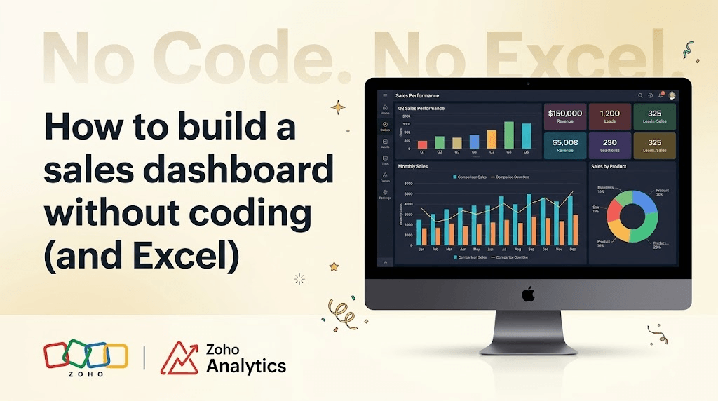
- How to build a sales dashboard without coding (and Excel)
How to build a sales dashboard without coding (and Excel)
- Last Updated : May 14, 2026
- 231 Views
- 4 Min Read
Most sales teams we talk to are still building their weekly reports in Excel.
This is a problem we hear a lot. And it's not a problem with Excel. Excel is a fine tool. The problem is that the spreadsheet has been asked to do three jobs it was never built for: pulling data from multiple systems, refreshing it when the source changes, and getting it in front of the team. Compared to that, a sales dashboard built using a proper analytics tool, does all three on its own.
Here's the thing most teams don't realize when they start looking at analytics tools: if your sales data lives in a popular CRM, you probably don't need to build a dashboard from scratch at all. You need to customize one that's already been built for you. In this post, we will walk through both paths, viz. starting from a pre-built dashboard (the faster route, and the one we recommend), and building one from scratch (when you have a custom data source or unusual requirements).
Either way, most sales leaders we work with get a working dashboard up and running within an afternoon.
Connect your CRM. Your dashboard is already there.
When you connect a popular CRM to Zoho Analytics, you don't land in an empty workspace. You get 75+ pre-built sales reports and dashboards, designed for sales teams, ready the moment your data finishes syncing.
This works with Zoho CRM, Bigin, HubSpot, Microsoft Dynamics CRM, Pipedrive, Insightly. Out of the box, you get revenue trends, rep performance, lead source analysis, sales by product and region, and forecasting.
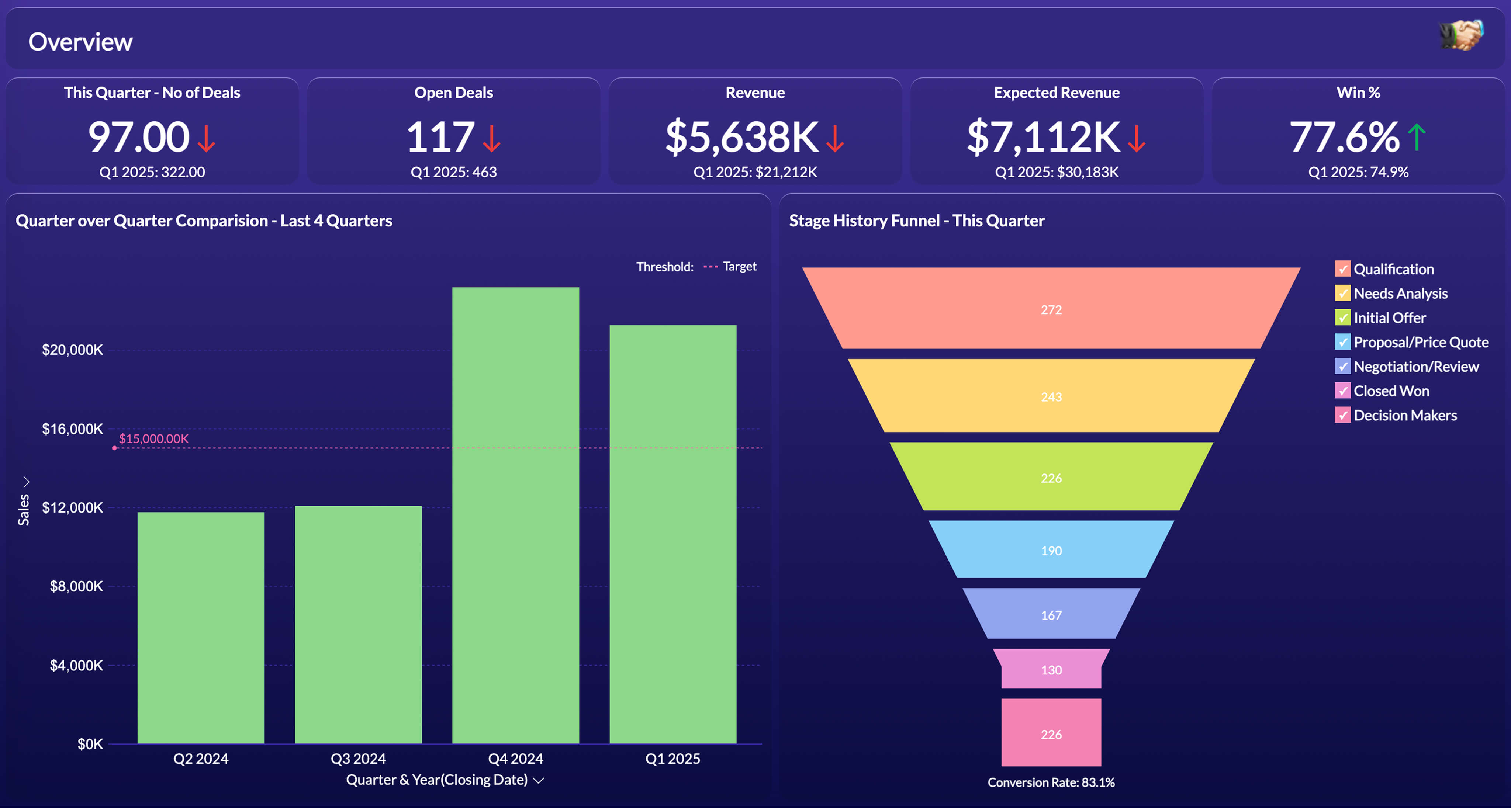
A sales dashboard in Zoho Analytics.
Connecting is point-and-click. Zoho CRM is one click. HubSpot and Pipedrive are a two-minute OAuth flow. You pick the modules you want to pull in, and Zoho Analytics handles the initial sync and all future refreshes automatically.
If your CRM is not on the list, Zoho Analytics supports 500+ data sources including databases, spreadsheets, and file uploads. In that case, you start from scratch with the drag-and-drop report builder, covered below.
Agree on your metrics before you customize anything
Most dashboard disagreements are not about the charts. They are about whose definition of a metric is correct. Before you customize anything, write down the metrics your team actually tracks and exactly how each is calculated. The ones that hold up across almost every industry:
- Revenue vs target -- actual sales against your plan or budget, by week, month, or quarter. The most universal metric in any sales operation.
- Average order value (AOV) -- total revenue divided by number of orders. Tracks whether you are selling more per transaction over time, and responds quickly to bundling or upsell programs.
- New vs repeat customer revenue -- what share of revenue comes from first-time buyers versus returning ones. The split tells you whether growth is coming from acquisition or retention, which are two very different problems.
- Sales by product or category -- which product lines, service types, or SKU categories are driving revenue. Essential for inventory planning, margin analysis, and identifying what to push harder.
- Sales by region or territory -- geographic breakdown of where revenue is coming from. Drives decisions on staffing, stock allocation, and where to focus field sales effort.
Get sign-off from sales leadership before you touch anything. It saves weeks of rework later.
Customize what's there. Build what's missing.
With your metrics agreed on, open the pre-built dashboards and decide what stays, what goes, and what needs to change. Typical customizations include removing KPIs your team doesn't use, adding metrics specific to your business, adjusting chart types and filters, and rearranging the layout so the numbers leadership asks about most appear first.
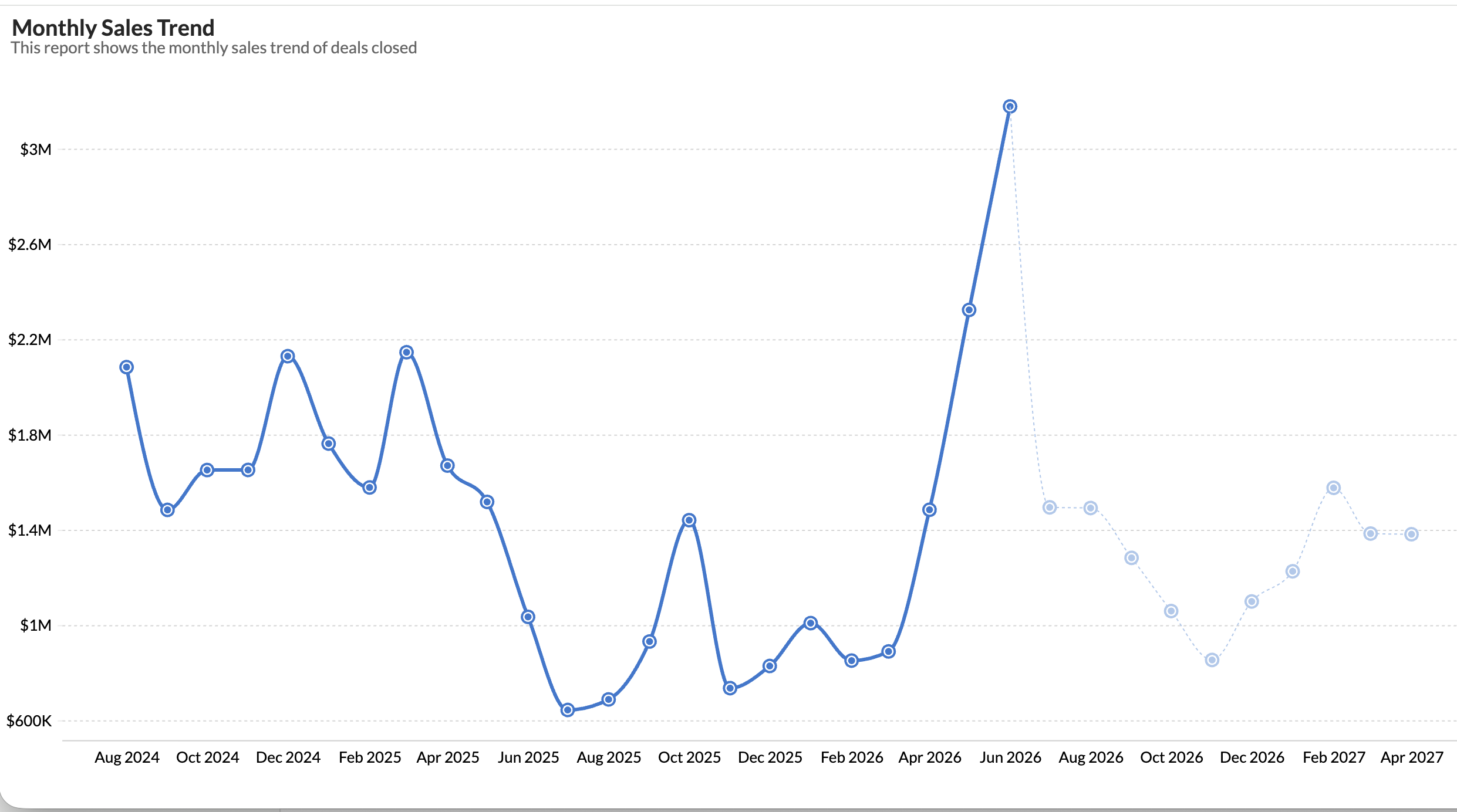
A sales trend report. Available out of the box, or easily customized to match your reporting cadence.
For charts that don't exist in the pre-built set, the report builder is drag-and-drop. Drag the metric, drag the dimension, pick the chart type. A working chart takes about 30 seconds. A polished one with filters and color coding takes about five minutes.
Ask Zia for the rest
Zoho Analytics includes Ask Zia, a conversational AI layer that turns plain English questions into charts. No formulas, no SQL, no DAX.
"Get me item-wise sales"
You get a nice chart back instantly. Sales managers can ask their own questions without needing training, or waiting for a chart to be built for them.
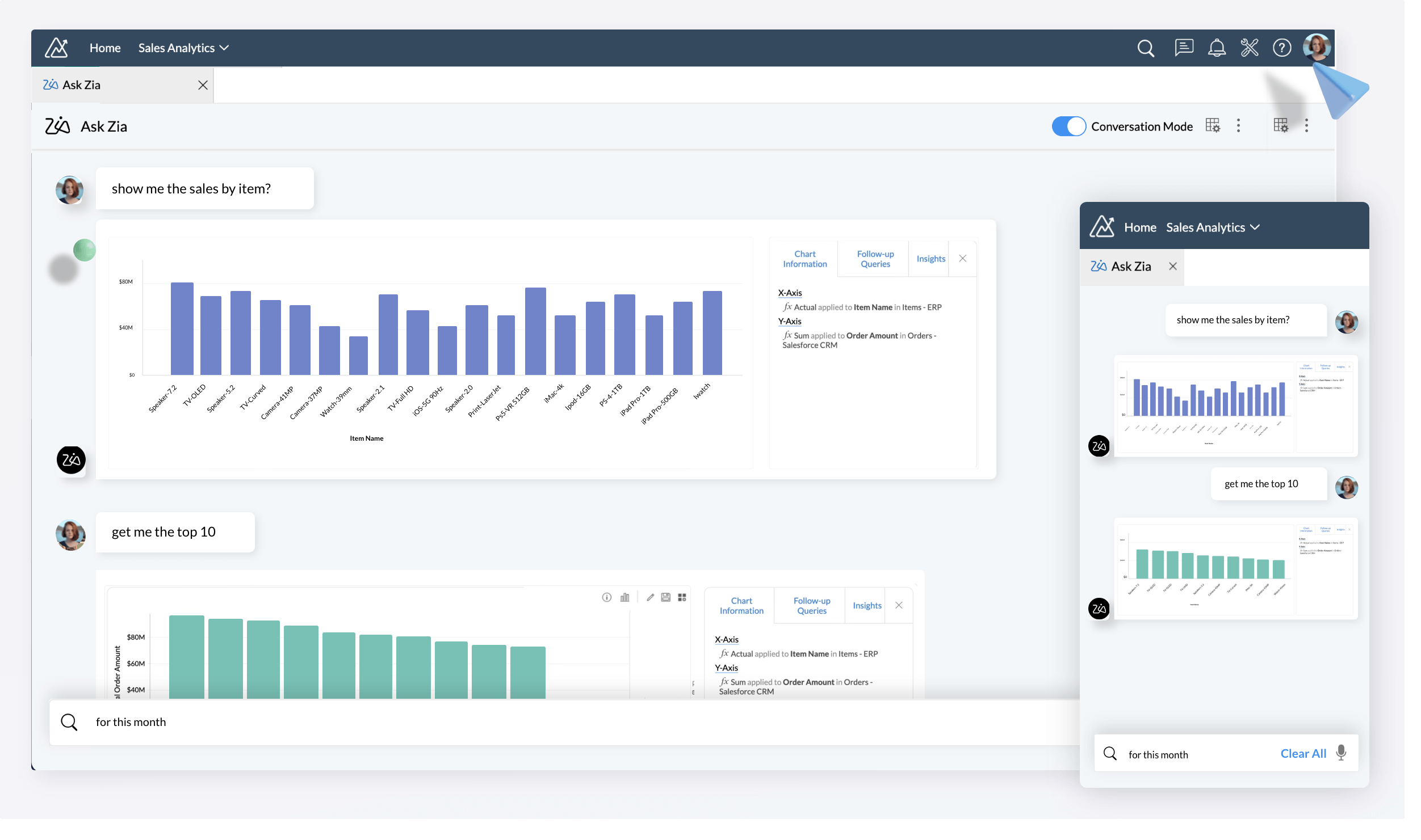
Ask Zia turns plain English questions into charts.
Share it with the team
Zoho Analytics handles distribution natively. You can schedule the dashboard to email out every Monday morning, embed it inside your CRM so reps see it inline, set up Slack alerts when a key metric crosses a threshold, and configure a mobile view for leadership to check on the go.
The scheduled email alone is usually enough to get the whole team looking at the same numbers, at the same time, automatically.
How long it actually takes
If your sales data is in a CRM with a native connector, most teams have a working dashboard in an afternoon. It takes 30 to 60 minutes to connect and sync, one to two hours to review the pre-built dashboards, and two to three hours to customize. A week of iteration with the sales team, and the Friday spreadsheet export is gone.
If you are building from scratch on a custom data source, add a day of build time and another week of iteration. Either way, if you have not agreed on metric definitions first, add a week to whichever path you take.
 Aravind
Aravind leads content and inbound marketing for Zoho Analytics, where he's focused on the embedded analytics and ISV segment. He's been writing about business intelligence, SaaS, and data products for Zoho since 2005, making him one of the longest-running voices in the Indian B2B SaaS content space. Connect with him on LinkedIn.