- HOME
- BI & Analytics
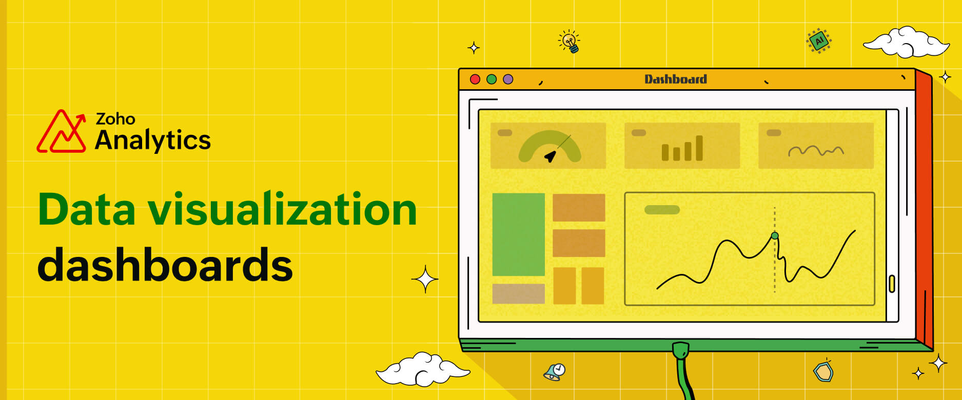
- Data Visualization Dashboards: What They Are, Examples & How to Build One
Data Visualization Dashboards: What They Are, Examples & How to Build One
- Last Updated : December 8, 2025
- 2.3K Views
- 8 Min Read
We live in an era where organizations generate massive amounts of data daily, yet most of them struggle to harness its power effectively.
Think about this: Marketing teams are expected to drive customers, sales leaders need to predict revenue, and executives have to identify business trends in real time.
But what happens instead? They're stuck waiting on reports from IT teams, dealing with outdated Excel sheets, and toggling between multiple platforms to piece together fragmented data.
A data visualization dashboard solves this problem by transforming complex data into easy-to-understand visuals, allowing businesses to track relevant key metrics from one centralized, intuitive interface.
With a data visualization dashboard:
- Marketers can instantly analyze their performance, identify winning channels and strategies, and optimize advertising costs.
- Sales teams can monitor pipelines, forecast revenue, and adjust strategies.
- Executives can get a live pulse on company performance and make decisions backed by data, not guesswork.
What is a data visualization dashboard?
A data visualization dashboard is a powerful tool that serves as a central hub for monitoring KPIs, trends, and data patterns. Instead of sifting through spreadsheets or static reports, you can see your data as engaging data visualization in one place, making identifying opportunities and risks much easier.
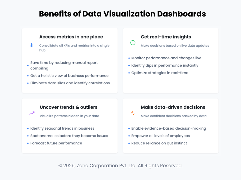
How businesses can be benefit from data visualization dashboards
- Access your metrics in one place: Bring every KPI and metric into a single, trusted hub. Instead of stitching together spreadsheets or waiting on manual reports, teams see a holistic view of performance across functions. A centralized dashboard breaks down data silos and makes it easier to spot relationships you’d otherwise miss.
- Get real-time insights from data: Dashboards update as your data changes, so you can monitor performance live. See spikes, dips, and shifts the moment they happen, and respond while it still matters. With instant visibility, you can fine-tune tactics and keep initiatives on track in real time.
- Uncover trends and outliers: Visualizations surface the stories hiding in your data. Quickly identify seasonal patterns, emerging behaviors, and anomalies before they become issues. With clearer signals, you can forecast more confidently and plan your next moves with precision.
- Make better data-driven decisions: When decisions are backed by reliable visuals, teams act with confidence. Dashboards encourage evidence-based conversations, empower people at every level to contribute, and reduce the reliance on gut feel. The result is faster alignment and better outcomes.
Key features of effective data visualization dashboards
A well-designed dashboard should provide clear, actionable insights that help users make better and faster decisions.
Here are the key features that make a data visualization dashboard truly effective:
Real-time updates
Businesses need up-to-the-minute insights to respond to changes in market trends, customer behavior, and key performance metrics.
A data visualization dashboard enables businesses to monitor KPIs in real time and eliminates manual intervention.
Customization and personalization
Different teams have different data needs. A marketing team needs a marketing dashboard with social media and advertisement performance data, while a CEO might need an executive dashboard with high-level revenue, growth, and customer retention metrics.
Businesses can create role-based business dashboards for executives, managers, and analysts.
Interactive and drill-down capabilities
A dashboard may provide a broad overview, but it needs to allow users to explore deeper. Decision makers need interactive data visualizations that drill down into specific details for deeper insights.
Users should be able to click on charts to filter data, drill down, and hover over data points.
Visual data storytelling
Different types of data require different visual formats to be easily understood. A well-designed dashboard should tell a clear data story without overwhelming users.
Dashboards with clear data storytelling will have a mix of visualization types to represent data effectively.
AI and predictive analytics
Businesses don't need just historical data; they need insights into what's likely to happen next.
AI data visualization tools enable businesses to create dashboards that can forecast trends, detect anomalies, and suggest data-driven actions.
Automated alerts and notifications
It's impossible for businesses to manually monitor dashboards 24/7, but missing a sudden drop in sales or campaign performance can lead to lost revenue and missed opportunities.
Users should be able to set up custom alerts if KPIs hit a critical threshold and get notifications by email or SMS.
Security and role-based controls
Not all employees need access to sensitive financial or customer data.
Businesses need to set up role-based permissions and different access levels (e.g., admin, manager, and team member).
5 Essential data visualization dashboard examples & templates
Here are some real-world examples of effective data visualization dashboards across different industries:
Marketing performance data visualization dashboard
Tracking campaigns across every channel, including search, social, email, and ads, doesn’t have to be complex. A marketing performance dashboard brings all your KPIs into one view, so you can monitor reach, engagement, conversions, spend, and ROI without hopping between tools.
Connect data from Google Analytics, ad platforms, social networks, and email providers to spot trends faster and align efforts to goals. Compare channels side by side, attribute outcomes to the right campaigns, and optimize budgets with real-time visibility into what’s working.
Who uses it?
- Digital marketers
- Social media managers
- PPC specialists

Sample marketing data visualization dashboard
Sales data visualization dashboard
Hitting your number gets easier when every signal is in one place. A sales dashboard gives you a live view of revenue, pipeline coverage, forecast accuracy, win rates, and sales velocity (broken down by team, territory, product, or rep). Spot risks early, track slippage, and see which deals need attention to keep the quarter on track.
Bring in data from your CRM, quota sheets, and billing tools to analyze conversions by stage, average deal size, and activity-to-outcome ratios. Drill into territories or accounts, compare performance against targets, and coach your team with clear, actionable insights.
Who uses it?
- Sales managers
- Business development teams
- CEOs
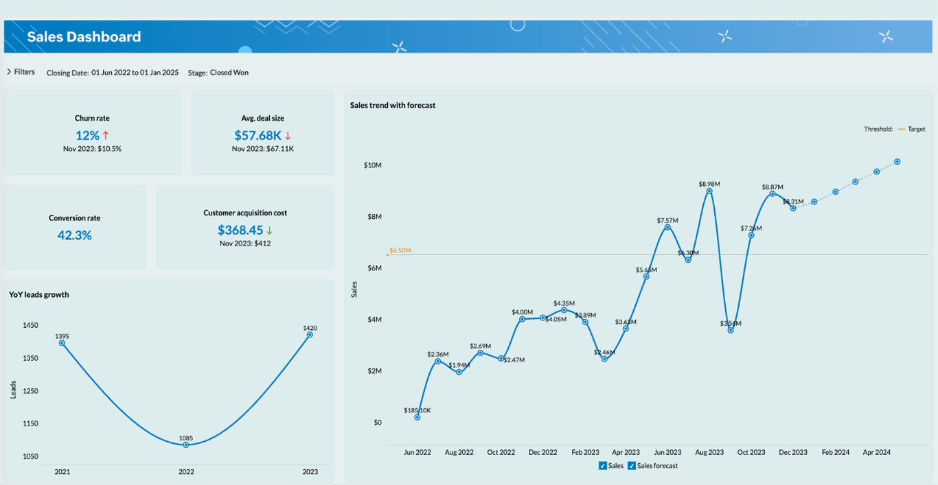
Sample sales data visualization dashboard
Financial data visualization dashboard
Turn spreadsheets into a single, trustworthy view of your company’s finances. A financial dashboard centralizes revenue, expenses, cash flow, and P&L so you can monitor margins, burn rate, and budget vs. actuals at a glance. Track 12-month trends to spot seasonality, surface overspending by cost center or vendor, and identify savings opportunities before they impact the bottom line.
Connect data from your accounting system, billing platform, payroll, and bank feeds to drill into departments, projects, or line items. Compare forecasts with actuals, visualize AR/AP aging, and keep leadership aligned with real-time, audit-ready numbers.
Who uses it?
- CFOs
- Finance teams
- Business owners
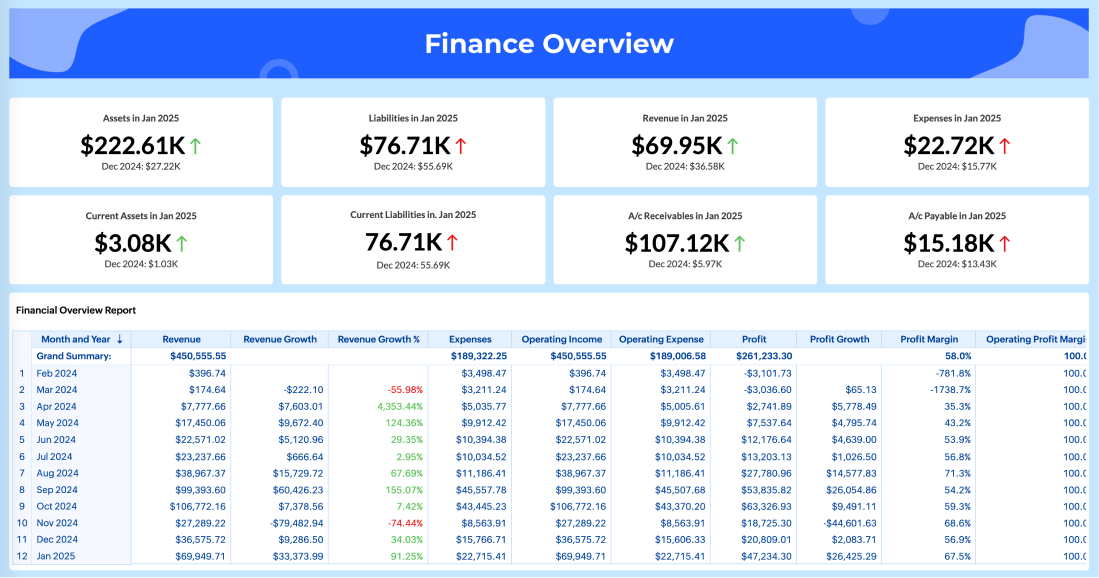
Sample finance data visualization dashboard
Customer support data visualization dashboard
Great support starts with clear visibility. A customer support dashboard brings your ticket queues, SLAs, and satisfaction scores into one live view so you can monitor volume, first-response time, average handle time, backlog, and resolution rates across channels like email, chat, phone, and social. Spot spikes early, reduce wait times, and keep customer experiences consistent.
Connect data from your help desk, telephony, and CRM to drill into teams, products, or issue types. Track CSAT and NPS trends, measure self-service deflection, analyze escalation patterns, and identify root causes driving repeat contacts. Use these insights to optimize staffing, strengthen your knowledge base, and proactively reduce churn risk.
Who uses it?
- Customer support teams
- Call center managers
- Customer success teams
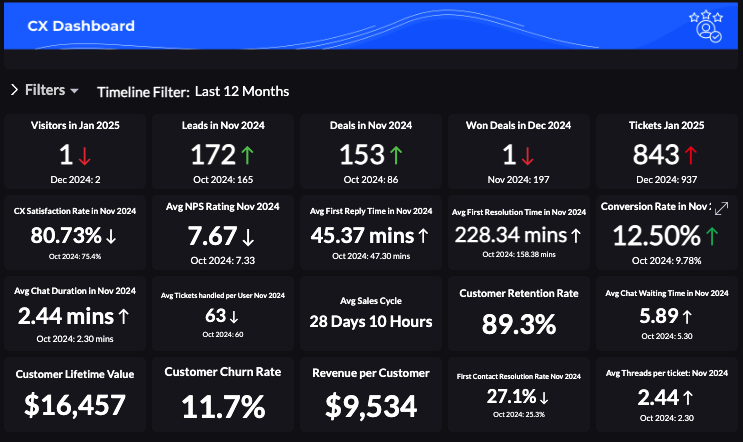
Sample customer success data visualization dashboard
Ecommerce data visualization dashboard
Grow revenue and protect margins with a single view of your online store. An ecommerce dashboard tracks sales, orders, conversion rate, average order value, ROAS, returns, and customer lifetime value across storefronts and channels. See which products, campaigns, and promotions are moving the needle, and spot issues like cart abandonment or stockouts before they impact revenue.
Connect data from your storefront, payment gateway, ad platforms, and inventory system to drill into performance by product, collection, channel, device, or region. Monitor inventory levels and sell-through, set low-stock alerts, and forecast demand to keep popular SKUs available. With real-time visibility, you can optimize acquisition spend, streamline fulfillment, and scale confidently.
Who uses it?
- eCommerce store owners
- Retail managers
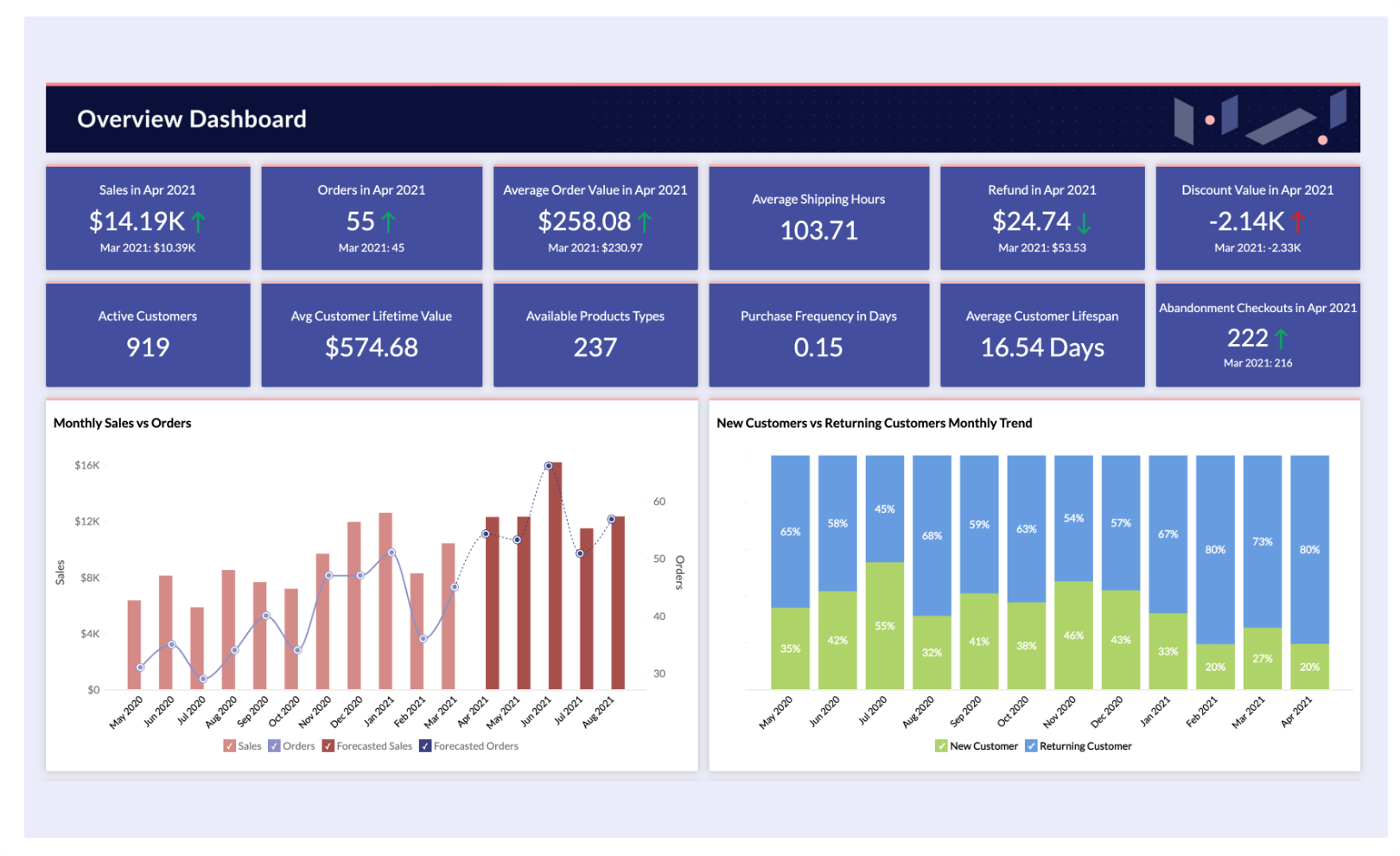
Sample ecommerce data visualization dashboard
Related: What is a KPI dashboard?
How to build a high-impact data visualization dashboard in 6 steps
Building a high-impact data visualization dashboard requires more than just adding charts and graphs.
Here's a step-by-step guide to building a dashboard:
Step 1: Define your goals and audience
Before building a dashboard, ask yourself the following questions:
- Who will use this dashboard? (Marketers, sales teams, executives, etc.)
- What KPIs matter most to them?
- What decisions will this dashboard help them make?
Identify the core objectives and tailor your dashboard to different users.
Step 2: Choose data sources
Integrate data from multiple sources, like marketing tools, CRMs, and finance tools, and make sure to set up auto-sync for real-time analysis.
Step 3: Select the right visualization types
Choosing the right visualizations helps users understand information faster and spot trends more easily.
Tip: Check out our guide on choosing the right data visualization type.
Step 4: Keep it simple
The best dashboards are clean, simple, and focused.
Limit your number of charts and widgets, use white space to make data easy to digest, and ensure labels, legends, and headings are clear.
Step 5: Make it interactive
Add filters, enable drill-downs, and allow users to interact with data for advanced analysis.
Step 6: Set up alerts
Instead of manually checking a dashboard every day, you can set up alerts for any critical metrics changes.
Check out our guide on creating data visualizations using Zoho Analytics (with videos)
Watch our webinar on five key practices for building informative analytics dashboards Building effective dashboards enables you to deliver the right insight at the right time for your teams. Watch our webinar as we discuss the industry's best practices in dashboard building, powerful dashboarding techniques with AI, and much more. |
Oh wait, there's a Step 0: choosing the best tool for building data visualization dashboards.
Zoho Analytics for building data visualization dashboards
Creating an effective data visualization dashboard starts with choosing the right tool. With so many options available, it's important to select a platform that meets your business needs, supports integration with your data sources, and offers user-friendly visualization options.
Here's one of the best data visualization tools you can try out: Zoho Analytics.
Zoho Analytics is a data visualization software trusted by more than 20,000 businesses. Analytics offers:
- Integration support with 500+ data sources, including databases and data lakes, cloud business apps, files, feeds, URLs, and spreadsheets.
- Automatic sync options with regular intervals for all your data sources.
- 50+ popular data visualization types to create reports and charts.
- Collaboration features to share dashboards with fine-grained access control.
- Data alerts to get notified when there's a critical change or an anomaly.
Advanced AI features with Zia, like:
- Ask Zia: Chat in natural language and get your visualizations created.
- Zia insights: Get insights from your visualizations as easy-to-read narratives at the click of a button.
- Zia suggestions: Get help choosing the right data visualization types for your reports.
Here's a short video of how we created a data visualization dashboard for IPL 2024.
Think Zoho Analytics is the solution for you? Sign up for a 15-day free trial and find out! If you need additional support or have specific questions, register for a free personalized demo.
No credit card required.
Data visualization dashboard FAQs
1. What types of data visualization dashboards can I build?
You can build strategic dashboards for high-level goals, operational dashboards to monitor daily activities, and analytical dashboards to explore trends, patterns, and root causes to support smarter, faster decisions.
2. What’s the purpose of using a data visualization dashboard?
Dashboards turn raw data into visuals that highlight key insights. They reduce manual reporting, track metrics in real time, and support faster, more informed decisions with easy-to-read charts and summaries.
3. How do I create a data visualization dashboard?
Define your goal, connect data sources, clean and organize data, choose the right visuals, and add interactivity like filters or drill-downs. Then share dashboards with your team to stay aligned.
4. Can I build real-time data visualization dashboards in Zoho Analytics?
Yes. Use live database connections or schedule data syncs for SaaS apps. Dashboards stay up to date automatically, so you always see the latest data for real-time decisions.
 Pradeep V
Pradeep is a product marketer at Zoho Analytics with a deep passion for data and analytics. With over eight years of experience, he has authored insightful content across diverse domains, including BI, data analytics, and more. His hands-on expertise in building dashboards for marketing, sales, and major sporting events like IPL and FIFA adds a data-driven perspective to his writing. He has also contributed guest blogs on LinkedIn, sharing his knowledge with a broader audience. Outside of work, he enjoys reading and exploring new ideas in the marketing world.