- HOME
- BI & Analytics
- The Best 5 AI Data Visualization Tools in 2026
The Best 5 AI Data Visualization Tools in 2026
- Last Updated : June 3, 2026
- 18.0K Views
- 15 Min Read
Quick filters:
- Budget-conscious teams with <50 users → Zoho Analytics or ThoughtSpot
- Fast deployment (<30 days) → Zoho Analytics or Domo
- Advanced visualization requirements → Tableau or Zoho Analytics
- Self-service for non-technical users → Zoho Analytics or ThoughtSpot
- Technical teams needing deep customization → Sisense or Tableau
Introduction
AI has completely transformed how businesses create reports, build dashboards, and uncover insights. What once required specialized data or IT teams can now be done by anyone, faster, easier, and with far more accuracy.
The bottlenecks of the past, like manual data preparation, long turnaround times, and analysis backlogs, have rapidly disappeared.
Modern AI data visualization tools now do far more than generate charts. They instantly analyze patterns, detect anomalies, forecast trends, summarize insights in natural language, enable real-time data visualization, and even suggest recommendations to improve KPIs based on your data. They empower every employee to explore data confidently and make smarter, real-time decisions.
As AI maturity continues to accelerate, 2026 brings a new generation of tools that are more intuitive, more adaptive, and more business-ready than ever.

AI data visualization tools enable:
- Anyone to build reports and dashboards without help
- Non-technical team members to analyze data independently
- Faster, smarter decision-making across the organization
If you're not fully tapping into your organization's data yet, or if you're aiming to build a data-first culture, you're in the right place.
Let's explore how these AI data visualization tools have improved the analytics process and look at five top options to consider for your business.
What are AI data visualization tools?
AI data visualization tools are advanced software applications that leverage artificial intelligence to streamline the process of creating, analyzing, and interpreting visual representations of data.
By combining AI capabilities with data visualization techniques, these self-service BI tools democratize data analysis and allow a wider range of business users to derive valuable insights from their data quickly and effectively.
The 5 best AI data visualization tools
- Zoho Analytics — Best for end-to-end AI-powered analytics
- Tableau — Best for advanced visual exploration
- Domo — Best for real-time dashboards and conversational data access
- Sisense — Best for customizable, embedded analytics
- ThoughtSpot — Best for search-driven, self-service analytics
1. Zoho Analytics
Zoho Analytics is an AI-powered BI and data analytics platform that excels in data visualization, offering a comprehensive range of AI features. With generative AI infused into every stage of the analytics process, Zoho Analytics is a top contender for teams that want powerful capabilities without enterprise complexity.
Key features
Easy integration with 500+ data sources
Zoho Analytics effortlessly connects with hundreds of data sources, including cloud business apps, databases, data lakes, cloud storage, files, feeds, and URLs. You can also customize data synchronization intervals to suit your needs.
Most popular integrations:
- CRM/Sales: Salesforce, HubSpot, Pipedrive, Zoho CRM, Microsoft Dynamics
- Marketing: Google Analytics, Google Ads, Facebook Ads, LinkedIn Ads, Mailchimp
- Finance: QuickBooks, Xero, Stripe
- Support: Zendesk, Freshdesk
- Databases: MySQL, PostgreSQL, SQL Server, Oracle, MongoDB, Snowflake
AI-powered data preparation studio
Prepare your raw data for analysis quickly with Zoho Analytics' built-in data preparation studio featuring over 250 transformation options. The AI suggests common transformations based on your data patterns, eliminating guesswork.
Common transformations include duplicate removal, handling missing values, standardizing date formats, cleaning and parsing text, splitting and merging columns, and converting data types.
Ask Zia: the AI agent for data visualization and analytics
Even non-technical users can easily generate visualizations using Ask Zia, Zoho's conversational AI assistant.
Ask the AI agent in plain language to:
- Create reports and dashboards ("Show me revenue by region last quarter")
- Get historic, diagnostic, and predictive insights ("Why did sales drop in March?")
- Receive AI-driven recommendations ("What should we focus on to increase conversion?")
Pre-built AI visualizations
If your business relies on multiple cloud apps, this feature saves significant time. Once you integrate your apps with Zoho Analytics, it automatically generates a comprehensive set of reports and dashboards. This allows you to start analyzing immediately without building reports from scratch.
Pre-built dashboards available for all business app connectors:
- Salesforce (Sales pipeline, forecasting, team performance)
- Google Analytics (Traffic analysis, conversion funnels, audience insights)
- QuickBooks (P&L statements, cash flow, AR/AP aging)
- Zendesk (Ticket volume, response times, CSAT trends)
Generative AI features using Zia
Zia Suggestions: Creating reports is easy with drag-and-drop functionality, but selecting the right visualization type can be challenging. Zia Suggestions recommends the best visualizations based on the data columns you select.
For example, if you select "Month" and "Revenue," Zia suggests line charts for trends, bar charts for comparisons, and area charts for cumulative views.
Zia Insights: Extracting insights from visualizations can be difficult, especially for users with limited data analysis experience. Zia Insights provides key takeaways from reports in easy-to-read narratives and visually appealing formats with just one click.
Sample insight:
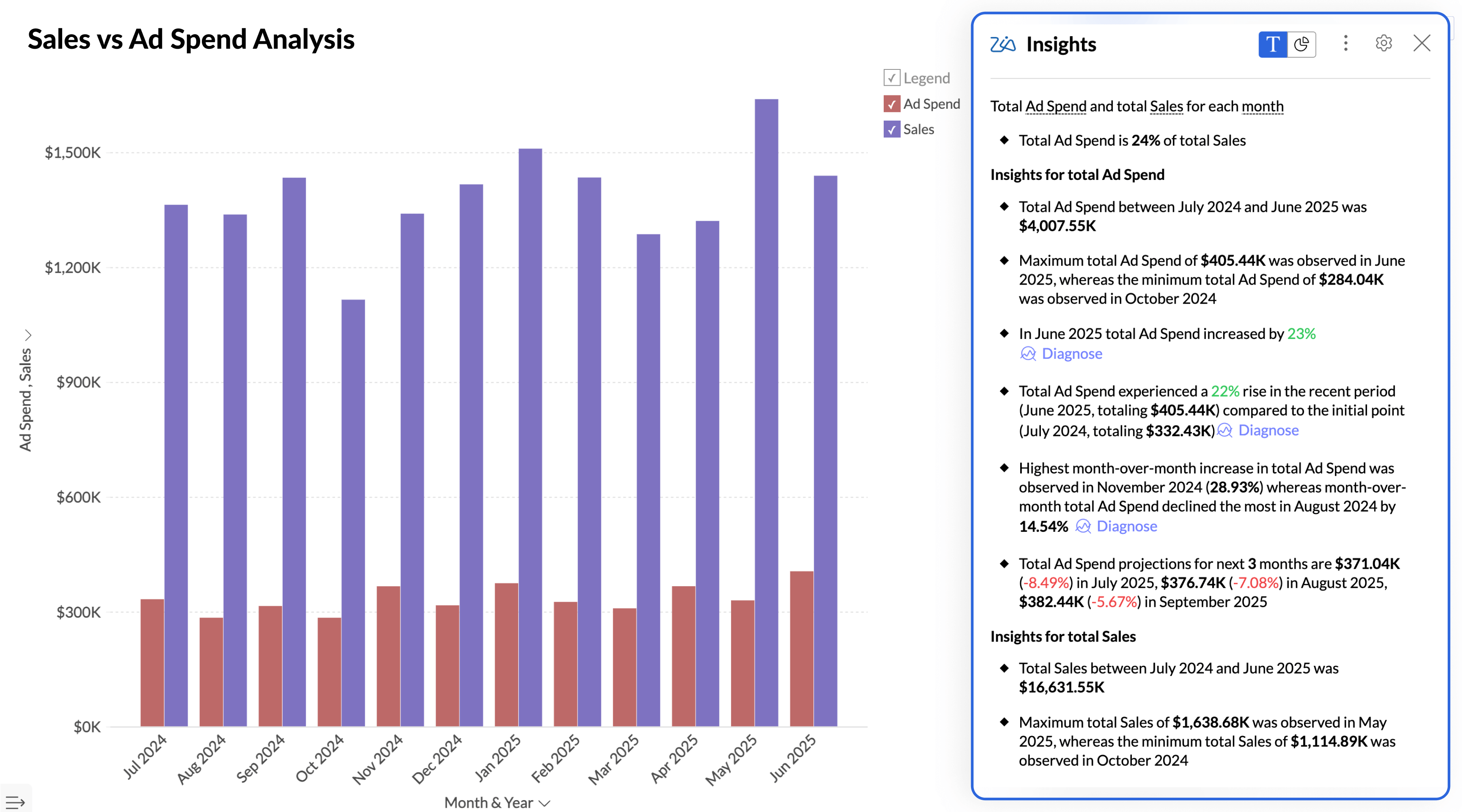
Auto Analysis: After importing your data into Zoho Analytics, you can opt for AI to generate reports and dashboards automatically. The AI analyzes your data structure, identifies key metrics, and creates relevant visualizations without any manual intervention.
Explain data: Click on any data point in a report and ask Zia to explain what's happening. The AI provides context like, "This spike represents a 340% increase from the previous week, coinciding with your Black Friday campaign launch on 24 Nov."
Predictive AI
While historical data offers valuable insights, forecasting future trends is crucial in a competitive business environment. Zoho Analytics' predictive AI allows you to forecast future performance using various models:
- Linear regression: For steady trend lines
- Polynomial regression: For curved growth patterns
- Exponential smoothing: For seasonal data
- ARIMA: For complex time series with trends and seasonality
The AI automatically selects the best-fit model and shows confidence intervals so you understand the prediction accuracy.
Anomaly detection
Identify anomalies and outliers in your data with Zoho Analytics' anomaly detection feature. The system learns normal patterns in your data and flags deviations automatically.
Real-world example: If your average daily sales are $50K ± $5K, the system will alert you when sales drops to $30K or spikes to $80K, helping you investigate issues or capitalize on opportunities quickly.
You'll receive automated alerts via email, Slack, or in-app notifications when anomalies are detected.
Collaboration options
Share reports and dashboards with your team and stakeholders to enable collaborative decision-making. You can:
- Share via link: Public or password-protected URLs
- Email schedules: Automated report delivery (daily, weekly, monthly)
- Embed dashboards: In your internal portals or customer-facing apps
- Control access: Custom roles limit who can view, edit, or share
Role-based access example: Sales reps see only their territory data, while regional managers see their entire region, and executives see everything.
Automated slideshow generation
Short on time for your next meeting? Zoho Analytics automatically creates slideshow presentations with interactive data visualizations and AI-generated insights, all in a single click.
You can select the most important charts for the presentation, and the AI adds narrative context and formats everything into a professional presentation ready for executive reviews or board meetings.
💡 Read how we save two hours on every marketing meeting with Zoho Analytics
What real users say
Pros
- Ease of use: Users appreciate the user-friendly interface of Zoho Analytics, making data analysis easy for all skill levels.
- Customization: Users love the customization options in Zoho Analytics, enabling tailored dashboards and reports for better data insight.
- Integrations: Users value the seamless integration capabilities of Zoho Analytics, enhancing their data management and reporting experience.
- Dashboard usability: Users find dashboard usability exceptional in Zoho Analytics, allowing easy customization and user-friendly data integration.
- Data visualization: Users commend the powerful data visualization in Zoho Analytics for transforming data into insightful, visually appealing dashboards.
Cons
- While the platform is powerful, certain advanced features require a learning curve.
- Steep learning curve for advanced formulas or custom SQL queries
Source:G2.com
Security & compliance
Certifications:
- SOC 2 Type II certified
- GDPR & CCPA compliant
- ISO 27001:2013
- HIPAA compliant (Healthcare edition)
- PCI DSS compliant
Security features:
- 256-bit AES encryption (data at rest)
- TLS 1.2+ encryption (data in transit)
- SSO/SAML 2.0 support
- Role-based access controls (RBAC)
- IP whitelisting
- Comprehensive audit logs for all data access
- Two-factor authentication (2FA)
Data residency options: Choose where your data is stored: US, EU, India, Australia, China data centers
Pricing: Starts at just $8/user/month.
Sample AI data visualizations from Zoho Analytics
Here's what AI-generated dashboards look like in Zoho Analytics:
Ready to try Zoho Analytics?
Sign up for a 15-day free trial and explore how easy it is to create data visualizations with AI assistance. No credit card required.
2. Tableau
Tableau is BI software that provides AI-driven data visualization capabilities. Owned by Salesforce, it enables users and data teams to seamlessly integrate data from various sources, create sophisticated dashboards and reports, and gain valuable AI-generated insights.
Key features
- AI-driven insights: Automatically generate insights to enhance your data analysis through Einstein Discovery integration
- Advanced data visualization: Create complex and visually stunning visualizations with extensive customization options
- Integrated with multiple data sources: Connect to a wide range of data sources for comprehensive analysis, with especially strong Salesforce integration
- User-friendly interface: Build visualizations with an intuitive drag-and-drop UI
- Tableau Prep: Powerful data preparation tools for complex transformations
- Enterprise governance: Robust security, scalability, and deployment options
What real users say
Pros
- Time-saving visualizations with room for UI improvement
- Effortlessly visualize complex data, but needs speed improvements
- Empowers data insights with ease, but pricey
Cons
- Learning curve: Users find Tableau's steep learning curve daunting, especially for non-technical users tackling advanced functionalities.
- Expensive: Users find Tableau's high licensing costs a barrier, especially for smaller teams looking to implement the tool.
- Slow performance: Users experience slow performance with large datasets and complex calculations, leading to frustration during analysis.
Source: G2.com
Security & compliance
- SOC 2 Type II, ISO 27001, HIPAA, GDPR, FedRAMP certified
- Row-level security and data encryption
- Enterprise-grade SSO and MFA support
- Comprehensive audit and governance features
Best for
- Large enterprises with complex Salesforce ecosystems
- Teams requiring pixel-perfect, publication-quality visualizations
- Organizations with dedicated BI teams and data analysts
- Companies with budget for premium licensing and support
Pricing: Starts at $75/user/month (Creator – Standard tier, billed annually)
Comparison: Zoho Analytics vs Tableau →
3. Domo
Domo is a cloud-based BI platform that provides advanced AI-powered data visualization tools. It helps organizations turn raw data into actionable insights with intuitive, interactive dashboards designed specifically for executive consumption.
Key features
- Natural language conversations: Interact with your data using simple, conversational language through Domo AI
- AI-powered insights: Automatically uncover key insights to guide your decisions with intelligent alerts
- Real-time dashboards: Access up-to-date data through dynamic, real-time dashboards
- 1000+ connectors: Industry-leading number of native data connectors
- Mobile-first design: Executive dashboards optimized for mobile consumption
- Data science tools: Built-in R and Python support for advanced analytics
What real users say
Pros
- Ease of use: Users find Domo's ease of use exceptional, facilitating access to data for informed decision-making.
- Data visualization: Users appreciate the data visualization capabilities of Domo, finding it easy to create intuitive, insightful dashboards.
- Integrations: Users value the seamless integration capabilities of Domo, enhancing data management and analytics across various platforms.
Cons
- Learning curve: Users experience a steep learning curve with Domo, finding initial navigation and training materials challenging.
- Missing features: Users are frustrated by missing features in Domo, noting limitations in analysis and customization compared to competitors.
- Data management issues: Users face data management issues with Domo, experiencing slow performance and complex steps for handling large datasets.
- Expensive: Users find the pricing to be on the higher side, making it difficult for smaller teams to afford Domo.
Source: G2.com
Security & compliance
- SOC 2, ISO 27001, HIPAA, GDPR certified
- Enterprise-grade encryption and access controls
- Federated authentication and SSO
- Granular role-based permissions
Best for
- Executive teams needing mobile-first, real-time dashboards
- Organizations requiring 24/7 operational monitoring
- Companies with diverse data sources (1000+ connector options)
- Teams prioritizing ease of use over deep customization
Pricing: Domo no longer uses per-user pricing. The platform operates on a consumption/credit-based pricing model.
User seats are unlimited; cost is driven by data row storage, ETL processing, dashboard refresh frequency, AI usage, and connector activity.
Pricing requires a custom sales quote. Estimated entry point is approximately $30,000/year depending on credit consumption.
Comparison: Domo vs. Zoho Analytics →
4. Sisense
Sisense enables organizations to turn complex data into actionable insights with intuitive, interactive visualizations. Its AI-driven tools simplify data analysis and presentation, with a particular strength in embedded analytics for customer-facing use cases.
Key features
- Conversational analytics: Engage with your data using natural language queries
- Interactive visualizations: Create dynamic, easy-to-understand visualizations with extensive customization
- White-label capabilities: Fully customize the look and feel for embedded use cases
- Developer-friendly APIs: Robust REST APIs for deep integration into your products
- In-chip technology: Fast query performance on large datasets
- Advanced collaboration options: Facilitate teamwork and decision-making with robust sharing features
What real users say
Pros
- Efficient data visualization with room for improvement
- Users appreciate the powerful data visualization capabilities of Sisense, enabling insightful and interactive dashboards for effective analysis.
- Users highlight the easy integration of Sisense, enhancing reporting capabilities and empowering business ownership of analytics.
Cons
- Learning curve: Users find the learning curve steep, especially for large datasets and customization, leading to frustration and confusion.
- Missing features: Users find the missing features in Sisense limit its effectiveness, impacting data customization and interactive analytics.
- Bugs: Users report frequent bugs and issues with customer support, impacting the reliability and usability of Sisense dashboards.
- Dashboard issues: Users face dashboard issues with integration, customization, search functionality, and tedious design setups, affecting overall usability.
- Limited customization: Users find the limited customization options in Sisense challenging, affecting their ability to tailor the experience effectively.
Source: G2.com
Security & compliance
- SOC 2, ISO 27001, HIPAA certified
- Multi-tenancy support for SaaS deployments
- Advanced data governance and lineage
- Comprehensive API security controls
Best for
- Software companies embedding analytics in their products
- Technical teams with developer resources
- Organizations requiring extensive white-labeling
- Companies with complex data models requiring custom solutions
Pricing: Launch plan: $399/month (20GB storage, 20K credits, 2 designer seats, 50 viewer seats).
5. ThoughtSpot
ThoughtSpot is an analytics platform that harnesses AI to provide robust data visualization capabilities through a unique search-first interface. It democratizes data access by enabling users of all technical levels to explore their data, ask questions, and uncover insights using natural, Google-like search.
Key features
- Search analytics: Quickly find answers by searching your data with natural language queries
- AI-generated insights (SpotIQ): Automatically discover key insights to inform your decisions through machine learning
- Interactive visualizations: Create and explore dynamic visualizations that bring your data to life
- Real-time monitoring: Stay informed with real-time data updates and monitoring
- Self-service at scale: Enable thousands of users to explore data without overwhelming IT
- Embedded analytics: Developer tools for embedding search into your applications
What real users say
Pros
- Users value the ease of use of ThoughtSpot, enabling even non-technical users to gain data insights effortlessly.
- Users appreciate ThoughtSpot's AI-driven insights and user-friendly interface, enhancing data gathering and decision-making efficiency.
- Users value the effective data visualizations of ThoughtSpot, enabling deeper insights and empowering self-discovery.
Cons
- Learning curve: Users find the learning curve steep initially, but appreciate the tool's power once familiar with it.
- Missing features: Users experience missing features in ThoughtSpot, causing formula and natural language processing issues, impacting data accuracy.
- Complexity: Users find ThoughtSpot's complexity challenging, especially in data modeling and setup for large datasets.
- Limited customization: Users find the limited customization options of ThoughtSpot frustrating, hindering their ability to personalize visualizations.
- Expensive: Users find ThoughtSpot's pricing to be expensive, especially as query consumption increases, impacting affordability for smaller businesses.
Source: G2.com
Security & compliance
- SOC 2, ISO 27001, HIPAA, FedRAMP certified
- Advanced row-level security
- Comprehensive audit logging
- Enterprise SSO and MFA
Best for
- Organizations prioritizing user adoption and self-service
- Non-technical business users who want to explore data independently
- Teams wanting to minimize training requirements
- Companies with budget for premium per-user pricing
Pricing: Starts at $25/user/month (5–50 users, up to 25M rows, billed annually).
How we evaluated these tools: Our framework
Selecting the right AI data visualization tool can be challenging, especially since the field is still evolving. Rather than just listing features, we evaluated each platform across 6 critical dimensions.
| Criteria | Weight | Why it matters |
|---|---|---|
| Implementation speed | 25% | Most teams need value in weeks, not months |
| AI capabilities | 25% | Differentiates modern tools from legacy BI |
| Integration ecosystem | 20% | Tool is only as good as data access |
| Reporting & collaboration | 15% | Analytics is a team sport |
| Support & enablement | 10% | Adoption depends on onboarding |
| Security & governance | 5% | Enterprise table stakes |
What matters most for your team?
The ideal weighting varies by team type:
For marketing/sales teams:
- Implementation speed (High priority) - Need quick wins to prove ROI
- Integration ecosystem (High priority) - Must connect to CRM, ads platforms
- AI capabilities (Medium priority) - Nice to have for forecasting
For data/analytics teams:
- AI capabilities (High priority) - Core differentiator from legacy tools
- Integration ecosystem (High priority) - Need flexibility for all sources
- Reporting & collaboration (Medium priority) - Must enable self-service
For finance/operations teams:
- Security & governance (High priority) - Compliance is non-negotiable
- Reporting & collaboration (High priority) - Need audit trails and controls
- Support & enablement (Medium priority) - Limited technical resources
For executive leadership:
- Implementation speed (High priority) - Time is money
- AI capabilities (High priority) - Want predictive insights, not just reporting
- Reporting & collaboration (High priority) - Need mobile access and sharing
Head-to-head comparison: The 5 best AI data visualization tools
| Feature | Zoho Analytics | Tableau | Domo | Sisense | ThoughtSpot |
|---|---|---|---|---|---|
| Implementation | ★★★★★ | ★★★ | ★★★★ | ★★★ | ★★★★ |
| Days to first dashboard | 1–3 days | 2–4 weeks | 1–2 weeks | 2–3 weeks | 3–5 days |
| AI Capabilities | ★★★★★ | ★★★★ | ★★★ | ★★★ | ★★★★★ |
| NLQ accuracy | 90%+ | 85% | 75% | 75% | 92%+ |
| Integrations | ★★★★★ | ★★★★ | ★★★★★ | ★★★ | ★★★ |
| Native connectors | 500+ | 200+ | 1000+ | 100+ | 150+ |
| Reporting | ★★★★★ | ★★★★★ | ★★★★ | ★★★★ | ★★★★ |
| Support | ★★★★★ | ★★★ | ★★★★ | ★★★ | ★★★★ |
| Security | ★★★★★ | ★★★★★ | ★★★★★ | ★★★★ | ★★★★★ |
| OVERALL SCORE | 4.8/5 | 4.2/5 | 4.0/5 | 3.5/5 | 4.3/5 |
| Best for | Mid-market teams needing fast deployment + comprehensive AI | Enterprises with Salesforce, complex visualization needs | C-suite dashboards, real-time operations | Embedded analytics, white-label products | Search-first culture, minimal training needed |
| Starting price | $8/user/month | $75/user/mo | Consumption/credit-based. No per user price. Custom quote required. | $399/month for 2 designer and 50 viewer seats | $25/user/mo |
Why organizations need an AI data visualization tool
AI-powered data visualization tools remove barriers that once limited data access to technical specialists. Now, anyone in your organization can explore trends, make predictions, and uncover insights without waiting for IT or data teams.
Here's where AI data visualization tools deliver exceptional value:
1. Enhanced user experience
- Natural language processing allows users to interact with data through voice and text queries
- Makes sophisticated analytics accessible even to non-technical business users
- Reduces dependency on data teams for routine reporting
2. Cost-effective analysis
- Reduces need for extensive data teams, as tools handle many tasks autonomously
- Eliminates manual reporting work (teams report 50-75% time savings)
- Faster time-to-insight means faster ROI on data investments
3. Faster decision-making
- Real-time dashboards enable immediate action on emerging trends
- Automated alerts notify stakeholders of anomalies instantly
- Predictive analytics help teams plan proactively, not reactively
4. Data democratization
- Self-service capabilities empower every employee to explore data
- Reduces analytics bottlenecks in IT and BI teams
- Creates data-driven culture across the organization
5. Scalability without complexity
- Cloud-native tools scale with your data volume and user base
- AI handles increasing complexity without proportional cost increases
- Modern tools grow with your business without painful migrations
💡 Related read: Top 3 free data visualization tools: A beginner's guide
Common questions from teams evaluating AI visualization tools
1. How long does implementation actually take?
| Tool | Time to first dashboard | Go-live | Full adoption |
|---|---|---|---|
| Zoho Analytics | 1–3 days | Week 2–3 | 30–45 days |
| Tableau | 2–4 weeks | 8–12 weeks | 3–6 months |
| Domo | 1–2 weeks | 2–3 weeks | Similar to Zoho |
| Sisense | 2–3 weeks | 4–8 weeks | 6–12 weeks |
| ThoughtSpot | 3–5 days | 2–8 weeks | 12-14 weeks |
2. What's the total cost beyond the sticker price?
Most vendors only show per-user pricing. Here's the complete financial picture:
| Cost component | Zoho Analytics | Tableau | Domo | Sisense | ThoughtSpot |
|---|---|---|---|---|---|
| Base License | $8/user/month | $75/user/month (Creator) | Sales quote required | $399/month | $25/user/month (min. commitment varies) |
| Pricing Model | Per user | Per user | Consumption-based credits | Platform-based | Per user + usage-based |
| Data Connectors | 500+ included | Included | Included | Included | Included |
| Support | Included (email, chat, phone) | Premier: $4,200+/year | Included (varies by contract) | Included | Included |
| Training | Free | $1,500–3,000/user | Additional cost | Additional cost | Included |
| Data Prep Tool | Included | Tableau Prep: +$70/user/month | Included | Included | Included |
| Professional Services | Optional ($150/hour) | Often required ($200–300/hour) | Often required | Required (implementation heavy) | $200–350/hour |
| Developer Resources | Not required | Not required | Sometimes required | 1–2 FTE developers recommended | Not typically required |
| Overage Fees | None | Possible (license expansion) | Based on usage credits | Varies | Possible if query volume exceeds tier |
| Cost Predictability | High | Medium | Low (hard to estimate) | Medium–Low | Medium (usage impacts cost) |
3. What happens during renewals?
Zoho Analytics:
- No automatic price increases at renewal (locked rate for multi-year contracts)
- Month-to-month option available (no long-term lock-in required)
- Add/remove users anytime with pro-rated billing
- Upgrade/downgrade plans mid-contract without penalty
- 30-day notice for cancellation
- Full data export capabilities (no vendor lock-in)
Tableau:
- Typical 3-5% annual price increases standard in renewals
- Annual contracts are standard (no month-to-month flexibility)
- Minimum user commitments often enforced
- Plan changes require contract amendments
- Heavy enterprise discounts in Year 1 may disappear at renewal
Domo:
- Annual contracts standard across all plan tiers
- Pricing negotiations vary (larger discounts for multi-year commitments)
- User minimums typically enforced
- Overage charges if data volume exceeds plan limits
Sisense:
- Pricing heavily customized (difficult to generalize)
- Renewals often negotiated based on actual usage patterns
- Embedded pricing can escalate with customer growth
ThoughtSpot:
- Annual contracts with usage-based pricing tiers
- Overage fees possible if query volume exceeds plan limits
- Price increases typical at renewal (3-7% annually)
Pro tip: During initial contract negotiation, request a "price protection clause" that caps annual increases at 3% or ties them to CPI. Many vendors will agree to this for multi-year commitments.
Visualize data independently with AI
AI tools are changing the way businesses handle data. They're simple enough for beginners but powerful enough for experts. The right AI data visualization platform can transform your organization from reactive reporting to proactive decision-making.
While choosing the right data visualization software involves considering various factors, we hope this comprehensive guide has helped you:
- Understand the evaluation criteria that matter most for your specific situation
- Compare tools objectively across implementation, AI capabilities, integrations, and cost
- Address common concerns about security, adoption, and total cost of ownership
- Identify the right next step based on your decision timeline and requirements
💡 Tip: Read our buyer’s guide to learn about the essential features of data visualization software and how to evaluate them.
Our recommendation:
If you need comprehensive AI capabilities, fast implementation, and strong ROI, Zoho Analytics offers the best balance of features, ease of use, and value. With 500+ integrations, Ask Zia AI agent, and transparent pricing starting at just $8/user/month, it's built for teams that want enterprise capabilities without enterprise complexity.
Option 1: Start free trial
Perfect if you want to test Zoho Analytics with your actual data before committing.
15 days free trial. No credit card required.
Expected timeline:
- Day 1: Sign up, connect 1-2 key data sources
- Day 3: Generate sample dashboards
- Day 7: Build 3-5 core dashboards for your team
- Day 14: Make final decision with full understanding
Option 2: See a custom demo for your industry
Perfect if you want to see how Zoho Analytics works specifically for your use case.
What you get:
- 45-minute personalized demo using your industry's typical data
- Sample dashboards built for your specific role (Sales, Marketing, Finance, Ops)
- Detailed pricing breakdown for your exact team size
- Implementation roadmap with timeline and milestones
 Pradeep V
Pradeep is a product marketer at Zoho Analytics with a deep passion for data and analytics. With over eight years of experience, he has authored insightful content across diverse domains, including BI, data analytics, and more. His hands-on expertise in building dashboards for marketing, sales, and major sporting events like IPL and FIFA adds a data-driven perspective to his writing. He has also contributed guest blogs on LinkedIn, sharing his knowledge with a broader audience. Outside of work, he enjoys reading and exploring new ideas in the marketing world.
Comments(1)
Exceptional post! Genuinely valued the way you highlighted this. Can’t wait for more updates like this! Keep it up!