- What is real-time data visualization?
- Why real-time data visualization matters most in 2026
- Benefits of using real-time data visualizations in business
- How can you visualize data in real time: 5 practical steps
- Real-time data visualization tools to consider
- Key features to look for in a real-time data visualization tool
- All-in-one real-time data visualization tool: Zoho Analytics
- Take action with real-time data visualization
What is real-time data visualization?
What happens when you take regular charts and graphs and make them update every few seconds? You get real-time interactive data visualization: dashboards that show you what's happening in your business right now, not what happened yesterday or last week.
Think of it as the difference between watching a live sports game and watching its highlights tomorrow. Real-time visualization displays your data the moment it's created or processed, typically within milliseconds to seconds. Instead of waiting for scheduled reports, you see changes as they happen.
Here's what real-time visualization lets you do:
- Spot problems the moment they start developing.
- Watch trends emerge while you can still act on them.
- Catch unusual patterns before they impact your business.
- Make decisions based on current data, not outdated reports.
However, real-time visualization isn't just about faster updates. It requires a solid technical foundation to work properly, and that applies to all modern data visualization tools.
- Data ingestion: Your system needs to collect streaming data quickly without bottlenecks.
- Processing speed: Information must be processed with minimal delay to keep visualizations
- current.
- Query efficiency: Dashboards should load and update fast, even with large data volumes.
- Scaling capability: The system must handle growing amounts of data without slowing down.
Without these pieces working together, your "real-time" dashboard becomes just another slow, outdated report.
The real power of real-time visualization lies in how it connects continuous data streams to business decisions. Instead of staring at spreadsheets full of numbers, you get visual patterns your brain can process instantly. This becomes critical when timing matters, like financial trading, monitoring IoT sensors, or tracking live events.
Real-time visualization enables teams and customers to explore data dynamically, making faster decisions and solving problems before they escalate. Rather than guessing or waiting for weekly reports, you can base choices on what's actually happening right now.
As data volumes and speeds continue increasing, traditional visualization methods designed for smaller, slower data simply can’t keep up. That’s why more businesses are moving to real-time approaches supported by AI data visualization tools that match the pace of modern data.
Why real-time data visualization matters most in 2026
Data loses value fast. Every minute your information sits unused, your competitors gain an edge you can't recover.
Real-time data analytics is no longer optional but essential for business success. Companies analyzing data as it happens consistently outperform those stuck with yesterday's reports.
Here's what changes when you can see your data live:
Make decisions that matter: Instead of guessing based on week-old snapshots, you spot emerging trends before competitors notice them. You identify market shifts while others wait for monthly reports. You capitalize on opportunities that disappear within hours.
Transform how you operate: Delta Air Lines invested over $100 million in airport baggage systems and cut mishandled baggage by 71% between 2007 and 2014. Netflix grew from $3.2 billion in 2011 to $33.7 billion by 2023 by using subscriber data and real-time analytics to make smarter content decisions.
Real-time data delivers measurable financial benefits:
- Cost reduction: Stop fraud before it happens, optimize inventory without guesswork, reduce waste through immediate adjustments.
- Operational efficiency: Fix problems as they occur instead of discovering them in post-mortems.
- Resource optimization: Allocate resources based on actual usage, not estimates.
- Maintenance savings: Predict equipment failures before they shut down operations.
Most importantly, real-time data keeps you ahead of problems instead of chasing them. You identify issues as they emerge (sometimes preventing them entirely) which maintains business continuity while minimizing risks. This becomes critical when data compliance requirements carry serious regulatory consequences.
Your customers notice the difference too. With immediate insights into preferences and behaviors, you can deliver personalized solutions exactly when customers need them. This responsiveness builds trust and loyalty that translate into better business outcomes.
Three trends have made real-time analytics accessible to more businesses: growing external data streams, increasing internal data sources from IoT devices and enterprise applications, and cloud infrastructure that puts powerful analytics within reach of organizations of all sizes.
Businesses that ignore real-time visualization operate at a significant disadvantage. If your data infrastructure isn't built for real-time analytics, you're missing opportunities to innovate, respond to customers, and build resilience that keeps you competitive.
Let your data tell you what to do next, while there's still time to act on it.
See it in action: when minutes determine millions
A global logistics company managing 50,000 daily shipments faces a sudden port disruption mid-day. Without real-time visibility, the problem won't surface until the end-of-day report, i.e., six hours later. By then, regional managers have already made routing decisions based on outdated data, compounding delays across connected supply chains.
With real-time dashboards in place, operations teams spot the disruption the moment it begins. Shipments get rerouted within minutes, priorities are flagged automatically, and customers are informed before they think to call.
The disruption still happens. But it stays a manageable incident instead of a full-scale operational failure.
Benefits of using real-time data visualizations in business
According to the MIT CISR research, companies using real-time data visualization see 62% higher revenue growth and 97% higher profit margins than businesses stuck with yesterday's reports. That's not just a nice-to-have improvement; that's the difference between thriving and just surviving.
Think of real-time visualization as your business command center. Site reliability engineers watch application performance, server health, and user experience all at once. Sales managers track live revenue numbers, production metrics, and supply chain updates as they change. When everyone can see the same current data, coordination across teams actually works.
But here's where it gets really valuable: you spot problems while they're still small. Instead of waiting for alerts that tell you something already went wrong, you see error rates creeping up gradually and fix them before customers notice. A slowly rising number of failed transactions becomes obvious on a live dashboard, letting you intervene before a minor glitch becomes a major outage.
Your customers benefit too. Real-time tracking of user behavior, social media reactions, and interaction patterns lets you adjust your marketing messages based on what's working right now. When you can see how people respond to your campaigns as they happen, you can double down on what works and kill what doesn't.
During crisis situations like unexpected traffic spikes and system failures, real-time visualization shows you exactly where to focus your resources. This immediate visibility can be the difference between keeping your systems running and watching customers leave for competitors.
Security teams rely on real-time dashboards to monitor cameras, alarms, and sensors across global facilities. When suspicious activity shows up visually, they can respond before actual fraud occurs.
How can you visualize data in real time: 5 practical steps
Setting up real-time data visualization doesn't have to be overwhelming. You can create dashboards that update as events happen by following these five steps.
Step 1: Know what you want to track
Start with your business goals. Do you need to monitor sales performance, website traffic, or system uptime? Maybe you want to track customer behavior or inventory levels in real-time.
Your objectives determine which tools make sense for your situation, and this is where choosing a data visualization tool becomes important.
Step 2: Get your data ready
Next, list the systems that generate the signals you care about.
These might include transaction systems, web or mobile apps, internal tools, CRM or support platforms, log files, or sensors.
Identify:
- Which events indicate something good or bad happening.
- Where those events are currently stored or generated.
- How frequently they update.
This helps you decide which data should be streamed as events and which can be read directly from operational systems.
Step 3: Choose how your data will stay “live”
There are two broad patterns for real-time data visualization tools.
Streaming data feeds: You push events into a central place as they happen. For example, every new order, error, click, or sensor reading is streamed into a table or topic. This is useful when you need second by second visibility.
Live or direct queries: Your dashboards query operational databases or APIs in real time, instead of relying only on scheduled batch loads. This is useful when source systems already maintain fresh data and can handle frequent reads.
Many teams combine both. Streaming for high velocity events, and live queries for up to date reference data such as customers, products, or configurations.
Step 4: Design dashboards that make sense
Plan your dashboard layout before you start building. Different data types need different visual approaches:
- Line charts show trends over time
- Bar charts compare different categories
- Gauges display current key metrics
- Heatmaps reveal patterns and density
Tip: Check out our guide on choosing the right data visualization type.
Keep it clean with plenty of white space, clear labels, and consistent colors.
Step 5: Test everything before you go live
Test your dashboards thoroughly to make sure they update correctly and show accurate data. Cross-check key numbers with your source systems to verify everything matches.
Once testing is complete, share it with your stakeholders. Set up regular reviews to gather feedback from users and make improvements.
These five steps give you a solid foundation for real-time visualization that turns your data into insights exactly when you need them most.
Real-time data visualization tools to consider
Choosing the right real-time data visualization tool can determine how fast your team responds to what's actually happening in your business. Here's a look at the top three platforms, what they do well, and who they're best suited for.
1. Zoho Analytics
Zoho Analytics is an all-in-one business intelligence platform built for teams that need live insights without the complexity. It combines a drag-and-drop interface with powerful real-time data infrastructure, so both technical teams and business users can build dashboards that update as events unfold.
Real-time data visualization strengths
Zoho Analytics approaches real-time data in two complementary ways.
1. Stream Analytics: Ingest high-velocity event data, such as financial transactions, IoT signals, or user activity, continuously through REST APIs or Google Pub/Sub push subscriptions. Reports built using streaming data refresh automatically every 30 seconds, keeping your visuals up to date with real-time events.
Live Connect: Instead of importing or storing data inside Zoho Analytics, this approach queries your operational databases directly. Every chart reflects up-to-the-minute values from your source, and since the data remains in your database, Live Connect supports internal security compliance.
Other supporting areas
Beyond real-time visualization, Zoho Analytics covers the full analytics workflow. You get AI-powered analysis through its Ask Zia agent (including automated report and dashboard generation, AI insights and recommendations, and many more), built-in collaboration features, white-labeling and embedded analytics options, and deep integrations with 500+ data sources. It also supports scheduled reports, blended data from multiple sources, and predictive analytics.
Pricing
Zoho Analytics offers a 15-day free trial on all paid plans with no credit card required. Paid cloud plans start at $8/user/month, with higher tiers, such as Standard, Premium, and Enterprise, scaling up in users, rows, and features. It's one of the most cost-effective options in the category.
Best for
Businesses that need real-time dashboards without a steep learning curve, teams that want to connect multiple data sources in one place, and organizations looking for strong value at a lower price point than enterprise-tier tools.
2. Power BI
Power BI is Microsoft's business intelligence platform and a go-to choice for organizations already working within the Microsoft ecosystem. It balances accessibility with depth and offers enough power for analysts.
Real-time data visualization strengths
Power BI supports real-time data through streaming datasets, which allow data pushed via the Power BI REST API or Azure Stream Analytics to appear on dashboards instantly. For near-real-time scenarios, Automatic Page Refresh lets DirectQuery-connected reports update frequently. Its tight integration with Azure services makes it a natural fit for teams already using Azure Event Hubs or Azure IoT Hub. It's also worth noting that Microsoft has announced the retirement of Power BI's legacy streaming datasets by October 2027, and recommends organizations plan their migration to Real-Time Intelligence in Microsoft Fabric for next-generation streaming capabilities.
Other supporting areas
Power BI's biggest advantage is its deep integration with the Microsoft stack. It also features AI-driven insights, natural language querying through Q&A, Copilot integration on higher-tier plans, etc. The Power BI Service handles collaboration, sharing, and access control across teams with ease.
Pricing
Power BI Pro, which enables sharing and collaboration in the cloud, is $14/user/month (billed annually). Power BI Premium Per User, which adds advanced features like larger dataset sizes and paginated reports, is $24/user/month. Enterprise capacity-based licensing is available for large-scale deployments.
Best for
Organizations already using Microsoft 365 or Azure, teams that need strong BI at an accessible price point.
💡 Compare Power BI vs Zoho Analytics
3. Tableau
Tableau is one of the most recognized names in data visualization. It's built for organizations that work with large, complex datasets and need highly customizable dashboards that can handle both historical and near-real-time data.
Real-time data visualization strengths
Tableau supports live data through its Live Connection feature, which queries databases directly so dashboards always reflect current data when refreshed. It's important to note that Tableau does not natively support continuous streaming data. For near-real-time scenarios, teams typically combine Tableau with external data pipeline tools or query frequently refreshed databases. When deployed on Tableau Server or Tableau Cloud, dashboards can be set to refresh at regular intervals, which makes it well-suited for near-real-time monitoring where updates every few minutes are sufficient.
Other supporting areas
Tableau's real strength is in visual exploration and storytelling. Its drag-and-drop interface enables deep, ad-hoc analysis, and Tableau Prep (included with Creator licenses) helps clean and shape data before it reaches the dashboard. It also offers AI-powered features like Tableau Pulse on higher-tier plans.
Pricing
Tableau uses a role-based licensing model, all billed annually. Creator licenses (full authoring, data prep, and publishing) are $75/user/month. Explorer licenses (web-based authoring and data exploration) are $42/user/month. Enterprise plans with advanced management and governance features are available at higher rates.
Best for
Data analysts and BI teams that need deep customization and exploratory analytics, enterprises with complex data environments, and organizations already invested in the Salesforce ecosystem.
💡 Compare Tableau vs Zoho Analytics
Key features to look for in a real-time data visualization tool
So, you're ready to move beyond static reports, but how do you pick the right tool when there are dozens of options out there?
Start with ease of use
If your team spends more time figuring out the software than analyzing data, you've already lost. Look for tools with drag-and-drop interfaces and pre-built templates that get you up and running fast. Your goal is insights, not wrestling with complicated software. The best tools let business users build and update dashboards independently, without waiting on technical teams every time something needs to change.
Data processing speed matters more than fancy features
Your visualizations are only as fast as the data infrastructure behind them. If your dashboard takes more time to load updated numbers, you're not really getting real-time insights. Before committing to a tool, test how it performs under your actual data volume (not just in a demo with clean, minimal data). A tool that handles real-world load without lag is worth far more than one with impressive features that slow down when it matters most.
Plan for growth from day one
Your data volume will increase, and that's a guarantee. Choose tools that scale without breaking your budget or slowing down performance. Cloud-based solutions handle this better because they can add server capacity automatically. Think beyond your current data sources too, as your business grows, you'll likely add new systems, teams, and use cases. The right tool grows with you instead of forcing a costly migration later.
Check integration capabilities early
Can the tool connect to your existing data sources without forcing you to export and import files manually? Look for solid APIs and pre-built connectors to your current systems. Manual data preparation kills the "real-time" advantage. The more your tool connects natively (your databases, business apps, cloud storage, and streaming services) the less time your team spends moving data around and the more time they spend acting on it.
Interactive features separate good tools from great ones
- Filtering and drill-down capabilities
- Dynamic data updates
- Customizable views for different team members
Static charts won't cut it anymore. You need interactive data visualization where users can explore data themselves and find the answers they're looking for.
Match visualizations to your data types
Different information needs different visual formats, like line charts for trends over time, bar charts for comparisons, heatmaps for distribution patterns. A tool with limited chart options will limit your analysis.
Consider collaboration features
Can multiple team members access shared dashboards? Can they work together on analysis in real-time? These capabilities become essential as your team grows.
Don't skip the support evaluation
Check what training resources and customer support the vendor offers. Even the best tool is useless if you can't get help when you need it.
All-in-one real-time data visualization tool: Zoho Analytics
Try Zoho Analytics for real-time data visualization. It combines an intuitive, drag-and-drop interface with powerful processing so both technical teams and business users can turn live data into clear, actionable dashboards.
How Zoho Analytics handles real-time data
Zoho Analytics supports real-time data in two complementary ways. Stream Analytics for high-velocity event streams, and Live Connect for querying your operational databases in real time.
1. Stream Analytics for live event data
Stream Analytics lets you ingest data continuously from streaming services using REST APIs or Google Pub/Sub push subscriptions. You can track critical events such as financial transactions, user activity, IoT and sensor signals, or other time-sensitive operations as they happen.
Reports built on streaming data are refreshed automatically every 30 seconds so your visuals stay in sync with what is happening right now. Zoho Analytics can retain up to 1 million rows or 1 hour of streamed data at any given time, which is ideal for monitoring windows where freshness matters more than long-term storage.
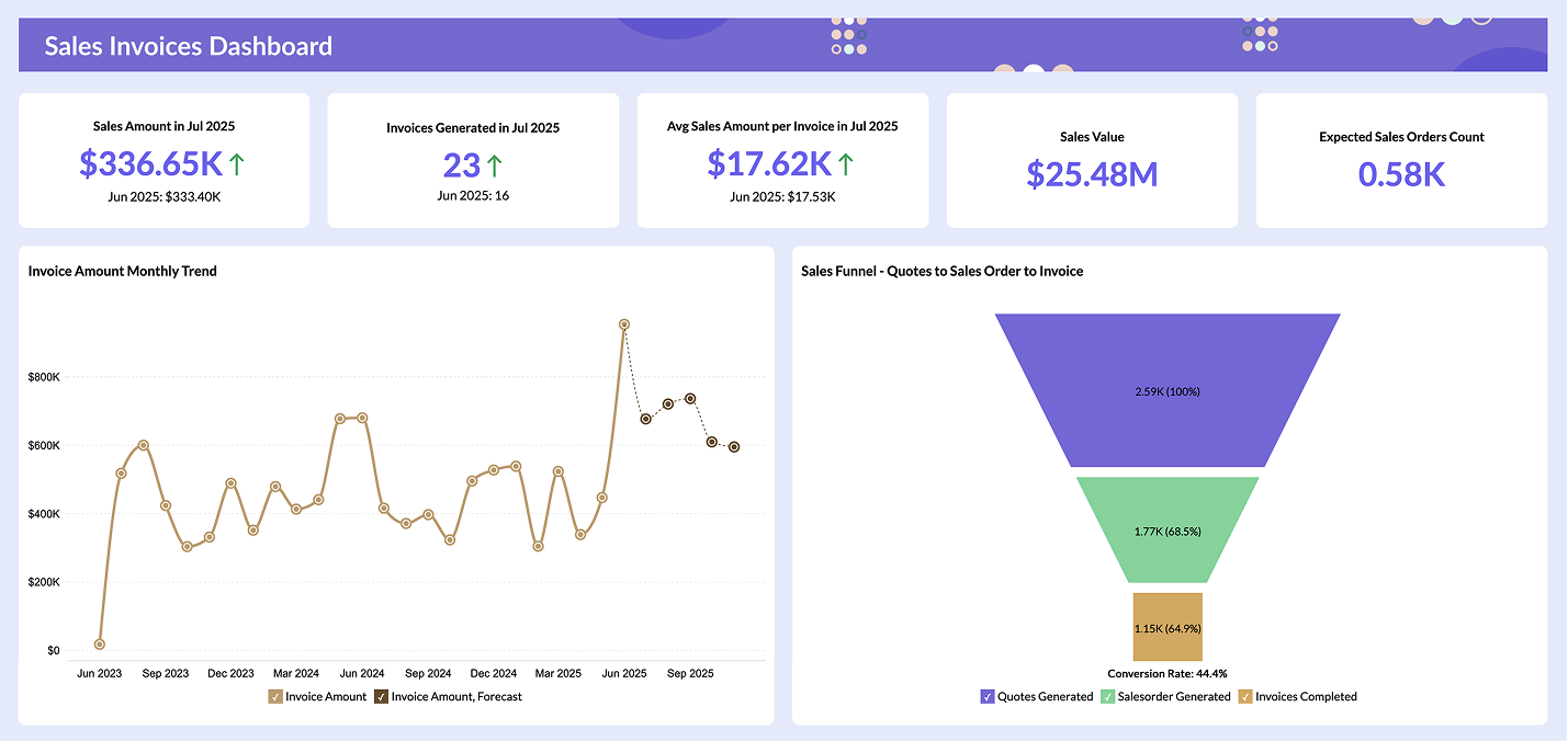
Here's a real-time dashboard we built using streaming data for IPL 2025:
IPL 2025 Real-time Dashboard
2. Live Connect for real-time database queries
Live Connect creates a direct, real-time connection to your databases and data lakes without importing or storing the data inside Zoho Analytics.Every time you open or interact with a report, Zoho Analytics generates queries on the fly and runs them on the source system so your charts always reflect up-to-the-minute values.
Because the data never leaves your database, Live Connect helps you maintain a single source of truth and stay compliant with internal security policies. Sensitive information remains in your own environment while Zoho Analytics uses secure protocols like SSL and SSH for data transmission.
Across both Stream Analytics and Live Connect, you still get the same easy, drag-and-drop experience for building visualizations. That means anyone on your team can explore real-time data, build dashboards, and monitor what matters most without needing deep technical expertise.
"We chose Zoho Analytics because it's live, up to date, and accurate. We are in a high volume business that fluctuates daily, so real-time insight is a must for us. Zoho Analytics gives us an instant snapshot of our sales performance and also helps us understand customer-preferred brands, market trends, seasonal trends, and sudden order spikes," says Oliver Hope, CFO of NetXL and Yay.com.
Take action with real-time data visualization
Real-time data visualization changes how fast you can respond to what's happening in your business right now.
The five steps we covered give you a clear path forward, from defining what you want to track to testing your dashboard before going live. Your results depend on picking the right tool with the features that actually matter: easy setup, fast data processing, and connections to your existing systems.
Zoho Analytics delivers exactly what you need for real-time visualization. Reports refresh every 30 seconds, direct connections to your data sources eliminate delays, and the drag-and-drop interface works even if you're not technical.
Here's what you should do next: Start with one critical metric you need to monitor live. Set up a simple real-time dashboard for that metric. Test it with your team. Then expand from there.
Frequently asked questions
What are the steps to visualize real-time data?
- Start by defining what you need to track, then identify your data sources. Decide whether you’ll stream events or query data directly. From there, choose the right visualization tool, build dashboards tailored to your metrics, and test everything before rolling it out.
How can you visualize data flows and transformations in real time?
- Use tools like Zoho Analytics that support real-time ETL (Extract, Transform, Load) pipelines or event-driven architectures. These platforms let you monitor how raw data moves, changes, and feeds into dashboards as it happens.
Which industries benefit most from real-time data visualization tools?
- Industries where timing is critical gain the most. Think finance, ecommerce, logistics, healthcare, telecom, and manufacturing. But any business that needs to react quickly can benefit from real-time insights.
What are the best real-time data visualization software?
- Top choices include Zoho Analytics, Tableau, and Power BI. Look for tools that offer live data connections, fast refresh rates, interactive dashboards, and scalability to match your needs.
What are the top challenges in implementing real-time data visualization?
- The main hurdles are integration with live data sources, ensuring low-latency performance, maintaining data accuracy, and picking the right tool that scales with your data. Poor infrastructure or manual data prep can also slow things down.
Can you use Zoho Analytics for visualizing real-time data?
- Yes. Zoho Analytics supports real-time visualization through Stream Analytics and Live Connect. You can stream event data or run direct queries on your databases.
Which visualization tool is best for real-time data tracking?
- It depends on your needs. Zoho Analytics suits most teams with its live streaming and direct database connections. Tableau works well for complex data environments, and Power BI is ideal for Microsoft-heavy setups.
How can data visualization enable faster access to better-integrated real-time information?
- By connecting directly to live data sources, visualization tools eliminate batch-load delays and manual exports. Your dashboards pull from the source as events happen, giving every team a single, continuously updated view.
How do real-time dashboards help teams see impact and take action instead of relying on guesswork?
- Real-time dashboards show what's happening now, not what happened yesterday. When metrics update as events unfold, teams can spot problems early, respond faster, and make decisions based on current data.
What are the different approaches to real-time data visualization?
- The two main approaches are streaming ingestion, where events are pushed into a pipeline as they happen, and live querying, where dashboards connect directly to operational databases. Many teams use both together.