- HOME
- BI & Analytics
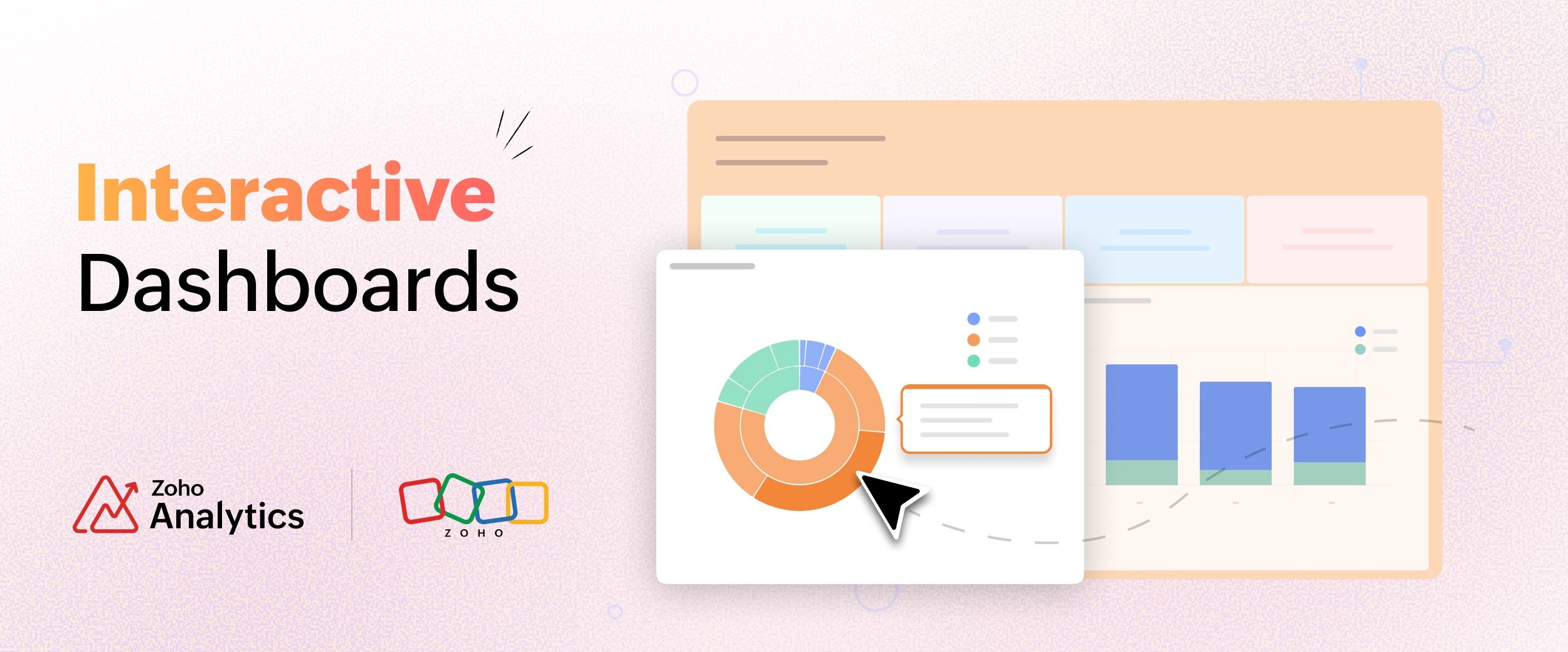
- Interactive Dashboards for Business Intelligence
Interactive Dashboards for Business Intelligence
- Last Updated : July 14, 2026
- 176 Views
- 12 Min Read
Business decisions need to be made at the right time, and decision makers should have the data and tools at their disposal to make those decisions. For example, a sales VP needs to know why a region is underperforming before the board call in two hours. A finance lead spots something odd in the cash flow and needs to trace it back before month-end closes. A support manager sees the backlog climbing and needs to know which queue to fix right now.
In most organizations, none of those questions get answered immediately. They get sent to an analyst, queued behind three other requests, and returned 48 hours later as a report. The people who needed the answer had to make the decision anyway, just without the data behind it.
The root problem is not a lack of data. Most organizations have more data than they know what to do with. The problem is access. The people with the business questions are not the same people who can get to the answers. Data lives in systems. Answers require analysts.
Interactive dashboards exist to close that gap. Instead of sending a question to someone who can query the data, the person with the question becomes the one doing the querying, by clicking, filtering, and drilling into a live dashboard.
What is an interactive dashboard?
An interactive dashboard is a data visualization dashboard that lets the person looking at it follow their own questions directly, by clicking, filtering, and drilling into the data, without asking anyone to build a new report. It is also known as a BI dashboard when it sits inside a business intelligence platform.
A lot of dashboards labeled interactive just have a filter dropdown or two on top of fixed charts. You can change the date range or the region, and that is where it ends.
A static dashboard answers only a fixed set of questions. You'll look at the dashboard and read the numbers, and if you have a follow-up question, you ask an analyst. A real interactive dashboard changes who can pursue a question at all. A manager who spots a dip can click straight into it and keep digging, without waiting for anyone. The question and the answer happen in one place, at one time, handled by one person.
Interactive data visualization is what makes this possible. Users click into charts, filter across panels, and follow a thread visually without knowing how the underlying data is structured. Good data visualization software handles the structure so the user can stay focused on the question.
Importance of interactive dashboards
Most companies already create and manage dashboards, but only a few have dashboards that people open on their own.
Even though 87% of organizations have given employees access to BI and analytics tools, only about 29% of employees actually use them, based on Gartner figures cited by IBM in late 2025.
In a static reporting setup, a business user notices something, asks an analyst, waits 48 hours for a report, then has three more questions. Repeat. The analysis is separated from the context, and the person with the business question never touches the data.
On the other hand, with an interactive dashboard, that whole loop happens in one sitting, by one person. The manager who noticed the dip clicks in and finds the cause without filing a request. That is why every serious dashboard software now competes on interactivity as much as on chart types.
Creating an interactive dashboard in 5 simple steps
Whether a dashboard gets used is mostly decided while you build it. These five steps help you build an interactive dashboard that people want to use regularly.
- Start with the questions: Write down the actual questions the people opening this dashboard ask in a normal week. A sales manager asks which reps are slipping. A finance lead asks what is overdue. Build around those questions. If you instead add every metric and filter, the people who do not already know what to ask will open it, feel lost, and close it.
- Connect your data sources: Pull from where the data actually lives, like a CRM, a finance system, a few spreadsheets, and an ad platform. Connect them into one dashboard so a single click can filter across all of them at once.
- Pick the right visualization for each question: A bar chart for comparison, a line for a trend, a KPI tile for a single headline number, a map for anything geographic. If you are still choosing a tool, compare the best data visualization tools on the range of chart types they support, since the newer data visualization types often answer questions a basic bar chart cannot.
- Wire up the interactions: Turn on cross-chart filtering so clicking one chart filters the rest. Enable drill-through, including on KPI widgets, so a number leads to the records behind it. Add drill actions so a user can act from inside a chart, updating a record or logging a task without leaving it.
Set the default view for each user: Scope the first load to the person opening it, so a regional manager sees their region and a rep sees their pipeline. Then hand it to someone who does not think about data for a living and watch them use it. If they get lost, the design is not done.
What are the key features of interactive dashboards?
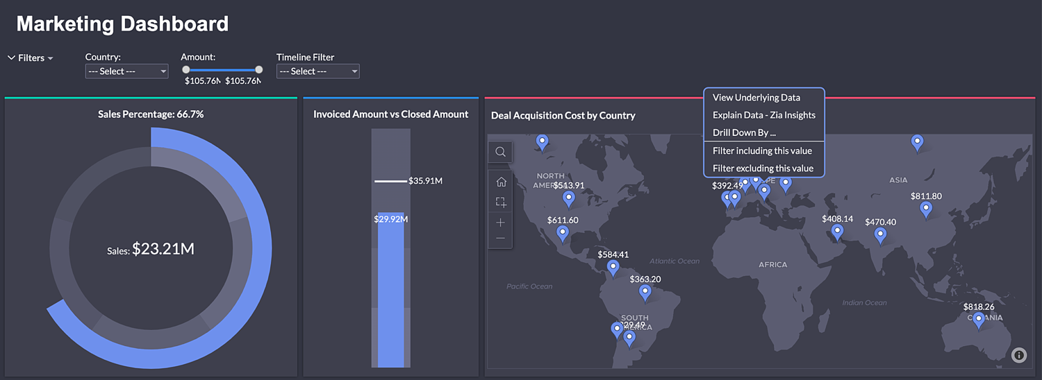
Cross-chart filtering
You click a data point in one chart to use it as a filter, and every other chart on the screen filters the same way. Click "Northeast" in a regional breakdown and your product mix, rep performance, and revenue trend all scope to "Northeast" at once, without a filter panel or dropdown.
Filters make you name what you want before you can see it. Cross-chart filtering lets you find it by clicking whatever looks off.
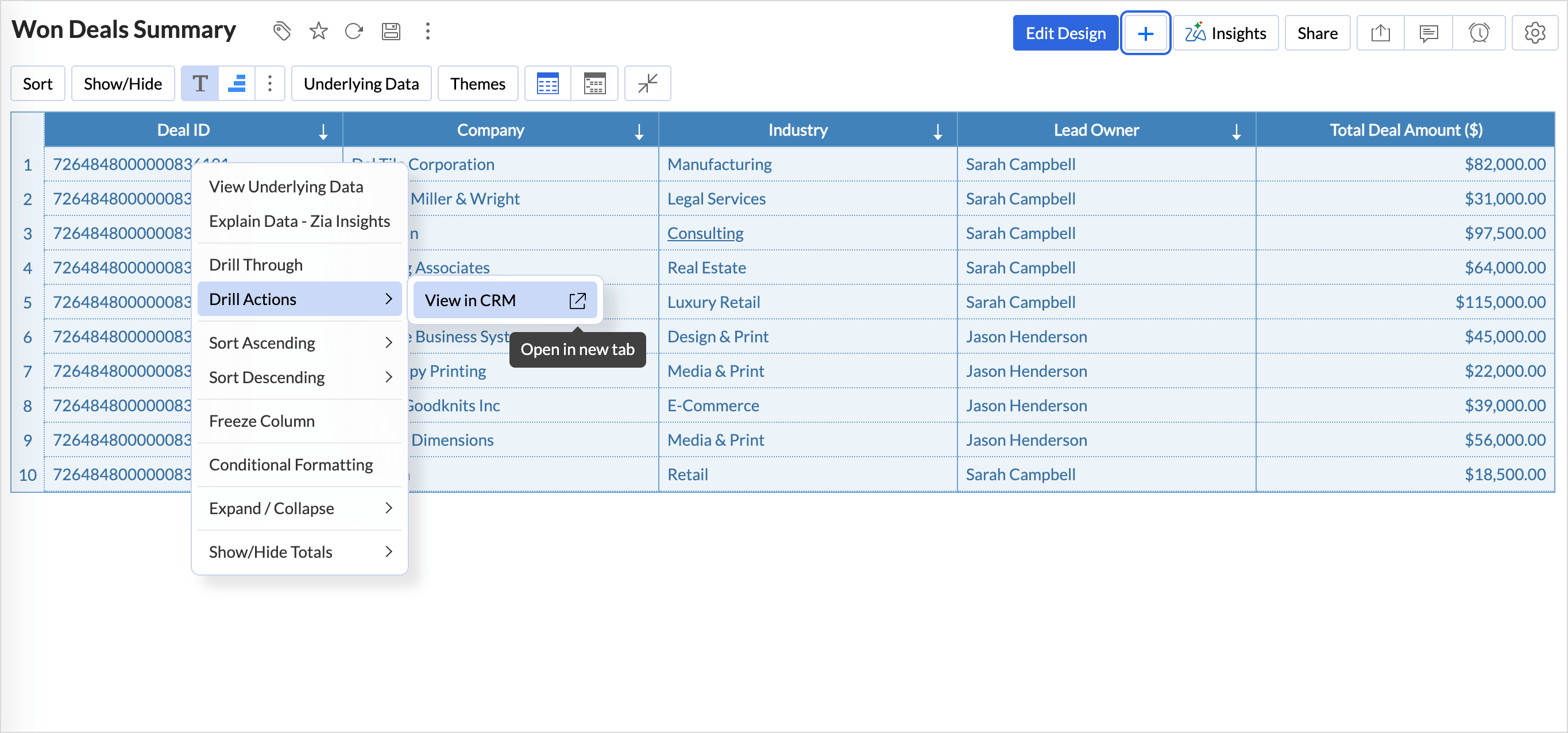
Drill-through on KPI widgets
Drill-through on standard charts is widely supported. Fewer tools support it on KPI widgets, the summary tiles showing a single number like total revenue, open tickets, or average deal size.
KPI widgets are mostly added at the top of dashboards, so a user reads those numbers first. When a number looks off, the instinct is to click it and find out why. If clicking does nothing, the user hits a dead end at the exact moment their curiosity was highest, and the export-to-Excel habit gets reinforced right there. Drill-through on KPIs takes a user from a headline number straight to the underlying records in one click, which is where the real investigation starts.
Contextual actions from charts
Instead of ending at "here is the data," the dashboard lets you take an action directly from a chart. Update a record, trigger a workflow, send a notification, or log a follow-up.
So the action happens in the same place you spotted the problem. You see a deal stalled in the pipeline, you update the stage and log a task from the same chart. You spot a support ticket that has gone unanswered too long, you assign it right there. The dashboard stops being a place to read numbers and becomes a place to act.
User-scoped filter inheritance
When a dashboard is shared with a user, the data they see can be scoped to their context automatically, based on the permissions they have been granted. A North region sales manager sees only North region data. A finance controller for one business unit sees only that unit's numbers.
This is different from row-level security, which restricts access. Filter inheritance applies the right view for each user when the dashboard loads, so the first thing they see is already relevant to them.
AI insights on dashboards
Better interactive dashboards include AI insights. At the chart level, clicking a report pulls up an analysis of that specific data: what the trend is, where the outlier sits, which segment is driving the number. At the dashboard level, the same capability should work across all the reports together and show patterns a user scanning charts one by one might not connect.
AI insights read a dashboard for the user and say what stands out in plain language: the trend, the outlier, the segment moving the number. Someone unsure how to read the data gets a starting point. For confident users, it speeds up the read and frees up attention for the decision that follows.
A diagnostic: Is your dashboard actually interactive?
These six questions will show you where business dashboards actually stand.
- What does your dashboard show when it first loads? If the answer is "all time, all regions, all products," it is not interactive. Open it on all time, all regions, all products, and a sales rep has to filter down to their own accounts before a single number means anything. A working dashboard loads already scoped to the person opening it.
- Can a non-technical user follow a question to its answer without help? Pick someone who does not think about data for a living. Give them a business question. Watch them use the dashboard without coaching. If they get lost or ask which filter to use, it is failing the people who make up most of your audience.
- When something looks wrong in one chart, can you find out why without leaving the dashboard? This is the drill-through test. Revenue is down 18% in one region. Can you get to the underlying transactions, or do you have to request a separate report? If it is a separate report, that anomaly sits unresolved until the analyst has bandwidth.
- Is it possible to filter the whole dashboard by clicking a data point in a report? The cross-filtering test. Click a segment, a region, a product. Does everything else update? If the other charts sit still, the clicks are not doing anything.
- How long does it take to go from "I noticed something" to "I understand what's behind it"? Time this honestly, for a question that needs investigation beyond the first chart. If the answer involves waiting for someone else, the dashboard is not doing its job.
- How many people opened the dashboard last week without being asked to? If people only open it before a meeting or when someone links them to it, it is a presentation tool, and presentation tools do not drive faster decisions.
Best interactive dashboard examples
Here is how the same set of features plays out for four different teams.
Sales pipeline dashboard: A sales manager opens their dashboard Monday morning. It loads showing their team's pipeline for the current quarter, already scoped to their region. They do not touch a filter. One rep's win rate is down from last month, so they click that rep's bar in the performance chart. The whole dashboard scopes to that rep: stage distribution, deal age, average deal size, activity log. The manager sees deals sitting in "proposal sent" for an average of 19 days, up from 8 last month. Clicking through to the actual deals, one has no activity logged in 12 days, another in 9, a third in 14. They know exactly what to raise in their one-on-one that afternoon. The total time took under five minutes. In a static setup, that same investigation is a two-day round trip, and by the time anyone knows what is happening with that rep's deals, two weeks have passed.
Marketing performance dashboard: A marketing lead sees blended cost per acquisition creeping up. They click the channel that looks responsible, and spend, conversions, and CPA across every campaign in that channel filter at once. The culprit is one campaign whose CPA doubled in a week. They drill into it, see the creative that stalled, and pause it from the same screen.
Finance and cash flow dashboard: A finance controller opens a dashboard scoped to their business unit. Accounts receivable is higher than usual, so they click the overdue bucket on the aging chart. The customer list, invoice detail, and days-outstanding all scope to overdue accounts. Two large invoices are driving most of the balance. They flag both for follow-up without leaving the dashboard.
Support operations dashboard: A support manager watches a backlog chart climb. They click the queue that is growing fastest, and ticket age, agent load, and resolution time scope to that queue. A handful of tickets have aged past the SLA. They reassign them from the same screen where they spotted the climb.
For more dashboards by team and use case, see these dashboard examples.
How Zoho Analytics supports interactive dashboards
The features discussed above are all available in Zoho Analytics. A few of them go further than the standard version, and those are worth calling out.
Cross-chart filtering works across multiple connected data sources. If your sales pipeline is in one system and your support data is in another, clicking a customer segment in one chart filters both.
Drill-through is available on KPI widgets, not only on standard charts. When a headline number looks wrong, users click through to the records behind it right away, instead of stalling at the tile.
Contextual drill actions let users update records, trigger workflows, and log tasks from inside a chart. Zia Insights works at both the report and dashboard level, and the insights can be pinned as the default view next to a report, so users see the plain-language read every time they open the dashboard.
User-scoped filter inheritance loads each person's dashboard showing the data relevant to their role and permissions, automatically. The platform connects to over 500 data sources and supports embedded analytics for teams building customer-facing dashboards into a product.
Synergy Resources, an ERP provider that runs its sales on Zoho CRM, shows what this looks like in practice. Before Zoho Analytics, their reporting ran on Crystal Reports and Excel, so the sales team waited on technical staff for every report, and their VP of Sales keyed metrics into spreadsheets by hand. Once they switched, non-technical staff started building and publishing their own dashboards, now shared with more than 90 people across the company. Customer analytics dashboards that used to take two days are done in minutes, the team saves around 48 hours a month, and their sales close rate went up 50%.
"Even non-technical resources were able to quickly develop and publish reports," says Alexander Campo, Customer Care and Sales Operations Manager at Synergy Resources, which freed their technical consultants for billable customer work. Read the full story.
Final thoughts
Start from the questions your users ask and work back to the data. Ship defaults that make the first view useful. Watch how often people open the dashboard.
Before you switch tools, check the design first. Go back to whose questions the dashboard was meant to answer, and rebuild the defaults around them.
When you create a dashboard in Zoho Analytics, you get the mechanics to do that from the start: cross-chart filtering across data sources, drill-through on KPI widgets, contextual actions, user-scoped views, and Zia Insights for your dashboard. The free trial gives you 15 days of full access and lets you connect your own data from day one. If you are a smaller team getting started, Zoho Analytics also offers a free data visualization software tier lets you build and share interactive dashboards at no cost.
Pick one dashboard your team that is less used, rebuild it around the questions they actually ask, and put it back in front of them. You will know within a week whether the redesign worked.
Build a Truly Interactive Dashboard Now
Commonly asked questions on interactive dashboards
1. What is the difference between an interactive dashboard and a static dashboard?
A static dashboard answers a fixed set of questions, and any follow-up needs a new report from an analyst. On the other hand, an interactive dashboard lets the user click, filter, and drill into the data to answer follow-up questions themselves, in real time.
2. What features should an interactive dashboard have?
Cross-chart filtering, drill-through on both charts and KPI tiles, contextual actions from inside a chart, user-scoped default views, and AI insights. The default view is the one to get right first, since it is what loads before anyone clicks.
3. How do you build an interactive dashboard?
Start with the questions your users actually ask, connect the relevant data sources, pick the right chart for each question, turn on the interactions like cross-filtering and drill-through, then scope the default view per user and test it with someone non-technical.
4. What are the benefits of interactive dashboards?
A business user can investigate and answer a question in minutes instead of waiting two days for an analyst's report. Companies that give staff self-service analytics report higher productivity and stronger revenue growth.
5. Can interactive dashboards work with multiple data sources?
Yes. A good interactive dashboard connects several sources at once, such as a CRM, a finance system, and ad platforms, and lets a single click filter across all of them. In Zoho Analytics, cross-chart filtering works across several connected sources at once.
Helpful resources:
 Pradeep V
Pradeep is a product marketer at Zoho Analytics with a deep passion for data and analytics. With over eight years of experience, he has authored insightful content across diverse domains, including BI, data analytics, and more. His hands-on expertise in building dashboards for marketing, sales, and major sporting events like IPL and FIFA adds a data-driven perspective to his writing. He has also contributed guest blogs on LinkedIn, sharing his knowledge with a broader audience. Outside of work, he enjoys reading and exploring new ideas in the marketing world.