- HOME
- BI & Analytics
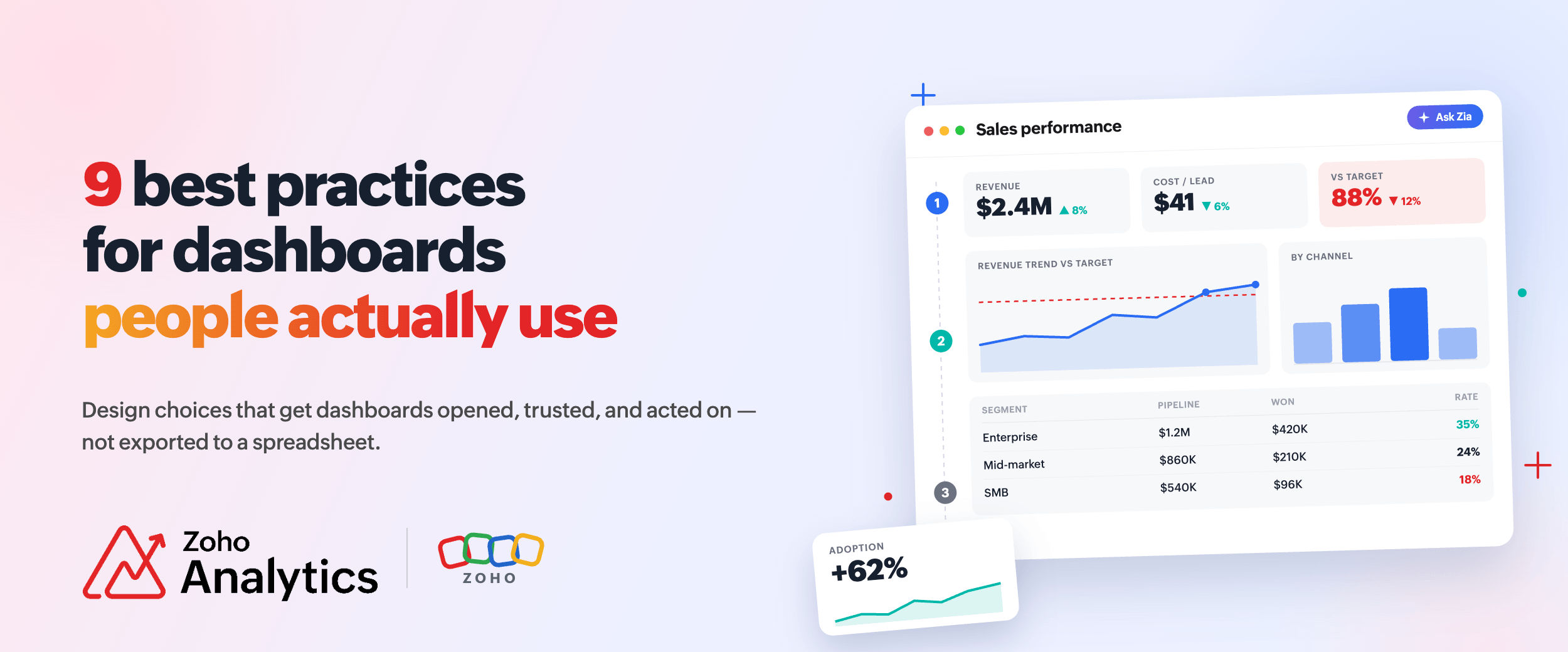
- Dashboard Design: 9 Best Practice To Improve Adoption
Dashboard Design: 9 Best Practice To Improve Adoption
- Last Updated : June 18, 2026
- 103 Views
- 9 Min Read
When a dashboard takes 45 seconds to answer one question, people stop using it. They ask the analyst instead. Or they export to Excel and build the answer themselves.
Forrester analyst Boris Evelson noted that self-service BI adoption among non-IT professionals has plateaued at around 20% and stayed there for the better part of a decade, regardless of how many "user-friendly" features vendors added. The dashboards are live. The data is connected. The tool just is not being used.
Here are 9 key best practices or rules you should be aware of before designing a dashboard. If you are evaluating or already using dashboard software , every principle here applies directly to what you will do inside the tool.
- Define the purpose before you build anything
- Match the dashboard type to the audience
- Use layout to guide the eye
- Let size, color, and contrast do the work
- Pick charts based on the question
- Every metric needs context to mean anything
- Build interactivity that lets users answer their own questions
- Alerts bring the data to users, not the other way around
- Dashboards go stale. Build in a review cycle.
1. Define the purpose before you build anything
The most common mistake in dashboard design happens before anyone opens a builder. A team decides they need to create a dashboard without agreeing on what questions it should answer.
Without a clear purpose, a dashboard becomes a collection of charts someone thought might be useful. Users open it, scan around, do not find what they came for, and close it.
Start with the questions the dashboard needs to answer. What should someone know within 30 seconds of opening it? What decision does each metric support? If a number is interesting but does not change what someone does, cut it. Who is the primary audience, and how often will they use it? A dashboard for a weekly executive review has different requirements than one checked every morning by an operations manager.
Example: A marketing team built a campaign dashboard tracking 22 metrics across paid, organic, and event channels. Nobody used it consistently. Talking to the actual users revealed the problem: marketing managers only needed cost per lead by channel, lead volume against target, and which campaigns were running behind. They rebuilt around those questions, and the usage went up.
2. Match the dashboard type to the audience
A dashboard for a CFO and one for a data analyst serve completely different purposes. They should look completely different too.
There are three main dashboard types.
Strategic dashboards: Built for weekly executive reviews
Strategic dashboards are for executives and senior leadership, checked weekly or monthly. The goal is immediate clarity on five to seven KPIs, with trend context for each. If a metric needs more than a label to explain it, it probably does not belong here. A useful test: could someone make a resourcing decision based only on this view?
Operational dashboards: Designed for daily problem-spotting
Operational dashboards are for managers and team leads, checked daily or more. Data is often near real-time. The priority is speed. How fast can someone spot a problem and act? Threshold alerts matter most here. If a support queue is rising or an SLA is slipping, the dashboard should show it without the user having to hunt.

Analytical dashboards: Built for depth
Analytical dashboards are for analysts. The expectation is depth. Users filter, drill down, and slice by dimension. These can be denser because the audience knows how to navigate density. The mistake here is over-designing for visual polish. Analysts care more about flexibility and data completeness than aesthetics.
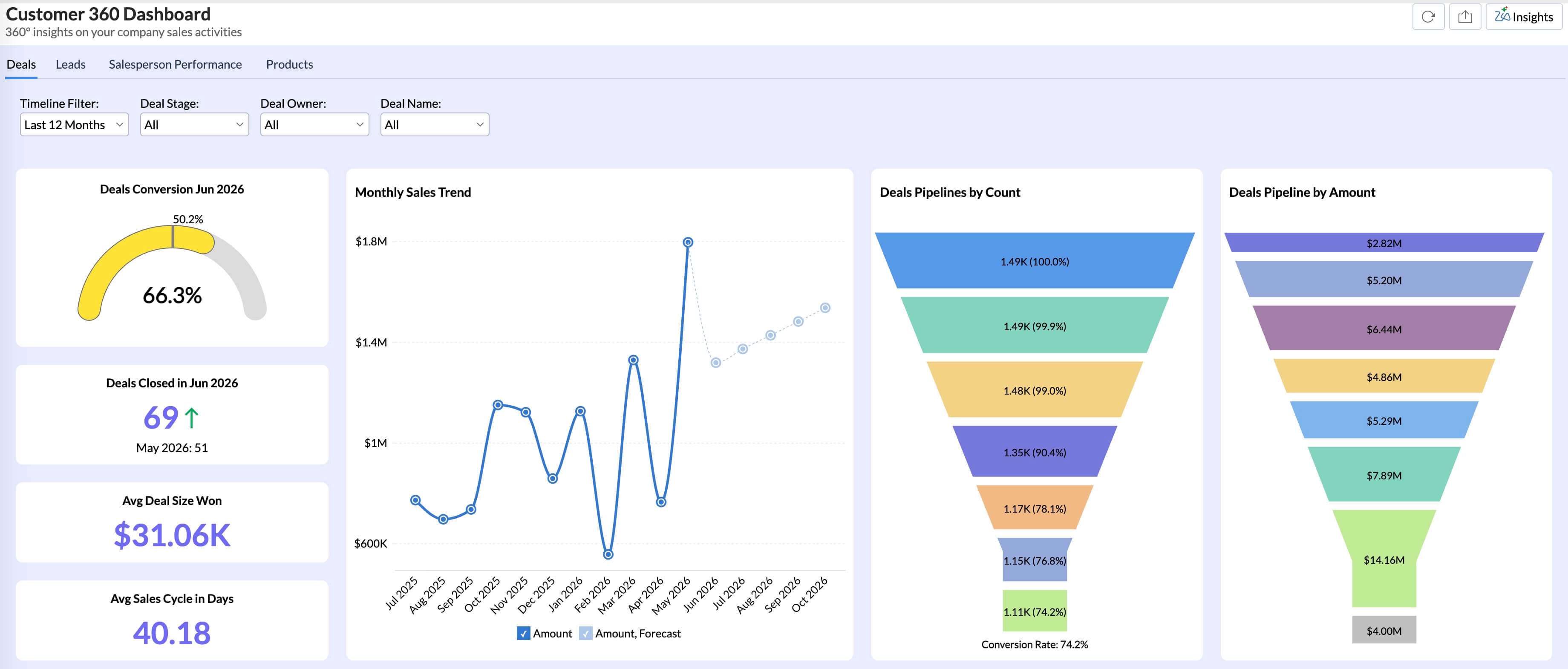
Example: A logistics company had one "Operations Dashboard" serving both their COO and their warehouse managers. The COO checked it for a daily read on delivery performance and fleet status. Warehouse managers needed live data on queue depth, dock assignments, and any open exceptions. The refresh rates they each needed were also different. After splitting into two dashboards, both audiences actually used theirs.
If you are building business dashboards for more than one audience type, build separate dashboards. One view trying to serve a CFO and an analyst at the same time will not serve either well.
3. Use layout to guide the eye
Visual hierarchy determines whether someone reads a dashboard or closes it in three seconds. When every widget looks the same, nothing stands out and the eye has no path to follow.
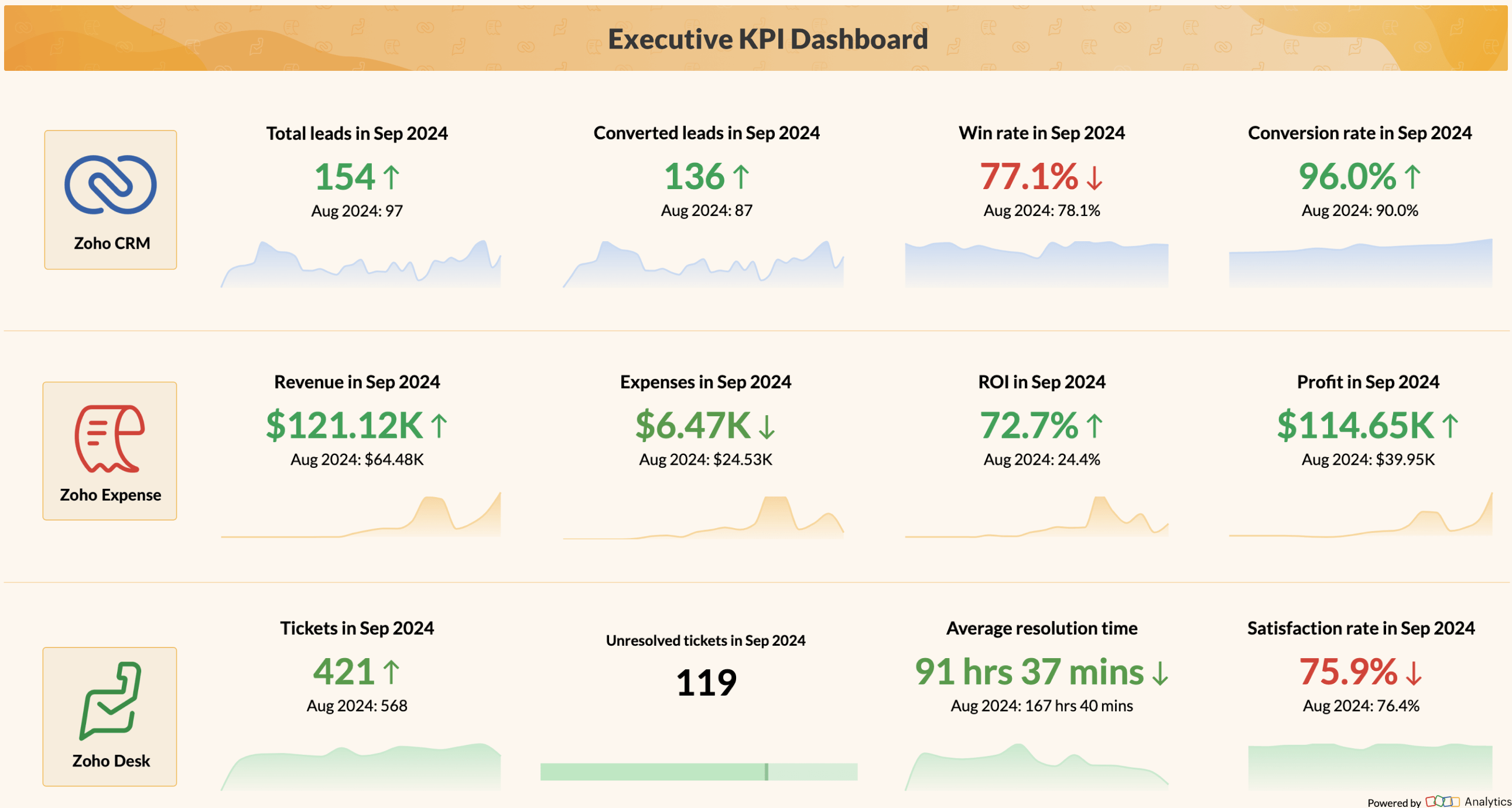
Dividing the screen into three horizontal zones is a layout that consistently works across dashboard types.
- Zone 1 (top): The headline. Two to four KPIs the user needs right away. Larger font, higher contrast, prominent placement. A first-time viewer should be able to read Zone 1 in five seconds and know the overall status.
- Zone 2 (middle): The context. Trend charts, period comparisons, target vs. actual. These explain Zone 1. If revenue is down 12%, Zone 2 shows whether it has been declining for three months or just dropped this week.
- Zone 3 (bottom): The detail. Segment breakdowns, tables, deep-dive data. Users who need to investigate come here. Users who only needed the headline never scroll this far.
This gives the same dashboard three levels of depth for three different types of users within one layout.
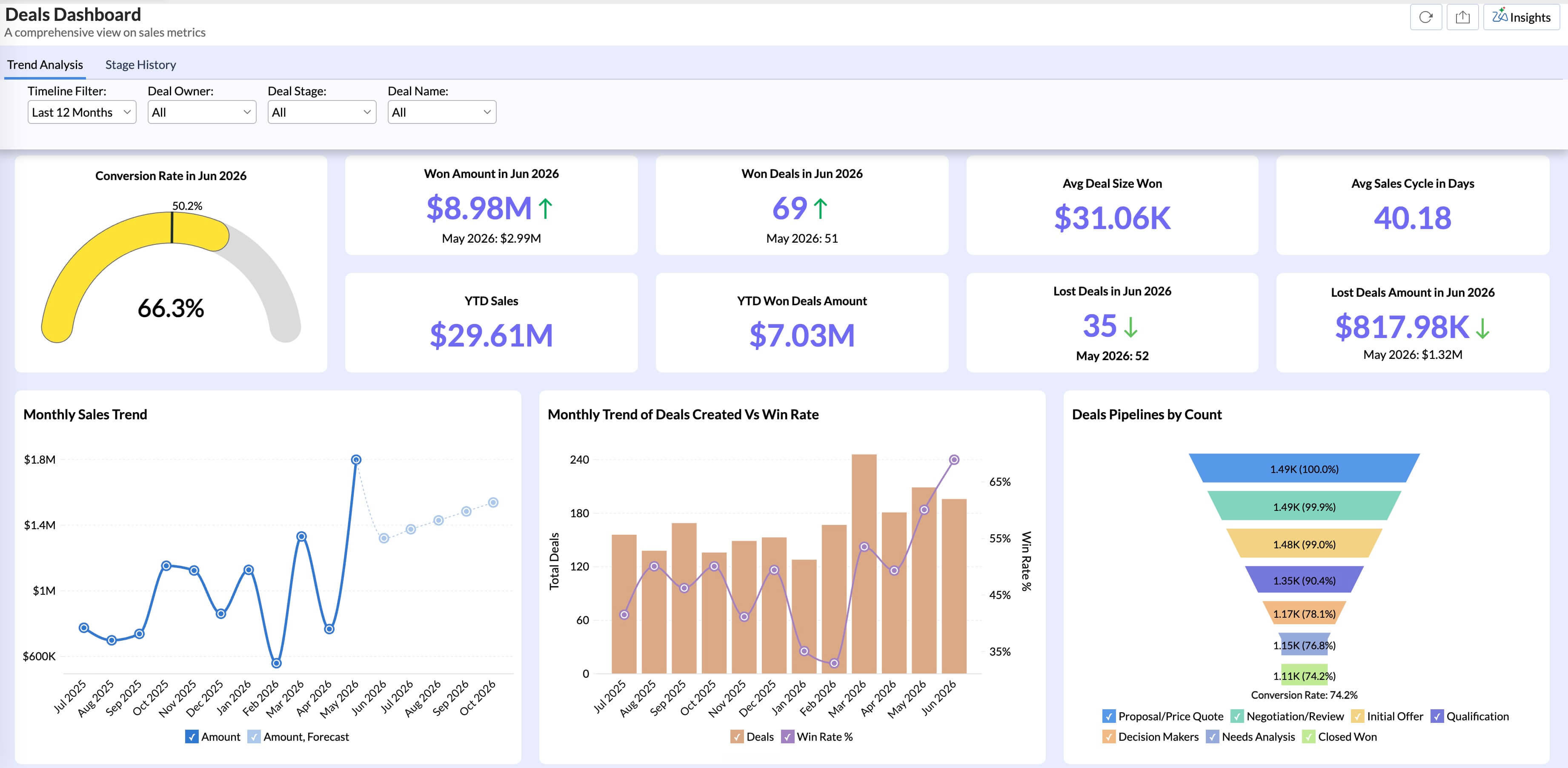
Example: A finance team rebuilt their dashboard using this model. Zone 1 had gross margin at the top, with revenue vs. budget and cash position below it. Zone 2 had the weekly revenue trend and budget pacing by department. Zone 3 had the full transaction breakdown by cost center. The finance director got what they needed at the top. The accounting team worked from the bottom. Nobody complained about the dashboard having too much or too little.
A useful check before sharing: find someone who has not seen the dashboard, give them five seconds with it, then ask what the most important metric was. Hesitation means Zone 1 needs work. Either the wrong metrics are there or there are too many of them.
4. Let size, color, and contrast do the work
You should not need to label the most important metric on a dashboard. Its size and contrast should already communicate that it matters.
Color does the most damage when overused. Reserve one accent color for the most important number. Use red and green only for directional signals: red for below target, green for above. Do not use brand colors on dashboards if your brand is red or orange. Pick a different signal color.
High-contrast primary metrics against lower-contrast supporting elements create a natural reading path without instructions. Avoid gradient fills on charts and 3D effects. They add visual noise without adding information, and 3D charts distort proportion.
Example: An e-commerce team created their dashboard with one accent color (dark blue) for headline KPIs and muted gray for secondary metrics. Standard red and green for threshold coloring.
5. Pick charts based on the question
Teams often pick a chart because it looks attractive, then work backwards to justify it. The question should come first. A line chart for trends over time. A bar chart for category comparison. A stacked bar or a table for part-to-whole. A histogram for distribution. If you start from the question, the chart choice is usually obvious.
KPI cards often outperform charts on executive dashboards. A card showing $2.4M with a sparkline and "up 8% vs last month" communicates faster than a full line chart would.
Scatter plots belong when correlation between two variables is the point. Tables belong when the exact number matters as much as the pattern. Pie charts with more than four segments, donut charts in most cases, dual-axis charts unless the axis relationship is the main message, and anything 3D: skip all of these.
We have a dedicated post that goes deep on which chart types work for which situations: see the Zoho Analytics chart selection guide.
Example: A SaaS company had a churn dashboard with a pie chart showing churn by customer segment, seven slices. Nobody could tell which segment was highest without hovering. They switched to a horizontal bar chart sorted by churn rate. Same data, readable in a glance.
6. Every metric needs context to mean anything
A number without context is just a number.
$2.4M in revenue means nothing unless the user knows the target was $3M, or that last year at this point it was $2.1M, or that the weekly trend has been declining for six weeks.
Add a target line to every trend chart. Add period-over-period comparison as a default. Use threshold coloring: green above target, amber within 10%, red below. Define what "bad" looks like so users do not have to guess.
Example: A sales dashboard showed daily revenue as a single number. Sales reps had no way to tell if 85 deals was a good day or a slow one. After adding a daily target line and a "last 30-day average" marker to the trend chart, reps could see at a glance where they stood. The sales manager stopped getting daily "how are we doing?" messages.
7. Build interactivity that lets users answer their own questions
A dashboard with just filter dropdowns is still mostly a static view. The user applies a filter, waits for the charts to update, and repeats. It works, but it is slow, and it requires knowing exactly what to filter for before seeing the result.
When users can click into the data directly and get answers without running a separate report, they stop exporting to Excel. You can use these three features to build truly interactive dashboards .
Cross-chart filtering: One click updates everything
A dropdown requires the user to already know what they want. The more useful pattern: clicking any element in a chart, a product name, a region, filters every other chart on the dashboard. One click, everything updates without any manual configuration.
Drill-down navigation: From KPI card to raw records
Design the drill path to start from the KPI card at the top to all the way. A number that looks unusual should be clickable, and one click should take the user to the records behind it.
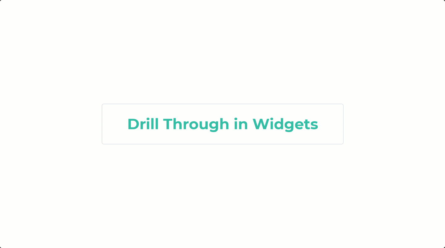
Role-based defaults: Load the right view for every user
A dashboard that loads showing all data for all time and all regions asks the user to configure it before anything is useful. When it loads already scoped to the user's context, a regional manager sees their region, a finance lead sees their business unit, and nobody has to touch a filter to get started.
Example: A retail company's regional managers had to apply three separate filters manually to get region-level data. After rebuilding with cross-chart filtering and role-based defaults, managers reported that they could answer their weekly review questions in about two minutes instead of the fifteen-plus it used to take.
8. Alerts bring the data to users, not the other way around
Many dashboards run on a pull model. What is it? Users have to remember to check. This works fine until something goes wrong, which is exactly when consistent monitoring matters most.
Alerts totally flip that. Instead of users visiting the dashboard when they remember to, the dashboard notifies them when something crosses a threshold.
Set alerts for the things that matter: support queue above 200, daily revenue dropping 15% below plan, a KPI outside its normal range for three consecutive days. Users do not need to remember to check. The data finds them when it matters.

Example: An e-commerce team set a threshold alert for cart abandonment rate. It jumped eight points overnight. At 7 AM the merchandising team got the alert, traced it to a broken discount code on the checkout page, and pushed a fix before the morning traffic peak. Without that alert, the problem would have sat unnoticed until the weekly review two days later.
9. Dashboards go stale. Build in a review cycle.
A dashboard that was accurate at launch is not guaranteed to be accurate now.
KPIs shift. A metric that tracked the right thing during a growth push does not automatically track the right thing once the priority changes to retention. A dashboard built for a feature that was later deprecated keeps running. People open it, see numbers that do not connect to anything current, and quietly stop using it. There is no error in the tool. Usage just drops.
A quarterly review is the practical fix. For any dashboard in regular use, go through five questions: Is every metric tied to a current business question? Does each metric have a named owner who can vouch for the definition and data quality? Are the threshold values still calibrated to current targets? Are any charts duplicating data from another dashboard with slightly different numbers? When was this dashboard last reviewed against the problem it was built to solve?
Example: A B2B software company had 14 dashboards in their BI tool. A quarterly audit found that six had not been opened in 90 days, two had metrics tied to deprecated products, and three duplicated each other with slightly different numbers. They consolidated to seven dashboards with clear owners and a review schedule. Dashboard usage across the company went up, because people trusted what they were seeing.
How Zoho Analytics handles this in practice
Zoho Analytics is one of the best dashboard tools for teams that want to apply these principles without needing engineering resources. Connect your first data source, use one of the prebuilt dashboards as a starting point, and apply the 3-zone layout model as you customize it. Run the 5-second test before you share it with anyone.
Start your 15-day free trial of Zoho Analytics and build your first dashboard today.
No credit card required.
 Pradeep V
Pradeep is a product marketer at Zoho Analytics with a deep passion for data and analytics. With over eight years of experience, he has authored insightful content across diverse domains, including BI, data analytics, and more. His hands-on expertise in building dashboards for marketing, sales, and major sporting events like IPL and FIFA adds a data-driven perspective to his writing. He has also contributed guest blogs on LinkedIn, sharing his knowledge with a broader audience. Outside of work, he enjoys reading and exploring new ideas in the marketing world.