- HOME
- Website Building
- FAQ Pages
- FAQ Examples: What a Great FAQ Page Looks Like
FAQ Examples: What a Great FAQ Page Looks Like
- 6 Mins Read
- Posted on January 5, 2020
- Last Updated on October 8, 2024
- By Mason
Your FAQ page will never be the most exciting part of your website (and if it is, you might have bigger problems). However, it remains a crucial point of communication with your site’s visitors. If someone is looking at your FAQ page, they’re probably doing one of two things:
- They’re interested in what you have to offer, but they’re not sold yet
- They’re looking for customer support following a purchase
In other words, someone looking at your FAQs is an opportunity to answer support questions and convert visitors to buyers. A good FAQ page can help you qualify leads, convert leads to customers, create a positive impression of your brand with new customers, and maintain loyalty with existing customers.
It might be hard to imagine how a humble FAQ page could do all of that. That’s why we’ve created a list of FAQ examples to show you exactly what to do:
Owl
Owl Optics sells inexpensive-yet-stylish glasses and lenses out of Germany. Since they’re a boutique operation, a big part of their strategy involves having a quirky and unique brand voice. This choice is reflected in clever and unconventional design choices throughout their site, including on their FAQ page:
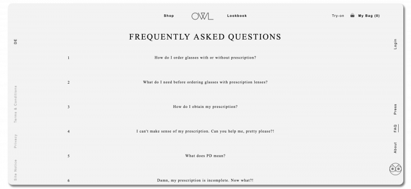
Why makes Owl’s FAQ page a good example?
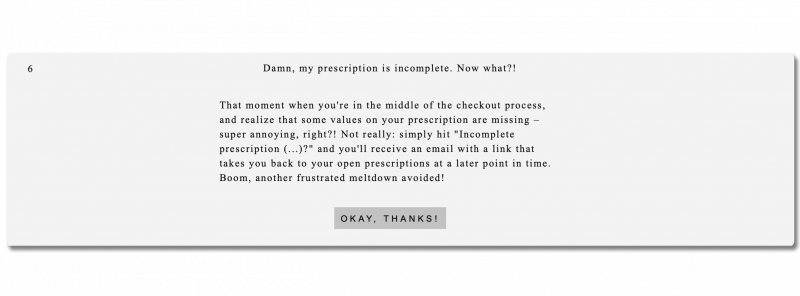
They maintain a distinctive brand voice. Owl shows their quirky persona in both questions and answers (“Damn, my prescription is incomplete. Now what?!”). This distinctive copy makes them relatable and memorable. Their target customer will browse several stores before deciding where to buy, so memorable and well-written FAQ copy may be the thing that sways them to buying from Owl.
Many FAQs are purely functional, using bare-bones and matter-of-fact copy. That’s why Owl choosing to inject levity and silliness into their FAQ makes their voice more visible than elsewhere. It’s a calculated risk and it isn’t necessarily a good fit for all businesses, but can pay off when executed well.
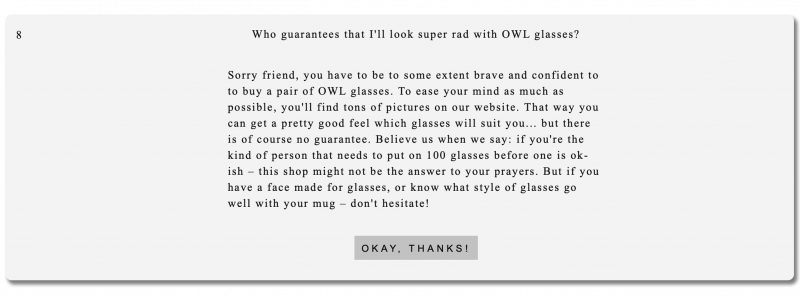
They address the difficult questions. One of the main concerns of people shopping for glasses online is choosing a pair that looks good on their face. Many companies address this by offering try-on kits or free return shipping. However, Owl doesn’t, putting them outside the industry norm.
Some companies try to conceal this kind of shortcoming and hope that potential customers won’t notice. Owl chooses to addresses the issue head-on. They don’t have a satisfaction guarantee, but that’s why you have to be “brave and confident to buy a pair of OWL glasses.”
They flip this difficult question on its head by reinforcing the narrative around who their customers are, and how they want their products to make you feel. By getting out in front of a potentially negative question, they can reframe the issue and demonstrate the boldness inherent to their brand.
Nixon
Nixon is an ecommerce company focused on selling unique watches, along with clothing, bags, and other accessories. Their watches range from fashion-focused, to specialized sports utility pieces, to custom designs. The sheer variety of their product offerings means they need to change their FAQ approach to address several different visitor personas without being overwhelming.
How does Nixon prioritize UX with their FAQs?
They provide product-specific FAQ sections. Nixon maintains a general FAQ page with their most common questions for cross-product topics like warranties and order support, along with top-level questions about watches and clothes.
However, they also have specific FAQs on some of their individual product pages. This lets them address questions relating to individual products, without overloading their main FAQ page with information that won’t apply to a majority of their visitors. In some cases – namely, for their smartwatch – they link directly to a product-specific FAQ page.
Product-specific FAQs are an especially good choice for businesses like Nixon, who sell products that may have a lot of unique, highly technical use-cases.
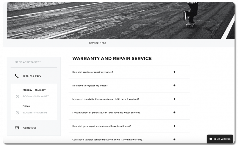
They offer multiple contact options. On Nixon’s FAQ page, they provide phone, email, and live chat options for getting in touch with support. Ideally, an FAQ page should act as a filter so that people don’t overload customer support with easily answerable questions. Providing a variety of contact options on the FAQ page ensures that visitors don’t get frustrated if they don’t find the answer they’re looking for. They allow customers to reach out in the manner that’s most convenient for them.
Related reading: Creating Support Pages that Support Your Sales
Netflix
Everyone knows Netflix. They most likely won’t be having any problems explaining what they do or how their service works. For the vast majority of visitors, the only reason you would even interact with Netflix outside of browsing and streaming would be for technical support and account management issues. So, Netflix has chosen to structure their FAQ page as a “Help Center”, focused primarily on customer support. This is an approach that works well for online services who want to lighten the load of troubleshooting on their support staff. (If you’re looking to adopt a similar approach, Zoho Desk can help.)
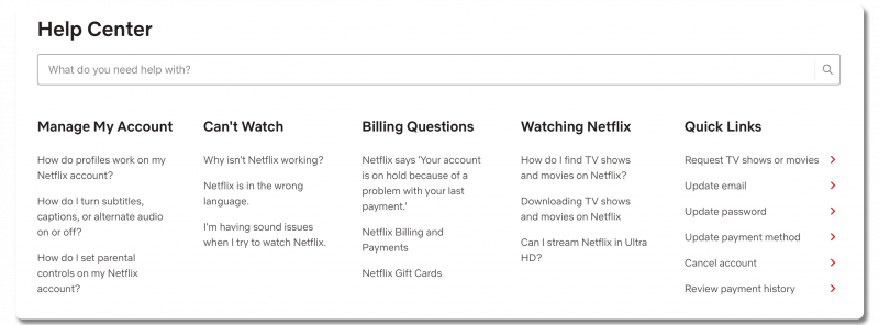
Netflix’s FAQ page is a great example of helping customers find what they need:
They have a well-implemented information hierarchy. Netflix shows thoughtfulness in how they’ve organized the questions in their Help Center. Rather than building a boilerplate linear scroll FAQ, Netflix has made their flow more accessible by segmenting questions into categories based on what kind of help their users need: account management, tech support, billing, and streaming. Within each category, questions link to separate help pages, which address general issues, followed by a set of more granular questions if their specific issue hasn’t been solved yet. This approach establishes an information hierarchy, which works like a funnel to direct users where they need to go, while maintaining a clean, uncluttered interface.
Related reading: How to Create an Effective Knowledge Base
They offer versatile search functionality. Another convenient feature of the Help Center is the search bar, which serves as a shortcut to get directly to more specific answers. If a user already knows exactly what they’re looking for, they can just type it in here, rather than navigating through the preset question flow. Users can also copy error codes into the search bar to reach the solution page for their problem immediately.
Boundary
Boundary sells durable modular backpacks designed for niche recreational activities, such as mountain biking and urban photography. Since Boundary sells a specialty product, it’s important to address technical questions upfront. That way, their customers can choose the version of the product that meets their specific needs.
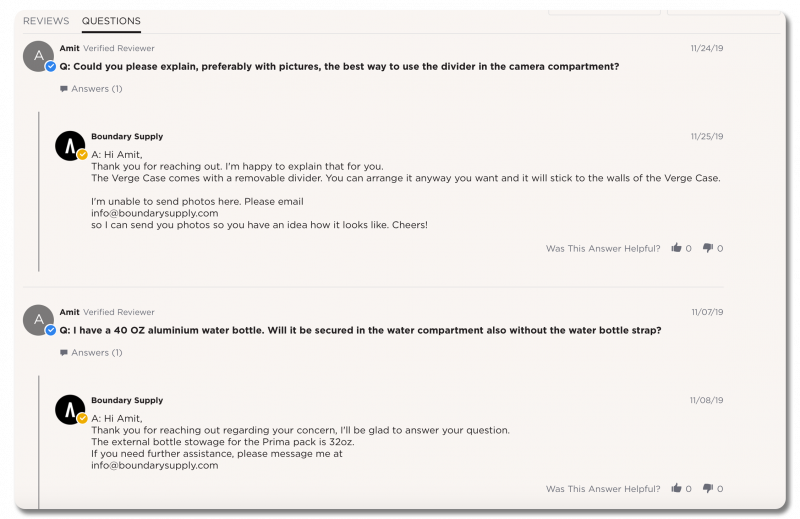
How does Boundary’s FAQ page meet the needs of their niche customers?
They have Q&As on their product pages. In addition to having a primary FAQ page, there’s a live product Q&A on each product page in their store. Their product experts use this to publicly respond to any technical questions that haven’t been covered in the product details and description.
This allows Boundary to address a common challenge, especially with niche products: what are the customer questions they haven’t anticipated? Sometimes, your customers have needs you just aren’t aware of. This solution gives a voice to those concerns. And in pushing responses live, Boundary also demonstrates their customer support team’s knowledge and reduces their future support load.
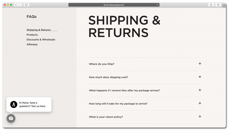
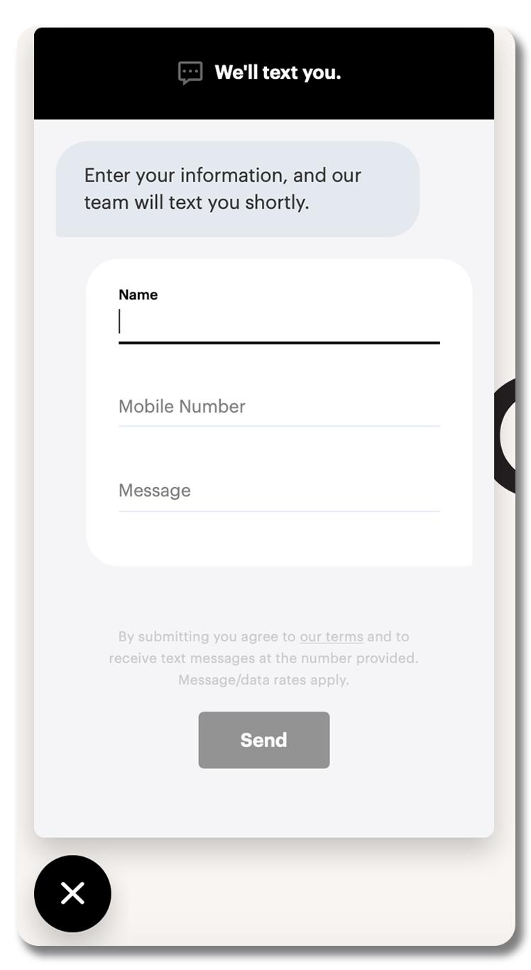
They offer SMS support. Boundary supplements their main FAQ page with a way to get in touch via text. In an online landscape where in-browser chat support has become the norm, live SMS chat does something new. For one thing, a visitor can now leave the site without fear of ending a conversation.
It also makes it as easy as possible to get in touch. Compared to an email or phone call, sending a text takes minimal effort. If a question occurs to a potential customer after they’ve left your site, they have your number in their phone. Remember: you should always be thinking about the user experience of your FAQ pages.
Related reading: 9 Ecommerce UX Best Practices in Action (Case Study)
At the same time, if you respond to a question via email, the recipient may not see it for hours or even days, depending on how often they check their email. But if you send them a text, they’ll see it much faster – and be ready to buy that much quicker.
Always focus on your audience
We hope you’ve picked up some new ideas for your FAQ page. While there’s no one-size-fits-all approach, it’s important to consider the different ways you can address your audience’s needs. After all, most of your website is focused on building interest in your products or services. On the other hand, your FAQ page is an opportunity to think about your customers’ concerns and anxieties, and how you can nip them in the bud.
Want to learn more? Check out our guide to building a great FAQ page. You can read all about using your FAQs to improve user experience, increase conversions, and more.