- HOME
- Website Building
- Testimonials
- Using Testimonials to Increase Conversions
Using Testimonials to Increase Conversions
- 7 Mins Read
- Posted on April 14, 2018
- Last Updated on October 8, 2024
- By Lauren
Your testimonials are collected, edited, and finally ready to be published. Now’s the most important step: putting them in front of your prospects’ eyes on your website so those conversions can start happening.

Of course, you should keep a dedicated “testimonial file” on your computer so that you can handily draw from it whenever you need to. You’ll be using your testimonials on just about everything: social media accounts, social media marketing campaigns, online search directories, marketing promotions, blog posts, email campaigns—wherever you can imagine them, really. There are few places we can think of that are not ideal for dropping a good testimonial in… but since we’re focusing on your website now, we’ve got a few recommendations to make about placement.
Create a dedicated testimonials page
A dedicated testimonials page is a veritable conversion goldmine for those prospects who demand a lot of social proof before they make their decision. A dedicated page works particularly well for products or services that require a lot of investment—whether time or money—on the prospect’s part. The more convincing your prospects will need, the more testimonials you should have on hand for them.
A dedicated testimonials page doesn’t need to be fancy. The words themselves will be the most important element on the page, after all. Nonetheless, from a UX perspective, you should consider the following:
- Use white space to clearly separate your testimonials from each other
- Use design to draw your visitors’ eyes toward your most stellar testimonials
- Include clients’ Gravatars, names, and information about their position and company alongside each testimonial
- Strive for visual variety: featured testimonials toward the top of your page, video testimonials, text-based testimonials with the company logo and quote, excerpts from case studies with a link to “read more,” and so on
- If you’re a business that caters to different verticals, or a range of industries, or is both B2B and B2C, include a search or filter feature that allows visitors to discover the testimonials that resonate most with them
Pro tip: If your work is regional and you have enough testimonials to warrant a filtering feature, consider filtering your reviews by region. Not only will this help your visitors self-select; it’ll also improve your standing in search results. For example, if you have a dedicated page for “San Diego testimonials,” you’ll be more likely to rank for a query for your offering “in San Diego.”
ChowNow’s testimonials page skillfully employs many of these techniques:

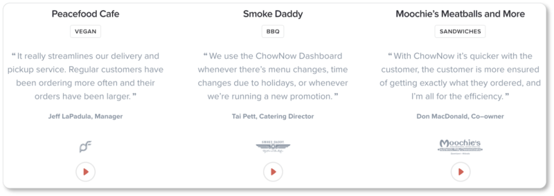
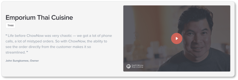
Notice the visual variety on ChowNow’s testimonials page. Some testimonials are displayed alongside video stills, while others are displayed as a simple text excerpt next to the restaurant’s logo. In addition, ChowNow features one testimonial above the fold of their page. The excerpt functions as the page headline, and the image behind the headline authenticates the copy. This presentation ensures that ChowNow’s site visitors don’t experience the boredom of visual repetition.
Notice, too, these two other important elements on their testimonials page: 1) ChowNow’s contact information on the top left corner of the page; and 2) The CTA to “Request a Demo” on the top right corner of the page. (They also smartly offer a live-chat option on their page, though we didn’t show that here).
Your testimonials page shouldn’t look like a standalone page. It should be part of the brilliantly interlinked structure of your website as a whole. Link from your testimonials page to your product pages, your CTA landing pages, and so on. Remember, the testimonial has a single function: to draw your prospects into your sales funnel. So once you’ve got them in front of your testimonial content, give them a clear next step to take.
Insert testimonials at friction points
Even if you create a dedicated page for your business testimonials, you shouldn’t limit them to that page.
In the first place, many prospects won’t go looking for your testimonials page, especially if the investment you’re asking them to make is on the smaller side. In the second place, testimonials are so powerful that a single good recommendation can mean a conversion, no matter what page of your site a prospect happens to be on.
So give them social proof even before they realize they want it—whatever page they happen to be on on your website. Think of it as staying one step ahead of your prospect… or of making their mouths water before they even realize they’re hungry.
But also know that there are very particular places on those pages that your testimonials should go.
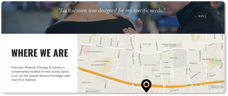
For example, Precision Physical Therapy incorporates a few short testimonials on their homepage…
… but they have another placed squarely on their Contact Us page:
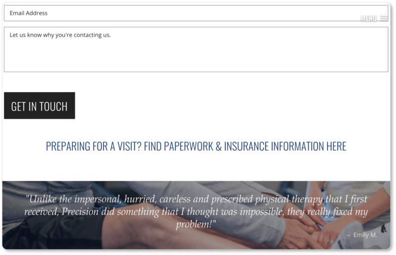
Any lingering doubts a prospect may have while hovering above that “Get in Touch” CTA might be dispelled when they read this very well-positioned testimonial. That’s one more inquiry for Precision Physical Therapy, because they knew to place their testimonial at a friction point.
A friction point is just what it sounds like: a place at which your prospect is likely to encounter resistance to conversion. Visitors will experience friction on your pricing page when they start doing the mental math and adding up the costs. The same is true when they get ready to click that CTA to get in touch or request a demo, simply because those are decisive moments. Your checkout page is also a major friction point, because people instinctively don’t like spending money, and closing a browser tab is sometimes easier than entering a 16-digit credit card number.
If you’re not entirely sure where these friction points are on your site, there are plenty of tools out there to help you. Zoho’s SalesIQ, for example, can track visitors’ movements on your site. Heatmapping tools (such as Optimizely, Crazy Egg, VWO, or Zoho PageSense) help you determine which page elements aren’t pulling their weight. Heat maps track mouse movements and will tell you where your visitors hover, where they click, and how far they scroll down a page.
Once you know where your friction points are, you’ll know where your prospects need reminders about the benefits they’ll receive from your product or service. Put your testimonials there.
Consider design
We showed you an example, above, of visual variety on ChowNow’s dedicated testimonial page. HubSpot opted for a uniform design on its testimonial page, but its testimonials are clearly distinguished from each other through whitespace, font, and client images:
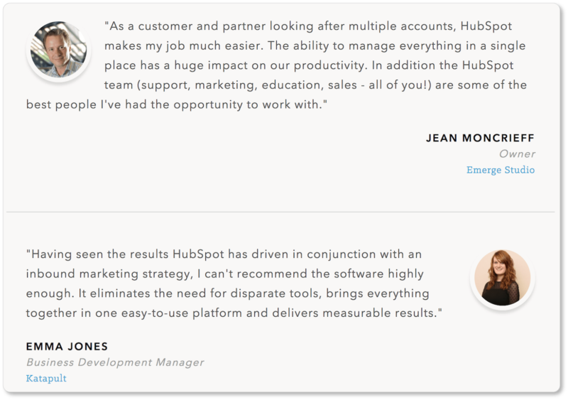
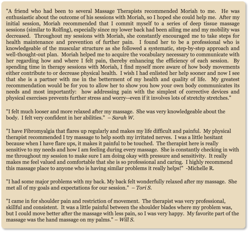
It’s crucial for good user experience (UX) to keep your testimonials looking like the bite-size, readable chunks of text they are. If your visitor clicks into your testimonials page and is confronted with a block of barely-differentiated text like the one at A Step Beyond Massage Therapy’s page, they’re not likely to be motivated to dig through all that content for a testimonial that resonates with them:
That said, if you decide (as you should!) to place testimonials at friction points on multiple pages on your site, you’ll need to draw your visitors’ eyes to those testimonials. After all, visitors won’t necessarily be looking for them or expecting them.
Here’s a standalone testimonial situated at the bottom of Square’s “payments” page:

Square has done a terrific job using design elements to draw its visitors’ eyes to its most outstanding testimonials. After all, the last thing you want after the labor of collecting and editing testimonials is to place them on your site in such a way that your prospects don’t even see them.
FortyOneTwenty displays a single testimonial on each of its four primary pages (homepage, “Our Work,” “About Us,” “Contact Us”). Next to each testimonial, however, are arrows that allow a visitor to click forward or backward to view the company’s other testimonials. Here’s the one on their About page:
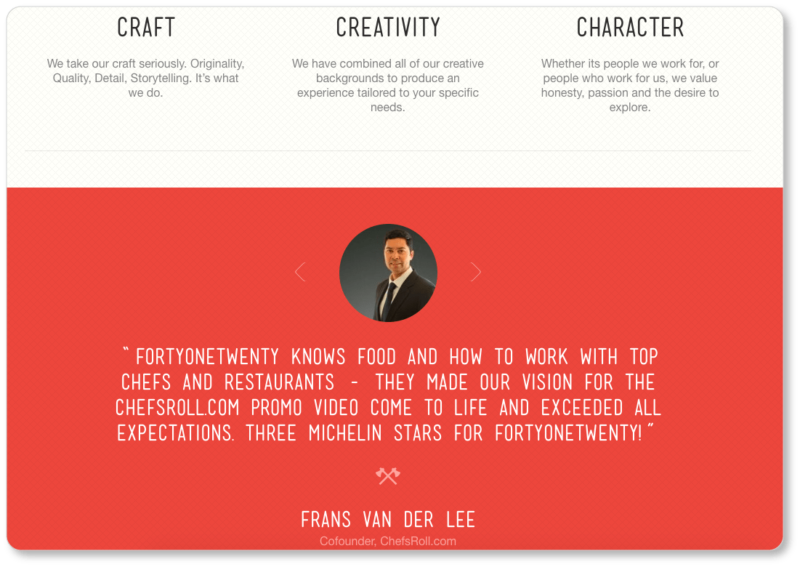
There’s no way a visitor to any one of FortyOneTwenty’s primary pages could miss their testimonials. They’re designed to take up nearly the entirety of a single screen view. And yet, because only one testimonial is shown at a time (with the others readily and visibly accessible), the page still looks clean.
There are any number of ways to draw your visitors’ eyes to the testimonials on your website. Surround the copy with images (or, conversely, surround them with whitespace), increase your font size, and experiment with colors until your testimonials are among the most stand-out elements of your page.
And of course, placing them near your CTA buttons—which should also be among the most outstanding elements of your site—will ensure that visitor attention gets drawn to them.
When do you have “enough testimonials”?
One answer to this question is that you’d have to work really hard to ever give your prospects too much social proof: Remind them as often as you can that you’ve left a trail of very enthusiastic customers in your wake.
But if you’re looking for a minimum, we suggest you offer enough testimonials on your web pages that: 1) All of your prospects’ possible objections are raised and countered; and 2) Each of your customer personae is “spoken to.” (In other words, you’ve covered the full range of imaginable prospect circumstances and pain points).
What this means is that you’ll want to pay attention to the relationship between each page on your business website and the kinds of testimonials you place on it. Testimonials that raise the objection of price but counter it with your product’s value or longevity, for example, should go on your pricing page. Testimonials praising the content of your monthly emails or your other content marketing efforts should be placed on your signup pages.
We’ve covered a lot when it comes to customer testimonials—from strategies for obtaining them, to the language to use when asking for them, to how to make best use of them on your website. In the next section, we offer a testimonials checklist that should be useful to you over the long haul. Tack it up in your office as a reminder that the process of testimonial acquisition is an ongoing one… and to ensure you’re following best practices with each new set of testimonials you put up on your website.