- HOME
- Website Building
- Testimonials
- Best Testimonials Pages: 4 Examples to Learn From
Best Testimonials Pages: 4 Examples to Learn From
- 6 Mins Read
- Posted on March 15, 2018
- Last Updated on October 8, 2024
- By Lauren
The bulk of your website probably consists of copy that sings the praises of your product or service, boasts about its features and benefits, and points to enticing images or videos that show your offering in its best light.
But the truth is that prospects are much less likely to take your word than they are to take the word of an unbiased outsider. That’s where customer testimonials come in—to confirm that all the bragging you’re doing is legitimate, and to substantiate the value of your offering.
In a word, a testimonial is advertising that you don’t have to pay for. And when it comes to building credibility, establishing trust, bolstering your company’s reputation, and turning cynics into believers, they’re among the most powerful marketing tools around.
Of course, testimonials should be sprinkled throughout your website—especially at friction points—but a dedicated testimonials page is an addition to your company site that’s worth considering. When done well, it’s a treasure trove of praise that prospects can click into while looking for confirmations about your offering.
What’s more, it’s another indexed page on your website that contains the keywords you’re trying to rank for. Pain points, product features, and benefits should be among the keywords you’re trying to rank for; and a good testimonials page will contain reviews with these keywords in them.
While we’ve discussed testimonials at length elsewhere, here we’re focusing on the best overall testimonials pages we’ve seen this year:
1. Booker
Booker is a software management tool for salons and spas. Their testimonials page is easily accessible from the main menu navigation under “Customer Stories”:
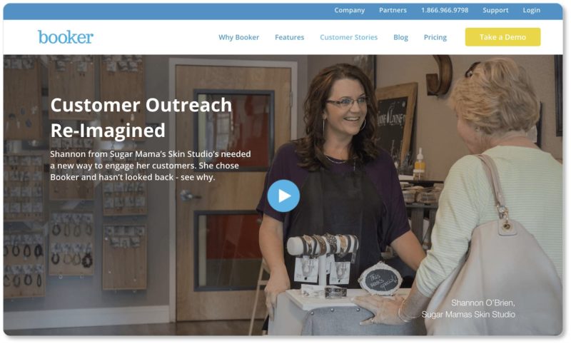
Best elements of Booker’s testimonials page:
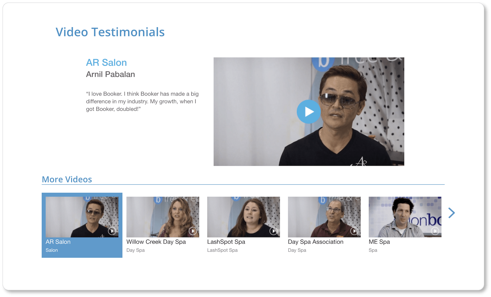
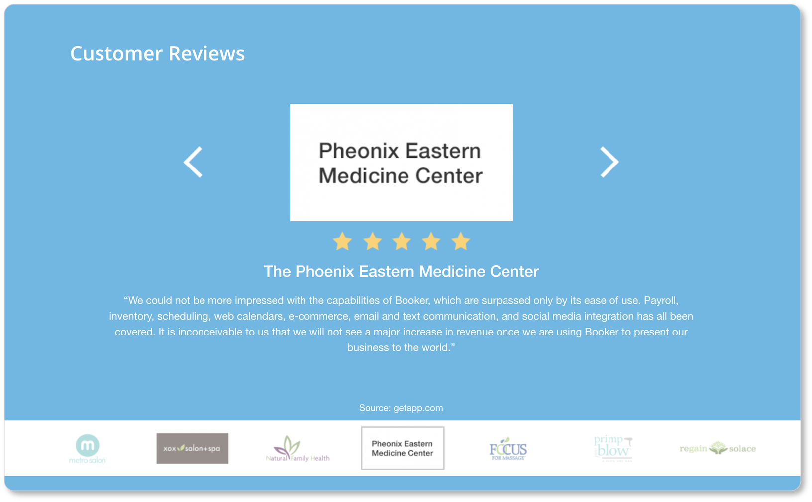
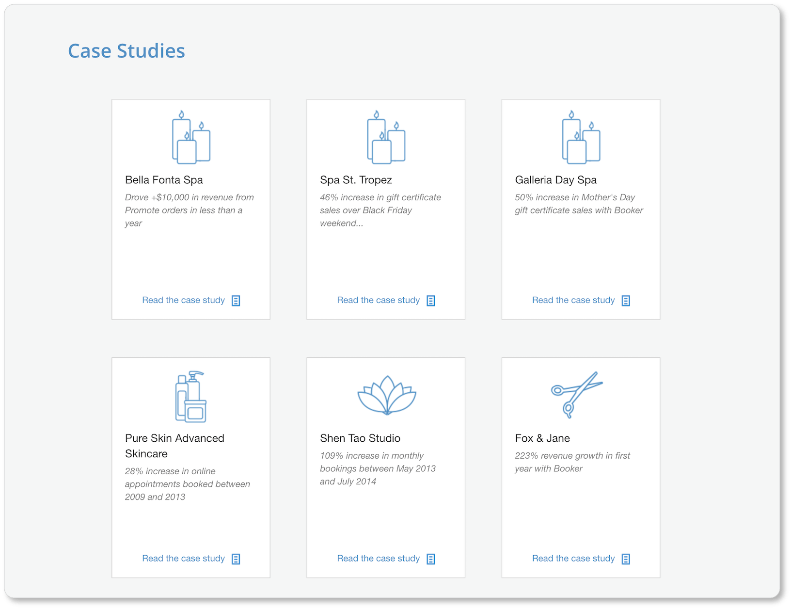
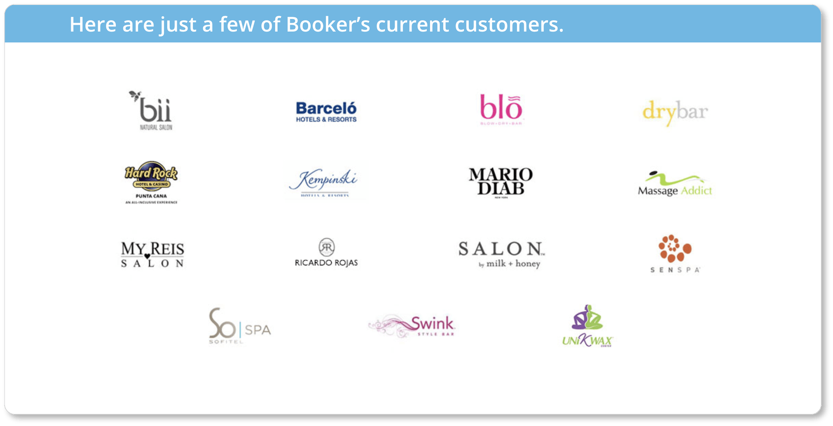
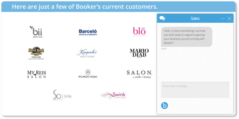
They embrace variety. Users are unlikely to get bored on Booker’s testimonials page, as their customers’ stories are offered in a range of genres: video testimonials, written customer reviews, case studies, a display of awards and accolades, and a collection of company logos from the businesses who use Booker. There’s more than enough here to keep Booker’s prospects informed and engaged:
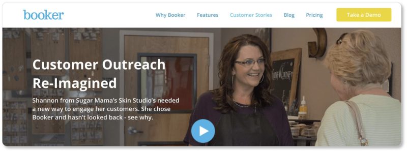
They offer different CTAs for prospects at different stages in the buyer’s journey. If a page of stellar testimonials is all a prospect needs to close the deal, you don’t want to send them searching for the “Purchase” CTA on another page of your website. Instead, make the next step absolutely clear.
Booker does this for prospects in the decision stage with their CTA to schedule a personalized demo. Like all good decision-stage CTAs, it’s positioned above the fold:
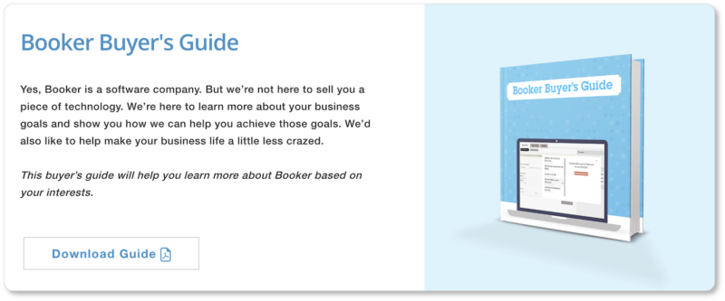
 For prospects in the consideration stage, however, Booker offers a free guide with detailed information about how their platform can be tailored to the prospect’s own business. This way, prospects who aren’t yet ready to schedule a demo still feel catered to:
They offer live chat. If a prospect clicks on your testimonials page, they’re probably on the threshold of converting. Booker doesn’t want to miss an opportunity to connect with these prospects, so they’ve embedded a live chat box on the page, and are ready to answer any questions:
2. Bizzabo
Bizzabo is a technology company that offers event management software. Their testimonials page looks like this:
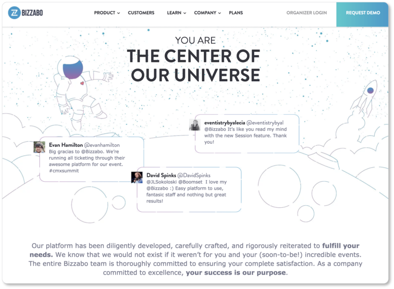
Best elements of Bizzabo’s testimonials page:
They offer customer-focused copy, beginning with their headline, and including the copy beneath the customer tweets. It’s worth observing how Bizzabo’s language evokes a sense of gratefulness while inviting prospects to imagine that incredible next event they’re going to put on… with the company’s help, naturally. This is a skillful example of good “you copy” at work; and the company’s claim that their customers are the center of their universe is quickly backed up by the testimonials that follow.
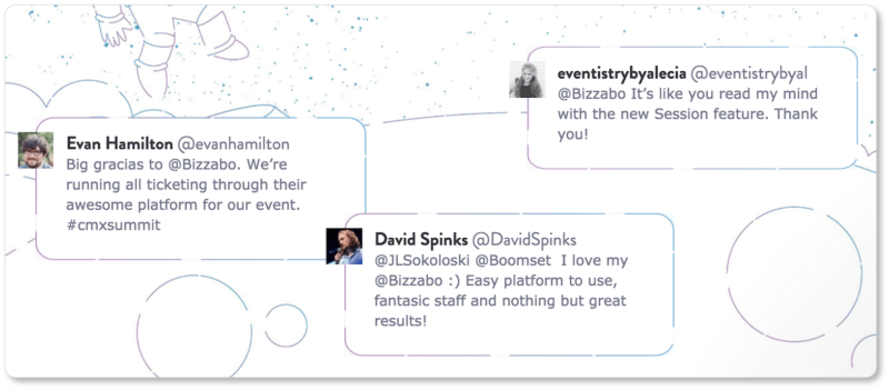
They evoke authenticity with real tweets. Displaying “found testimonials” in this way increases legitimacy; and embedding tweets is one of the best ways to ensure your more suspicious visitors don’t think you’re writing your own testimonials. On Bizzabo’s page, we’re also given the users’ avatars and @mentions, apparently without any editing at all. The company definitely gets authenticity points for this strategy:
They display their customer service ratings boldly. Like Booker, Bizzabo offers secondary forms of social proof on their testimonials page—here, in the form of a 5/5 customer service rating. The rating itself is unmissable on Bizzabo’s page; and this strategy is worth imitating if your business has won a particularly impressive award, or has equally standout numbers:

3. Bluebeam
Bluebeam is a software company that designs tools for PDF documents and digital workflow. Their testimonials and case studies are spread out across a few of their website’s pages. For example, their page called “Our Customers” contains both video testimonials and case studies:
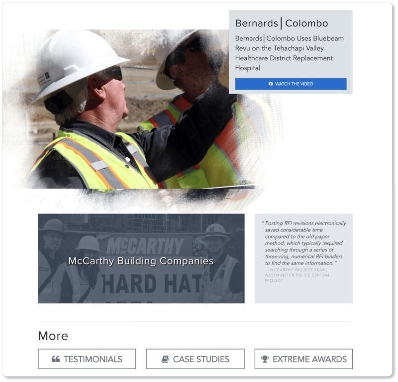
If a user arrives at the end of Bluebeam’s “Customers” page and still wants to know more, they’ve got a few CTAs to choose from. Here’s the page for “Case Studies”:
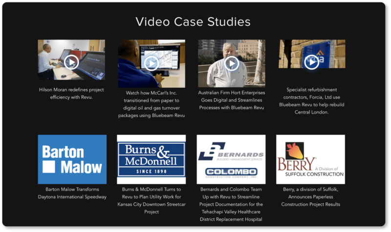
Best elements of Bluebeam’s testimonials page:
They offer a value proposition in their headline. Just because the testimonials page is there to let your customers do the talking for you doesn’t mean that you can’t remind visitors of the benefits they’ll experience from working with you. If you play your cards right and ask the right questions, your customers’ testimonials will only confirm what your value proposition promises… which makes you look even better:
 They spread the love across multiple pages. Bluebeam’s visitors can essentially choose their own adventure. Some may only need the two testimonials and videos on the company’s Customers page to convince them.
Others who feel they need more can look through shorter testimonials, longer case studies, or a list of companies whose projects have won awards for “demonstrating how [they] use [Bluebeam’s product] to truly work without limits.”
Regardless of where they go, prospects are led to aspirational content with every click. Ultimately, this means more prospects are motivated to click on that CTA to download a trial.
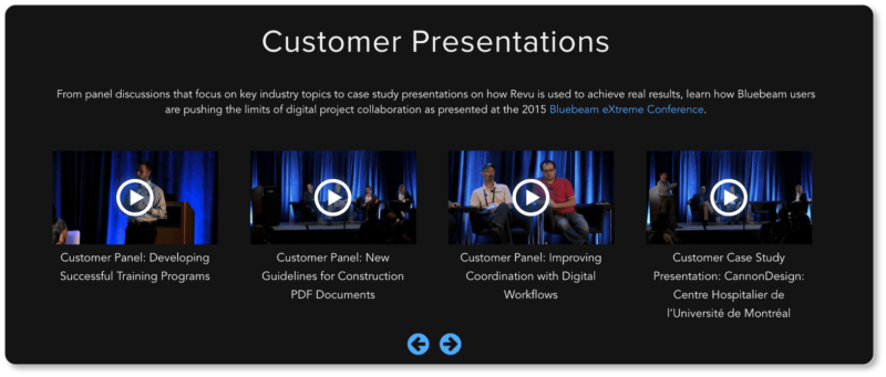
They give their customers room to look good. A testimonial is more convincing if it makes the customer look good, and Bluebeam seems aware of this. The first set of videos on their Case Studies page are panel discussions from the company’s 2015 conference, in which clients discuss how they’ve used Bluebeam’s product to “push the limits of digital project collaboration” in their own companies.
While this would seem counter-intuitive, Bluebeam ends up looking good by virtue of the fact that their clients are thriving in their respective industries—thanks to Bluebeam.
4. Focus Lab
Focus Lab is a web design and development company that’s done a remarkable job creating a visually-consistent testimonials page that doubles as an online portfolio.
Best elements of Focus Lab’s testimonials page:
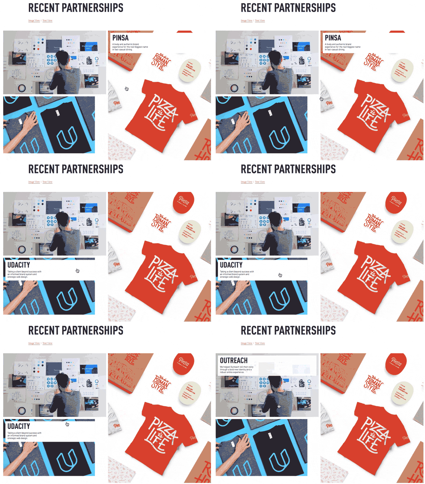
When a user hovers over each of the images on the company’s website, a text box appears with the name of Focus Lab’s client, inviting the user to click to read more:
On the dedicated page for each project, visitors then have access to an entire case study, stunning design images, and standalone testimonials from the company Focus Lab was helping to brand:

So now it’s your turn: Play a little! Our challenge to you is to think a bit outside the box and offer more than that tedious list of indiscrete customer quotes you usually see on business websites. Make your visitors feel like they’ve just stumbled upon a gold mine.
That’s not to say that your testimonials themselves shouldn’t be strong enough to stand on their own. It’s worth asking yourself if you’d buy your product if all you had to go on were the words written by your customers on your website. If your answer is a “no” (or a “maybe”), then scroll back up and see if any of the examples above can provide you with some inspiration.
