- HOME
- Ecommerce
- Best Practices for Ecommerce UX
- 3 Examples of Effective Ecommerce Websites
3 Examples of Effective Ecommerce Websites
- 8 Mins Read
- Posted on March 13, 2018
- Last Updated on October 8, 2024
- By Lauren
Given the astounding rate at which eCommerce continues to grow, the smartest move you can make for your retail business is to offer an online shop.
Of course, this doesn’t just mean throwing some photos of your products up on a website and assuming that your online shoppers’ psychology is the same as that of your in-store consumers. Indeed, there’s a particular set of obstacles that online shoppers have to overcome before they can be convinced to buy your product.
Prospects may be understandably wary about purchasing from a company whose employees they aren’t in direct contact with during the transaction. They don’t get to experience the psychological phenomenon of perceived ownership that occurs when they actually touch the product—an important step toward conversion. They may have anxieties about giving up their credit card information online. And so on.
If you can recall the reasons you’ve decided against making online purchases in the past (bad site UX, lack of trust signals, confusing checkout forms), you can probably create your own list of friction points you’d like your online shop to avoid. But it’s sometimes more difficult to remember the things you should include on your online shop pages.
So below, we look at three of our favorite online shops, and analyze what those pages are doing well.
1. Zoku
Zoku is a housewares company whose most popular product is the Quick Pop Maker, which makes frozen popsicles in minutes. Here’s their homepage:
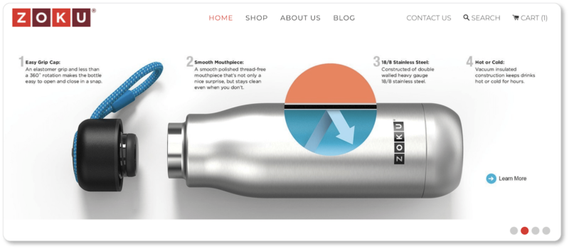
Best elements of Zoku’s homepage:
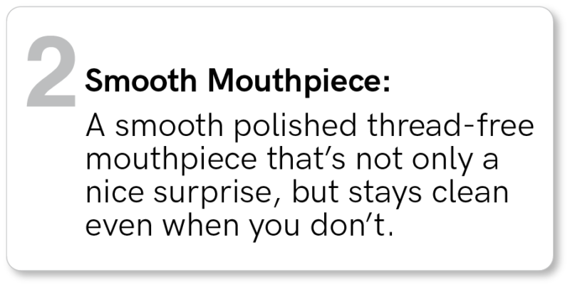
It offers a hero image with strong product features. Zoku actually displays four hero images that rotate while visitors are on the page, which means they can see four of the company’s best products without doing any work—and without the page feeling overwhelming.
What we like about the image above is that it points out four of the product’s most outstanding features. And it does so while describing prospect benefits and speaking to prospects directly (i.e. “stays clean even when you don’t”). This strategy is called “you copy”; it keeps prospects front-of-mind as you write:
Its shopping cart has memory. Keeping a persistent cart means the company can remind prospects about the products they were recently interested in. It also keeps prospects from having to go through the search process all over again when they return to the site.
It considers lead generation. The most outstanding CTA on Zoku’s homepage is that button to sign up for their recipe newsletter. (The “Learn more” button on their hero image pales in comparison.) While this is a surprising move, it’s possible the company has determined that leads are more valuable, over the long term, than one-time purchases are:
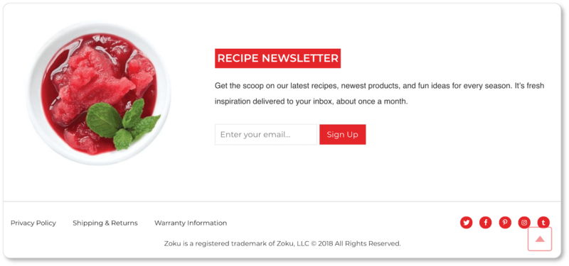
Either way, Zoku is taking the long view. Once it’s got those emails, after all, it can include them in future content marketing efforts—which means building stronger relationships with its prospects over time.
Now here’s Zoku’s product page for their Single Quick Pop Maker:
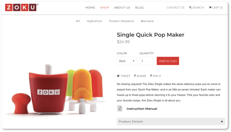
Best elements of Zoku’s product page:
It brings the product to life with multimedia. Zoku offers prospects a short video to show exactly how the product works:
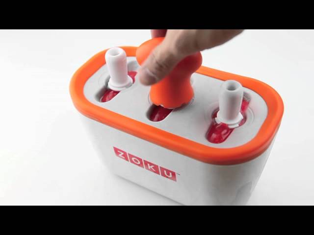
Video is an excellent multimedia choice for this particular product, given that speed is one of its primary benefits (pops “in as little as seven minutes!”).
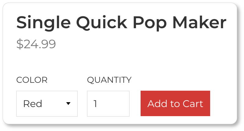
It has a standout “Add to Cart” button. Zoku has only one CTA on its product page. By the time they’re reading the details about your product, prospects should only have one goal (purchase). Here, there’s one clear path marked out for prospects… and little to sidetrack them from this goal:
It displays an “Added to Cart” confirmation. When we added the Single Quick Pop Maker to our cart, we were taken directly to the cart page, with a summary of what we’d placed in it:
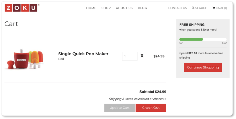
Notice that prospects now have two primary CTAs: one to continue shopping (with an incentive to do so: they’re halfway to free shipping), and one to check out right away. Either click is a win for Zoku. But the larger point is that users get the satisfaction of seeing feedback validating the move they’ve just made.
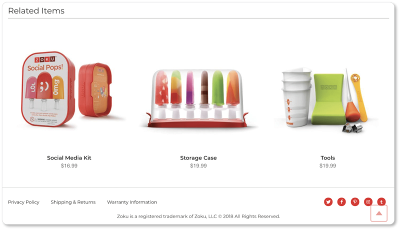
It employs cross-selling strategies. Zoku displays three other products that can be used in tandem with the Quick Pop Maker. Prospects are inside Zoku’s purchasing funnel by now, and the company makes the best of that fact:
2. Master & Dynamic
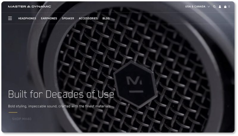
Master & Dynamic makes earphones, headphones, and other audio accessories. Their homepage looks like this:
Best elements of Master & Dynamic’s homepage:
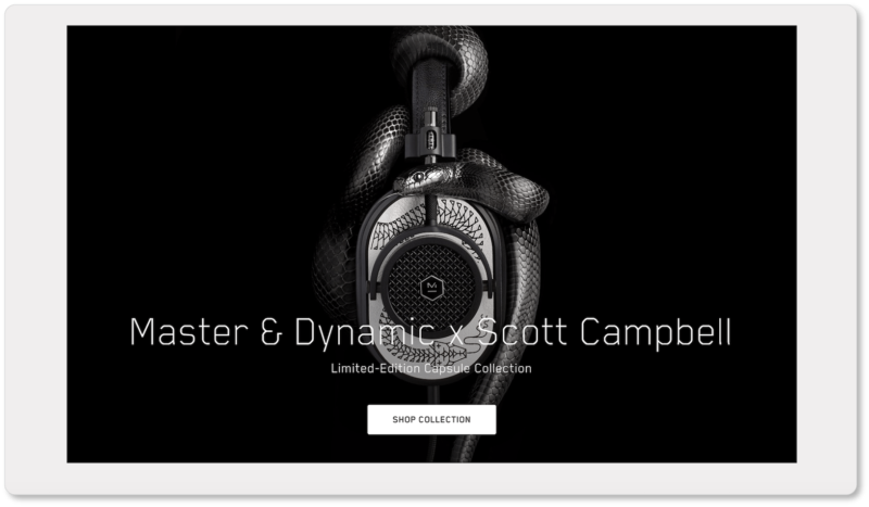
Its hero image is a compelling video that runs for about 30 seconds before looping again. (We’ve included stills from the video below.) It pans in on product details, giving prospects a better sense of how they might feel to the touch. This gives visitors an experience of perceived ownership—an important step toward purchase:


The video also shows Master & Dynamic’s products in use. This is called “lifestyle content,” and it allows prospects to envision an increased quality of life thanks to the product in question.
It offers strong value propositions. A value proposition explains why your company is a better choice than any other company a prospect might be considering. You’ll typically see value propositions offered prominently in the headline of a page; and Master & Dynamic certainly does that here.
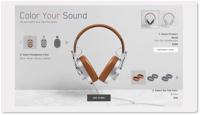
But they also offer a more subtle value proposition. Beyond simply saying it in a headline, they show prospects how they’re different from other companies by offering a “mix and match” option that prospects probably won’t get elsewhere (this is called differentiation):
Notice that Master & Dynamic doesn’t have to say “here’s something we offer that our competition doesn’t.” The differentiating element is already apparent.
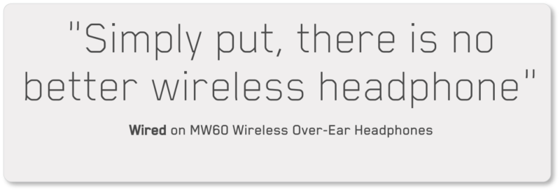
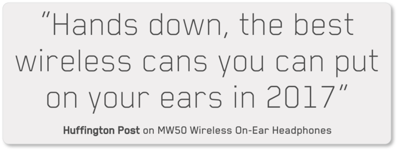
It displays product reviews. If there’s an online shop out there with too much social proof, we haven’t come across it yet. Master & Dynamic recognizes the value of this site element; they offer reviews on their homepage as well as on their individual product pages:

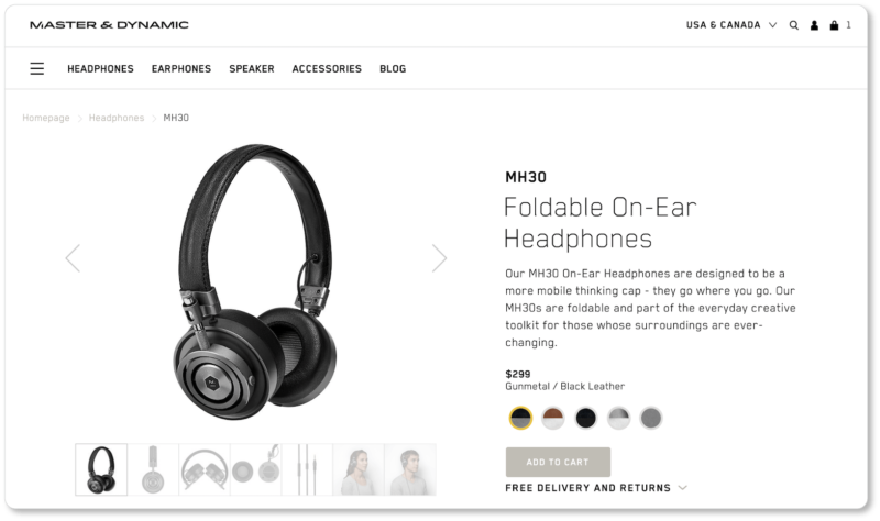
Now here’s the product page for Master & Dynamic’s Foldable On-Ear Headphones:

Best elements of Master & Dynamic’s product page:
It uses a straightforward and descriptive product title. We’re going to guess that “Foldable On-Ear Headphones” is a great title from an SEO perspective. Google Chrome’s Keywords Everywhere extension tells us that 8,100 people search for “on-ear headphones” every month:

Master & Dynamic has chosen a product title using keywords their prospects actually search for. And there’s no ambiguity on the prospect’s end: The product title tells them exactly what they’re getting.
It brings its customers to life. Here’s the video on the product page:

This is essentially a video testimonial; and here’s the psychology behind it: Prospects begin to identify with one (or both) of Master & Dynamic’s customers, who are letting prospects briefly, but intimately, into their lives. As both customers tell prospects how these headphones are adding value to their lives, the product is now doubly compelling thanks to that element of identification.
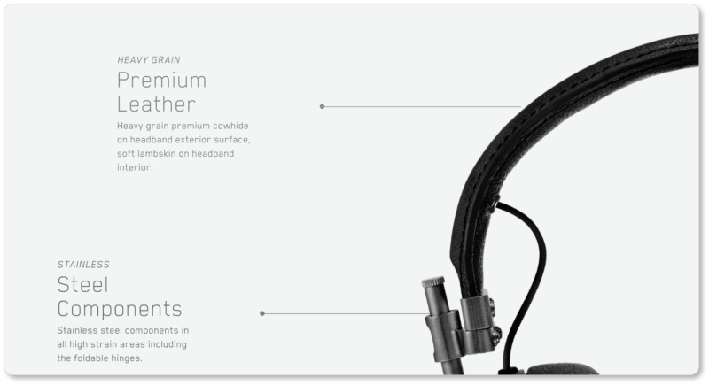
It catalogues the product’s features and benefits in great detail—and yet in as few words as possible:
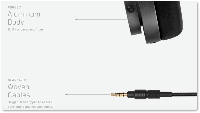
It leaves nothing uncertain. Product dimensions, weight, materials, microphone type, Apple compatibility and other specs—as well as exactly what will arrive “In the Box” after a prospect clicks the purchase button: Master & Dynamic leaves nothing ambiguous here:
![]()
3. Beardbrand
The beard care company offers another remarkable online shop. Here’s their homepage:


Best elements of Beardbrand’s homepage:
It provides live chat. Notice that green “Support” CTA on the final screenshot in the carousel? That CTA follows visitors down the page. Prospects who click the button get a prompt that asks “How can we help?” and, in lieu of an actual sales assistant, get their questions answered right away. This probably means more conversions for Beardbrand.
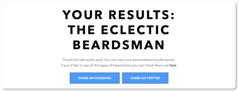
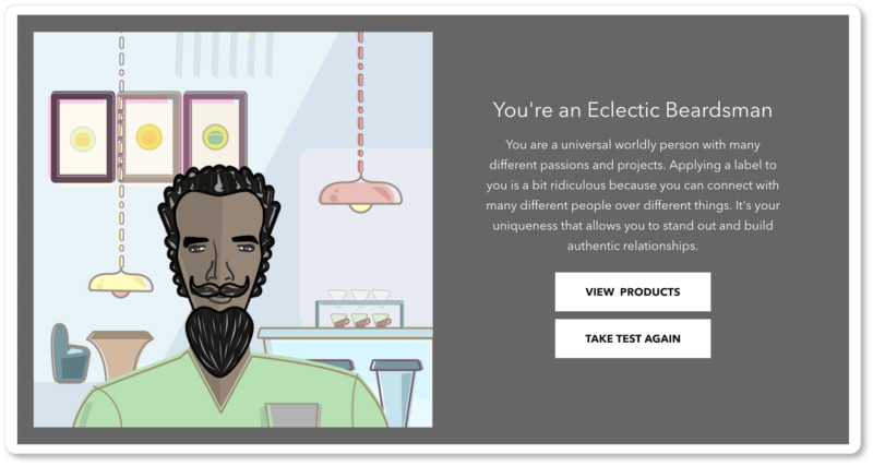
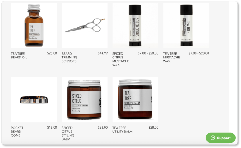
It offers links to a quiz and a blog to get prospects into its sales funnel. These are two different CTAs that appeal to prospects in two different states of mind (wanting to be entertained; wanting to be educated)… but both ultimately land prospects to the same place—through lead generation, to conversions.
We took the quiz; because who doesn’t love a good quiz? Note how the company offers links to share our results on Facebook and Twitter (which means free advertising for Beardbrand), as well as a link to the products we should consider based on our “type.” And suddenly we’re on a product page, after the pleasure of a little diversion:
It voices the company’s mission and its ethos—both in very well-written copy:

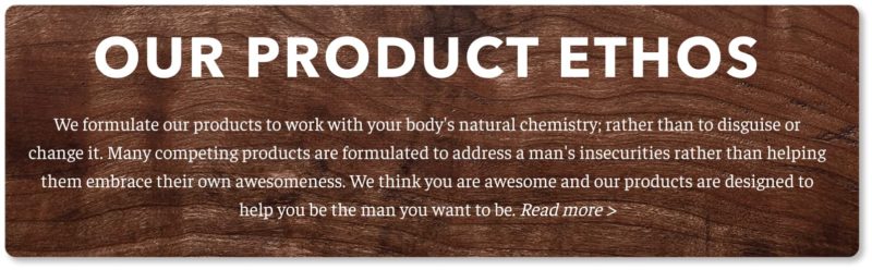
By the time they’re halfway down the homepage, visitors are undeniably clear about what Beardbrand’s company values are.
What we particularly like about the company’s mission is the play on words (keep on growing your beard; keep on growing your self), along with its aspirational language and its smart logic (self-investment and good grooming = confidence = investment in community = a better world). And the ethos copy reads as though Beardbrand is every prospect’s biggest advocate.
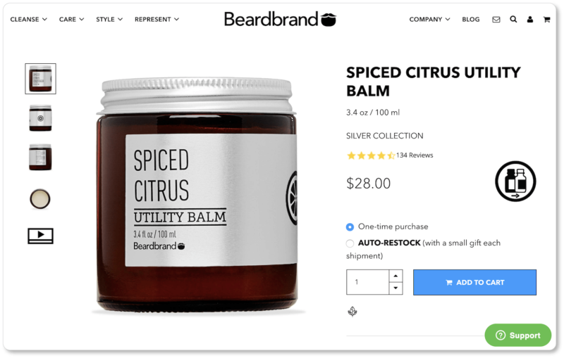
Now here’s the product page for Beardbrand’s Spiced Citrus Utility Balm:
Best elements of Beardbrand’s product page:
It states product availability. Here’s what happens when a visitor clicks into a product that is currently out of stock:
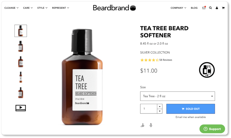
Notice that the CTA is different: Rather than “Add to Cart,” it reads “Sold Out,” and the prospect is offered the option of receiving an email when the product is available again. A feature like this ensures your prospects won’t be frustrated when they get to the checkout page and realize they’ve been “led on” about product availability through the shopping process.
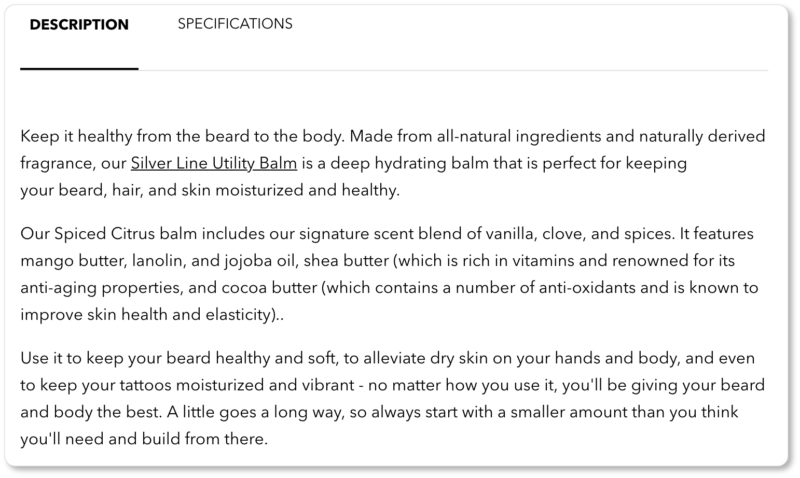
It offers compelling product descriptions. Beardbrand’s description highlights the product’s natural quality and hydrating effects, lists its ingredients, and mentions some of those ingredients’ most remarkable qualities (anti-aging, good for skin elasticity). It even goes so far as to suggest it’s an all-purpose product. (You can also “use it to keep your tattoos moisturized and vibrant”):
It offers a subscription service. We hope you didn’t miss this brilliantly-offered “Auto-Restock” option:
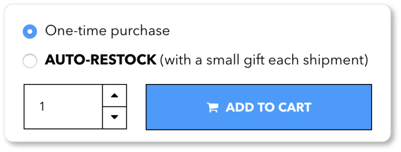
The advantages of subscription are many, the biggest one being recurring—and predictable—revenue. You’re also reducing the risk of losing customers to competitors, since they’ll be so appreciative of this convenience that it won’t occur to them to look elsewhere.
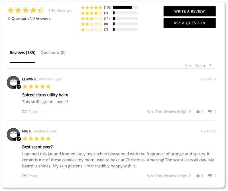
It displays customer reviews. More social proof? Sure; we’ll take it. Beardbrand does well to include that CTA to “Write a Review”—not only because it means more in-the-moment testimonials for the company; but also because it makes the reviews that are there look all the more authentic:
Collectively, these three business websites exemplify best use of the most important online shop elements we can think of.
Now it’s your turn: experiment with your eCommerce platform and the plugins available to you to see what kinds of design, UX, and virtual product experience you can offer your site visitors.
Know that the above are best practices—meaning they work for the majority of businesses—and thus are great places to begin playing. Employ them and then test them to see what works best for you.