- HOME
- Ecommerce
- Best Practices for Ecommerce UX
- Best Design Practices for Your Product Pages
Best Design Practices for Your Product Pages
- 9 Mins Read
- Posted on June 5, 2019
- Last Updated on October 8, 2024
- By Lauren
When we discussed best UX practices for your online store homepage, we emphasized that your homepage is the virtual equivalent of your storefront… so you should treat your homepage imagery with the same care and attention with which you treat your display window. This means picking and choosing which items to display (like your newest or best-selling products), rather than overwhelming your visitor with your entire product range.
With individual product pages, however, you have the opportunity to display every product you offer—in all its glory. This is not only your chance to communicate your business’s respectability and professionalism through design, as you do with your homepage. It’s also your chance to prove that each of your products is worthy of your business’s name.
Here are our best practices for doing so, while keeping user experience top-of-mind:
Make the best use of high-quality images
When’s the last time you bought a product online without knowing what it looked like? (We’re going to guess your answer to that question is pretty close to “never.”) No matter how compelling the copy on a product page is, high-quality photos will always communicate the benefits of a product more effectively than words can. Notice we said “high-quality.” This means large, high-resolution, professional, appealing—in fact, virtually irresistible—images.
Notice, too, that we said “images,” plural. Your prospects can’t hold your product in their hands—let alone try it on—before they buy it from you online. So give them as much visual information as you possibly can about your product.
Photos of your product from various angles give online shoppers a better sense of its size, shape, style, and color than a single photo ever could. We recommend a minimum of four product images from different angles. This simulates viewing it in person. If you sell clothes, have your model pose in a variety of positions, so prospects can see how the material hangs and folds as the model moves.
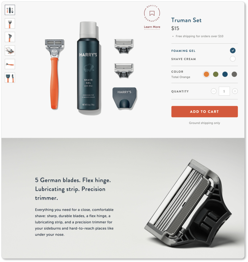
Make your images large… maybe even a little larger than you think you should. Hyundai increased its requests for test drives by 62% by ditching its thumbnail photos and displaying large, exquisite product photos of its cars. Razor company Harry’s also exemplifies this strategy:
Include a zoom feature so prospects can view your product close up and get a better sense of its texture. (Apps like All in One Product Zoom are great for this.) You might even consider a 360-degree view, so prospects can see your product from every angle, evoking a tactile experience with it. Companies such as Hoot offer services for 3D and 360-degree product photography.
Your product images should be situated front and center, above the fold. Your visitors clicked into the product page because they wanted to view the product… so give them what they’re looking for immediately.
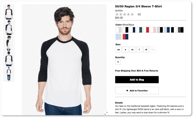
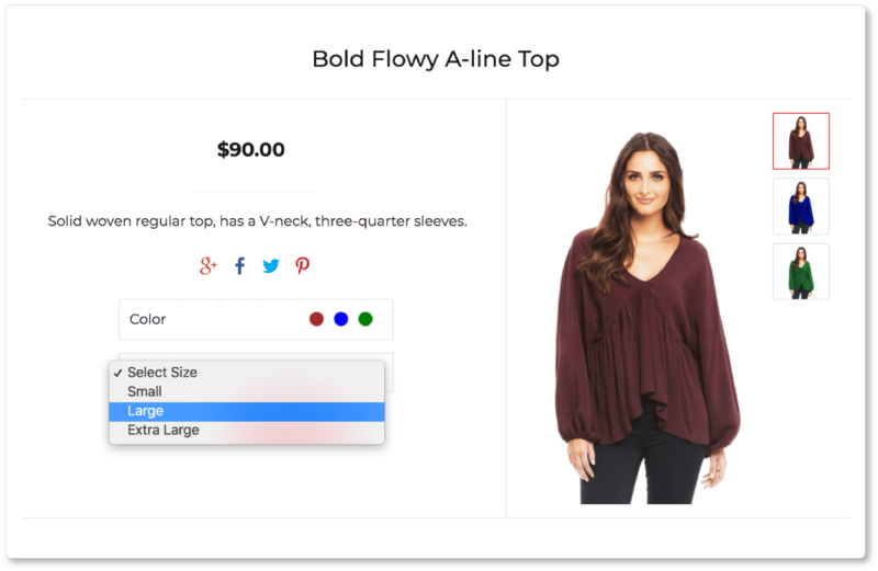
If the product comes in multiple colors, include photos of each. “Green” can mean anything from lime to emerald to seaweed green, and prospects will want to know which they’re getting when they hit that “purchase” button. American Apparel offers eleven different color combinations of this shirt, and the image is refreshed with the new colors whenever a user hovers over another color combination box:
Include photos of your product in use. If you sell camping equipment, for example, offer high-resolution images of your products being passed around a campfire by a group of (very happy!) friends. This is called “lifestyle content,” and it allows prospects to envision themselves using and benefiting from your product. It’ll also give you an advantage over competitors who may be displaying images of their product without context.
When prospects get a glimpse of what ownership might look like, they’re better able to envision owning your product themselves. And envisioning is a crucial step toward purchasing.
Use video to bring your product to life
Product videos can work wonders for your conversions. Take Zappos, for example, which saw between a 6% and 30% increase in conversions when they began adding videos to their product pages.
Videos are the closest you get to a perfect display of your product. They also help you demonstrate more complex products (or disprove the perception that your product is difficult to use), show your production process, more thoroughly explain the differences between features, and give your customers and employees the opportunity to speak about an item they’re intimate with—whether because they use it or because they helped make it.
Pro tip: Make sure your images and videos don’t negatively influence your page load time. The faster your pages load, the better.
High-quality product photos and videos build trust, overcome objections, reduce purchase anxiety, let prospects understand what to expect, increase social sharing, and help differentiate you from your competitors. And, if you keep your imagery consistent, they also establish brand identity. They require a financial and time investment, for sure; but for all those benefits, it’ll be worth it.
Have a standout “Add to Cart” button
When a prospect clicks into a product page, the two things that should stand out most to them are 1) your product imagery and 2) your CTA button. Both should be visible above the fold. You know—and your prospects know—that the primary goal of your product page is conversions. Visitors will be expecting to see your CTA… and they’ll be confused if it’s not prominently located on your page. And confusion, so they say, is the enemy of conversion.
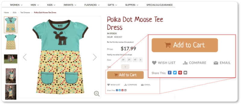
Make your visitors’ next step absolutely clear. Your “Add to Cart” button should pop. It should be in stark contrast to the overall color of your site’s palette. It should be large. And it should be placed logically within the information hierarchy on your product page.
This means that if your prospects require a lot of information about your product—this is typically the case if the product is complex, expensive, or both—your “Add to Cart” CTA should be placed both above the fold and below the fold, after your product detail copy.
Visitors should be able to view your product images, understand what they’re on the verge of purchasing through your product description, and then be immediately prompted by the CTA button to click.
Have an added-to-cart confirmation
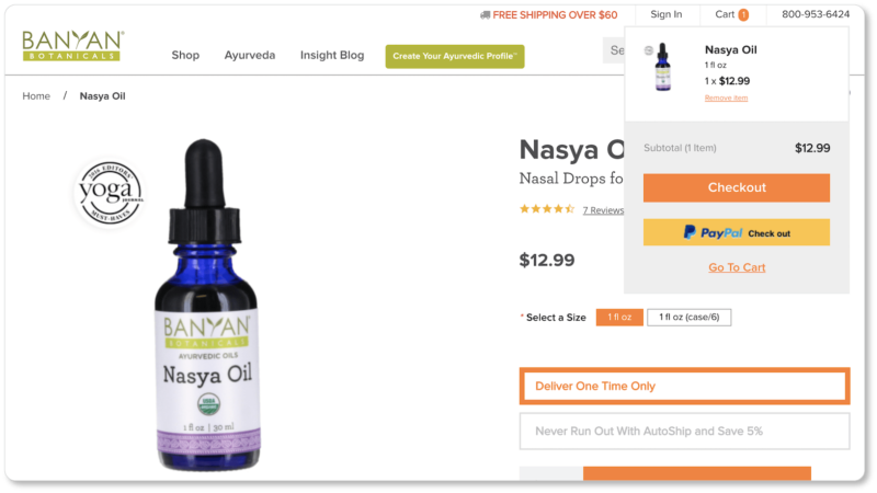
Remember: Every aspect of users’ shopping and purchasing process needs to be as unambiguous as possible. Assure your prospect that the “Add to Cart” button just worked, as Banyan Botanicals does when they display the number of items in the cart in the top-right corner of the page. When a visitor hovers over this number, they’re shown the items the cart contains:
If your store is built on Commerce Plus, your site users will see a brief pop-up message notifying them that they’ve successfully added a product to their cart.
Include social sharing buttons
There’s no escaping social media at this point, and online stores aren’t an exception to the new rule. Including these buttons allows customers to promote your products for you—which means cost-free advertising and expansion of your audience base. It also means more ways to alert your followers to deals and sales. There’s every reason to include these buttons… and no reason not to.
Here’s an example from Lazy One. Their social sharing buttons are subtle, but they’re intelligently placed below the “Wish List” button so that prospects compiling their holiday or birthday wishlists can publicly share what they want with family and friends:
Pro tip: A wishlist is a terrific feature worth considering for your product pages. It lets prospects “bookmark” items for later purchase. It also gives you an opportunity to remind prospects about their wishlisted items with a targeted email later down the road.
Use breadcrumb navigation
In the last section, we discussed your navigation menu as a feature that displays the products in your catalog through primary (parent) categories and sub-categories. (Depending on the breadth and complexity of your catalog, you might also offer sub-sub-categories.) Regardless of how many levels deep your navigation goes, you’ll want to offer breadcrumb navigation. Here’s the breadcrumb navigation for the Lazy One dress, above:

Breadcrumb navigation helps users understand the relationship of the page they’re on to your site’s other pages. What’s more, they offer hyperlinks so that users can “pan out” from sub-category pages to higher-level pages. (On Lazy One’s page, for example, we could just click on the word “Kids” to return to the broader category page, minimizing the number of clicks we’d otherwise need to take to get there.)
Note that breadcrumbs can take two forms: They can be hierarchy-based (they’ll display according to page architecture of your website) or history-based (they’ll display according to the user’s navigational path.) (Zoho’s commerce platform displays breadcrumbs based on hierarchy.) They’re one of those site elements that often gets overlooked; but they can be invaluable for visitors who can’t turn around and go back down the aisle in your store where they remember first eyeing your product.
Offer a sizing guide
This one’s for you clothing retailers out there. Of course, you’ll be offering both color and size options in the form of dropdown menus or checkboxes. We recommend a dropdown menu, by the way: Individual boxes take up valuable real estate, especially on mobile; and they’re harder to navigate on mobile because users have to zoom in to ensure they’re tapping the right selection. Here’s an example of how color and size options can be offered in Commerce Plus:
Give your prospects a comprehensive size guide, too—ideally as a link above or below your size options. You don’t want to run the risk of dealing with unnecessary returns (and, we promise you, neither does your customer), so give them detailed information about size and fit to allow them to make the best selection for their body type.
Avoid visual clutter
We’ve suggested quite a few elements that should go on your product pages. The key, now, is to employ them all through minimal design. A cluttered page means frustrating UX for your site visitors, and it adds unnecessary friction to their shopping experience.
You want your prospect to focus on your product—nothing more. That means clearing the product page of any information that doesn’t speak to your product specs, features, and benefits, and that doesn’t answer the questions your prospects will have about the product.
It means maintaining white space around page elements so that your product images and CTA button stand out, and so your visitor can find the information they’re looking for.
Another reason you’ll want to avoid clutter is to be sure your product pages load quickly. Slow page load time is bad UX; and it’ll drastically decrease conversions and hinder your SEO efforts. A content-heavy web-page will always take longer to load. Stick with sharp and simple.
The wallet company Bellroy has has done well with their product pages. Here’s the page for their key cover, which offers a short looping video to show how the product works:
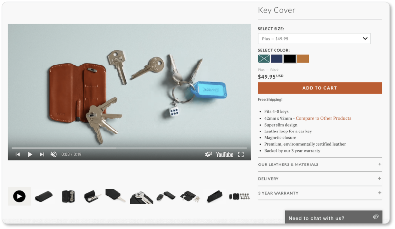
The features are easy to scan because they’re in bullet points; and if prospects want more information about materials, delivery, or Bellroy’s 3-year warranty, they can click on those plus-signs—but the information is otherwise hidden to minimize clutter.
There’s also smart informational hierarchy here. The product title, a compelling video, product features, and the “Add to Cart” button are above the fold. A simple but elegant product description (notice the “you copy”—copy that focuses on, and speaks directly to, the prospect) and a large image of the product are below the fold. Note how the designer’s explanation includes a customer benefit:
And that’s nearly the entire product page. Exceptionally done, if you ask us.
Keep an eye out for good design
We recommend that you spend some time on the websites of businesses that are offering products similar to yours (and that are making a killing at it). As you move through their product pages, pay attention to where your eyes go, and to the elements of those pages that most draw you in. You’ll probably have a fairly quick aesthetic reaction; observe that.
But then go one step further and imagine yourself as a prospect who’s considering purchasing their product. Is the imagery (or other multimedia) crisp enough that you can imagine taking the product in hand? Do have a sensory experience of what it’s like to hold it (or wear it)? Does the company offer you lifestyle content in its images that helps you envision benefiting from their product and fathom how it will enhance your life? Are there supporting videos? If so, are they brief and compelling? In the end, is that CTA just begging to be clicked? In other words, what’s your user experience on the site?
Critiques like this are a practice that will eventually become a habit; often, it’s easier to perform them on business websites that aren’t yours. Of course, this kind of close examination will be of great benefit when it’s time to turn to your own product pages and apply the lessons you’ve learned through these observations.
Your product pages offer such stellar UX (and your business offers such a terrific product) that your visitor has added it to the shopping cart? Congratulations! And yet, your work is hardly over—the cart and checkout experience may be your biggest hurdles yet. In the next section, we look at best practices for shopping cart UX.