- HOME
- Website Building
- CTA Buttons
- Best Practices for CTA Placement
Best Practices for CTA Placement
- 9 Mins Read
- Posted on April 17, 2018
- Last Updated on October 8, 2024
- By Lauren
 In our other CTA guides, we’ve shared best practices for both button design and button copy. Of course, neither of these elements can be considered without thinking about button positioning. After all, no matter how eye-catching your CTA button is, no one will see it if it’s at the bottom of a very long landing page.
That’s not to say you should put your CTA front-and-center and call it a day. Though we do generally recommend above-the-fold placement. Indeed, we do it ourselves here at Zoho:

As with nearly everything on your business website, the art of placement is a bit more nuanced than that. You likely aren’t surprised to hear it takes into account both visitor psychology and user perception. That said, here are our recommendations on placement:
Put the CTA at your prospects’ desire point(s)
According to a frequently cited study performed in 2010, web users spend about 80% of their time “above the fold” on any given page. By “above the fold,” we mean the initially visible portion of a web page—what you see before you scroll down. In response to this study, a chorus of conversion pros has recommended that all CTA buttons on all pages be above the fold.
That belief fails to take into account two important things. For one, it’s no longer 2010. User behavior has evolved as the web has evolved. As we’ve grown accustomed to our mobile devices, scrolling has become second nature. It is worth noting that users only scroll if they like what they see above the fold, which is why making good use of that space is so important.
The other factor to consider is the possibility of a visitor trying to understand a more complex product or service. Such prospects need more in-depth information, as well as time to digest that information. Michael Aagaard once optimized a CTA for a relatively complex subscription service by placing the button well below the fold. That CTA experienced a 304% increase in conversions.
The reason for the increase? The service needed to be explained before visitors were ready to commit.
So, when should your CTA be above the fold?
It makes sense to place a CTA above the fold on a page whose product or service is straightforward or free. That means either your users already know the value they’ll get, or they’re not taking a financial chance on your offering.
For example, Vertical Response offers a free version of their email marketing software. Because their product requires no financial investment, they can put their CTA above the fold (twice!).

And when should the CTA be below the fold?
If your CTA requires a heavy commitment, it’s a different story. Whether that commitment is time, money, or comprehension, your prospects may want to read the entire page before committing.
They’ll need time to analyze your product’s features, benefits, and relevance to their pain points. It’s important for them to understand why your product is a smart investment. In that case, they’ll likely skip past a CTA at the top of the page. Instead, they’ll be looking for it at the bottom of the page, after they know more about your offering.
In such a situation, you might actually reduce conversions if you only offer one CTA and it’s above the fold. That’s why we’d suggest using two:
- An above the fold CTA for prospects who already know the details of your offering
- Another CTA after the product/service copy, for prospects who need more detail
In other words, there’s a general correlation between product complexity or price and CTA placement. Your goal is to predict the point where your prospect will be ready to take the next step, and put your CTA there. This requires thorough knowledge of your prospects and their buying behavior. Heatmaps and scrollmaps are helpful tools for collecting this kind of data, as is market research.
When all else fails, use multiple CTA buttons
Ask yourself what stage your prospects are in by the time they arrive at this page. If they know they want your product before the page even loads, give them the CTA immediately. However, if many visitors will be unfamiliar with your product, put one CTA above the fold and another at the bottom of the page.
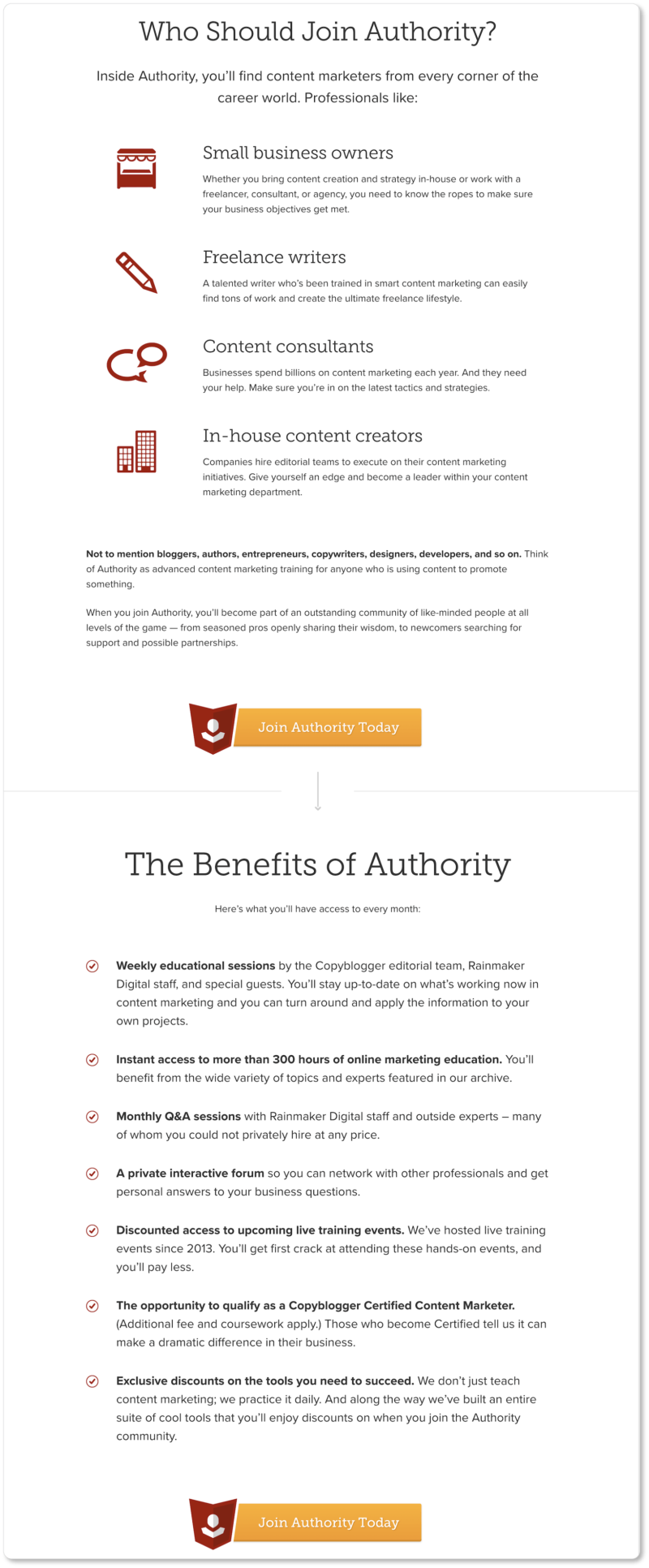
If the page copy is long and there are a few possible points at which your prospects will be ready to take action, scatter a few CTAs throughout the page. Copyblogger does this for their content marketing program:
Your prospect should never have to scroll back to the top of the page (or all the way down, for that matter) to find a CTA after making a decision. Remember, you want it to be as easy as possible for them to buy.
Create negative space around the CTA
In design terms, negative space (often called “white space”) is the space between paragraphs, graphics, images, and other elements of your web page. White space isn’t an accidental element of a page. In fact, it’s a critical part of good user experience (UX), page balance, and overall elegance. As Paul Boag has explained, negative space also increases legibility, as well as viewers’ comprehension and attention.
As a general rule, the emptier the space surrounding an element is, the more noticeable that element will be. Apple uses plenty of “white” space on its product landing pages. (Although if it were up to us, those “CTA buttons” would actually look like buttons.)

A CTA surrounded by white space is more visible than one sandwiched between text and graphical elements. You want your button separate enough from these other elements that it commands attention from visitors.
Anything that could serve as a distraction should be far away from your CTA. (We talk more about what can be near it in our section on button copy.) Reducing distractions near their CTA was one of the ways Open Mile boosted conversions by 232%.
That said, don’t give the button too much space, or you run the risk of making it look unrelated to your content. As with so many elements of optimal CTA placement, the perfect amount of negative space will come from a combination of common sense and A/B testing.
Keep your pages focused
You’re putting a lot of thought into a single CTA button. The last thing you want is for it to compete with another button for a completely different action. Remember that every new CTA you add to a page reduces the impact of each individual CTA.
Studies have shown, again and again, that the more choices people are offered, the less likely they are to take any of them. Psychologists call this “choice overload” or “analysis paralysis.”
So don’t offer your prospects too many possible actions at once. We’d suggest no more than two. And don’t distribute their attention too broadly. If your visitor sees two CTAs at once, for example, the second one should be there in support of your primary CTA. You have one goal for your page, and that’s (one) conversion. (Your homepage may be the exception to this general rule, as it’s trying to capture a range of visitors and prospects at once.)
It helps to ask yourself what single action you want prospects to do on this page. Maybe it’s signing up for a newsletter. Maybe it’s downloading a free trial. Maybe it’s purchasing a product.
If your answer is all three, then you may have one or two pages too few. Unbounce’s co-founder Oli Gardner calls this keeping an “attention ratio” of 1:1.
Exceptions to the “single CTA” rule
That said, there may be times when it makes sense to have more than one CTA on a single page. For example, you may want to offer your prospects the opportunity to “take the tour” or “watch the video tutorial” before they buy. Offering a secondary action may be what pushes your prospect further down your sales funnel, so it makes sense to have those alternate actions placed there.
Create and visually enforce a hierarchy of CTAs
In such cases, it’s important that you’re clear on the hierarchy of your CTA buttons. Which one leads directly to the conversion, and which one is there to support the conversion? Guide prospects toward the more important CTA by making that button stand out. The less conversion-centric CTA can be less attention-grabbing.
We suggest that you make those lesser CTAs smaller, lighter, grey-scale, or transparent ghost buttons. They’re still available to a prospect who needs to take another action before converting, but they’ll pale in comparison to your primary CTA, increasing both its attractiveness and its clickability.
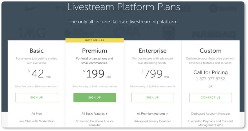
Muting all secondary buttons conveys to the user that the other option—the one with the more vibrant button—is the better choice. Livestream offers a great example of this hierarchy:

Clearly, Livestream prefers that its prospects “Get Started” (this is where the conversions happen for them, after all); but the “Request Demo” ghost button is there for prospects who need more time with the product before they make a decision.
Stripe also considers CTA hierarchy on their homepage:

There are two CTAs below the fold here: “Create Stripe Account” and “Contact Sales.” It’s abundantly clear what Stripe’s primary CTA is, because it stands out more visibly against the page’s light background. (Stripe’s sales team—which is probably fielding fewer emails because some prospects are simply choosing the “Create Account” button instead—may be grateful for this.)
Compare these examples to Salesforce’s homepage, on which visitors are offered two options: to “Watch Demo” or to “Try For Free.”
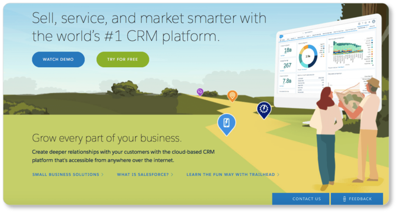
Salesforce probably wants its visitors to click on the “Try For Free” CTA, since that’s the button that’ll push its prospects closer to conversions. And yet that’s not the button that stands out, because so much of the imagery above the fold is green. From a pure conversion standpoint, Salesforce doesn’t appear to be driving its visitors toward one particular goal.
Neither does NetLine, for that matter:

Undoubtedly, what NetLine wants its prospects to do is “Get Started Now.” But both of their CTAs look exactly the same. And without that visual hierarchy, NetLine runs the risk of prospects clicking on “Watch How It Works” and then clicking out of their site due to boredom, interest sparked elsewhere, or because they’ve got somewhere else to be… all without ever clicking on that “Get Started Now” button.
Your A/B testing may show that having “Talk to Sales” or to “Watch a Demo” buttons will actually increase conversions. In that case, by all means, place those buttons beside the highest-priority CTA.
But always ensure that the more conversion-centric CTA (“Create Account,” “Get Started,” “Try it For Free”) is the button that pops.
Learn from other businesses
So there you have it: We’ve covered best practices for CTA button design, copy, and placement. Of course, you’ll have more than a single call-to-action on your business website. Indeed, we recommend you have one on every page. (What that CTA is will depend on your visitors’ state of mind on that particular page.) So it’s worth clicking into the websites we’ve offered to see how those businesses are using CTAs on other pages of their site. Livestream, for instance, has an exemplary CTA hierarchy on its pricing page:
And we think we did alright with the CTA above the fold of our CRM product page:

It’s worth clicking into the websites of some of your favorite (successful!) businesses to see how well they’re playing the CTA game. Pay attention to how the button colors play with the other colors on their pages. Observe what their button copy is doing, and what language or design elements surround them. How far down the page do you have to scroll to see their CTAs? To what degree is this scroll time a function of the product or service’s price or involvement?
You know the questions to ask at this point. Go ahead and do a little “CTA critique.” Doing this exercise this with other websites will be helpful when it’s time to work on your CTAs.
In the next section, we’ve got a CTA button checklist for you. Print it out and keep it near, so that with every new call to action you add to your website, you can ensure you’ve got all your “best practices” bases covered.