- HOME
- Website Building
- CTA Buttons
- Button Copy: Making Your CTA Persuade
Button Copy: Making Your CTA Persuade
- 10 Mins Read
- Posted on April 18, 2018
- Last Updated on October 8, 2024
- By Lauren
The virtual real estate company Empire Flippers saw a 33% increase in conversions when they changed their button copy from “Join Us!” to “Make Money Flipping Websites.” The security software company Sophos saw a 77% increase in conversions when they changed their button copy from “Request a Quote” to “Request Pricing.” And the referral program software company Friendbuy saw a 211% increase in conversions when they changed their CTA copy from “Wanna see it? Share Friendbuy with Friends!” to “See demo.”
As the results above demonstrate, language can have an enormous impact on how effective your CTA button is. Good button design will allow your prospect to see and identify your CTA; but your button copy is what will prompt them to click on it once they’ve recognized it. The copy is the last thing your prospect will read before clicking (or deciding against clicking), so the precise language you choose can make or break a conversion.
Pro Tip: Your button font should be large, bold, legible, and appropriate to the size and color of the button itself. You’ve chosen contrasting colors for your CTA button and the page it sits on. Contrast between the button and its font is just as important.
Keep it brief, yet descriptive
Remember, your button is… well, button-sized, so you won’t exactly be swimming in space for your copy. You’ll have room for a short sentence (around 5 words) at best.
By the time they arrive at your CTA, your prospects already know the features, value, cost, and benefits of your product or service, and they’re ready to act. Many of them will have read the copy on your page, and they’ll want no more than a few more words of assurance at this point—so don’t make them read more than they want to.
According to the digital marketing master Neil Patel, if your button copy takes more than one second to read, it’s too long. More than one second means your prospect has had to pause before clicking… and every pause can lower your conversion rates.
Of course, don’t get so caught up in Neil’s caution that you’re reading your copy with a stopwatch and jettisoning some of your best 6-word alternatives. But because you are so limited, every word on your CTA needs to pack a punch. Buffer offers a list of 189 “Words that Convert” to get you started; but you know your prospects and customers better than anyone, so you should come up with your own list of “power words.” What words stir their emotions? Which ones prompt them to act? It’s better to employ the words that have worked for you in the past than it is to trust a generic list.
That said, “short” doesnt mean “vague.” While you see this kind of language in many of the examples we offer in these sections, “Start Today” or “Download Now” are sometimes too ambiguous to make good copy. When the page makes it abundantly clear what a user is “starting” or “downloading,” that’s one thing. But a user who has just read a particularly complex landing page may be less certain about what, exactly, they’re getting into. Visitors are more likely to bounce than they are to click on a suspiciously vague button; so make sure your copy is clear about what that click leads to.
Your button copy should call clearly for a specific action and let your visitor know exactly what they’ll get when they click on it. You might try “Keep me informed,” “Download my free ebook,” or “Start my membership!” In each of these examples, a prospect knows exactly what’s in the click for them.
Consider using the first person
You’ll have noticed that the three examples we gave above have one thing in common: They all make use of the first person. “I,” “me,” and “my” can be some of the most influential words you use in your button copy.
Michael Aagaard saw a 90% increase in click-through rates for Unbounce simply by changing “Start your free 30 day trial” to “Start my free 30 day trial.” Copyblogger followed suit, and saw a 24% increase when they changed their button copy from “Try Schedulicity Free” to “End My Scheduling Hassles”—even though the second button was smaller.
The switch to the first person may feel strange initially. In copywriting, we’re trained to address our copy to “you” to make our prospects feel as though they’re being spoken to directly. And you should still absolutely do this in your page copy.
However, when it’s time for your prospects to click on that button, having the copy written in the first person can have a number of practical effects. In the first place, seeing “me” makes prospects feel more in charge of whether or not they click. It’s a way of handing control over to them… and we don’t have to tell you what an invigorating feeling control is.
In the second place, it helps your prospect visualize the value they’re about to receive as it contributes specifically to their life. It projects your prospect into the immediate future, allowing them to more effectively imagine how their lives will improve as soon as they click. The inbound marketing company IMPACT recognizes this particular psychological effect with their “Get My Ticket” CTA. (They even include an image that represents the prospect’s future self for added—excuse the pun—impact):

Finally, using personal pronouns allows you to subconsciously evoke the feeling that your prospect is already participating in your business. Clicking, then, is only the culmination of a relationship that they’re already involved in.
Again, “I copy” won’t necessarily be your highest converting, and many of the examples we show in this content don’t use it. But when you’re A/B testing for button text, it’s absolutely worth considering the psychological effects of speaking from the prospect’s perspective in your copy.
The “I want to ____” Test
One great strategy for figuring out exactly what to write on your button copy is to complete this sentence from the point of view of your prospects:
I want to _____.
Completing the sentence will encourage you to come up with copy like “Reduce My Mortgage Payments, Fast.” And it’ll prevent you from using copy like “Register For More Information.”
In particular, it’ll help you to pay attention to that opening verb, which is possibly the most important word in your copy. No one really wants to register for anything… but they certainly want to see a reduction in their monthly payments.
Use action words
Here’s a simple truth that borders on the obvious: When there’s no action word in your button copy, there’s nothing encouraging your prospects to… well, take action.
So try motivating your readers from the first word of the button copy—and make those verbs exciting. “Buy,” “Order,” “Submit,” “Sign Up,” “Download” and “Register” may indeed be action words, but they’re not terribly compelling. What’s more, many of them (“Buy,” “Order”) remind a prospect of what they have to part with (money), and the word “Submit” is full of negative connotations.
What your prospects do want is to “Get,” “Own,” “Try,” “Go,” “Start,” “See,” “Watch,” “Open,” and “Increase.” All of these words suggest momentum, and they’re much more likely to spur prospects into action.
Unbounce gives us an example of a Danish company that saw a 38% increase in conversions just by changing the word (or its Danish equivalent) from “Order” to “Get.”
Focus on the benefit
We can’t emphasize the importance of your prospects’ desire enough when it comes to your button copy.
Consider what your prospects want and what they want to become (stronger, smarter, happier, wealthier, slimmer, more muscular, more respected, etc) by virtue of using your product or service. You’ve already spelled out the benefits in your page copy; your button copy may be the place to reinforce them.
Appeal to your prospects’ frugality, ambition… maybe even their laziness. “Find the best solution for me” may do better than “Show me how to find the best solution.” “Let’s get started!” will probably perform better than “Enter our shop.” Dispense with “Download my score” and try “Get my free score.” You get the picture.
And if your offer is free, this fact absolutely must go in your button copy.
Your prospect’s desire is at a maximum by the time they’re hovering over your CTA. Don’t diminish it with boring copy that reminds them about what they have to give up. Focus instead on the benefits they’ll enjoy once they click.
Create a sense of urgency
Let’s make one thing clear: You don’t want to deceive your prospects. That’s not good for your business in the long run. However, with every opportunity you give them to pause and reflect on their decision, you’re also giving them an opportunity to say “no.” That’s where the urgency strategy comes in: It keeps your prospects from thinking they have time to pause.
Possibly the most fool-proof example of an urgent CTA is “Get Started With ___ Now.” Timing words such as “now,” “today,” “right away,” and “immediately” are as good as action verbs because they rush your prospects into action.
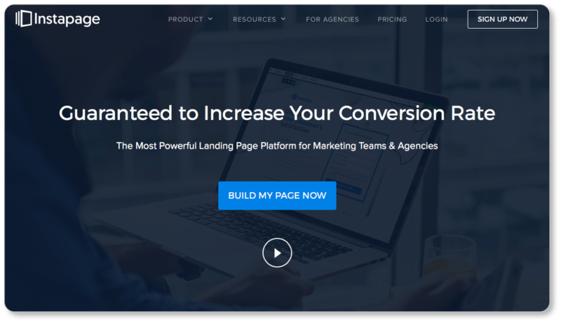
The above-the-fold CTA on Instapage’s homepage simply reads “Build My Page Now,” and that final word adds a subtle sense of urgency to the matter:
Urgency can also take the form of a “limited time” or “limited availability” offer, increasing your visitors’ sense that they must act right away. Limiting the time on an offer makes your prospect feel like you’re limiting their personal choice and freedom.
Prospects tend to react to this sense of limitation by removing the limit itself… and for you, this means conversions. Marcus Taylor increased the conversion rate of a page by nearly 300% when he added a countdown with the text “Time Left to Download,” as well as a counter for “Bundles Bought” near the CTA. (These are called “click triggers”; we’ll get to them in a moment.)
Scarcity is another form of urgency. We tend to place a higher value on things that are about to be unavailable to us. WiderFunnel saw a 106% increase in conversions on a CTA for an RV rental company when they added the line “Limited Availability—Book Now!”
When you use the scarcity strategy, consider using actual numbers. People trust numbers; and they’re much more likely to jump when they see “Only 4 Copies Left!” than when they see “Only A Few Copies Left!”
Of course, urgency loses its effect over the long run, because your prospects and customers will eventually become immune to it. So save this strategy for your most important and profitable CTAs.
Use click triggers
In our section on button placement, we discuss the importance of keeping white space around your CTA to make it stand out. However, there is one type of copy worth keeping close to your CTA, because it functions as additional encouragement for prospects who are about to click.
Joanna Wiebe of Copyhackers calls these “click triggers.” They may include things like money-back guarantees, testimonials, ratings, reviews, security icons, key benefits (i.e. “free shipping”), and anxiety-reducing information (i.e. “no credit card information necessary” or “we won’t send you spam”).
HubSpot has a great example on its homepage: Just to the right of the “Get started” button, the prospect is reminded that there are “FREE versions of every HubSpot product,” so the prospect can “Start now and upgrade as [they] grow”:
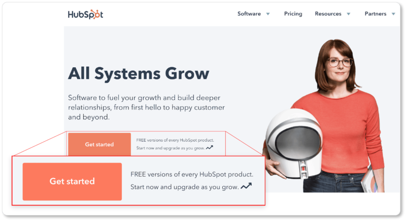
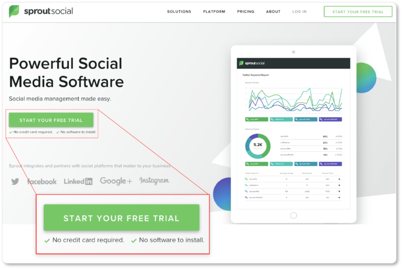
Risk-minimizing information, indeed—and probably a strong conversion optimizer for HubSpot. Sprout Social’s CTA for their free trial is supported by two click triggers immediately beneath it. The first assures prospects that they won’t need to give over their credit card information; the second reminds them of a benefit of using the product (there’s nothing to install):
You may feel—and you may be right—that your page copy is strong enough not to necessitate these click triggers. Certainly piling on more of the same information isn’t going to do your conversions any good. But if you think there’s a chance that your prospect may still have any remaining fears, uncertainties, or doubts after all your copy (and you’ll know for sure thanks to A/B testing), this would be the place to emphasize the rewards of taking action.
Don’t copy this copy
We can’t emphasize enough that these “best practices” are general and are not necessarily the best practices for each of your business’ CTA buttons. As you’ve probably noticed, we’ve given you plenty of examples of good CTA copy above—not all of which adhere to every suggestion we make. It’s up to each business to do its own A/B testing and determine which of these elements to keep and which to omit.
With the above recommendations, if your “Request Demo” CTA isn’t producing the conversion numbers you want it to, you’ll now have a shortlist of variations to experiment with. Maybe you’ll change your verb. Maybe you’ll insert the first person. Maybe you’ll include click triggers, or the word “now.” You get the point.
You’ll make these changes one at a time and watch for the difference that variation makes. A/B testing is a patient practice, but it will tell you a lot about what makes your prospects tick (and click). What’s more, each CTA you test will give you a better idea of what other CTAs on other pages of your site should offer.
In the next section, we discuss how to best position your CTA button to increase conversions… and why it’s important to consider the “one-CTA-per-page” rule.