- HOME
- Website Building
- CTA Buttons
- The Best CTA Buttons: 5 Examples to Learn From
The Best CTA Buttons: 5 Examples to Learn From
- 6 Mins Read
- Posted on March 10, 2018
- Last Updated on October 8, 2024
- By Lauren
Prospects who arrive on your company website are likely to need two things before they take any action—a little guidance, and a little motivation.
That’s where your calls to action come in.
A CTA is anything on your site designed to inspire your visitor to click. It involves a button (because that’s where the click happens); and the action can be anything from downloading a demo to adding an item to a shopping cart to signing up for a webinar to subscribing to a newsletter… the possibilities are really only limited by what your business offers.
But despite the fact that calls to action can prompt such a variety of actions, best practices for CTAs are pretty consistent across the board. They require attention to the button itself (design, copy, and placement), as well as to its surrounding elements. As is the case with all other web elements, CTAs don’t live in isolation—their context on the page is significant.
We’ve gathered these CTAs so you can see some real-world examples of satisfying user experiences. While we can’t say how well these buttons are actually performing, they’re certainly playing the best practices game… and we really enjoyed them.
When it comes to your own CTAs, keep testing to see what works best for your site and resonates most with your visitors. In the meantime, feel free to take some tips from the examples below.
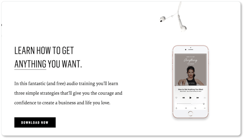
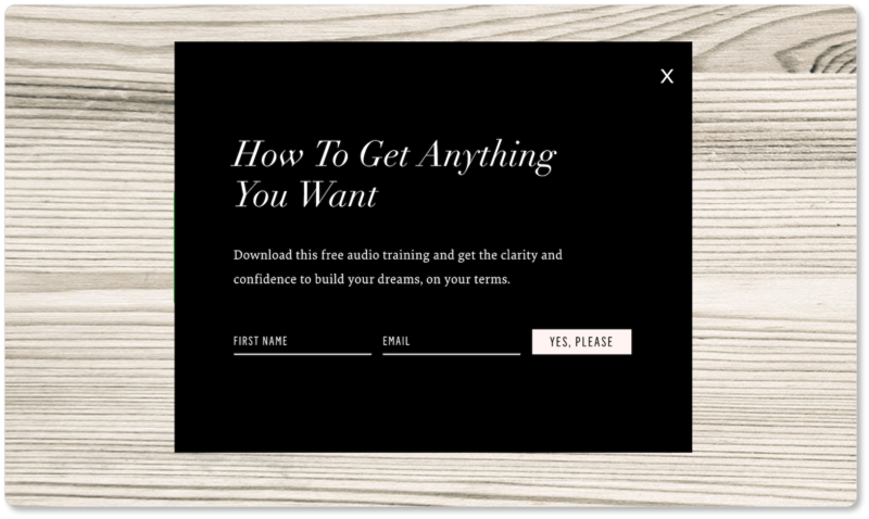
1. Marie Forleo: The Download CTA
This motivational speaker and life coach Marie Forleo is currently offering free audio training on her website. One CTA for the download is positioned halfway down her homepage. But there’s also a pop-up that appears once a visitor has been on Marie’s site for a few seconds—a different CTA for the same training. Here are both of them:
Best elements of Marie Forleo’s CTA:
She offers very compelling copy by the CTA. Whether you believe Marie really can teach you how to “Get Anything You Want,” or you’re incredulous that she can make such a claim, we’re going to bet that this copy pulls a lot of prospects in.
The copy around both CTAs is just different enough that it resonates with distinct prospects: those whose goals are career-focused (“to create a business and life you love”), and those who are still figuring out what their goals are (“clarity and confidence”). This is a great example of how to use different language for different prospects. What’s more, both CTAs wisely mention that the training is free.
Her button speaks in the prospect’s voice. “Yes, Please” is some short-but-smart copy that mimics what a prospect might be thinking. When the CTA language resonates with the language in a user’s mind, it makes them more likely to click. What’s more, the word “please” implies Marie is offering something already worth being grateful for. The copy thus suggests intimacy and appreciation, and attributes good manners to the prospect, all at once.
She includes a visual of her offering. This is a bit more difficult to do when the offering is not a tangible product; but Marie works around that by including a high-quality image of her audio training “in use.” This helps prospects believe that they’re going to get exactly what they sign up for—no strings, and no surprises.
2. Samsung: The Order CTA
Here’s what’s above the fold on Samsung’s homepage:

Best elements of Samsung’s CTA:
It creates a sense of urgency. The CTA copy “Pre-Order Now” accomplishes two things. The word “now” is the imperative word in impulse buys; it subtly intimates that buying later won’t be an option. Moreover, pre-ordering allows prospects to feel as though they’re ahead of the game, so visitors to Samsung’s site who like being first have that much more incentive to click.
It uses negative space effectively. Samsung chose not to use a standout color for its CTA (which is a general best practice), but they don’t crowd their button either, so visitors can’t miss it. They’ve also made it responsive: When a visitor hovers over it, the button turns black and its copy turns white. Thus there’s no ambiguity about whether it’s a clickable element.
It establishes hierarchy. Samsung actually offers two CTAs above the fold: one to “Pre-Order Now” and one to “Learn More.” But while they show prospects two options, they make it abundantly clear which option the prospect “should” click on.
For one thing, the “Learn More” CTA is not a button, so from a psychological standpoint, users will be less inclined to click on it. For another, it doesn’t give any visual feedback when a user hovers over it. These two subtle distinctions ensure that users—whether consciously or not—understand which of the two options is preferable.
3. BounceX: The Consideration-Stage CTA
This behavioral automation software company offers a CTA halfway down their homepage:
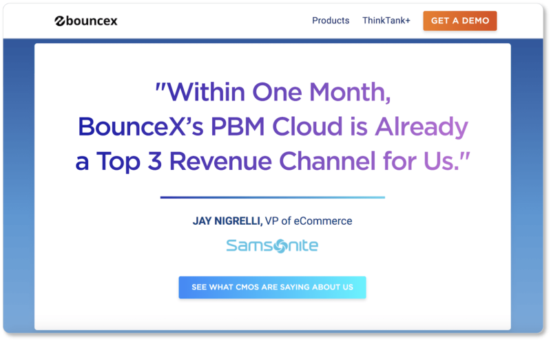
Best elements of BounceX’s CTA:
They speak to their prospect range. Not everyone who comes to BounceX’s site will be ready to “Get a Demo,” as the CTA at the top invites decision-stage prospects to do. So prospects in the consideration stage get their own CTA—one that invites them to learn more about the company by getting an outside perspective.
Their social proof contains authenticity markers. Full name, position, company logo: All these things legitimize the quote here. BounceX’s more distrustful prospects can look Jay up to ensure he’s real, or contact Samsonite to hear more about what BounceX has done for them.
Their button copy promises authority opinion. The button doesn’t just invite prospects to “See What People are Saying about Us”; the testimonials are by top-level corporate executives whose authority in their respective industries makes their valuation of BounceX significant.
4. Kabbage: The Account-Creation CTA
Kabbage gives loans to small businesses. The first step of their application process entails filling out an account-creation form that looks like this:
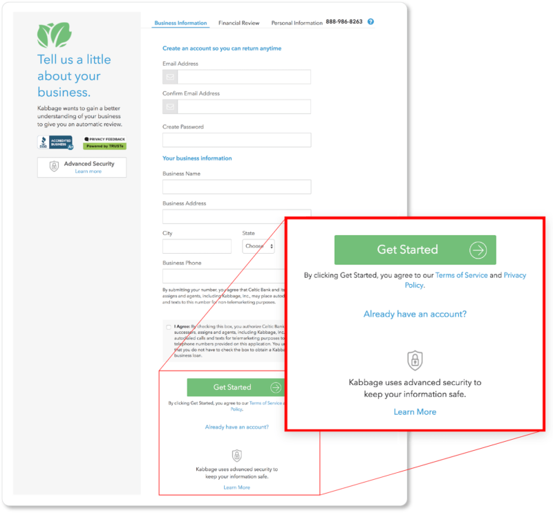
Best elements of Kabbage’s CTA:
They employ the “I want to ___” test. This CTA could have read “Continue,” but instead it uses a more desirable verb. No prospect wants to “Continue”—what they want is to get that loan and get their business going. “Get Started” thus means more than “get started on my application”; it also means “get started on upping my business game (and improving my life).”
Their CTA icon implies progress. That arrow pointing to the right suggests immediacy, speed, and forward motion: all things you want your prospects to feel… especially when the process they’re in on your site entails many (or lengthy) forms.
They display security badges by their CTA. That lock icon by the CTA is a wise addition on Kabbage’s part. It means their applicants feel more trust and less anxiety, and the company sees more conversions.
5. Outreach: The Watch CTA
Here’s the CTA on the landing page to request a demo from this sales engagement platform:
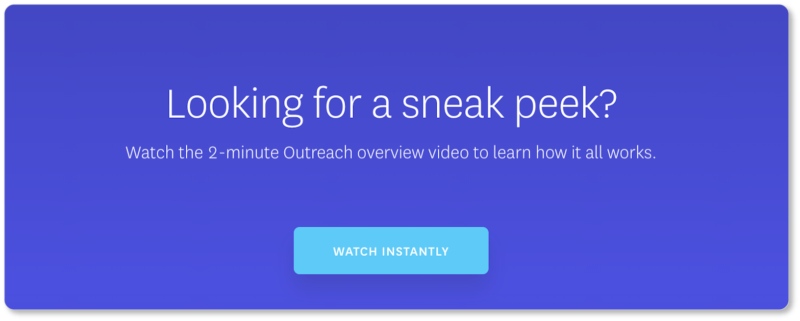
Best elements of Outreach’s CTA:
They promise instant gratification. “Watch instantly,” or, really, do anything instantly, is great benefit-driven CTA copy for a world of impatient users accustomed to having exactly what they want at their virtual fingertips.
The copy makes visitors feel privy to something they shouldn’t be. Of course, everyone who clicks on Outreach’s CTA can view their video; but the term “sneak peek” gives the impression that each individual visitor is getting special access.
They specify how long the video is. A general rule of thumb for your CTAs is to dispense with all ambiguity: Let users know exactly what’s in store for them on the other side of that button. Outreach adheres to this perfectly. “Watch the 2-minute long video” doesn’t just tell users they’ll be taken to a page to watch something; they also know how long that experience will take. More certainty = more conversions.
We’ve haven’t gone over every possible CTA type out there; but these buttons cover most of the best practices we describe in our content on calls to action. Feel free to check those pages out for more examples… and then get creating your own irresistible calls to action!