Even if you’ve read our tips on how to create stronger, more effective product pages, shopping carts, and everything else that goes into an ecommerce site, you may be wondering how you can pull all of those separate elements together. What does it look like to consider UX from the jump, and create a site that helps visitors along their journey, while also generating more sales?
We scoured one award-winning ecommerce site for with the intent of demonstrating exactly that. Keep reading to see best practices in action for every step of a potential purchaser’s journey, from browsing to buying.
A well-designed ecommerce site: Heyday skincare
Heyday is a self-described “one-stop skincare shop where knowledgeable experts, customized facials, and powerful products come together to help you put your best face forward.”
The site is a fusion of service-plus-product. Visitors can book an appointment with a licensed esthetician in New York or Los Angeles. They can also buy “products our therapists love and use” in the other half of the site, an online shop. This framing bakes social proof into the site from the very beginning. After all, if professional estheticians use the products, they must be good.
Connecting with customers
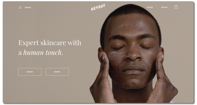
When visitors land on Heyday’s site, they’re greeted with a video in the “hero image” space. Using video in this space is a terrific way to capture visitor attention immediately. The hero video cycles between several different people using skincare products.
What makes this video so strong is that it appeals to a customer persona quite different from the persona typically associated with, or expected from, skincare companies. Heyday makes it clear from the beginning that their products (and services) aren’t gendered. Men who click into the site immediately know that Heyday considers them a potential customer, and don’t have to ask if they’re in the right place.
Keeping it simple
Aside from the hero video, the simplicity of the options offered above the fold is immediately obvious.
The CTA buttons just below the value proposition show visitors there are two primary actions they can take on the site. They can book an appointment, or they can shop products. Those same options show up in the main menu (top right corner of the page) for visitors who look there first. Heyday’s more complex navigation menu is hidden behind the hamburger icon (top left corner of the page). This keeps visitors from becoming overwhelmed when they first land on the homepage.
When a visitor clicks on the hamburger menu, here’s what they see:
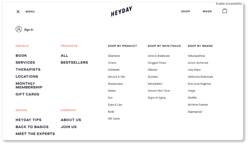
User-focused navigation
Initially, it might seem that there’s a lot happening here. But when you look closer, you’ll observe that Heyday offers more options in order to make navigating simpler (meaning: fewer clicks) for its visitors. There are four primary categories on the left side of the menu, in orange text so as to stand out:
- Facials
- Products
- Advice
- Company
For visitors who are looking to browse the company’s selection, Heyday offers two options under “Products”: “All” and “Bestsellers.” The right side of the main menu is for visitors who know what they’re looking for. Those visitors can shop by product, brand, or skin condition.
“Skin Focus,” by the way, is a filter we don’t see often enough. It’s a brilliant—and empathetic—way to make UX easier on visitors who have arrived on the site in a frustrated or concerned state. They may initially have no idea what products to look at, but the navigation guides them there.
In other words, Heyday offers a navigation menu that caters to two types of prospects:
- Those who don’t know the company or the industry well and are in “discovery” or “browsing” mode
- Those who arrive on the site with a clearer intention and don’t want to click through Heyday’s categories to find what they’re looking for
In creating their menu, Heyday is keeping their whole range of users in mind.
Since we’ve never been here before, we clicked on “All” in the “Products” category. Here’s what we saw next:
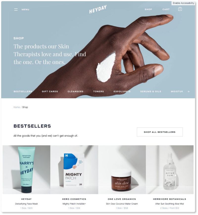
Note that, for visitors who click on “All” products, Heyday groups its offerings by type. These visitors probably aren’t looking for specific brands or for particular skin conditions. Otherwise, they’d have clicked into those menu items.
On this landing page, types are listed in the horizontal menu beneath the hero image. Those categories are displayed in the same order when a user scrolls down. Naturally, Heyday puts their bestsellers at the top.
Remember, we’ve identified ourselves as “browsers” based on what we clicked into from the homepage. We’re probably not committed to a purchase yet, so offering these “hot items” first might capture our attention more quickly. It also continues to provide social proof and simplifies the shopping experience for first-time users.
Persuasive product pages
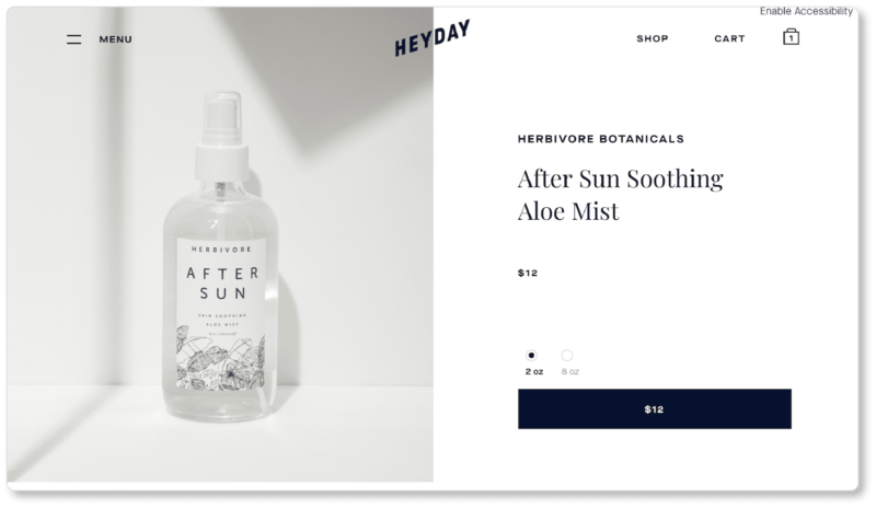
We clicked into the After Sun Soothing Aloe Mist:
Heyday’s product pages do a lot of things right:
Strong product photography
Granted, it doesn’t follow the best practices we laid out in our Ecommerce Product Photography Guidebook. (A great reminder that “best practices” are only that—they’re not law!) For example, the shadows that fall in the upper-right hand corner and to the left of the product are not a best practice. Even so, those shadows and the line where the table meets the wall frame the product rather than distract from it. It’s an interesting decision on the photographer’s part and it works well. Most importantly, both the product and the copy on its label are clear.
Easy-to-find “Add to Cart” button
It’s the second most-visible thing above the fold. Remember, your ongoing question when thinking about UX should be: Does the user know where to go next from here? Heyday ensures they do.
That space above the fold is entirely clear of visual clutter. Users see the product, note the price, choose the size they want (the price auto-updates when a new selection is made), and click the CTA. Indeed, our only recommendation for the company would be to stick with convention and have the button read “Add to Cart.” A button that says “$12” doesn’t exactly tell us what’ll happen when we click on it. Users should always know precisely what clicking on a button will do.
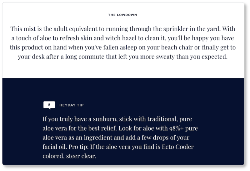
“Heyday tips” and “Pro tips”
What we love about this decision is that it affirms the company is as interested in educating its market as it is in selling to them: Prospects feel they’re being seen and heard rather than capitalized on. Indeed, these “tips” aren’t even specific to Heyday’s product. They’re true of all aloe vera products, and they’ll benefit the target market no matter who they buy their aloe from.
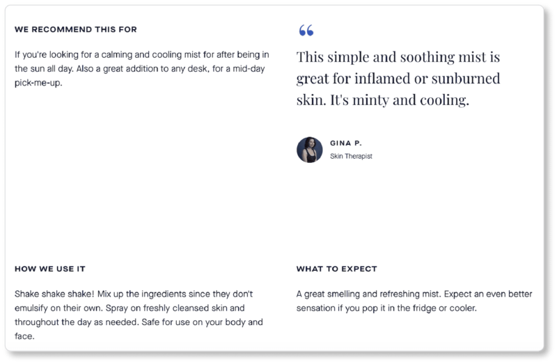
Product education
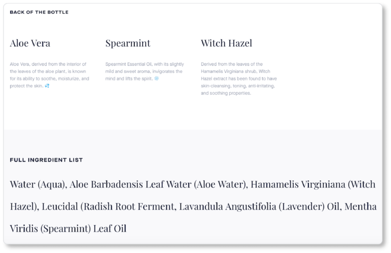
This continues further down the page (check out the headings “We Recommend This For,” “How We Use It,” “What to Expect”). Heyday doesn’t leave a stone unturned—or a question unanswered—here: When would I use this? What’s the best way to use it? What will it do to/for me? And of course: What, exactly, is in it?
Social proof
Heyday offers social proof from the demographic prospects most want to hear it from—professional estheticians. Remember, everything that’s sold on Heyday’s online shop is already recommended by the pros; but putting faces and names to those recommendations humanizes the endorsement, making it even easier for prospects to trust the product and the company.
All of this occurs on a remarkably clutter-free and easy-to-scan product page.
Clean cart & checkout design
We won’t linger too long on Heyday’s add-to-cart and checkout processes, but it’s worth noting a few things in that portion of the buyer’s journey. For one, a series of microinteractions occurs when a user clicks the “Add to Cart” CTA.
Three things happen at once:
- The color of the button changes
- The copy on the button changes
- The cart icon in the top-right corner is updated to reflect the addition
These microinteractions instill confidence in the user and signal that the website registered the action they took.
We’d have loved both a more conspicuous route to checkout and a CTA to keep shopping at this point (you should always give users both options on your cart page!). However, Heyday leaves us to figure out our next steps on our own. So we click into the cart page and move through a pretty standard checkout process after that.
Checkout and order confirmation
Here’s what the shopping cart looks like:
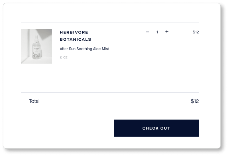
Notice that Heyday displays a product image along with some details (product name and size), and gives prospects the option of increasing or decreasing order size. To remove an item from the cart altogether, users must click the “—” icon until the number hits zero. This took us a second to figure out; most users expect an “X” for this.
On the checkout page, Heyday offers both PayPal and Amazon Pay for express checkout. They also offer guest checkout as a default, but give returning users the option to sign in. There’s no forcing account creation, which we love. What we don’t love is that we weren’t given the cost with tax until this page. And we won’t be given the total cost with shipping until the next page:
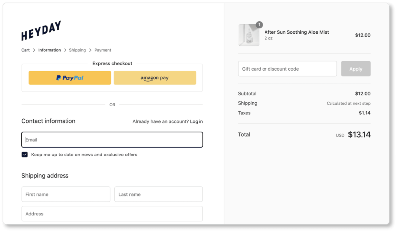
By the time we completed checkout (not shown), our total cost had nearly doubled from the listed price (from $12.00 to $22.87), so Heyday doesn’t get points for total-cost transparency here. But the UX up until these final pages was remarkably good.
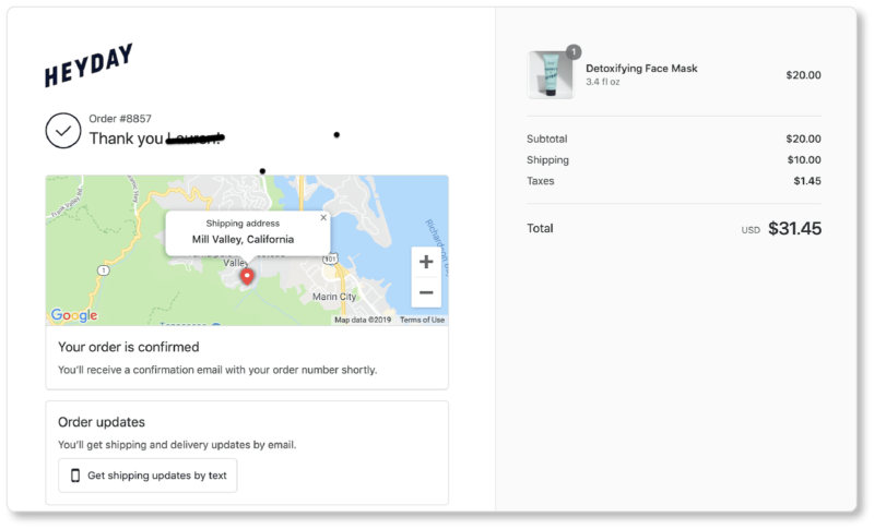
Clear order confirmation and specific next steps
The company redeemed itself when, after some more browsing, we ended up purchasing a product after all. Here’s what we saw on the confirmation page:
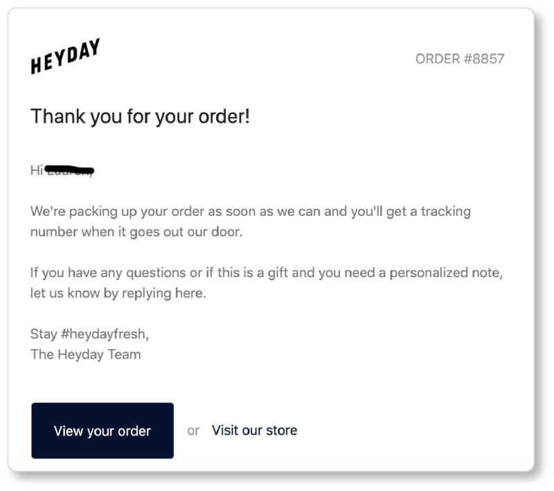
And here’s the email we received just moments after hitting the “Purchase” CTA:
Heyday does a few things really well here. For one, their confirmation page shows us exactly what we purchased, what we paid for it, where it’s being shipped to on the map, and what next steps are. A confirmation email is coming, so we’ll be on the lookout for it. We also know that we can expect shipping and delivery updates by email. But, if we prefer, we can click that CTA to get them by text instead.
In the confirmation email, we’re given more next steps (look out for the tracking number). We’re also given a few options:
- “Giftify” our purchase
- View our order
- Start shopping again (“Visit our store”)
- Look for their hashtag on social media
- And, perhaps, use the hashtag in our own social posts when the product arrives
Not bad for what’s essentially a two-sentence email!
Your UX homework:
Here’s what you should learn from looking at Heyday’s design:
- Make it immediately obvious who your ideal customers are on your homepage
- Keep your navigation options simple and user-focused
- Make good use of social proof
- Show visitors that you’re interested in helping them improve their lives and get the most from your products
- When a visitor takes an action, make it very clear that they’ve taken an action
Last but not least: On every page of your site, does the user know where to go next from here? If not, what do you need to change to do that?
Even if that’s the only UX principle you keep in mind while building your ecommerce site, it will serve you (and your business) well.