In the last section, we guided you through a number of best practices for product descriptions. Over the course of that exploration, we touched on consumer psychology indirectly: Your product descriptions’ focus on prospects’ pain points and problems, for example; or the subtle ways you can preempt buyer’s guilt before prospects even click that “Add to Cart” CTA. We asked you to spend some time thinking about the ways you’ve justified online purchases in the past. And hopefully, you’ve used those justifications to start crafting your ecommerce product copy—with your target market top-of-mind with every word you write. That copy is helping your prospects envision results—and possibly even life changes—thanks to your product.
But that was just your product description we were talking about—one of many copy elements on your product page. Remember, “copy” includes any and all written content (read: words) displayed on your product pages. There are plenty of other ways you can leverage consumer psychology—well beyond your product descriptions—to influence behavior and boost online sales. We’re talking everything from your product page FAQs to the copy on your CTA buttons. And they’re tried-and-true strategies you probably encounter regularly in your own experience as an online consumer: language that, taken as a whole, invokes feelings of urgency, excitement, desire, trust, and/or the fear of missing out that causes you to hit that “Add to Cart” button… sometimes without even rationalizing it.
Here are some strategies for using psychology on product pages (and other pages):
Urgency and scarcity principles
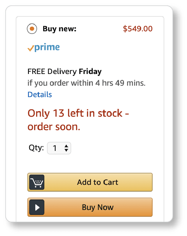
Two strategies for increasing conversions are to create the sense that your product may not be available to prospects at a later time (scarcity), or that a special deal will soon end or the price may soon increase (urgency). These strategies put pressure on site visitors and compel them to purchase before it’s “too late.”
Urgency and scarcity tactics should seem familiar; Amazon uses them both often, and to great effect:
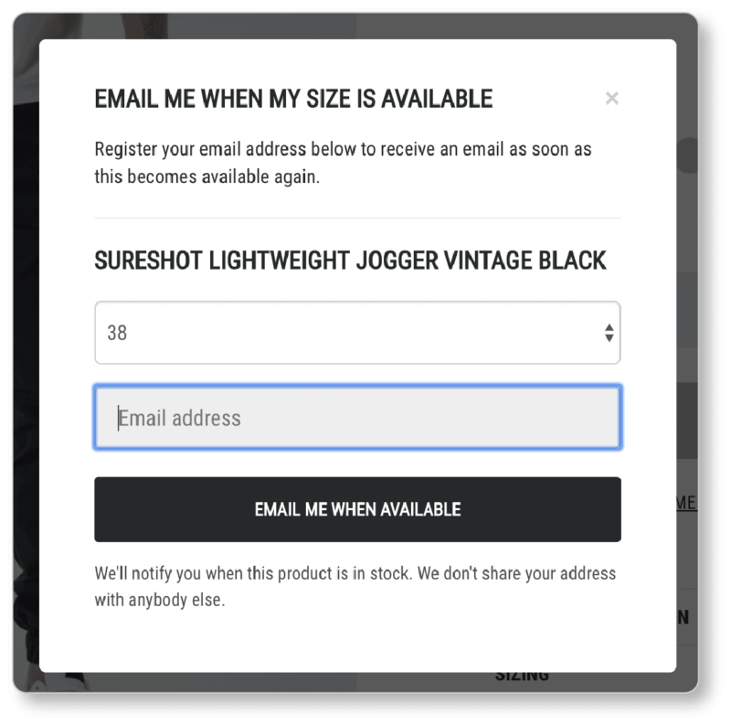
Another form the scarcity principle can take is “Out of Stock” notifications. (Out of stock notifications also serve as a form of social proof, which we’ll discuss in a moment.) When prospects receive email notifications that the product is back in stock, they’re all the more likely to purchase… and quickly! After all, they don’t want to miss out on owning the product a second time. Here’s how Zanerobe does it:
Social proof
Social proof is the social and psychological phenomenon in which people (here, consumers) rely on the actions and choices of others to determine their own actions and choices. The idea, of course, is that if “everyone” is doing it, it’s the “right” thing to do. Customer testimonials—which we’ve written about at length elsewhere—are one form of social proof. Other forms of social proof leverage psychology to make visitors feel as though they’re missing out on something. You’re showing would-be customers that they can be a part of an exclusive community, if they buy your product.
One way of accomplishing this is to add user-generated content such as Instagram images to your product page. The clothing company BlackMilk has customers add a hashtag for the specific item they’re wearing in their Instagram posts, which is one way of demonstrating product popularity:

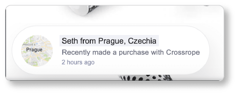
Other forms of social proof include social media share buttons, “heart” or “like” buttons, lists of how many customers have bought a particular item, and “Most Popular” or “Best-Selling” categories. You may remember Crossrope—the jump rope company we discussed in our product photography guide. Aside from understanding the power of great images, Crossrope also understands the power of social proof. They’ve installed a plugin that tells site visitors about purchases recently made on the site. Prospects see this information while they’re on the product page. (Talk about a terrific conversion optimization strategy!)
What’s more, the company shows visitors how many people are currently on the site on its homepage:

And of course, this form of social proof should look familiar to you from Airbnb:
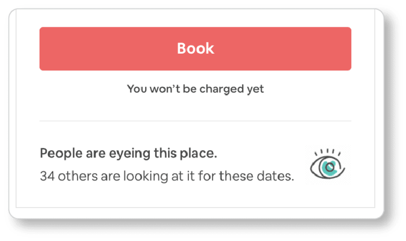 Of course, the retail version of this might read something like: “34 people currently have this product in their carts.” This strategy is essentially a combination of the urgency/scarcity principles and social proof. As you can imagine, the two often go hand-in-hand.
Cross-selling and up-selling
By the time your prospect gets to your product page, they’re clearly inside your purchasing funnel—so you may as well make the most of it. Cross-selling is showing your prospect related products. Think accessories for technology products (need a case or an extra charger for those earbuds?), or the “look book” style approach that clothing retailers often take: You simply couldn’t buy that skirt without also buying those shoes… oh, and also that top.
Up-selling, on the other hand, is selling those related products as a package. It can also mean encouraging prospects to buy a higher-end version of the product they’re already interested in.
Once again, Amazon employs both of these strategies with remarkable success. If you’ve ever searched for anything on their site, you’ve probably noticed their cross-selling efforts look something like this:
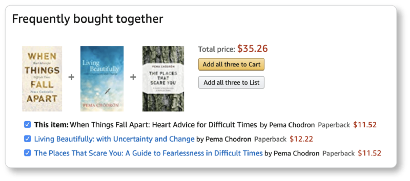
Of course, there’s not a penny of savings in the “opportunity” Amazon has offered us of buying three books together; but buyers tend to overlook this fact when they feel Amazon has done the “work” of curating products they might be interested in.
Note that Amazon doesn’t display these other options so high up on the page that they become distractions. You don’t want to divert your prospect from the purchase at hand by sending them down a rabbit hole in which they forget what their original intent was.
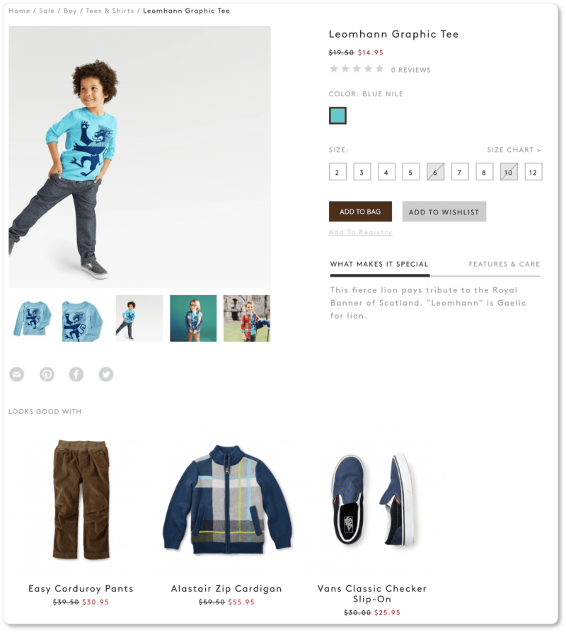
The Tea Collection also cross-sells well. On the product page for this shirt, prospects are offered recommendations to complete the look (“Looks good with”):
Dollar Shave Club, on the other hand, has their up-selling game down. Prospects who opt to try their “Daily Essentials Starter Set” click the $5 CTA, and are then taken to a page of “Add-Ons.” (So much for that $5 price tag… and yet, the product imagery on that second page is so appealing—and the reviews are so good—that we bet Dollar Shave Club sees a lot of add-ons)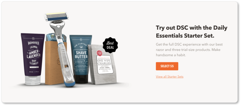
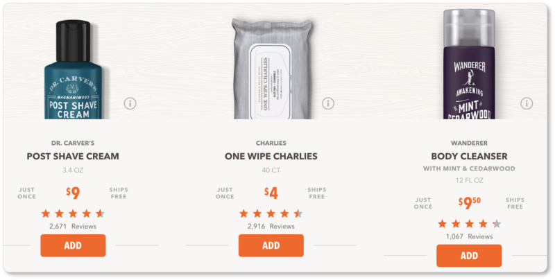
Commerce Plus has a product recommendation engine that offers recommendations based on products that are commonly purchased together, as well as visitors’ browsing and purchase histories. These recommendations are so valuable because they’re based on previous behaviors… and therefore, on likely future behaviors. There’s little you can offer that’s more personalized than this.
If your ecommerce platform doesn’t support up-selling and cross-selling, you can always suggest complementary products in your product descriptions. Both of these strategies are valuable because they alert your visitors to products they may not otherwise know exist in your shop, and reveal the rich variety you have to offer.
Subscriptions
You probably know Dollar Shave Club as a popular subscription-based business that offers a product that needs to be regularly replenished. In a subscription-based model, customers sign up to purchase your product on an ongoing basis—generally with a monthly renewal. Whatever the time frame, the product is faithfully delivered on that date.
Surely you’ve seen this for certain products on Amazon as well. We say “certain products” because—as you can imagine—this strategy really only works for products that have to be repurchased often, such as beauty products or food.
For the ecommerce business offering its product as a subscription, the biggest advantage is obvious: recurring—and thus predictable—revenue, and a measure of stability. The Baymard Institute calculates that the average cart abandonment rate is currently at 69.23%. Incorporating a subscription option into your online shop—and shouting it loudly in the copy on your product pages—means you’re not subjecting yourself to the risk of abandonment on the threshold of each new replenishment.
What’s more, it costs about 6 times more to acquire new customers than it does to retain the ones you’ve already got. Thus, the more recurring customers, the better—and this is precisely what subscription models ensure. They reduce your risk of losing customers to your competitors, since your customers will be so appreciative of the convenience you offer that it won’t occur to them to look elsewhere.
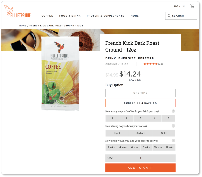
Bulletproof has recognized the value of the subscription service for its own products. (Freshly ground coffee shipped to our house every two weeks? Yes, please.) On the product page, users have the option of making a one-time purchase or of subscribing: Bulletproof offers an incentive of 5% off for subscribers. When users click on the subscription option, they see the reduced price (more psychology!) and answer a few quick questions, including how often they’d like their shipments to arrive.
And then? They never have to worry about running out of coffee again:
Trust badges
Data breaches, identity theft, credit card fraud… we’ve all heard the horror stories. Prospects are understandably wary about giving out personal information online. So if you want potential customers to do so, you have to convince them that their information is safe with you.
You don’t need to inundate your visitor with trust badges—indeed, you don’t want them to think you’re offering a false sense of security. One or two recognized badges should do the job:

The watch retailer Express Watches ran an A/B test in which they changed their message on a Seiko watch product page from “Never Beaten on Price” to “Seiko Authorized Dealer Site.” This simple change—which essentially promised customers that they were getting the real deal rather than an imitation—resulted in a 107% increase in sales, and suggested that prospects prioritize authenticity to low prices.
Such quality trust signals should indeed be sprinkled throughout your site… but product pages are important places to display them.
Free shipping
We’ve discussed strategies for offsetting the costs of free shipping at length elsewhere, so we won’t go into it again here. We’ll simply say this: It’s entirely worth it to you to offer free shipping (not to mention free returns and exchanges) to your customers.
And it’s certainly worth reminding your prospects—again and again, on individual product pages—that they won’t be paying anything more for the product than the number they’re currently looking at.
Because, of course, knowing this will make them all the more likely to buy.
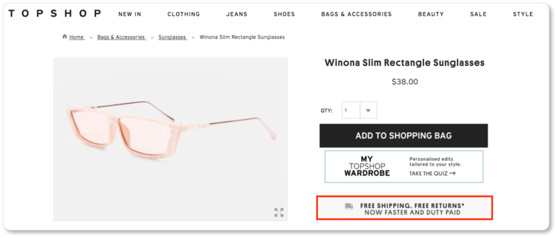
Topshop wisely acknowledges their free shipping and returns on their homepage; but they also call it out on each individual product page:
Think outside the “best practice” box
You may have noticed that just below the “Add to Shopping Bag” CTA on Topshop’s product page is a second CTA (“My Topshop Wardrobe”) that lets prospects take Topshop’s quiz and get “Personalised edits tailored to [their] style.”
Here’s the thing: This is not a best practice. Indeed, anything that causes a prospect to pause (or in this case, take a complete detour) in the midst of a shopping or selection process generally means fewer conversions. When prospects click on Topshop’s secondary CTA, they’re taken to another page entirely… and the chances of them returning to the product page? We bet they aren’t 100%.
Then again, we also don’t know what kind of testing Topshop does. We tried to take the quiz ourselves, and after 17 questions (yeah; you read that correctly), we were officially annoyed. But then again, we’re not particularly keen on clothes shopping—and we feel pretty confident that we’re not one of Topshop’s buyer personas. When we finally finished the quiz, we were presented with a page of offerings that suited “our style”… ALL of which, incidentally, cost more than those $38 glasses we were about to buy:
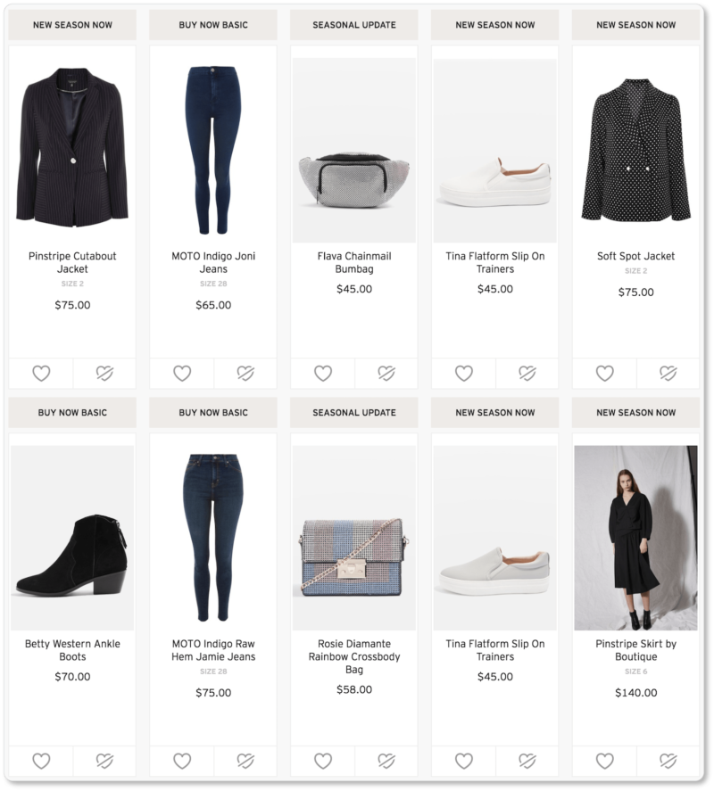
What’s more, Topshop got our email address in the process (we had to give it to them before we saw this page), which means they’ve got another contact on their list for future email marketing campaigns.
In other words, it’s possible that by eschewing one particular best practice (keep your visitor in the sales funnel!) and by paying more attention to their own prospects’ and customers’ psychology (the desire to have a relationship with a clothing company that “knows” what they like), Topshop has actually increased their conversions in the long run.
So remember that your prospects’ and customers’ particular psychologies will ultimately be the driving force in the product page elements you decide to use. Start with best practices, yes… but learn your target market’s particular psychology more deeply with every set of data you dive into.
Over the last five pages, we’ve discussed best practices for online shop copy at length. Now it’s time to see how some of the smartest ecommerce businesses are taking these practices and running with them. In the next section, we offer some of the best ecommerce product copy we’ve seen.

