
- What is marketing data visualization?
- Marketing data visualization: The current landscape
- Why visualize your marketing data?
- Types of marketing visualizations (and when to use each)
- Top data visualization tools for marketers
- Key features to look for in a marketing data visualization tool
- Why Zoho Analytics is best for marketing data visualization
- Marketing data visualization examples
- Future trends in marketing data visualization
What is marketing data visualization?
Marketing data visualization is the practice of translating raw marketing data, such as ad spend, web traffic, email performance, lead volume, pipeline contribution, into charts, dashboards, and visual reports that are fast to read and easy to act on. Instead of scanning rows in a spreadsheet, you see a trend line, a funnel chart, or a report at a glance.
At its core, it connects two things most marketing teams keep separate: the data that lives in your tools and the decisions you need to make every day. A well-built marketing visualization describes what happened and tells you where to look next.
What counts as marketing data?
Any signal generated by your marketing activity is fair game. In practice, this covers four interconnected layers:
- Acquisition data: Traffic sources, paid impressions, clicks, cost-per-click, keyword rankings, and search console performance. These tell you where people are coming from and what you’re paying to reach them.
- Engagement data: Email opens, click-through rates, social media reach, post engagement, content views, and session behavior on your website. These reveal how your audience responds once they’ve arrived.
- Conversion data: Form fills, demo requests, free trial sign-ups, MQL volumes, and campaign-to-opportunity linkage. This is where marketing touches the pipeline and where budgets get justified.
- Revenue & ROI data: Customer acquisition cost (CAC), lifetime value (LTV), return on ad spend (ROAS), and revenue influenced by channel. These connect your marketing activity to business outcomes.
Visualizing these layers together (rather than in separate platform dashboards) is where the real power lies. When you can draw a straight line from a campaign click to a closed deal, every budget conversation becomes easier.
💡 Tip: The most common mistake teams make isn’t choosing the wrong chart type. It’s visualizing data in isolation. An email open rate chart is interesting. That same chart layered against pipeline generated from that campaign is actionable.
Marketing data visualization: The current landscape
Right now, your data is everywhere and nowhere. Ads live in their platforms. Web data sits in analytics. Email lives in its own island. Sales lives in the CRM. Pulling a simple answer (“What did last week’s spend do to pipeline?”) turns into a scavenger hunt.
- The big shift: Privacy changes and signal loss mean attribution isn’t a neat last-click line anymore. If you’re still exporting CSVs and stitching them in spreadsheets, you’re working with stale numbers and your marketing analytics needs an upgrade.
- What “good” looks like: one place to monitor the funnel end-to-end, with shared definitions for CAC, CPL, MQL→SQL conversion, and ROAS so everyone works for the same truth.
Why visualize your marketing data?
Visualizing your marketing data brings clarity. Instead of digging through exports or guessing at trends, you can glance at a chart and understand what changed, when it changed, and why it matters.
Good visuals speed up your decision-making because they highlight patterns like seasonality, fatigue, or a sudden jump in cost before they become problems.
They also align teams. When everyone sees the same definitions for CAC, CPL, and conversion rate, conversations shift from debating numbers to deciding actions.
Most importantly, visualization keeps you operating in real time. You can cut wasted spend, shift budgets, and push winning creative while a campaign is still live, not weeks later when a static report arrives.
Types of marketing visualizations (and when to use each)
Start with the question you need to answer, then choose the chart that naturally answers it.
If you are tracking how something changes over time, a line chart is your best friend. Plot sessions, conversions, revenue, or cost week by week, and you will spot slope changes that a table hides.

When you need to compare things side by side, such as campaigns, audiences, or countries, use bar or column charts. They make rankings obvious and stop you from over reading tiny differences.

When composition matters, stacked bars or area charts show how each channel contributes to the whole. They are perfect for understanding your mix across devices or platforms.

For journeys with clear steps, use a funnel chart to reveal where people drop off. A simple view from impression to click to lead to opportunity makes the bottleneck unmissable.

Finally, timing patterns deserve a heatmap. Plot engagement or cost by day and hour to find the posting windows or call times that consistently perform.

Tip: Read our guide on choosing the right data visualization type
Top data visualization tools for marketers
Here are some of the best data visualization tools shortlisted based on features, ease of use, and pricing:
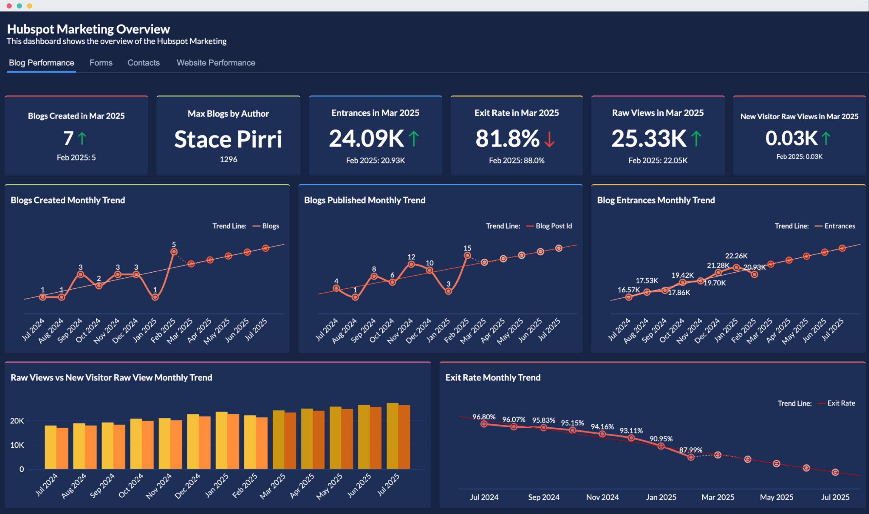
1. Zoho Analytics
Zoho Analytics is a AI-powered marketing analytics platform built for marketers who need quick, reliable insights without filing a ticket to the BI team. Unlike most analytics platforms that treat marketing connectors as an afterthought, Zoho Analytics ships with 25+ native marketing integrations, pre-built dashboards for every major channel, and Ask Zia, an AI assistant that answers plain-English questions about your data. You can blend ad spend from Meta, lead data from HubSpot, and revenue from your CRM in a single report, without writing a line of SQL, giving you a unified view of full-funnel performance that most marketing teams have never had before.
Key strengths:
- Native integrations with 25+ marketing tools: Connect directly to GA4, Google Search Console, Semrush, HubSpot Marketing, Facebook Ads, LinkedIn, Instagram, YouTube, and more.
- Prebuilt dashboards for instant insights: Each integration comes with ready-made reports and dashboards so marketers don’t need to build everything from scratch.
- Unified marketing + business analysis: Blend data from your CRM, finance software, support tool, or ad platforms to understand full funnel performance.
- AI-powered analytics: Features like Ask Zia (AI agent), Zia Insights (automated narrative insights), and smart recommendations help non-technical users discover trends quickly.
- Automated data sync: Set data refresh schedules (hourly/daily) to ensure dashboards always reflect the latest performance.
- Easy and secure collaboration: Share dashboards with granular permissions, embed them securely, and collaborate with internal teams or clients.
Pricing:
- Basic: $30/month: 2 users, 0.5M rows. A solid starting point for small marketing teams.
- Standard: $60/month: 5 users, 1M rows. The most popular plan for growing teams.
- Premium: $145/month: 15 users, 5M rows. Full feature access for established marketing operations.
- Enterprise: Custom pricing: Unlimited users, advanced governance, and white-labeling options.
All plans are billed annually. A free plan is available for individuals. A 15-day free trial is included on all paid plans. No credit card required.
What users say:
“Zoho Analytics’ ability to integrate and blend data from multiple sources and create deep valuable insights out of it is the key. Once you sync the data and build reports there is no necessity to go back and refeed the data into it. It does it automatically.” — Jessica Eddowes, VP of Digital Marketing & Ecommerce, Lice Clinics of America
“Seamless integrations with key marketing platforms like GA4, Google Ads, and Facebook. Highly customizable dashboards for client-ready reports. Automated report scheduling saves time and boosts efficiency.” — Linton W., Project Manager (via G2)
“I think the best thing about Zoho analytics is that it is user-friendly anyone beginner can easily be used it. Zoho Analytics gives the user a wide range of data connector options like Facebook ads, google ads, linkedin, google Analytics and many more. Excellent Data Visualisation In The Form of tables, charts, maps.” — Juned A., (via G2)
Best for: Marketing teams that want a self-serve analytics platform with strong marketing integrations, pre-built dashboards, and minimal setup, without needing a dedicated data analyst.
15 Days free trial. No credit card required2. Tableau
Tableau allows analysts to build highly customized, interactive dashboards that can tell a nuanced data story. For marketing teams, Tableau shines when you’re working with data warehouse-level volumes that need sophisticated modeling before visualization. The trade-off is clear: Tableau requires analyst or BI support to set up and maintain. Marketers typically can’t use it independently without a data intermediary.
Key strengths:
- Customizable visualizations: Build interactive dashboards that can tell a rich data story.
- Strong connector ecosystem: Integrates with data warehouses (Snowflake, BigQuery), spreadsheets, cloud apps, and marketing data pipelines.
- Enterprise-grade analytics: Suitable for large marketing teams that need governance, security controls, and support for large data volumes.
- Broad adoption: Widely used across business functions, making cross-department dashboards and a shared data culture easier to establish.
Pricing:
- Viewer: $15/user/month: View and interact with published dashboards only.
- Explorer: $42/user/month: Build and explore content from existing data sources.
- Creator: $75/user/month: Full access including data connections and publishing. Required for at least one user per organization.
All plans are billed annually. Tableau is part of Salesforce; enterprise capacity pricing is available for large deployments.
What users say:
“Tableau is an excellent data visualization tool that makes complex data easy to understand through interactive and visually appealing dashboards. Its drag-and-drop interface allows users to explore data quickly, while still offering advanced capabilities for deeper analysis. At times, the loading time can be quite long when working with complex data. Additionally, creating dashboards in Tableau often requires the expertise of someone experienced with the tool.” — Tanishka G., Marketing Manager (via G2)
“What I like best about Tableau is its ability to turn complex data into clear, interactive visualizations. It makes it easy to explore data, identify trends, and surface insights without needing deep technical skills. Complexity for Beginners. While Tableau is user-friendly in general, some advanced features like calculated fields, LOD expressions, or table calculations have a steep learning curve.” — Annpurna S., Marketing Data Ops Lead (via G2)
Best for: Large teams or organizations with a dedicated data function that need maximum visualization flexibility and can accommodate a longer setup time.
3. Power BI
Power BI is the analytics layer that slots neatly into the Microsoft ecosystem. If your organization runs on Excel, Teams, SharePoint, Dynamics 365, and Azure, Power BI is a natural extension. The challenge is that Power BI’s marketing-specific integrations are limited. You’ll often need third-party connectors or custom data pipelines to pull in ad platform and email data, which adds setup complexity and maintenance overhead.
Key strengths:
- Tight integration with Microsoft apps: Works seamlessly with Excel, Teams, Dynamics 365, SharePoint, and Azure.
- AI features: Offers natural-language querying and smart narratives.
- Data modeling capabilities: Can unify CRM, sales, and marketing data within the Microsoft ecosystem.
- Competitive pricing: Power BI Pro is bundled with many Microsoft 365 plans, reducing additional licensing costs for existing Microsoft customers.
Pricing:
- Free: Personal use with limited sharing capabilities.
- Power BI Pro: $14/user/month: Full collaboration and sharing. Often included in Microsoft 365 E3/E5 subscriptions.
- Premium Per User: $20/user/month: Advanced AI features, larger dataset sizes, and paginated reports.
- Premium (capacity): Custom pricing: Organization-wide deployment without per-user licensing.
What users say:
“I like how Power BI makes it easy to turn complex data into clear, interactive dashboards, and how well it integrates with other Microsoft tools. I dislike that Power BI can have a steep learning curve, especially with data modeling and DAX, and that performance can lag with large or complex datasets.” — Gerardo S., Paid Media Manager, Marketing and Advertising (via G2)
“What I like most is its ability to quickly turn raw data into clear, interactive dashboards. It integrates smoothly with multiple data sources, especially within the Microsoft ecosystem. The biggest drawback of Power BI, in my experience, is the learning curve around DAX and more complex data modeling, which can be tough for beginners to pick up. ” — Abhishek B., System Engineer (via G2)
Best for: Enterprises already standardized on Microsoft where Power BI licensing is bundled, and the primary need is integrating CRM and sales data with marketing performance.
Comparison table: Best data visualization tools for marketers
Feature | Zoho Analytics | Tableau | Power BI |
Marketing integrations | 25+ native integrations (GA4, GSC, Semrush, HubSpot, LinkedIn, Meta, YouTube, Instagram) | Limited direct marketing connectors; often requires data pipelines | Few marketing-specific connectors; relies on third-party tools |
Prebuilt marketing dashboards | Extensive, ready-to-use dashboards for all major channels | Limited starter dashboards; more manual setup | Minimal marketing templates; requires custom build |
Setup time | Very fast; marketer-friendly setup without data team | Slow; requires BI or analyst setup | Medium; setup easier if already on Microsoft |
Data blending | Native cross-app blending with minimal effort | Possible but needs modeling expertise | Possible but requires strong data modeling |
AI capabilities | Ask Zia, automated insights, smart recommendations | Offers predictive modeling with expertise | Good AI features but not tailored for marketers |
Starting price | $30/month (team plan) | $15/user/month (Viewer) | $10/user/month (Pro) |
Best suited for | Marketing teams wanting quick, self-serve insights | Data-heavy teams with BI support | Organizations standardized on Microsoft |
How to choose a data visualization tool for marketing: list your sources, your team’s skills, and how often you need to change dashboards. Pick the data visualization software that gets answers quickly without adding friction.
Note: Read our guide on how to choose the right data visualization tool.
Key features to look for in a marketing data visualization tool
Not every analytics platform is built for marketing. A tool might be powerful for finance or engineering and still leave your marketing team relying on spreadsheets. Before you evaluate options, here are the capabilities that actually move the needle for marketing use cases.
- Native marketing integrations: Your tool should connect directly to the platforms you already use, like GA4, Google Ads, Meta Ads, HubSpot, LinkedIn, Mailchimp, without requiring custom scripts or third-party data pipelines. Native connectors mean faster setup, more reliable syncs, and far less maintenance.
- Cross-source data blending: The real insights live at the intersection of your data sources. A visualization tool worth using should let you join ad spend, web behavior, CRM leads, and revenue in a single dashboard without a data engineer involved. If blending requires writing SQL or building custom ETL pipelines, it’s not built for marketing.
- Prebuilt marketing dashboards: Starting from a blank canvas every time is inefficient. Look for marketing dashboard software that ships with ready-made dashboards for common marketing tools. Good templates get you to insights on day one, not week three.
- AI-assisted insights: The best tools don’t just show you data. They tell you what to notice. AI features like anomaly detection, smart trend summaries, and plain-English querying (“Which campaigns exceeded CPA targets last month?”) help marketers surface the right signal before it becomes a crisis.
- Automated data refresh: Marketing moves fast. A dashboard that updates once a week is a historical document, not an operational tool. Look for configurable refresh schedules (ideally hourly or daily) so your dashboards reflect live performance, not last Tuesday’s numbers.
- Marketer-friendly report builder: If every new chart requires a data analyst or a support ticket, the tool becomes a bottleneck. Drag-and-drop report builders, formula libraries, and visual filter controls let marketing teams stay self-sufficient.
- Controlled sharing and collaboration: Marketing data is sensitive. Channel-level spend, pipeline attribution, and competitive metrics shouldn’t be visible to everyone. Look for granular permission controls, secure embedding, and the ability to share specific dashboards with external stakeholders like agencies without granting full account access.
- Alerting and goal tracking: Great visualization tools don’t wait for you to notice a problem. They notify you. Threshold-based alerts for metrics like CPA creeping above target, CTR dropping below baseline, or leads falling short of weekly goals keep your team proactive rather than reactive.
💡Tip: Read our buyer’s guide to learn about the essential features of data visualization software and how to evaluate them.
Before you sign up for anything: Build a shortlist of the data sources you need to connect, the metrics you report on weekly, and who on your team will be building vs. viewing dashboards.
Why Zoho Analytics is best for marketing data visualization
- Connect your core marketing tools: GA4, Google Ads, Search Console, LinkedIn/Facebook Ads, Mailchimp, and your CRM. Zoho Analytics supports 25+ marketing integrations and offers 50+ pre-built dashboards per tool, so you can validate numbers right away instead of hand-building everything.
- Blend for full-funnel truth: Join ad spend, site behavior, leads, opportunities, and revenue. Lock definitions (e.g., CAC = Spend / New Customers) so every chart speaks the same language.
- Build without headaches: Use drag-and-drop to create custom reports and dashboards. Need something specific? Ask in plain English to Ask Zia (“Show campaigns with CPA above target in the last 14 days”) and drop the result straight into your dashboard.
- Stay current automatically: Turn on automated data syncs for near real-time tracking. Set alerts for thresholds so you can catch issues early.
- Make insights social and secure: Share dashboards with the right permissions. Comment directly on charts and dashboards.
- Present via automated slideshows: Your dashboard becomes your deck. Simply select the reports to present and let Zia create your marketing deck with interactive data visualization and AI insights.
- Get nudged by your data: Get AI-powered insights to surface anomalies and opportunities (For example, “for example, “Facebook Ads CTR is rising in APAC. Consider increasing spend to drive more traffic.”).
"Zoho Analytics' ability to integrate and blend data from multiple sources and create deep valuable insights out of it is the key. Once you sync the data and build reports there is no necessity to go back and refeed the data into it. It does it automatically."
- Jessica Eddowes, VP of Digital Marketing & Ecommerce, Lice Clinics of America
Marketing data visualization examples
AI traffic dashboard
Track traffic and key performance metrics from AI tools like ChatGPT, Perplexity, Gemini, and Claude, so you can see where your content is being referenced, how it’s performing, and what to optimize for.

Get this AI traffic dashboard template & connect your own data →
Google Analytics (GA4)
See users, sessions, engagement, conversions, and revenue over time with Google Analytics advanced analytics. Identify which sources and landing pages actually drive conversions.

Get this GA4 dashboard template & connect your own data →
Google Search Console
Track impressions, clicks, CTR, and average position with Google Search Console advanced analytics. See the monthly trend insights and page insights, plus country and device insights to understand how your website is performing.

Get this Google Search Console dashboard template & connect your own data →
Mailchimp (or your email platform like Zoho Campaigns and Klaviyo)
Follow list growth, opens, clicks, unsubscribes, and revenue per send with Mailchimp advanced analytics. A funnel (Sent → Opened → Clicked) tells the truth about creative vs. audience.

Get this Mailchimp dashboard template & connect your own data →
Social media (paid + organic)
Monitor reach, engagement, ER%, clicks, follows, and cost per result with social media advanced analytics. A heatmap of engagement by day/hour surfaces posting windows; a bar chart of top posts by engagement makes content planning much easier.

Get this social media dashboard template & connect your own data →
Future trends in marketing data visualization
- AI as your helper: AI is becoming part of everyday analytics. It creates dashboards faster, suggests the right charts, and answers plain-English questions like “Which campaign wasted the budget this week?”
💡Related read: Check out our list of best AI data visualization tools
- Predictive, not just reactive: Predictive analytics shows what’s likely to happen next. You can forecast leads, pipeline, and revenue by channel, then compare the forecast to real results and adjust early.
Frequently asked questions
What is marketing data visualization?
- Marketing data visualization is the practice of turning raw marketing data, such as ad spend, web traffic, email performance, pipeline, into charts and business dashboards that are easy to read. The goal is faster decisions: see what changed, understand why, and act while campaigns are still live.
What are the most common chart types for visualizing marketing data?
- Line charts show trends, bar charts compare campaigns, stacked charts show channel mix, funnels highlight drop-offs, scatter/bubble charts reveal relationships, and heatmaps uncover time-based patterns. These cover most marketing analysis needs.
What are common data visualization mistakes to avoid in marketing reports?
- Avoid overcrowded charts, inconsistent colors, mixed scales, and irrelevant KPIs. Don't switch chart types mid-series. Always include date ranges, targets, and context for major changes to prevent misinterpretation.
Which marketing metrics benefit most from visualization?
- Trend and efficiency metrics, include CTR, CVR, CPC/CPA/CPL, ROAS, CAC, LTV, funnel conversions, pipeline contribution, and cohort retention, gain clarity through visuals, making patterns, seasonality, and performance shifts easier to identify.
What tools can I use to visualize marketing data?
- If you want marketer-friendly setup with strong connectors, pre-built dashboards, drag-and-drop, and AI help, Zoho Analytics is a great starting point.
How do I create custom data visualizations for marketing data?
- Start with the question, pick the right chart, define your metric, and pull the required fields. In Zoho Analytics, you can build visuals using drag-and-drop or Ask Zia, then refine with filters and formatting.
How do I unify marketing data for a centralized visualization dashboard?
- Connect all sources (ads, web, email, CRM), standardize naming, map shared dimensions, and link spend → leads → revenue. Set automated refresh and governed metrics. Zoho Analytics simplifies this through native connectors and built-in data blending.