- HOME
- Ecommerce
- The Ecommerce Product Photography Guidebook
- Examples of Great Ecommerce Product Photography
Examples of Great Ecommerce Product Photography
- 9 Mins Read
- Posted on May 1, 2019
- Last Updated on October 8, 2024
- By Lauren
Over the course of this ebook, we’ve given you the tools and the knowledge to get started on your product photography journey. We’ve discussed the benefits of offering strong product photography on your ecommerce site; the pros and cons of DIY photography and of outsourcing; the tools and equipment you’ll need in your photographer’s toolbox; how to plan and execute your product shoot; the types of in-studio product images worth experimenting with; best practices for editing your images; and how to optimize your product images to increase your chances of ranking in the search results.
It’s a lot of information; we know… especially if this is the first time you’re picking up a camera for professional purposes. As we’ve stressed over the course of this content, there’s bound to be a learning curve in this aspect of your ecommerce endeavors. And one of the best things you can do—alongside continual practice—is get inspired by the great ecommerce product photography you see around you. After all, it’s one thing to give you a diagram describing a three-point lighting setup, and another to show you a product image that’s been lit by a similar setup. You know what the best practices are; now it’s time to see some results that other businesses (and other product photographers) have achieved by following them.
Bliss
Bliss is a skincare company that offers 100% cruelty-free products for face and body. Their homepage contains two category pages—”Skincare” and “Body”—which is a bit confusing (we can think of many product types that fit into both)… but we’ve got more to say about main menu navigation elsewhere. For now, we clicked into “Skincare,” and were greeted by a category page that looks like this:
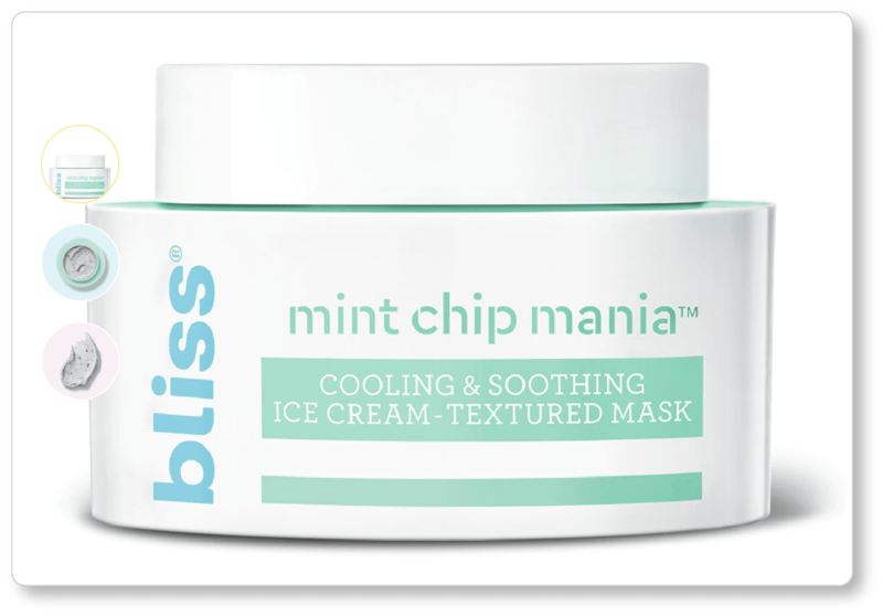
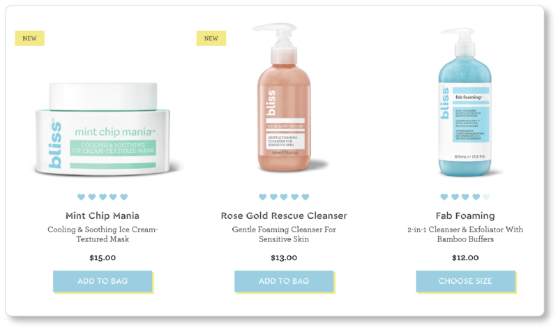 Since we’ve just spent so much time discussing light and shadows, it’s worth taking a moment to see what Bliss has done consistently across its category images—the drop shadow, a primary light source that’s always to the left of the product, a secondary light source (or “fill light”) always to its right. It’s also worth noting that the products aren’t sized relative to each other: Bliss’s Rose Gold Rescue Cleanser is a 190 ml bottle, while its Fab Foaming cleanser is more than twice that size (510 ml)—a difference prospects certainly wouldn’t recognize based solely on the visual information they’re given. It’ll be up to you how you’ll register product size for your prospects; just keep in mind that the more visual information you can give them, the better.
We clicked into “Mint Chip Mania” (because how could we not be lured by that product title?), and immediately saw the same image we were given in thumbnail-size on the category page. In other words, we were offered a sense of continuity—a crucial element of user experience to consider when it comes to your product images. (You never want users to wonder—even for a millisecond—if they clicked into the wrong page.) What’s more, we were given two other product photos, both of which reinforced the promise made in the product’s subtitle (“Cooling & Soothing Ice Cream-Textured Mask”):
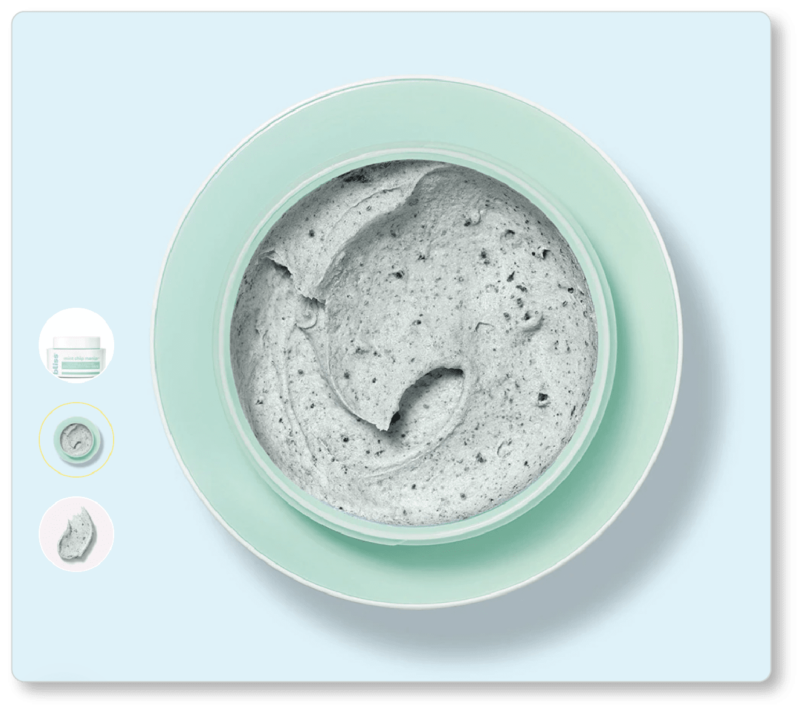
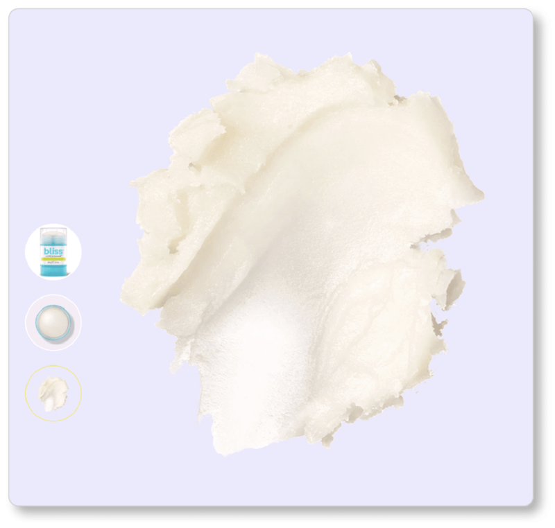
One of the recommendations we made earlier in this content was to re-read your product descriptions (product titles included), and use that language to inspire the kinds of product photographs you might offer. In this case, Bliss’s product description promises a full mint-chip ice cream experience (“Mint chip masks looks, smells, and feels like ice cream for a fun and refreshing experience”). For prospects who don’t believe that such colors and textures are possible in a face mask, the proof is now in the picture. (Since you’re probably wondering, the “chocolate chips” in Bliss’s product are pieces of shea butter.)
Note that for its primary product photo—the first image prospects see when they click into the product page—Bliss has followed the best practices we’ve offered in terms of product lighting and background. Between the light setup, drop shadows, and background removal, the product pops on the page.
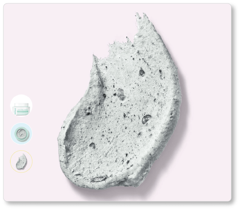
And while Bliss chose pastel backgrounds for its other product photos, those backgrounds don’t distract from the product at hand. The company not only keeps its background colors consistent across products; it’s also consistent with angles and image “types.” (We particularly love the “smear” image, which helps prospects identify a given product’s texture and consistency.) Indeed, frontal view / top view / “smear” image are a consistent trio across Bliss’s product line. And from a UX perspective, those inset thumbnail images are terrific: They keep visitors in the photograph, rather than forcing them to look beyond its edges for more product images.
TruBrain
TruBrain sells what they call “brain food designed by UCLA-trained neuroscientists to help you create faster, impact more, and grab more life.” The company only offers two products—a drink and a bar—so there’s no “category” page to speak of. But here are two of the images on the product page for their brain drink. (We don’t show it here; but it’s worth noting that one of TruBrain’s “product images” is its nutrition label. This is an essential thing to offer—whether as an image or in your specs; but we like that TruBrain chose to use an image here. It means the company can answer the question every prospect is bound to have within their collection of product images):
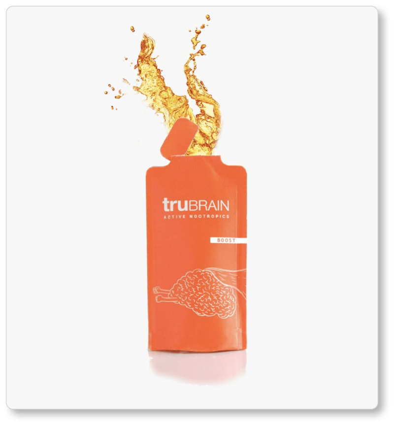
 TruBrain appears to have left the white backdrop in its product images (remember: a “pure” white backdrop will often look greyish in your final images); but the company figured out another way to ensure the product pops: by capturing the product in motion. (If your product is a liquid, by the way, Fstoppers has a video about how to add a splash to your products… and of course, there are YouTube videos aplenty for the product splash.)
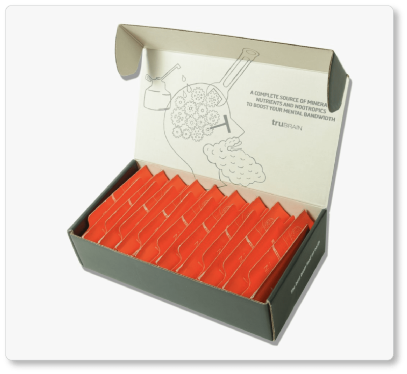
What’s more, one of TruBrain’s images shows the product in its packaging. This is valuable for at least two reasons we can think of. The first is that it helps the company with their overall branding strategy. The image on the inside cover of the box is the same image that’s currently above the fold of the company’s website; and the more often they see it, the more quickly prospects will come to associate this design with the company brand. The second is that TruBrain’s drinks can be ordered in packages of 20, 30, or 60. Displaying an image of the product in its packaging preempts a set of questions prospects are bound to ask: How will these individual drink-packs arrive, and how will I store them? (Remember, your product photography can—and should—play a role in your FAQs.)
Finally, TruBrain strategically uses photography further down the product page when detailing its product’s ingredients:
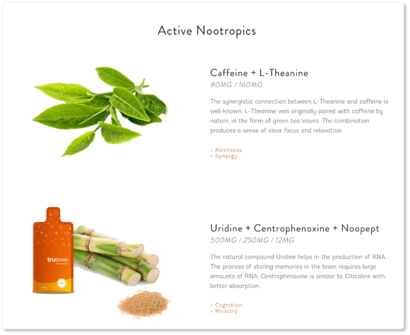 This time, as you’ll notice, the company edited out the image backgrounds entirely. They also wisely positioned their product beside one of its ingredients. In this instance, photographing the active ingredients helps support the company’s claims that they’re “not Big Pharma”; this is an all-natural product. And the visual juxtaposition of the product alongside its active compounds reinforces that claim to product purity.
Crossrope
Crossrope makes what they call “the most effective jump rope system on the planet,” including ergonomic handle grips and a “Fast Clip System” that allows jumpers to quickly and easily change out ropes during their workouts. Because Crossrope only sells one type of item, their homepage essentially functions as their category page:
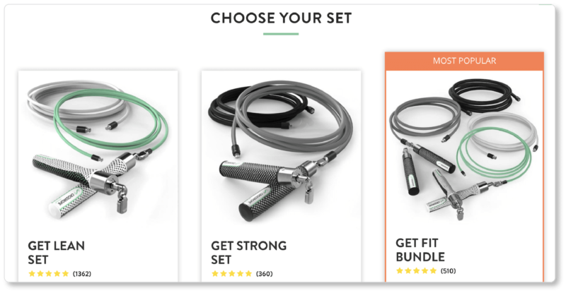
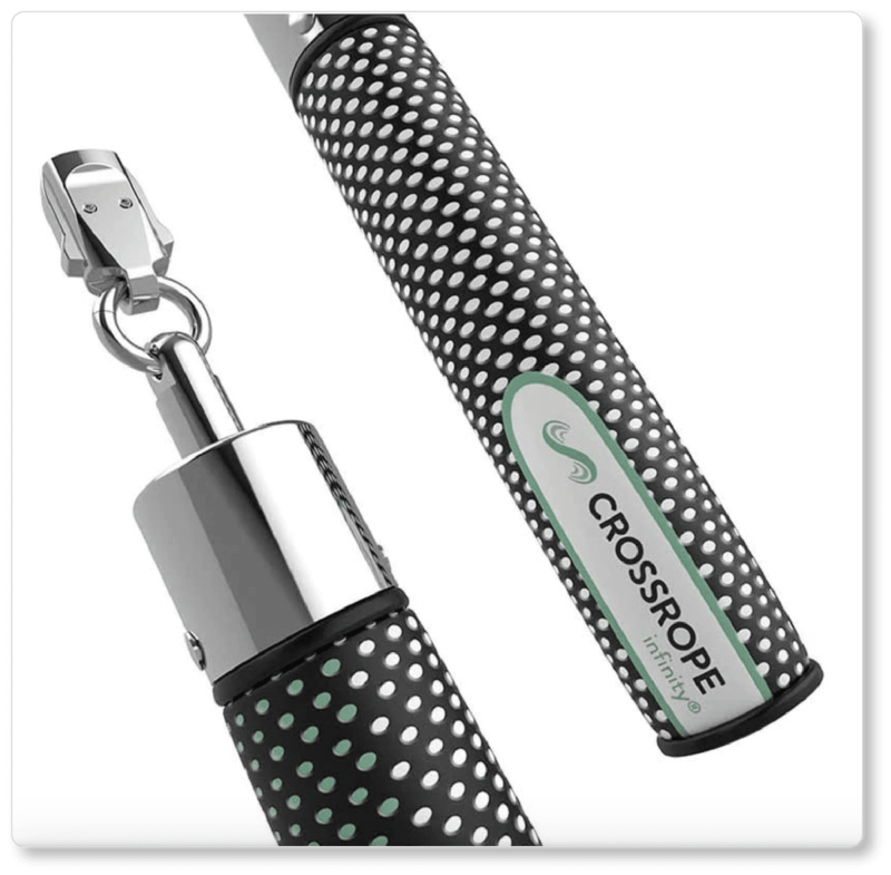
As with Bliss, when we click into one of the product sets, we’re initially presented with the same product image, but bigger (remember consistency!). We’re then offered a few others: a close-up image of the handles, individual photographs of each rope in the set, and a “lifestyle” image. This last photograph not only allows prospects to better visualize the role this equipment might play in their lives; it also gives them an absolute sense of size:
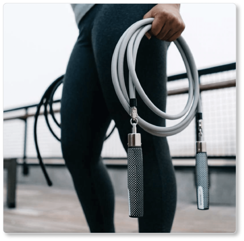
Of course, our discussion of product photography was limited in the foregoing pages to in-studio photography. But it’s worth stressing here that lifestyle or in-context photography can be exceptionally powerful insofar as it stirs prospects’ imaginations to the possibilities of your product in their lives. So while you’ll want to follow our best practices for your studio shots, you should also get start experimenting with your camera outdoors—and with models—to discover other ways you can visually market your product.
That said, there are two things in particular that we love about Crossrope’s in-studio images. The first is that they offer both an image of the entire set (so prospects can see the whole of what they’ll be getting in a single view) and images of each of its separate components (so prospects can register them as separate parts and check out the detail). The second is the detail itself. You probably observed that the image of the handle was taken at such close range that prospects can gather how the Fast Clip mechanism works. And the clarity of the image is impeccable.
Zoku
Zoku is a kitchen housewares company. When we clicked into its category page for “Hydration,” and then “Stainless Steel Bottles,” this was what we were greeted with:
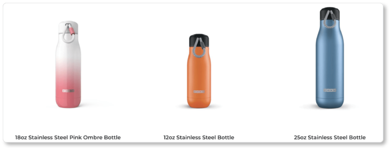
What we noticed (and loved) first is the size difference in these product images: The bottles are 18 oz, 12 oz, and 25 oz, respectively. Zoku didn’t scale them so that they presented as all the same size; that would’ve confused visitors who were shopping by sight rather than reading the copy. (Compare this to what Bliss did above.) Of course, that’s not to say that if your business sells both tiny and huge items you should scale them relative to each other! But in a case like this—and with products of similar sizes—Zoku made a wise decision. Before we clicked into a product, we scrolled down a bit and noticed that the category page offers some stellar images of one of the products in that category:
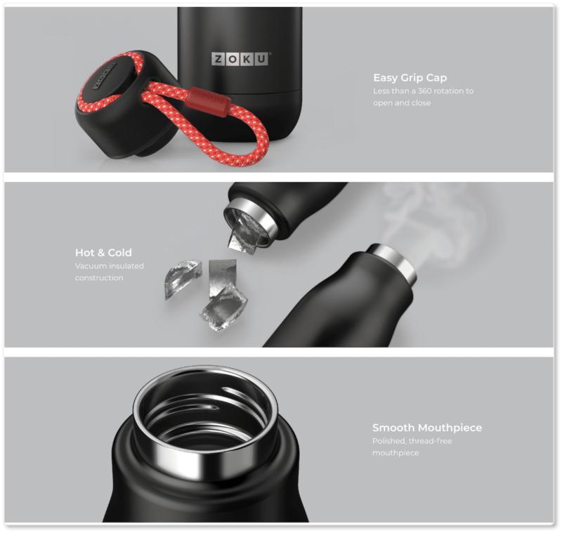
Of course, there’s nothing particularly brilliant going on here… and that’s precisely the point! Product images are supposed to do nothing more than show your product in its best light—both literally and figuratively. What Zoku has wisely recognized is that there are three primary features prospects are likely looking for in stainless steel bottles: a smooth mouthpiece, a cap that’s easy to grip and turn, and exceptional insulation that’s going to keep their liquid at the same temperature it was when they first poured it in.
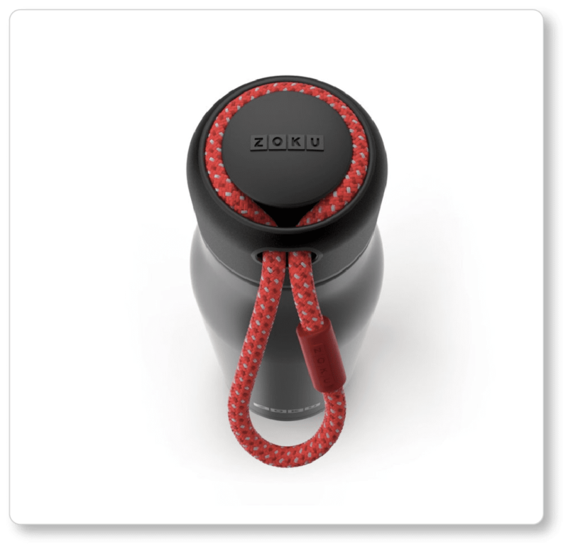
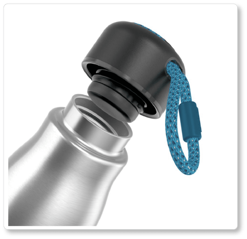
Zoku’s close-up of the mouthpiece in that bottom image gives prospects an idea of how the product will feel when their mouths come into contact with it. (You’ll notice again that the product is lit from both sides—primary light on the left, fill light on the right—as well as from the top.) Its close-up of the cap in the top image allows prospects to imagine what that material feels like too. Users won’t have gotten the clearest idea of the cap from the thumbnail images in the category page. The product page image not only gives them a “material” sense of what it would feel like to grip the cap; it also alerts them to an aesthetically pleasing design decision: a removable paracord lanyard that gives users two ways to carry.
Of course, we’re also loving that image in the middle. Zoku has promised a product that’s well-insulated… and while there’s no “proving” that in a picture, the company did the next-best thing by adding two details suggestive of insulation. The ice cubes and steam emanating from the bottles offer a subtle (or rather, not-so-subtle) psychological suggestion of the product’s efficacy—as though the caps of both bottles have just come off, and we’re delighted to discover that the internal temperature hasn’t changed a bit.
When we clicked into a product page for one of the bottles, we were given a few more stellar close-ups of the product, as well as a visual of our color options. (The shadows are subtle, but worth paying attention to):
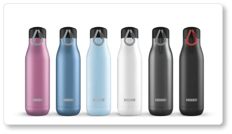
Elsewhere, we’ve discussed the importance of offering visitors images of every color and style your product comes in—don’t make them imagine what “purple” means (amethyst? lavender? lilac? eggplant?). We don’t have to tell you that for every prospect question your product page can’t answer, you’re that much closer to losing them. So give more than a drop-down menu of color options. Give them an absolute sense of what that color means.
Between these four ecommerce sites, we think you’ll have plenty of fodder for thought. And if you’re feeling overwhelmed, remember that the best practices behind product photography are ultimately very simple: Your product images need only answer your prospects’ fundamental questions (How big is it? What does it feel like? What is it made of? How many parts are there? How is it packaged? What colors does it come in? What features should I care about?) while looking exceptionally sharp, clear, and professional.
So jump into these websites and explore further… or dig into others and perform your own critique. What angles are the products being shown from? What angles are they being lit from? What shadows have been added? What objects are in the background for context? What “story” are the images ultimately telling about the product?
The sooner you can learn to thoughtfully critique the photographic choices of other ecommerce websites, the stronger your own product photography will be.