- HOME
- Email sending
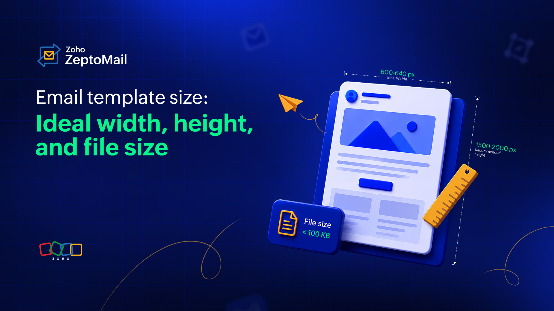
- Email template size: Ideal width, height, and file size
Email template size: Ideal width, height, and file size
- Published : June 30, 2026
- Last Updated : July 9, 2026
- 185 Views
- 8 Min Read
You've spent hours crafting the perfect email and concentrating on creating compelling copy, eye-catching visuals, and a clear email CTA. But if your dimensions are off, none of that work matters. Your email might get clipped in Gmail, render awkwardly on mobile, or get swallowed by spam filters before it ever reaches an inbox.
Getting an email template size right isn’t about rigid rules. It’s about understanding how email clients behave, what devices your readers use, and where the real technical limits lie. This article breaks it all down with specific numbers, real-world context, and best practices you can apply to enhance emails for your business.
What size should an email template be?
Dimension | Recommended size |
Template width | 600px–640px |
Template height | 1,500px–2,000px (max 3,000px) |
HTML file weight | Under 100 KB |
Total email size (with images) | Under 2 MB |
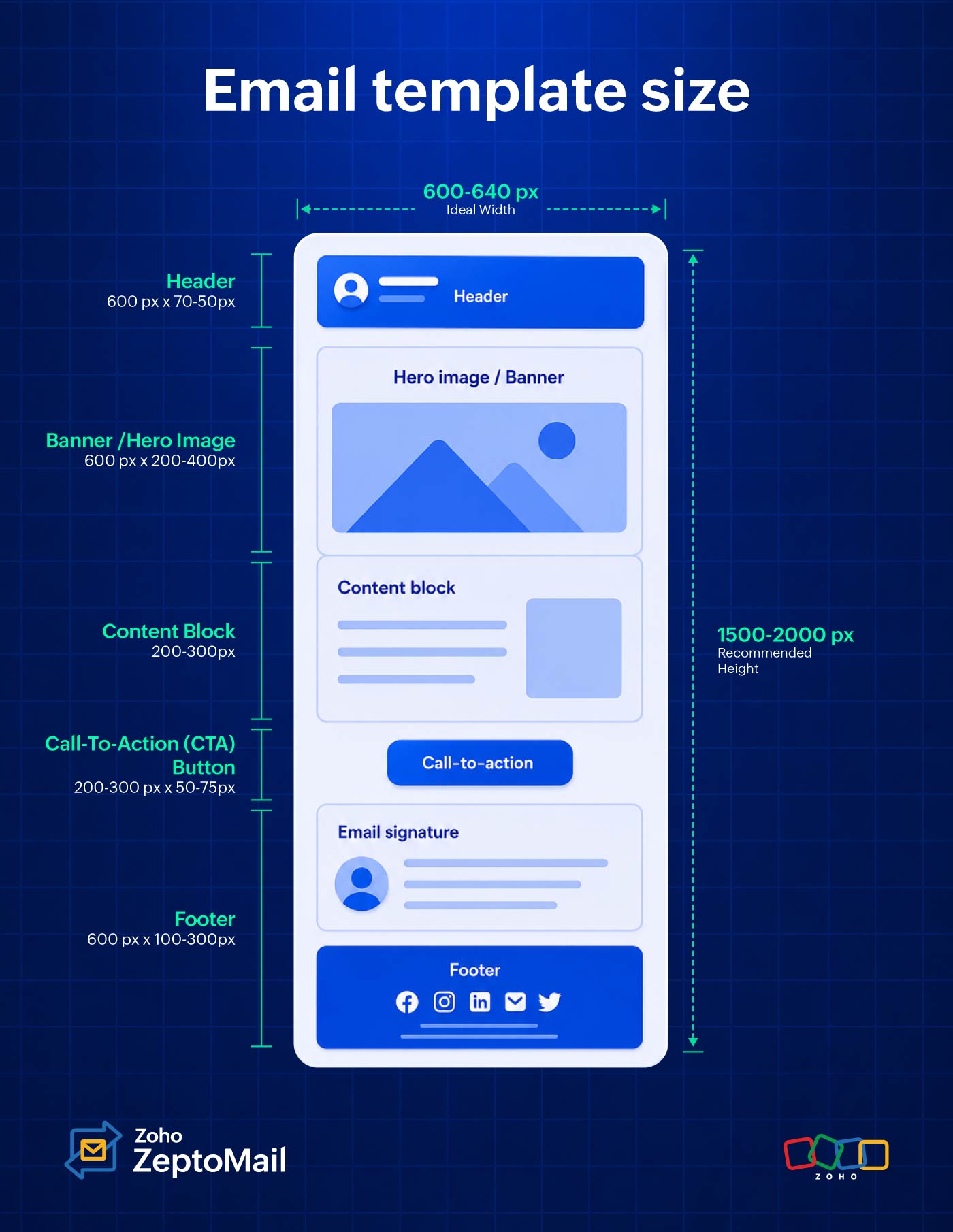
Email header | 600px wide, 60px–200px high |
Email banner | 600px–680px wide, 200px–400px high |
CTA button | 150px–300px wide, 50px–75px high |
Email footer | ~100px high (max 300px) |
Preview text | 50–100 characters |
Body images | 600px–800px wide, under 200 KB |
GIFs | Under 500 KB (max 1 MB) |
Standard email dimensions overview: Transactional vs. marketing
Before diving into measurements, let's understand that not all emails are built the same. Email design splits broadly into two categories, and each has different size expectations.
Marketing emails are the newsletters, promotional campaigns, and product announcements that are designed to engage, persuade, and convert. They tend to be longer, image-rich, and layout-heavy. A typical marketing email can run 2,500 to 3,000 pixels tall and includes multiple content blocks, banners, and CTAs.
Transactional emails include order confirmations, password resets, shipping notifications, and receipts that usually carry functional information that helps a user complete an action. Their design is intentionally simpler. Readers trust them because they’re relevant. Most transactional emails sit between 600 pixels and 1,200 pixels in total height, sometimes reaching 1,500 pixels, but rarely beyond.
The width rule, however, applies equally to both: 600 pixels is the battle-tested standard.
Attribute | Transactional emails | Marketing emails |
Primary goal | Deliver critical user information | Drive engagement, clicks, and sales |
Ideal height | 400px–800px | 1,500px–3,000px |
Image density | Minimal (logo, basic iconography) | Heavy (hero images, product grids) |
Layout style | Clean, single-column, highly scannable | Complex multi-column or editorial |
A detailed breakdown of best email template sizes
Email width
The industry-standard email width is 600 to 640 pixels. While this standard originated from older email clients like Outlook, it remains the safest choice today because it renders consistently across all major email clients.
Why should your email width be between 600 to 640 pixels for desktop?
It ensures consistent rendering across major email clients, including Outlook, Gmail, Zoho Mail, Apple Mail, and Yahoo Mail.
It helps preserve background colors and layout elements in Gmail, which may not display background colors correctly for templates wider than 640 pixels.
It reduces rendering issues in Outlook, which uses the Microsoft Word rendering engine and can behave unpredictably with non-standard email widths.
It provides a comfortable reading experience, preventing content from appearing too stretched on desktop screens while remaining mobile-friendly.
It reduces the need for extensive testing, as 600 to 640 pixels is a widely supported width across devices and email clients.
Can you use wider emails?
Yes. Many brands now use 700 to 800 pixel layouts, especially when most of their audience uses modern clients such as Gmail, Zoho Mail, or Apple Mail. However, if a significant portion of your audience uses Outlook, 600 to 640 pixels remains the safer option.
What’s the ideal email width for mobile?
For mobile devices, design your email to fit smaller screens:
Portrait mode: 320 pixels
Landscape mode: 480 pixels
Because most users read emails in portrait mode, it’s best to optimize for 320 pixels rather than relying on landscape viewing.
Device | Recommended width |
Desktop (standard) | 600px–640px |
Desktop (modern clients) | 700px–800px |
Mobile (portrait) | 320px |
Mobile (landscape) | 480px |
Email height
Unlike width, email height doesn’t have a fixed limit, but reader attention does. While you can create long emails, most recipients skim rather than read every section. Here are two things you need to remember when deciding on the height of your emails.
Find the sweet spot
Aim for a height between 1,500 and 2,000 pixels for marketing emails. This provides enough space for your message without overwhelming readers.
Design based on the fold principle
The first 300 to 500 pixels of your email are the most valuable. This “above-the-fold” area is visible before recipients start scrolling, so it should contain your key message, value proposition, and primary call-to-action (CTA).
File size
When optimizing emails, there are two types of file sizes to keep in mind: HTML size and media size. Managing both helps improve deliverability, loading speed, and the overall recipient experience.
HTML size: Avoid the 102 KB danger zone
If your email’s raw HTML exceeds 102 KB, Gmail may automatically truncate the message and display a “Message clipped. View entire message” link. This can hide important content such as your footer, unsubscribe links, and CTAs, while also affecting email analytics and engagement tracking.
Recommended limit: Keep your HTML file under 102 KB.
Media file size
Large images can slow down load times, especially on mobile devices or slower connections. To maintain a smooth experience, optimize images without sacrificing quality.
Recommended size:
Individual images: Under 200 KB
Animated GIFs: Under 1 MB
Compress images before uploading and use modern formats where supported to reduce file weight.
Attachment size
Although most email providers such as Gmail and Yahoo support attachments of up to 25 MB, large attachments can negatively impact email deliverability and increase the likelihood of emails being flagged as spam.
Best practice: Keep attachments as small as possible. For larger files, upload them to cloud storage and include a download link within the email instead of attaching the file directly.
Size guide for other email components
Creating a great email isn’t just about choosing the right template, it’s also about balancing each element so your message is easy to read, visually appealing, and effective. Use the guidelines below to size your email components for the best user experience across devices.
Email header
The email header is the top section of your email and is usually the first element subscribers see. It typically contains your logo, brand name, navigation links, or a preheader message that provides additional context for the email.
Recommended size: 600 pixels wide × 70 to 150 pixels high
Keep your header clean and uncluttered. A simple logo and minimal navigation help establish brand recognition without distracting readers from your main message. Because this section appears above the fold, it should load quickly and clearly communicate who the email is from.
Banners and hero images
A banner or hero image is the first major visual your subscribers see, typically placed directly below the header or logo. It sets the tone for the email, grabs attention, and highlights your primary message or promotion.
Recommended size: 600 pixels wide × 200 to 400 pixels high
For the sharpest display on high-resolution screens, follow the Retina rule design and export your images at twice their display size. For example, create a banner that’s 1200 pixels wide but display it at 600 pixels wide in your email. This helps images appear crisp and professional on Retina and other high-density displays.
Content blocks
Content blocks are the individual sections that make up the body of your email. They can contain text, images, product features, testimonials, or other key information.
Recommended size: 200 to 300 pixels high per section
Keeping content blocks relatively compact makes your email easier to scan and prevents information overload. As a general rule, aim for a balanced 60/40 text-to-image ratio to maintain visual interest while ensuring that your message remains clear.
CTA buttons
Call-to-action (CTA) buttons are designed to drive clicks and encourage readers to take the next step, whether that’s making a purchase, registering for an event, or learning more.
Recommended CTA button size: 200 to 300 pixels wide × 50 to 75 pixels high
Buttons should be large enough to stand out and easy to tap on mobile devices. In longer emails, consider repeating your primary CTA further down the page so readers don’t have to scroll back up to take action.
Footer
The footer is the final section of your email and typically contains important information such as your company address, legal disclaimers, social links, and unsubscribe options.
Recommended size: 100 to 300 pixels high
Footer content should be easy to read without taking up unnecessary space. A font size of 11 to 12 pixels is ideal, providing good readability while keeping the section compact and unobtrusive.
What’s the ideal email template size for transactional emails?
Transactional emails are designed to deliver important information quickly, whether it’s an order confirmation, password reset, shipping update, or account notification. Unlike promotional emails, recipients open these messages with a specific purpose in mind, so clarity should always take priority over design.
Recommended size: 600 pixels wide and under 800 pixels high
Keep the layout clean and focused by minimizing unnecessary elements. Avoid large hero images, promotional banners, sidebars, or excessive copy that could distract from the main message. Every section should support the recipient’s goal of finding the information they need as quickly as possible.
Pro tip: Place the most important details—such as confirmation numbers, order summaries, tracking links, or reset buttons—above the fold so recipients can access them without scrolling. Here are some quick recommended size ranges that you can use for your transactional emails.
Component | Recommended size |
Email container | 600px wide (industry standard) |
Email header | 600px wide × 70–150px high |
Banner/hero image | 600px wide × 200–400px high |
Content blocks | 600px wide × 200–300px high per section |
CTA buttons | 200–300px wide × 50–75px high |
Footer | 600px wide × 100–300px high |
How do you set email template sizes in ZeptoMail?
When using a dedicated transactional email service like ZeptoMail, maintaining optimal email template sizes becomes much easier. Whether you’re designing emails with ZeptoMail’s rich-text editor or uploading custom HTML, following a few best practices can help ensure consistent rendering and faster delivery.
Using HTML templates
When creating custom HTML emails, use a responsive email layout and constrain the main container to a maximum width of 600 pixels for optimal display across devices. A common approach is to use an outer wrapper table with width="100%" and a centered inner container set to max-width: 600px.
Using pre-built templates
ZeptoMail provides a collection of pre-built email templates that follow standard email design dimensions and responsive layout practices. You can customize the content while keeping the default structure and sizing intact.
Best practices for email template size optimization
Keeping your emails lightweight is essential for fast load times, better deliverability, and a smoother experience across devices. Follow these best practices to ensure that your emails remain optimized without sacrificing design or functionality.
1. Size and code constraints
HTML size: Keep the raw HTML file under 102 KB to prevent Gmail from clipping your content and breaking your tracking.
Don’t change dimensions: Stick to a width of 600 to 650 pixels for desktop preview panes, using responsive design for mobile (320 to 480 pixels).
Clean code: Inline your CSS and minify the HTML to strip out blank spaces. Never copy-paste directly from Word or Docs because it introduces hidden, bloated code.
2. Image and attachment optimization is the key
Large images are one of the biggest contributors to email weight. So make sure to optimize it from the start.
Keep an eye on text ratio: Aim for 60% text and 40% images. Avoid image-only emails, which trigger spam filters.
Compression: Keep images under 200 KB and always include alt text in case images don’t load.
Limit the number of images: While visuals are important, too many images can increase email weight and slow performance. Use images strategically and balance them with live text whenever possible.
Avoid large attachments: Attachments can negatively impact deliverability and increase load times. Instead of attaching large files, host them online and link to them from your email.
3. Deliverability essentials
Technical setup: Authenticate your domain using SPF, DKIM, and DMARC protocols in your DNS settings.
List hygiene: Regularly remove inactive subscribers (no opens in 3 to 6 months) to keep bounce rates low.
Easy exit: Make your unsubscribe link prominent. If users can’t find it, they’ll click “Report Spam” instead.
Test across devices: Before sending, test your email on desktop and mobile devices to ensure that images load correctly, content displays as intended, and file sizes remain manageable.
Wrapping up
Designing a great email template requires a strict balance of aesthetics and digital restrictions. By following recommended email template size standards, you can ensure better readability, consistent rendering across devices, and improved deliverability. Keeping your emails lightweight and responsive not only helps them reach the inbox successfully but also creates a smoother, more engaging experience for your recipients.