- HOME
- More
- Best Practices
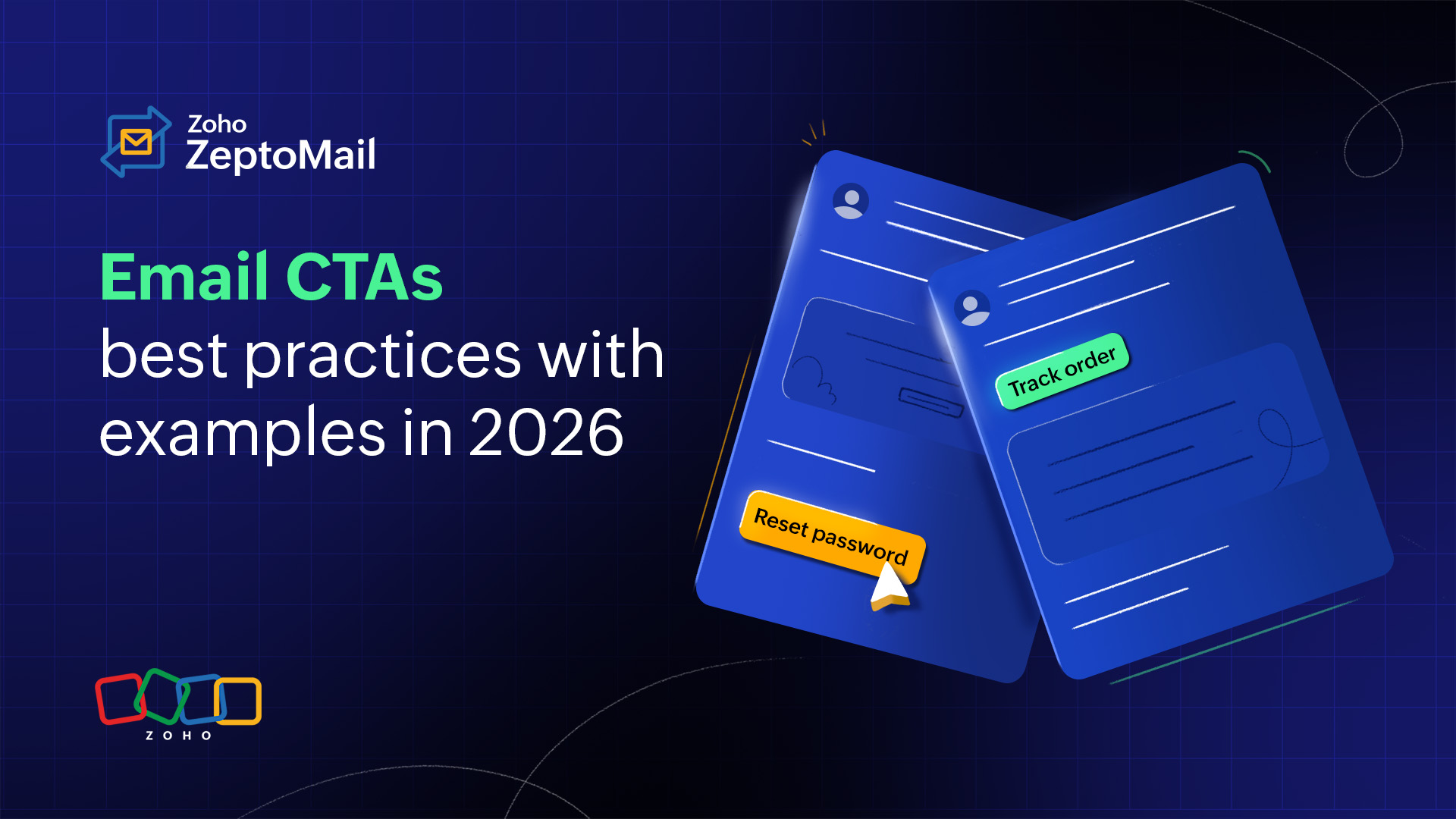
- Best practices for email CTAs in 2026, with examples
Best practices for email CTAs in 2026, with examples
- Published : January 29, 2026
- Last Updated : January 30, 2026
- 671 Views
- 8 Min Read
We’ve all clicked hundreds of CTAs in our emails. The term Call to Action isn’t new to us either. Most people talk about CTAs in the context of marketing emails and how they improve engagement. But stats clearly say transactional emails are the most opened emails your business sends.
Think about these emails: OTP emails? They are opened instantly. Password reset emails? They are opened urgently. Shipping updates? They are opened repeatedly. Payment reminders? They are opened when people want to resolve something fast.
That means transactional emails come with something marketing emails often don’t: user intent to complete something. And whenever intent is high, your CTA matters more than ever. In this article, let’s look at everything you need to know about email CTAs in transactional emails.
What is a CTA?
A call to action (CTA) is an element in an email that redirects the reader on what to do next. It's usually in the form of a button, link, or short clickable line.
Example: “Click here to reset your password” or “Buy now.”
What is the purpose of CTAs in emails?
We can look at the purpose of CTAs from the perspective of marketing and transactional emails separately.
Feature | Marketing Emails | Transactional Emails |
Purpose | To drive purchases or sign-ups | To help users complete an action (login, verification, payment, tracking, etc.) |
Focus | Business-centric | User-centric |
CTA importance | CTA is optional and promotional | CTA is important and functional |
Open rates | Usually low | Usually high |
Where do you insert a CTA in a transactional email?
In transactional emails, your reader isn’t browsing. They’re doing something. They open the email to verify an OTP, reset a password, track an order, pay an invoice, or download a statement. Here are the best placements for transactional email CTAs to make the next step obvious within the first few seconds.
1. Above the fold (first screen view)
“Above the fold” simply means the part of the email visible without scrolling. This placement matters because most people open emails on their mobile device. For urgent transactional emails like OTPs or password reset emails, the CTA should appear immediately after the main message.
Example: The user shouldn’t have to scroll at all to complete the action when you begin the email like this followed by a CTA.
Hey {{Name}},
Your OTP is 548921. It will expire in 10 minutes.
[Verify OTP]
2. Right after the key message
In transactional emails, the CTA should always come after the key information. That key message is the moment the user understands what this email is all about and what they should do next; this is where your CTA should appear naturally.
Example: This flow works because the user reads one sentence and instantly sees the action.
Hey {{Name}},
Your payment is due on Jan 28, 2026.
[Pay now]
3. Repeat the CTA once at the end if the message is too long
For shorter transactional emails, one CTA is enough. But for longer transactional emails like statement emails, service emails, or legal/policy updates, repeating the CTA once at the end can significantly improve clicks.
Why? Because not everyone clicks immediately. Some users scroll to check the transaction summary, verify details, read terms, confirm charges. So when they reach the end, you want them to have an easy next step without having to scroll back up.
Example: Using two different CTAs work better when the email is too long.
...
Top CTA: [View statement]
...
End CTA: [Download statement PDF]
The different types of email CTAs
CTAs can be used for different purposes in a transactional email. Let's see how they can be classified based on their functionality.
1. Primary CTA
This is the core action the user is expected to take after reading the email. Ideally, every transactional email should have one strong primary CTA.
When to use it:OTP emails, password resets, payments, confirmations, order actions.
Goal: To drive the user to complete the main task quickly.
Examples:
Reset password
Pay now
Verify OTP
Confirm order
2. Secondary CTA
A secondary CTA is the supporting option. It’s useful for users who can’t do the main action or need help. This CTA is optional, but powerful, when it’s used correctly. Remember, secondary CTAs should never compete with the main CTA. Keep them visually smaller or text-based.
When to use: Payment failures, cancellations, service issues.
Goal: To reduce confusion and support tickets.
Examples:
Contact support
Update payment method
Reschedule delivery
Change email preferences
3. Confirmation CTA
This CTA is used when the user needs to confirm identity or approve an activity that was performed from a different device or location. It’s common in security-focused transactional emails.
When to use: Login verification, email verification, account changes.
Goal: To prevent unauthorized actions and increase trust.
Examples:
Confirm your identity
Approve login
Verify this device
Confirm changes
4. Navigation CTA
Navigation CTAs help users view details or track progress, especially in e-commerce and service workflows. These CTAs aren’t about decision-making, they’re about easy access.
When to use: Shipping emails, order confirmations, bank statements, payment confirmations.
Goal: To guide the user to relevant pages with ease.
Examples:
Track your package
View your order
View your statement
Download your invoice
5. Safety CTA (fraud protection and control)
Safety CTAs help protect both the customer and the business from fraudulent activity. They give users a fast way to respond if something looks suspicious. In 2026, this is no longer optional; users expect security-first email experiences.
When to use: OTP emails, password reset emails, new login alerts, billing changes.
Goal: To reduce fraud and to build credibility.
Examples:
Report suspicious activity
Secure my account
This wasn’t me
Disable login attempt
9 best practices to follow when creating email CTAs
1. Always stick to one primary CTA
Transactional emails should help users complete one key action: verify, reset, track, view invoice, or confirm payment. Adding too many CTAs can overwhelm users, create confusion, and reduce clicks. That’s why it’s best to stick to one clear primary CTA so users know what to do next instantly.
For example, when you send a password reset email, stick to one primary CTA:
✅ Do: Reset password
❌ Don’t: Reset password | Contact support | Explore features | Upgrade plan
2. Use action-first language
Always start the CTA with a clear verb so it feels instant and obvious. The verb should be followed with the exact purpose the user requested, so there’s no doubt about what will happen after they click. This reduces hesitation and makes it easier for readers to take the next step quickly.
Examples: Keep CTAs clear and direct like:
Verify email
Reset password
View order details
Track shipment
Download invoice
Confirm payment
3. Align the CTA with the user’s intent
Transactional emails are triggered because the user took an action, so the CTA should support that exact purpose. Always place the CTA immediately after the user’s intent is mentioned, so they can quickly click and navigate to the right place without confusion.
Example: If email is for payment failure:
✅ Do: Update payment method
❌ Don't: View pricing
4. Make it accessible on all devices
CTAs should work smoothly on mobile because many transactional emails are opened on phones. Make sure the CTA button or link is tap-friendly and spaced well. When you design a CTA button, keep these points in mind.
CTA design checklist:
Large tap-friendly button (easy thumb click)
Enough spacing between CTA texts
High contrast button and readable text
Pick colors that are visible and clear even in dark mode
5. Design CTAs for scanning
Most of us don’t read transactional emails word by word. We usually scan to understand what the email is about and what to do next. That’s why placing your CTA in the right spot is essential, especially on mobile, where attention spans are short.
Make CTAs easy to spot:
Put the CTA above the fold (early in the email)
Use button styling for the main action
Keep CTA text short (two to five words)
6. Don’t bury CTAs inside paragraphs
Transactional email CTAs shouldn’t feel like they’re hidden. If the CTA is placed inside a long block of text, users may miss it while scanning and end up dropping off. Always give the CTA its own space with clear formatting so it stands out instantly.
✅ Do:
Your order is on the way. Track your delivery below.
[Track shipment]
❌ Don’t:
Your order has been shipped successfully and is currently in transit. If you would like to know the latest status of your delivery, you can click the link to continue tracking the shipment details.
7. Always include a fallback option
Transactional emails should still work even if buttons fail due to email client or security settings. To avoid blocking users, always include a clickable secondary link below the primary CTA.
Example: If the button doesn’t work, copy and paste this link into your browser: <URL>.
8. Keep the CTA specific
Specific CTAs improve clarity and reduce unnecessary support queries. Using vague action words like open, download, or view without context leaves users unsure about what they’re actually accessing. That’s why clarity always matters in transactional emails.
Use clear CTAs:
View refund status
Track delivery
Download statement
Avoid vague CTAs like:
Track
Open
View
9. Use secondary CTAs only when necessary
When needed, include one clear primary CTA and limit secondary CTAs to specific use cases, such as OTPs or bank transaction emails. Secondary CTAs should support safety or help users, like reporting suspicious activity or contacting support, without distracting from the main action.
Example:
Primary CTA: [Reset password]
Secondary CTA: Secure your account (link)
Examples of CTAs for transactional emails
1. OTP emails (one-time password)
OTP emails are high-urgency emails, so the CTA should help users verify quickly without distractions.
Goal: To quickly verify an account using OTP.
CTA examples:
Verify OTP
Confirm login
Complete sign in
Verify and continue
Approve this login
Best practice: Always add a secondary security CTA at the end of an email to Report suspicious activity if there are any such instances.
2. Password reset emails
Password reset CTAs should feel secure and direct, because users usually click them with urgency.
Goal: To reset password securely.
CTA examples:
Reset password
Create a new password
Secure my account
Change password
3. Shipping emails
Shipping emails should guide customers to the latest order status instantly, without making them search for updates.
Goal: To track delivery step-by-step and keep the customer updated.
CTA examples:
Track shipment
View delivery status
Check tracking updates
Reschedule delivery
Update delivery address
4. Payment emails (reminder/confirmation/cancellation)
Payment confirmation or payment reminder emails must remove friction and help users complete the payment action in just one click.
Goal: To complete payment.
CTA examples:
Pay now
Retry payment
Update payment method
View pending invoice
Download invoice
5. Bank statement emails (Monthly/Quarterly statements)
Statement emails should make it easy for users to access important documents securely, especially on mobile.
Goal: To view the statement securely.
CTA examples:
View statement
Download statement
View account summary
Download PDF
View transactions
6. Service emails (Downtime/maintenance/feature changes)
Service emails should clearly direct users to the right page for updates so they don’t panic or raise unnecessary tickets.
Goal: To inform and guide users to perform an action.
CTA examples:
View status page
Check incident updates
See maintenance details
View affected services
Learn what to do next
7. Cancellation emails (Order/subscription/booking)
Subscription or order cancellation email CTAs should be calm and supportive, and clearly show what users can do after the cancellation is confirmed.
Goal: To confirm cancellation and offer next steps.
CTA examples:
View cancellation details
Download cancellation receipt
Reactivate subscription
Book again
Contact support
8. Feedback emails
Feedback or survey email CTAs should feel effortless and quick, so users are more likely to respond without overthinking.
Goal: To capture quick feedback.
CTA examples:
Rate your experience
Leave feedback
Tell us what went wrong
Share suggestions
Submit review
9. Order confirmation emails
Order confirmation emails should reassure customers and guide them to manage or track their purchase easily.
Goal: To confirm a purchase and reduce anxiety.
CTA examples:
View order
Track order
Download invoice
Manage order
Update delivery address
10. Legal emails (Policy updates/terms/compliance)
Legal emails should keep the tone neutral and clear, with CTAs focused only on reviewing or managing account settings.
Goal: To keep things transparent and acknowledge the information.
CTA examples:
Review updated terms
View privacy policy
Read full changes
Download policy
Manage account settings
Wrapping up
Now you understand that transactional emails are opened with intent, so your CTA should make the next step effortless. Before we wrap up, here's a quick checklist to make sure your CTA is clear, helpful, and click-ready.
Quick transactional email CTA checklist:
Is there one clear, primary CTA?
Is the CTA placed above the fold?
Is the CTA specific and action-driven, not vague?
Does it match the exact purpose of the email?
Is there a fallback option (backup link or copy-paste URL)?
Is the CTA mobile-friendly (tap-friendly, spaced well)?
Does the CTA reduce confusion and prevent support queries?
Is there a secondary CTA for security or support where needed (for example, “Report suspicious activity” or “Contact support”)?
Is the CTA accessible (readable contrast, clear text, works in dark mode)?
Keep these points in mind and you’ll be able to craft CTAs that feel effortless, trustworthy, and high-converting across all of your transactional emails.