- HOME
- Email sending
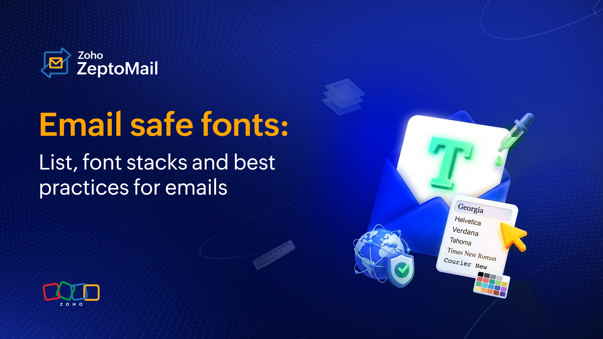
- Email-safe fonts: List, font stacks, and best practices for emails
Email-safe fonts: List, font stacks, and best practices for emails
- Published : April 21, 2026
- Last Updated : April 21, 2026
- 582 Views
- 7 Min Read
When people think about email performance, they usually jump to subject lines, personalization, or email CTAs. But there’s a quieter factor that influences everything from readability to conversions. That’s your font choice.
Fonts shape how your message feels, how quickly it’s understood, and how consistently it appears across devices. And in emails, especially transactional ones, you don’t get a second chance if something renders incorrectly.
This guide walks you through everything you need to know about email-safe fonts, including what they are, why they matter, and how to choose the right ones for different types of emails.
What are email-safe fonts?
Email-safe fonts are fonts that are widely supported across different devices, operating systems, and applications, and display consistently for all users. They’re accessible across computers, Android phones, and various email clients, and they load reliably in different email service providers like Gmail, Apple Mail, and Zoho Mail.
Unlike website fonts, emails don’t have the luxury of full browser support. Many email clients, especially Outlook, have strict rendering limitations. If a font isn’t supported, the email client replaces it with something else, often breaking your intended design.
Email-safe fonts avoid that risk. They’re:
Pre-installed on most devices.
Recognized by major email clients.
Reliable in terms of layout and spacing.
Why do fonts matter in email design?
Fonts are often overlooked in email design, but they play a crucial role in how your message is read, understood, and acted upon. The right font doesn’t just make your email look good; it directly impacts user experience, accessibility, and performance. Using the right font in an email can:
Improve readability and make emails easy to scan.
Create a strong first impression of your brand.
Ensure consistent rendering across devices and email clients.
Enhance accessibility for all users.
Help establish clear visual hierarchy (headings, body, CTAs).
Guide user attention to key actions.
Influence engagement and conversions.
Build trust and credibility.
Prevent layout breaks caused by unsupported fonts.
The 10 best email-friendly and supported fonts
These fonts are widely supported and safe to use across almost all email clients.
Arial
𝖧𝖾𝗅𝗏𝖾𝗍𝗂𝖼𝖺
Georgia
Times New Roman
Tahoma
Trebuchet MS
Courier New(monospace)
Verdana
Calibri
Comic sans
1. Arial
A go-to sans-serif font. If you want your email to look clean, simple, and highly readable at all sizes, then Arial is an ideal choice for business communication. It works well for both headings and body text.
2. Helvetica
A slightly more refined alternative to Arial. It works great for modern-looking emails. This font is easy to read and is especially effective for headers and UI-like email layouts.
3. Georgia
A serif font designed for screen readability. Georgia is well-suited for longer content and adds a slightly formal tone, making it ideal for structured or professional communication.
4. Times New Roman
A classic and familiar font that has been traditionally used in emails. While still reliable, it has become less common in modern email design due to its more formal and dated appearance.
5. Verdana
Verdana is designed specifically for screens, with wider letter spacing that improves readability. It works especially well on smaller devices.
6. Tahoma
Tahoma gives emails a compact and sharp look. It works particularly well when your content is dense and you need to fit more information without compromising clarity.
7. Trebuchet MS
A more expressive sans-serif font, often used for headings. It adds a bit of personality while still maintaining readability.
8. Courier New
A monospace font typically used for technical content or code-like formatting. It’s not commonly used for general emails but can be useful in specific contexts.
9. Calibri
A clean and modern font commonly used in business communication. It offers a professional look and works well for both internal and external emails.
10. Comic Sans
An informal and friendly font that can feel approachable in casual communication. However, it’s not recommended for professional or transactional emails because it can reduce credibility and seriousness.
System fonts vs. web fonts
When it comes to emails, fonts are generally categorized into two main types: system fonts and web fonts.
Feature | System fonts | Web fonts |
Availability | Pre-installed | Loaded externally |
Compatibility | High (all clients) | Limited (varies by client) |
Reliability | Very high | Medium |
Design flexibility | Limited | High |
Best for | Transactional emails | Marketing and newsletters |
System fonts
System fonts are fonts that are already installed on a user’s device, whether it’s a phone, laptop, or tablet. Because they don’t need to be loaded externally, they’re highly reliable and render consistently across all email clients.
Examples:
Arial
Helvetica
Verdana
Tahoma
Georgia
Times New Roman
Calibri
Key characteristics:
No loading time.
Supported across most email clients.
Consistent appearance across devices.
Best for critical communication.
Best use cases:
Transactional emails (OTPs, receipts, alerts).
Business emails.
Any email where reliability is more important than design.
Web fonts (custom fonts)
Web fonts are fonts that are loaded from external sources, like Google Fonts, when the email is opened. They allow for more creative and brand-aligned designs, but come with limited support in email clients.
Examples:
Open Sans
Roboto
Lato
Poppins
Raleway
Merriweather
Key characteristics:
Require external loading.
Not supported in all email clients (especially Outlook).
Offer more design flexibility.
Need fallback fonts.
Best use cases:
Marketing emails.
Newsletters.
Brand-focused campaigns.
What are email-safe font stacks?
An email-safe font stack is a list of fonts defined in order of priority in your email’s CSS. It tells the email client which font to display first and which ones to fall back on if the preferred font isn’t supported.
Key characteristics:
Ensures a consistent display across email clients.
Prevents layout and design issues.
Improves readability and user experience.
Provides reliable fallbacks for unsupported fonts.
How do they work?
If the first font isn’t available, the email client automatically tries the next one in the list, and so on, until it finds a supported font.
Example: Sans-serif font stack (most recommended)
Best for: Transactional emails, business emails, general use
font-family: 'Roboto', Arial, Helvetica, sans-serif;Roboto is the primary font (used if supported).
Arial and Helvetica are the fallback fonts.
Sans-serif is the final default.
How to choose the right font for your emails?
Which font is preferred for transactional emails?
For transactional emails, the priority is clarity, speed, and reliability.
A sans-serif font is the most preferred choice because it’s clean, simple, and highly readable across all devices and email clients. The absence of decorative strokes (serifs) makes the text easier to scan, especially in time-sensitive emails like OTPs, receipts, and alerts.
Why sans-serif fonts work for transactional emails:
They ensure quick readability.
They render consistently across devices and clients.
They reduce visual clutter.
They support accessibility.
Recommended fonts for transactional emails:
Arial
Helvetica
Verdana
Tahoma
Trebuchet MS
Calibri
Best practice:
Stick to a single, clean font and avoid decorative or custom fonts. Transactional emails are action-driven, so readability should always come first.
Which font is preferred for marketing emails?
For marketing emails, the goal shifts slightly from pure clarity to engagement and brand expression while still maintaining readability.
A combination of sans-serif and web fonts is often preferred because it allows you to create a visual hierarchy and personality without compromising usability.
Why these fonts work for marketing emails:
They help highlight headings, offers, and CTAs
They align with brand identity
They improve visual appeal without hurting readability.
Recommended fonts for marketing emails:
Sans-serif (safe and reliable):
Arial
Helvetica
Verdana
Calibri
Web fonts (for branding, with fallback):
Open Sans
Roboto
Lato
Poppins
Best practice:
Use one font for headings and another for body text to create contrast and guide the reader’s attention.
Which font is preferred for newsletter emails?
Newsletter emails are typically more content-heavy, so the priority is long-form readability and comfortable reading experience.
A mix of serif and sans-serif fonts works best here.
Why this combination works:
Serif fonts improve readability for longer paragraphs
Sans-serif fonts keep headings clean and structured
Recommended fonts for newsletters:
For body text (long-form reading):
Georgia
Times New Roman
For headings and structure:
Arial
Verdana
Trebuchet MS
Optional web fonts (with fallback):
Merriweather (great for body text)
Raleway (great for headings)
Best practice:
Keep line spacing generous and avoid overly decorative fonts. Newsletters should feel easy to read, not overwhelming.
Which fonts can be used for email signatures?
Email signatures should be clean, professional, and consistent across devices. Using web-safe (email-safe) fonts ensures that your signature looks the same in every inbox.
Recommended web-safe fonts for email signatures:
Arial
Helvetica
Verdana
Tahoma
Georgia
Times New Roman
Calibri
Best practice:
Keep the font size between 12pt and 14pt for readability. Always stick to one font style to maintain consistency. Use standard colors (black, dark grey, or a brand color) for email signatures.
How do fonts affect email accessibility?
Fonts play a key role in making emails accessible to a wider audience, including users with visual impairments or reading difficulties.
Improves readability for all users: Clear, well-spaced fonts reduce eye strain and make content easier to consume.
Supports screen readers: Standard, simple fonts ensure better compatibility with assistive technologies.
Enhances legibility on small screens: Mobile-friendly fonts remain clear even at smaller sizes.
Helps users with dyslexia or low vision: Sans-serif fonts with good spacing are easier to process.
Works well with proper contrast and spacing: Fonts combined with good design improve overall accessibility.
Most common email font mistakes to avoid
Even a well-designed email can fail if font choices aren’t handled carefully.
Using unsupported fonts
Using fonts that aren’t supported across email clients can lead to unexpected fallbacks and broken layouts.
Relying only on custom/web fonts
Depending entirely on web fonts can cause inconsistency because not all email clients support them.
Not defining fallback fonts
Skipping fallback fonts can result in unpredictable rendering and affect the overall email design.
Using too many fonts
Using multiple fonts in one email makes the design look cluttered and less professional.
Choosing decorative or script fonts
Overly stylized fonts reduce readability and can make your email appear less credible.
Using very small font sizes
Small text can be difficult to read, especially on mobile devices, leading to poor user experience.
Poor line spacing
Tight or inconsistent spacing makes content feel cramped and harder to scan quickly.
Using text inside images
Text embedded in images can impact accessibility, may not load properly, and reduces readability.
Wrapping up
Fonts may seem like a small detail, but they have a significant impact on how your emails are experienced. From improving readability to ensuring consistent rendering across devices, the right font choice supports both design and performance.
For transactional emails, clarity and reliability should always come first, making sans-serif fonts the best choice. For marketing and newsletters, you can introduce more flexibility while still prioritizing readability.
Ultimately, the goal is simple: Choose fonts that make your message easy to read, quick to understand, and consistent across every inbox.