- HOME
- Email sending
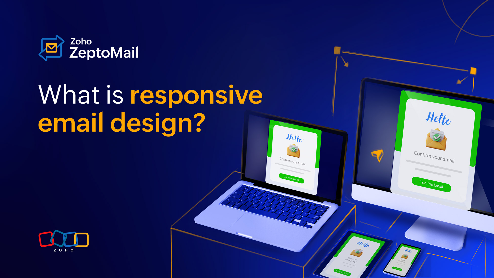
- What is responsive email design, and why is it so important?
What is responsive email design, and why is it so important?
- Published : February 27, 2026
- Last Updated : February 27, 2026
- 233 Views
- 5 Min Read
Transactional emails, such as password resets, order confirmations, OTPs, invoices, and shipping notifications are among the most critical communications a business sends. Unlike marketing emails, they’re expected, time-sensitive, and often action-driven. They’re often the next step in the customer's journey.
A recent study suggests that mobile clients account for 41.6% of email opens. Combined with a higher open rate for transactional emails over other types of emails, responsiveness in transactional email isn’t a design luxury but a functional requirement. With the majority of transactional emails now opened on mobile devices, a non-responsive email can directly lead to failed logins, abandoned checkouts, increased support tickets, and poor brand trust. This article explores what responsive transactional emails are and why they matter.
What are responsive transactional emails?
Emails are accessed and displayed across devices of different sizes. A responsive email is one that automatically adapts its layouts, typography, and interaction elements to the screen size or the email client being used. This can be mobile, tablet, or desktop. A responsive email adapts to the device or client while maintaining clarity and usability.
Key characteristics include:
Readable text without zooming.
Buttons and links that are easy to tap.
Layouts that structure cleanly on small screens.
Fast loading with minimal assets.
Graceful rendering across inconsistent email clients.
Why responsiveness is especially critical for transactional emails
High intent, low tolerance
Transactional emails are triggered by customers, so they expect to open them with intent: “I need my OTP now” or “Where is my order?”. This means customers have a lower tolerance for broken formatting. With the margin for error being lower, a non-responsive email can frustrate the customer. A poor mobile experience can cause:
Login failures.
Missed payments.
Uncompleted verification steps.
Increased customer support queries.
Mobile-first consumption
Studies consistently show that 40% of emails are opened on mobile devices, often within seconds of delivery. If the email isn’t readable or immediately actionable, it has failed its purpose.
Brand trust and reliability
Transactional emails carry crucial and sometimes sensitive information. These emails come with implicit trust. A broken or poorly formatted email can raise concerns about:
Security.
Authenticity.
Technical competence.
In regulated or enterprise environments, this perception matters even more.
Core principles to remember when creating a responsive transactional email
Content comes first
Transactional emails don’t promote a brand or service. The primary focus is to communicate information to the customer about an action. They should prioritize clarity over aesthetics. Images or design elements should not overpower the content.
Best practices include:
Focusing on one primary message in an email.
Highlighting one primary call-to-action (CTA).
Avoiding clutter, promotional banners, or unnecessary imagery.
Single-column layouts
For responsive emails, it’s better to go with a single-column layout. This is even more true in content-focused transactional emails. Multi-column layouts can break on mobile or require complex CSS support that many email clients don’t fully support.
Single-column layouts usually:
Has a structure that flows naturally on small screens.
Are easier to maintain across devices.
Reduce rendering inconsistencies.
Readable typography
Content is the primary focus in transactional emails, so readability is of the utmost importance. Typography is one of the most common causes of poor mobile experiences.
Recommended guidelines include:
Body text: 14–16px minimum.
Headings: 20–26px.
Line height: 1.4–1.6.
Using web-safe fonts (Arial, Helvetica, system fonts).
Avoiding light font weights and low-contrast text.
Touch-friendly CTAs
Transactional emails often require user action. The CTAs should be accessible and clickable irrespective of the device or email client the email is viewed on.
CTA best practices include:
Minimum button height: 44px.
Adequate padding (especially vertically).
High color contrast.
Avoid placing links too close together.
Buttons should be obvious, not disguised as plain text links.
Clear content hierarchy
Every transactional template should make the following instantly obvious:
Why the email was sent.
What action is required (if any).
What happens next.
Maintain clear hierarchy or flow in your content: headline → context → action → support info. This is especially important on mobile, where only the top portion of the email may be visible initially.
Common pitfalls to avoid
Over-reliance on images
The content should make sense on its own. Because transactional emails are communicating important and often time-sensitive information, they should remain usable even if the emails are blocked.
Avoid:
Image-only buttons.
Image-based text.
Critical information embedded in images.
Always include meaningful alt text and HTML-based CTAs.
Large payloads
Unlike marketing emails, you don’t need to stuff your transactional emails with design elements. A transactional email should load instantly for the best experience and fastest access to information.
Best practices include:
Keeping the total email size under 100 KB.
Avoiding heavy fonts or background images.
Using inline CSS instead of large <style> blocks where possible.
Inconsistent client testing
Responsiveness across email clients is as important as responsiveness across devices. An email that looks perfect in Apple Mail may break in Outlook or Gmail. Email rendering tools or real-device testing are essential.
Accessibility and responsiveness
In transactional emails, accessibility isn’t a separate concern from responsiveness—it’s a direct enabler of responsive behavior. Many of the same constraints that affect screen readers, low-vision users, and assistive technologies also affect mobile devices, constrained email clients, and image-blocked environments. In practice, an accessible transactional email is almost always more responsive, and a non-accessible one often fails on mobile.
Responsive transactional emails should also be accessible with:
Sufficient color contrast.
Semantic HTML structure for screen readers.
Descriptive link text (avoid “Click here”).
Logical reading order.
Accessibility improvements often improve mobile usability as well.
Performance, deliverability, and responsiveness
In transactional email systems, performance, deliverability, and responsiveness form a single feedback loop. Poor performance affects deliverability. Poor deliverability affects engagement. Poor engagement undermines responsiveness. You cannot optimize one without impacting the others.
Responsive design indirectly affects deliverability in the following ways:
Poorly structured HTML can trigger spam filters.
Excessive CSS or malformed tables can cause clipping.
Broken layouts increase user complaints and disengagement.
Clean, responsive code supports both user experience and inbox placement.
Measuring success
Taking the right steps only matters if we quantify the success and continuously monitor progress.
Key things to verify and validate:
Mobile readability.
Button usability.
Text wrapping.
Image blocking behavior.
Dark mode compatibility (where applicable).
Rendering issues that seem minor can have a major impact at scale.
Here are some key metrics to evaluate responsive transactional emails:
Mobile vs. desktop open rates.
Click-through rate on primary CTA.
Completion rate (e.g., password reset success).
Support tickets related to email issues.
A drop in mobile engagement is often the first sign of responsiveness problems.
Operational benefits of responsive templates
Well-designed responsive templates:
Reduce support tickets.
Improve task completion rates like password resets or logins.
Lower resend and retry volumes so fewer resources are wasted.
Strengthen brand trust.
Simplify long-term maintenance.
Wrapping up
Responsive email templates in a transactional context aren’t about visual flair—they’re about reliability, clarity, and speed. These emails are mission-critical touchpoints where usability, speed, and clarity directly impact user success and brand credibility. By adopting mobile-first structures, hybrid layouts, accessible typography, and performance-conscious design, organizations can ensure their transactional emails work flawlessly—across devices, clients, and millions of sends—exactly when users depend on them most.