- HOME
- Website Building
- Business Blogs
- Choosing the Right Design and Functionality for Your Blog
Choosing the Right Design and Functionality for Your Blog
- 11 Mins Read
- Posted on April 13, 2018
- Last Updated on October 8, 2024
- By Lauren
We’ve given you a lot to consider when it comes to using your blog as a content marketing tool. But now that you’re planning out your editorial calendar for the coming months, mapping out your topics, and optimizing every post you write for SEO, it might be easy to overlook that other decisive element of your blog: the design.

You’ll know better than we do—through tools such as Google Analytics—whether the majority of visitors find your blog through organic search or through your site’s homepage navigation. But regardless of how they first discover your blog, visitors will only click into that next post (and, moreover, subscribe) if you appeal to them aesthetically.
According to Tony Haile at Chartbeat, 55% of clicks get less than 15 seconds of attention. So while page views on your blog might look good, they don’t mean much if you can’t keep that visitor on your site. And visitors make that decision to stay or go astonishingly quickly.
Undoubtedly, low-quality content will send your visitors right off of your site. But so will a lack of search options, a shortage of visual content, bad (or nonexistent) categorization, unfriendly navigation, and poor layout choices.
This means that from a design standpoint, you want to:
- make it as appealing as possible for visitors to linger on your blog and browse your content offerings
- make it as easy as possible for visitors to identify which of your posts contain the information they’re looking for
- make it as straightforward as possible for visitors to interact with your content and your company
Here’s how to make those things happen:
Choose the right template
Of course, we can’t tell you exactly what “the right template” is for your blog. But we can make some recommendations.
Most templates fall into one-, two-, or three-column layouts. These examples from Zoho Sites demonstrate how the number of columns impacts the density of text on the page:


The sidebars (of which there is one in a two-column layout, and two in a three-column layout) include elements such as recent and most popular posts, subscription sign-ups, links to individual authors, categories, and tags—all of which we’ll cover below.
Our recommendation is to experiment with the two-column layout first. There’s a reason this is one of the most common blog layouts you’ll see. A three-column layout can feel crowded and overwhelming—not to mention that the extra column means a slower page load time. A one-column layout, on the other hand, deprives your visitor of any number of readily-available homepage options: to browse your most popular posts, utilize categories and tags to find the posts that pertain to their inquiries, or quickly click into posts by their favorite authors.
A two-column layout offers the best of both worlds. It’s clean and uncongested, and thus offers a satisfying UX. But it also gives visitors a friendlier navigation experience, rather than restricting them to reading your posts in reverse-chronological order.
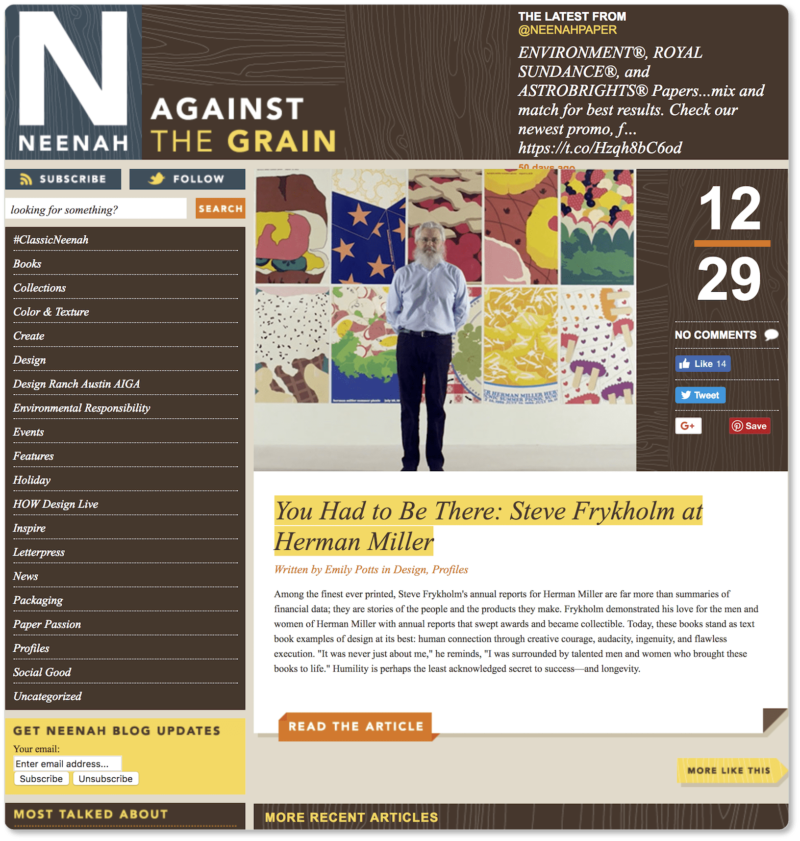
Take a look at the differences between Sleeknote’s and Neenah’s blog homepages:
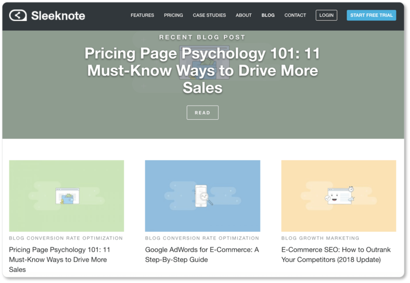
Sleeknote’s page is sparse and minimalistic, and there’s certainly something visually compelling about this design. But from a UX perspective, it leaves some things to be desired. For one thing, there’s no option for a user to search the blog archives. Nor are there any tags or category options… which means visitors have to scroll down and scan every post title for clues if there’s a specific question they’re looking to answer. The posts also aren’t given dates, so users have no idea how far back in time they’re searching when they scroll.
Neenah Paper outperforms Sleeknote when it comes to UX. With its two-column layout and its sidebar on the left, Neenah gives users the option to search for a specific keyword or term, filter posts by category, and scan the most popular posts—plus subscribe or follow Neenah on social media.
Remember that your blog is one of the most important content marketing tools you have—it’s a veritable knowledge base that you’ll be building over years. You don’t want users to only be able to easily access the posts on the first page of your site, because your older content is pretty great, too. That means prioritizing users’ ability to search and browse your posts by category.
While we say “try a two-column layout first,” it’s only a best practice, not an absolute. You may have enough “extras” to add to your page (and can do so while keeping the page clean) that you’ll want use a three-column layout. Or maybe you don’t post often, or—like the clothing company Taylor Stitch—your blog is connected to your store; and so the most recent posts are the most important ones, because the older ones refer to products you may not even sell anymore:
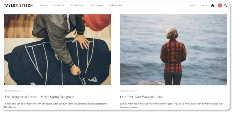
In a case like this, the one-column layout may very well be the way to go.
If you’re using a good CMS, changing templates should be a fairly easeful endeavor; so you may start with one template but do some A/B testing with another. You might also consider asking your user base (your subscribers and commenters) what their preferences are.
Choose the template that works best with your content (text, images, videos, etc.) and compliments the rest of your website, and test that template with your first few blog posts. Test a variety of scenarios, including searching your posts, browsing via tags and categories, commenting, and skimming your content.
How are your images displayed? Does the template look too busy once your content is placed in it? Is the page width “just right” (not so narrow that users have to scroll endlessly to read; not so wide that scanning the text is difficult)? Is it compatible with all browsers (Safari, Firefox, Chrome, Internet Explorer)? What about mobile?
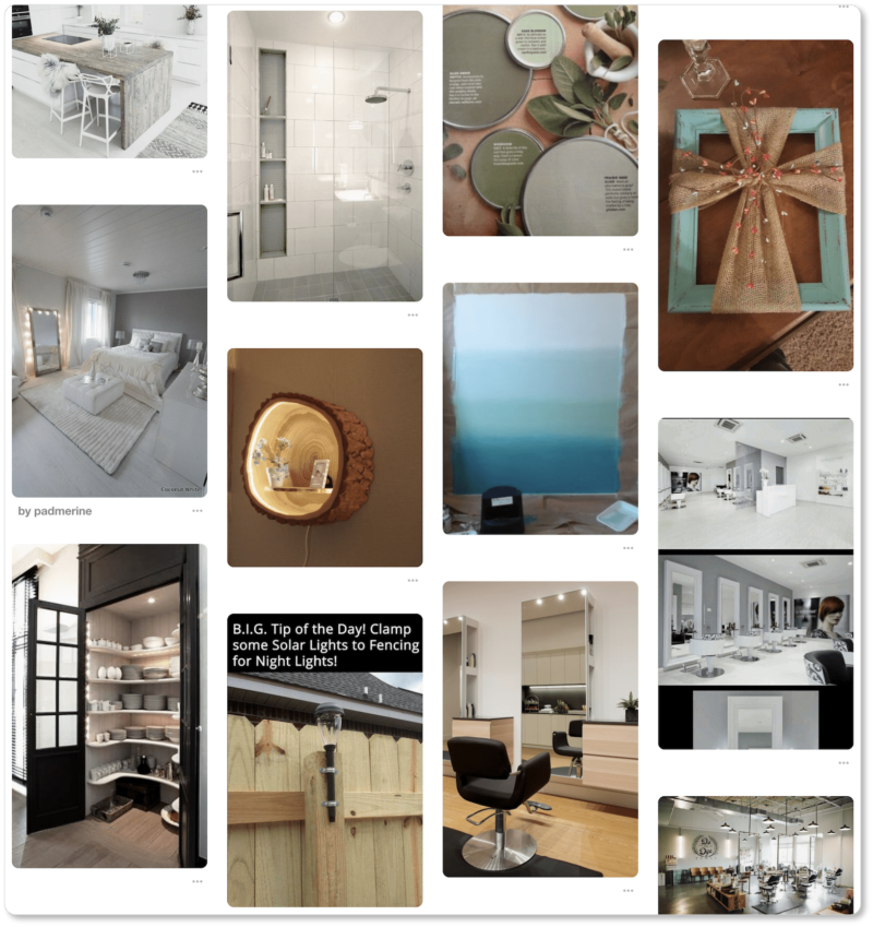
Consider a card layout
If you’re not sure what we mean by “card layout,” think Pinterest:
Here’s why we cast our vote for this layout: Even if you’re only posting once a week, that’s 52 posts a year, 520 posts in ten years… the content will multiply quickly enough. A card-based design allows you to organize your posts so that users get a visual experience of the breadth and variety of your content without the sense of overwhelm that would accompany a text-based display.
From your users’ perspective, card-based design means perceived organization, visual appeal, and terrific UX. Here are two examples of card layout from the blogs at Benetech and Web Designer Depot:

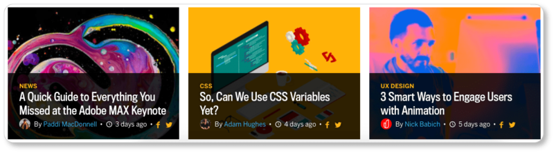
Note that these cards display different sets of information. Both include a featured image, the blog’s title, the post’s category, and its author; and both let you share the post—before you’ve even read it—directly from the card. But Benetech includes excerpts from the post, whereas Web Designer Depot does not. Benetech displays a publication date, while Web Designer Depot displays how many days ago the post was published. Benetech’s cards invite you to “read more,” while for Web Designer Depot, clicking to “read more” is implied.
Here are the elements you should consider incorporating on your card, in approximate order of importance (we’d say the first six elements are non-negotiable, while the last three are up to you):
- Featured image
- Blog title
- Category tag
- Blog excerpt
- Blog author
- Post date
- Social sharing links
- “Read more” button
- Read time
The blog’s title and featured image should be the most prominent elements of your cards. The category tag and excerpt will help your visitor determine with relative certainty whether the article is relevant to their inquiry. These four elements together will determine the click-through.
As a best practice, organize your cards on your blog’s homepage in columns of two or three. More than three and your text will be too small to be readable; one post at a time and your visitors will be doing a lot of scrolling.
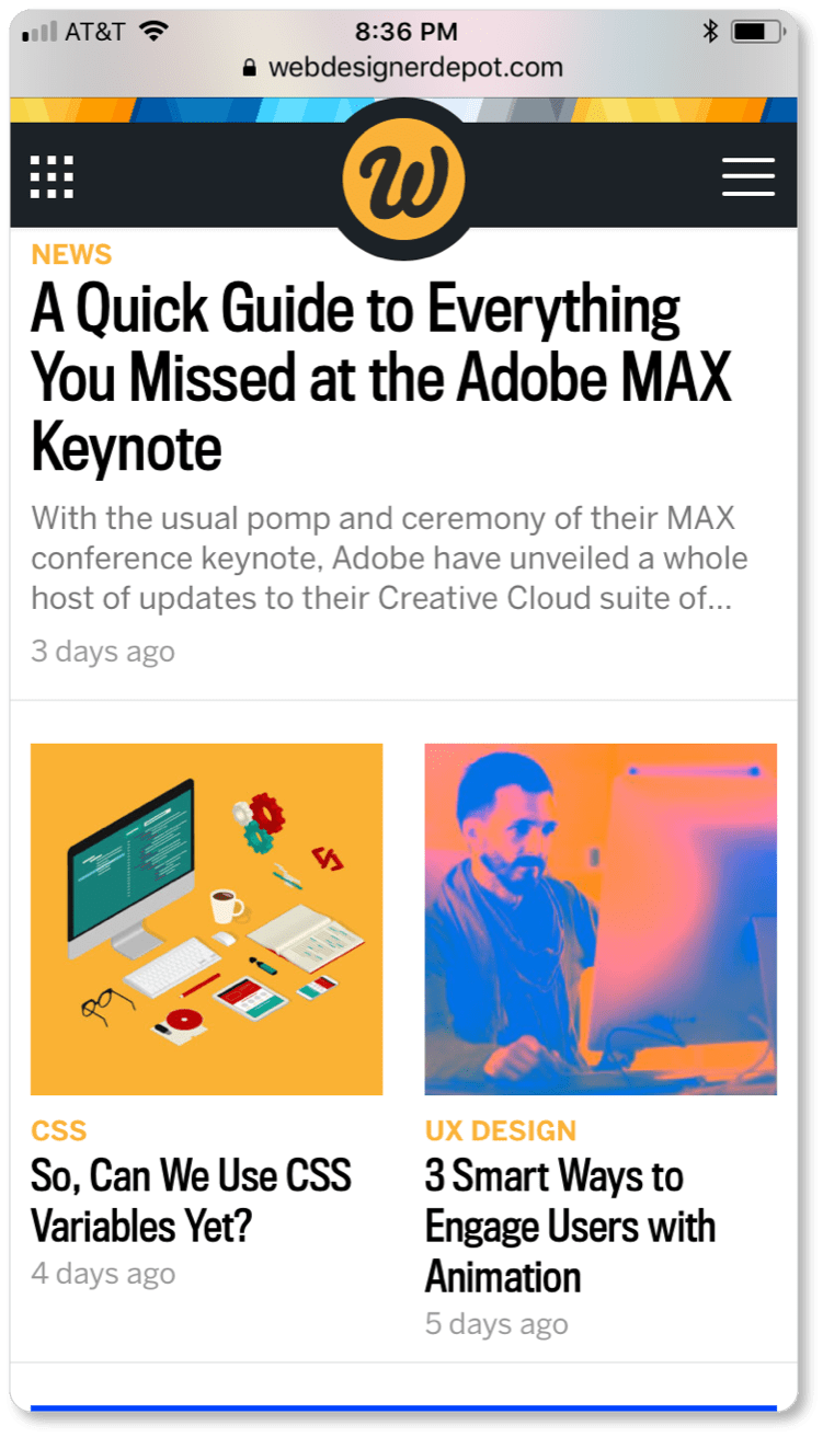
And since we’re on the topic of scrolling: Make sure you take a look at how your card layout displays on mobile devices. Is it still user-friendly? Web Designer Depot dispensed with the author and social sharing elements of their cards on mobile, so a user can still view a number of cards at a time:
Keep your evergreen posts visible
“Evergreen” content is exactly what it sounds like: in-depth and perennially relevant to your audience. Because evergreen content remains relevant, it will continue to bring in organic traffic, and it will continue to position you as an authority.
Of course, not every blog post you write will be evergreen. Sometimes you’ll have to respond, for instance, to a transient trend or a current event. But you’ll be aiming for some blog content that will be as relevant five or even ten years from now as it is today.
Once those evergreen posts are published, you don’t want them relegated to the black hole of blogging oblivion, as sometimes happens to even the best of posts. (This is the nature of the blog, which typically categorizes and displays posts in reverse-chronological order).
There are ways to combat the strict chronology, however. For your evergreen content, include a section in your blog’s sidebar that allows your visitors to browse “Most Popular Posts” or “Most Commented-on Posts.” This will allow you to display the posts that rank highest overall on Google searches and have the most social shares and backlinks from other websites.
Your “Most Popular Posts” will, in the long run, be the posts that contain the most evergreen content.
There may very well come a time when an evergreen post has been so popular for so long that it’s worth moving from your blog to the main content on your website. Until then, having it perpetually available on your blog’s homepage is a great way to keep it getting views.
Properly tag and categorize your posts
Tagging and categorizing allows visitors to click on topics of interest and view every post you’ve written that falls under those categories. The biggest advantage for your visitor is that the feature improves user experience (UX). The biggest advantage for you is that it increases your visitors’ time on your blog, boosts the number of page views, and lowers the bounce rate—all of which impact your SEO ranking.
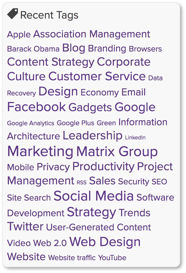
There are also widgets available for “tag clouds”—those visual representations of the most present or popular keywords in a given blog. Here’s an example from the blog at the Matrix Group:
Employing effective sidebar design
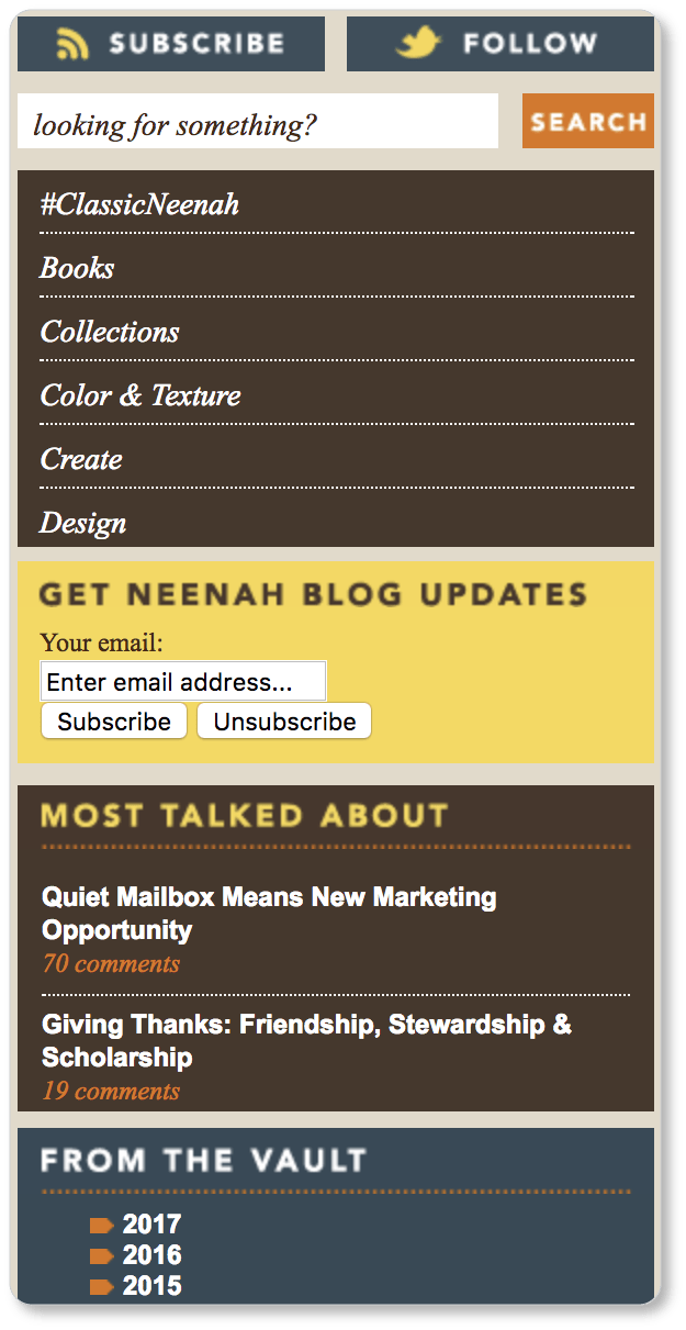
We mentioned the sidebar for Neenah Paper’s blog earlier in this section, and it’s worth returning to. Neenah’s sidebar offers visitors the option to subscribe, follow, search by keyword, browse by category, read their “Most Talked About” posts, and scroll through their archives (“The Vault”) by year:
When we say “an effective sidebar design,” we mean a design that’s effective for both your business and your visitor. From your business’ perspective, you’ll want sidebar elements that point your reader toward subscriptions (RSS feed), conversions (CTAs), and shares (social sharing icons).
From your visitors’ perspective, you’ll want sidebar elements that mean ease of navigation (search, categories, tags), the ability to get to know you and your company better (bio), and the option to browse your offerings and discover content they may not otherwise discover on their own (most popular posts, author list, and so on).
It also means a few things from a UX perspective:
- Keep white space between your sidebar offerings. This way you won’t overwhelm your user.
- Keep a logical hierarchy in your sidebar information. If you offer a list of featured authors in your sidebar, you probably don’t want this to be the first thing your visitors see. Offer them, instead, the option to search, subscribe, or browse your categories initially. Of course, the hierarchy you choose will be determined in part by your audience and their needs, so think about your users when you’re choosing which features to forefront.
- Don’t make it all about yourself. If the only things in your sidebar are your bio, a subscription box, three separate ads for your products, and a set of social sharing icons, you certainly won’t win The Most Customer-Centric Blog Award. Instead, give your visitors what they came for. If you include a CTA in your sidebar, place it below the link for “Most Popular” posts. If you ask them to subscribe, make sure your blog categories are visible just below that subscription button. You get the point. Your sidebar should have your visitor’s interests at heart.
Content you might put in your sidebars includes:
- a search feature
- a subscription option
- an owner or business bio
- a category for recent posts
- a category for most popular or most commented-on posts
- a browse-by-category option
- a search-by-tags option
- a list of featured authors
- call to action buttons
- social sharing icons
- product promotions
- donate buttons
Take a look at the other blogs in your industry (you know, the ones maintained by the businesses that are doing really well). See what they’re doing with their sidebars. And then consider using these as models for your starting place… but only for your starting place.
Always include a call to action
Every blog post is an opportunity to make an ask—especially if you position that ask at the end of a piece of content of exceptional value to your reader. Don’t miss out on this conversion opportunity: Your blog is likely to become your biggest source of traffic, and your readers are devouring your content because they’re in need of the product or service you provide. So take their virtual hands after that final sentence, and lead them to the next place.
Every blog post should include one specific and compelling call to action—no more. This may be to submit a contact form, answer a question, take a survey, take advantage of an offer, subscribe, sign up for updates, click for a free tool or download or complimentary consultation: The CTA will depend on what the content of that particular blog post is. Your CTA should always be relevant to what your visitor just read.
For example, if your blog post is about creating high-converting product pages, offer a free case study (in exchange for an email or a subscription) that narrates how you helped a client employ particular strategies to increase their conversions.
Here’s an example of an appropriate CTA from the insurance company Allstate’s blog:
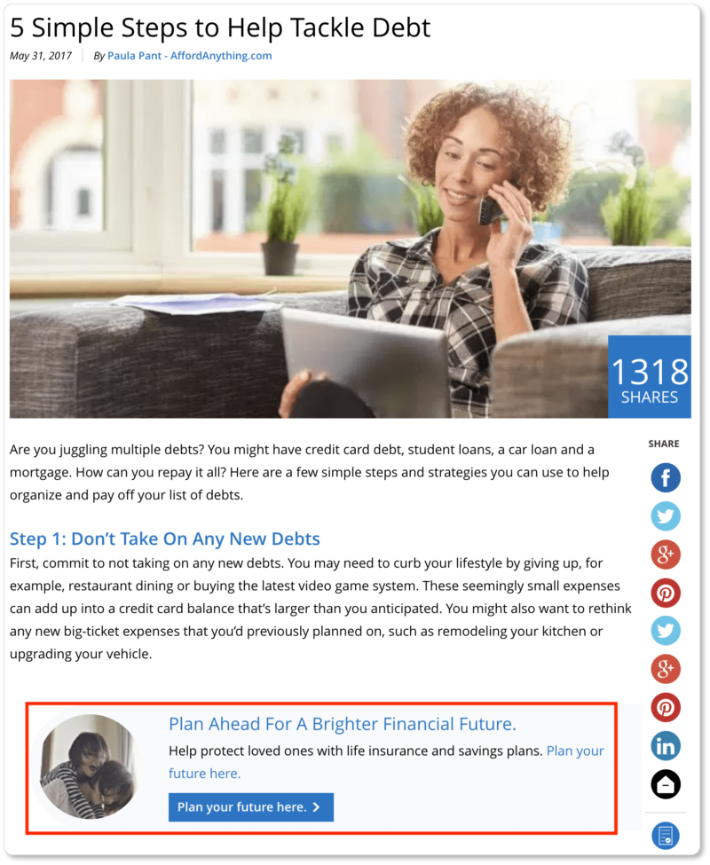
Allstate uses a blog post on “tackling debt” to offer a CTA for “savings plans.” This is a different CTA than the one they use for the post called “Choosing the Right Kitchen Flooring for Your Home“:
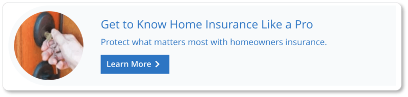
If your CTA is unrelated to your post, your readers are less likely to click; and they may be disappointed that they’re being “sold” something that has nothing to do with their particular question or problem.
Staging user scenarios
We recommend finding a few friends or colleagues who’d be willing to sit down with you for ten or fifteen minutes and talk through their moment-by-moment thought process as they navigate your blog.
Sit them down in front of your homepage and let them take it from there. If they know your line of work, maybe they’ll begin with the search option; if they don’t, they might head straight to the categories. Maybe they’ll click right into the first post on your page, simply because it’s the one above the fold. Have them talk aloud about why they’re choosing to click on what they’re clicking on: Is it the images that compel them? The text? Where do they come to dead-ends in their navigation; and what would they need you to offer them in that moment in order to remain on your site?
This last question, by the way, is possibly one of the most important questions you could ask about your blog—both from a UX perspective, and from an SEO perspective.
By now, you’ve determined your reader persona; mapped out your keywords; begun writing killer SEO-optimized content; found (or created) compelling images to pair with it… in short, your business blog is up and running exquisitely. Now it’s a matter of bringing in the traffic. Of course, SEO and content marketing will already be doing some of this work; but in the next section, we offer additional strategies for building your blog’s audience.