- HOME
- Product updates
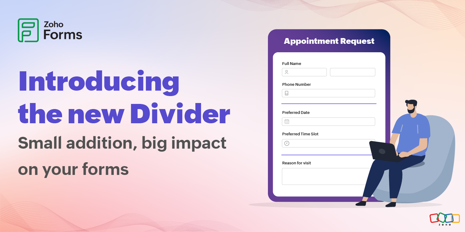
- New field alert: Divider
New field alert: Divider
- Last Updated : January 20, 2026
- 2.2K Views
- 7 Min Read
At some point in our lives, we all have stared at a long form and thought, "This is such a long form and looks like a wall of text".
This is why form design is a balancing act between gathering the information you need and keeping your users engaged enough to actually finish filling it out. And most of the times, the smallest design elements can make the biggest difference in this process.
Zoho Forms is introducing a new field, Divider, to make a difference in your form design.
What exactly is a Divider field?
It is a horizontal line that acts as a visual separator between different sections of your form.
Unlike the section field, the Divider doesn't come with a visible label in your live form. It's purely visual. This makes it perfect for those moments when you want to create breathing room and structure without explicitly labeling every single break in your form.
Understanding your form organization options: Page breaks, sections, and dividers
Before exploring the Divider field, let's clarify how it fits into Zoho Forms' ecosystem of organizing tools.
You have 3 ways to structure your forms in Zoho Forms, and each serves a different purpose.
Page break: For very long forms
Page breaks create multi-page forms where users navigate through distinct pages, typically with Next and Previous buttons. This is your heavyweight option for form organization.
Physically separate content into different pages
This is not just visual separation. It's actual structural separation. Your respondents can see and interact with one page at a time, which creates focus and reduces cognitive load. They are not distracted by upcoming questions or overwhelmed by the volume of information.
Certain workflows have inherent stages that map perfectly to separate pages. An event registration might flow from personal details to event selection to payment information. Each stage is meaningfully distinct and sequential. Using multi-page forms for such scenarios lets users understand they're moving through a process, not just filling out a random collection of fields.
Enable conditional page visibility
This is where page breaks become truly powerful. You can create intelligent forms that adapt to each user.
Show page 4 only if they answered "Yes" to question 7 on page 2. Skip page 3 entirely if they selected "Option B" on page 1. This dynamic behavior means users only see relevant questions, making the form feel shorter and more personalized.
A form that might be 50 questions for some users could be just 20 for others because you're only showing what's necessary based on their specific situation.
Reduce form abandonment by making progress feel achievable
The psychology here is fascinating. When faced with a long form, users make quick assessments about whether it's worth their time. A single page with 20 fields looks daunting and triggers abandonment. But "Page 1 of 4" with five fields looks doable. Even though it has the same total workload, the perception is completely different. Multi-page forms with progress indicators influence the goal gradient effect, the psychological phenomenon where people accelerate their efforts as they get closer to a goal.
Section: The labeled organizer
Section fields add visible headers within a single page of your form. Unlike the field labels you see in the form builder, section labels are typically styled to stand out.

In professional contexts like medical intake forms or legal documents, users need explicit signposting. Section labels can tell users exactly what information is being requested. This clarity reduces confusion for respondents and enhances the professional appearance of your form. It signals that you have thoughtfully organized the information collection process rather than throwing random questions together.
When to use the section field
Users need to quickly scan and find specific sections
In longer forms, users might need to go back and change something in one section or save and come back later. In forms that users return to repeatedly or need to reference later, section labels act as landmarks. If someone needs to update their emergency contact information in an employee profile, a clear section label like "Emergency Contacts" let them quickly navigate to the right place without reading every field. This is especially important in forms where scrolling and scanning without headers becomes tedious and time consuming.
Sections also help when users need to discuss the form with others: "I'm stuck on the section about prior employment" is much clearer than "I'm stuck on question 17." This shared vocabulary between you and your users improves communication and support.
Forms which require descriptions or instructions for sections
Need to explain why you are asking for certain information or provide instructions that apply to multiple fields? Section fields in Zoho Forms don't just provide labels; they can include description text that explains the purpose of an entire section or provides instructions for all the fields within it. Users read the section description once and then understand the context for all subsequent fields in that section.
Divider: The subtle separator
Now we come to the newest addition: the Divider field. It's the minimalist's choice with all structure and no labels.
Visual breaks without adding text
Not every separation needs an announcement. Sometimes you just need breathing room between field groups without the formality of a labeled section. This is perfect for forms where the context is already clear from the field labels themselves or where adding more text would be redundant or overwhelming.

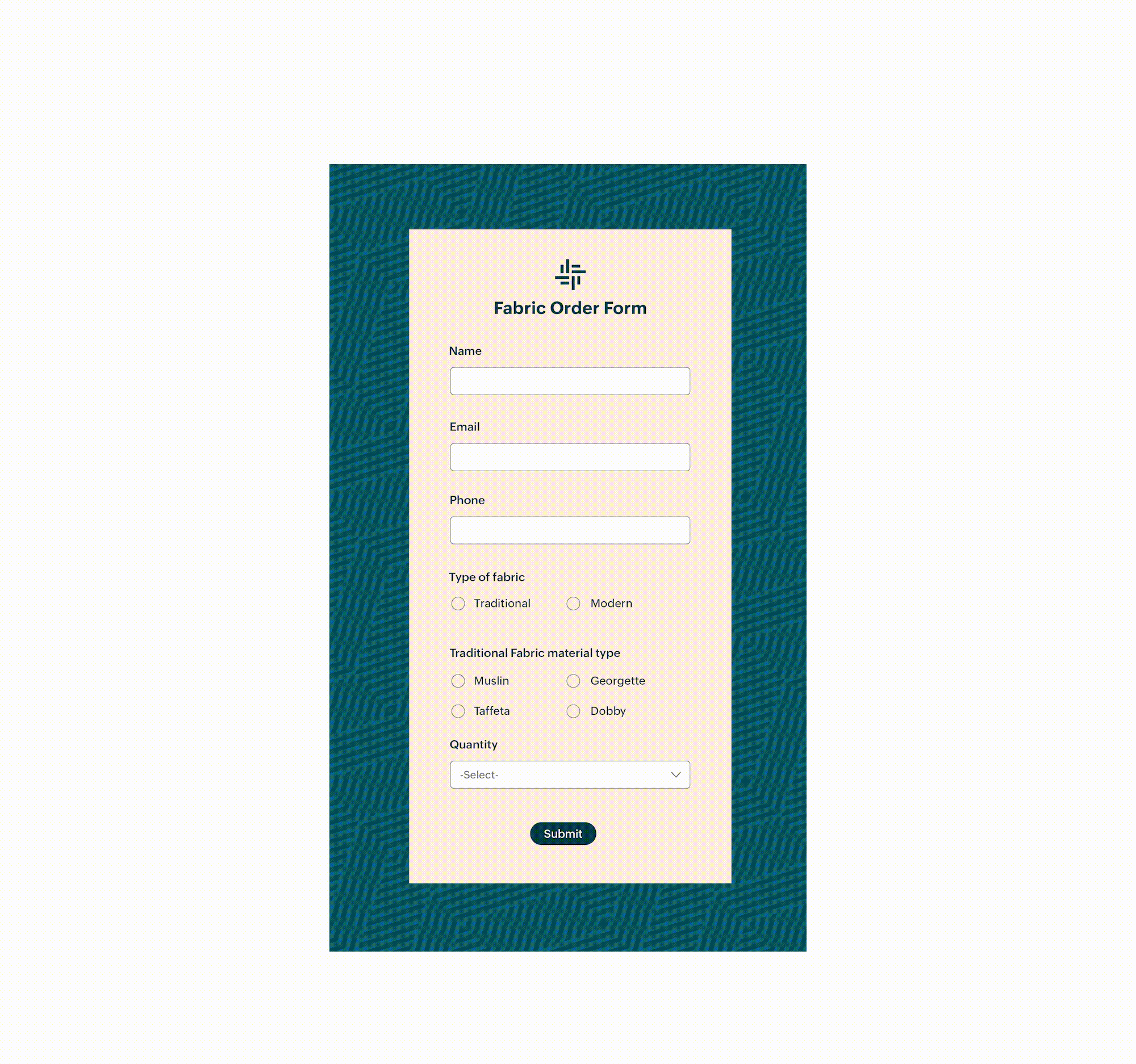
For example, in a registration form, you might have basic personal fields (name, email, and phone), address fields, and communication preferences. These aren't different enough to need section headers, but they are distinct enough to benefit from visual breaks. Dividers acknowledge these subtle distinctions without making them seem more significant than they are.
Customizable line styles, thicknesses, and colors
While dividers are simple, they are not one-size-fits-all. You can adjust them to match your form's aesthetic. Solid lines feel formal and clear, dashed lines feel softer and less definitive, and dotted lines can feel playful or informal.

Color choices also matter because a brand-colored divider reinforces your visual identity. This customizability means dividers can work in virtually any design context.
Choosing the right tool for your form
Here's a practical framework for deciding which organizational tool to use.
How long is your form?
- Under 10 fields : Probably no organization needed
- 10–20 fields : Consider dividers or sections
- 20–30 fields : Sections or dividers with careful grouping
- 30+ fields : Seriously consider page breaks
Do your field groups need labels?
- Yes, absolutely : Use section fields
- Helpful but not required : Use sections for major divisions and dividers for minor ones
- No, just separation : Use dividers exclusively
The powerful combination strategy
You don't have to choose just one. The most effective forms often combine these tools strategically.
For years, the choice was binary. Use section headers or don't organize at all. Page breaks helped with longer forms, but there was a missing middle ground.
The Divider field fills that gap by acknowledging that sometimes you want structure without formality, breathing room without labels, and organization without adding more text to an already text-heavy medium.
Why should you care about a simple line?
We all have abandoned a form halfway through because it felt overwhelming. As form creators, we sometimes forget that what is logical to us might feel chaotic to our users.
The divider field solves this problem elegantly. Research by the Baymard Institute found that 18% of online shoppers have abandoned an order solely due to difficult or complicated form processes.
Dividers are like paragraph breaks in a long article or chapter breaks in a book. They give your users' eyes (and brains) a moment to pause, process, and prepare for what is coming next.
The psychology of white space
There is actual science behind why dividers work so well. Our brains naturally group related information together and look for patterns. When everything runs together without visual breaks, we experience what psychologists call extraneous cognitive load, which means our brains have to work harder to make sense of what we are looking at.
A well-placed divider tells your users that they have finished one part and can take a breath before moving on to the next thing. It's subtle, but it makes a real difference in completion rates. According to research from Nielsen Norman Group, structured forms that organize content logically help users focus on one information category at a time, minimize context switching between unrelated topics, and create a sense of progress as users complete each section.
Design tips for maximum impact
Now that you know what the divider field can do, here are some pro tips for using it effectively.
Don't overdo it
Dividers are best used in moderation. Too many dividers can chop up your form into so many pieces that it loses coherence. Use them strategically to group related content, not after every single field.
If you are adding more than one divider per 5 fields, step back and reconsider your form structure. Maybe you actually need section headers, or maybe your form needs reorganizing.
Match your design language
Your divider should feel like it belongs in your form. If you have a sleek, modern form with lots of white space and minimalist design, a thin, subtle divider in a neutral color works beautifully. If your form is more traditional or corporate, a medium-weight solid line might be more appropriate.
The goal is for the divider to enhance your design, not fight against it.
Consider color psychology
Colors can communicate. A bright blue divider might feel energetic and modern. A gray divider feels professional and neutral. A divider that matches your brand color reinforces brand recognition.
Think about what feeling you want to evoke and choose your divider color accordingly. Just make sure it has enough contrast to be visible without being jarring.
Get started today!
Go ahead and try adding some dividers to your form. Pay attention to how they change the feel of it. Notice how a simple line can transform a cluttered page into an organized, digestible experience. Your users might not consciously notice the dividers, but they'll definitely notice how much easier your form is to complete.
 Samhita V
Samhita is a seasoned product expert at Zoho Forms who blends deep product expertise and user education to help businesses make sense of powerful features without the jargon. Known for her thoughtful storytelling and crisp communication, she adds a subtle creative flair to every piece she writes. With a knack for spotting real-world use cases and adding a touch of fun to her narratives, she’s on a mission to make even the most complex workflows feel approachable. Beyond the desk, she channels her creativity into dance and mural art, finding new ways to infuse her surroundings with color, rhythm, and meaning.