- HOME
- Website Building
- Web Forms
- How to Create Effective Online Scheduling Forms
How to Create Effective Online Scheduling Forms
- 11 Mins Read
- Posted on April 16, 2018
- Last Updated on October 8, 2024
- By Lauren
Gone are the days when a prospect would pick up the phone to call you, and you’d open your paper planner to choose a time that worked for both parties. Now we book online through dedicated scheduling pages and online booking systems. When we schedule the appointment, our calendars are automatically updated and we’re immediately sent an e-mail confirmation; often we’ll receive another reminder a few days before the appointment is scheduled.
 We’re in an age of vast simplicity and convenience for the customer. This scheduling ease is something your clients will expect not only from your scheduling software, but from your scheduling pages as well. And if they don’t get it, they may very well end up booking online with your competitor, two blocks down.
Of course, you reap plenty of benefits when your business offers online scheduling to clients. These include:
- The ability to be “open” 24/7 to accept reservations. People do a good share of their internet surfing outside of business hours; and they’re more likely to book appointments in the moment than they are to remember to call back during your business hours the following day.
- More site traffic—and thus improved SEO. When you offer online booking, you increase site traffic… and the busier your website, the higher it’ll get listed on a SERP (search engine results page) when someone searches for the service you provide. In other words, online bookings help build your online reputation.
- Easy social media sharing. Using an online booking system means you’ve got a link that clients can easily share on social when they’re posting about their experience with your business. This means sharing direct access to you with their followers, which is a great boon for your conversions (and, again, for your site traffic and your SEO).
If your business offers the option of booking online, you likely use scheduling software or a plugin such as Zoho Bookings, Acuity, TimeTap, Appointy, Booker, or Booking Calendar. (These are but a few of the many options out there.) What software you use will depend upon some combination of the industry you’re in and the CMS you use, as well as your budget and the breadth of client details you’ll need to collect during the booking process.
We’re hardly here to make suggestions for you one way or the other—though there are some things that an online booking system should, at minimum, do for you:
- Ensure that bookings can only be made during your hours of availability
- Be customized to allow you to capture all relevant information you need from the client during the booking process
- Automatically update your availability as soon as the booking has been made
- Send an automated email to the client to confirm the booking
Ideally it will also accept payments and register discount codes, and will handle not only your online bookings, but also bookings from other sources (email, phone, walk-ins).
What elements you have on your scheduling page will be determined in part by the software you use, and in part by the complexity of the service you offer. But regardless of your industry, exceptional UX will be crucial to maintaining a scheduling page that actually converts prospects to clients.
If you’ve been on the client side of a booking process before, this shouldn’t surprise you. Data from a leading online appointment scheduling platform recently showed that only about 12% of clicks on “Book an Appointment” CTAs resulted in scheduled appointments. That seems like a remarkably low percentage—especially since visitors understood exactly what they were clicking into.
What’s kept 88% of visitors from completing the booking process? Our guess is that no small portion of form abandonments are due to unsatisfactory user experience. That’s why the majority of our best practices below are grounded in UX.
Make the path to booking short and clear
You probably don’t need us to tell you that the more steps there are between your prospect and their appointment, the less likely they are to follow through. So make the number of times your prospects need to click (and the number of fields as they have to fill out) as few as possible.
Granted, the process will often require at least a few clicks. In many cases, prospects have to categorize both the service and themselves, and this may require additional pages to hone in on the appointment objective. For example, here are the steps for booking an appointment with the wedding retailer BHLDN. There are six of them, but they’re clear:


Let’s linger on BHLDN’s final page—the web form—for a moment. As first-timers to their site, the request to “list any names of dresses you are interested in” is a surprise. We’d insert a link here that would open another page—without closing this one—so the prospect could look at the dresses again, in case they didn’t know this information would be requested during the booking process.
Beyond that, it seems that BHLDN is asking for just the right amount of information, given the possible complexity and likely expense of the service. They’re (nearly) a solid example of the “as few clicks as possible” rule.
Hopefully BHLDN’s process gives you an idea of what a short, clear path to booking an appointment could look like. It also exemplifies consistency in design. If you didn’t observe how both the color palate and the font are consistent across the company’s scheduling pages, go back through those images again. At no point could a prospect worry that they’ve gone down the wrong road here. Consistent design makes for clarity about the end point.
If you feel too inside of your own booking process, ask someone (a friend, a partner) who has never booked a service with your business before to go through the process of scheduling with you. Start them at your homepage and have them narrate their thinking out loud as they take themselves through the process. This is the surest way to discover what elements of your system are confusing, unexplained, or missing.
Ask your friend to be honest with you. If there’s a point at which they would get frustrated—or give up and click out of your site altogether—they should tell you. If they think you’re asking for irrelevant information on your form, they should tell you that as well.
The whole process should take a matter of minutes; and it’s one of the most valuable things you can do to clarify where the hiccups are in your process.
Make your booking page accessible from both your homepage and services page
Keep in mind that a visitor who comes to your site may be checking out your services for the first time. It makes sense to offer them the option of booking an appointment while they’re in the midst of learning about your services. After all, you want them to feel confident that they’re making the right choice (about both service and provider), so give them a proper services page… but keep that booking option visible.
On the other hand, that visitor may have been booking services with you regularly for the past ten years. In which case, don’t make them click through the same series of pages of repeat information before they can book. (That’s what we’d call frustrating.) Make it easy for the visitors who “know the drill” to get to your scheduling page as quickly as they can, by making it available from your homepage.
Make it mobile-friendly
There’s a very good chance that over half of the visitors who arrive at your site are doing so from their mobile phones.
Don’t make these visitors wait until they’re back at their desktops or laptops to book with you… you run the risk of them forgetting that they wanted to book anything to begin with. Not to mention there’s a very high chance that if they had a frustrating experience with your site on mobile, they’re not going to give you a second chance on their desktops.
Here’s an example of a very mobile-friendly booking process, through Rincon Chiro:


Notice the copy on Rincon’s final CTA: “Reserve without Paying.” This serves as a comforting reminder to the client who may not want to provide further information (either because they don’t trust sharing that information online or because they don’t want to tap out all those credit card numbers on their small screens).
Have your phone number visible
No matter how well your scheduling system works or how clear the process is, there’s always the possibility that your clients will have questions—whether about the booking system itself or about your services.
And while the whole point of the scheduling page and online appointment system is to keep clients from having to pick up the phone, you don’t want to leave them without any options if it turns out they can’t finish booking online.
So give them the quickest way to contact you: your phone number. Live chat is another great customer service option; and it may be worth having both on your scheduling page.
Include a text box for additional information
You’re bound to get clients who have additional things they want to say about their appointment: whether it’s specific needs they have, details they want you to know about them, or particulars about the service that they want to make sure are available to them when they arrive.
For instance, if you run a bodywork business, a client might want to stress—for the sake of their own comfort—that they want a male or female practitioner working on them. If it’s for a tattoo, the client might feel the need to let you know that this is “their first,” and to please bear with them if they come in a little nervous, or with a lot of questions.
These will often be comments you can’t predict. So leave that space so that clients can say whatever they need to say that will make them feel better about the appointment. If the “notes” option isn’t there, you run the risk of them clicking out of your site, and going to a competitor whose scheduling software is willing to “listen.”
Consider a range of online payment options
Notice we’re only saying “consider” here. Whether or not you decide to have your clients pay during the booking process is up to you.
The biggest pro of online payments is that they ensure you still get paid if there’s a last-minute cancellation or a no-show. And of course, the biggest pro for your clients is that the software will remember their payment information, which they won’t have to re-enter every time they book with you.
The biggest con, however, is that you might lose those clients who don’t want to give their credit card information over on the internet.
If you do decide to accept online payments, give your clients many options. Accept the major credit cards and debit cards. If your clients want to pay with PayPal, let them.
And please, put the logos for those payment options on your scheduling page, so your clients don’t get to the end of the process and realize they don’t have the right form of payment to complete the booking.
Consider Upselling
Take a look at what Project Zen does on their booking page:
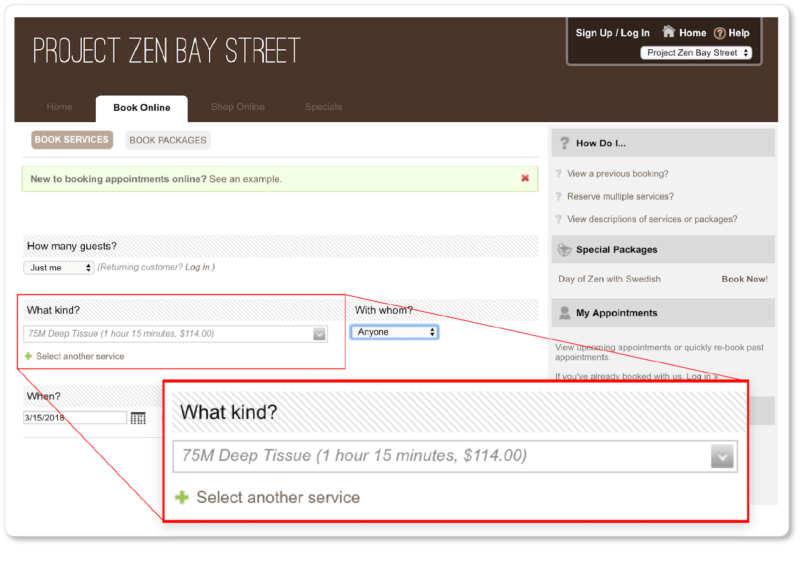
A client initially thinks they just want a deep tissue massage; but then they see that CTA to “Select another service,” which might include hot stones or a 30-minute tui na session. And they suddenly feel like they’re already splurging anyhow, so why not?
You see this all the time with, for example, car rental companies. You rent the car; but maybe you also want insurance, or a GPS system, or a Sirius XM Radio, or a child seat…
Your clients are already on the verge of hitting what is essentially the “purchase” button. This is your chocolate-at-the-checkout-aisle moment. Don’t be afraid to let them know you have extras on offer for them—whether that’s additional services or add-ons to the service they’re about to book.
Remove distractions
We know… we just recommended that you offer last-minute add-ons to your clients’ service requests—which in theory is a distraction. One of the reasons we like Project Zen’s example above is that the suggestion to the client to “Select another service” could just as easily be ignored as it could be taken up.
Project Zen doesn’t include photographs of other services that the client might choose. There’s nothing flashy or distracting about the upsell that will pull the client off the path of converting to go read in-depth about other services. They only offer a subtle suggestion that the client might gift themselves an extra 30 minutes or so of pampering.
That said, keep the pages in your booking process as sparse as possible—beginning with your scheduling page. This is not the place to link to other pages on your site, or to add videos of the other exciting services you offer.
If they leave your scheduling page (unless it’s to be directed to your booking software), your prospect may never come back. From the moment they hit the button to begin the scheduling process, there should be nothing else your client is concerned with except choosing a date and hitting “Book Now.”
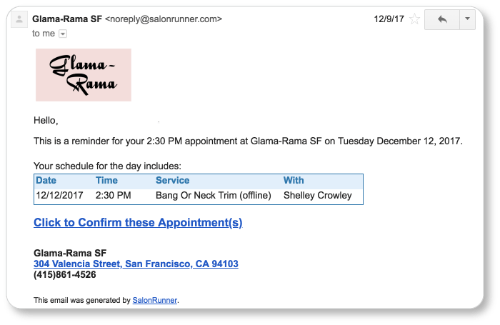
Send a confirmation email and a follow-up reminder
Admittedly, this tip isn’t exactly about your scheduling page; but it’s worth offering.
Automatic confirmation emails (which should include date, time, and the location of the appointment) increase customer trust in your booking process and peace of mind about the way you run your business.
And the follow-up reminders are just as important: They keep you from having to charge clients for forgotten appointments and no-shows. They also give you the opportunity to give useful last-minute details or reminders—about directions, parking, what to bring, and so on.
Neither e-mail has to be complex. Your booking software should be capable of sending both. Here’s Glama-Rama’s confirmation e-mail:
Aim for repeat clients
Once a client has booked an appointment with you, their data is entered into a structured system. This is where your longer-term relationship with them begins.
Use the contact information they gave you to send out occasional emails with discount codes, coupons, specials, free information (as part of a larger content marketing strategy)… and of course, reminders to book again with you in the future.
Of course, they’ll be all the more likely to do so if they had a great user experience on your scheduling pages… and if the service you offered them at the appointment was remarkable.
Over the course of this chapter, we’ve given you a lot of tricks, tips, and best practices for your web forms. Hopefully you’ve been putting them into action as you’ve been consuming this content. Our final offering to you is a set of comprehensive web form checklists, which should help you ensure you’re offering your site visitors the most conversion-friendly web forms possible.