- HOME
- Website Building
- Homepages
- Cultivating a Diverse Set of Visitor Journeys
Cultivating a Diverse Set of Visitor Journeys
- 10 Mins Read
- Posted on April 19, 2018
- Last Updated on October 8, 2024
- By Lauren
Think about all the websites you visit in a day, and your reasons for doing so. Your intentions may include education, reference, satisfying curiosity, entertainment, social networking, browsing, shopping, purchasing, discovery… the list goes on. The point is, you aren’t only ever on a website because you plan to buy.
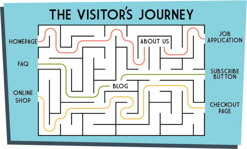
Although prospects and customers are your most valuable visitors from a monetary perspective, your homepage should speak to the full range of other visitors as well—even if it only does so subtly. After all, you can derive a lot of value from less directly monetizable traffic. Job seekers, journalists, investors, industry partners… all of these demographics play an important role in your business. It’s essential that you take this user spectrum into account when you’re thinking about how to curate your homepage content.
What’s more, even if we are just looking strictly at prospects and customers, the buyer’s journey is more complex than most people give it credit for: There are three stages of prospect alone (awareness, consideration, decision); and you’ll want to take these nuances into consideration. You should bear these three different-but-related visitor ranges in mind:
- The different types of visitors who come to your site
- The different buyer personas of those specific visitors who want to purchase your product or service
- The different buyer journeys each prospect takes through your sales pipeline
Ideally, each of these interconnected demographics will need to find its way through your site, eventually landing on the right content. Building site structure, UX, and web copy that supports that is tricky; but we’ve got you covered here. Read on to learn more about how to balance the many competing interests of your full visitor range.
Consider the different types of visitors to your site
You probably have your buyers front-of-mind as you’re mapping out your company homepage, and we understand that single-mindedness. (We do the same—and we’ll get to that part shortly.) But it may be worth it to remember that your full spectrum of visitors probably extends well beyond those soon-to-be-paying prospects and paying customers. Indeed, many of your other visitors may be as profitable for your business (albeit in different ways) as your prospects and customers are.
This range of possible visitors to your business website includes, but is hardly limited to:
- prospective employees looking to work with you
- content contributors (i.e. bloggers) looking for a home for their content
- media outlets looking for fodder for their next article
- other businesses looking to collaborate
- investors looking to… well, invest
Your visitor range will likely be determined by the nature and size of your business, among other factors—and certain of these behaviors you might want to cultivate on your homepage. Over time, analytics will give you a sense of user intent; Google Analytics and Zoho PageSense are great tools to use for this kind of research.
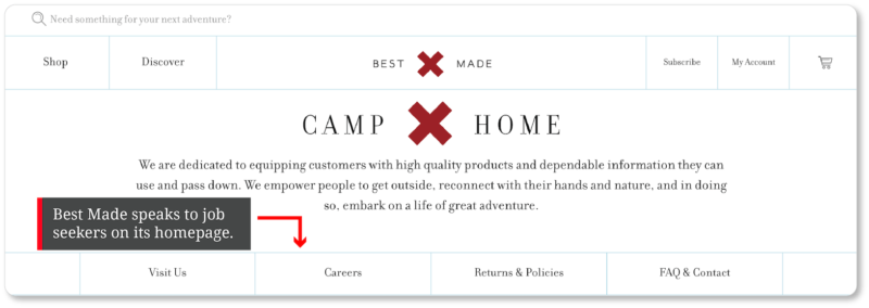
In the meantime, a little attention to the kinds of queries your business receives on a daily basis should inform you well enough about whom your homepage audience will likely be. For instance, the outdoor lifestyle brand Best Made, which claims to be growing right now, includes a prominent link to its “Careers” page on its homepage:
The natural gas and electric utility company NiSource speaks directly to both job seekers and investors on its homepage:
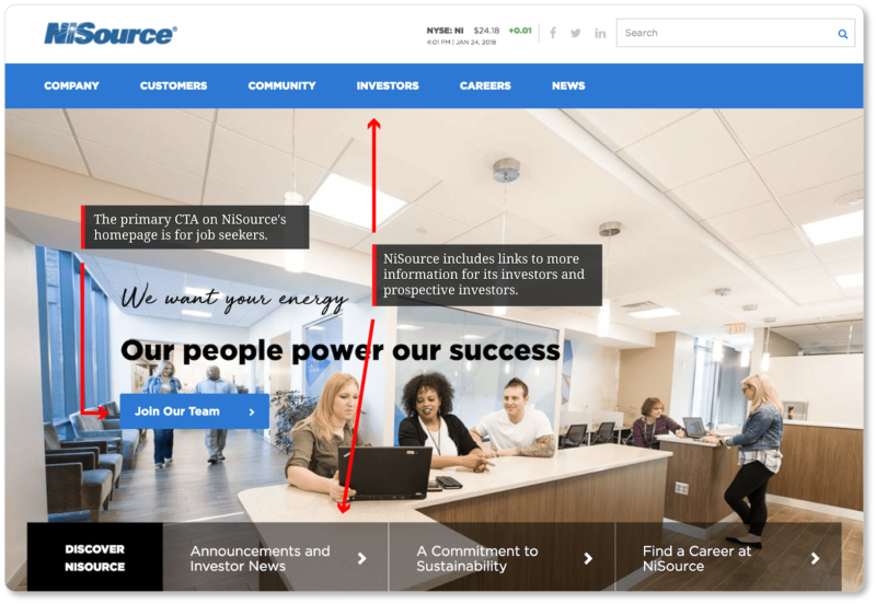
In other words, if you have a lot of job openings, or job inquiries, or your business runs as much on investor relations as it does on customer relations (and so on), don’t send those visitors on a wild search for the information relevant to them.
And if those kinds of visitors are few and far between—or if A/B testing suggests to you that focusing on prospects for the vast majority of your homepage is your best move, you can always include accessible links for other visitor types in your footer, as Shopify, the social network Nextdoor, and the jeans retailer Imogene + Willie do:
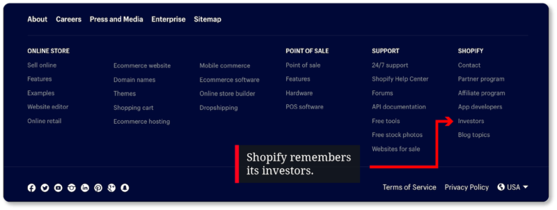


The point is to offer effortless navigation for every user intent.
Consider the different buyer personas for your business
Customers and prospects are the homepage audience you’ve probably spent most of your energy thinking about. But when it’s time to really home in on your prospects, remember that your business may very well have more than one type of buyer persona. And it shouldn’t be a surprise at this point that our recommendation is to say a little something to each of them on your homepage.
Hopefully you’ve spent some time mapping out these various customer personas so you can speak to each of them—and perhaps invite each of them to take a slightly different journey—on your homepage. Take the homepage for Dripping Springs Real Estate, for example:
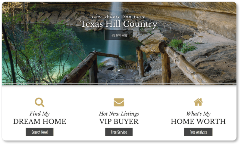
A visitor to Dripping Springs’ page is likely to have landed here for one of two reasons: They’re either looking to buy a house or looking to sell one. But just below the fold, the company takes three visitor types into account, making a subtle but critical distinction between two different types of homebuyer. The CTA to “Find My Dream Home” is for visitors who may be browsing in a non-committal way. The CTA for “VIP Buyer,” however, is for visitors ready to buy: It leads users to a signup page, where they enter their email to get updates on new listings. And, of course, the final CTA (“What’s My Home Worth”) is for visitors looking to sell.
Or take Scorpion. The internet marketing company clearly articulates on its homepage the range of clients (and industries) it works for:
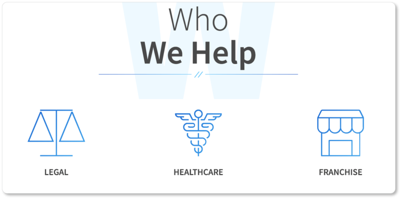
There’s even a feature further down their homepage that allows prospective clients to choose their industry and see the websites Scorpion has designed for businesses similar to their own:

Scorpion necessarily offers a smaller range of CTAs than Dripping Springs does (they have only a “Contact Us” CTA above the fold and a “Request More Information” CTA at the bottom of the page): Its prospective clients are all there because they need the same kind of service.
Nonetheless, Scorpion is explicit about the breadth of its prospect spectrum. Its homepage speaks to all the industries it caters to—and it uses good design principles to do so without overwhelming its visitors.
Finally, maybe your prospects “range” insofar as they’re interested in your product or service for different reasons. Take the homepage for Myoton, a device that assesses soft tissue:
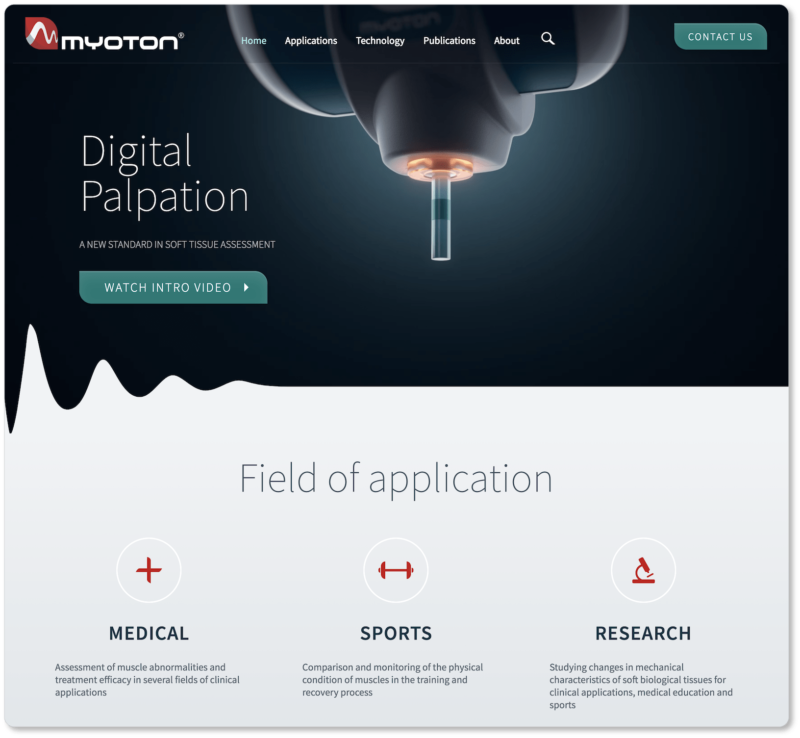
Myoton’s entire website is built around a single product; yet its homepage explicitly identifies three categories of visitor, all of whom would be interested in the device as a consequence of the particular industry they’re in.
So take a tip from these company homepages and consider your entire prospect range… whether that range is a function of disparate intentions, disparate industries, or disparate interests.
Consider the buyer’s journey
The range of prospects who arrive on your company website will be at different points in their journey as consumers. You’ll be trying to move each of these prospects off your homepage and onto other pages of your site, and through their own particular journey in your sales funnel. The buyer’s journey consists of three stages:
- Awareness: The prospect recognizes they have a problem that needs to be solved… but while they know they have a need, they don’t know about your company yet. During the awareness stage, the nature of the prospect’s need is clarified, and they discover your company’s existence as one potential remedy for their problem.
- Consideration: In this stage, the prospect researches their options to determine how each company’s offerings, approaches, or methods will address their particular pain points. By now, the prospect has thoroughly defined the nature of their problem and is firmly committed to solving it.
- Decision: The prospect has determined the best approach to solving their problem. In the decision stage, they reduce their options to a shortlist of businesses who offer that particular approach. The decision stage culminates in the reduction of that list to a single choice.
Your homepage should reflect the mindsets of prospects who are in each of these three stages of the journey. It won’t necessarily do this through loads of copy (that’s for your subpages); but it should at least do it through CTAs.
For instance, homepage CTAs for visitors in the awareness stage might include lead magnets such as ebooks, whitepapers, or guides that educate your visitor on a particular topic. They might even include subscription CTAs for your blog. (Like your content marketing strategy, your strategy for visitors in the awareness stage should be focused more on educating your prospect than on selling your product or service.) Of course, you should always exchange this content for your visitors’ email addresses—you are perpetually building your email list, after all.
CTAs for visitors in the consideration stage should link to content that solves clearly defined problems. Case studies are great CTA offerings for this stage. Take the CTA on IMPACT’s homepage, which offers an inbound marketing strategy template—again, in exchange for an email address:
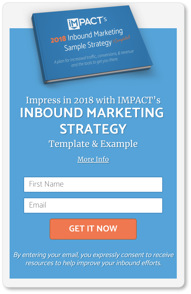
CTA copy for visitors in the decision stage includes “Start My Free Trial,” “Schedule a Demo,” “Request a Consultation,” or “Buy Now.” These are the CTAs that should be positioned at the top of your homepage.
Pro Tip: Don’t crowd all your CTAs together at the top of the page: Visitors who aren’t yet ready to buy your product or use your service will need to scroll down anyhow, in order to learn more. But those visitors ready to start? They should have immediate access to that decision-stage CTA. (And if there is more than one CTA in a scroll, make it clear which one you want your visitors to choose.)
To exemplify how the strategies above might play out on a homepage, let’s take a closer look at two websites.
Here are some screenshots from Thumbtack’s homepage:
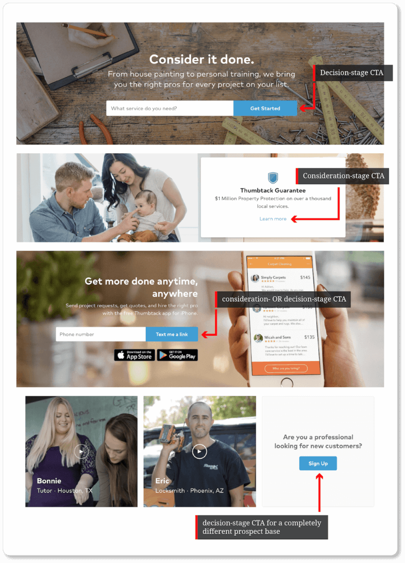
Thumbtack displays four different calls to action on its homepage. (You’ll have noticed that they’re all the same color.) The primary CTA—located above the fold—is for prospects at the decision stage, who are ready to use Thumbtack to hire a professional. The second CTA is designed for those in the consideration stage, who want to know what kind of protections the company offers before they choose Thumbtack for their business. The third CTA is for visitors in the consideration or decision stage.
The final CTA is for a different category of Thumbtack prospect who’s at the decision stage: the professional who is ready to find new clients through the platform. This person has the most to gain from Thumbtack (gainful employment), so it makes sense that their CTA is farthest down the page. This UX decision means Thumbtack’s most valuable visitors—paying customers—have a clear shot through the sales pipeline. A very smart choice, in our opinion.
Thumbtack doesn’t necessarily need a CTA for someone who’s in the first stage of the buyer’s journey, because prospects are already aware of the problem they need solved when they arrive on Thumbtack’s site. (Not to mention that Thumbtack’s SEO strategy is solid: They show up on the first page—as the 5th and 1st organic search result, respectively—of Google searches for “electricians near me” and “carpenters near me”):


Now let’s take a closer look at Ellevest’s homepage:
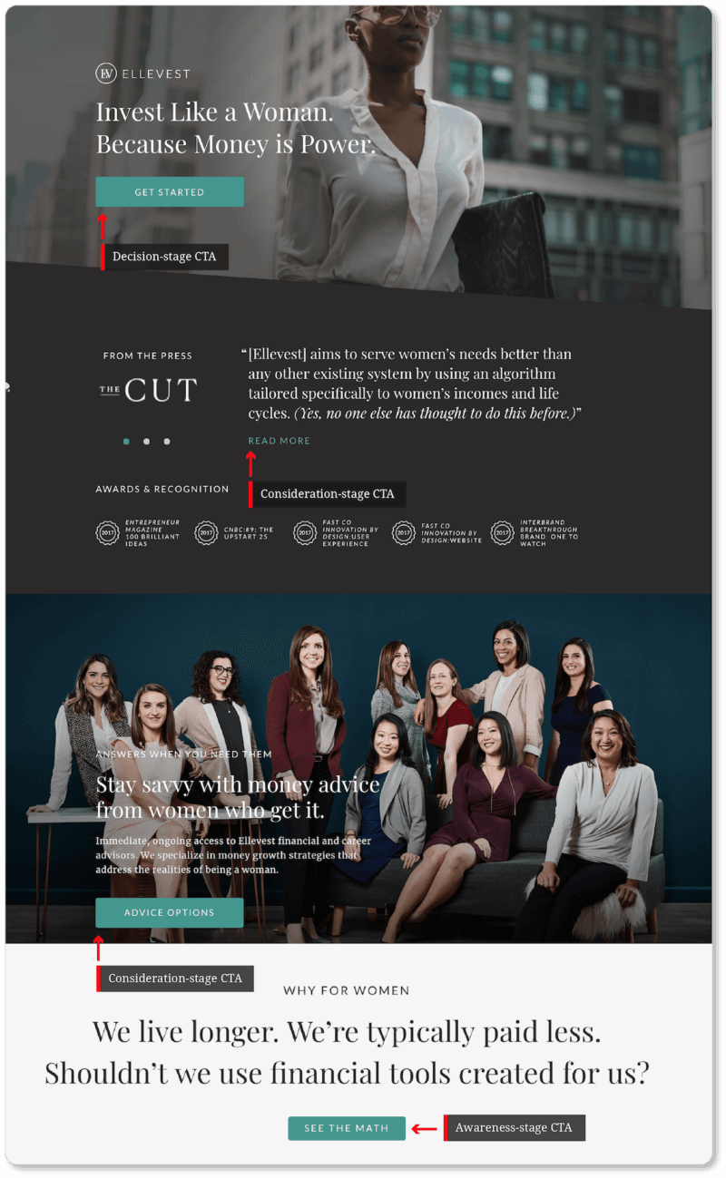
Ellevest’s primary CTA is designed for visitors in the decision stage—though it’s worth noting that the company offers the same CTA at the bottom of the page for visitors who entered the decision stage while reading their homepage. Offering your decision-stage CTA twice—once above the fold and then again at the bottom of homepage—is a wise strategy.
The second and third CTAs offer visitors in the consideration stage more information. The first comes in the form of press articles, which serve a double benefit for the company. For one thing, they offer prospects social proof from a long list of significant media outlets (Forbes, The New York Times, Business Insider, Bloomberg). In addition, the articles do more than celebrate and advocate for the company: They also locate it in a crucial moment for its clients. In this sense, the articles speak to prospects in both the awareness and consideration stages:


The third CTA gives prospects in the consideration stage more information about the different services Ellevest offers.
The fourth CTA here is, we think, one of the most remarkable CTAs Ellevest could offer its visitors in the awareness stage. The CTA copy invites visitors to “See the Math”; and the page users are taken to when they click essentially tells them about a problem that many visitors may not even know they had:
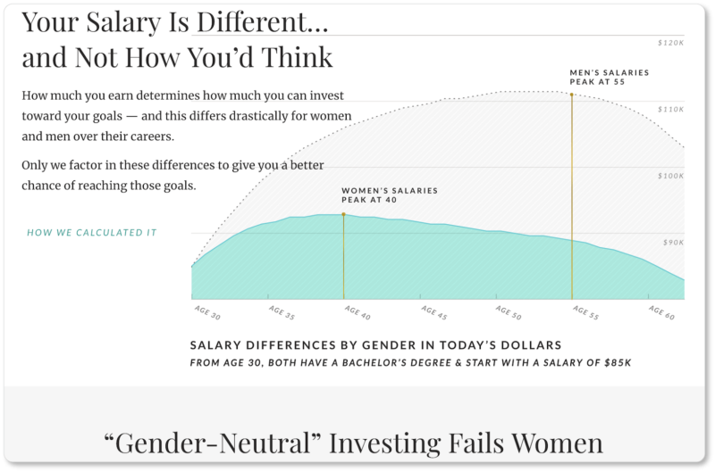
And there you have it: a brilliantly executed series of calls to action that cover all stages of the buyer’s journey—including informing site visitors of a problem they might not have even known about… but are now probably compelled to fix.
A journey for every visitor
In short, your homepage CTAs (or your footer links, or the links elsewhere on your homepage) aren’t doing their jobs if any of your users gets stuck on the page and doesn’t know where to go next. Have one action for each type of visitor, so that every user knows the best next step to take for their circumstances and commitment levels. In this way, your homepage will be more than a virtual business brochure: It’ll be a sales and lead-generation machine for your company.
Your awareness-stage visitors might be looking for a CTA to “Read Our Story,” discover “Why Our Company?” or “Download Fact Sheet.” Your consideration-stage visitors might be looking for CTAs such as “Read Case Studies,” “Schedule a Demo,” “View Our Products,” or “FAQ.” Your decision-stage visitors will probably be looking for the “Contact Us,” “Request an Estimate,” or “Purchase” CTA. Of course, you’ll make these specific to your offering… and you’ll offer them in your company’s voice and language.
All three stages of the buyer’s journey can ultimately be covered in a short homepage. You’ve seen the proof of this above. And we bet that, if you manage this, your visitors will be delighted with the options your homepage offers them.
Of course, there’s another “type” of visitor very much worth taking into account as you consider your company homepage (and your entire website for that matter): your mobile visitors. In the next section, we discuss the importance of recognizing that your mobile visitors will require a different experience of your homepage than your desktop visitors will—as well as some strategies for offering it to them.