- HOME
- Website Building
- Business Blogs
- Our Favorite Examples of Effective Business Blogs
Our Favorite Examples of Effective Business Blogs
- 7 Mins Read
- Posted on March 12, 2018
- Last Updated on October 8, 2024
- By Lauren
If you run a business, you should be blogging already. By now, maintaining a blog is an imperative in any business’s marketing strategy, because your blog is your content marketing machine. It’s there to offer consistent, valuable content that meets your prospects’ and customers’ needs.
There’s a sort of “if you build it (well), they will come” quality to the whole strategy: You know your prospects and their pain points, and you create search engine-friendly material to solve those pain points. When prospects go searching online for solutions, your blog posts show up… because you’ve already done the work, and are prepared to meet their needs.
But that’s just the copy. If you’ve spent any time on business blogs, you’ve noticed there’s a wide range of design elements and presentation out there. We’ve given you a load of best practices for your business blog elsewhere; here, we showcase three blogs so you can take some tips from businesses who are playing the blogging game well:
1. SmartBug
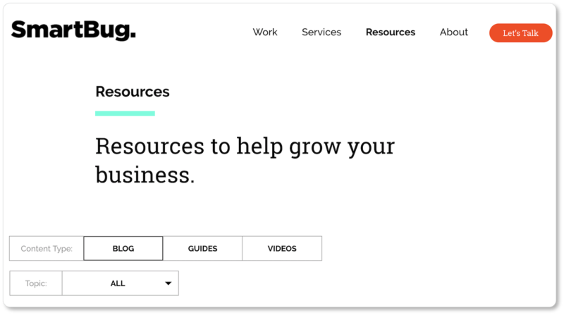
SmartBug is digital inbound marketing agency. Here’s what their blog’s homepage looks like:
Best elements of SmartBug’s blog:
The titles of their blogs are descriptive and diverse. SmartBug’s titles communicate precisely what each post is about, and point to a variety of blog types:
This includes listicles (“7 Cold Email Tips”), resources (“Favorite Marketing Tools Our Team Uses”), and how-tos (“How to Conduct an Effective Content Audit”). Other titles—not shown here—point to comprehensive posts (“Everything CMOs Should Know About Video Marketing”) and explanatory posts (“The Difference Between Direct and Organic Search Traffic Sources”).
SmartBug understands that visitors have different commitment levels and different amounts of spare time in their days. (That’s why they offer both listicles and comprehensive posts.)
They state their goal and reader benefits in their headline. Granted, “Resources to help grow your business” is broad; but the categories listed under “Topics” (Inbound Marketing, Marketing Strategy, etc) clarify what “resources” entails. Visitors quickly know what topics they can get educated on.
They offer category filters, by both “type” and “topic.” This feature keeps visitors from having to scroll through the blog, scanning title after title, until they find the content they’re looking for:

They post often and keep up on their industry. There are currently 12 posts on SmartBug’s homepage, and they were posted over the course of 18 days. This is great for SEO; and it keeps SmartBug’s hungrier readers happy.
What’s more, once a week SmartBug publishes a post called “This Week in Inbound Marketing.” Here’s the one they published just after Facebook’s recent algorithm change:

SmartBug looks current, engaged, and forward-looking. In other words, someone you’d want to do business with.
They offer two standout CTAs: that unmissable “Let’s Talk” button above the fold, and another at the bottom of the page:


SmartBug doesn’t leave prospects hanging after offering all that great content. There’s a clear next step for them to take after they’ve realized the company has more than a blog to offer them.
They display social proof. SmartBug offers a testimonial about the value of their service at a major friction point (the second CTA to get in touch). This is called a “click trigger,” and the company has chosen a strong testimonial to prompt those clicks.
2. Santander Bank
Santander’s blog is called “Prosper and Thrive.” Here’s its homepage:


Best elements of Santander’s blog:
They’re clear about their reader persona. Santander knows what its demographic is: millennials who are urban, cosmopolitan, diverse, practical, and… let’s face it, a bit broke. Here’s how we could tell:
Each of Santander’s blog posts provides content appropriate to this demographic’s pain points.
They display featured posts. Above the fold of Propser and Thrive’s homepage are featured posts that offer visitors the “best of” right away. (This might mean evergreen content, or the posts with the most comments or the most social shares.)
From a user perpsective, this design strategy means visitors get access to Santander’s most important content first. And from a business perspective, it means Santander’s most popular content becomes even more popular.
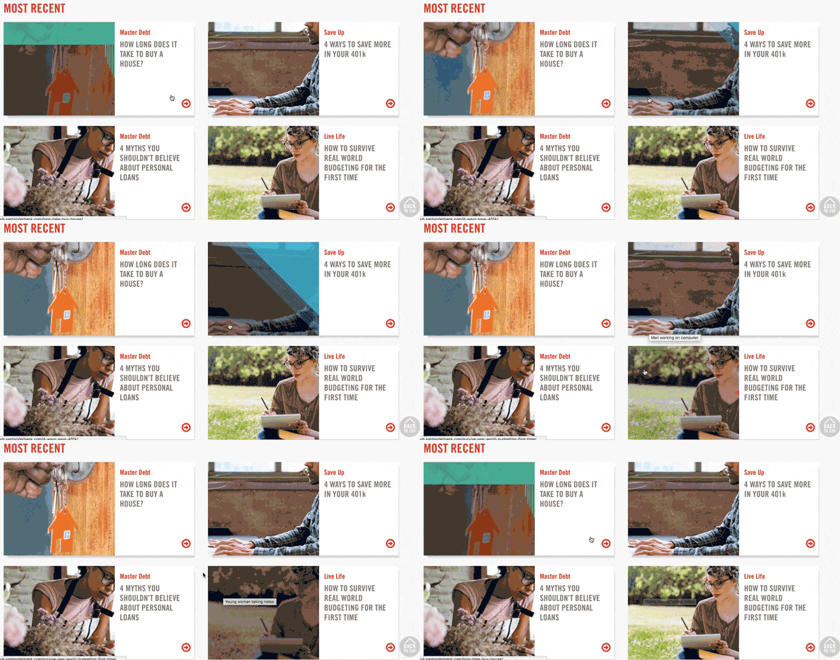
They include microinteractions. They may seem like small matters, but good microinteractions make good UX… and that’s no small thing. When a user hovers over a blog post on the homepage, a microinteraction occurs, alerting users to which of the three categories it’s in (Blue = “Save Up”; Green = “Master Debt”; Red = “Live Life”):
But the visual satisfaction doesn’t end there. We clicked into “5 Tips for Curing a Holiday Debt Hangover“:

One thing to notice is Santander’s use of links. That first bit of hypertext (“an average of $1,003 in new debt”) is an external link to a study at Magnify Money; the other two link to Santander’s own posts on skipping Black Friday madness and holiday budgeting tips. Internal and external links (provided you’re linking out to authority sites) are both great for SEO.
It also appears that Santander carefully considers keywords in their posts. In the text above, the word “debt” occurs 11 times, and the term “holiday debt” 4 times. When we did a Google search for “holiday debt,” the third result that came up was the Mangify Money study Santander links to:

Santander appears to be doing due diligence in their search engine research, and creating keywords based on that research. (Notice how they’ve apparently taken the term “debt hangover” from Magnify Money’s study as well.)
Other things we appreciate about Santander’s inner blog pages:
- Those conspicuous social sharing buttons beneath the post’s featured image
- That Santander keeps their copy easy on the eyes
- The recommended posts and standout subscription CTA to the right of every post:

- That each post offers a “Respect Rule,” infusing some humor into a possibly anxious set of topics:

- That Santander asks for feedback at the end of every post. Users answer by clicking a thumbs-up or thumbs-down icon (again, they know their demographic!); this helps the bank determine their future content, as well as which posts to promote:

3. Equinox
Equinox is a luxury fitness club; their blog is called “Furthermore.” Here is its homepage:
Best elements of Equinox’s blog:
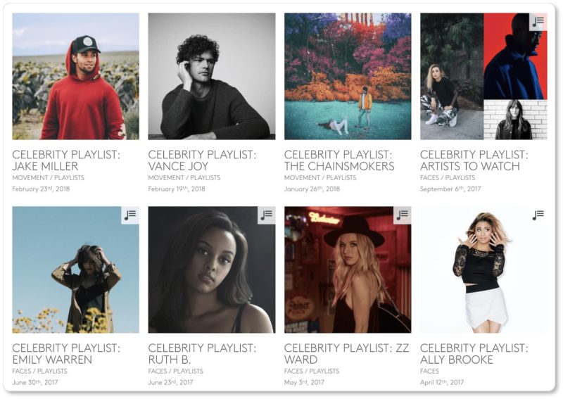
They offer a remarkable variety of post types. This page might feel overwhelming for some visitors; but Equinox is certainly pulling out all the stops and displaying all it has to offer. The topics range from nutrition to science to style; but it’s not just the content that ranges—it’s also the form it comes in. Equinox offers videos, personal stories, and how-tos; they also offer workout playlists (these posts link to Equinox’s Spotify page):
They show their social media posts. Equinox displays its most recent Instagram and Twitter posts, inviting readers in through imagery and copy, and making it remarkably easy to follow them:

They’ve got great subscription copy. Furthermore’s subscription CTA reads:
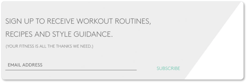
Equinox clarifies for prospective subscribers that they’ll be getting a lot in exchange for (virtually) nothing. If it were up to us, that “Subscribe” CTA would stand out much more; but the copy is well done.
We clicked into a post called “The Future of Injury Recovery,” and noted two things about the blog’s internal posts worth remarking upon. The first is that Equinox doesn’t only offer links to other posts on their own blog; they also link to posts elsewhere on the internet. While this move may send users down a rabbit-hole of research that isn’t on Equinox’s site, the company’s willingness to offer these resources suggests that their priority is educating their readers.
What we like most about Equinox’s design, however, is that if a user keeps scrolling down the page, another post appears on a similar topic. These were the next two posts we saw. (Notice they’re about recovery and injury prevention, respectively):


Furthermore keeps us on the page by offering more of the same… and we don’t have to do anything but keep scrolling.
There are thousands of business blogs out there, and many that are playing well with these best practices. If you’d like more examples, check out our content on business blogs.
And remember to be patient with your own blog—not only because it’ll take some time and some testing to figure out your best presentation; but also because creating the content will be an ongoing practice for as long as you’re in business. But the long-term results can be wholly gratifying.


