- HOME
- Quick Reads
- Ecommerce UX: 3 Examples to Learn From
Ecommerce UX: 3 Examples to Learn From
- 9 Mins Read
- Posted on January 5, 2020
- Last Updated on October 29, 2024
- By Lauren
At Zoho Academy, we’ve covered best practices for ecommerce UX at length. We’ve offered tips, tricks, and strategies for homepages, product pages, shopping carts, checkout pages, and customer service—specifically live chat. For each of those on-site elements, those articles have examples of businesses who were putting those best practices into action.
But what happens when it’s time to think about all those elements together, working as a well-oiled UX machine for visitors and prospects on their online journeys? Below, we look at three well-designed ecommerce sites, and consider how they’ve implemented best UX practices.
Leaf Shave
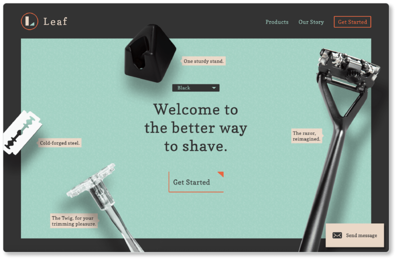
Leaf Shave is a razor company that offers “a plastic-free shave people actually love.” Here’s their above the fold content:
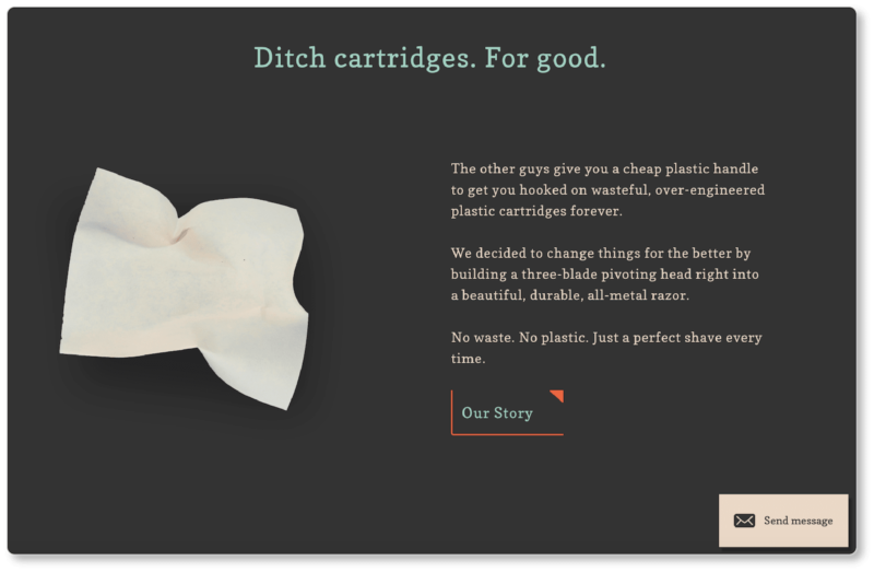
And here’s an example of copy and graphics slightly further down:
For starters, Leaf’s got its visual branding figured out: it’s gorgeous and consistent. UX is fundamentally about usability. Think of the Amazons and eBays of the world: these websites are hardly visually appealing, but they offer stellar UX. But that doesn’t mean that users won’t ultimately be more engaged by an aesthetically pleasing website and a beautiful brand.
Focus on the value
There are at least two value propositions on Leaf’s homepage. There’s the inviting header (“Welcome to the better way to shave”), which users will see first, and which will likely draw them in more out of curiosity than anything: What is the better way to shave? But there’s also the longer value proposition under the heading “Ditch cartridges. For good.”
What makes this value proposition so great is that it doesn’t ask prospects to do the work of figuring out how this company is different from “the other guys.” There are a thousand razor companies out there; and Leaf recognizes that it has to shout out its differentiation strategy if it’s going to spur engagement. Less work for us? Yes, please.
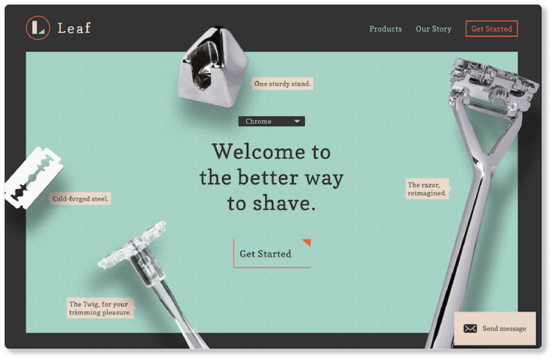
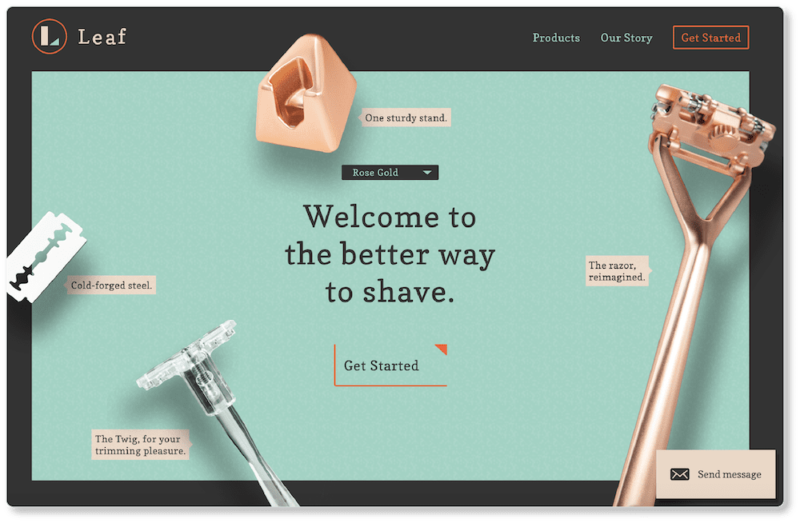
Perhaps what we love most about Leaf’s homepage occurs above the fold. Here, the company offers a drop-down menu above its header that lets prospects choose a color to see what the entire set looks like in that color. On a typical ecommerce site, we have to wait until the product page to see these options:
Other things we love about Leaf’s homepage include:
- How the company engages users through microinteractions that allow them to click on each part of the razor to learn about its features.
- The video loop that shows prospects how easy the product is to assemble. After all, anything that can be shown in a nine-second loop should be simple enough.
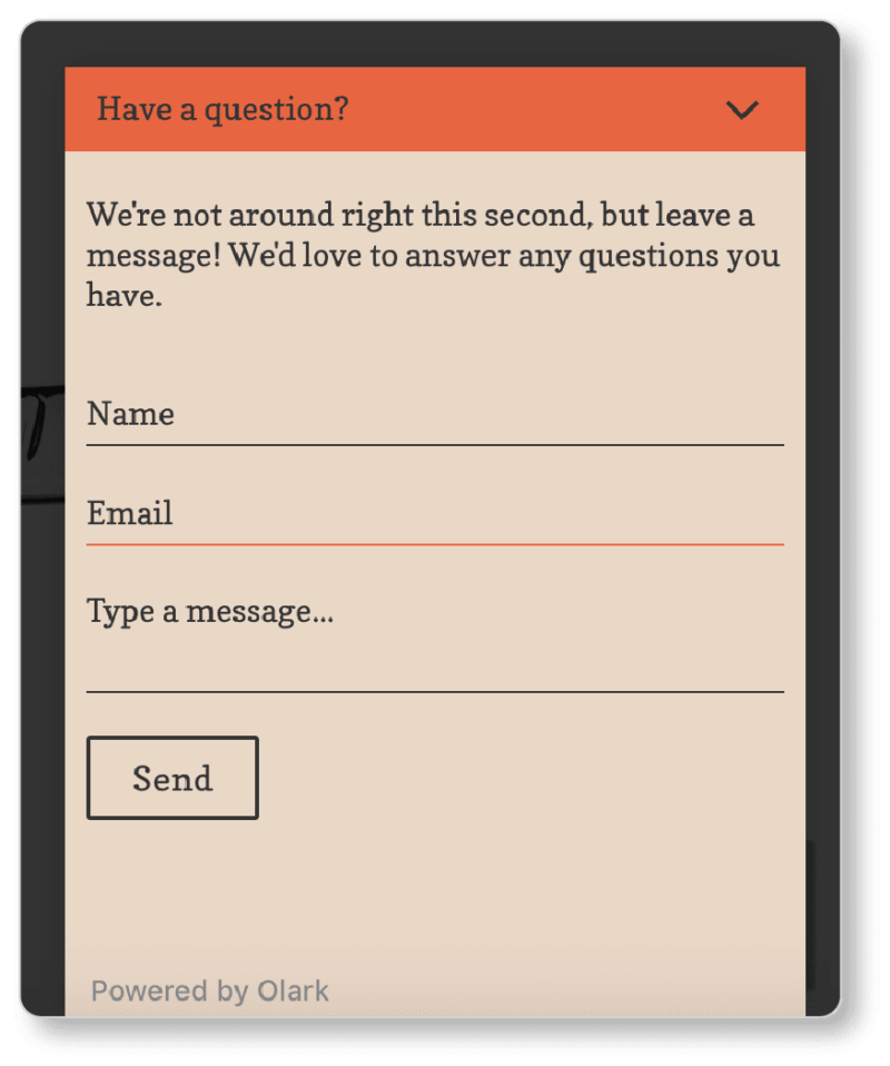
- The persistent “Send Message” CTA in the bottom right-hand corner of the browse. It’s got a retro look to it, in keeping with the company’s branding; but it’s actually a live chat window. (We knew this because Leaf placed it precisely where we expect a chat window to be.)
The company wasn’t online when we clicked in; but we appreciate that they told us as much. It helped set our expectations. We gave them our email address, and we expect that we’ll be contacted there when they’re back online:
Knowing that the answer to our question is forthcoming, we clicked into a product page for a blade disposer. One of our favorite user experiences occurred when we added that product to the shopping cart:
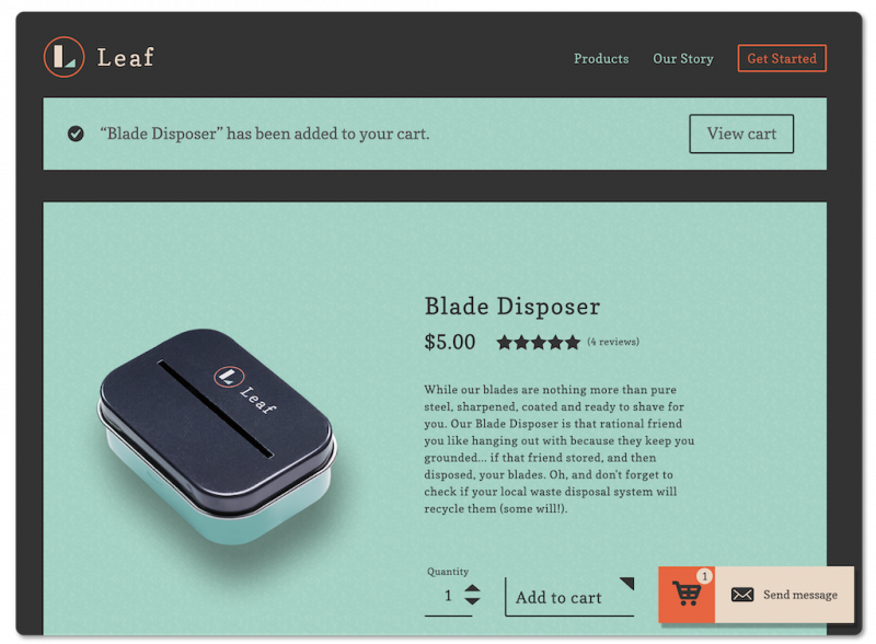
Two things happen almost simultaneously here:
- A bar appears at the top of the screen alerting us to the fact that we’ve just added an item to the cart, along with a CTA to “View cart” right away
- A bright orange cart icon appears at the bottom-right, showing us how many items are now in the cart.
We can click on either one of these to be taken to the cart page. Clearly, Leaf’s priority at this point is moving users through to purchase. We suggest you consider a secondary “Continue Shopping” CTA in your own shopping cart—don’t presume customers are only there to buy one item.
We clicked into the cart and then into checkout. Leaf’s checkout page is remarkably user-friendly. (Notice how the company offers an “X” to the left of the product image for users who decide to remove items):
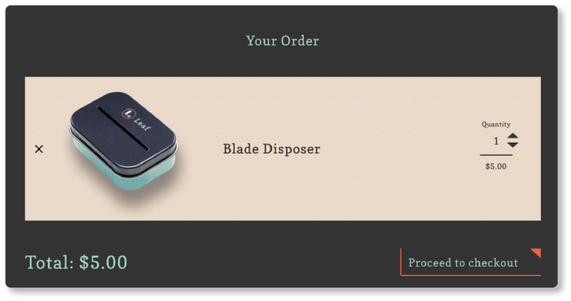
Here’s everything Leaf does right in their checkout process:
- Fast and distraction-free. The entire checkout process occurs on a single page. And checkout is enclosed, which means that there are no distractions during the process.
- Time-saving checkout form elements, which include the presumption that shipping and billing addresses are the same (though prospects can tick a box that says “Ship to a different address?” if this isn’t the case), not forcing account creation, and the option to speed-pay with PayPal.
- No surprise costs. There’s no tax on the item, which is wonderful. And shipping costs are auto-updated on the same page as soon as the prospect enters the destination address. (Given the size and weight of the product, there’s no enormous sticker shock here; so Leaf gets away with revealing the total cost later than we’d otherwise like to see it.)
- Clearly show what payments they accept. We love that they show the logos for the payment types they accept here…though it’s never a bad idea to do so earlier in the journey than later.
Finally, it’s worth pointing out that somewhere in this process, we took the product out of the cart to see what would happen. (These are things you should play with as you look for your own “best examples”!) Here’s what popped up right away:
![]()
It’s a charming response, if you ask us. And it’s wholly in line with their brand voice.
Akua
Akua makes jerky snacks out of sea kelp. Here’s what users see first when they land on the company’s homepage:
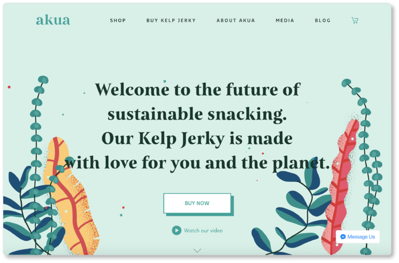
We immediately noticed two things:
- The simplicity of the first impression. Akua offers a primary navigation menu with only five items, a value proposition bookended by simple imagery, a primary CTA that leads users directly to the shop, and a secondary CTA that leads to a video to learn more about the company. The CTAs have an obvious hierarchy to them (which is smart from a business standpoint); but they don’t force visitors who aren’t ready into the purchasing funnel.
- The live chat option is persistent but hardly obnoxious; it sits quietly in the bottom right-hand corner and we know it’s there if we need it.
We assumed—correctly—that the difference between the “Shop” and “Buy Kelp Jerky” menu items were that the former would lead us to a catalog of all of Akua’s products, and the latter would lead us only to their jerky products. It’s worth noting that the second menu item is a great move from an SEO standpoint.
We clicked into one of their flavors, and were met with this:
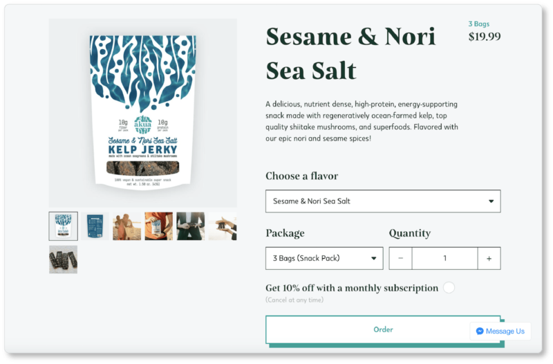
Subscription options for products
When we click on the drop-down menu under “Package” and select a different option, the price shown in the top right-hand corner changes immediately. The same is true when we change quantities and when we tick the box to “Get 10% off with a monthly subscription.” As prospects, watching the price decrease when we click on the subscription option is remarkably satisfying. And of course, we love that Akua is willing to make our lives easier by ensuring we don’t have to reorder every time we have to reprovision.
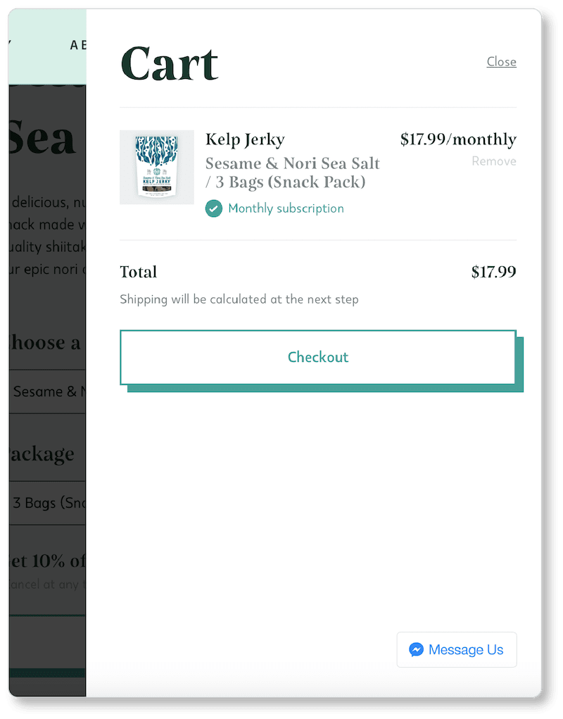
Clean checkout
When we clicked the “Order” CTA, a cart view appeared on the right side of the browser. Akua doesn’t have a “cart page,” but they offer a “cart view.” From here we have the option to head to checkout, or to hit “Close” and continue shopping.
We’re also told that “Shipping will be calculated at the next step.” Sometimes this is really all a business can offer… but it’s certainly a best practice to at least tell your prospects that additional charges are coming. This diminishes at least a bit of the sticker shock they might experience when they finally see that total cost.
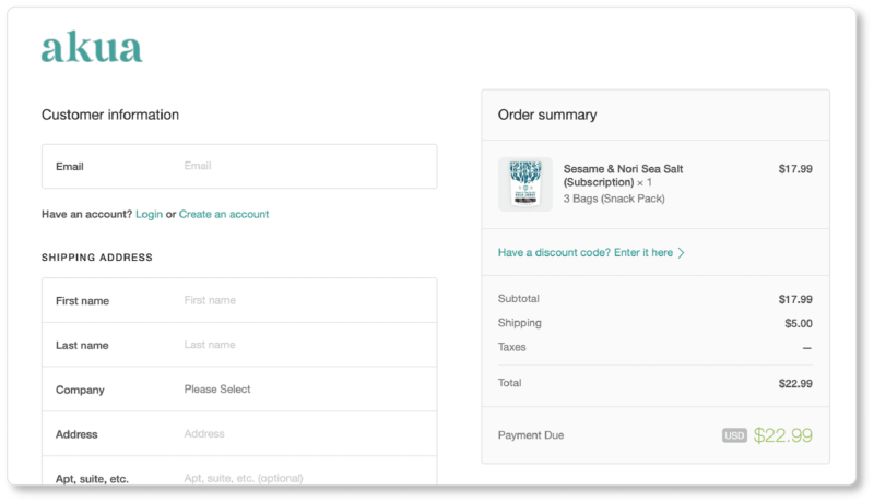
When we hit “Checkout,” Akua led us through a two-page checkout process, where we continued to see our cart summary on the right of the screen as we filled in our information on the left.
The only thing we’d have asked for is a progress bar so that we knew how many pages we had left to fill out:
Bear Walker
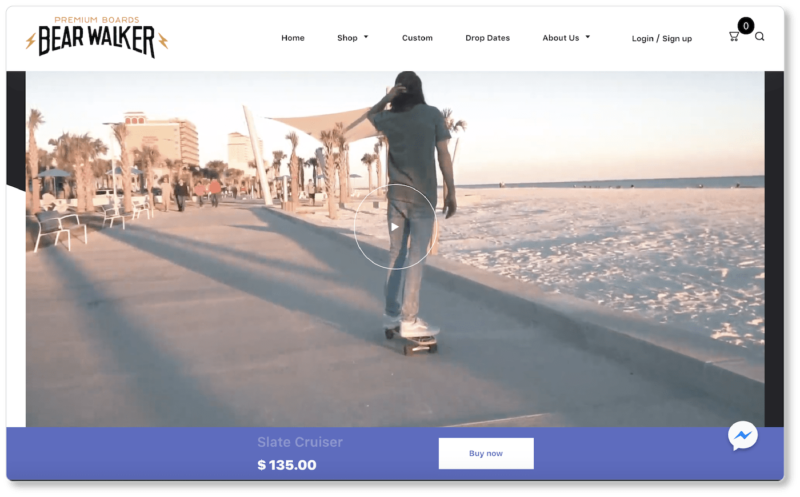
Bear Walker is a skateboard company. Here’s what visitors see first when they land on the company’s homepage:
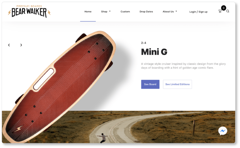
Focused copy and design
You may notice that Bear Walker does something that no other company we’ve shown here has done. They’ve chosen one of their products to highlight above the fold. Or, rather, they show one at a time: The “hero image” is a slider; and if visitors pause long enough above the fold, they’ll see 4 of the boards. For visitors who find themselves interested in a particular model, the primary CTA (“See Board”) is for them. The secondary CTA (“See Limited Editions”) is for visitors who want to browse other options.
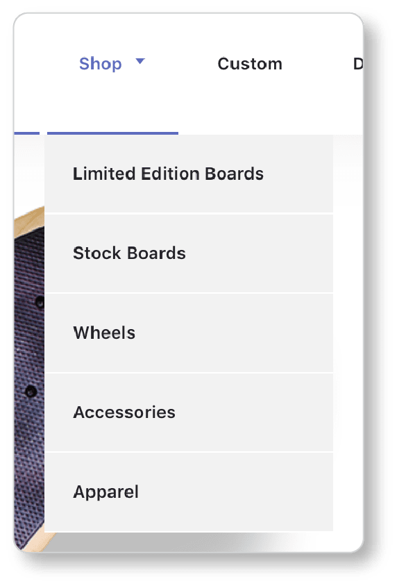
You might also notice that BW is the first of the sites we’ve shown to offer a search feature in its navigation menu—in the top right corner, just where we’d expect to see it, beside the cart icon. Their main menu only contains five items… and only two of those items present drop-down menus when a user hovers over them:
The remainder of Bear Walker’s homepage is simple, uncluttered, and straightforward: an email signup form, two videos, and five category images that lead to product category pages.
Granted, they don’t have a huge range of products, but they’re certainly not trying to pack a ton of information onto the homepage. And the “sticky” navigation menu moves with the user as they scroll, making it easy to navigate to a different page.
Showcasing your products
A few things Bear Walker’s product pages do well:
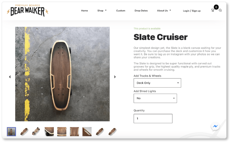
- Multiple images. This is a product prospects will want to see from as many angles as possible. BW shows the top and bottom of its boards at various angles, along with detailed close-ups of the wheels and the handiwork. It’s as good as users will get to holding the product in their hands.
- The note above the product title that says “This product is available.” Don’t make your prospects wait until the checkout page to discover that the item they want is out of stock.
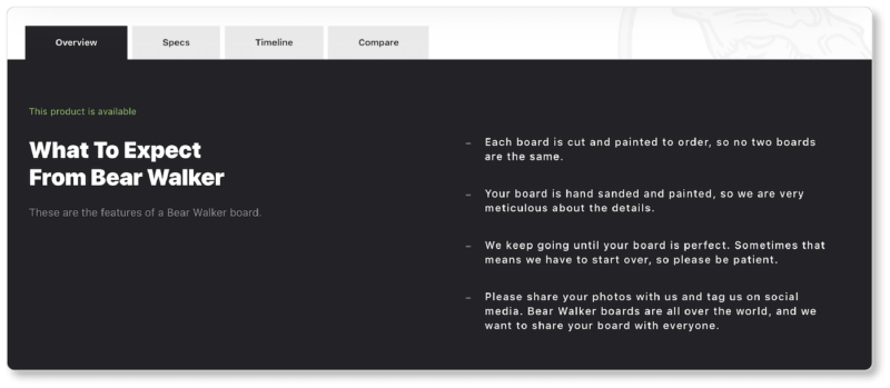
- The emphasis on singularity and perfection. Even though these emphases are not about site usability, they get the prospect stoked on the product—and on the possibility of owning one. In the product overview, the company notes that because each board is made-to-order, “no two boards are the same.” It also asks customers who’ve made a purchase to be patient: Bear Walker is “meticulous about the details,” and sometimes needs to start over again on an order to make a more perfect board. We’re not even boarders, and we’ve just gotten excited about this product:
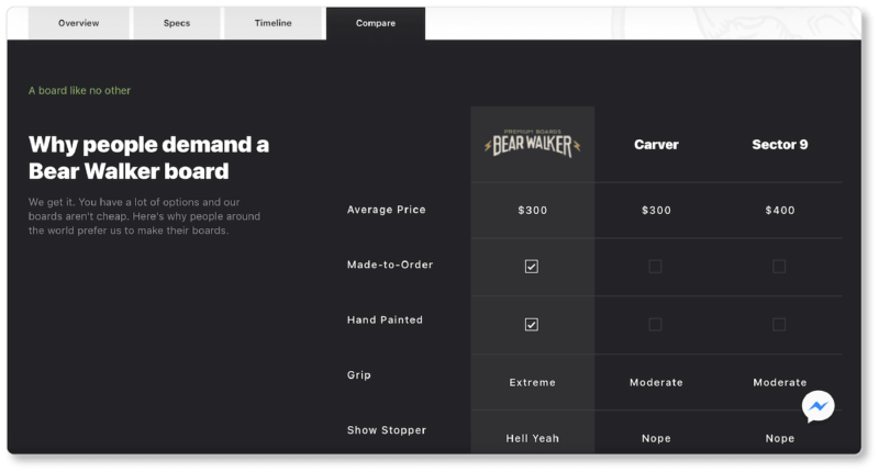
- The competitor comparison. If you’re a Bear Walker prospect, you don’t even have to do the work of comparing them to the competition. They’ve already done it for you. Users are offered side-by-side comparisons of price, production process, grip, and more:
- The product video. Remember, consumers aren’t just buying your product: They’re buying into a lifestyle. Bear Walker keeps this in mind, and offers a video that allows prospects to imagine an ideal life centered around their product:
- A persistent “Buy Now” CTA. We love this element. You’ll note in the image of the video above that the “Buy Now” CTA folows users down the product page as they scroll. There’s a fair amount of information on the company’s product pages—from a timeline of how the boards get made, to social proof, and more. Prospects might make that decision to buy at any point while scrolling. Bear Walker is ready for that moment.
We’ve given you quite a bit to chew on here—but we’ve hardly covered everything; and we recommend you click into these sites to see what else they’re up to. (All three have been acknowledged on the ecommerce awards site; so they’ve already been vetted by design pros who’ve given them the thumbs-up.)
Once you’ve dug into those? Look around to see what else out there. There are “best practices,” and then there are other practices. Some are experimental, others are more traditional, and the only way to find out what will work for you is to start experimenting.