How to use social network interfaces for your business
- Last Updated : August 17, 2023
- 4.1K Views
- 12 Min Read
Decades ago, when the internet was blowing up and it seemed like everyone was creating a website, no one would have believed that in the future a major chunk of the internet’s billion-strong traffic would be directed to less than a dozen sites.
How did social media become so popular? By making you feel more connected to the rest of the internet, like you’re part of something bigger.
When I first logged in to Facebook in 2009, I couldn’t imagine how intertwined my life would become with it. Back then, blogging was popular, and you had a page where you wrote and connected with a few people you knew, but not with the whole world. To connect the world, you need to be accessible to everyone on it.
So how did some sites achieve this, where others couldn’t? What makes these sites so accessible and shareable?
It’s ultimately their sleek, easy-to-use interfaces that entice you to interact with them.
Let’s look more into how the interfaces of some of these channels work and how to use them to their full potential.
Profile picture
The first things that catch your attention when you open a Facebook Page are the name and the profile picture. Just like how your name and face are the first forms of identification in real life, social networks—being a virtual extension of you—reflect the same. Your profile picture is way more important than your cover photo, bio, or the rest of the features of your profile, at least at a glance.
Ideally, your profile picture should be your brand logo, but it can also be the photo of the founder, CEO, or employees, if that’s your specific branding strategy. Avoid using too much text on your profile picture, as it won’t be readable when it appears in the news feed, side bar, and comments.
Make sure the main focus of your profile picture stays within a circle of diameter equal to the side of your photo. Facebook has recently changed the profile picture to fit in a circle. So make sure you cut corners, literally!
You can use tools like VSCOCam and Facetune to get the perfect profile photo—one that’s bright, crisp, and eye-catching. Your profile picture should be at least 180×180 to upload to Facebook. However, we recommend that it be at least 500×500 for better clarity when it appears on bigger screens and news feeds.
If your logo has a white background, you should consider changing it to a different color, or invert the colors so that it will appear properly on the white background of the news feed. You can also give it a light colored outline so it doesn’t blend in too much.Consider matching the tone and mood of your profile and cover photos.

And speaking of cover photos…
Cover Photo
Cover photos occupy the top portion of a profile or page. From when it was introduced to now, the dimensions have changed slightly every now and then. This can be a bit challenging, as it’s easy for a social media manager to miss resolution changes when they’ve got so much else to stay on top of!

If you plan on designing a cover and don’t want to change it for awhile, we recommend using one that’s flexible—you can use things like mosaics of patterns, or keep it minimal.

If your banner contains a bunch of text or a subject, make sure it’s placed close to the center so it doesn’t get cropped out. Slight changes in the cover dimension requirements over time can take it out of the frame, and this will also make it easier when you view your photo on mobile. Dimensions change from 830×312 on the web to 640×360 on mobile, so make sure the main content, such as your logo and text, fit within 640×312 when designing a cover photo. Create cover photos and profile pictures with the same background, so it looks like it’s streaming into the profile picture.
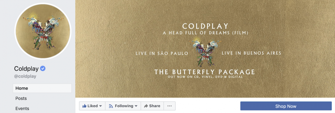
Add a link to your website, or a relevant event page, on the caption of your cover photo to make it easier for anyone viewing it to visit your site. According to a survey by Animoto, 60 percent of consumers watched branded videos on Facebook. If you have the right content for it, creating a video cover for Facebook can help you showcase your product or service.
There are many tools that let you create video covers with the right dimensions and length, like Biteable and Canva. You can also go a step further and create an animated video cover for your page. Make sure the video is a minimum of 20 seconds, but keep it short, intriguing, and crisp. The thumbnail for the video should be neat, as many viewers may only be viewing the thumbnail, due to a slow internet connection. Check out Ferrari and Doodly’s Facebook video covers for inspiration.
And there you go, your profile is now one of a kind!
Emojis and stickers
If your brand persona is on the livelier side, don’t rule out Facebook’s stickers and emojis.
Although you can only use them from the mobile app, stickers can go a long way in helping your posts stand out. Moreover, to give your posts and comments a more personal touch, add emojis when appropriate. Just remember, though, emojis and stickers look playful and add color to your content, but don’t overdo them!
Though not a part of the visual framework of a network, they can really add—or detract—from how your audience interacts with your page.

Now, let’s look at a feature that lets Facebook users and pages contribute their creativity to the interface.
Frames
Another way to promote your brand or event is by creating profile and story frames.
Frames are visual overlays for profile pictures and stories, that your fans can use to show support for your brand, or excitement for an upcoming event. Story frames will reach users’ entire friends lists, rather than posts, which don’t always show up on news feed.
If you want the frame to go viral—maybe to help build a reputation as being design-focused—you may want to just make it aesthetically appealing, with no branding.
To create a Facebook frame:
Use image editing software to create a .PNG file of a frame. Now open Facebook’s Frame Studio. Select Create a frame. Choose either Profile photo or Camera photo (for story frames). You can upload .PNG files here, and customize them till they’re perfect.
We suggest that the design is limited to the sides and corners in the case of profile photo frames. However, you can also add elements in the middle, if they are minimal. Save this .PNG file. After you create a frame you can name it, and choose to schedule it for a particular time. The frame can also be selected for a particular location, if it’s relevant to that particular place or is meant for an event happening there. You can drop a pin location, or choose places in bulk, like cities and countries. When you create a frame, remember that Facebook has to approve it for it to go live, so you may have to wait a while. If you’re planning an event, submit a frame a few days early, so it goes live on time.
Instagram has been a boon for countless startups over the years—and for any business that targets people under 35, it’s an absolute necessity.
According to Instagram, it has two million monthly advertisers, and 80% of Instagram users follow one or more brand profiles. Instead of being just a platform to entice your audience and bring them to your product website, you can now sell products directly on Instagram.
But how do you make full use of Instagram? How do you make your content stand out? Why is original content sometimes not enough?
The answer is quite simple—Instagram is all about aesthetics.
The first thing that attracts a user when they see your profile is how visually appealing it is. So before you start, or reorganize, your Instagram, think about a theme for your profile. The theme should be consistent with your brand messaging, and we recommend a set design for all your posts, or for posts in multiples of 3—due to the way Instagram displays posts on your profile.
The theme can be your brand’s color palette, minimal, bold colors, sleek, or almost anything else you can come up with. Choose something unique that represents your brand’s persona and go all out!
Go here to read more about brand building with Instagram aesthetics.
Now, let’s take a look at how your feed looks.
Theme
Here are a few tips for creating a consistent eye-catching theme for your profile:
Use similar filters on your photos. This makes the feed more pleasing to the eye and gives it a professional look.
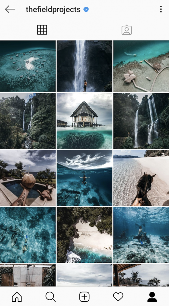
Color coordinate your feed. This can be as simple as editing all your photos to be dark or light or just a sleek monochrome.
Build a puzzle-like profile with connected photos.
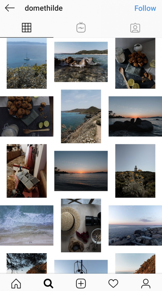
Grid
You can’t overlook the Instagram grid if you want a beautiful profile!
These are a few ways to curate photos on the Instagram grid:
- 3×3 grid
Make 3×3 grids for photos of an upcoming huge event that needs all the attention. Or if you want, you can use it for all your posts, if that’s how you feel like your product should be showcased.
- 2×3 grid
Similar to 3×3 grids, you can cut up landscape photos with an app for this. For iOS, we recommend Photo Grid, and Nine Grid Crop for Android.
- 1×3 grid
This is the most common and efficient style. Three photos can be from the same event or with a similar style, colors, or products. And don’t hesitate to mix these three grid styles to suit your needs!

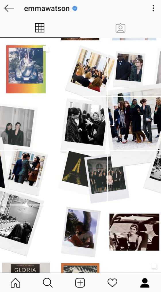
A line going down the center of your profile can add a striking look to your page:

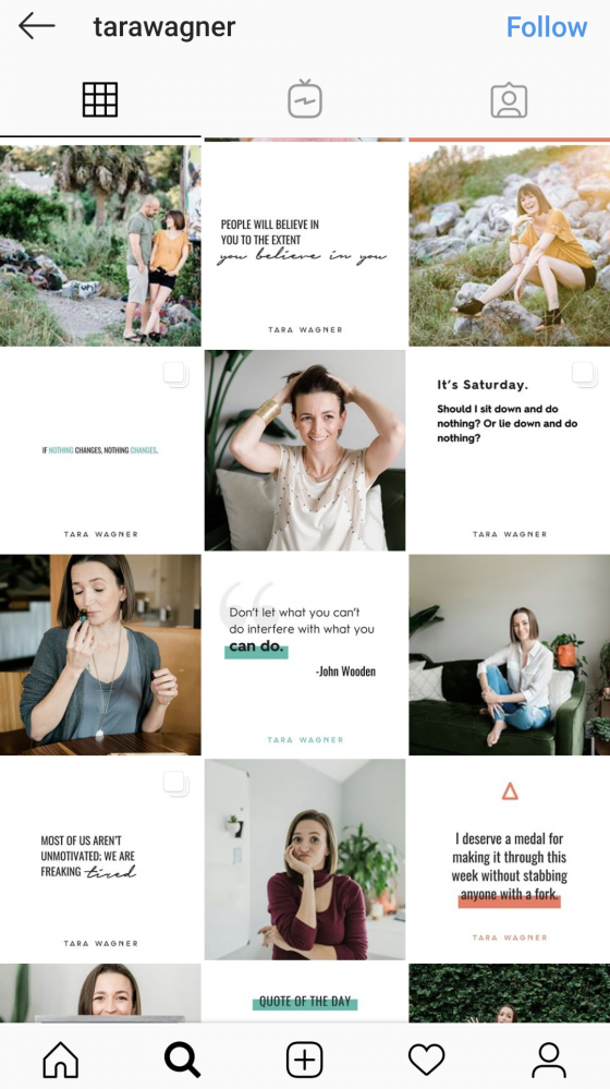
Or alternating text tiles with photo tiles:
Framing photos
Another good way to give your profile a more consistent theme is through framing.
Solid frames
Mixed frames
Highlights
You can save your stories on your profile with Instagram’s highlights feature. You can organize your highlights into categories and keep adding to them later from new stories. And to make your highlights look neat, give them themed covers. Make them look catchy, as well as organized.

Posts on the feed
Keep up with design trends or make statements of your own. Most photos will drown in the feed, and you have mere seconds to catch a viewer’s eye. Make unique, memorable statements that can help people remember your posts and get them to come back to your profile.
Here are a few tips to get you started:
- Leave a few lines after your caption to add the hashtags, so they don’t make your post look crowded. Remember, hashtags aren’t for your followers to look at, but a way for potential followers to find you. Images in blue shades receive more attention on Instagram.

Instagram posts with a high proportion of background space also tend to receive more likes than ones that are close up.

- Frame your photos with the 3×3 grid lines on the Instagram editor, as even slightly tilted photos can look odd on the feed.

- Lastly, you can add aesthetic text to your videos with apps like Videohance, to make them look more insta-worthy!
Stories
When creating a string of stories, ensure you use a consistent filter, if you’re using one at all. However, don’t add too many, as this may result in you spamming your followers.
Add swipe-up links to your stories, if you have more than the 10k followers needed to use the feature. As a brand, it’s important to post stories, so your audience is regularly reminded of you. While you have the freedom of being more personal and light-hearted with your stories, they’re also an important tool to help understand your customers’ needs. Use features like GIFs and stickers to make your stories more interesting and colorful. You can also let fans pitch in on ideas and preferences by putting up polls and questions.
At a glance, Pinterest might just look like a beautiful, jumbled mosaic. But it can also be a way of connecting your brand to be out there as it is also used by many as a search engine.
Profile theme
Pinterest lets you post loads of boards and pins, so it’s important to have consistent themes to keep things digestible.
Profile Picture

Add a profile picture that’s preferably your logo or a photo of you (from the shoulders up). It can also be any picture that represents what your Pinterest account will be about.
The minimum dimension for a profile picture on Pinterest is 160×160 pixels. If it’s smaller, your photo may appear blurry, and it may not load if it’s too large, so resize it before you upload it. Make sure the picture is square and not rectangular, which may cause it to be automatically cropped or resized, which isn’t ideal.

Organizing Boards
Organize Pinterest in a way that helps you find things easily.
If you have too many boards, integrate them as separate sections within a board.

- Upload potrait photos, rather than square or landscape photos—they go better with the Pinterest interface.
- Use high quality 2:3 aspect ratio photos, Pinterest has also maintained that they prefer high resolution photos, like 600×900 pixels.
- Keep in mind that pins that are longer than 1260 pixels get truncated on the feed view. However, they can view the full pin when the user clicks on them.
- Create a striking Pinterest aesthetic for your brand by ensuring consistency in the font, the colors, and any other visuals. A way to begin zeroing in on a theme is by setting a default color palette and font. A good way to start is by creating Pinterest board covers according to your theme.
Carousel pins
In a recent update, Pinterest released carousel pins, which lets the user add up to five pictures within a pin, so they can all be accessed from the mobile feed by swiping. It’s available for all business accounts in Pinterest’s ad markets.
If you want to create more pins similar to each other, or show more information within a pin instead of different pins, create a carousel with them. It could be pictures of a product from different angles, in different colors, or just for products of the same category.
Profile Picture
Twitter is all about text, so visuals usually take a back seat. But to really stand out, you need to up your visual game, too.

Start with your profile picture—ideally it should be about 400×400 pixels and contain your brand logo. On your Twitter profile it’ll be cropped into a circle shape. Use unique colors and styles to stand out on the Twitter feed, or your updates can get lost in all the noise. Twitter avatars are only 48 pixels in the feed, so be bold in this small space.
Cover Photo
Your Twitter header can be harnessed to show more information about your company. This is a great place to display your slogan, upcoming events, and more. The size of your banner is 600×200, but 60 pixels from the top and bottom will be cropped according to different screens, so keep the main content within that.
The profile picture may move around according to the size of the screen, but it will be always be from the left, so keep text away from the bottom left—either center it, move it to the top, or keep it to the right.

Visually appealing tweets
Tweets with images generate 313% more engagement, be it photos, images or GIFs. 500 million GIFs have been used in the past year alone, so take advantage of images to stretch Twitter’s 280 character limit.
For an image or a photo, 1024×512 works best, as this is the maximum size of the image on pop up. This will appear on the feed at 506×253.Keep images around 3 MB.Post a mix of image and text posts. Add extra blank lines inside tweets to make them look larger and hence occupy more space in the feed.
Emojis
Another way to make your tweets stand out is the use of emojis. Use the right kind of Twitter emojis to make your posts look more lively and engaging.
Use the bio
Leverage the Twitter bio to give additional information about your brand in a few sentences. Your bio should be short. The character limit is 160, but according to a study, bios with approximately 91 characters have the maximum number of followers. Learn how to write a kickass bio for your brand.
These were just a few tips we wanted to share with you about making the best use of your social media interfaces, and helping them stand out from the crowd. We hope they help you build more aesthetically pleasing profiles and feeds.
Feel free to share your thoughts with us in the comment section below!