How to use Instagram aesthetics for brand-building
- Last Updated : August 17, 2023
- 6.7K Views
- 5 Min Read

If you’re a business on Instagram, you know it’s not easy. On the fastest growing social network with people’s feeds refreshing every ten seconds, you’ll need to bring your A-game with every single post. Good, is usually not good enough on Instagram and the reasons are plenty—the abundance of smartphone cameras, editing tools, design templates and most importantly, businesses that pay attention to details. You probably know what we mean when we say that some Insta handles have really nailed their #aesthetic.
Many Instagram businesses get popular and receive thousands of follows—not necessarily because of their stylish product offerings, value, or how great their campaigns are. It’s simply because of how their Instagram feed looks. It’s so visually compelling that you hit follow—that you want to see more of that visual goodness popping up on your screen. It doesn’t matter that their competitors may have a slightly better offering.
That’s the brutal reality of it. That you could spend hundreds of hours building meaningful posts for your Instagram handle, but another profile with color coordinated socks and matched coffee mugs could surpass your numbers overnight with a single viral post.
But, how is that fair?
To that we have to tell you at the outset—that’s just how the platform works. It’s all about getting the optics right for anyone trying to make a splash on a platform like Instagram. You need to create a range of visual engagement that will get your brand noticed.
We should mention that there are scores of Instagram accounts with steep numbers of followers and likes—but most of these followers are never going to be a prospect for them to make revenue through. More likes don’t guarantee more business. People simply like subscribing to visually great looking content, that doesn’t necessarily translate into business. It does, however, give you an opportunity to be noticed, to grow, and to make an impression.
There are some Instagrammers who build a visual strategy as a whole artistic pursuit, just to create a pretty feed. But when you bring brand marketing into the mix, it’s a lot trickier. You have to contextualize each pretty picture with your brand’s messaging—because the ultimate goal of Instagram marketing isn’t just building a perfect looking feed. It is to drive traffic, create engagement, and subsequently broaden sales and marketing.
The rules are fairly simple—you win if you build a comprehensive brand aesthetic. Your feed reflects your brand’s internet street cred. You can save the blogs for Medium or LinkedIn, and the well-worded campaigns for Facebook. Instagram is where you’re dressed to impress.
Treat your feed as one cohesive unit and see what story your feed as a whole tells a viewer—this is the first step into understanding how Instagram aesthetics help build your audience. Creating stellar photos and using the right editing tools are actually only the next step. Whether it’s the use of a recognizable border or decorative typography for your feed, there are various ways to make your posts feel more integrated, cohesive.
Here are five Instagram handles that show us how striking visual strategies can help build your following and make you stand out. Their strategies are not only effective but definitely doable for a business that’s planning to set aside time and resources into marketing on Instagram.
1. Palette
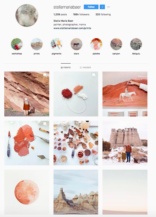
Artist and photographer Stella Maria Baer has an Instagram feed that looks like it put the “A” in aesthetics. With a set color-palette of just red and brown pastels, she’s transformed her Instagram into an exploration of everyday things but confined it within the shades that she’s picked out. Her whole profile is awash with a consistent color scheme that ties it all together—the range of textures, the subjects, and her content.
2. Magazine effect

Many fashion brands are creating a formidable Instagram presence for themselves.
We picked ASOS because it does two things right—first, it sticks to the theme of bold and urban chic, consistently. This translates into the photo styles, palettes and even the editing. The second reason is something you’ll figure out if you ever happen to land on their Instagram handle. From their Stories archive offering everything relevant and interesting for its followers from style advice, to news on sustainable fashion, to its IGTV videos adding a splash of DIY and entertainment content—the brand’s Instagram is compartmentalized to look like almost like a digital magazine. Perhaps one of the smartest use of the Instagram layout, yet!
3. Having fun with the branding
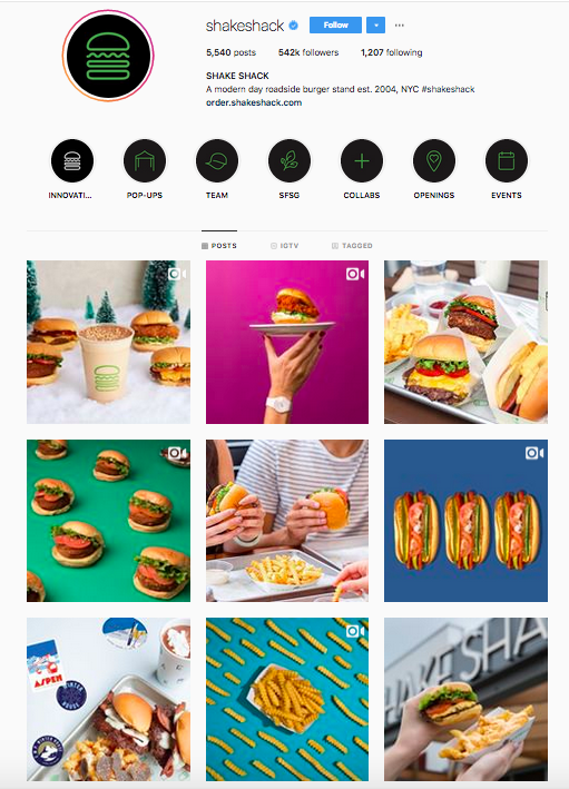
The fast-food company Shake Shack makes it to far too many lists about great Instagram marketing, and not without good reason. Even if it doesn’t have a concept art-esque feed, every single one of its posts has broadly covered what Instagrammers care about—a pop of color, cute animals, and delicious food. With their feed being a ferris wheel of these things, Shake Shack’s Insta updates fall squarely in the zone of what the Instagram audience at large-not just their own-would like to see when they scroll through the app.
4. Consistent gorgeousness

Flowers for dreamers is a business that made it to this list not by finding a visual hack, but by capitalizing on what was already an advantage, to begin with. Not all brands are lucky enough to have products that naturally lend to beautiful photos. However, if you happen to have that luck, then we’d say run with it, and steal some hearts on the way! That’s what the flower company Flowers for dreams, did. They pack all the gorgeousness into not only their products but also their Instagram feed that’s bursting with aesthetic concepts, stories and ideas all adorned with the season’s flora—a great way to fit their business into every visual narrative they could create.
5. Gaming the Instagram layout
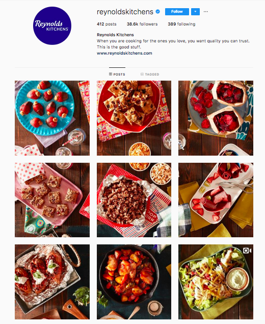
This is one of the smartest ways to use the Instagram layout to your advantage. Using the rule of 3s, 6s, and 9s, you can create optical tricks and present your pictures in fun, creative ways on your Instagram feed. Look at Reynolds Kitchens, one of the profiles that use the social network’s square 3×3 view layout to its advantage and conceptualizing their photos to make them look like they flow seamlessly from grid to grid.
If it also made you hungry, then that’s a double win. So you see, it takes effort to come out with a strong visual narrative that matches your business. But once you have one in place, you only need to work towards adding to it. You’ve already done the most difficult part.
Yes, and it means exactly what you think it means. Fewer trips to the drawing board and more heart reacts on the horizon. Now, isn’t that wonderful?
 Amruthavarshinii
Chats & writes about anything from social media, culture, to how chai latte isn't a real thing.