- HOME
- Product updates
- One size fits none
One size fits none
- Last Updated : September 4, 2026
- 0 Views
- 2 Min Read
I have written before about how to create WCAG compliant forms and building forms that work for everyone.
We explored screen reader compatibility, keyboard navigation, clear error messages, zoom support, and all the accessibility features in Zoho Forms that ensure a form doesn't quietly shut people out.
As I mentioned in my earlier blog, accessibility is an ongoing responsibility. And it is something the Zoho Forms team takes seriously and is constantly exploring new ways to make Zoho Forms more inclusive and easier to use for everyone.
Here's what we kept thinking about.
The assumption hiding inside "accessible"
When you build an accessible form, you make decisions on behalf of your respondents. High contrast or standard? Larger text or default? You pick one setting, publish, and hope it works for the person on the other end.
Think about the respondent who is actually landing on your form.
Mr. Richard has low vision. He has already turned up the font size on his laptop. It's something he adjusts everywhere he goes. When he opens a form, he doesn't want to fight the layout. He just wants to read it.
Miss Mira has dyslexia. Crowded text is hard for her, not impossible, but slow and tiring. A little extra space between characters, something most people never notice, makes reading feel less like work.
Mr. Nick works in direct sunlight most of the day. Bright white backgrounds on his laptop are genuinely uncomfortable. He's had dark mode on everything for years.
3 people. 3 completely different needs.
The panel that changes things
This is what Zoho Forms now gives respondents.
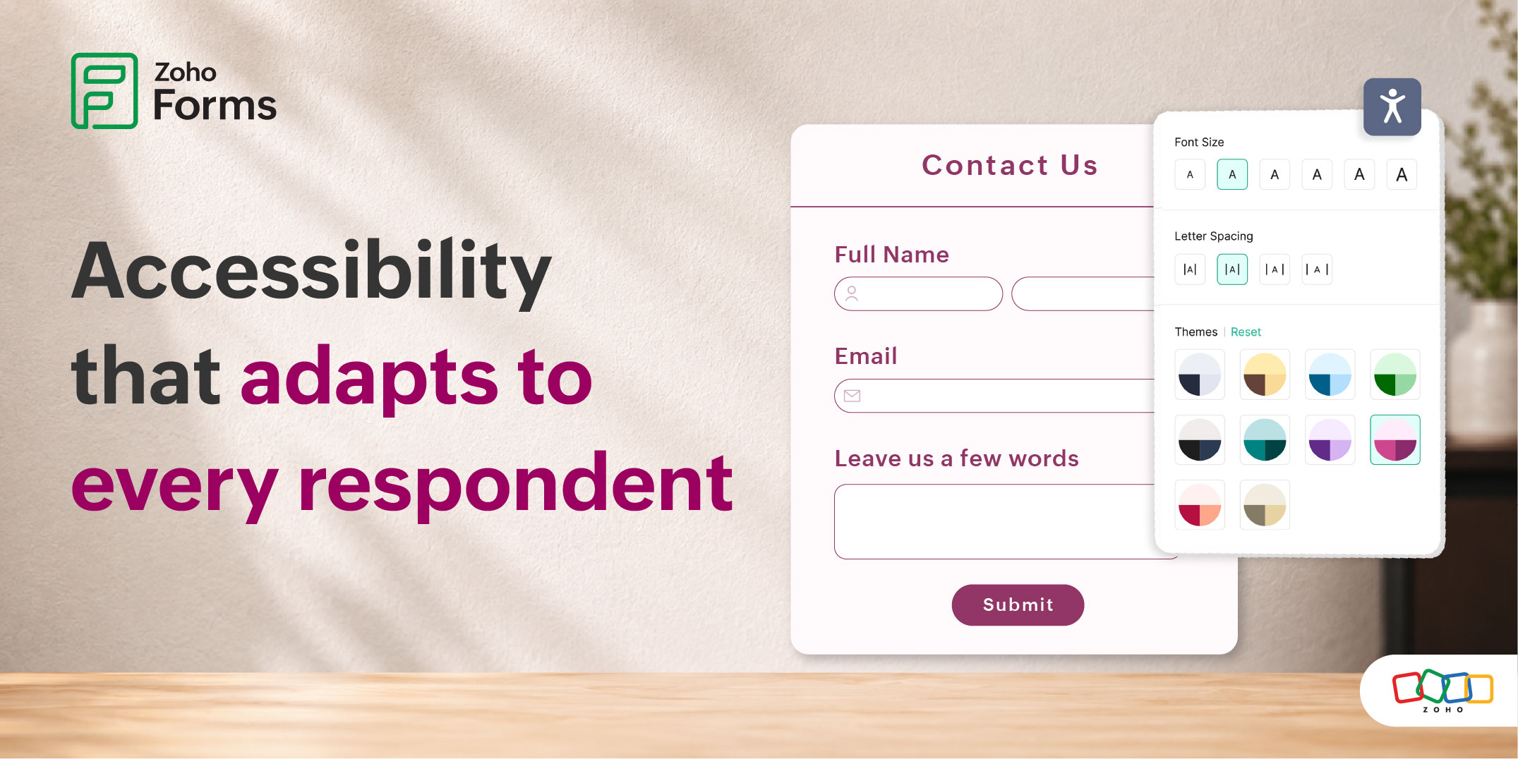
When you enable accessibility controls on your form, a small Accessibility icon appears on the respondent's side. One click, and a panel opens right there, without leaving the form.
From that panel, they decide how the form looks and feels for them.
Font Size
Graduated options to resize everything from field labels to the heading. Mr. Richard clicks the size he needs, and the form adjusts instantly.
Letter Spacing
4 spacing presets that open up the distance between characters. Miss Mira now moves through the form in her own rhythm.
Themes
Multiple color options for users who need maximum differentiation, softer palettes for those who find high stimulation hard to manage, and dark themes for users who find bright screens uncomfortable.
Why this matters more than it sounds
Accessibility features built at the form level are important. But they're a starting point, not a finish line. They protect against the most common barriers. They can't account for every person's specific need, because those needs don't follow a pattern.
What the respondent panel does is hand control back to the person filling the form. It says: you know what you need better than the form builder does. Here, adjust it.
That shift is small in terms of UI. Three settings, one panel, one click to open it. But what it represents is different. It's the difference between a form that was built with some users in mind, and a form that makes room for each person who shows up.
 Samhita V
Samhita is a seasoned product expert at Zoho Forms who blends deep product expertise and user education to help businesses make sense of powerful features without the jargon. Known for her thoughtful storytelling and crisp communication, she adds a subtle creative flair to every piece she writes. With a knack for spotting real-world use cases and adding a touch of fun to her narratives, she’s on a mission to make even the most complex workflows feel approachable. Beyond the desk, she channels her creativity into dance and mural art, finding new ways to infuse her surroundings with color, rhythm, and meaning.