How to write compelling CTAs on social media
- Last Updated : August 17, 2023
- 5.8K Views
- 6 minutes Min Read

Brands can do many things on social media—build a following, interact with followers, and even convert those followers into customers. After all, social media marketing is part of the marketing funnel, and ultimately, the goal of a brand will be to close some deals. Managers may want to see a tangible rise in revenue that can be attributed to social media. Why else would they invest in these channels?
But that’s getting ahead of ourselves. Before we sell our products to our followers, we need to be able to get them to subscribe to our blogs, sign up for discounts, or fill out a form. One essential skill is needed to do all that—writing CTAs.
A CTA (Call To Action) can be used for many purposes. Sometimes you’ll write tweets or make Instagram Stories when you want your followers to perform specific actions. It could be something as simple as re-tweeting your content or downloading your app. CTAs are very powerful; they’re often just a single image, a button, or a few words found at the end of your content, but they’re what will help your brand do more business. So, how do you write them?
Writing effective CTAs
When it comes to CTAs, there are a lot of factors that you’ll need to consider. Tinkering around with even one of them can drastically change your results, for better or worse. However, we’ve compiled what we think are the most effective things to do while writing a CTA:
1. Be direct
When you’re writing a CTA, go all in.
Don’t worry about coming off as “too salesy” or “too hard.” There’s no such thing. You want your followers to perform an action. Ask them directly: “Download this,” “Subscribe to that.”
Once you’ve done that, go harder. Creating a sense of urgency in your CTA can lead to more responses.
If we wanted to get followers to subscribe to a newsletter on social media marketing, we’d start off with: “Subscribe to our newsletter today!”
2. What’s in it for them?
It’s important to make this very clear while writing a CTA. No one is going to take action just because you asked them to. You need to tell your followers what benefit they’ll get, or they won’t care. Why should they?
Whenever you write a CTA, take a step back and put yourself in the readers’ shoes. Ask yourself what’s in it for you. If your copy doesn’t answer the question, change it.
Once you tell your followers exactly what they’ll gain if they take the action, your CTA should look something like this: “Want to gain 1000 followers in the next 6 months? Subscribe to our newsletter today to find out how!”
3. Use images
Here’s a fun fact—visual aids will make your CTA up to 43% more persuasive. This is because visuals command attention, and so it’s worth the effort to design an image for your CTA.
Also keep in mind that your visuals don’t need to be clickable. They can be used for things like attracting attention in crowded social media feeds, so when people scroll through your profile, they’re more likely to stop at posts that have your CTA on them.
4. Be aware of the network you’re on
Different networks work differently, and so it only makes sense that you modify your content for each network that you’re posting to. For example, the CTA that you use in your Twitter feed can be fun and engaging, but your LinkedIn posts might need to be more professional.
5. Measure your results
As mentioned earlier, a small tweak to any component of the CTA could have a massive impact. So, it only makes sense that you track your CTAs to see how they’re performing. This is the only way you’ll figure out what works best for your brand.
Keep an eye on the analytics: what’s the click-through rate? Are your followers taking the actions you want? Is the CTA as effective as you hoped it would be?
If you’re not satisfied with the results, you can always switch things up. Reword your copy, change your design or both. Monitor how the new CTA performs, and then keep refining till you’re satisfied with the results.
6. Stay true to your voice
Your company has a “voice” that reflects in every piece of content that it puts out. Your CTA is part of that. If you write an entire post in a very professional, mild tone, and then have a casual, fun CTA, that’s going to look a little odd.
The best way to stick to a uniform voice is to describe your existing tone with three different adjectives first. “Confident,” “cool,” “casual.” Once you’ve done this, simply write your CTA trying to stay true to these adjectives, and you’ll be done in no time.
7. Use CTAs everywhere
And I do mean everywhere.
Someone posts a question on your wall? Mentions you in their tweet? Great! If you can add a CTA in your replies, do it. A CTA is just a prompt to make the reader take an action, it doesn’t necessarily have to be only in the posts you make. Doing this means that people don’t necessarily have to visit your profile to see the CTA. Others who have similar questions, or who just happen to find the thread may find your CTA, and then click on it from there.
Our favorite CTAs
Now that we’ve gone through a few basic tips on how you can write effective CTAs for your brand, I thought I’d show you some of my favorite CTAs, and what we can learn from them. These CTAs may not be from social media as such, but the concepts are all universal.
Grammarly
 Grammarly has a simple, beautiful CTA. The first thing you notice on this page is that the CTA button “Add to Chrome” really pops out of the screen. It grabs attention, and that is what they want. Then, they’ve also added “It’s free” to the button, just to sweeten the deal.
While this page has been designed beautifully, notice how they’ve clearly communicated the benefits the users will get. They’ve also added a review from Forbes at the bottom of the screen for good measure. Perfect.
Netflix
 Netflix has done a great job with this page. You might notice that they haven’t really said what they do anywhere, but the background image they use does a great job of communicating it effectively. You look at it and you know that it has something to do with streaming shows or movies, even if you’ve never heard of Netflix before.
Netflix also understands the pain points of customers. Personally, I’d be a bit skeptical of subscription services, because I don’t want to go through a hassle if I want to cancel my subscription. Netflix allays that fear by mentioning “cancel anytime” on the page.
UncommonGoods
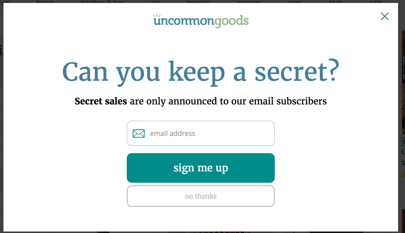 What UncommonGoods is doing here is trying to get people to sign up for emails—but there’s a real sense of exclusivity that’s created in order to do that. And exclusivity attracts. People always want to be part of an exclusive group, and they’ve used that to push their CTA.
Also notice how the “sign me up” button is larger, bold, and really stands out on the page, while “no thanks” blends in with the background and isn’t that visible.
Reuters
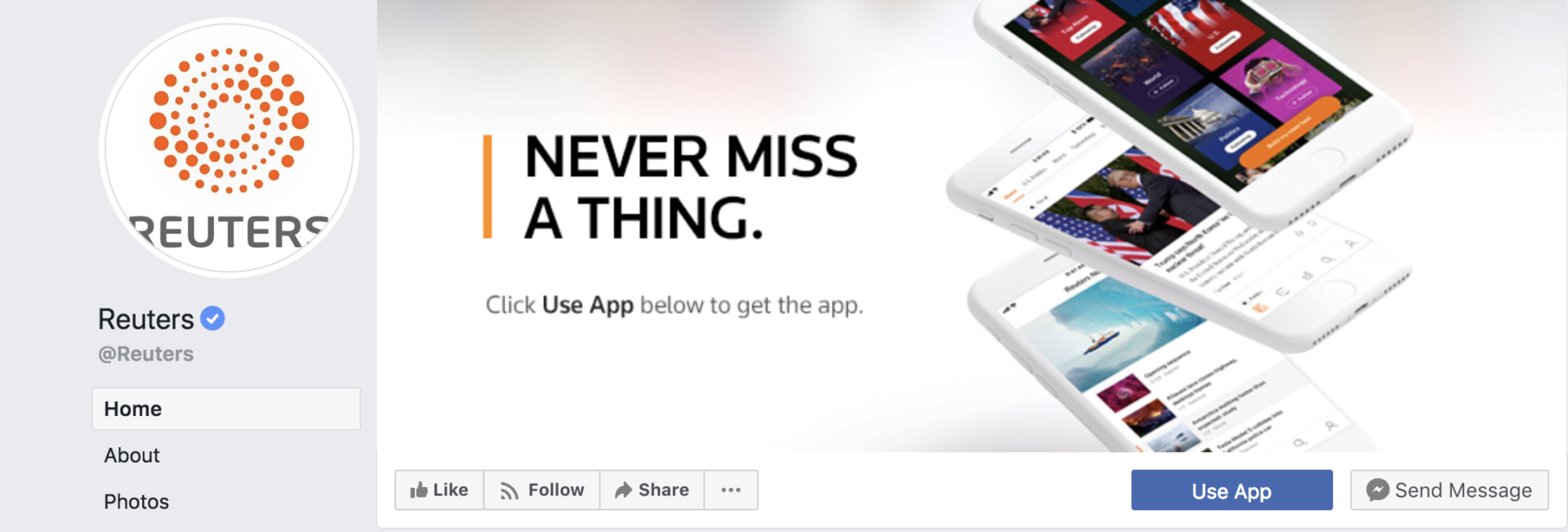 Here’s an example from Reuters‘ Facebook page. What they’ve done here is really clever. The CTA is the first thing on the page, so there’s no way that people who visit their profile will miss it. To make it more persuasive, they’ve used their cover photo to draw attention to the “Use App” button.
The picture itself is well designed. “Never miss a thing” is the perfect copy for a journalism brand—it perfectly captures what their potential clients would want. And since the CTA button is for their mobile app, their design has pictures of mobile phones.
Van Heusen
 Van Heusen offered discounts on accessories a while back, and this was their social media post. Notice how their copy is direct, and to the point, complete with their own branded hashtag.
Van Heusen made this post to sell their accessories at a discount on their Facebook page. Notice how they have a short copy that is direct and to the point, and how they’ve managed to include a branded hashtag as well.
And to make sure that it grabs attention, they’ve attached a video to the post as well. The video shows a model with their clothes and accessories and is sure to grab your attention when you scroll down their page. This is a great example of how brands can use media to capture attention more effectively.
That’s it from us for today! Is there something you want to discuss? Leave a comment below and we’ll be sure to get back to you!
 Vishal
Content writer at Zoho Social, stand up comedian, and lover of dogs. I read a lot.