- HOME
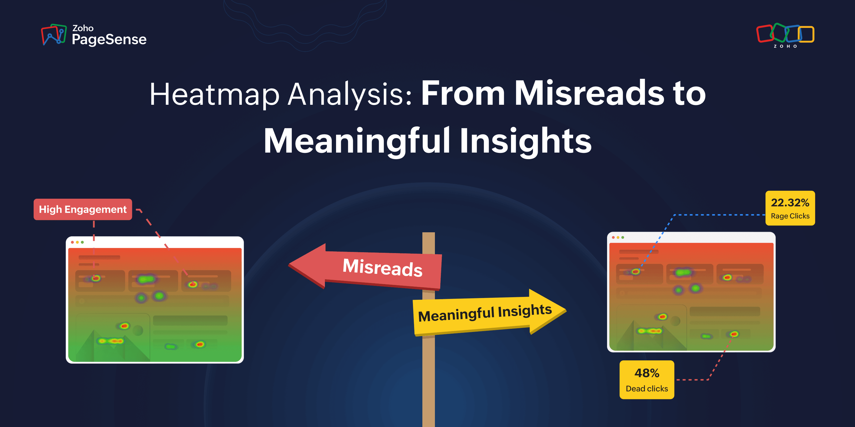
- How to analyze heatmap data correctly and uncover meaningful user insights
How to analyze heatmap data correctly and uncover meaningful user insights
- Last Updated : June 19, 2026
- 46 Views
- 7 Min Read
Most growth teams run heatmaps. Few know how to read them. Not because the tool is complicated, but because heatmap data looks more obvious than it is.
Red zones feel like wins. Scroll cliffs feel like content problems. High scroll depth feels like engagement. And the aggregate view feels like the full picture.
None of those instincts are reliable. And building tests on them is how teams spend weeks optimizing the wrong thing with complete confidence.
This guide covers what heatmap data actually means, the patterns that consistently get misread, and the four checks that turn a heatmap from a pretty visual into something a growth team can actually act on.
Mistake #1: Assuming red means good
Here's the thing nobody tells you about heatmap colors: warm = busy. That's it. Busy is not the same as good.
A red cluster on your pricing section has two equally likely explanations:
Scenario A: Visitors are carefully comparing plans, reading details, building toward a decision. That's genuine engagement. Leave it alone.
Scenario B: Visitors are rereading the same confusing pricing line over and over because it doesn't answer their question. That's friction. It needs fixing.
Same heatmap. Same red. Completely opposite problem.
As Jakob Nielsen of the Nielsen Norman Group put it: "A big red blob does not tell you why users are confused — only that they clicked a lot there."
This gets even more important with clicks on non-interactive elements. When visitors click a product image expecting it to expand, or tap a heading expecting a dropdown — nothing happens. They feel stuck. Baymard Institute's usability research identifies these dead-click patterns as consistent trust and momentum killers on product and pricing pages. And yet they show up as hot zones in your heatmap.
The fix: Don't just stare at the click heatmap. Open session recordings for visitors who clicked that zone. Watch five. If they clicked, paused, then bounced — that's frustration, not engagement. Fix the element before building any test around it.
Mistake #2: Blaming content for a scroll cliff that's actually a speed problem
Your scroll map shows a cliff at 40%. The natural reaction: rewrite the content. New copy. New headline. New section order. Three tests later, still nothing moves.
What if the cliff had nothing to do with the content?
A scroll cliff caused by a slow-rendering page looks identical to one caused by weak copy. Visitors leaving because the page hasn't finished loading show up exactly the same as visitors leaving because they weren't convinced. There is zero visual difference in the heatmap.
And slow pages lose people fast. When load time increases from 1 second to 3 seconds, bounce probability jumps 32%. Every extra second of delay costs 7% in conversions on average. On mobile, 53% of visitors abandon a page that takes more than 3 seconds to load — before engaging with a single piece of content.
If visitors are leaving before content appears, no copy test in the world will fix it.
Do this before rewriting anything:
Check your Core Web Vitals — specifically your Largest Contentful Paint (LCP). Google's official good threshold is LCP under 2.5 seconds, INP under 200 milliseconds, and CLS under 0.1. If LCP is slow at the depth where your cliff appears, you have a speed problem wearing a content problem's clothes.
Then open session recordings in PageSense. Filter to mobile visitors who exited at that scroll depth. Watch the first five seconds. Are they leaving before the page finishes loading — or after reading and deciding to bounce? You can answer that question in ten minutes. Running a copy test to figure it out takes three weeks.
Fix the speed first. Then look at the content.
Mistake #3: Trusting the aggregate view
By default, every heatmap blends every visitor into one overlay. The first-time organic visitor. The returning user comparing plans before upgrading. The paid ad visitor checking whether the page matches the ad they clicked. All three scroll differently, click differently, and drop off at completely different points.
The aggregate shows you all of them at once. Which means it accurately represents none of them.
Research confirms that interpreting aggregate heatmap data without segmentation leads to incorrect conclusions — and optimizations that actively move the site in the wrong direction.
Returning visitors are a particularly big distortion. They already know your product, skip the orientation content that new visitors need to read carefully, and go straight to what they're looking for. An aggregate heatmap mixes those two completely different navigation patterns into one overlay. You end up optimizing for a visitor who doesn't exist.
The device split matters just as much. Mobile sessions bounce at 51.8% versus 39.7% on desktop — a 12-point gap that hasn't closed in three years despite widespread mobile-first design investment. Mobile users don't just use smaller screens. They bring different attention spans, different patience levels, and different interaction mechanics entirely.
Always segment before drawing any conclusion:
Split this | Because |
Mobile vs. Desktop | Different screens, inputs, and scroll behavior |
New vs. Returning | Returning visitors skip what new ones need to read |
Paid vs. Organic | Different intent, different expectations on arrival |
In PageSense, you can filter heatmap data by device, traffic source, new vs. returning visitors, location, and browser — simultaneously. The pattern that leads to a real fix almost never lives in the aggregate view. It lives in a specific segment.
Mistake #4: Thinking high scroll depth means the page is working
High scroll depth feels like a great signal. Visitors are reading. They're engaged. They're into it.
Except — they might not be doing any of those things.
A visitor can reach the bottom of a page without processing a single sentence. Scanning for something they can't find. Growing increasingly frustrated. Absorbing nothing you intended them to absorb. The scroll map shows them as a success. They left having gotten nothing from the page.
Psychologist John Sweller's Cognitive Load Theory established that human working memory has real limits — around seven items at once before performance degrades. A page loaded with competing CTAs, dense copy blocks, autoplay video, navigation options, and feature lists doesn't give visitors a conversion problem. It gives them a cognitive overload problem. They scroll aimlessly because they can't process enough to decide.
CXL documented this directly. Moving a CTA to the bottom of a long page produced a 304% lift in conversions — for a complex product. Visitors needed to read the full context before they were ready to act. Putting the CTA in their face early created resistance. Letting them read first created conversion.
So when scroll depth is high but conversions are low, the question is never just "what's wrong with my CTA?" It's:
Are visitors reading — or scanning for an exit?
In PageSense, filter session recordings to visitors who scrolled past 70% of the page but didn't convert. Watch five.
Slow scrolling with pauses → they read everything, hit friction at the conversion step. Fix the CTA or the moment just before it.
Fast scrolling without stopping → they were scanning and never found what they needed. Fix the content, not the CTA.
Two completely different tests. Two completely different fixes. The recordings tell you which one to run.
Bonus: The above-the-fold CTA rule isn't always right
The most common action taken from scroll data is: cliff appears before the CTA, so move the CTA above the cliff. Feels logical. Often wrong.
Marketing Experiments ran a controlled test and found a below-the-fold CTA outperformed the above-fold version by 20%. CXL's 304% lift mentioned above came from moving a CTA lower, not higher. In both cases, the reason was the same: for complex products, asking for a commitment before building context creates pressure. Not conversion.
Nielsen Norman Group's research confirms users spend 57% of their viewing time above the fold — so visibility is genuinely higher there. But visibility and readiness to act are two different things. A visitor who sees a "Start your free trial" button before understanding what the product does is more likely to feel pushed than persuaded.
The above-fold section's job is not to hold the CTA. It's to create enough pull that the visitor wants to keep scrolling until they're ready.
Simple rule:
Familiar, simple product → CTA above the fold works
Complex, unfamiliar product → let visitors read first, then ask
If visitors are dropping off before reaching the CTA, the first question isn't "should I move the button?" It's "is the top of the page compelling enough to make them want to keep going?" Fix the pull. Then revisit placement.
Before acting on any heatmap pattern, ask these four questions
Question | What to check |
Is this a speed or content problem? | Check LCP at the cliff depth before rewriting a word |
Whose behavior am I actually seeing? | Segment by device and traffic source — never read aggregate only |
Reading or scanning? | Watch 5 session recordings of non-converters at that scroll depth |
Hot zone or stuck zone? | Cross-reference click heatmap with session recordings on the same element |
The one habit that separates good CRO teams from great ones
Good teams see a heatmap pattern and act on it.
Great teams see a pattern, come up with two possible explanations, pull a second data source to figure out which one is right, then build the test.
That extra step is where weeks of wasted test cycles get eliminated. Heatmaps surface patterns. Session recordings explain them. Scroll maps show where interest drops. Form analytics show where visitors stop. Funnel analysis shows which step is bleeding the most traffic.
The problem most teams run into is that these all live in different places — one tab for heatmaps, another for recordings, somewhere else for form data. By the time you've pulled everything together, the thread between spotting the problem and investigating it is long gone.
PageSense puts the full diagnostic workflow in one place — click maps, scroll maps, attention maps, session recordings, form analytics, funnel analysis, and A/B testing. When you spot a pattern in the heatmap, the recordings to explain it are three clicks away. No exports. No tab-switching. No lost momentum.