

- HOME
- Ecommerce branding
- How to create the best product page design for your ecommerce website
How to create the best product page design for your ecommerce website
In the online world, you only have a couple of seconds to impress your audience. How customers feel when looking at your web page can be the difference between securing a purchase or them going to a competitor.
Think of your ecommerce product page as a mandala. This centuries-old art form has more than just aesthetic appeal. What makes a mandala unique is its centricity, inclusiveness, and completeness. That’s why they appeal not just to our senses but also to our souls.
Here’s how you can bring a mandala’s qualities of cohesion to your product page:
1. Most buyers don’t spend time reading the entire page
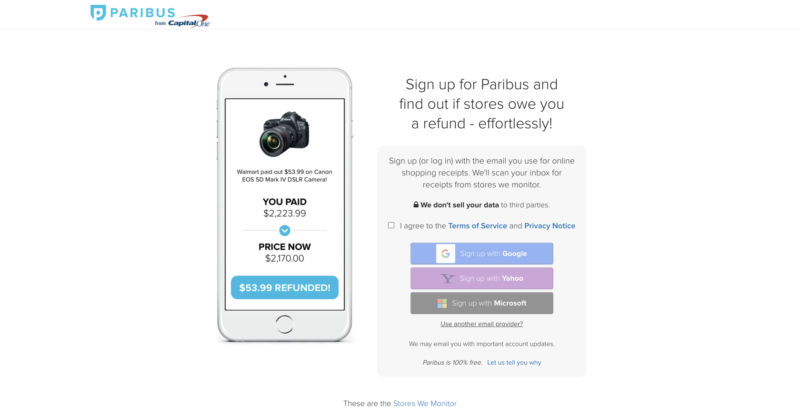
The product description is what matters. The attention span of a customer is just 8 seconds before they switch to something more interesting. Having a unique title and an easy scannable description is important. Your communication must be concise and focused on conversion. Paribus makes a point to convince you to install their app. They provide refunds when there is a price fall for one of your purchases.
2. Great visuals can lure the buyer
Speaking through images is the fastest way to communicate with your audience. Content presented with images has 80% better chance of a conversion. How else would a customer judge your product in the digital form if they can’t visually evaluate it? High-resolution product photographs from multiple angles and zoom levels—plus a 360-degree viewing option—give customers confidence in the product. Videos are another visually appealing way of connecting with your audience. 85% of customers say that watching a video has helped them make a purchase decision!
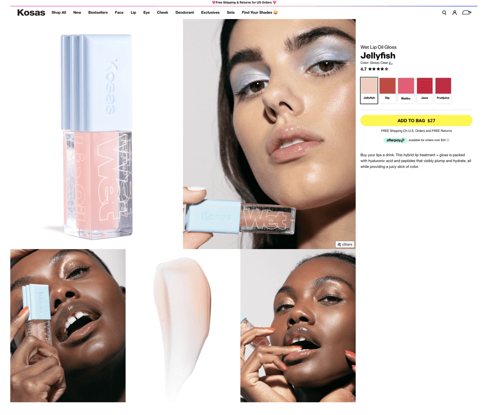
Example: Kosas Beauty uses real-life product images on their site, which gives customers an exact idea about the product’s true colors.
Pro tip: You can capture great product photos right from your smartphone.
3. Clean and simple layouts sell
Not every website visitor converts into a paying customer. In fact, less than 3% do! Cluttered page design is only going to bring that number down further. It’s important for your page to have a clear hierarchy of different elements.
For instance, begin with the product title in large, bold text and then place the first product image within the top fold. Remember that in most cultures people read from left to right and from top to bottom in a Z fashion. Perhaps that is why Amazon places its product image on the left—first to show the customer what the product looks like—and then places the title to its right to say what the product is and describe it. Of course, your product page will render on mobile entirely differently, so take care to make your product pages responsive and optimized for mobile.
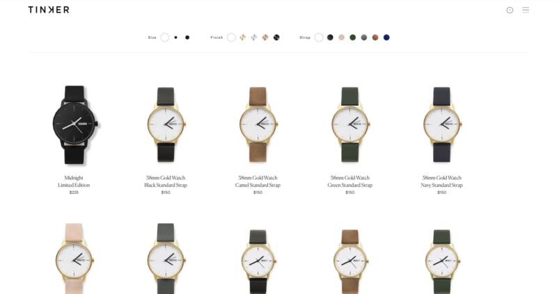
Example: Tinker watches have a clean and simple layout for their products along with an overhead, concise filter to choose every aspect of the watch individually.
4. An emotionally appealing product story wins hearts
A customer comes looking for a product online with a particular intention. If you’re selling products, you need a good story to back your product up with. The association a customer forms with the product is really a relationship—the more exclusive it is, the more the emotional attachment. Use storytelling techniques to convince your customers that your product is doing more than just meeting a need or solving a problem. Appeal to a deeper instinct, whether aspirational or for gratification. The more emotionally vested a customer is in your product (and its story), the higher the chance of conversion (and repeat purchase).
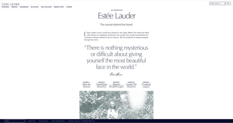
Example: Estee Lauder has been an established brand since 1946, and they talk about their legacy and their success of become a brand using their family recipe.
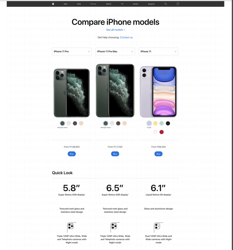
5. Details and product comparison can help customers evaluate better
Once customers become interested in your product, they will move to the description and the details on the product page. These can include technical specifications, color variations (which you can support with images), sizes, and other attributes. Mention the product details in bullet points for easy reading. Confusion is inevitable and natural when your inventory offers multiple choices to fulfill the same need, so here is where the product comparison feature comes to the rescue. Display a point-by-point comparison of different products to help customers with their decision paralysis.
Example: Apple has done a thorough job when it comes to product comparison.
Pro tip: Some site-building software solutions like our own Zoho Commerce allow you to add custom fields to your product pages. This means you can easily collect product-specific information or display certain details about the product. Use this powerful feature to add relevant and useful information to your product page.
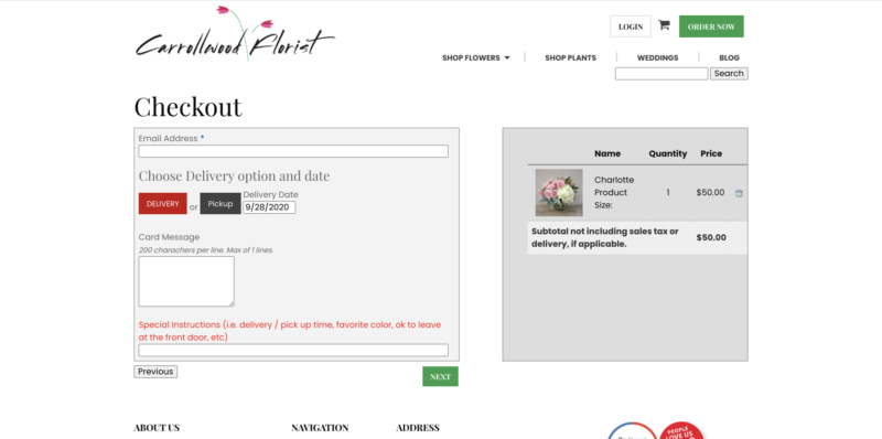
6. Estimated delivery times can create excitement
With the purchase of a product comes the anticipation of owning it. Telling your customers when they can expect the product to arrive at their doorstep even before they have placed the order heightens their excitement. Make sure you have enough inventory in stock to fulfill the promise you make though! You can provide delivery time estimates along with shipping costs right on the product page, which makes customers far less likely to abandon their shopping carts at checkout.
Example: Carrollwood florist allows you to choose your date and time of delivery. The shipping charges will be added once you provide the delivery address during checkout.
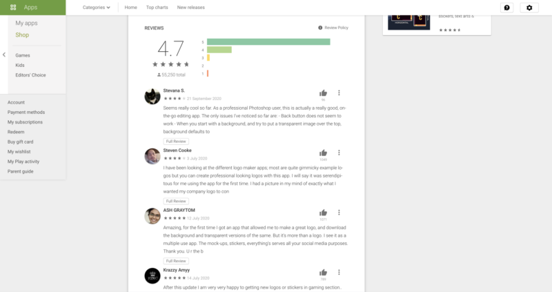
7. User ratings and reviews can generate trust
Customers seek genuineness and social proof, and nothing delivers this better than ratings and reviews coming from unbiased product users. 88% of customers give credence to product reviews. Any fog of uncertainty can be dispelled by showcasing what other customers think of your product or related services. Make sure to have this on your product page to increase trust with customers—especially new ones.
Example: Google Play features some of the most reliable and sought-after reviews and ratings for apps. This helps other customers choose an app to suit their requirements.
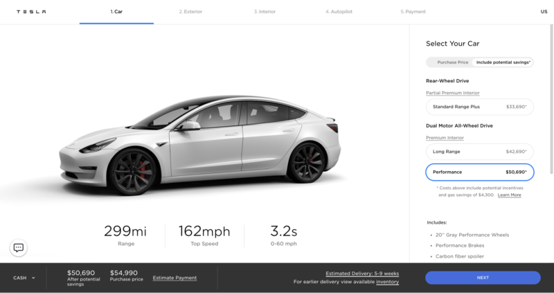
8. Recommendations can improve upselling
The personalized recommendation is an often-overlooked feature of a great product page. Recommendations based on the category, other product attributes, buying history, location, or what other people have bought creates a deeper connection in the buying process. Including this, on the product page, itself increases the likelihood of upselling. 80% of buyers have been known to have a greater interest in products when offered personalized recommendations.
Example: Tesla allows customers to customize their products before completing the purchase, which increases the chances of upselling.
While every ecommerce website is unique in its branding, there are some common elements to the ones that are the most successful. Customers have no interest in a product page that is just a wall of text. Making the page too text-heavy is likely to add to their anxiety levels. What you need to offer your customers is more than just the perfect product—you need to offer the perfect purchase journey.
Pay the same attention to your product page that Mandala designers do to their work and you will end up creating a design that is a treat to the eyes and appeals to your customer’s emotions. That is what will close the purchase cycle. A Mandala-like cohesion on your product page is possible by combining the right design elements.
Read more about Zoho Commerce’s advanced design features, which can help you bring this cohesion to your own page: sticky elements, shapers, and advanced visual editor.