- HOME
- Email Marketing
- Crafting mobile-friendly emails: A guide to responsive design
Crafting mobile-friendly emails: A guide to responsive design
- Last Updated : April 9, 2024
- 807 Views
- 5 Min Read

You see them everywhere; in the wee hours of the morning when people first wake up, on public transport on their way to work, in the lunch hall between bites of sandwiches, during coffee breaks at work, and even in bed before going to sleep—the mobile phone is a permanent accessory of modern lifestyles, and the apps that comes along with it guide our preferences too.
Crafting mobile-friendly email campaigns is no longer a choice but a necessity for businesses. In fact, about 73% of marketers prioritize mobile device optimization for campaigns. That's reason enough to make sure you know why it's high time to reach out to mobile users the right way!
With an estimated 64% of email opens occurring on smartphones and tablets, optimizing emails for mobile is imperative for reaching and engaging busy professionals on the go (source: Litmus). Responsive design plays a pivotal role by ensuring that emails seamlessly adapt to various screen sizes and orientations. Research indicates that 75% of users will delete emails that don't display well on mobile devices (source: BlueHornet), emphasizing the importance of creating visually appealing and easily navigable emails for mobile users. In this blog, we'll delve into the significance of responsive design for mobile-friendly emails and provide actionable insights for its effective implementation in B2B marketing strategies.
What is responsive design?
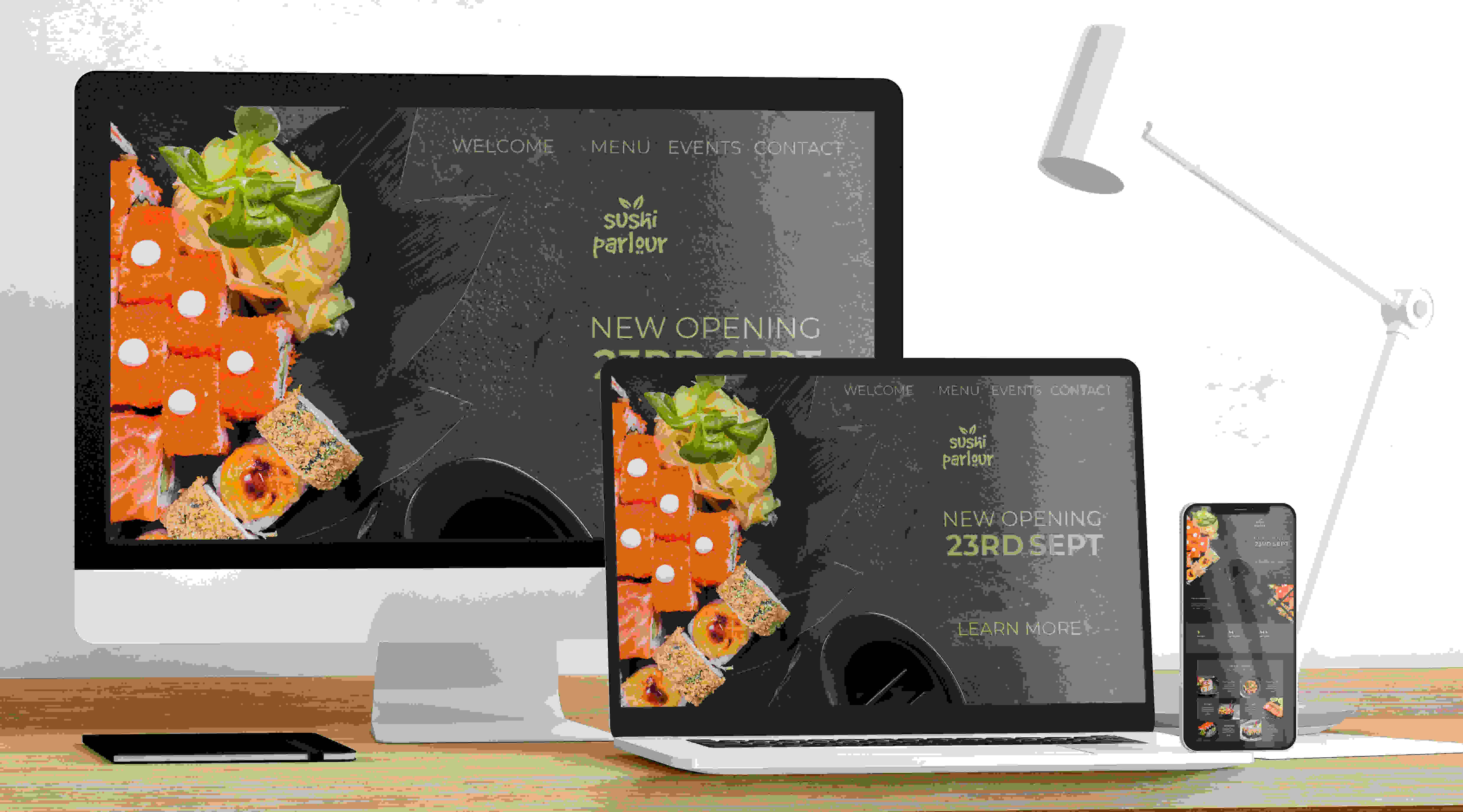
In today's world, people consume content across multiple devices: phones, laptops, or tablets. Hence, it's imperative that webpages and emails adapt dynamically to the user's device, screen size, and orientation. In the context of email marketing, responsive design ensures that emails render correctly across a wide range of devices, from large desktop monitors to small smartphone screens. By utilizing flexible layouts, fluid images, and media queries, responsive design optimizes the user experience and maximizes engagement.
Below is an example of responsive design, where the same content is displayed across different layouts in different devices.
Why responsive design matters for email marketing
Responsive design is undoubtedly the biggest factor that enables mobile optimization for emails. Here are some reasons why:
Mobile usage trends
With the proliferation of smartphones and tablets, a significant portion of email opens now occur on mobile devices. According to a study by Bluecore, 59% of millennials and 67% of Gen Zs use their smartphones as their primary email access point. Ignoring mobile optimization means missing out on valuable opportunities to connect with your audience.
User experience
A study by SuperOffice found that almost one in five email campaigns were not optimized for mobile viewing. At a time when people are predominantly working across devices, responsive emails provide a seamless and enjoyable experience. Easy-to-read text, properly sized images, and clickable buttons contribute to a positive user experience.
Improved engagement and conversions
A study conducted by Constant Contact in 2013 came up with an interesting find: Over 75% of American users said they would delete an email if they were unable to read it on their phones. Findings like these have gone a long way toward pushing people to use mobile-friendly designs for their emails, to capture the attention of recipients, and to encourage them to take action. Whether that action involves making a purchase, signing up for a webinar, or downloading a resource, responsive design can boost engagement and conversions.
Brand reputation
As a marketer, you want to focus on your email metrics, including clicks, conversions, ROI, and unsubscribes. Sending out poorly optimized emails that appear broken or distorted on mobile devices can harm your brand's reputation, leading to more people unsubscribing from your mails. Investing in responsive design demonstrates professionalism and a commitment to providing a superior user experience.
Tips for implementing responsive design in email campaigns
Use a responsive email template
Start with a responsive email template that's specifically designed to adapt to various screen sizes. Many email marketing platforms offer pre-built responsive templates that you can customize to suit your brand.
Pro tip: It helps when you use professionally designed email templates for your work, and automation tools like Zoho Campaigns come with a collection of simple email templates that enable you to send your customers professional-quality email campaigns that align with your business and marketing goals.
Optimize images
Ensure that images in your emails are optimized for mobile devices. Use compressed images and specify their dimensions using CSS to prevent them from appearing oversized or pixelated on smaller screens. For instance, mailers from a travel business will be picture-heavy, as they carry details of travel destinations and holiday packages. In such instances, it's all the more necessary to optimize the images.

Pro tip: Check out this best practices guide by Adobe to learn more about image optimization.
Keep it simple
You should keep your email layouts clean and simple to accommodate smaller screens. Avoid cluttered designs and excessive text that may overwhelm mobile users. Remember that while you might design your email on a PC or laptop, they're reading it on a smaller screen. Use white space effectively to improve readability and visual appeal. White space refers to the negative or empty space that's devoid of any visual elements. It's an important part of design that enables clarity and legibility and draws attention to the most important aspects of your message. Though it's not necessarily easy to understand this concept immediately, you can learn more about it and understand it better by reading this. Also, check out this ad by Ford, which uses a lot of empty space to declutter the ad and keep the focus on the message.

Prioritize content
While you focus on design elements, don't forget to keep the content at the heart of it. Place the most important content and calls to action (CTAs) near the top of your emails, where they're easily accessible without scrolling. Mobile users are often on the move and have limited attention spans. Make sure your message is clear and concise. This email from Uber looks tailor-made for a mobile phone user. After all, people book their Uber using their phone. The design is not only eye-catching on a small device, but gets to the point without requiring any further scrolling.

Use responsive fonts and buttons
Choose fonts that are legible on small screens and scale appropriately across different devices. Similarly, use buttons instead of text links for CTAs, and ensure they're large enough to tap with a finger. This mailer by the New Yorker gets to the point quickly and cuts the unnecessary fluff by displaying the CTA prominently to elicit a response from readers.

Test across devices and email clients
Before sending out your emails, test them thoroughly across various devices, operating systems, and email clients. These checks apply to any campaign that you send out regularly. Only when you pay attention to how the layout and formatting appear on different screens will you be able to identify any issues that need to be fixed.
In the age of mobile-first communication, responsive design is no longer a luxury—it's a necessity for effective email marketing. By prioritizing mobile optimization and implementing responsive design techniques, businesses can deliver compelling email campaigns that resonate with audiences on the go. From improving user experience to driving engagement and conversions, responsive design plays a pivotal role in the success of email marketing efforts. Embrace responsive design and watch your mobile-friendly emails thrive in the digital landscape. And like we said, taking help from a professional email marketing tool like Zoho Campaigns ensures that you can tick all these boxes off automatically.