Creating a lasting first impression with Form Design

First impressions can make or break a business's reputation with consumers, and your online forms often serve as the initial point of contact with potential customers. These forms are not just data entry points, they are an opportunity to showcase your professionalism, trustworthiness, and commitment to delivering an excellent user experience.
Imagine walking into a store with mismatched signs and a chaotic layout. It doesn't inspire trust. You want to see an organized, well-planned space. Similarly, a well-designed form instills confidence in the user. It tells them they're in the right place, dealing with professionals who pay attention to detail.

Here are a few effective strategies to ensure your forms leave a remarkable first impression.
Reflect your brand identity
Your business's identity is what sets you apart, makes you memorable, and builds trust with your audience. Your online forms are an integral part of that identity. They're not just boxes to fill, they're an extension of your brand.
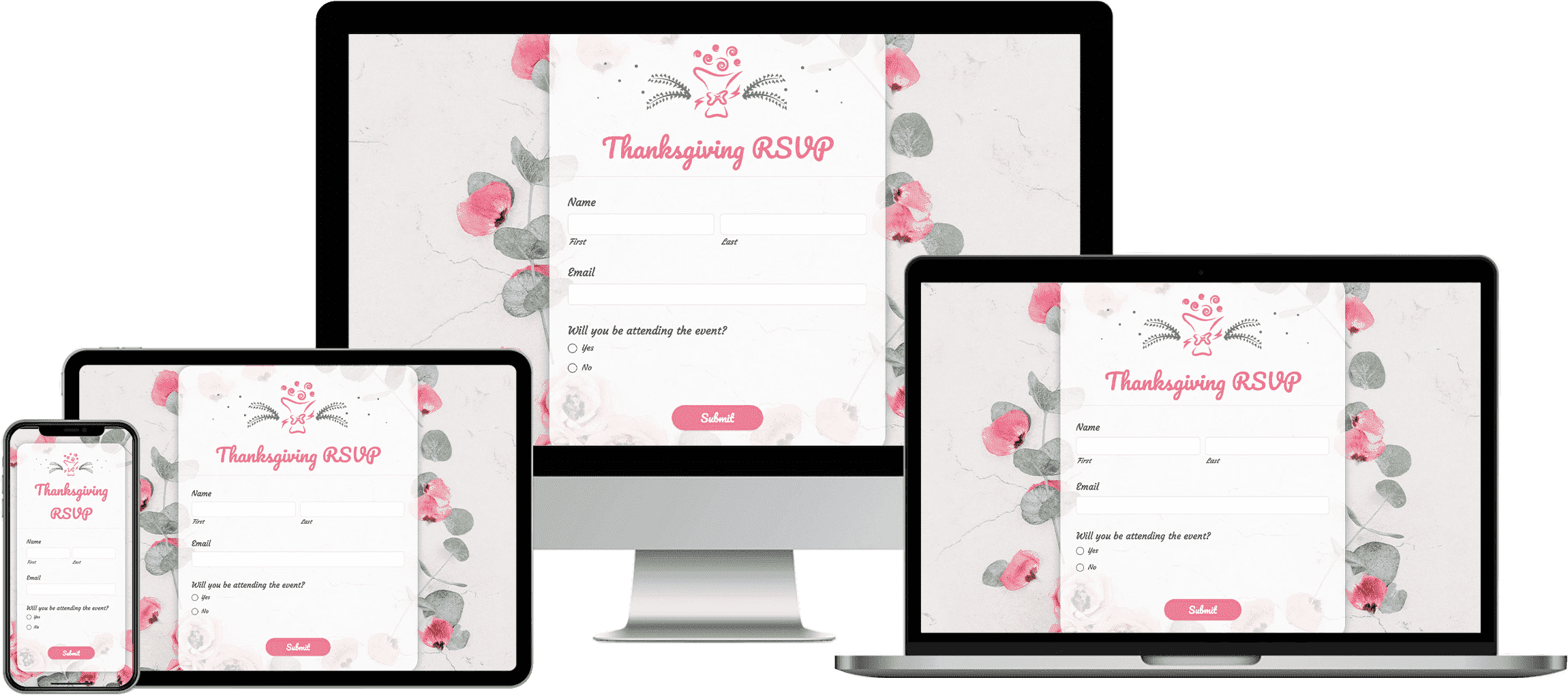
Your logo is the face of your brand. Incorporating the logo into your form is akin to placing your signature on an important document. It's a mark of authenticity and ownership. Ensure it's appropriately sized and placed, not overpowering but prominent enough to be noticed.
Imagine stepping into a high-end boutique. The colors, carefully chosen to resonate with the brand, surround you. Similarly, your form's color scheme should mirror your brand's palette. Whether it's the serene blues of a wellness brand or the vibrant hues of a tech startup, these colors should evoke familiarity.
Learn about choosing the right colors for your form.
Each font has its own personality, so your chosen font style should echo your brand's voice. A sleek, modern font may suit a tech company, while a more classic, serif font might befit a heritage clothing brand. Consistency in font choice across your website and forms is like using the same tone of voice in all your communications.
Learn more about choosing the right font style for your form.
Think of your brand as a story. From your website to your social media pages, every chapter should flow seamlessly. When a user moves from one page to another on your website or fills in a form, they should feel like they're still in the same narrative. Consistent imagery, icons, and design elements tie everything together to create a cohesive customer journey.
Keep it clean
Imagine walking into a room that's tidy, with everything in its place, versus one that's cluttered and chaotic. The former invites a sense of calm and focus, while the latter can be overwhelming and distracting. The same principles apply to your form design. A form's primary purpose is to collect specific information. Unnecessary elements or excessive text can confuse users and make it challenging to focus on what's important. You can make use of the Card form type to ensure that users progress smoothly from one field to the next.
Clean and uncluttered forms are more likely to display well on various devices, including smartphones and tablets. This is crucial in today's mobile-centric world, ensuring that users can comfortably complete the form regardless of their device.
Craft clear and concise instructions
Filling out a form without clear directions can be frustrating, confusing, and ultimately, lead to form abandonment. Lowering your form abandonment rate is an important goal for any business that depends on forms to convert website visitors into leads and customers.
Clear instructions guide users on how to accurately fill out a form, reducing the time and effort required to complete it. When users understand exactly what is required and how their information will be used, they feel more confident completing your forms. Avoid jargon, technical terms, or complex language that might be unfamiliar to users. Opt for simple, everyday language that will be easily understood by your entire audience.
Provide instructions and examples for specific fields, offering users the information they need to fill out the form. Clear instructions are particularly crucial for visually impaired users who may be relying on screen readers. Check out our accessibility features for online forms to help ensure accessibility for all of your users.
Choose a user-friendly layout
Walking through a well-designed store where everything is intuitively laid out helps make your shopping experience a breeze. The form-filling process on your website should offer a similar experience for your customers. Much like organizing items by category on store shelves, grouping related fields together on a form helps users understand the context and purpose of each section, making it easy to complete the form quickly.
Each question should flow logically from the previous one. This way, users feel like they're progressing naturally through the form, rather than jumping back and forth. It eliminates guesswork and keeps the process straightforward.
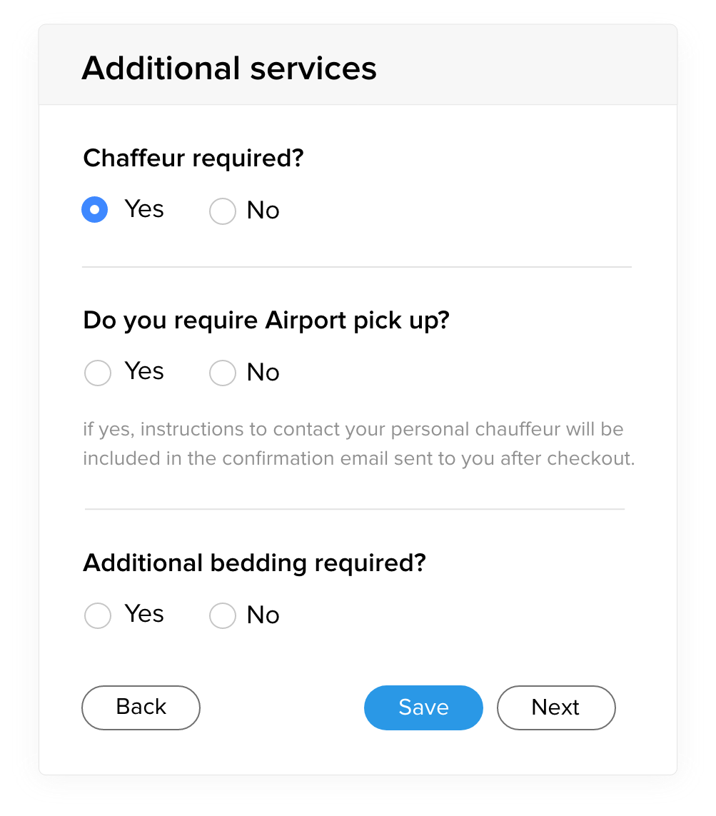
Customize with conditional logic
Think about how helpful it is when a salesperson asks about your needs or preferences and provides relevant recommendations. Applying conditional logic for forms does just that. Conditional logic allows you to show or hide questions based on user responses. This creates a tailored experience, where users only see questions or pages that are relevant to them. It demonstrates that you respect their time and value their input.
Learn more about how to make your customers feel valued.
Explain the benefits
Much like a well-informed salesperson would explain the benefits of a product, any webpage containing a form should detail the advantages of completing it. What will the user gain? Users are more likely to engage with a form that offers something of value, and providing clear information upfront demonstrates your credibility.
Engage your audience
Adopt a conversational tone, rather than sounding robotic or overly formal. This makes the form feel more like a friendly interaction rather than a bureaucratic process. Employ persuasive language with action verbs and social proof (e.g., "Join thousands of satisfied customers!") to encourage the user to complete the form.
A well-designed form doesn't just look good, it exudes competence and confidence. When done right, it's a chance to leave a positive, lasting impression. By incorporating these strategies, you're not just making a form; you're crafting a piece of your brand's story.


Comments