
- 16K
Customers
- 3M
Users
In this article
- What are automated reporting tools?
- Manual Excel vs automated reporting
- Why organizations are moving away from manual reporting
- How automated reporting solves business pain points
- Popular automated reporting tools in 2026
- Quick comparison table
- How to choose the right automated reporting tool
- How to evaluate automated reporting tools
- Common mistakes
TL;DR
- Manual reporting wastes an average of 6+ hours per week per person, and 88% of those spreadsheets contain errors anyway.
- Automated reporting tools fix this by connecting directly to your data sources and generating reports on schedule, in real time, without manual effort.
- The right one depends on your data sources, budget, and whether you need AI-native features or just solid scheduling.
- This guide breaks down the top 4 platforms for 2026 so you can find your match in under 10 minutes.
Not sure which tier you're in? Zoho Analytics offers a free plan with no credit card required. The fastest way to see if it fits before evaluating anything else.
SourceWhat Are Automated Reporting Tools?
An automated reporting tool is a software solution that generates reports from raw data without requiring repeated manual effort. Instead of analysts manually collecting spreadsheets, cleaning data, and building presentations, the tool connects directly to data sources, processes the information, and delivers insights through predefined report templates.
Five core components that make automated reporting tools work:
- Data integration: Connects the system to spreadsheets, databases, APIs, cloud platforms, or business apps through live connections
- Data processing and transformation: Cleans, filters, or reshapes raw data before reporting
- Report templates and design: Establish the visual structure that can be reused with new data
- Automation logic: Controls when and how reports generate — time-based, user-triggered, or event-driven
- Output and distribution: Shares reports as PDFs, embedded platform views, or automatic emails
But automated reporting isn't one-size-fits-all. Organizations adopt different report types based on needs: operational, financial, marketing, business intelligence, and interactive executive KPI dashboards.
Manual Excel vs Automated Reporting: A Simple Example
Imagine a marketing manager preparing a weekly campaign performance report. They export data from multiple platforms like Google Ads, email tools, and CRM systems into Excel. Then comes the routine: cleaning the data, aligning formats, creating pivot tables, and building charts to show performance trends. What should be a quick update turns into hours of repetitive work. And if someone asks a new question like "Which campaign had the highest ROI last month?", they have to start digging again.
Now multiply this effort across weeks, teams, and growing datasets. This is where manual reporting starts to fall apart. You might be wondering if automated dashboards really make a difference. The reality is, Excel works well at a smaller scale, but as data grows, it becomes harder to manage. Teams spend more time preparing data than actually analyzing it. Answering simple business questions requires manual filtering, rework, and constant back-and-forth.
In contrast, automated dashboards eliminate this friction. Data is pulled directly from multiple sources, updated in real time, and visualized instantly. What once took hours, sometimes days, can now be done in minutes. Instead of building reports, teams can focus on insights: spotting trends, identifying top-performing campaigns, and making faster decisions.
Manual spreadsheets also come with familiar risks such as multiple file versions, broken formulas, and outdated data the moment it's shared. Automated reporting removes these challenges by offering a single source of truth, live data updates, and easy sharing through secure links instead of static files. In the end, it's not just about saving time — it's about shifting from reactive reporting to proactive decision-making.
Why Organizations Are Moving Away from Manual Reporting
Manual reporting generates hidden operational expenses that accumulate across departments scattered among various individuals and functions, making the total impact invisible to everyone.
Time-consuming data collection and entry
- 80% of reporting and analytics work goes toward preparing and reconciling data, not analyzing it.
- Most analysts spend most of their time cleaning and organizing data rather than deriving insights.
Human error and data inconsistencies
- Even experienced users frequently make mistakes in spreadsheets. 88% of them contain errors.
- Poor data quality imposes an annual financial burden of about $12.9 million on businesses.
Lack of real-time insights
Reports arrive days or weeks after questions are asked. Insights are available only after decisions have been finalized. By the time manually compiled reports are finalized, the data is already outdated.
Scalability challenges with growing data
Every new client or data source introduces more spreadsheets, presentations, and hours of work. Traditional manual systems struggle to manage the large volumes of data in modern data environments. Scaling usually involves hiring and training more employees, which is an expensive and time-consuming process.
How Automated Reporting Solves Business Pain Points
No more spreadsheet nightmares — with automated reporting, data is pulled on its own, the same checks run every time, and mistakes are caught before anything goes live. Dashboards refresh themselves constantly, so you're always looking at current info. And when your data volume grows? Automation handles it without you needing to hire a whole new team.
From time sink to instant delivery
When data collection is automated, the hours analysts spend pulling from CRMs, ad platforms, and spreadsheets each week collapse to near zero. Instead of a finance team spending Monday morning reconciling last week's numbers, an automated pipeline runs overnight and delivers a complete report to every stakeholder's inbox before they start work.
If you're a marketing agency that once invested 60 to 90 hours monthly on creating client reports, you can now automate the entire process — pulling data, formatting, applying branding, and sending reports through one scheduled workflow. This allows the team to transition from report creation to offering strategic advice. The reports are still delivered, but the time spent on them drops to zero.
From error-prone spreadsheets to consistent, validated data
Automated reporting tools pull directly from source systems, bypassing the manual copy-paste steps where most errors are introduced. The same transformation logic runs every time — no formula drift, no misaligned columns, no version confusion between "Final_v2" and "Final_FINAL."
If your sales operations team has previously had to manually reconcile Salesforce exports with finance data every quarter, only to find discrepancies after reports were already shared, you can instead implement an automated pipeline that combines both data sources, enforces consistent business rules, and identifies anomalies before reporting is finalized. Mistakes are detected in advance, not uncovered during a board meeting.
From stale snapshots to real-time visibility
Automated dashboards link to real-time data sources and update either continuously or according to your specific decision needs. Instead of relying on outdated metrics when reports are shared, the data is always up to date the moment anyone accesses the dashboard.
If you're a retail operations manager who used to rely on weekly summaries to spot underperforming stores, you can now use live dashboards to track sales, inventory, and customer traffic by location in real time. If a store falls below a set threshold, an instant alert is sent, allowing the issue to be addressed within hours, rather than waiting until the next weekly report.
From headcount dependency to elastic scale
Manual reporting grows linearly: more data, more clients, more products mean exponentially more people are needed to manage it. Automation eliminates that dependency — once a pipeline is set up, it processes ten data sources just as effortlessly as one hundred.
If you're a SaaS company growing from 50 to 500 enterprise clients, you don't need to scale your reporting team proportionally. The same automated workflows that delivered weekly usage reports to 50 clients deliver them to 500, with each report personalized to the client's data — all without a single additional hire in the analytics function.
Popular Automated Reporting Tools in 2026
The 4 platforms leading the market in 2026 are:
- Zoho Analytics — Best overall for ease of use, affordability, and marketing agencies needing campaign performance tracking, ROI analysis, and client reporting dashboards
- Domo — Best for real-time data and team collaboration
- Tableau — Best for advanced data visualization and storytelling
- Power BI — Best for Microsoft ecosystem users
Zoho Analytics
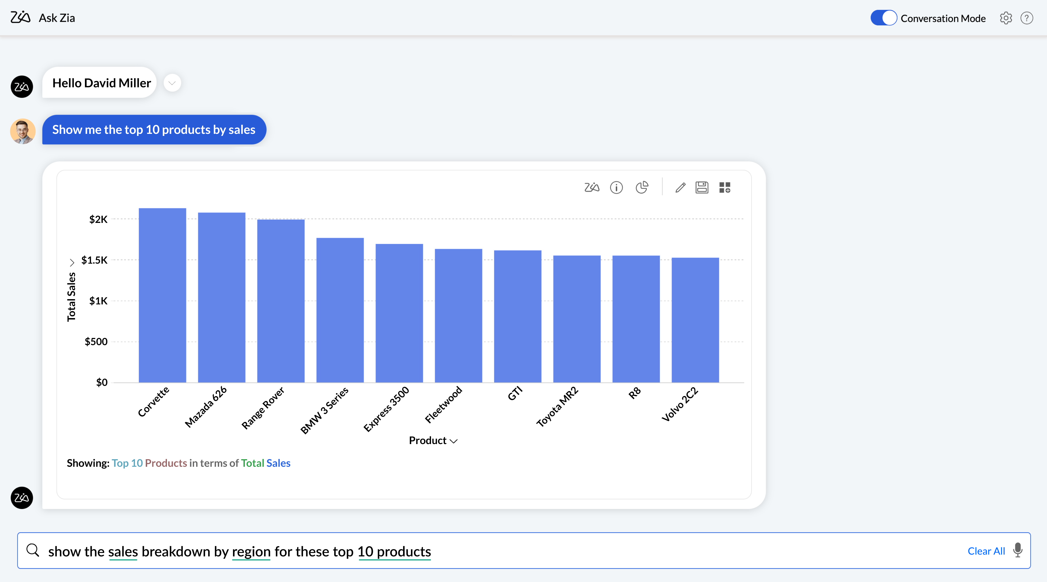
Zoho Analytics is an Agentic AI-powered self-service analytics and BI platform built for teams that want answers fast without relying on a data analyst. Its Ask Zia assistant accepts natural language questions and returns reports instantly. Auto-analysis scans your data schema the moment you import a dataset and generates categorized dashboards automatically with no manual setup required.

"A major benefit of using Zoho Analytics is the reduction in time spent on crunching numbers. Another important thing for me is to not only have a reporting system but an automated one to such a degree that it doesn’t need any manual intervention. Zoho Analytics really does it well."
 Nick PoeschlCo-Founder, Saint CharlesRead more here
Key Strengths: 500+ native connectors with pre-built domain-specific reports per integration; visual drag-and-drop pipeline builder; ML model creation without code; embedded analytics support; lowest total cost of ownership in its category.
- Agentic AI — Ask Zia
- Auto-Analysis — Instant Report Generation
- Data Integration — 500+ Sources
- Visual Data Pipelines — No-Code ETL
- Zia Insights — Automated Narrative Reports
1. Agentic AI — Ask Zia
Ask Zia has evolved beyond a simple Q&A tool into a full agentic AI analytical assistant. It handles the entire BI workflow — from building data pipelines and preparing data to creating reports, diagnosing anomalies, and delivering smart recommendations — all through natural language conversation. With a human-in-the-loop approach, you stay in control while AI handles the complexity.
2. Auto-Analysis — Instant Report Generation
Import your data and Zoho Analytics automatically analyzes the schema, selects the most meaningful metrics and dimensions, and generates a full set of categorized reports and dashboards in minutes. No manual configuration. No query writing.

3. Data Integration — 500+ Sources
Connect to databases, data lakes, cloud business apps, and local files through live connections or scheduled syncs. Each business app integration comes with pre-built domain-specific reports — not a blank canvas — so you start with value on day one.

4. Visual Data Pipelines — No-Code ETL
Build end-to-end ETL pipelines using the visual drag-and-drop pipeline builder. Join, append, cleanse, transform, and enrich data using 250+ built-in functions. No coding required. Pipelines run automatically on schedule, keeping reports current without manual intervention.

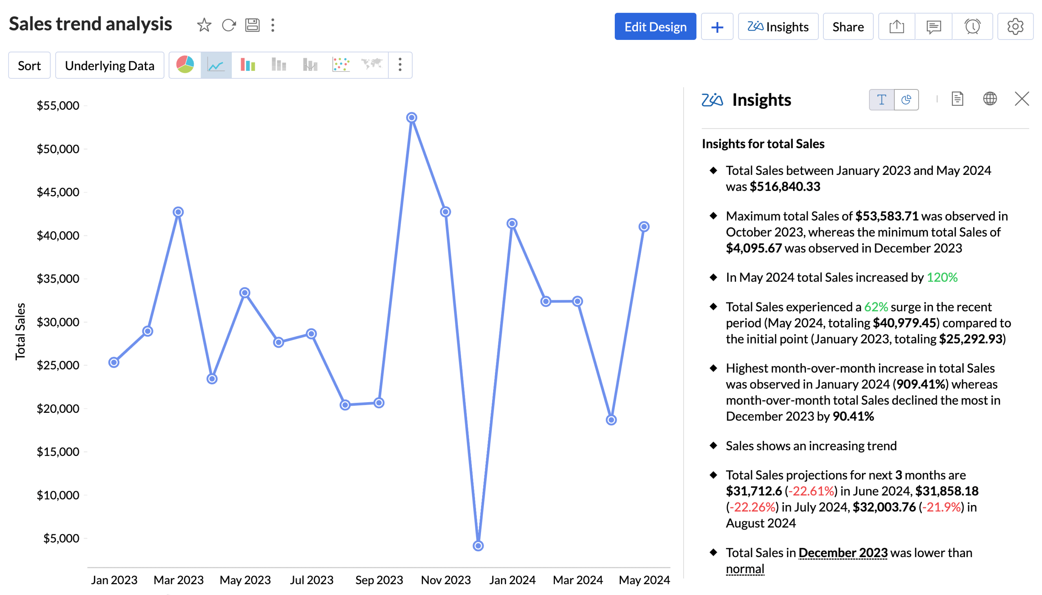
5. Zia Insights — Automated Narrative Reports
Zia automatically surfaces contextual, actionable insights as digestible narratives alongside your visualizations. Instead of staring at charts and drawing your own conclusions, Zia explains what changed, why it changed, and what to do about it — proactively.
Pros:
- Intuitive interface — non-technical users productive quickly
- Deep integration across the Zoho ecosystem
- Interactive and strong data visualization dashboards
- Affordable entry point with a generous free tier
- AI features (Zia) built natively, not bolted on
Cons:
- Some advanced features have a learning curve
- Less robust as a standalone enterprise solution
Level of automation: High — AI auto-generates reports on import, NLQ removes the need to build queries manually, scheduled delivery included across all paid plans.
 Source
 Pricing: Free plan available. Starts at $8 per user per month.
Best for: Zoho Analytics works best for businesses of all sizes that want AI-powered reporting without the complexity or cost of enterprise platforms, especially teams already using other Zoho products. Organizations that need deep UI customization, real-time operational monitoring, or complex data governance will likely outgrow it.
See it in action with your own data. No setup fees. No BI team needed.
Sign up for freeDomo
Domo is a cloud-native, end-to-end BI platform designed for organizations that need data from every corner of the business unified in one place. Its Magic ETL tool lets non-technical users transform and blend data without writing code. Its writeback functionality enables two-way interaction — users can enter adjustments directly from dashboards back into source systems like Salesforce, making it particularly strong for financial forecasting and operational review workflows.
Key Strengths: 1,000+ pre-built connectors; no-code ETL for non-technical users; real-time monitoring with threshold alerts; mobile-optimized dashboards.
Pros:
- Writeback enables two-way data interaction
- Magic ETL is powerful for non-technical teams
- Real-time data access and cloud-scale performance
- Massive connector library covers niche tools
Cons:
- Expensive, and pricing can spiral with the consumption model
- 2024 shift to credit-based pricing disrupts experimentation
- Out-of-the-box visualizations are basic compared to Tableau
- Customer support quality is inconsistent per user reports
- Frequent updates require dedicated internal attention
Level of Automation: High — Automated alerting, threshold triggers, scheduled reports, and an AI Service Layer for proactive insights.
 Source
 Pricing: Free trial available. Custom contract, typically USD 10,000–20,000 annually. Recently moved to a consumption/credit-based model.
Best for: Domo is best suited for mid-to-large organizations that need a single platform to unify data across many systems and make it accessible to non-technical business users. Smaller teams or those on tight budgets will struggle to justify the cost, and data science teams who need advanced visualization flexibility will hit its limits.
User Opinion
What do you dislike about Domo? Areas for improvement:
Workflows Lack Flexibility and Intuitiveness
While Domo Workflows are functional, they are not intuitive and come with a steep learning curve. Once deployed, workflows cannot be edited, which limits agility and forces you to rebuild from scratch for even minor changes. They work best when dealing with data already inside Domo but are not as powerful or flexible as external tools like Make or n8n for broader automation needs.
No Semantic Layer
The lack of a semantic layer makes it harder to standardize business logic across datasets and reports, leading to inconsistencies and increased maintenance overhead.
Domo AI Chat Needs Maturity
Even with all AI readiness checks in place, the Domo AI chat still struggles to interpret queries accurately or return reliable answers. It feels underpowered compared to other AI copilots and could benefit from improved context awareness and language understanding.
Embedding Limitations with Domo Everywhere
Embedding capabilities are limited. For example, it's not currently possible to embed custom apps or forms directly into our website using Domo Everywhere, which restricts how we can extend Domo into customer-facing or external platforms.
Limited Form Customization and Availability
There are very few customization options for forms in Domo. Forms must be part of a workflow or custom app in order to exist, which makes quick, standalone form use cases difficult or impossible without additional development.
Tableau
Tableau is a widely known analytics platform and the industry benchmark for AI data visualization. Its strength isn't just automation — it's the depth and quality of insights you can build and surface. Data Stories add automated plain-language explanations directly in dashboards. Tableau Prep Conductor automates data flow scheduling and alerts. Predictive modeling and exponential smoothing for forecasting are available natively, without third-party tools.
Key Strengths: Industry-leading visualization flexibility; native predictive modeling; Tableau Prep for automated ETL flows; Data Stories for automated narrative generation; REST API for programmatic report updates.
Pros:
- Best-in-class visualization
- Strong community and documentation
- Native predictive modeling
Cons:
- Among the highest per-user costs in the market
- AI features (Pulse) feel add-on rather than native
- Requires Alteryx or third-party tools for complex ETL
- Steeper learning curve than Power BI
- Not cost-effective for small teams or basic reporting needs
Level of Automation: Medium — Strong for scheduled flows and report delivery, but AI-driven automation is less mature than Zoho or Domo.
 Source
 Pricing: Free trial available. Starts at $75 per user per month (Tableau Creator).
User Opinion
A real Tableau user's review from G2:
"Good tool for visualizing data but can be slow at times"
What do you like best about Tableau?
I like how easy it is to turn data into visuals. You don't need to be super technical to make dashboards or find insights. The drag and drop part makes it quick to build things, and it helps explain numbers in a way everyone can understand.
What do you dislike about Tableau?
Sometimes it feels a bit heavy, especially when working with large datasets. It can slow down or take time to load dashboards. Also, a few settings or formatting options are not very straightforward, so you need to dig around to fix small things.
Best for: Tableau works best for data science teams, analytics departments, and enterprises where visual quality and analytical depth are non-negotiable. Teams that primarily need automated scheduled reporting with less emphasis on custom visualization or those working in the Microsoft ecosystem will find it overbuilt and overpriced for their needs.
Power BI
Power BI is the default choice for organizations already embedded in Microsoft's ecosystem. The integration with Microsoft 365, Azure, and Teams is seamless and requires no additional configuration. Copilot generates DAX calculations and report narratives in natural language. The Power Automate visual lets end-users trigger automated workflows directly from within reports based on live data context without leaving the dashboard.
Key Strengths: Native Microsoft Fabric and 365 integration; Copilot for AI-assisted report building; Power Automate for data-triggered workflows; Quick Reports for automatic pattern identification; free Desktop version; lowest per-user cost among enterprise BI tools.
Pros:
- Seamless integration with the Microsoft ecosystem
- Excel users onboard quickly
- Copilot accelerates report building
- Power Automate integration adds real workflow automation
Cons:
- DAX learning curve is steep for non-technical users
- Performance can struggle with very large datasets
- Heavy Azure dependency for full-scale deployments
- Less suitable for non-Microsoft environments
Level of Automation: High (Within the Microsoft ecosystem) — Copilot, Quick Reports, Power Automate visual, and scheduled delivery all work natively.
 Source
 Pricing: Free Desktop version available. Starts at $14 per user per month.
User Opinion
A real Microsoft Power BI user's review from G2:
"Alright Product with room to grow"
What do you like best about Microsoft Power BI?
Visualization capabilities, ease of use, and integration with Microsoft products.
What do you dislike about Microsoft Power BI?
Data integration challenges with complex datasets, map modifications and customizations, and challenges when creating complex formulas.
Best for: Power BI is the strongest choice for organizations running on Microsoft infrastructure — the cost-to-capability ratio is unmatched in that context. Teams outside the Microsoft ecosystem, or those requiring advanced custom visualizations and deep data storytelling, will find it limiting.
Quick Comparison Table: Automated Reporting Tools
Most businesses get overwhelmed comparing automated reporting platforms feature-by-feature. You don't need another 47-point checklist. You need to match your specific business requirements to the right platform category. The table below cuts through the marketing noise and shows what actually matters for decision-making:
| Tool | Data Sources | Automation | Visualization | Pricing |
|---|---|---|---|---|
| Zoho AnalyticsSMBs wanting AI-powered reporting without enterprise complexity | 500+ connectors | High AI auto-generates reports, NLQ via Zia, scheduled delivery | Interactive dashboards, drag-and-drop builder, embedded analytics | Free plan · From $8 / user / month |
| TableauEnterprises where visual quality and analytical depth are non-negotiable | 100+ native connectors + REST API | Medium Strong scheduled flows; AI (Pulse) less mature | Best-in-class custom visualizations, predictive modeling, Data Stories | From $42 / user / month |
| Power BIOrganizations running on Microsoft infrastructure | Microsoft Fabric + 100+ connectors | High Copilot, Quick Reports, Power Automate visual | Good interactive dashboards | Free desktop · From $14 / user / month |
| DomoMid-to-large organizations needing unified data across many systems | 2,000+ connectors with Writeback | High AI Service Layer, threshold alerts, scheduled reports | Mobile-optimized dashboards; basic out-of-the-box visuals | Custom pricing |
Patterns from this comparison: AI-native platforms (Zoho Analytics, Domo) provide natural language querying and proactive insights. Traditional BI tools (Tableau, Power BI) offer AI as an add-on, not a foundation. Connector counts don't tell the whole story — what matters is whether your specific data sources are supported with reliable, two-way sync.
Here's how to use this comparison: Match your primary use case first, then verify if the pricing tier fits your budget. If you are consolidating reports across multiple departments, start with Zoho Analytics. If you are already using Microsoft tools, Power BI makes sense.
How to Choose the Right Automated Reporting Tool
Match your primary use case first, verify pricing fits your budget, then evaluate the below criteria to choose the right tool:
- Data integration and connectivity
- Customization and report building capabilities
- Automation features and scheduling
- Visualization and dashboard options
- Scalability and performance
Data integration and connectivity
Your tool should connect natively to your existing CRMs, databases, marketing platforms, and analytics tools. While custom integrations may seem flexible, they can consume months of development time. Look for out-of-the-box connectors and verify compliance certifications before choosing.
Customization and report building capabilities
Test the report builder during your trial. If it takes more than 30 minutes to create a basic dashboard, it's not intuitive enough. Look for drag-and-drop editors, pre-built templates, custom filters, calculated metrics, and branding controls.
Automation features and scheduling
Verify if the tool offers flexible scheduling (daily, weekly, monthly), and delivery options (emails, dashboards). Threshold-triggered alerts that instantly notify when metrics fall off ensure issues aren't overlooked for weeks.
Visualization and dashboard options
Features such as filters, time-range pickers, and the ability to drill down are essential. If users can't click to explore details, they'll end up back in Excel. Additionally, customizable dashboards and responsive data visualizations enable smooth access and interaction with insights across different devices and roles.
Scalability and performance
Ask vendors about how their platforms perform at five times your current data volume. Their response will indicate if a platform migration will be necessary within the next two years. A robust BI platform should maintain fast query performance and smooth BI dashboard loading even as data volumes, users, and complexity grow.
How to Evaluate Automated Reporting Tools: A Scoring Framework
Selecting the right automated reporting tool is difficult, especially as AI capabilities continue to evolve rapidly across platforms. Rather than listing features, we evaluated each platform across 6 critical dimensions that determine real-world performance — not just what looks good in a demo.
Our Evaluation Criteria & Weightings
| Criteria | Weight | What we measured | Why it matters |
|---|---|---|---|
| Automation Depth | 25% | Time from data import to first automated report; NLQ accuracy; threshold and event-based triggers; auto-generated insights quality | This is the core reason you're buying a reporting tool. Automation must work end-to-end, not just schedule a PDF. |
| AI Capabilities | 25% | Natural language query accuracy; automated insight quality; predictive analytics depth; anomaly detection precision | This is what separates modern tools from legacy BI. AI must genuinely work — not exist as a checkbox feature. |
| Integration Ecosystem | 20% | Number of native connectors; API flexibility; data refresh options; support for custom sources | Your tool is only as good as the data it can access. Integration gaps mean manual work creeps back in. |
| Reporting & Collaboration | 15% | Dashboard sharing options; role-based access controls; automated report distribution; mobile experience quality | Analytics is a team sport. Siloed insights don't drive organizational decisions. |
| Support & Enablement | 10% | Onboarding programs; documentation quality; community resources; response times | Even the best tool fails without proper support during the critical adoption phase. |
| Security & Governance | 5% | Compliance certifications; data encryption standards; SSO/SAML support; audit trail capabilities | Table stakes for enterprise — non-negotiable, but not always a competitive differentiator. |
Our Scoring Methodology
Each tool received a score of 1–5 for each criterion:
- 5 = Industry leading: Best-in-class, nothing better exists on the market
- 4 = Strong: Exceeds expectations, minor gaps only
- 3 = Adequate: Meets needs, some notable limitations
- 2 = Developing: Basic functionality present, significant gaps
- 1 = Weak: Missing or poorly executed
Questions to Ask Before Purchasing
Most vendors will walk you through a polished demo on their best-case data. These questions are designed to surface what they're reluctant to share — integration challenges, automation constraints, hidden expenses, and whether you can truly trust the platform with your data long term.
On data integration:
- Which of our existing data sources are supported natively, and which require a custom connector, third-party middleware, or professional services?
- How are sync failures detected and communicated? Is alerting built in, or will we only find out when reports stop updating?
On automation depth:
- What exactly triggers automated reports — scheduled intervals only, or can we configure threshold-based and event-driven triggers?
- What is the failure behavior when an automated report errors — silent skip, error notification, or blank delivery?
On scalability and performance:
- At what data volume do customers on our plan typically start seeing performance degradation?
- What does the upgrade path look like — a plan change, or a full platform migration?
On pricing and total cost of ownership:
- What is explicitly included at our plan tier, and what requires an add-on — SSO, API access, embedded analytics, additional connectors?
- Are there costs for exporting our data or migrating off the platform if we switch vendors?
On support and implementation:
- What SLA is included at our plan tier, and what is the escalation path during a critical reporting outage?
- What does full implementation typically cost for an organization of our size, beyond the subscription fee?
On security, compliance, and trust: Your reporting platform will hold live connections to your most sensitive business data — revenue figures, customer records, operational metrics. This is the category most buyers under-scrutinize, and the one most likely to cause problems after go-live.
- What certifications does the platform hold — SOC 2 Type II, ISO 27001, GDPR, HIPAA — and can you share current audit reports?
- Does the platform use our data to train AI models, and can we opt out?
- What happens to our data if we cancel? Is deletion on request, and what is the confirmed timeline?
Trust is earned through transparency. Any vendor that struggles to answer these questions directly is telling you something important.
Common Mistakes When Implementing Automated Reporting
- Over-complicating initial setup — Businesses attempting to automate all processes at once overwhelm both technology and employees. Begin with the three to five reports that require the most manual effort. Achieving early successes fosters confidence before scaling up.
- Ignoring data quality and governance — Automated reporting amplifies existing data problems — it doesn't fix them. Introduce data quality monitoring to detect inconsistencies before report generation. Put in place governance policies that clearly outline how data is collected, stored, and preserved.
- Not defining clear KPIs upfront — Vague objectives like "improving efficiency" can't be measured. Instead, set clear targets like "cut report generation time by 30%" or "automate 80% of routine reporting tasks by the end of the quarter." Pick 3–5 critical metrics and track them consistently.
- Failing to train users properly — Training should include both navigating the system and interpreting reports. When teams realize that automation allows them to focus on analysis instead of data gathering, they become supporters rather than barriers.
Manual reporting isn't just slow — it's a compounding liability. Every hour spent compiling spreadsheets is an hour not spent on the analysis that actually moves the business forward. The tools exist. The decision is which one fits where you are right now. Match your category, verify your data sources are supported, start with your three most time-consuming reports, and run a trial on your actual data before committing. The right automated reporting tool doesn't just save time. It changes what your team is capable of.
Why Zoho Analytics Is the Fastest Path to Automated Reporting
Most businesses get stuck at implementation because automated reporting tools require weeks of setup and configuration before a single report goes live. Zoho Analytics eliminates that gap. The moment you import your data, auto-analysis takes over — scanning your schema, identifying the most meaningful metrics and dimensions, and generating a complete set of categorized dashboards automatically.
No query writing. No manual configuration. No waiting on a BI team.
Ask Zia removes the need to understand data structure entirely. Ask a question in plain language, get a report back instantly. For teams that need answers fast without building the infrastructure to find them, that's the difference between insight and inertia.
With 500+ native connectors, a free plan to start, and pricing that scales without the enterprise overhead, Zoho Analytics is the fastest path from raw data to automated reporting for teams of any size.
Frequently Asked Questions
What is reporting automation?
- Reporting automation is the process of using software to collect, process, and deliver data reports without manual effort. Instead of an analyst pulling data from multiple sources, formatting it, and distributing it by hand, an automated system handles the entire workflow on a schedule, in real time, or triggered by a specific event. The result is that reports arrive when they're needed, with current data, without anyone having to build them.
What is an automated reporting tool?
- An automated reporting tool is software that connects to your data sources, applies predefined logic and templates, and generates reports automatically. It handles data collection, transformation, visualization, and distribution in one system. Most modern tools also include dashboards, scheduling, alert triggers, and AI features that surface insights without requiring manual analysis.
What are the types of automated reporting tools?
- The market splits into four categories. Marketing and client reporting tools are built for agencies that need white-labeled, client-ready reports with native marketing connectors. AI-native analytics platforms (Zoho Analytics, Domo) offer natural language querying and auto-generated dashboards. Traditional BI platforms (Tableau, Power BI) handle complex data modeling at enterprise scale. Open-source and SMB options offer cost-effective solutions with free or low-cost entry points.
Are automated reporting tools worth it?
- For most organizations, yes. But the value depends on where your current bottleneck is. If your team spends significant time each week compiling reports rather than analyzing them, automation directly reclaims that time. According to Gartner, the majority of analytics effort in most organizations goes toward data preparation rather than actual analysis. Automation shifts that ratio. The caveat is that tools amplify whatever data quality exists — if your source data is messy, automated reports will surface those problems at scale.
Can small teams use reporting automation?
- Yes, and some of the best options are built specifically for smaller teams. Zoho Analytics offers a free plan and paid tiers starting at $8 per user per month. Small teams often see the fastest ROI from automation because they don't have dedicated BI resources — automation fills that gap without requiring a hire.
How often should reports be automated?
- It depends on how quickly the underlying data changes and how often decisions depend on it. Operational metrics like sales pipeline, support tickets, or campaign performance benefit from daily or real-time updates. Financial and executive reports are typically automated weekly or monthly. A good rule of thumb: match the reporting frequency to the decision cycle. If a metric influences a decision that gets made weekly, a weekly automated report is the right cadence. If it's checked daily, automate daily.
Do automated reporting tools replace Excel?
- For ongoing, recurring reports — yes, they should. Excel is a strong tool for one-time analysis, ad-hoc calculations, and scenarios where you need complete control over the logic. It's a poor fit for reports that need to run on a schedule, pull from live data sources, or be shared with multiple stakeholders consistently. Automated reporting tools handle those use cases better: they connect directly to source systems, eliminate the manual refresh cycle, and remove the version control and error risks that come with shared spreadsheets. Most teams end up using both — Excel for exploration, automated dashboards for ongoing reporting.