- HOME
- Design & deliver
- 6 types of visual content to make your slides more interesting
6 types of visual content to make your slides more interesting
- Last Updated : December 6, 2024
- 2.3K Views
- 5 Min Read

Visuals have become an integral part of the communication process, especially in the digital era where 90% of information transmitted to the brain is visual. Visual aids have been shown to increase the persuasiveness of presentations by 43%. While text-based content will always play a key role in your slides, here are 6 different types of visual content to make your data and information visually interesting.
Quotes

OR
"The ones who are crazy enough to think they can change the world, are the ones who do". - Steve Jobs
Which do you like better: the quote as an image or as text? Using visuals not only grabs a user's attention but will also help them retain the message. Using a quote in your first slide is a great technique to open your presentation and help your audience focus on what they are about to hear.
Meme

In this digital era, memes have become an inevitably popular content type to gain extensive momentum online. This has also made its way into business presentations, and memes can be used to keep the session light. There are a few things to keep in mind before using memes in your slides. Examine whether it's appropriate for your target audience and whether it complements your content. If your presentation is for a younger audience or for an informal gathering, then employing memes will help you pique interest and encourage participation.
Videos
According to Terakeet, one billion hours of YouTube content is consumed daily, largely because videos have become the most sought-after content type for quick consumption of information. There are different types of videos that can be used to enhance a business deck, some of which include testimonials, product demos, educational videos, and employee training videos.
Adding videos to your slides is also a terrific way to get people talking. Rather than shrinking the slides and viewing them, adding them to the slides directly is a smoother and more professional approach.

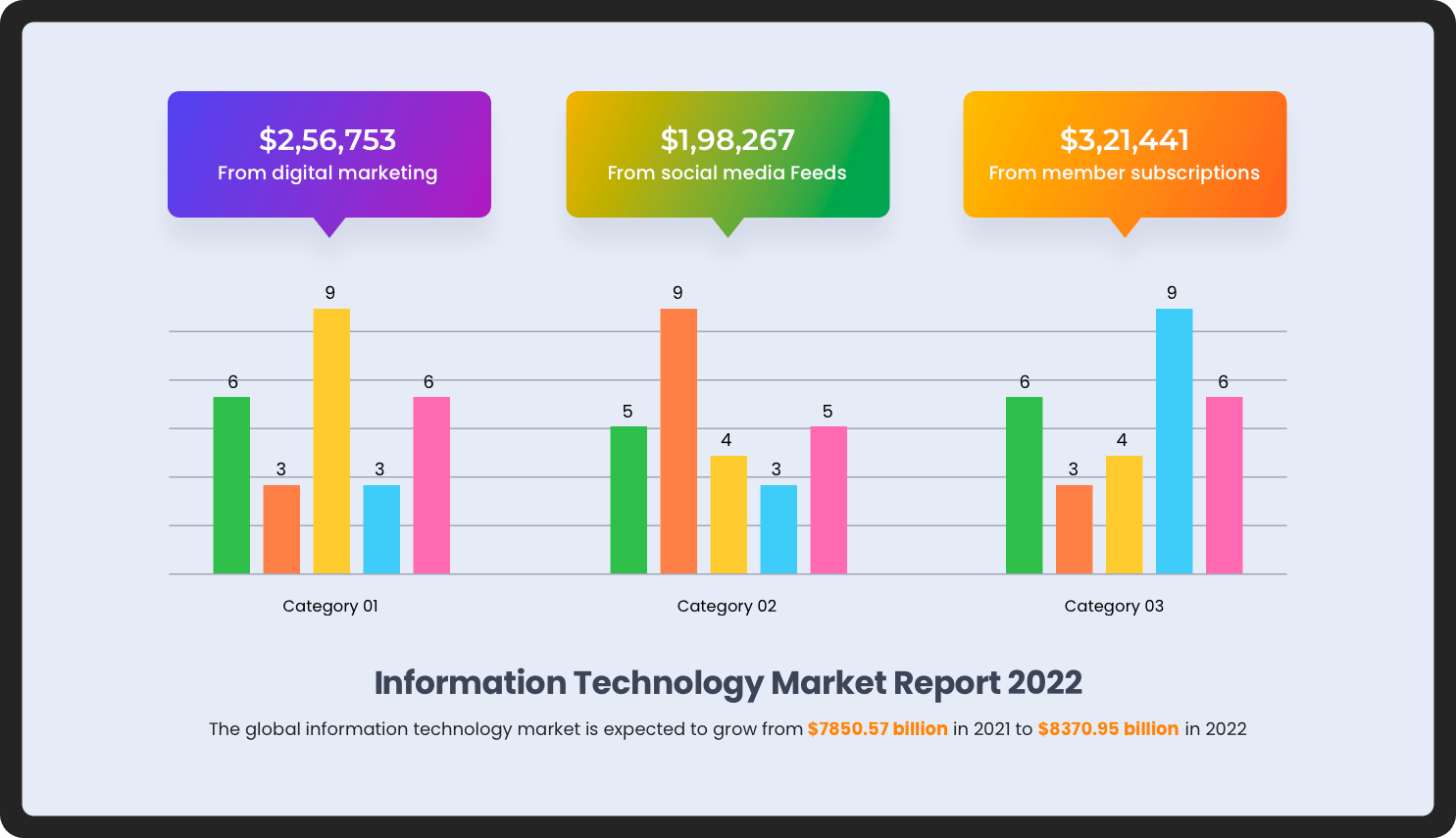
Graphs and charts
Business updates and market studies contain numbers that often deliver more impact when presented visually. Charts and graphs simplify the data, making it easier (and faster) to digest. Depending on the graph and what colors are used, the nuances of certain data sets can be displayed on screen while a speaker goes into more depth, which keeps even information-dense presentations interesting.
There are several types of charts and graphs that can be used for data visualization. Understand your objective and choose the correct type of graph to match your presentation.
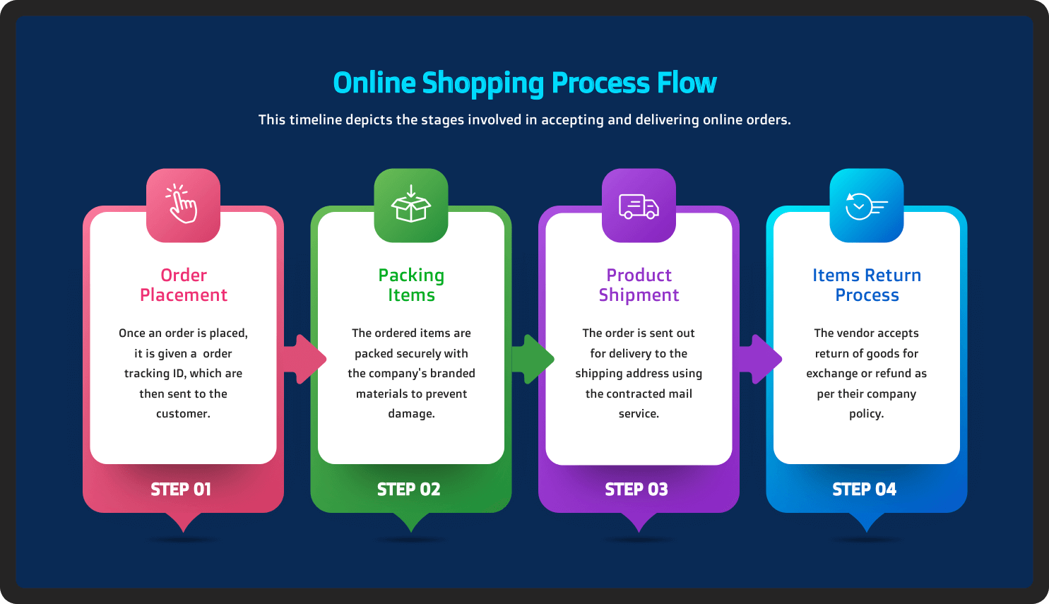
Infographics
Just like graphs and charts, infographics are an intuitive way to present complex data. Since infographics are elaborate, showcasing them at once on a slide can be overwhelming, even though they may be visual. The best way to include an infographic in your presentation is to use it part by part instead of showing it all at once.
Screenshots
Screenshots are a great way to illustrate product demos and how-to guides with interesting visuals, especially for tech and SaaS companies. The best practice for using these screenshots is to annotate the images. Whether you're pitching your product to a client or presenting product updates to your team, including screenshots is a great way to get your ideas across and generate enthusiasm.
Final thoughts
Using visuals will help you gain better traction for your presentations and drive more engagement among your audience. This is also a great opportunity for presenters to take a break from presenting and let the slides do the talking. Remember to use visual aids only as a means to supplement your delivery and try not to overshadow the speech itself.