- HOME
- Design & deliver
- 25 presentation design tips to quickly upgrade your slides
25 presentation design tips to quickly upgrade your slides
- Last Updated : September 30, 2025
- 831 Views
- 7 Min Read

They say content is king. And sure, having a strong message, clear data, or clever ideas is the backbone of any presentation. But even the best content can fall flat if it is presented poorly. Content may be the king, but design is what makes it look royal.
It has a quiet power that is often overlooked. Design can guide the audience’s attention, highlight what matters most, and bring your content to life.
Creating visually appealing slides isn’t as hard as it seems. In this post, we’ll walk you through simple design changes that can help your slides look neat, clear, and engaging.
Presentation design tips that can be implemented easily
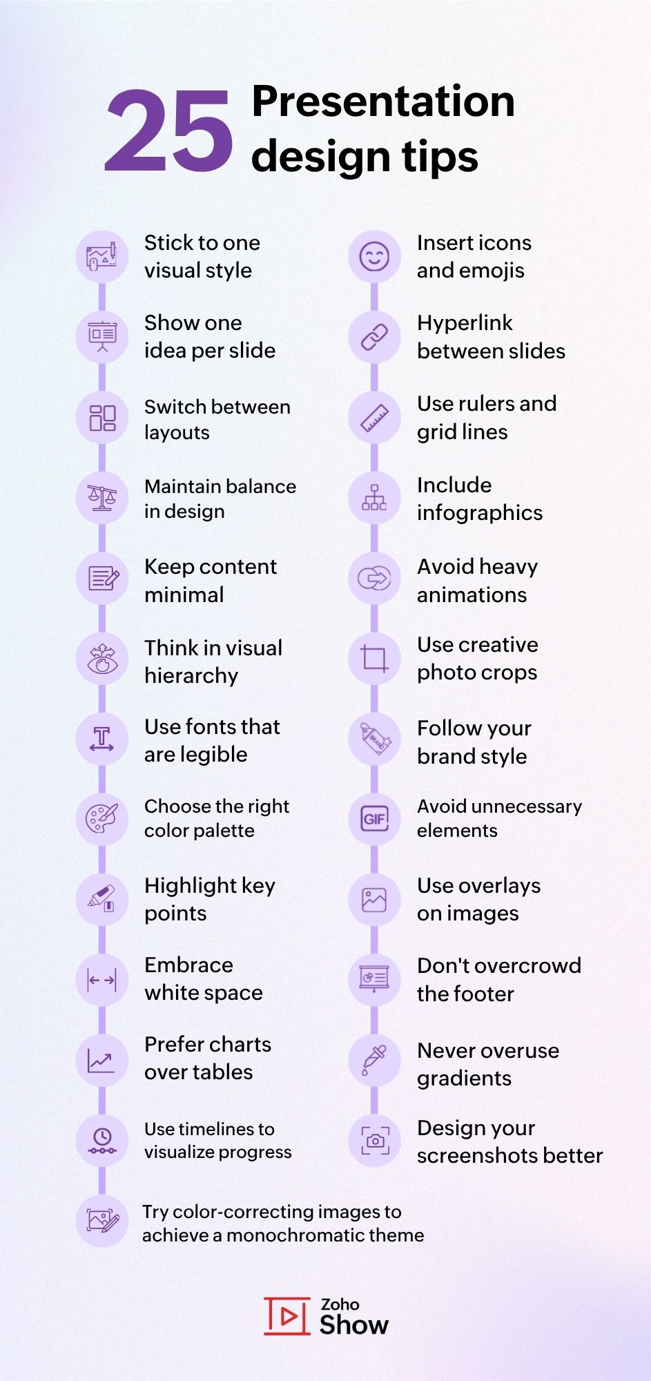
1. Stick to one visual style
A consistent style instantly makes your deck feel neat. Decide whether you want to use illustrations, stock images, or clean shapes, and carry that style across all slides. Mixing too many styles can look messy and distract your audience.
Before you start designing, make sure you can find all the visuals you need in that particular style and that it suits the tone of your presentation. If not, switch at the beginning instead of having to rework everything later.
2. Show one idea per slide
Slides are easiest to follow when they highlight a single thought. If you want to add more, simply split it into multiple slides so your audience isn’t overwhelmed. This also gives you room to explain each point better.
Ask yourself if you can explain what the slide is about in a single sentence. If not, split it into separate slides.
3. Switch between layouts for variety
When you follow the same structure, slide after slide can feel monotonous. Alternate between image-heavy, text-focused, or split-screen slides to keep your audience engaged and interested till the end.
Glance through your slides in the sidebar view. If you see the same layout four times in a row, change one of them to something different.
4. Maintain balance in the design
A well-balanced slide feels easier on the eyes and keeps your audience focused. Symmetry isn’t always about making both sides identical, but about distributing visual weight evenly. For example, if you place a heavy text on the top left, balance it with an image, icon, or design element on the bottom right.
5. Keep content minimal
Avoid overloading your slides with sentences and paragraphs. Use only keywords or short phrases that can be read in seconds, while you explain the details verbally. This way, your audience listens to you instead of just reading.
Use the 5x5 rule: a maximum of 5 lines per slide and a maximum of 5 words per line. If you exceed the limit, try to shorten or summarize your content.
6. Think in visual hierarchy
Visual hierarchy is about showing your audience what matters most at a glance. Bigger, bolder text should always signal the main point, while smaller or lighter text supports it. Even the placement of elements matters. Put the most important items where the eye naturally goes first, like the top or center of the slide.
After designing a slide, step back and look at it for just 3 seconds. Whatever your eyes notice first should be the main idea. If they go to the wrong detail, adjust the size, color, or position until the hierarchy feels right.
7. Use fonts that are legible
Skip fancy, cursive fonts that are hard to read on screen. Stick to bold, clean typefaces that look sharp whether you’re presenting in a small room or a big hall.
Reduce the slide to 60% size. If every word is still readable without strain, the fonts are legible. Fancy fonts usually don't pass this test.
8. Choose the right color palette
Colors create mood instantly. Pick 3 to 4 shades that go well together, and make sure your text always stands out from the background for easy readability. If you’re presenting for work, never miss to align with your brand colors.
Convert your slide to grayscale. If the hierarchy and readability are still clear, your colors are working well together.
9. Highlight key points with contrast
Use color, bold text, or shapes to make important information pop. High contrast ensures your audience knows exactly where to focus first.
Make sure the color you choose to highlight is part of the color scheme you are using, or at least goes well with it. This will look better than an usual yellow highlight.
10. Embrace white space
White space isn’t wasted space, it’s breathing room. Leaving gaps around text and visuals prevents clutter and makes your slides feel clear and elegant.
Leave a considerable margin space of at least 1 inch. Also, having more white space around key points, logos, or titles can help draw attention to them.
11. Prefer charts over tables
Charts are far easier to digest than raw tables packed with numbers. They highlight patterns, comparisons, and trends quickly, helping your audience see the bigger picture. Tables have their place, but whenever possible, visualize data to make it memorable.
Check if your audience gets the main insight within seconds. If not, turn it into a chart.
12. Use timelines to visualize progress
Timelines are perfect for showing project milestones, growth, or events in order. They simplify complex progress updates into a clear story.
Using path animation on the timeline slide can make it more interactive and engaging.
13. Design your screenshots better
Don’t drop raw screenshots into your slides. Crop, highlight, blur irrelevant areas, or place them inside device mockups to make them visually appealing.
If your product or service has a landing page, most of the screenshots you used there work well in your presentations too.

14. Insert icons and emojis if possible
Small visuals like icons or emojis can make slides feel more lively and relatable. Just don’t overdo them. Use them to enhance meaning, not distract.
You can also use these as a replacement for bullet points so slides with lists don't look old-fashioned or common.
15. Add buttons to hyperlink between slides
Turn your slides into an interactive experience by linking sections together. Hyperlink buttons make it easy for your audience to navigate your deck like a mini website.
Maintain consistency when it comes to the color of these buttons. You don't have to use the usual red and green, but consistency helps viewers identify the buttons quickly.
16. Use rulers and grid lines while designing
Alignment is non-negotiable. If elements are arranged randomly, slides instantly look bad. Position text, shapes, and visuals to invisible grids for a neater, professional look.
Try using rulers and grid lines on pre-built presentation templates to understand how the positioning is done.
17. Include infographics instead of bullet points
Replace boring lists with visuals that connect ideas. Infographics help your audience remember content better than plain text ever could.
To save time, you can also turn certain in-built diagrams and flowcharts into infographics by tweaking the elements slightly if needed.
18. Refrain from using heavy animations and transitions
A little movement can make your slides engaging, but too much looks distracting. Stick to simple and smooth animations and transitions to add flow.
Avoid using basic animations (like entry and exit), as they are no longer part of modern presentations. Try path animation or morph transition to make your slides feel like part of one bigger picture.
19. Make use of creative photo crops
Standard rectangular images can look plain. Try cropping photos into circles, diagonals, or shapes to add a creative twist without extra effort.
Add a thick stroke in any of the theme colors to the cropped images. This helps the image stand out instead of getting lost in the background.

20. Follow your brand style
If you’re presenting for a company, reflect the brand’s fonts, colors, and tone in your slides. It builds trust and makes your deck feel more professional.
Most presentation software lets you store your brand assets in a centralized library. This can help you source slides or slide elements and get the colors and fonts right.
21. Avoid unnecessary decorative elements
Don't use extra clip art, borders, or random shapes that hold no value. Keep your design simple and clutter-free so the focus stays on your content.
Stick to one element per slide at the maximum. Always remember when it comes to presentation slides less is more.
22. Use overlays on images
If text overlaps with a photo, add a semi-transparent overlay (like black at 40%). It makes text easier to read while keeping the image visible.
If your text color is dark, use a light overlay (like white) so the content is clearly visible.
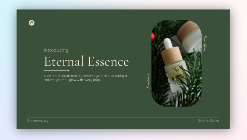
23. Try color-correcting images to achieve a monochromatic theme
Monochrome presentations are clean and professional. If you decide to go with this style, also try recoloring your images so it syncs well with the presentation theme. Below is an example of a monochromatic presentation slide with a color-corrected image.
24. Don't overcrowd the footer section
Avoid stuffing footers with logos, disclaimers, or extra text. This clutters the bottom part of the slide and distracts from the actual content.
Add your brand logo only to slides where it is essential, like the title slide, end slide, and pricing slide. Also, hyperlink any content to its source instead of mentioning it in the top or bottom corners.
25. Never overuse gradients or shadows
Strong gradients and heavy shadows can make your slides look cluttered and old fashioned.
Even when using shadows minimally, blur them and decrease the distance to achieve a more polished look.
Final thoughts
At the end of the day, slides are your biggest ally. They won’t speak for you, but they can either strengthen your delivery or quietly sabotage it. With thoughtful design choices that highlight clarity, flow, and balance, your slides become your support.
So don’t treat design as an afterthought. Treat it as the atmosphere you create for your audience. Because when your slides and your words work together, that’s when your message truly stays.
Also read
If you are in search for more resources that'll help you with presentation designs, here are some posts that you'll not want to miss!
Mastering presentation color schemes (with popular palettes you can try)
Top 10 visual cues to use in your next presentation
5 Font styles that make your business presentations stand out