- HOME
- Design & deliver
- 5 Font styles that make your business presentations stand out
5 Font styles that make your business presentations stand out
- Last Updated : September 30, 2022
- 3.3K Views
- 5 Min Read
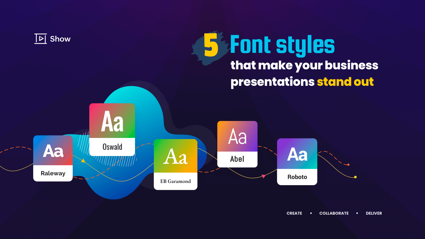
Two key objectives of a presentation are to convey your message to your audience and to maintain their attention. Your choice of fonts plays a significant role in setting the tone of your presentation and bringing your content to life. The right font will convey the right emotions to the reader and keep your audience hooked. Here are five font styles to use to transform your next presentation:

A compelling and bold font, Oswald is great for headlines and subheadings. It is a professional and readable font with normal line weight that gives your slides a subtle, yet sophisticated, look.

Raleway is a professional typeface with a clean and sharp appearance. When used for capitalized and bold text, Raleway is great for titles and headers that captivate your audience. The bold and light versions of this font are versatile and can be used anywhere, from headings to smaller content (like the text in your graphs and charts).
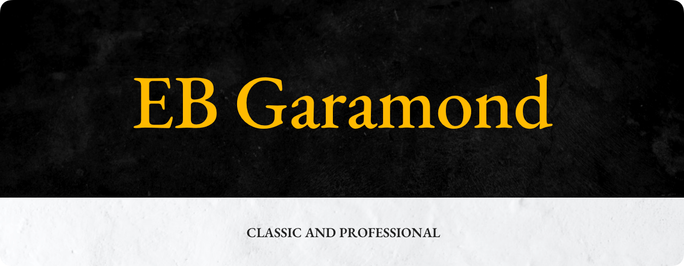
Classic and professional, Garamond is one of the oldest fonts still in use. This is a great choice for your title slide, as it gives your deck an elegant and sophisticated look. With a normal line weight, this font is a solid choice for professional decks.

Abel has a thin line weight that gives your presentation a simple and clean look. Quite similar to Raleway, the bold variation of this font is a good choice for your title, and the normal version can be used for your subheadings and image descriptions.

With a normal to heavy line weight, Roboto is highly readable and can be used for the body of your presentation. This is a great choice for professional slide decks and gives your content a distinctive look.
Here are some guidelines to follow before choosing a font style:
To understand whether a font is the right choice for your presentation, you first need to understand the basics of typography and their impact on creating engaging presentations. Here are some points to keep in mind:
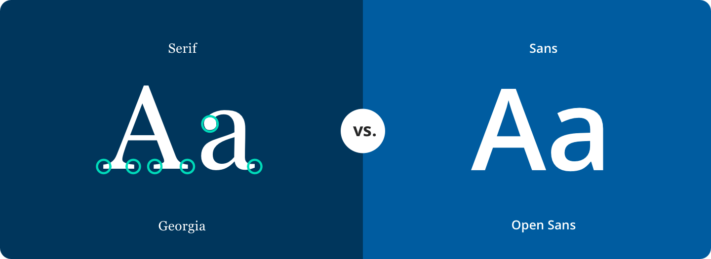
Category: One of the first determinations to be made when selecting a font is whether you want to use serif or sans. Choose your category depending on the length of your copy. Serif typefaces are easier to read than sans typefaces for lengthy copy, as they help the eye travel across a line. Use Sans to highlight content, like your title and headline.
Size: The appropriate font size is subjective, and depends on other factors, like the style of your presentation, and size of the room, projector, or screen. However, the ideal font size for the title, headline, and subheading is typically between 32 and 40.
Effects: Some font styles have a heavy line weight. Making these fonts "bold" will likely make the content illegible. Choose your font effects carefully, as effects like shadows and highlights can make your slides too flashy and unappealing.
Audience: Identify the demographics of your target audience before designing your sales deck, as not all fonts are appealing to all groups. Fonts under the Sans category are usually preferable for presentations targeting children or anyone learning to read. These fonts are also good for readers with certain visual impairments.
Use fonts wisely to differentiate and categorize the different sections of your slide. As a general principle, avoid using similar font styles, as this will make it difficult to distinguish different types of text. Remember, optimizing typography is optimizing the readability of your slide. With Show, you can explore and use a wide range of font categories for different presentation styles. You can also upload your own brand fonts using the Library feature when you're working on professional decks.