- HOME
- Design & deliver
- Mastering presentation color schemes (with popular palettes you can try)
Mastering presentation color schemes (with popular palettes you can try)
- Last Updated : August 21, 2025
- 1.7K Views
- 7 Min Read

Imagine walking into two different coffee shops.
The first one is filled with soft beige and muted green tones. The atmosphere feels calm, quiet, and soothing. You instinctively slow down and settle in. The second one greets you with bold reds, bright yellows, and vibrant accents. It’s energetic, lively, and full of buzz. You feel instantly awake, ready to chat or get things done.
Same type of place, but they set two completely different moods, which are heavily influenced by colors. Presentations work the same way. Before your audience has a chance to read or hear the first word, your color choices have already started shaping how they feel.
In this post, we’ll explore how color affects the mood of your slides through color psychology, and how you can build your own schemes using basic color theory. We’ve also added some examples of trendy palettes at the end to help you get started.
What is color psychology?
Before we dive into different color theories or learn how to create color schemes for presentations, it’s important to understand how colors affect people.
That’s where color psychology comes in. Color psychology is the study of how colors influence the way we feel, think, and behave. Different colors can trigger different emotional responses, often without us even realizing it.
Here are some of the most used colors and the emotions mapped with them:
Red: Bold, intense, and attention grabbing.
Red often signals urgency, passion, or excitement. It’s a color that makes people sit up and notice.
Blue: Calming, trustworthy, and professional.
Blue is calm yet powerful. It creates a sense of stability, confidence, and focus.
Green: Fresh, balanced, and reassuring.
Green is commonly linked to nature, growth, health, and even safety.
Yellow: Bright, cheerful, and optimistic.
Yellow adds warmth and energy, adding a positive and uplifting feel.
Orange: Playful, enthusiastic, and energetic.
Orange brings a fun, approachable vibe and works well when you want to appear lively and confident.
Purple: Imaginative, creative, and luxurious.
Purple often adds a sense of uniqueness or innovation.
Pink: Friendly, soft, and nurturing.
Pink can feel lighthearted or comforting, depending on the tone and pairing.
Brown: Grounded, warm, and natural.
Brown creates a sense of stability and earthiness, often used in more rustic or minimalist designs.
Black: Strong, sleek, and formal.
Black adds contrast and sophistication but can feel heavy if overused.
White: Clean, simple, and open.
White brings clarity and space, often used as a background to let other colors shine.
Grey: Neutral, balanced, and modern.
Grey doesn’t demand attention but subtly adds professionalism to a palette.
When you apply color psychology to your slides, you’re not just decorating but also shaping how your audience feels about your message.
Now that you know how individual colors can influence mood, let’s look at how they come together to form color schemes.
What is a color scheme or color palette?
A color scheme is a set of colors put together in a planned way to create a certain mood or style. It’s the plan for how colors will be used so they feel balanced and work well side by side.
The colors in a scheme can be similar, opposite, or somewhere in between. They might be bright and bold, soft and muted, or a mix of both. What matters is that they work together in a way that creates the desired effect.
Types of color schemes
Warm palettes
Made up of reds, oranges, and yellows, warm palettes feel energetic, passionate, and inviting. They’re great for grabbing attention and creating a lively atmosphere.
Cool palettes
With blues, greens, and purples, cool palettes bring calmness, trust, and focus. They work well when you want your slides to feel steady and professional.
Neutral palettes
Using whites, grays, blacks, and browns, neutral palettes give a clean, minimal, and balanced look. They can stand alone or be paired with warm or cool accents to add more depth.
Mixed-temperature palettes
These combine both warm and cool colors to create contrast and visual interest. For example, like a navy blue base with a touch of gold.
Muted palettes
Soft, de-saturated tones that create a subtle, understated mood. Perfect for a calm and relaxed feel.
Vibrant palettes
Bold, saturated colors that bring high energy and impact. Ideal for making your slides feel lively and energetic.
There are endless possibilities when it comes to color schemes, but to create one that looks and feels cohesive and professional, it's a good idea to dive deep into the color theories coming up next.
Different color theories
Color theory is a framework that helps you understand how colors relate to each other and how to use them effectively in a design. It’s what helps you decide which colors go well together, which ones contrast sharply, and which ones create harmony. Here are some color theories used commonly.
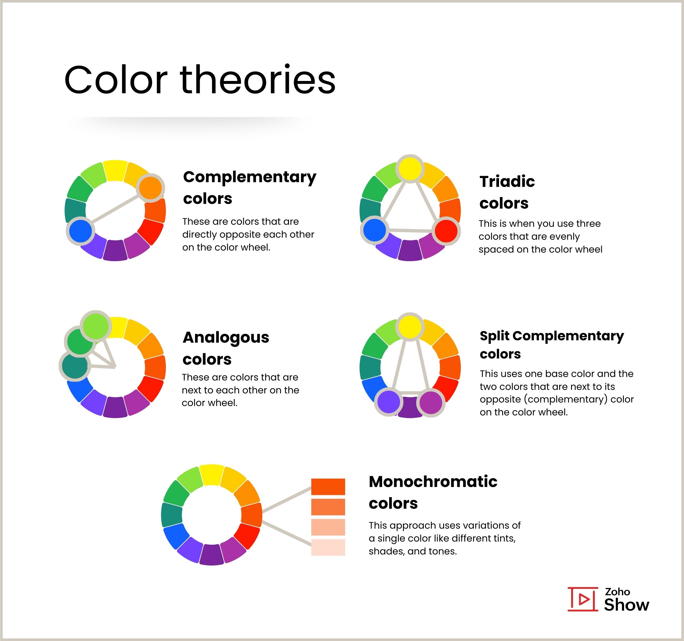
Complementary colors
These are colors that are directly opposite each other on the color wheel—like blue and orange or red and green. When used together, the high contrast creates a vibrant look.
Analogous colors
These are colors that are next to each other on the color wheel. For example, blue, teal, and green. They create a harmonious, pleasing palette and are ideal when you want a calm and neat look.
Triadic colors
This is when you use three colors that are evenly spaced on the color wheel, like red, yellow, and blue. Triadic schemes are balanced yet bold and are great when you want your slides to feel energetic without overwhelming your audience.
Monochromatic colors
This approach uses variations of a single color like different tints, shades, and tones. It’s a clean and elegant option, perfect when you want a minimal look with emotional impact.
Split complementary
A split complementary color scheme uses one base color and the two colors that are next to its opposite (complementary) color on the color wheel. This combo gives you a strong contrast (like complementary colors), but it's a bit softer and more balanced.
You can incorporate these theories into your presentations even if you're not a professional designer. What matters is being thoughtful with your choices. The right color combinations not only catch the eye but also shape how your audience feels about your message.
You’re now ready to create your own color schemes using these theories. If you feel like taking a look at a few examples would help, you'll find them toward the end.
Choosing color schemes for different presentations
You might have a preferred style—bold and loud or soft and subtle—but it won't be the perfect fit for every presentation. The key to choosing the right color scheme lies in understanding your content, your audience, and the mood you want to create.
Here are some general color suggestions for different presentations. You can also use colors specific to your brand or industry (for example, blues to represent healthcare).
Business reports and data-heavy presentations
Go for calm, professional tones like blues, grays, and whites. These colors help maintain focus and keep the attention on the content.
Creative pitches and product launches
Choose vibrant, energetic combos like purples, oranges, or triadic schemes. These colors help you stand out and express innovation and boldness.
Educational or training sessions
Use friendly, clear colors like greens and teals in a balanced way. These colors create an approachable atmosphere and make your content easier to follow.
Portfolio or personal branding presentations
Stick to a consistent color story. Monochromatic palettes or analogous hues work great here. This helps you appear polished and intentional.
Inspirational or storytelling decks
Choose warm, expressive colors like earthy browns, soft pinks, and muted oranges to make the presentation feel more personal and relatable.
Trendy color schemes to try in your presentations
Looking for a quick way to bring your slides to life? The color palettes below offer a helpful starting point. These are some of the popular combinations being used now and help you create different moods.
Of course, they are just suggestions. These palettes are here to give you a head start. Once you get used to how this works, try creating your own combinations that better fit your content and style. Exploring your own palettes can bring a sense of originality and make your presentation feel more personal and intentional.
Calm and earthy
This color palette blends muted greens, soft beige, and warm brown to create a natural, grounded look. It’s ideal for eco-conscious themes, wellness content, or any presentation that calls for a calm, organic feel. 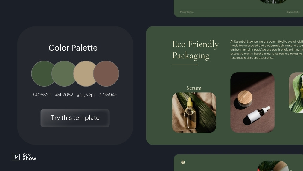
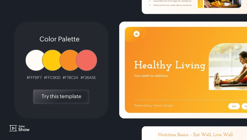
Bright and energetic
Vibrant orange tones paired with soft neutrals bring in a lively, uplifting feel. Ideal for adding energy to your slides without making them too loud. It’s well-suited for topics like personal development, well-being, or team culture.
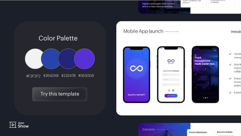
Bold and futuristic
This palette uses rich purples, deep blues, and sharp contrasts to create a sleek, tech-friendly look. Ideal for anytime you want to project a modern image or a sense of forward thinking.
Soft neutrals with a modern edge
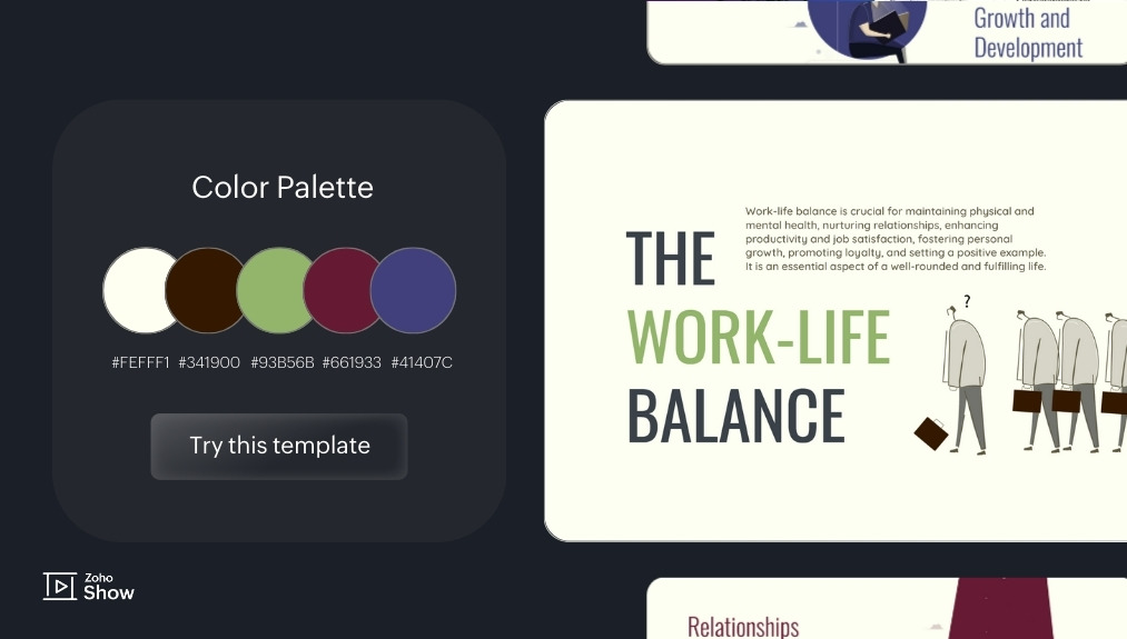
Clean off-whites, gentle beige, and strategic pops of deep blue and red give this palette a professional yet warm tone. The palette feels clean and balanced, with a quiet sense of confidence. It’s ideal for any presentations on wellness, mindfulness, or personal growth.
Vibrant and fun
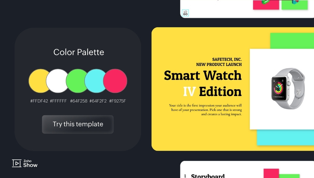
The scheme below uses punchy neon colors and vibrant contrasts to bring energy and edge. These colors bring a playful, dynamic energy that feels full of life and personality. Perfect for product launches or startup decks that need to pop with a fun, tech-inspired feel.
Final thoughts
A good presentation isn’t just about what’s on the slide. It’s about how it makes your audience feel. And that feeling often begins with color.
Through color psychology, we understand how different shades can evoke different emotions. With color theory, we learn how to pair them in ways that feel balanced and intentional. You don’t have to follow every rule, but knowing how colors work together can help you make smarter, more meaningful choices.
Once you know the mood you want to create, you can start building combinations that fit your story. When used effectively, color doesn’t just decorate your slides; it gives them voice.
If you have any favorite color combinations that have worked well in your presentations, feel free to share them in the comments. We’d love to see what inspires you!
Also read:
Working to elevate the look and feel of your presentations even more? Here are some resources you might find useful.
Deconstructing a presentation template: Layouts, colors, fonts, and more
Tips for maintaining visual consistency across your slides