- HOME
- How to optimize a landing page that actually converts
How to optimize a landing page that actually converts
- Last Updated : July 10, 2026
- 66 Views
- 9 Min Read

You built the page. You know the product cold — what it does, who it's for, why anyone should care. So when you look at it, everything makes sense. The headline reads right. The flow feels logical. The CTA is right there.
Then a stranger lands on it. Someone who's never heard of you, who clicked a Google ad at 9pm with three other tabs open. Six seconds later, they're gone.
You pull up the analytics — all you can see is high bounce rate and low conversions. You go back to the page. It still looks completely fine to you.
That gap — between how clear a page feels to its creator and how confusing it is to a first-time visitor — is the core problem of landing page optimization. And no checklist of buttons and headlines will fully close it.
The stranger's first ten seconds
Let me describe what actually happens when someone lands on a page they've never seen before.
They don't read it. Not yet. First, they scan — picking up shapes, colours, visual weight. Their brain is answering one question in under a second: does this feel right for what I was looking for?
If the answer is "I'm not sure," they're already biased toward leaving. They haven't read a word yet.
Then they read the headline. And the headline has one job — not to describe your product, not to be clever, not to sound like your brand — but to make the visitor feel instantly that they're in the right place. That this page was built for someone exactly like them, with exactly their problem.
If the headline does that, they scroll.
If it doesn't — if it's even slightly vague, slightly generic, slightly more about you than about them — they're calculating whether it's worth the effort to keep reading.
Most of the time, they decide it isn't.
Here's the part that kills most teams: you can't see this happening. You can see the bounce rate, the conversion number. But you can't see the exact moment the stranger decided your page wasn't for them, you can't see which line lost them or which question they had that never got answered. Unless you open a session recording.
Watching a real visitor land on your page, scroll for two seconds, and leave — without scrolling past the hero, without reading the value proposition, without ever reaching the CTA — is one of the most confronting and useful things a growth team can do. Because you stop seeing your page and start seeing theirs.
The three conversations happening simultaneously
When a visitor is on your landing page, they're not having one conversation with your content. They're having three — at the same time.
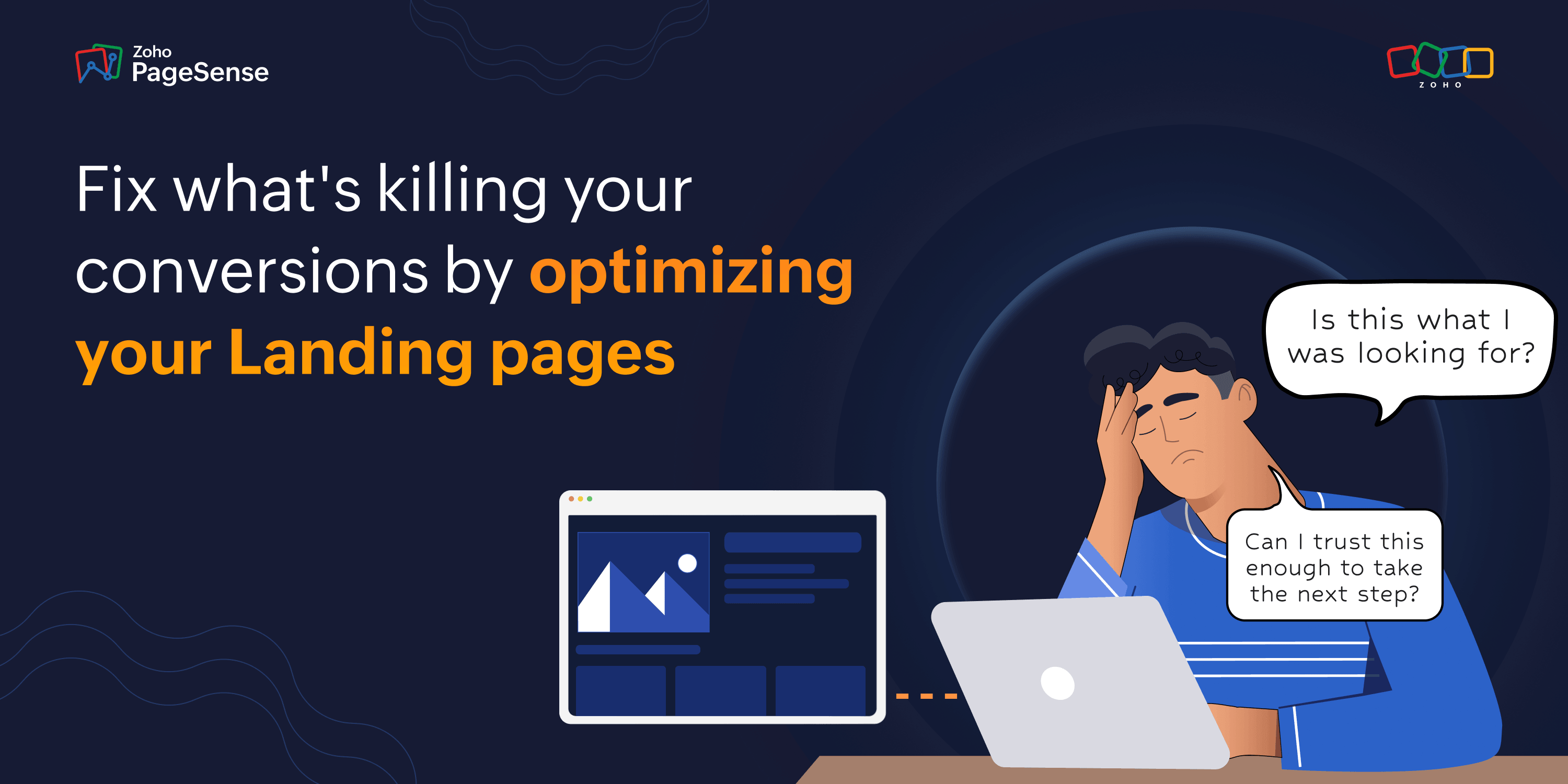
Conversation 1: "Is this what I was looking for?"
This one starts before they even read the headline. It's the snap pattern-match between what the ad, email, or search result promised and what the page is delivering. If the ad said "cut your reporting time in half" and the page opens with "Welcome to [Product Name]" — that conversation ends immediately. Mismatch. Gone.
Conversation 2: "Can I trust this enough to take the next step?"
This one runs throughout the entire page visit, and it's never fully settled. Every claim the page makes opens a corresponding doubt. "Best-in-class performance" → prove it. "Trusted by 5,000 teams" → which ones? Anyone I've heard of? "Setup in minutes" → that's what they all say.
This is why trust signals placed at the bottom of the page don't work. By the time the visitor gets there, they've been accumulating unanswered doubts for the entire scroll. Proof needs to show up at the exact moment the doubt arises — right next to the claim that created it.
Conversation 3: "Is the effort worth it right now?"
This is the conversation that happens at the form. Not "do I want this product" — that question is already answered if they've scrolled this far. The question is whether what you're asking them to do right now — fill in these fields, give you this information, commit to this action — is proportionate to what they're getting.
Ask for a phone number in exchange for a free report? Disproportionate. They leave. Ask for a name and email in exchange for a 30-day free trial? Proportionate. They fill it in.
The form isn't a data collection step. It's the final moment of the visitor's cost-benefit calculation. And most forms fail not because they're too long, but because the page didn't build enough value before the form appeared to justify what it's asking for.
Your behavioural data is the only way to know which conversation broke down first — and at exactly what point. That's what scroll maps, heatmaps, session recordings, and form analytics actually tell you. Not which element to change, but which conversation collapsed and when.
What your heatmap is actually showing you
Most teams open a heatmap and look at the bright red areas. They think: "Good, people are looking there."
That's half the story.
The more important question is what the heatmap reveals about where visitor attention dies.
When you open your PageSense scroll map, you're looking at visitor confidence — expressed as physical movement through your page. Every percentage point of scroll depth represents visitors who were engaged enough at the previous section to keep going. A drop-off at 35% doesn't mean your page is too long. It means something in the first third failed to answer one of those three conversations convincingly enough to earn the next scroll.
Think of it like a conversation that stalls. The visitor was listening. Then something — a vague claim, a missing proof point, a headline that didn't quite land — created a doubt they couldn't resolve. And rather than asking, they left.
Here's how each behavioural data type maps to those three conversations:
Scroll maps → Conversation 1. If visitors are leaving in the first 20–30% of the page, the "is this what I was looking for?" conversation failed. Your message match is off, or the headline didn't land fast enough.
Heatmap click patterns → Conversation 2. Dead clicks (visitors clicking on non-linked images and headlines) and rage clicks (frantic repeated clicking in one spot) are the physical expression of unresolved doubt. A rage-click cluster near your pricing section almost always means visitors wanted to find out something — a cancellation policy, a plan comparison, a pricing detail — and couldn't.
Form field drop-off → Conversation 3. PageSense tracks drop-off at the field level, not just "they abandoned the form." Seeing that 40% of visitors who started your form abandoned specifically on the phone number field tells you exactly which question felt disproportionate. That's not a form length problem. That's a value-proposition problem at the final moment.
Session recordings → All three. This is where you stop looking at aggregate patterns and start watching individual humans navigate the page. A visitor who scrolls slowly back up to reread your pricing section before abandoning is showing you a trust gap in real time. A visitor who starts filling the form, hovers over the phone field, and exits is showing you exactly where the effort felt too high relative to the value.
The blindspot your analytics can't show you
Here's something important that gets missed in almost every landing page discussion.
Your conversion rate is an average, and averages are very good at hiding the things that actually matter.
A 4% conversion rate could mean four things. It could mean every visitor type converts at roughly the same rate. Or it could mean organic search is converting at 12% and paid traffic is limping along at 1%. Or desktop is at 7% and mobile is at 1.5%. Or one campaign is quietly pulling 15% while everything else drags the number back down to mediocre.
The "4%" you're staring at is not a page problem. It might be a traffic mix problem. Or a device problem. Or a campaign problem. You won't know until you break it apart.
This is one of the most expensive mistakes a team can make. You see 4%, you decide the page needs work, you redesign it — and the organic visitors who were converting at 12% just fine start converting at 9% because you moved something that was working for them. You fixed nothing. You broke something.
Segmenting your heatmap by traffic source in PageSense takes about 30 seconds. What you see when you do it is almost always surprising. Paid traffic and organic traffic behave completely differently on the same page — because they didn't arrive the same way.
Someone from a branded search already knows who you are. They don't need to be convinced you exist. They need proof you're the right choice and a clear path to say yes.
Someone from a cold display ad has never heard of you. They need context before proof even registers.
Same page, two completely different conversations. And if the page is written for one of them, the other one is going to leave — and bring your average down with them.
The fix isn't more elements—It's better sequencing.
Here's what every checklist gets wrong.
The elements of a high-converting landing page aren't a secret — headline, value proposition, proof, CTA. form. Everyone knows this. Everybody lists them in a slightly different order and calls it an optimization guide.
What almost nobody talks about is sequence.
Not what's on the page — but when each thing shows up. Because a landing page isn't a collection of elements — it's a conversation. And like any conversation, order matters.
- A testimonial at the bottom of the page answers a question the visitor stopped asking four scrolls ago.
- A pricing section before the value proposition asks someone to judge cost before they understand what they're paying for.
- A CTA before any proof asks a stranger to trust you before you've given them a reason to.
The right question isn't "do we have a testimonial?" It's "is the testimonial sitting at the exact moment the visitor is most likely to doubt the claim above it?"
The question isn't "is our CTA visible?" It's "by the time someone reaches this button, have we answered enough of their questions that clicking it feels like the obvious next move?"
This is how you end up with all the right ingredients and a 2% conversion rate. The page has everything it's supposed to have. The recipe is just wrong.
And the only way to find the right sequence — for your specific audience, your specific traffic — is to watch what they actually do. Not guess. Watch. Where do they hesitate? Where do they scroll back up? Where does attention spike right before they leave?
That's not something you can reason your way to from a spreadsheet. It's in the behavior. And behavior is exactly what a heatmap shows you.
The five things worth checking this week
Not a full redesign. Not a new framework. Just five things that behavioural data can answer in under an hour.
1. Does your scroll map show a cliff in the first 30%?
If yes: your opening section — headline, subheadline, first visual — didn't earn the next scroll. Check whether the headline is specific enough to make the visitor feel immediately recognised. Check whether the ad or email that sent them matches what the page opens with.
2. Are there rage clicks anywhere on the page?
If yes: open those sessions in recordings.See what the visitor was trying to do. Almost always, it's something they expected to be interactive — a price, a feature, a logo — that wasn't. Either make it interactive and useful, or redesign it so it doesn't look like something that should respond.
3. Where does your form drop off at the field level?
The field where most visitors abandon is the field that feels disproportionate. Make it optional. If completions jump, you've confirmed the diagnosis. If they don't, the problem is trust — the page didn't build enough confidence before the form appeared.
4. What's your mobile scroll map showing vs. your desktop scroll map?
Segment them in Zoho PageSense. If mobile shows a deeper scroll cliff than desktop, you have a mobile-specific friction point — usually a CTA sitting below where the keyboard appears, or a form field too small to tap reliably, or a section that stacks badly on a narrow screen.
5. Filter session recordings to visitors who scrolled 70%+ but didn't convert.
These are the visitors who engaged fully with your page and still said no. What they do in the last 20 seconds before they leave tells you everything about the unanswered objection that cost you the conversion. Watch their mouse. See what they hover on. See what they go back to read. That behaviour is the question your page never answered.
One last thing
Here's the most honest thing I can say about landing page optimisation.
The page you have right now is already telling you why it's not converting. Not in the aggregate numbers — in the specific, moment-by-moment behaviour of the real visitors who land on it every day.
They're showing you where the headline lost them. Where the form felt like too much. Where the doubt arose that the proof didn't resolve. Where the expectation from the ad collided with the reality of the page.
You just need to watch.
Not to redesign from instinct. Not to run an A/B test based on what you think looks better. But to actually watch what strangers do on a page built by people who know it too well.
Your conversion rate isn't an opinion. It's a record of every visitor who came close and then decided it wasn't worth it.
The question is: are you curious enough to find out exactly why?
