But that’s not all we have been working on. We have also been busy building a lot of new things we know you will love. We kept this as a surprise for all of our users – and here it is.
Let me explain. When you follow a deal, it’s because you’re interested in seeing what happens with it. But what happens if a week goes by and you haven’t heard anything? How will you remember? Pulse takes care of that for you. In the Pulse tab inside Zoho CRM, you can view what is happening and what is NOT happening, and you can also set different time intervals for keeping track of your deals.
Build Custom Apps based on your CRM Data
With this latest Zoho CRM update, you can now build custom apps that access data inside your CRM system easier than ever before. For example, if you want to build a Travel Expense app, you can have one field ask what account or deal this travel was related to – and display a list of deals right from Zoho CRM. Of course, you have always been able to build this with an our API, but this update makes it easier for you to build apps with Zoho Creator – so there’s no coding required, just drag-and-drop. In addition, you are able to add these custom apps as tabs inside Zoho CRM.
Connect with your Customers on Social Media
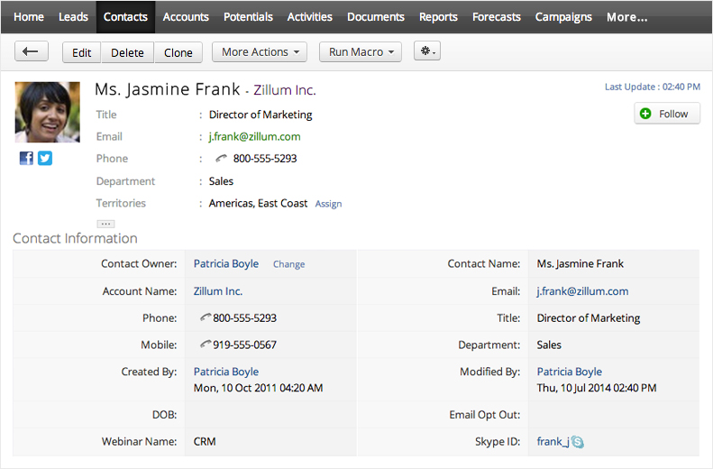
Zoho CRM now allows you to link a CRM contact with their LinkedIn profile. So you can not only very easily get their position, company, city and more – but now you will also be able to keep up to date with their business and professional activity. You can even see their picture directly in your Zoho CRM contact. You can even send a note to your contact through LinkedIn right from Zoho CRM. Webhooks make Zoho CRM even easier to integrate
We’ve had a pretty good and liberal API program for a while. But say for example, you want to update your inventory system every time you close a deal. How can you alert the external system that something just changed inside Zoho CRM? That’s what webhooks are for. Without getting too technical, every time some condition is met, Zoho CRM will send a quick message to your external system (your inventory system in this example) to give it a “heads up”. After that, more complex processing might take place through the API.
This is a major release and a major milestone for us, and hopefully you will find it exciting and useful!
Rodrigo
How can I easily take a message from someone on Twitter, Facebook, LinkedIn or Google+ and turn it into a lead record? Let's say someone contacts me and I wanted to follow up with them, but they have never been in the CRM before. How can I quickly convert and transfer their info into a Zoho CRM lead? Is there an automated way to do this? Is there another way to do this other than zapier? Thanks!
Absolutely agree with joachim.meyn: The week only begins on Sunday in the US. Everywhere else you should be able to configure that the week start on Monday.Actually I'm surprised this is not automatically changed when you change locale country.
I would really like to be able to see my recently viewed contacts with their associated accounts on the list, so that I can go back and fix something when I can't remember who it was. There is a predefined app, but it doesn't identify it with the account which makes it nearly useless.
I have the same problem. The titles are the most important part of my note - basically a summary with the details in the note. Our staff doesn't generally notice the "title" so our notes are all mixed up. I won't change to the new version till that's fixed. At the very least the "title" field needs to be moved up before the note. In addition, we need an automtic duplicate of some general account fields in the contact so we don't have to jump back and forth between screens, or have to add a duplicate field and re-enter the same info and risk not updating one or the other.
I totally agree.Please give us "back space" functionality, it's the only web based system that seems to opt out.... Very frustrating
PLEASE... How about a back space function?
I like the new look and feel of the CRM. The only issue i'm having now is when i click on the back-page arrow it does not go back to my previous page, it goes back to the home page or some other page.
dear zoho - i am still using the old version because when i go to create a new note i have to click to add a title, two steps extra - and the titles don't remember my previous titles (i generally use the same ones) so i have to type it all in manually every time instead of it being there and i just hit enter. and if i don't add a title with the two extra steps, my note has no title, so it's hard to find and i have no idea what's in there. i will not switch to the new version unless this gets changed or unless i am forced to, and then if i am forced to and this is not changed, zoho will be less useful for me, and if my sales manager asks if we should find a different crm solution, instead of saying 'no way', because i like zoho, i will be open to it.please advise
On balance I like the new interface. However There is STILL much room for improvement on the mobile Iphone and Ipad user interfaces so Android users take note even us "Apple's" are not happy ....yet ......
On the desktop/laptop interface there are still some very annoying and I am sure easy to fix UI issues that I'm amazed have not been put in place. eg When creating a new opportunity, having entered the account - why do I have to use a look up to find the contact why can't i start typing a first name and it auto enters as it does with other fields ? So simple surely.....and would make such a massive difference to an everyday user.
Pulse is great. However, if Pulse can track WHAT was changed rather than WHEN a general change was made - it would actually make sense. "Oh, Pulse says George changed some fields last night around 2am" - the obvious next question for anyone who is trying to understand the changes is "Well.. umm, so what exactly did George change?" No doubt you guys have good programmers. But if your programmers don't know what's good for customers who are in sales/marketing - nothing feasible will come out of your company.
Before I start off, I love Zoho CRM, and I like some of the features of the new UI. However, I think that a few relatively simple changes can really improve the product tremendously. I do find it frustrating that so many people want the same changes, and I was using the new UI on beta a long time ago and strongly suggested many of these and was just told that the new UI is better.It seems that many people are upset with the wasted space on the side screen while others talk of the new web 2.0 reality. In reality, heavy users will mostly be using Zoho CRM on desktop and laptops. The wasted space on the side and all of the wasted space with the spacing, the fonts, and the layout is very annoying. When you're constantly going through leads, contacts, potentials, accounts, etc..., and especially on dual screens, it does add up to a lot of time and confusion having to page up or down. I've had to really prioritize what goes on top. I'd like to see notes immediately with every item, but yet I also want to know what events or tasks are ongoing or have occured. With the default location for attachments now being with the contacts versus accounts, I have to look for them. E-mails would be good to see on the same screen shot so I could know to add notes or not. I do not know anything about programming, but it does not seem to be very difficult to allow users to set preferences and modules as to how they view the program. Many great functional features got taken away for aesthetics. I would like to see options to place "recent items" in an empty wasted space, or maybe 1 click new lead/contact/potential or calender.FYI Fit&ForgetWater- I am an Enterprise user, but I did start out as a free user with one account. It is Zoho's strategy to bring people on for free and convert them to paying customers. Should I expect less from my CRM provider since they also offer a free version?Another feature that I would love to see is some kind of tutorial program, either video or text that would explain the system and features and how to use them. I have never used CRM before Zoho, and I would have never realized the potential of CRM if I haven't a longstanding relation with a Zoho "Master" via Elance, who I pay to tell me how to set up, customize, make changes, find out the rules and set-up restrictions, and work out bugs. For example, someone mentioned being able to get lead information directly from e-mail- that would be a great time saver, but it's news to me and I can't figure out how on my own, I realize I'm a technical dummy.Lastly, ANDROID! More people have Android than Apple, why do we not have an app!?!?! When they introduced an app for Apple, I was excited even though many Android users were upset. I figured an Android app had to be along shortly. That was months ago! So now the interface is not only optimized for smartphones and tablets- a minority of users-, but specially for Apple?I feel better now.
This is hands down one of the best cloud CRMs out there. Easy to use, easy to customize, integrated email blasts, campaign management, templates, workflows - are you serious?! Well done.
I am looking forward to better linking of CRM and Books
The new look is clean which is great, however I like the wider screen view in the old version. I work on a 23 inch screen so have plenty of real estate, it is a shame that Zoho can't take advantage of it.
I have been using the beta version of the new UI for few months and this final version is really great. We came over from the big boys on £BigMoney per month to a smaller quirky platform independant ZohoCRM. For what we are paying £Peanuts per month, what we get is EXCEPTIONALLY GOOD. I am actually quite surprised that so many people using the FREE version feel FREE to complain without contributing to the upkeep of the company and the FREE software they just keep on using FREELY. I’m part of a business as well and really; everybody needs to pay a fair price for products, otherwise everybody soon suffers, and then nobody can make money in business.Having said all that the UI is clear and fresh looking, uncluttered and easy to navigate, the old was too crowded (with strange colours), working from a desktop or laptop is no problem, though when I get time I may change the layout a little to make better use of the space. The thing is, the more tightly you pack things into the space, the busier it all begins to look. So it is a trade off between the clean look and wide perspective viewing. Fortunately we are using standard (non wide screen) monitors so it works well for us. We are hoping to implement the forms into the website next so that we can generate lead data directly into zoho from our site apart from email.While I’m on the point of emails, another great offering without the clutter of adverts and a real (non big brother) approach to privacy, so once you delete it, it’s gone as opposed to other email providers. The email module for CRM works well and looks equally slick in the new UI, adding contacts and leads directly from the email is a breeze.Zoho has been a revolution in CRM for us and am so glad your still trying to improve it. Randal and Brian Plants comments on the 16th Dec 2011 are good ones and really would raise the stakes in the CRM world if you could get them added in the next update.In the words of a famous burger chain, I'm loving it....Thanks
Initially, I preferred the old interface for productivity--I am reluctantly getting used to the new one. I agree with the complaints about font sizing, excessive line spacing, and scrolling. Finally, Zoho is still very clunky when it comes to creating tasks, events and reminders. It just takes way too long. I don't want to do it, and it's impossible to get my people to enter all their info, all the time.
I've been using for quite some time now,
introduced it even with a couple of projects. The
new UI is okay, but some things are not as they
should be:
1. The search field belongs on the top left, not
the top right
2. The calendar is okay to the US everywhere else
the week starts on Monday not on Sunday, this
should be configurable
3. The Outlook plug-in allows only very small
attachments, this is no longer realistic. Today a
size of up to 10 MB is quite common
4. Synchronising emails the CC field is not taken
into accountJoachim
My 2 gripes are:
1. the 'Recent Items' - I preferred the one before the new UI became default i.e. next to calendar icon. The one one the left is clunky and an 'afterthought' - make it optional if you have to
2. Excessive Scrolling and clicking - just move the index to the way it was - on top
Do you do Webinar training on this CRM?
Hi, the new features look very good including notes option for most of the fields however the UI is now less intuitive and more difficult to navigate through. Search option under accounts, etc is not conveniently located where you need to click on search magnifying glass on the right and then put the desired search on the left. I am hoping the old UI version will be maintained through as it had much more logical approach. A combination of both versions would be ideal though.
This change made me lose all my connected activities. 2 months of work and now somehow I have to get it back
I find it very ahrd to read the notes on each contact. It is hard to tell where one note end and the other starts.We need clear defines between notes. Every thing is very grey. It's nearly there but needs more tweaks.Kieran
ZOHO - Allways and Forever!
Congratulations!
Hi - really love the linked in profiles, and cant wait to see all the other main social media links such as twitter and facebook (are these in the pipeline?).I notice that some of my linked in contacts photos are not coming through and some are. I tested it on mine also on my record and my photo is not coming through either.Is there a setting I should be changing? Overall I like the new changes, but do agree that to scroll down so much can be time consuming.
Question - I would like to tag an email directly to a potential record so that all relevant emails in connection with the potential are all together. Otherwise when working on a potential contact I keep having to go to different contact records, and sometimes other users may not which particular contact record to go to. Can you help on this or is there a work around you can suggest as I believe salesforce.com manage this with a bcc field. Many thanks and look forward to reply. Kind regards. Eileen
Please keep it simple. Just let me see customer info and type my own notes, date, time stamped and who wrote the notes. Then we need to QUICKLY schedule my next call visit etc also let me set up QUICKLY a reminder or alerts and allow me to send a QUICK text or e mail to someone else. this is the most basic need of anyone in business. Don't make it cumbersome. Zoho can be too "clunky" too many time consuming steps. Let people in SALES work with the developers.
What about validation rules? I am evaluating Zoho CRM as a possible replacement for our old CRM where there is a number of data validation rules that I may need tomigrate across
And fix that products/services section. Three popups (product and price book and discount) with 10 items ! And total discount is not REFRESHING when changing items in quotes, inovices etc - causing incorrect quotes - sent to customers.
I have been fortunate enough to be one of the early testers. From the comments I see above with concerns I think that after you work with the new UI you will be pleased.It is possible to customize the compact/business card view to show the fields you want to see. This is VERY helpful in reducing the amount of scrolling.Also, the search feature is greatly improved.The one feature I really liked that seems to have disappeared is the ability to set reminders for tasks. I can send myself an e-mail notification of the task, but I cannot set a reminder (not sure if this is because I am using the Free version now when I used to use the Enterprise edition)
I just dont understand why there is not an android app for zoho. ?? I thought that wouldve been one of the announcements.:)
Also I want to say that the iPhone app works great for me. It was a big reason I came back o Zoho after leaving and trying other CRMS. Way to go. Please keep improving on it.
I don't know what everyone's problem is with the margins. It's web 2.0 people...move on. I've been a user for nearly 3 years and I love the new Zoho. Two things, if I may: 1. Please find a way to bring back the "Recent Items" list. It was in the BETA version but gone now. 2. I love the LinkedIN integration. What a nice surprise that was. It would be great if after the LinkedIn profile has been verified, that the profile image of the contact would then appear in the contact screen. Having to keep clicking on the LinkedIn button to see the contacts face doesn't make a lot of sense to me. That's it though. Great job on the overhaul!
The Linked IN feature is interesting and potentially useful. However, please consider the practical nature of what the user may want to do with this:We are a small user, with over 3000 contacts. If I tell my sales and marketing people to find out which contacts have a Linked In account, it appears we have to go through all 3000 - one at a time and associate the record with ZCRM. There will be resistance - so it will not get done.If we do diligently search and associate new users, there does not appear to be a way to report or track who has a Linked In account. I was not able to find any "Linked In" fields in the columns lists that would allow for a "View List" or "Report" to be generated. Therefore, we have not practical way to track or monitor this activity.As a cmpany, we are not interested in our users doing the activity because it is "cool". We are only interested in the time investment if it is useful to the customer and our business. Tracking and reporting is required to determine the value of the activity. Without data, it is an exercise that is difficult to quantify the ROI.If there are fields available that will enable tracking and reporting - please advise where they are, but we could not find them.Suggestions:Put some type of data tag field in place so View Lists and Reports can be generated.Include a Time Stamp and Created By stamp connected to the activity. So we can track who and when.Implement a Mass Udpate/Calculate function, that allows us to process groups of contacts to complete the Associate Function. There will be a significant amount of rejections because of the variable nature of the records Linked In vs ZOHO. But an orderly, report driven, search and associate process would be much better than doing this one at a time.Thanks.
I am excited ..........
Is there anyway to chance the spacing in each field - each field takes up two full lines and makes you scroll down to see thing. Really need to be able to change the font and spacing of each line. The new way makes it TOO HARD TO USE...
Margins blow, cause too much scrolling. Also please move the search box back to the left side - top far right doesn't cut it.Going to try out Follow to see what it's all about.
Honestly, I solely use Zoho for relationship management and tasks for each account. I prefer the old version - the new one requires you to "show details" before you can see a phone number, email, etc and requires you to click "show all notes". When getting transferred a call and pulling up an account, you need to have that information immediately - a few extra clicks does make a difference.
Integration with the smartphones still sucks. In the Blackberry app you can't even cut and paste content into it. If you want to make a To Do List in a task, there is no way of hitting enter to go to the next line. Turns into one long unhappy sentence.
What about such a basic thing as multiple calendars in CRM linking with the smartphones? Pretty basic thing I would think in the business world.I really wonder when I see all these Gizmo Apps that Zoho spends time to develop and comes out with where there head is??
How do I copy contacts LinkedIn photo to Zoho?
Please LISTEN to your customers. As Aaron says, the vertical padding and font sizes are ridiculous. Love the new design and features BUT please stop me from having to scroll down to see my information!!!!
It is a waste of time.
loving the new zoho, great look, and very easy to use. keep up the good work!
süpeeer
Almost every feedback comment lately has told you to go back to a wider screen so scrolling is minimized. I received a reply from support saying the new way is better. Obviously it is not what your customers want, why are you refusing to listen? We want less scrolling and less wasted space on the margins.
We are very excited about all the new updates, especially Pulse and the LinkedIn integration. We've been ZOHO customers for almost 3 years and I'm thrilled about the new look and functionality of the CRM. However, it would be nice if it stretched to a wide screen view so that less scrolling was required.