Reimagining charts in Zoho Sheet: Smarter, faster, and more flexible

Great charts don't just visualize numbers—they communicate insights, highlight trends, and break down complex data into digestible snapshots. At Zoho Sheet, we are constantly enhancing the charting experience to help you create meaningful charts.
The latest version introduces support to dynamic data ranges, fine-tuned customization over individual chart elements, and a sleek 3-tab UI (Data, Design and Format) for an intuitive charting experience.
Create charts that tell your data story
Selecting the appropriate data range is crucial to create precise and meaningful charts. With the latest update, you can now create charts with named expressions, named ranges, tables, and formulas, in addition to the static data ranges that you're used to. Static ranges are suitable for stable data while dynamic ranges like named expressions and tables, offer flexibility for evolving datasets. The choice of the data range depends on whether your data remains stable or expands.
In addition, we're extending dynamic data range support to the chart elements like title, subtitle, legend, and more. Every element can now be referenced to cells containing values or even formulas, which ensures they get updated whenever the underlying reference changes.
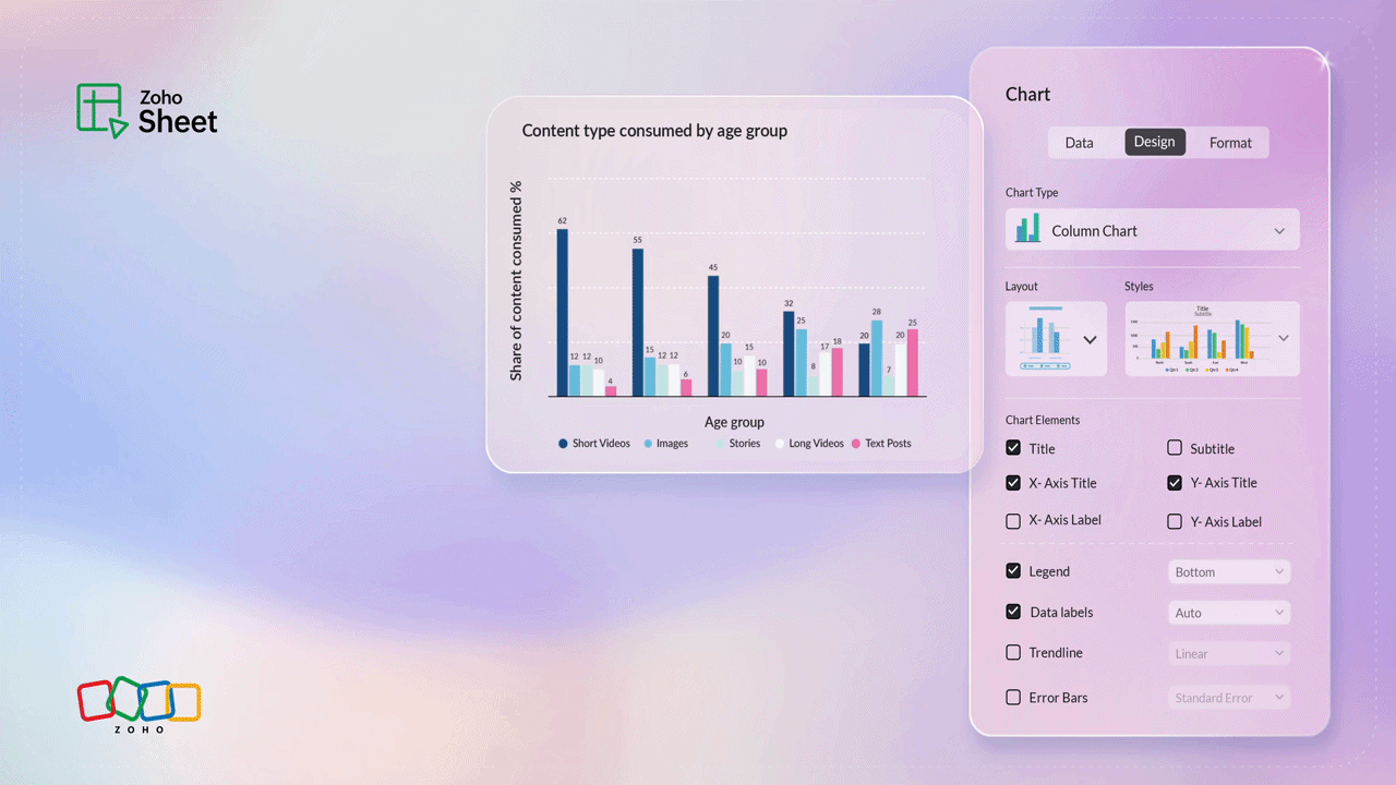
Customize every element
Zoho Sheet now offers advanced customization options that give you fine-grained control over the design of your charts. Imagine your charts like a canvas, and you have a full set of colors and brushes. From subtle shadows to borders, margins to precise styling, every detail is in your hands. And the best part? You can apply these customizations for the individual chart elements—title, subtitle, area, series, trendline, data labels, and axes—and edit them anytime quickly by double-clicking the element inside the chart.
Animated race charts—now even better
Race charts have always been a great choice to visualize the progress of data over a given period of time. With the new version, you don't just compare numbers but create engaging race charts—move through your data with a timeline slider, add images for better context, and display total labels for complete insights.
Locate your charts instantly
What if you could land on a specific chart, without scrolling through the sheet to find it? The new navigation panel makes it possible by listing all the charts created in the spreadsheet. You can simply click on the chart name to go to the chart directly or manage it right from the side pane.
Intelligent auto-resize
Whether you're trying to fit in your chart within a dashboard layout or expanding it for a detailed view, the chart elements can now intelligently adapt to any size.
Faster and smoother loading
Sheet's improved rendering capacity will help ensure that charts render quickly as they enter the screen, for a smooth and lag-free experience, no matter how many charts are in your sheet.
Upshot
Together, these updates mark the a new step forward in transforming the way data is visualized inside Zoho Sheet. Going ahead, we're working on making charts more intelligent, insightful, and impactful.
Try out these latest enhancements and tell us in the comments what you loved the most!


Comments