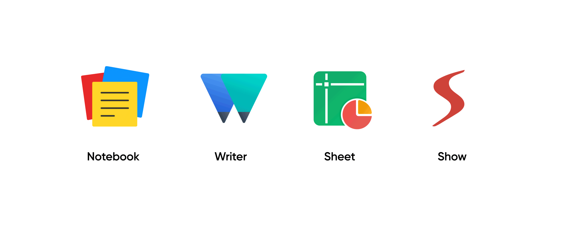
Your favorite Zoho office suite products—Writer, Sheet, Show, and Notebook—are getting new, refreshed logos.

When we first launched Writer—Zoho's first cloud app—we knew it was going to be an uphill climb to build a familiar, yet uncompromising office experience on the web. Now, more than a decade later, our word processing, spreadsheet, presentation, and note-taking apps stand among the best, with tens of thousands of documents created every day.
Starting today, we're bringing new design updates to our office apps to create a refreshing, unified experience across the suite, and the first of these updates are new product logos.

Embracing Logolinism
If you use multiple Zoho apps, you've likely already noticed our new line-based logos on other apps. This is based on our new design language, Logolinism, which embraces simple, linear shapes to create easily recognizable product metaphors.

The minimal, understated nature of the design—which we believe truly reflects the Zoho brand itself—also gives us more flexibility to adapt our logos across multiple platforms, media, and color palettes.
These new changes are rolling out across the Writer, Sheet, Show, Notebook and WorkDrive web and mobile apps as we speak. We'll be back with more design updates for the office suite, as well as complete insights into Logolinism and our process behind it, in the coming weeks.
We know design is a highly subjective experience, and since you're seeing these changes with a fresh perspective, we at Zoho would love to know what you think. Post your thoughts about the new designs in the comments below!?
Do more with Zoho: You can now use Writer, Sheet, and Show as part of our cloud-based office suite and other collaboration tools by signing up for Zoho Workplace or for Zoho One.
very usefull
Hey there, glad you found it helpful. =]
Love the logos so much that it is inspiring me to change mine! Is Logolinism available as another Zoho Application :)
Thank you so much, Ravi. We didn't think about it being an app. But we'd be more than happy to take a look at your designs, and pass on our inputs as well. =] Let's connect via Twitter? :)
Nice, also good to see some uniformity to all the many app UIs. Quaint that you would not start with the company logo though to signal this new direction, but guess it's smarter to learn from doing all the other logos to get the most important one right :) Not seeing Show or Writer anymore in the Zoho one launcher though?
Thank you so much, Bram. You're right. We did learn a lot while implementing the design for the 45+ different products we have. We're still learning. :) Our customers identify us with the four blocks and their colors right now, and we'd want to make sure we get the company logo just right when we make changes with that. =] Regarding the Zoho One launcher, it was an error from our side. The fix is going live very soon. Until that, please use writer.zoho.com, sheet.zoho.com, and show.zoho.com to visit the editor dashboards directly. Sincere apologies for the inconvenience.
I love the design concept. Going minimal is awesome, but what about Zoho's logo? It's still in 3D.
Thank you so much, Samuel. You're right, it's still in 3D. As of now, our primary goal is to bring Logolinism to the product logos first. Being a 45+ product company, we're still working hard on achieving that target first. We do not have any immediate plans to change the Zoho logo, yet. :)
Wonderful job. Love the design and concept. Cheers to you all, Zoho team.
Thank you so much, Dinesh! Have a great day! =]
this is better of course
Thank you, Maged! Glad you liked it :)
I'm new here, and I like the new logo for Zoho Sheets, the only logo I've known for Sheets.
Welcome to Zoho, Dave!:)
Awesome! Awesome! Awesome!
We're stoked you like it, Rupe! Thank you so much! :)
Nice job, awsome thought and remarkable design of the logo
Thank you so much, Deepak! =]
Software
Nice job Zoho! Not only do the logos look and feel great, but the communication of the evolution of the design language is spectacular. Keep making great products for us to use and keep up the great branding. Our company loves everything you do.
Thank you so much! You made our day!:)
thanks you
Glad you liked it, Ian :)
thanks