
- What is finance data visualization?/a>
- Why you should use data visualizations for financial data
- Data visualization types used in finance
- 6 financial data visualization examples
- Top 3 data visualization tools for finance in 2026
- Best financial data visualization tool: Zoho Analytics
- Get started with financial data visualization: A practical roadmap
- What's next for your finance data visualization journey?
What is finance data visualization?
Finance data visualization is the process of representing financial data in visual form, including charts, maps, graphs, and interactive dashboards. Instead of wrestling with complex spreadsheets, you can convert numerical data into accessible visual formats that reveal insights at a glance. This is where data visualization becomes a competitive advantage.
Why does this matter for your business? Visual representations help you cut through information overload and highlight patterns that might otherwise stay hidden in raw data. Studies show that approximately 65% of people are visual learners, which makes visual financial data particularly effective for improving understanding and driving better decisions.
Here's what finance data visualization can do for your business:
- Turn complex financial data into accessible insights
- Spot outliers and patterns more easily than in spreadsheets
- Summarize large quantities of information from multiple sources
- Communicate clear messages without requiring financial expertise
- Support faster, more informed decision-making
What makes this approach so powerful? The human eye naturally identifies patterns and distinguishes colors, making it much easier to spot trends and relationships in visual formats compared to numerical tables.
For finance teams, data visualization isn't just about creating attractive charts; it's about making financial insights accessible across your organization. According to the Agile Finance Revealed report by Oracle and the American Institute of CPAs, top-performing finance leaders prioritize data visualization skills more than their peers. This capability helps finance teams evolve from “expense control, spreadsheet-driven accounting and reporting centers into predictive analytics powerhouses that create business value”.
Visual financial data also improves communication within your organization. Instead of presenting reports filled with numbers, you can engage audiences with compelling visual representations that make complex information accessible even to those without financial backgrounds. As interactive data visualization becomes more common, teams gain deeper clarity and faster insight.
With markets becoming increasingly volatile and data-driven, mastering financial data visualization has become essential for professionals who need to rapidly identify trends, validate assumptions, and adapt strategies in real time.
So how do you get started with finance data visualization? Let's explore why visual representations of financial data provide concrete business advantages.
Why you should use data visualizations for financial data
Finance teams today generate more data than ever before. But creating attractive charts isn't the real goal; it's about gaining concrete business advantages that drive growth and improve how you operate.
Here's what happens when you start visualizing your financial data.
Improves clarity and understanding
Financial data visualization cuts through complexity and makes information accessible to everyone, regardless of their financial background. Studies show that 90% of information transmitted to the brain is visual, making visualization the most effective method for understanding financial data.
Since most people are visual learners, representing financial information graphically makes it easier to understand and remember. Good visuals can explain complex concepts that would otherwise require pages of reports to communicate. When you transform numbers into visual stories, stakeholders can grasp key insights quickly without getting overwhelmed by spreadsheet details.
Helps spot trends and outliers
Here's where financial visualization really shines: revealing patterns that stay hidden in raw data. Interactive visualizations make it much easier to spot trends, identify outliers, and detect anomalies that might signal potential problems or opportunities.
When you visualize financial data properly:
- Patterns and relationships become immediately apparent
- Anomalies that might indicate fraud or errors get detected quickly
- Historical comparisons reveal long-term trends and seasonal patterns
- Correlations between different financial metrics become visible
Supports faster decision making
Opportunities and risks can emerge and evolve within seconds in volatile financial markets. Data visualization tools help finance professionals make rapid, informed decisions based on real-time insights.
Modern data visualization tools enable on-the-fly analysis, letting you explore data from multiple angles and test assumptions instantly. The result? Visualizing financial data reduces the time needed for forecasting and planning while improving decision-making efficiency.
Enhances communication with stakeholders
Nobody wants to read through dozens of pages filled with numbers. Financial data visualization bridges the gap between finance teams and other stakeholders by presenting complex information in an engaging, easy-to-understand format.
Effective visual representations help tell financial stories by organizing data and highlighting important information. This storytelling approach guides executives and non-finance users through key assumptions, risks, and constraints while keeping their attention and encouraging collaboration.
The bottom line? Finance data visualization changes how organizations communicate about money, making financial insights accessible to everyone from executives to operational teams. This leads to better-aligned decision-making across your entire organization.
Now that you understand why financial data visualization matters, let's look at the specific types of visualizations that work best for different kinds of financial analysis.
Data visualization types used in finance
So which chart type should you use for your financial data? The answer depends on what story you're trying to tell. Each visualization serves a specific purpose in financial analysis and reporting.
Line charts for trends over time
Line charts connect individual data points with straight lines to show financial trends over specific periods. They work best for time-series financial data such as stock prices, revenue fluctuations, or profit margins. Line charts typically display closing prices in finance, filtering out noise from less critical times like open, high, and low prices.
Financial analysts prefer line charts because they clearly identify trends, support historical analysis, and help with strategic decision-making.
Bar and column charts for comparisons
Bar and column charts use rectangular shapes whose length corresponds to the values they represent. These charts excel at comparing financial metrics across different categories or groups.
When should you use which? Bar charts work better with long category titles and numerous data points, while column charts are preferable for time series data since people naturally view time on the horizontal axis. Both types can be stacked to show how components contribute to a total, making them ideal for displaying percentage breakdowns in financial reports.
Heatmaps for pattern recognition
Heatmaps use color coding to represent value intensity, helping you quickly identify patterns in complex financial datasets. Each cell in the matrix gets a color based on its value, with darker colors typically indicating higher values.
Financial professionals use heatmaps to establish relationships between variables, analyze large datasets, and identify concentrations or patterns that might not be visible in traditional charts. They're particularly valuable for analyzing correlations between large datasets with many variables.
Scatter plots for correlation analysis
Scatter plots display values on both x and y axes to reveal relationships between two variables. In finance, they help identify correlations between metrics like sales versus expenses or stock price versus market index.
A visual inspection of scatter plots lets you detect positive, negative, or null correlations. For instance, a scatter plot comparing Nike stock versus S&P 500 would show a positive correlation as both values tend to increase together.
Stacked area charts for composition over time
Stacked area charts combine elements of line and bar charts to show how multiple components contribute to a whole over time. They're excellent for displaying cumulative totals while revealing how different categories contribute proportionally.
In financial contexts, stacked area charts effectively show revenue breakdowns by product lines, market segments, or geographic regions over multiple periods. They help identify which segments are growing faster and how the composition of a total changes over time.
Now that you know which chart types to use, let's look at specific financial dashboard examples that put these visualizations to work.
6 financial data visualization examples
Finance data visualization comes alive through specialized data visualization dashboards that turn raw numbers into actionable business insights. These six essential dashboard examples help finance teams make better decisions faster.
For a concrete build using a live QuickBooks connection, see our guide on building financial reporting dashboards from QuickBooks data, which walks through the P&L, cash flow, AR aging, and revenue views that most finance teams need.
Financial statement dashboard
Financial statement dashboards give you a complete view of your organization's financial health by pulling data from multiple sources. These visuals combine key performance indicators like revenue by division and operating margins over time into one unified view.
What makes these dashboards valuable? They give executives immediate visibility into company performance, with the ability to drill down from high-level KPIs to detailed breakdowns. You can customize these dashboards to analyze specific variables like expense types and get real-time revenue and expense forecasting.

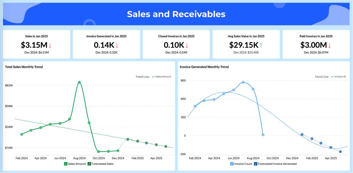
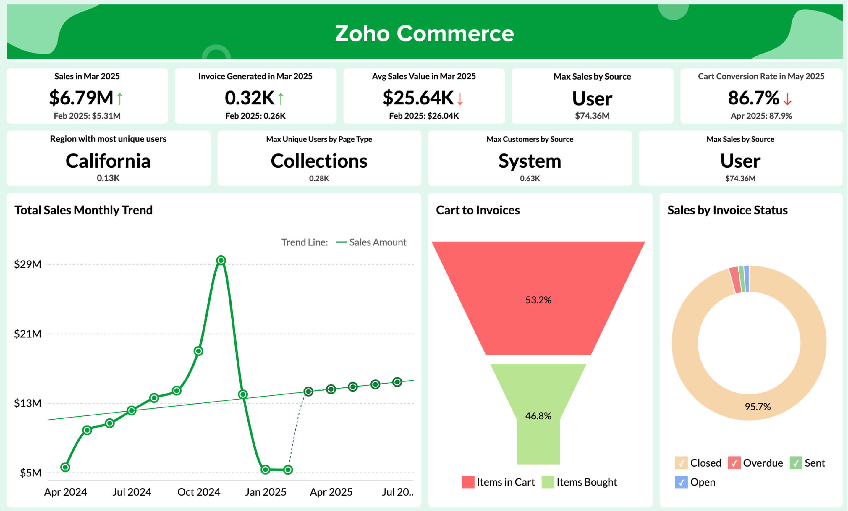
Sales and receivables dashboard
The accounts receivable dashboard tracks all your crucial accounts receivable (AR) metrics in one place. You can see overdue receivables, cash on hand, days sales outstanding, and aging of receivables at a glance.
With graphical representations of unpaid invoices and payment trends, your finance team can quickly identify which customers have the largest outstanding balances and spot seasonal payment patterns. The best AR dashboards let you filter and sort data to get focused views of accounts receivable, supporting customer payment analysis and financial planning.
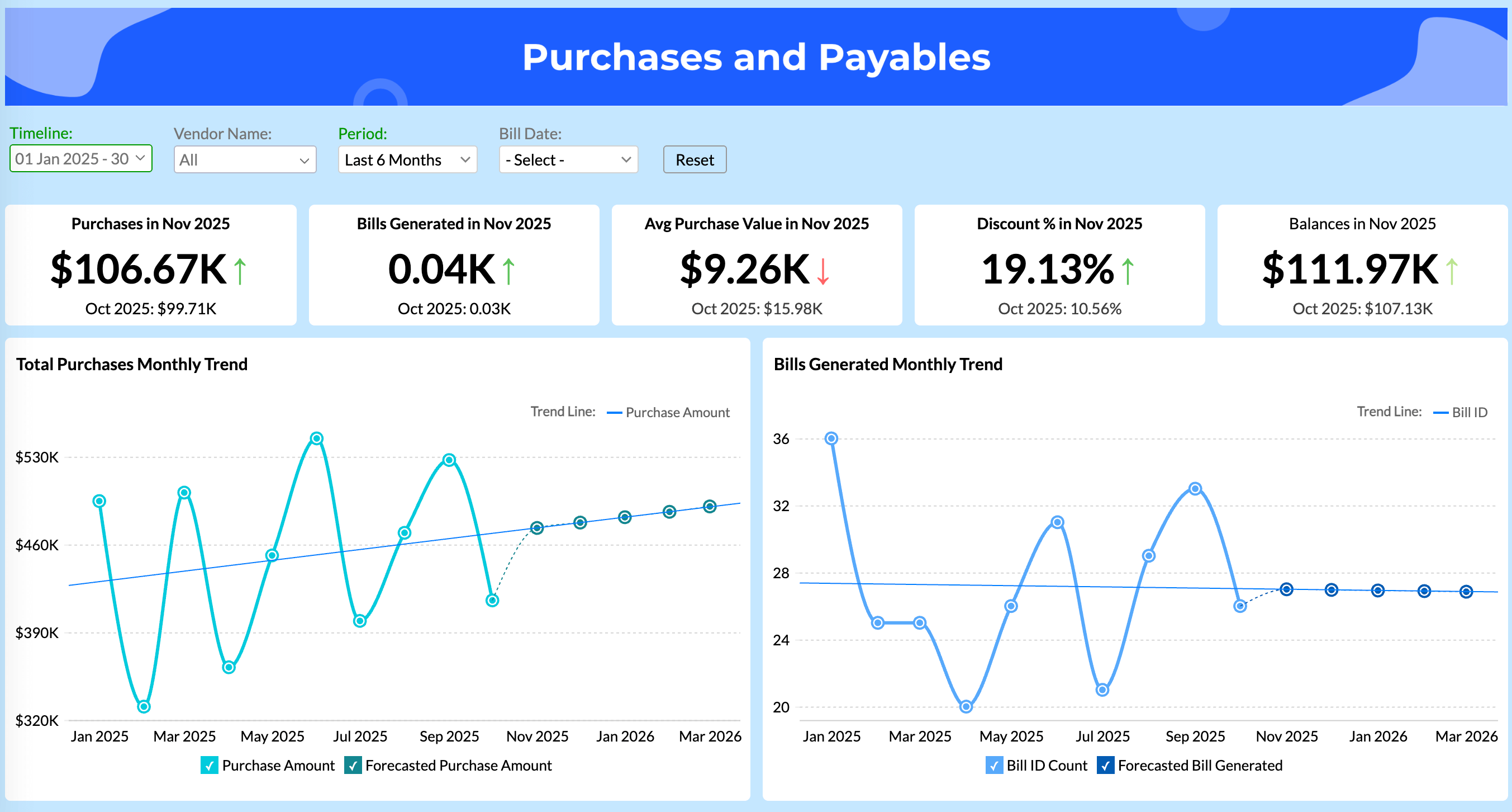
Purchases and payables dashboard
Accounts payable dashboards help your AP team monitor vendor bills and payment obligations. They show total unpaid and overdue amounts with clear scorecards, so you immediately understand your current obligations.
These visualizations identify your top vendors by outstanding balances and show the distribution through interactive charts. The accounts payable aging report breaks down overdue amounts by time periods, helping you prioritize which bills need immediate attention. Smart accounts payable dashboards help you optimize payment schedules while keeping vendor relationships strong.
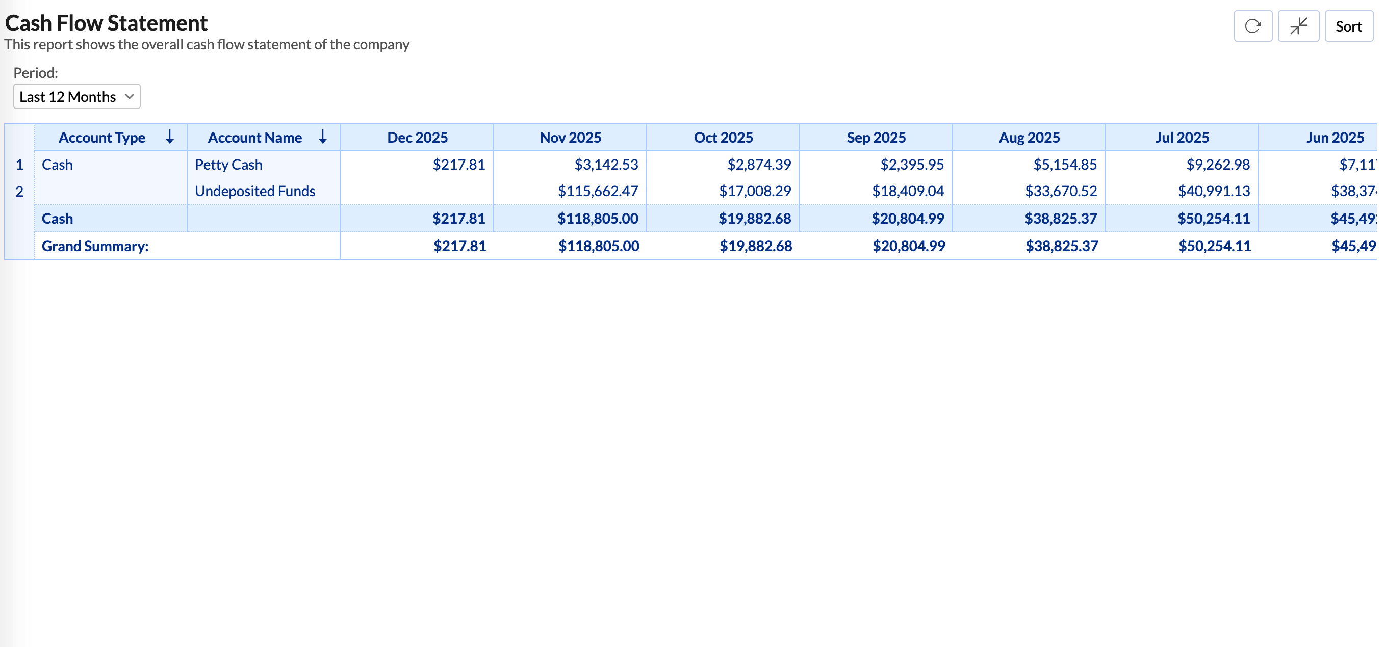
Cashflow and Balance sheet
Cash flow dashboards show real-time data about your business's immediate spending power. They include essential metrics like cash on hand, cash conversion cycle, and gross profit margins.
Balance sheet dashboards let you analyze your overall financial condition as you close the books each month. These typically show nine key performance indicators: current assets, current liabilities, working capital, liquidity ratio, and debt-to-equity ratio.
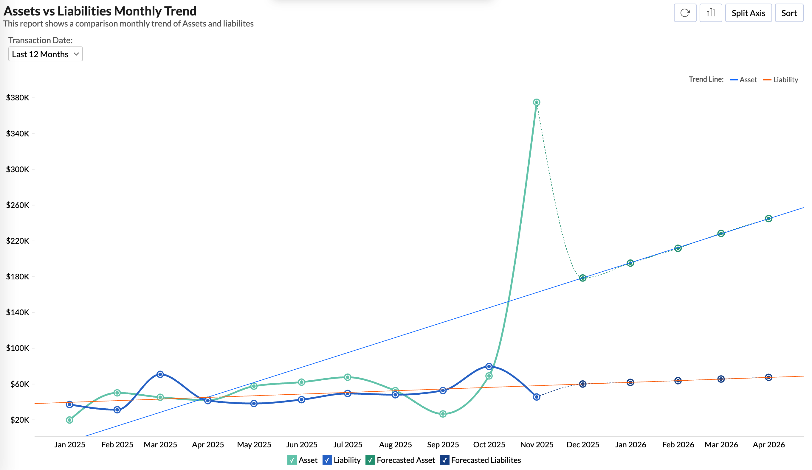
Assets and liabilities
Assets and liabilities dashboards visually represent your company's resources and obligations. Effective visualizations separate current assets (cash, receivables, inventory) from non-current assets (property, equipment).
These reports help stakeholders quickly assess financial position and stability without digging through complex numerical data.
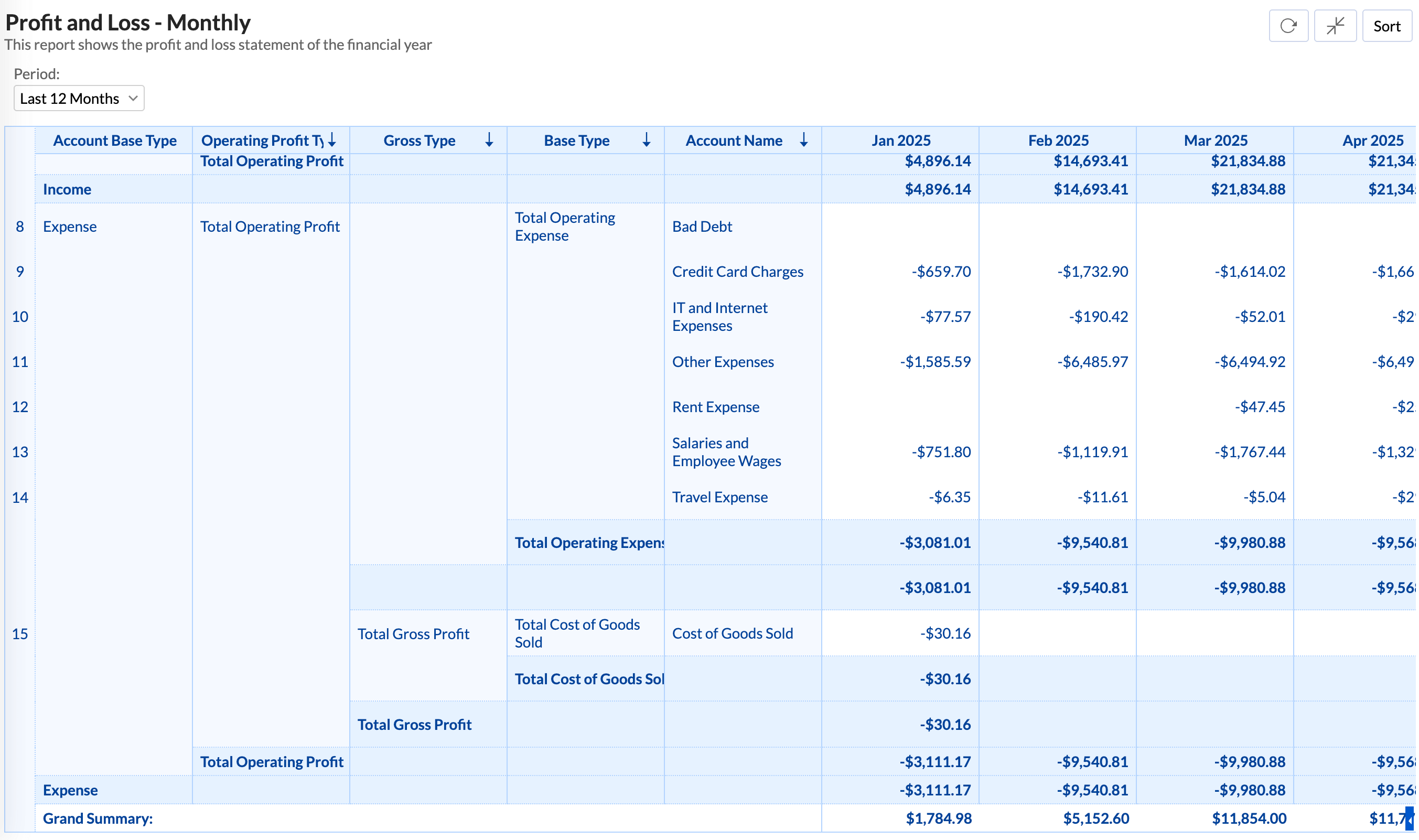
Profit and loss
P&L dashboards summarize your expenses, revenues, and costs throughout the fiscal year. They help management find opportunities to improve the bottom line while cutting unnecessary costs.
Now that you understand the key dashboard types, which tools can help you create these visualizations for your business?
Top 3 data visualization tools for finance in 2026
We bet you've probably searched for the perfect finance visualization tool or data visualization software and found dozens of options promising to solve all your data problems. The reality? Most tools either overwhelm you with unnecessary features or fall short when you need advanced financial analytics.
However, there's good news. After analyzing user satisfaction data and platform capabilities, three tools stand out for finance teams in 2026.
Zoho Analytics
Recognized in the 2025 Gartner® Magic Quadrant™ for ABI Platforms, Zoho Analytics delivers finance-specific capabilities that actually work. With 91% of surveyed users recommending it, the platform excels in business value and predictive analytics.
What sets Zoho Analytics apart for finance teams? AI-powered anomaly detection alerts you to unusual patterns in financial data before they become problems. Try Zoho Analytics for financial analytics to transform scattered financial data into unified dashboards with real-time P&L, balance sheet, and cash flow statements.
You get 500+ data source integrations, pre-built financial templates, and an intuitive interface that doesn't require a data science degree to use.
Power BI
If your finance team already works in the Microsoft ecosystem, Power BI offers seamless integration with the Office suite. Finance departments use Power BI's data visualization capabilities to enhance income statements, balance sheets, and cash flow reports. The learning curve can be steep, but the integration benefits make it worth considering if you're already invested in Microsoft tools.
Tableau
Tableau remains the visual standard for enterprises that prioritize high-design financial dashboards. Finance professionals use Tableau to gain deeper understanding of revenue forecasting, pricing trends, and product margins.
The platform excels at helping finance teams break free from manual spreadsheet processes to deliver analytics that fuel business strategy. However, Tableau comes with enterprise-level complexity and pricing that may not suit smaller finance teams.
So which tool should you choose? Let's look at why Zoho Analytics emerges as the standout choice for most finance teams.
Best financial data visualization tool: Zoho Analytics
After examining numerous finance data visualization solutions, Zoho Analytics emerges as the standout choice for businesses seeking both power and simplicity.
This self-service BI platform has earned recognition in the 2025 Gartner® Magic Quadrant™ for Analytics and Business Intelligence Platforms for the fourth consecutive year, reflecting its growing industry authority.
Here's what makes Zoho Analytics ideal for finance teams:
- AI-powered assistant Zia for conversational analytics and automatic insights detection
- Pre-built dashboards for financial metrics like purchases, invoiced amounts, profits, and budget vs. spend
- Over 75+ pre-configured financial data visualizations ready to use
- Seamless integration with 500+ data sources, including popular financial software
- Significantly more affordable pricing compared to alternatives like Tableau and Power BI
The platform's intuitive drag-and-drop interface enables finance professionals to create insightful visualizations without technical expertise or hiring dedicated analysts. For small and medium businesses particularly, Zoho Analytics provides enterprise-level capabilities without the steep learning curve or prohibitive costs of competitors.
Try Zoho Analytics for financial analytics to transform your financial data into clear visual narratives that drive better business decisions. Its combination of powerful visualizations, AI assistance, and cost-effectiveness makes it the ideal choice for finance teams of all sizes in 2025.
But having the right tool is just the first step. Let's look at how to implement financial data visualization successfully in your organization.
Get started with financial data visualization: A practical roadmap
You've seen the benefits and explored the tools. Now comes the critical question: How do you actually implement financial data visualization in your organization?
Here's the reality: Success requires more than just buying software and hoping for the best. You need a systematic approach that addresses your specific business needs.
Step 1: Define your goals clearly
What do you want to achieve with financial data visualization? Are you managing global risk, increasing sales, or improving decision-making? Without clear objectives, you'll end up with beautiful dashboards that don't drive business value.
Step 2: Know your audience
Different stakeholders need different levels of detail. Executives want high-level insights they can act on quickly, while operations teams need granular data for day-to-day decisions. Tailor your dashboards accordingly.
Step 3: Choose the right tools
Consider factors like ease of use, compatibility with your existing systems, and customization options. Tools worth evaluating include Zoho Analytics, Power BI, and Tableau. Try Zoho Analytics for financial analytics if you need a solution that combines powerful features with an intuitive interface.
💡Tip: Read our buyer’s guide to learn about the essential features of data visualization software and how to evaluate them.
Step 4: Follow these implementation principles
As you build your visualizations, keep these guidelines in mind:
- Keep visualizations simple and clear. Avoid cluttering charts with unnecessary elements
- Focus only on essential data that supports your story
- Use logical color schemes with clear labels and titles
- Create interactive features that allow users to explore data deeply
Step 5: Invest in your team
Here's what most organizations get wrong: They assume great tools automatically create great results. Even with excellent software, your finance team's confidence and abilities with data visualization determine ultimate success.
Provide proper training. Help your team understand not just how to use the tools, but how to think about data storytelling and visual communication.
What's the outcome? Your organization can turn complex financial data into clear, actionable insights that drive better business decisions. But remember, successful implementation takes time, planning, and commitment to developing your team's skills.
Ready to put this roadmap into action? The sooner you start, the sooner you'll see the benefits of data-driven financial insights.
What's next for your finance data visualization journey?
We started with a simple question: How do you turn abstract numbers into actionable business insights that actually drive decisions?
You now have the answer. Financial data visualization isn't just about creating attractive charts; it's about making your financial insights accessible to everyone in your organization, from executives to operational teams.
Here's what you've learned:
Visual data beats spreadsheets every time. With 90% of information processed visually, charts and graphs help you spot trends, identify outliers, and make faster decisions than endless rows of numbers ever could.
The right visualization matters. Line charts for trends, bar charts for comparisons, heatmaps for patterns. Each serves a specific purpose in telling your financial story effectively.
Purpose-built dashboards deliver results. Whether you need P&L insights, cash flow monitoring, or receivables tracking, specialized dashboards give you immediate access to the metrics that matter most.
Tools make the difference. Zoho Analytics stands out for its combination of powerful features, user-friendly interface, and cost-effectiveness, especially for finance teams that want enterprise-level capabilities without the complexity.
But here's the real takeaway: successful implementation requires more than just selecting the right software. You need clear goals, the right visualizations for your audience, and proper training for your team.
So what should you do next?
Start small. Pick one financial challenge you're facing: maybe it's understanding cash flow patterns or identifying your best-performing revenue streams. Create a simple dashboard that addresses that specific need. Learn from what works, then expand to other areas.
The finance world keeps generating more data every day. Your ability to visualize this information effectively gives you a competitive advantage. While your competitors struggle with spreadsheets, you'll be making data-driven decisions that drive real business results.
Frequently asked questions
How do you choose the right financial KPIs for dashboard visualization?
- You choose the right KPIs by starting with the business decisions your team makes regularly, such as pricing, spend control, or cash management, and selecting the metrics that directly inform those decisions. It’s important to keep dashboards focused, with a clear mix of leading and lagging indicators that are updated regularly and understood across teams.
What are the common mistakes to avoid in financial data visualization?
- One common mistake is overloading dashboards with too many charts or metrics, which overwhelms rather than clarifies. Others include inconsistent time ranges, unclear or truncated axes, and poor use of color that hides instead of highlights trends. Another big one is failing to standardize definitions, leading to misaligned views between teams.
What are the popular tools for financial data visualization?
- The most widely used tools include Zoho Analytics, Microsoft Power BI, and Tableau. Each offers strong features for finance teams—Zoho for affordability and ease of use, Power BI for Microsoft-integrated environments, and Tableau for advanced interactivity.
Can you visualize real-time financial data with Zoho Analytics?
- Yes, Zoho Analytics supports real-time or near real-time visualization when connected to live databases. For most SaaS tools like Zoho Books or Xero, you can schedule frequent syncs. It also offers alerting and automation to surface changes as soon as they happen.
What are the top data visualization tools for my startup’s financial reports?
- For startups, Zoho Analytics is a great choice due to its cost-effectiveness and built-in financial templates. Power BI is strong if you’re already using Microsoft products, and Looker Studio is helpful if you want a lightweight, free option tied to Google tools.
What are the best practices for creating a unified data visualization for HR and finance?
- To unify HR and finance data, start by aligning on shared dimensions like departments, locations, and time periods. Use consistent definitions for metrics like headcount, payroll, and cost centers. It’s essential to apply role-based security to protect sensitive information and to design executive summaries that highlight joint impacts, such as cost per hire or ROI per team.