- HOME
- All Products
- How interface design shapes collaboration, productivity, and security in modern workplace suites
How interface design shapes collaboration, productivity, and security in modern workplace suites
- Published : April 24, 2026
- Last Updated : April 27, 2026
- 354 Views
- 21 Min Read
A comparison of the UI/UX in Zoho Workplace, Google Workspace, and Microsoft 365 for everyday work
Most workplace comparisons talk about features, pricing, or storage. Very few look at the layer your employees actually live in all day: the interface.
In most enterprises, “work tools” are defined by domains.Sales lives in the CRM. Support lives in the ticketing tool. Finance lives in the ERP. Developers live in the code repo and issue tracker. HR lives in the HRMS.But day to day, none of these tools are the first window people open. The real starting point is the workplace suite: mail, calendar, chat, and files, and it’s different from almost every other enterprise tool. It’s domain and department agnostic.
A modern workplace suite is no longer “just email plus a few extra apps”. Zoho Workplace, Google Workspace, and Microsoft 365 all ship the same basic bundle: enterprise mail, calendar, chat, video meetings, cloud storage, online editors, and an admin console. On the surface, their mail screens look almost identical: a list in the middle, navigation on the left, and a reading pane on the right. The differentiation is in how the interface arranges it: search vs. structure, email as hub vs. email as stream, one shell vs. many apps, calm vs. busy, hints vs. hand-holding.
To compare these suites in a way that matches how people actually use them, it helps to stop thinking in terms of “features” and instead look at what is literally on the screen. Every workday is a series of screens: the first page you land on, the inbox you live in, the actions available in one click, and the way you find old work.
1. Home and app navigation
At a high level, all three suites use the same three navigation elements:
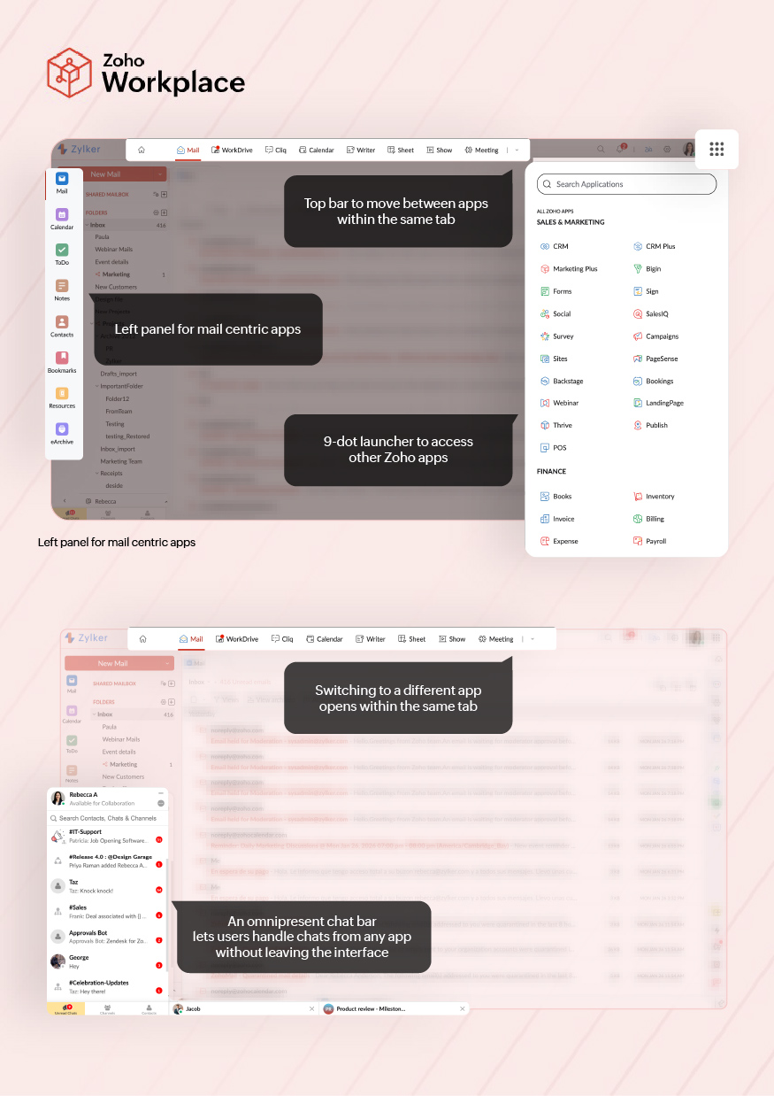
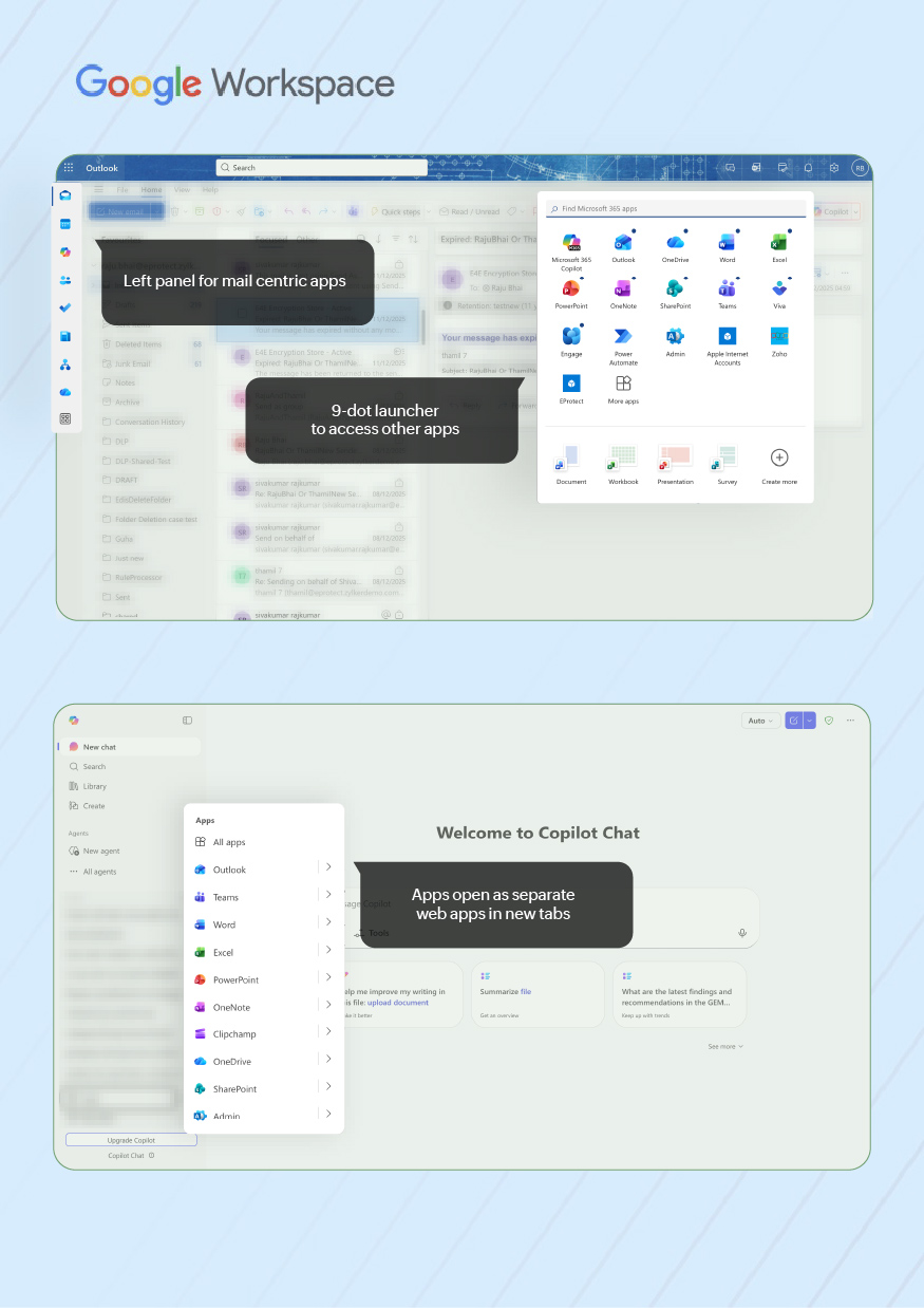
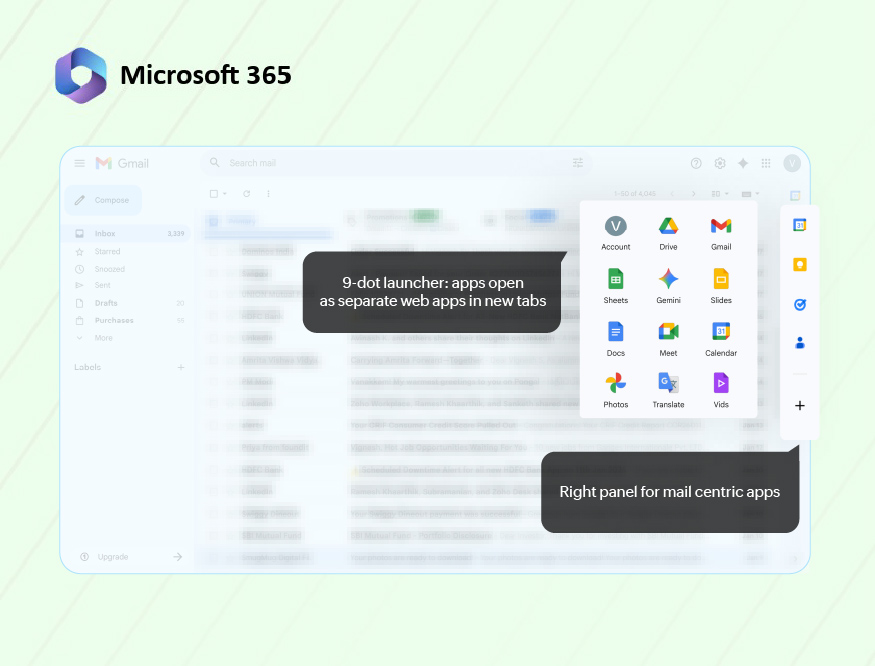
- A 9-dot app launcher (full ecosystem): Opens the wider suite or vendor ecosystem: all mail, collaboration, storage, and business apps available to that account.
- Top bar (suite-level context): Indicates which major suite app you’re in (Mail, Calendar, Chat, Files, Docs) and often provides a way to jump between them.
- Left panel (in-app navigation): Handles local navigation inside the current app: folders and views in Mail, sections in Calendar, or people and channels in collaboration tools.
Zoho Workplace, Google Workspace, and Microsoft 365 all follow this pattern, but they differ in what they treat as “home”, how configurable that home is, and whether Mail behaves like a self-contained work hub or just one app among many.
| Zoho Workplace Zoho implements a two-level home: customizable Workplace dashboard for suite-wide overview and Zoho Mail as the primary personal work surface. | Google Workspace | Microsoft 365 |
9-dot launcher (ecosystem) |
|
|
|
Top bar/suite home
|
|
|
|
Left panel inside mail |
|
|
|
Notifications | There are two visible attention points.
| The notifications are inbox-centric.
|
|
2. Inbox layout
Across Zoho Workplace, Google Workspace, and Microsoft 365, the inbox screen is basically the same three-zone layout:
1. Navigation zone: Shows folders/labels/filters/views and tells you where you are (inbox, a project folder, “Focused”, “Promotions”).
2. Message list (center): Shows a scrollable list of conversations with sender, subject, snippet, time, and small icons (attachments, flags, categories).
3. Reading/detail pane (right or bottom, or full screen): Shows the opened message or thread. Hosts the reply box, toolbars, and any extra actions (turn into task, meeting, rule).
All three also have a search bar at the top, a way to adjust density (how tight the rows are), and a way to group/split the inbox.
Structurally, they’re almost identical. The only real differences are how heavy or light the list looks, how they split work (tabs vs. focused vs. filters), and how much extra information they pack into each row.
Aspect | Zoho Workplace | Google Workspace | Microsoft 365 |
Density and visual load | Medium density by default. One row per conversation with sender, subject, snippet and a few icons (flags, attachments).
List isn’t overloaded; visual weight sits between Gmail and Outlook. | Lightest by default. More whitespace and fewer icons per row.
Category tabs and labels carry some of the organizational load, so the main list can stay visually simple. | Heaviest by default. Rows can show avatars, flags, categories, preview lines and Focused/Other state.
Optimized for large or shared mailboxes where more status per row is needed. |
Layout configuration | Reading pane can be placed right, bottom, or disabled, and resized.
Users can toggle date grouping (Today, Last 7 days), conversation view, and some view options, but column-level controls are limited. | Quick settings expose Display density (Default/Comfortable/Compact), reading pane (right/below/off), and inbox type (Default with tabs, Important first, Unread first, Priority, Multiple inboxes).
Category tabs and label visibility are configurable. | Layout is highly configurable: reading pane right/bottom/off, number of preview lines, Focused Inbox on/off, conversation vs. single messages, and which indicators are shown in the list.
Designed to support different view presets for heavy mail users. |
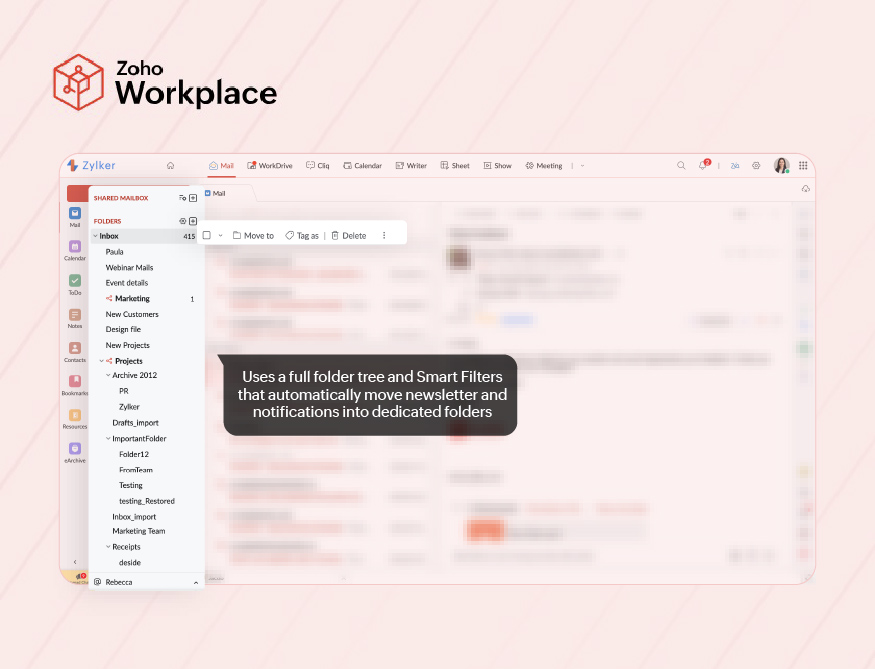
Distinct/unique layout choices | Uses a full folder tree plus Smart Filters that automatically move newsletters and notifications into dedicated folders, so bulk mail is separated without tabs.
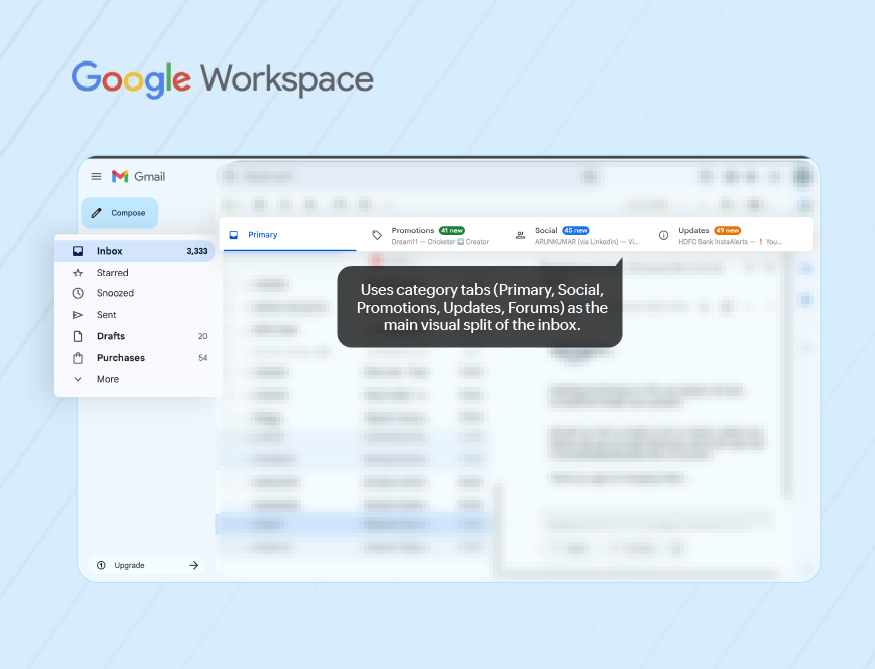
Date grouping headers give time-based structure inside the list. | Uses category tabs (Primary, Social, Promotions, Updates, Forums) as the main visual split of the inbox in Default view; machine learning routes incoming mail into these tabs.
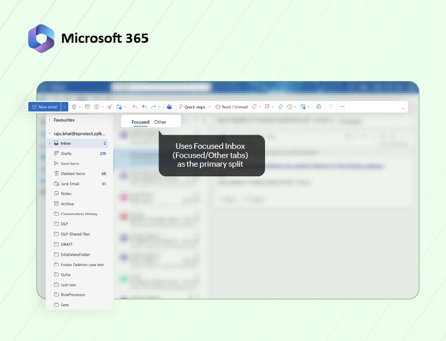
Conversation view is on by default and heavily used. | Uses Focused Inbox (Focused/Other tabs) as the primary split when enabled, plus richer row markers.
Often combined with shared mailboxes and multiple accounts, making Outlook suitable for operations or team mailboxes that need more control over how work is surfaced. |
3. Actions from the inbox screen
Once a user is looking at their inbox or an open email, the interface mainly shapes three types of behavior:
- Triage and mailbox control: How quickly and confidently users can clean up and organize the inbox from the list itself: archive, delete, move, mark read/unread, snooze, and handle multiple messages at once.
- Tasking and follow-up: How clearly the UI supports “what happens next with this mail”: setting reminders, creating tasks, tracking items to closure, or marking them for later attention in a reliable way.
- Workflow integration from mail: How easily users can move from an email into the rest of their work: creating calendar events, working with files, pushing items into other tools (projects, tickets, CRM), or starting follow-up conversations in chat/collaboration spaces without losing context.
All three suites support these three types of actions. The differences are in what’s surfaced by default on the screen, how many clicks are needed, and whether email stays the main work surface or hands off quickly to other apps.
Aspect | Zoho Workplace | Google Workspace | Microsoft 365 |
Triage and mailbox control
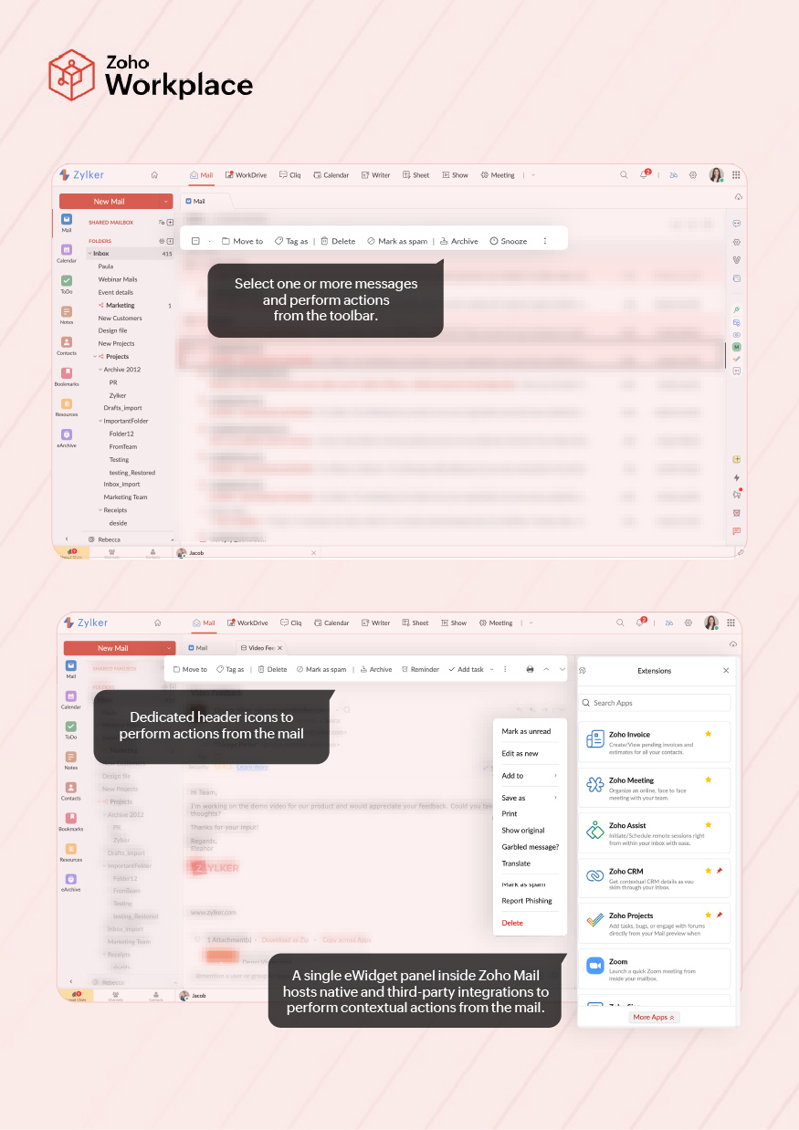
| Users typically select one or more messages and act via the toolbar (delete, move, mark, spam, snooze), with a few inline icons on each row.
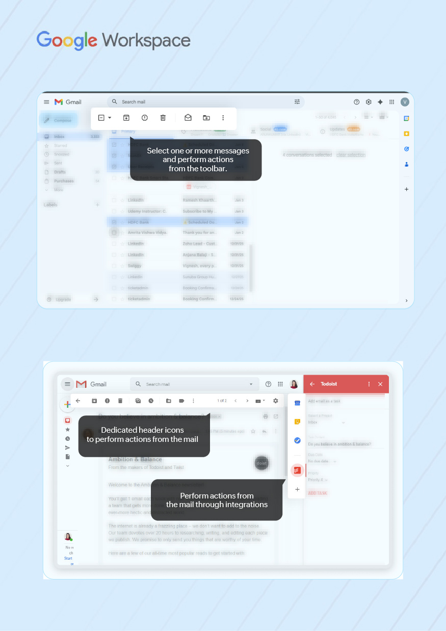
The layout favors deliberate processing of selected items rather than high-speed hover triage. | Hover actions (archive, delete, mark read/unread, snooze) are always visible on each row, plus a strong right-click menu.
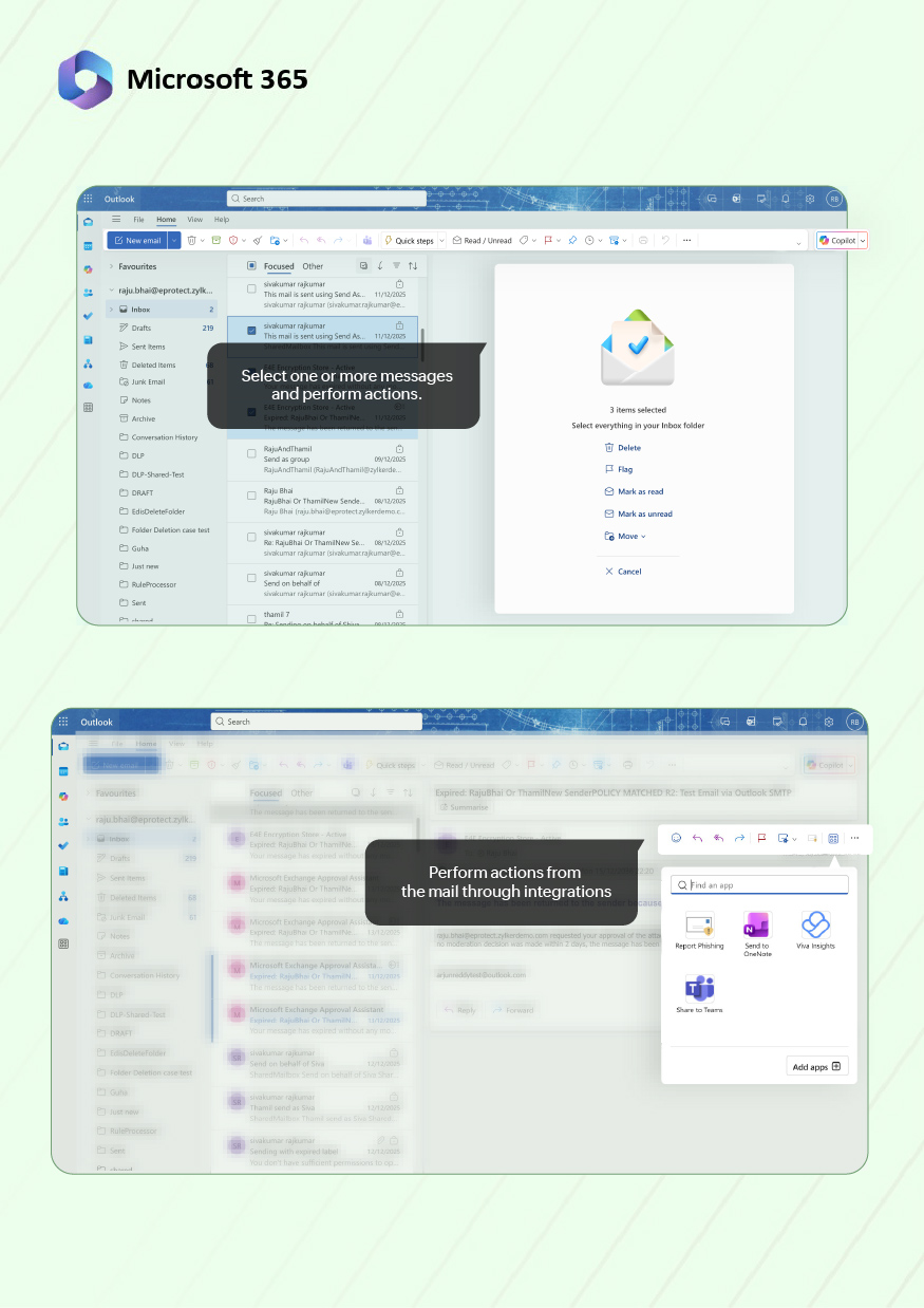
The UI encourages fast, lightweight triage directly from the list without opening most messages. | Row “Quick Actions” and a rich command bar combine to support flagging, categorizing, moving and archiving in one pass.
This suits high-volume and shared mailboxes, though the number of visible controls is higher than in Zoho or Gmail. |
Tasking and follow-up | On the open message, follow-up options like Reminder, Add task, Snooze, Permalink, and Summarize are exposed as dedicated header icons. This makes “come back to this”, “track this”, or “share this link” a single, obvious step while staying in the same view.
Zia gives users a quick summary of emails and allows them to be added to notes and tasks. | The message header stays compact: archive, spam, delete, move, labels, plus a “More” menu. Follow-up options such as Add to Tasks or “Create event” exist but are generally menu- or side-panel-driven, so users see them only if they know where to look.
Gemini in Gmail creates thread summaries, synthesizes replies, offers expand/minimize cards, and to-do reminders. | The command bar exposes many controls (flag, categorize, Sweep, Rules, etc.) and integrates with My Day / To Do, but most of these appear as general commands rather than a small, focused follow-up cluster.
Power users benefit; casual users tend to rely on flags and folders.
In Outlook, Copilot summarizes threads, highlights key points with citations, and generates quick file summaries for attachments like PDFs. |
Workflow integration from mail | Calendar, Tasks/ToDo, Notes, and Reminders live as modules inside the Zoho Mail interface. Items created from an email are usually reviewed and managed in the same application shell, which reduces context switching.
Follow-ups and discussions created from a message stay anchored to that mail, so users can triage and collaborate without leaving the Mail interface. | Calendar, Tasks, Chat, and Spaces sit alongside Gmail in the same window (side panel and left rail).
Work from a message usually continues in tasks, calendar or chat/space threads, so users step out of the inbox for follow-up while using Gmail mainly as a stream and search starting point. | Outlook surfaces To Do, Calendar, and Teams from the same screen through panes and commands.
Emails that become work are quickly turned into tasks, events or Teams conversations, so ongoing activity lives in those dedicated apps while Outlook remains the entry point. |
Workflow integration from mail–OTB extensions/add-ons | A single eWidget panel inside Zoho Mail hosts integrations from Zoho Marketplace and other Zoho apps.
It treats extensions as part of the mail console, so contextual actions feel like a native continuation of the message. | Gmail surfaces Workspace add-ons as separate icons in the right-side panel.
They’re context-aware on a message, but behave more like optional side tools than a unified “workflow hub” in the mail UI. | Outlook add-ins are invoked from the message toolbar/“More actions” menu and open in a side pane.
They’re powerful and IT-governed, but sit a click deeper and feel like advanced options rather than a primary workflow surface. |
4. Organizing and discovery
Across Zoho Workplace, Google Workspace, and Microsoft 365, users keep control of mail in three ways:
- Organization model (what the user sees): The visible structure on the left: folders, labels, categories, shared mailboxes, and special views. This is how people mentally map “where things live”.
- Automation: rules, smart filters, automatic splits: How incoming mail is routed or split without manual effort: rules, filters, smart folders, tabs, focused views.
- Search and filter experience (how users “find”): How users look up past mail when they don’t remember the structure: search box, operators, filters, saved views.
Differences across the three suites include how much structure is exposed, how heavily they lean on automatic splitting, and whether users are expected to rely mainly on search or on visible folders/views.
Aspect | Zoho Workplace | Google Workspace | Microsoft 365 |
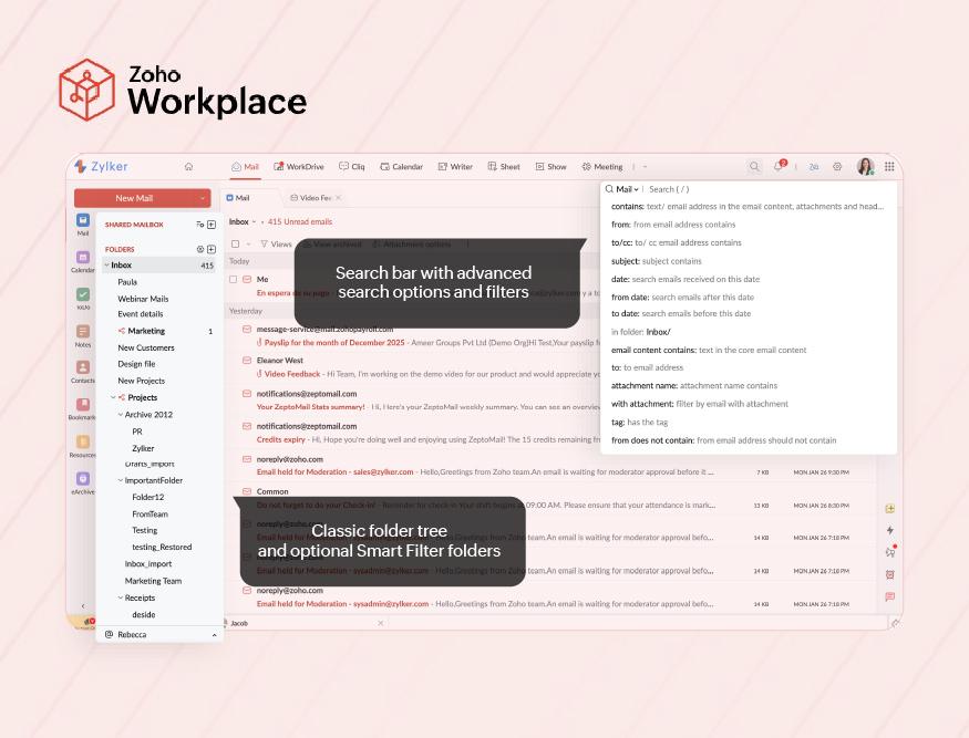
Folders, labels, and inbox views | Classic folder tree on the left (Inbox, Sent, Archive, custom folders), plus tags and optional Smart Filter folders such as Newsletters and Notifications.
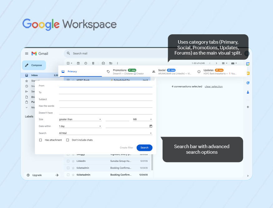
The UI assumes users are comfortable with a visible, hierarchical structure that they can scan and click. | Uses labels instead of folders, with system labels (Inbox, Sent, Drafts), user labels, and optional category tabs (Primary, Social, Promotions, Updates, Forums) at the top of the inbox in Default view.
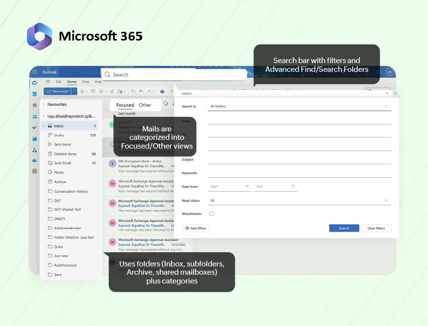
Users see a simpler left side than Zoho or Outlook; a lot of categorization happens via labels and tabs rather than deep hierarchies. | Uses folders (Inbox, subfolders, Archive, shared mailboxes) plus categories and Search Folders.
The left side often shows multiple mailbox trees in larger environments.
UI is built around the idea that teams will maintain a folder structure and use categories for cross-cutting views. |
Automation: rules, smart filters, automatic splits | Incoming filters let users route mail into folders, tag, mark, or forward based on conditions;
Smart Filters automatically detect newsletters, notifications, and group mail and file them into their own folders with tags.
This reduces inbox noise without changing the basic “one main inbox + folders” mental model. | Uses filters + inbox types: filters apply labels/actions automatically; inbox types (Default, Important first, Unread first, Starred first, Priority, Multiple inboxes) and category tabs use machine learning to split mail across sections.
Gmail expects users to lean more on auto-splitting and search, and less on heavy manual foldering. | Uses Rules to move/categorize mail on arrival and Focused Inbox to split into Focused/Other based on importance.
Guidance and training often focus on building a rule + folder + category system, especially for shared and role-based mailboxes. |
Search & filter experience (how users “find”) | Global search bar with advanced search options (from, to, subject, folder, date range, attachment), plus support for saved views via filters/tags.
Tutorials and docs emphasize building filters to keep the inbox manageable, then using search on top. This suits teams that want a visible structure first, search second.
Zia Search extends beyond Mail to return results from across Zoho apps- Mail, Desk, Cliq, Connect, and more, for unified retrieval. | Strong, central search box with operator support (from:, to:, has:attachment, label:), and many layouts (Priority, Multiple inboxes) built on search sections.
The UI clearly assumes search + smart inbox as the primary way to find mail; manual structure is optional and often shallow.
Google Workspace users get a powerful, conversational AI assistant to handle complex queries beyond a simple keyword search. | Search bar at the top with filters and Advanced Find/Search Folders for complex queries; combined with categories and folders, this supports very granular retrieval (by sender, category, date, size).
Outlook is tuned for heavy mailbox administration, where admins and power users need precise, repeatable searches and saved search-based views. It includes an easily accessible Copilot search.
Copilot looks at Outlook emails and can also pull in relevant information from Teams chats, Word docs, Excel files, and more. |
5. Security cues in the mail UI
On the mail screen, security shows up in three ways:
- On-screen alerts and trust markers: What the user sees on or around a message: banners, “external” tags, signature/encryption markers, suspicious link warnings.
- Policy and filtering behavior (automatic handling): What the system does before the user sees the mail: spam/phishing filters, blacklists/whitelists, DLP, or policy checks that can block, quarantine, or tag a message.
- User actions on suspicious mail: What the user can do from the UI: mark spam/not spam, report phishing, block sender, create filters, or override/escalate when a safe mail is misclassified.
Aspect | Zoho Workplace (Zoho Mail web) | Google Workspace (Gmail–Workspace) | Microsoft 365 (Outlook on the web/new Outlook) |
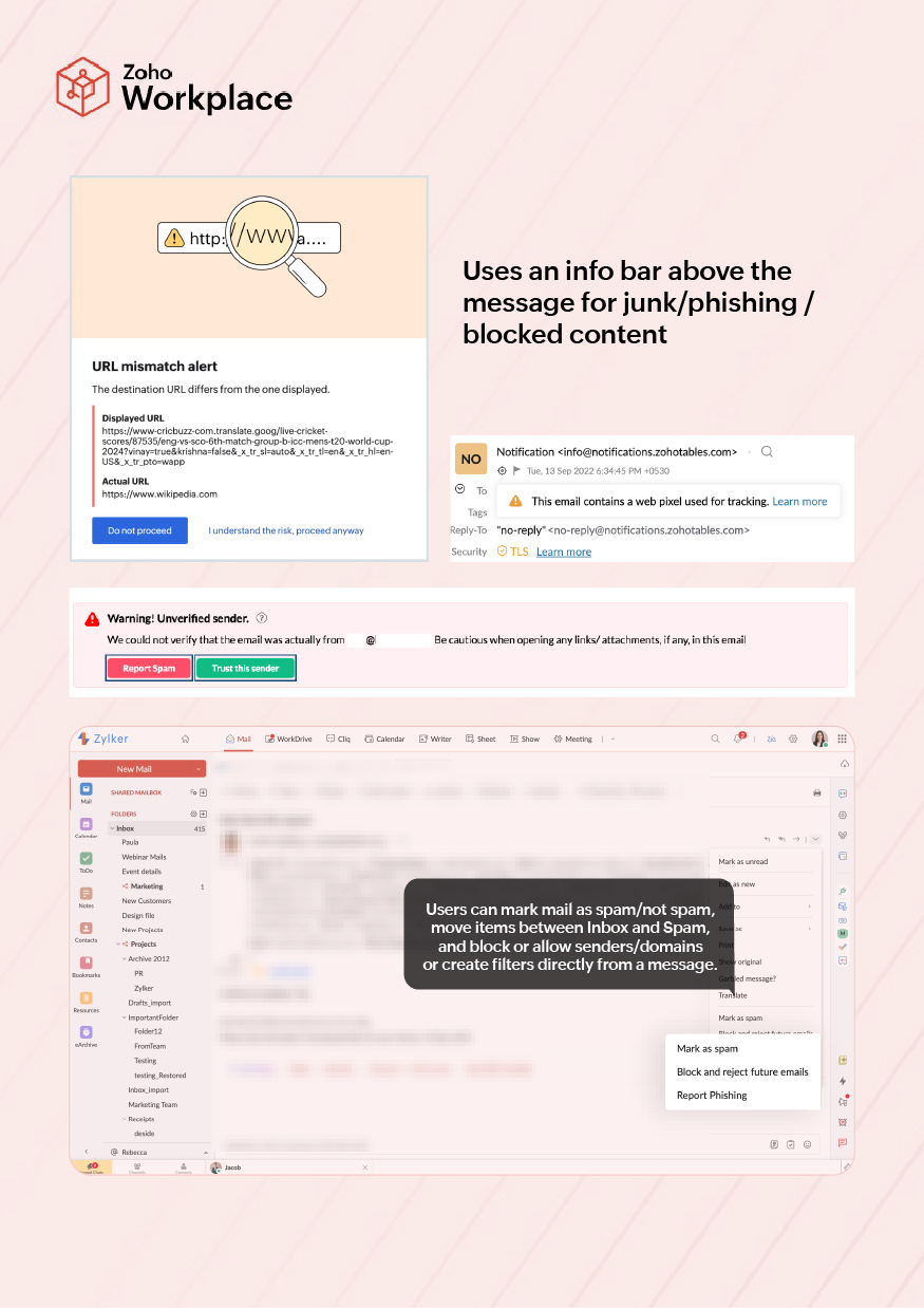
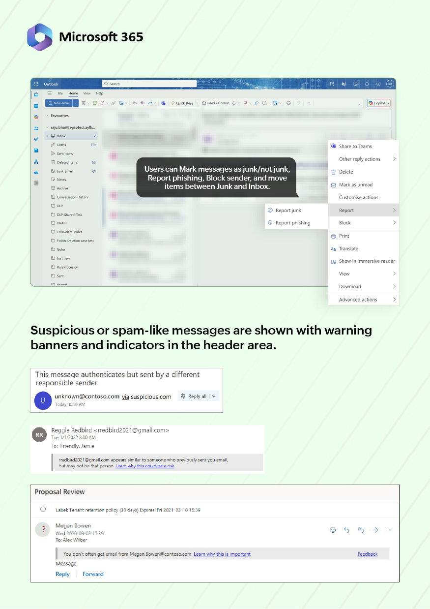
On-screen alerts and trust markers | Suspicious or spam-like messages are shown with warning banners in the header area, plus indicators for spam/phishing classification.
External or unusual senders can be highlighted, and signed/encrypted messages show status icons.
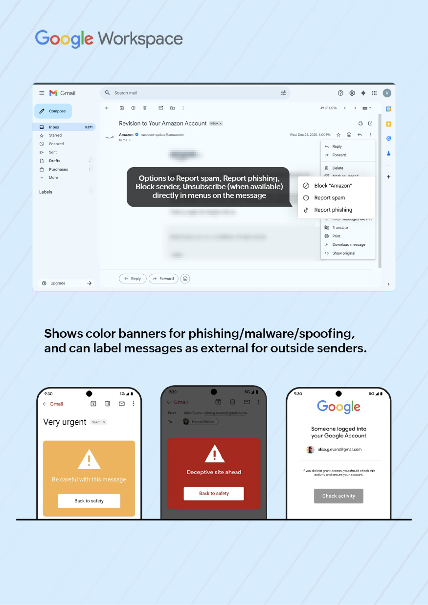
UX implication: users get a clear visual “this is risky/this is signed” cue without opening any separate screen. | Gmail shows color banners for phishing/malware/spoofing, and can label messages as external for outside senders.
Links can show warning pop-ups if the target looks suspicious.
UX implication: risk is communicated mainly through one strong banner and a small “External” marker, keeping the rest of the layout clean. | Outlook on the web uses an info bar above the message for junk/phishing/blocked content, plus external tags and, in many tenants, sensitivity/encryption labels in the header (e.g., Confidential, Encrypted).
UX implication: the header can carry several policy cues at once, which is powerful but visually dense. |
Policy and filtering behavior (automatic handling) | Server-side spam and malware filters push mail to Spam/Junk automatically; admins can define allowed/blocked senders and domains, content filters, and attachment policies for incoming and outgoing mail.
UX implication: users mostly see the result as “this landed in Inbox vs. Spam with a banner”, and heavy policy work stays invisible unless something is blocked. | Google’s spam/phishing engine routes suspicious mail to Spam or shows a banner; Workspace admins configure allow/block lists, DMARC/DKIM/S/MIME enforcement, and DLP/compliance rules (e.g., warnings or blocks on certain content or external recipients).
UX implication: from the user view, decisions appear as “this went to Spam” or “this mail is blocked/needs confirmation”, with minimal extra UI beyond a warning. | Microsoft 365 uses Exchange Online Protection/Defender for automatic spam, malware and phishing handling; messages may be delivered, junked, quarantined, or stripped of content.
Admins configure transport rules, safe/blocked senders, DLP, and sensitivity labeling.
UX implication: end users see the outcome as folder placement, info-bar messages, and sometimes “policy tip” text explaining why something can’t be sent or forwarded. |
User actions on suspicious mail | From Zoho Mail, users can mark mail as spam/not spam, move items between Inbox and Spam, and often block or allow senders/domains or create filters directly from a message.
UX implication: recovery from false positives and training of spam filters can be done quickly from the same screen, without admin consoles. | Gmail exposes Report spam, Report phishing, Block sender, Unsubscribe (when available) directly in menus on the message, plus “Not spam” in the Spam folder. Filters can be created from a message to auto-handle similar mail.
UX implication: user training of the filter and sender blocking is straightforward, but more advanced policy changes are intentionally kept out of the user UI. | Outlook on the web lets users Mark as junk/not junk, Report phishing, Block sender, and move items between Junk and Inbox. Quick actions and right-click menus support this, and some tenants add a “Report message” add-in for security teams.
UX implication: users can clean up and escalate suspicious mail from the inbox, while more complex policy/rules remain admin-side. |
How mail UI translates into real work
So far we have covered the interface layer at the screen level:
- Where you land (home and navigation)
- How the inbox looks (layout, density)
- What you can do in one click (actions)
- How mail is organized and found
- How security shows up in the UI
But organizations don’t buy “nice navigation”; they care about what it does to actual work. When people sit in Mail all day, those UI and UX choices show up as patterns in how they work with others, get through queues, handle risky mail, ramp up on the tool, and stay productive across very different roles and abilities. In this ebook, we group those patterns into six “aspects of work” that a workplace suite can help or hurt:
- Collaboration
- Productivity
- Security and trust
- Learning curve
- Accessibility
- Inclusivity (different roles and working styles)
UI/UX aspects that shape day-to-day work
Aspect of work | UI/UX behaviors that influence this in real work |
Collaboration: How people coordinate with others from inside the workplace suite | Moving from mail to calendar, chat or spaces when clarifying a request or setting up a discussion, using a single click from the top bar, left panel, or (in Zoho’s case) the bottom chat bar instead of hunting for where those apps live. Sharing a message as a link into a channel, doc, or ticket so the team can react on the same source instead of forwarding copies. Picking up long-running threads because the inbox groups related messages clearly and shows who’s involved at a glance. Parking project or account mail in shared views (folders, labels, team inboxes) where everyone knows to look for context before replying. |
Productivity: How quickly people can turn incoming mail into finished work | Starting the day already in the right surface (inbox, shared mailbox, queue, or dashboard) instead of clicking through multiple homes and launchers. Clearing routine notifications quickly using row-level actions, while still being able to slow down and open important messages without losing place. Turning a mail into a follow-up (reminder, task, calendar slot) in the same view when planning work, instead of copying details into another tool. Finding older decisions or attachments during a call because search and filters pull up the right thread in a couple of tries. |
Security and trust: How safely people act on external mail and policies | Spotting risky invoices, resumes, or vendor mails because banners, “external” tags, and link warnings stand out clearly while triaging the inbox. Understanding why a mail landed in Spam, Promotions, or “Other” when someone says they didn’t see it, based on simple cues in the UI. Fixing misclassified but legitimate mail on the spot (not spam, move back, unblock sender) without raising a ticket every time. Sending sensitive updates knowing the header clearly shows if the message is encrypted, labeled, or restricted from forwarding. |
Learning curve: How hard it is for users to become effective | Figuring out on day one “where work starts” (mail, dashboard, calendar) because there is one obvious home, not several competing ones. Moving between mail, calendar, chat, and files with the same pattern every time, so users don’t have to remember different tricks per app. Learning one main way the inbox is structured (folders, labels, tabs, or focused views) instead of juggling overlapping models with different names. Guessing correctly where reply, archive, move, search, and follow-up live on the screen, because their position doesn’t change between views. |
Accessibility: How well the suite supports different physical/cognitive needs | Reading long stretches of mail without eye strain because density, font size, and reading pane position can be adjusted to suit the person and device. Recognizing flags, errors, and warnings even when tired or color-blind, because icons and short text are used instead of color alone. Hitting the right action (Reply, Archive, Delete, Mark as spam) reliably on a trackpad or touch device because click targets are large enough. Handling basic triage, search, and move operations via keyboard when using assistive tech or working with limited mouse control. |
Inclusivity (different roles and working styles): How well one suite supports many ways of working | Working either from a calmer inbox with fewer signals or a denser view with more status, depending on whether the role is managerial, operational, or high-volume support. Choosing to rely more on visible structure (folders, shared mailboxes, views) or on search-first patterns, depending on how the team likes to work. Pinning or prioritizing the apps and views that matter most to a role (shared mailbox vs. personal inbox, calendar-heavy vs. doc-heavy work) in navigation. Letting occasional users (approvers, field staff) get by with the basics, while power users discover deeper features in the same interface without changing tools. |
UI/UX score by aspect of work
The rating table presents a numeric view of how each suite’s interface (across vendors) supports different aspects of work by comparing screen- level behavior.
Aspect of work | Zoho Workplace | Google Workspace | Microsoft 365 |
Collaboration | 9/10: Mail, Calendar, Tasks, Notes, Cliq, and the persistent bottom chat bar keep most everyday collaboration anchored to Zoho Mail.
Little context switching once people live there.
Clicking an email address opens a contact card with office presence, role, chat options, follow‑ups, and team coordination. | 4/10: Gmail + Chat/Spaces share a frame, but anything beyond simple conversation jumps out to other tabs.
Threads, tasks, and spaces feel loosely connected rather than one work surface. | 8/10: Outlook + Teams + shared mailboxes give strong collaboration for structured teams, but users often jump between Outlook and Teams windows.
Capable, but spread across surfaces. |
Productivity | 8/10: Medium density, Smart Filters, clear follow-up controls and in-shell modules help turn mail into work without leaving the app.
The Mail Assistant offers a command-style overlay to trigger common actions using fast, contextual input—reducing clicks and menu hunting. The dashboard also includes Streams, a consolidated feed of mentions, shared messages, tasks, and posts, grouped into ‘To Me’, ‘By Me’, and ‘Favorites’, so users can resume work without checking multiple apps. | 6/10: Very good for fast triage (hover icons, smart inbox types). Weaker when mail has to become a tracked task or structured queue, because that quickly moves into Tasks/Calendar/Spaces and away from the inbox. | 7/10: Highly configurable layouts, Focused Inbox and rich command bar suit high-volume and shared mailboxes.
Productivity is strong for trained users, but the volume of controls increases cognitive load. |
Security and trust | 7/10: Banners, spam/phishing markers and sender cues are visible without cluttering the view.
User actions (mark spam, not spam, block/allow, filters) are close to the message. Enterprise security depth is solid, but not surfaced as heavily as in Microsoft’s stack. | 7/10: Clear banners, “external” tags and link warnings. User actions (Report spam/phishing, Block, Not spam) are straightforward.
Many policy decisions stay hidden, which keeps the UI clean but can obscure “why did this happen?”. | 9/10: Outlook exposes junk/phishing info bars, external tags, sensitivity labels, and policy tips directly in the header.
Combined with Exchange Online Protection/Defender, the UI makes policy decisions very explicit, at the cost of more visual noise. |
Learning curve | 9/10: One obvious start point (Workplace dashboard → Zoho Mail as personal console). Navigation is consistent, folder-based structure is familiar, and follow-up controls are visible on the message.
New users reach “productive” quickly.
The right panel sports a Product updates widget that allows users to keep track of what's new with Zoho Mail without leaving the app. | 4/10: Screen looks simple, but the mix of labels, tabs, inbox types, multiple inbox views, and hidden follow-up options adds conceptual weight.
Easy to send/receive; harder to learn “how work should be organized” in an enterprise way.
Workspace has in-app feature prompts, a one-time pop-up, banner, or tooltip in Gmail, Drive, or Docs when a new feature is rolled out, giving a short announcement or quick tour. | 7/10: Outlook follows long-standing patterns, but multiple overlapping ideas (folders, categories, Focused Inbox, rules, shared mailboxes) mean new users typically need training.
The design assumes some Outlook/Exchange history.
Microsoft shares product updates via the Message Center (admins) and Roadmap (public). For end users, new features usually appear silently after updates, with no in‑app widget. |
Accessibility | 7/10: Adjustable density, reading pane placement, and clear icons support different visual needs.
Keyboard use is supported, but accessibility is not the dominant design theme, and options are less discoverable than in Google or Microsoft.
| 8/10: Light layout, large click targets, and consistent web patterns help with assistive tech.
Warnings use color plus icons/text.
Overall, easy to read and operate for a wide range of users. | 8/10: Benefits from Microsoft’s broader accessibility work (high-contrast modes, strong keyboard support, screen-reader focus, configurable density).
Interface is busy but core actions and warnings are reachable in multiple ways. |
Inclusivity (roles and working styles) | 8/10: Medium-density inbox, Smart Filters, shared views, and mail-anchored tasks suit both individual roles and operations/support teams.
The common console feel (mail + bottom chat bar) works for many styles without changing tools.
Built-in shared Mailbox and delegated access enable structured team handling of queues within the same UI.
The toggle widget allows users to access Zoho Marketplace for other extensions that can be used with Zoho Mail. | 5/10: Works very well for individual, search-heavy users.
Offers fewer built-in affordances for teams that live out of shared queues or strict folder rules unless you add other tools.
High-volume roles often push beyond the default UI.
The GSuite Marketplace offers other tools including a third-party shared mail box that can be integrated with Workspace. | 8/10: A very good fit for complex, role-based environments: shared mailboxes, multiple accounts, rules and categories, support operations, and support and compliance teams.
Managers and occasional users can feel the UI is “too much” for simple needs. Office 365 has extensive tools including shared mail box built out of box for businesses to improve their productivity. |
Conclusion
Zoho Workplace: Mail as the work console
In this view, Zoho scores highest where the mail client is treated as the primary work surface:
- Navigation, inbox layout, actions, and organizing tools are all designed around staying inside Zoho Mail while you move between mail, calendar, tasks, notes, and Cliq. A dedicated storage panel in the right rail lets users monitor usage and bulk-delete mail, like clearing all messages from a sender, without navigating folders, keeping inboxes light and focused.
- The persistent bottom chat bar and in-shell modules reduce context switching; collaboration and individual work both happen from the same console.
- The trade-off is that very deep, security-driven signaling and extremely complex multi-mailbox setups aren’t surfaced as aggressively as in Microsoft 365.
For organizations that want a single, understandable “workplace window” for most employees, Zoho’s UI/UX choices line up well with that goal.
Google Workspace: Light inbox, search-first mindset
Google scores well on accessibility and quick triage, but lower on structured work management from mail:
- The Gmail interface is light, predictable and accessible, with fast row-level actions and strong search.
- However, many of the UI patterns (labels + tabs + inbox types) assume a search-first, individual productivity model, not a heavy queue/shared mailbox model.
- Collaboration and follow-up are available, but they tend to move into separate tools and tabs rather than staying anchored to the original email.
For organizations where Docs and Drive are the real center, and mail is mostly a stream plus a search box, this UI works. For ops-heavy or queue-based teams, more scaffolding is usually needed on top.
Microsoft 365: rich enterprise control, heavier surface
Microsoft 365 scores highest on security and trust and is strong on inclusivity for complex roles:
- Outlook’s UI makes enterprise security decisions clearly visible through info bars, labels and policy tips; combined with rules, categories, shared mailboxes, and Focused Inbox, it handles large and complex environments well.
- Collaboration is strong once users are inside Teams or structured shared mailboxes, but the experience is intentionally distributed across several products.
- The cost is visual and cognitive weight. New users face more concepts at once, and simple roles can feel over-served by the interface.
For organizations with mature Exchange/Active Directory environments, strict compliance, and many role-based mailboxes, the Microsoft 365 UI aligns with existing practice, even if it demands more training.
***The scoring is heuristic, not statistical. It is meant as a concise interpretation of the earlier tables, for decision-makers who need a directional view of how Zoho Workplace, Google Workspace, and Microsoft 365 behave as everyday work environments.
This post was co-authored by Sandeep Kotla and Vignesh S
 Tanya Austin
Tanya is a Senior Product Marketing Specialist at Zoho with nearly a decade of experience in tech marketing. Formerly focused on the cybersecurity landscape, she now helps teams build more efficient, connected digital environments through Zoho’s suite of productivity tools. She is a firm believer that most of life’s challenges can be navigated with a clear strategy, a historical perspective, and a soundtrack of 80s cinematic rock.